09.08.10
Excerpt: Book
Art of McSweeney’s
To an extent, Art of McSweeney’s — an oral history of the San Francisco–based quarterly, from Chronicle Books — is about the quirky illustrations, charts, graphs, and covers that have defined the look of Dave Eggers’s publishing venture for the last twelve years. But even more, it’s about the art of book-making, which in this case means reproductions of original sketches; odd detours to visit Arni and Bjössi, the Icelandic printers who produced more than a dozen issues before McSweeney’s moved its printing facilities to Singapore and North America; interviews with authors and artists; charts of printing specs; drawings of pensive clouds; and guides to reviewing unsolicited material. The book begins with a photocopy of the first email Eggers sent out to potential contributors in 1998, laying out the terms of the magazine and asking for submissions:
“I think it will be called McSweeney’s, after a man named Timothy McSweeney, who, when I was growing up, used to write long, tortured, often incomprehensible letters to my family, claiming to be a long-forgotten member of my mother’s side (she was Adelaide McSweeney) and outlining when and where he would be in the coming months, should we need to reach him and bring him back into the fold. If it’s not called McSweeney’s, I’ll find an obscure but appropriate word in the dictionary — or, better yet, a word in another language! — and call it that. Whatever its name, it will be about 160 pages, perfect-bound, and will in many ways look like most literary quarterlies. (I mention this to clarify that it will not be what is known, among the youth, as a ‘zine.’)”
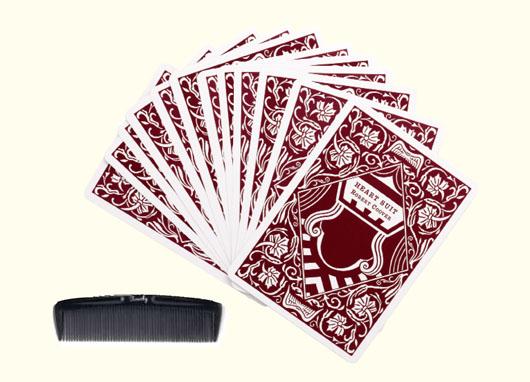
McSweeney’s did look that way for a long time; Eggers likes to point out that no one there ever had any formal training in book design or production. And there always was an emphasis on the book-as-object. “If we’re to ensure the survival of physical books, these books have to be things you want to buy, hold, bring to bed or the tub or the beach,” Eggers says. But as the staff became more comfortable in its role as accidental designers, the issues began to feel even more awesomely object-like. Issue 7, in 2002, got bookboard and a rubber bellyband; issue 11 had foil stamping and a leatherette casewrap. But McSweeney’s 16 was the first time the book began to look not so much like a book. That issue consisted of a cloth-bound, foldable box containing a comb, a deck of cards, and two smaller volumes. Soon after came issue 17, a bundle of junk mail, and 19, a cigar box full of pamphlets and ephemera.
McSweeney’s 16 — the one with the comb — also has the distinction of being the first issue I ever owned, and so we’ve excerpted the story of its making below.
Eli Horowitz: I’d been wondering about a book that could be normal-size but with an enormous cover. Something that could sit on a shelf, pretend to be a normal book, but then unfurl into something else entirely. That led me to various folding contraptions, which I tested mostly by tearing napkins into various shapes.
Dave Eggers: The artwork on the exterior started with Joanna Davis. She’s the sister of our friend Amanda Davis, a writer who died too young, in 2003. We’d always admired Joanna’s art when we saw it in Amanda’s house in Oakland. Joanna did these gorgeous paintings, almost monochromatic, of forests. So I kept thinking of a way we could use her stuff for a cover. But until Issue 16, we hadn’t really used much in the way of illustration on the covers.
Joanna Davis: I had moved to Pennsylvania and fell in love with drawing dormant winter trees. For the first time in my life I could draw something over and over and over again without getting bored. Eli asked me to do several different drawings in a short amount of time for the cover, until we got to the perfect one. I was actively involved in all the ensuing decisions: how it was to be printed, the type of fabric, the color of the ink, etc. I yessed it all. I was so happy that my drawing was being used that they could have shredded and defecated on it before going to press and I would have been fine with it. Luckily none of the decisions involved violence.
Eli Horowitz: The only violence was directed at those napkins. Once we had the basic shape, I thought of the built-in pockets as a way to hold everything in on the inside. But it was important to me that the pockets be earned. I wanted the function to require the form. I didn’t want to just have some stories in one pocket, some stories in another, other stories in another. So I tried to think about what kinds of things would need a pocket — separate works, collections of things, objects — while meanwhile keeping my ears open for works that might fit.
Angela Petrella: When I was an intern, Eli asked me to come up with some ideas for alternative ways to present a story. His initial starting-point suggestion was “a deck of cards,” and he told me to come up with two hundred ideas like that. So after many, many hours, I gave him a list of things like a waitress’s pad, a reporter’s notebook, a hotel guestbook, a teacher’s grade book, a TV guide — everything ever. A few months later, I got the issue. It was a deck of cards.

Eli Horowitz: We figured out three items — the novella, the playing cards, and the book of stories — but we still needed a fourth. I really wanted an object in there. To fit, it had to be thin and long. And it had to be inexpensive. Beyond that, I just wanted something clear, immediate, frank. I considered a ruler or a magnifying glass, but I didn’t want to imply any specific purpose — I didn’t want readers wondering what they were supposed to measure or examine. So I settled on the comb.
Chris Ying: Once at a book fair, a customer looked at this issue and said, “Oh, I get it. Like, combing for good fiction.” I just said, “Yeah, exactly.”
Eli Horowitz: The comb is pretty much nonsense. I’ve heard the whole thing compared to a gentleman’s grooming kit, which had never entered my mind.
Dave Eggers: This was the first issue Eli really conceived on his own, I think, so I was giving him a wide berth, but periodically checking in with him. I didn’t really know what the thing would look like until he showed me the printer’s mockup, which was pretty incredible. I couldn’t believe they could make such a thing affordable. And then he showed me four different combs. The printer had subcontracted with a comb-maker, and they sent us four options, including an afro-pick. I don’t know if I ever asked why we would have a comb in the issue.
Eli Horowitz: After we resolved the comb thing, there were other technical issues to sort out. For instance, the layout for Adam Levin’s story, “Considering the Bittersweet End of Susan Falls,” took some conversation.
Adam Levin: My story had a couple too many visual weirdnesses — varying typography, diagrams, and marginalia. When I realized after a couple years that the problem was impossible for me to solve, I sent it to McSweeney’s, hoping they’d understand. After Eli accepted the story, we sussed out which weird things were essential and which weren’t. I rewrote sentences and added paragraphs. Chapter 2, the weirdest looking one — it was supposed to look like a really smart fifteen-year-old girl’s marginalia in a textbook and a page of Chumash (a Torah in book form, with marginal commentary) — switched places with Chapter 3. It seemed best to push that weird-looking one a little further back, just like you wait ’til at least the second date before showing the girl your eleventh toe.
Eli Horowitz: And Nathaniel Minton, another writer we included, was really sick while we were working on his piece.
Nathaniel Minton: I had a fever of 104˚when I got the galley back from Eli. There was this delightful drawing of a tree on my story along with a note about the comb.

Eli Horowitz: Issue 16 also marked the first appearance of any material from Denis Johnson’s novel Tree of Smoke, which directly led to me attempting to build a cabin on his land in Idaho. This stemmed from the promise Sean Wilsey had made to Denis a few years earlier — that we’d build a cabin for him in exchange for being able to publish some of his work. Ann Beattie’s novella “Mr. Nobody At All,” the other heavy hitter in there, had been bumped from her book and was just sitting in her drawer.
Ann Beattie: “Mr. Nobody At All” came to me as a title when I pulled a book off the shelf and found the name, reading about the artist Edouard Vuillard. I guess it clicked because what we name things, as opposed to what they are, was the subject of the piece I was writing. I’d gotten tired of going to memorial services and hearing people talk about their significance in the lives of the people who were dead: their special moments; their deeply significant anecdotes. I wrote part one, then told my friend Harry Mathews that what I was working on didn’t pass the “Et alors?” test. To explain this in-joke: a mutual friend once described a situation in which he found himself doing research for a book in France. When people listened to what he’d discovered about his subject, he’d act like he was the gossiping concierge, asking,“Et alors?” Anyway — I had the first part of what I was writing, but didn’t think it much mattered. Harry suggested I stage a second memorial service. He was exactly right, and that gave me the idea to ask him to write his own tribute (I told him a bit — but just a bit—about the imaginary person I’d been writing about). Whew.
Eli Horowitz: Issue 16, along with two other books we were expecting — The Facts of Winter and The People of Paper—was frozen in customs for a couple awful weeks. It was a huge, huge pain. Apparently they were sharing a container with some other shipment from Singapore, and that shipment contained “dead animals.”
FromArt of McSweeney’s by The Editors of McSweeney’s. Copyright 2010 by McSweeney’s and reprinted with permission from the publisher, Chronicle Books.