07.15.11
Excerpt: Magazine
David Lynch’s workshop in The Chronicle #2
It wouldn’t be totally wrongheaded to view The Chronicle — a new biannual publication produced by the cultish Copenhagen ready-to-wear brand Rützou — as a fashion designer’s mood board, come to life. For each issue, the creative team — which consists of Rützou’s designer, founder, and namesake Suzanne; her husband, creative director Peter Bundegaard; and editor-in-chief Frederik Bjerregaard — selects a thematic framework and then collates together visual inspiration to support it. Called “Poetic Realism,” the first issue was abstract and moody, with photographic essays on pattern or urban decay and collages of the magazines’ own diverse inspirations, including Luigi Colani, Matthew Barney, Ernst Haeckel, melancholy, and a Mott Street acupuncturist in New York’s Chinatown. The latest issue, called Sense and Sensibility, more literally serves as a scrapbook for creative inspiration: “Sketches, abstractions in watercolor, visual logbooks, black-and-white imagery, personal portraits, simple doodles, this vast collection is a glimpse into a range of international artists’ creative processes and their final work,” the team writes.
By international artists, they mean the likes of Marc Newson, Julie Verhoeven, and David Lynch, who offers a glimpse into his Parisian printmaking lair in the excerpt we’ve reprinted below. They’re the kind of deeply creative figures Rützou herself might reference one season, but by putting their stories on paper and distributing the book in like-minded shops from Tokyo to New York, she makes her personal influences something like open source. As Bundegaard says: “Creative matter never really belongs to anybody and has no final destination. In this manner the publication is more a vehicle for creative distribution: a work in progress. The publication is meant to be used, the pages torn out and put into other context by the reader.” Read the interview with Lynch below, and if you’re interested in finding a paper copy of the magazine to do just that, follow the link at the bottom of the story for a list of stockists worldwide.
“The Paris Suite”
Text: Anne Dorothea Bruun
Photography: Patrice Forest, Anne Dorothea Bruun
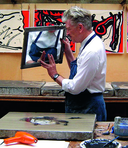
For over a century, the Parisian studio Idem has enabled renowned artists such as Picasso, Matisse and Chagall to dive into their creativity in a limitless sphere where only tranquility and inspiration rule. Today David Lynch has found his way to Idem where he explores his latest creative expression: the lithography. Lynch and his friend, studio director and owner Patrice Forest, took The Chronicle for a visit behind the scenes to zoom in on the artist’s work desk.
Idem is a 1400 square meter studio dating back to 1880, well hidden from the commercial vibes of modern Montparnasse — a remembrance of industrialization, adds Patrice Forest, the studio owner. There is a certain raw and truth-seeking feel about this place, like a Martin Scorsese movie fused with a Turner painting. It is as if a certain code governs the studio, a special respect for the artist and his creative monologue. The huge impressive printing machines, which in their time were a technological revolution enabling a mechanical mass production of visual art, also deserve great respect.
Today Idem allows American movie director and artist David Lynch to retire for periods of time and concentrate on his pictorial art. Lynch is primarily known for his surreal films such as Blue Velvet, Eraserhead and Mulholland Drive, as well as for the TV series Twin Peaks. Born in 1946 in Montana, he is one of those rare filmmakers who was originally educated as a painter, and has never been able to put down his brush. Lynch starts off by describing the actual making-of process, from idea to lithography:
“It’s a thrilling thing when an idea comes for any medium. With drawing and painting — and these are such beautiful worlds — it’s not just realizing the idea but also seeing how the idea can be even greater when the nature of the paint, the nature of the paper — all these natural phenomena intermingling with the idea — how they all work together to add to the idea. It is sort of a man and nature working together thing, I guess.”
During the interaction between the artist and the creative process, it seems for Lynch as if the tools almost affect the lithographs with their own natural force. There seems to be an inherent force within the polished stones, on which the pictures are created, and in the machines, caused by the repetitious process that is lithographical printing. The name Idem suddenly makes sense, since it means “the same” in Latin.
The concentration of motifs touched by every instrument is in many ways bestowed upon them — very similar to African sculptures that can possess something almost spiritual, created by centuries of rituals.
Walking through Idem is as if all the metal in the old printing machines canalize a kind of latent magnetism, while drawing you into the great history of the surroundings. The different working tools all send out an echo of Picasso, Matisse, Braque and Chagall, who all were once inspired here. The echo is felt in the room. Today David Lynch, together with young photographers and the Danish artist Peter Brandes, creates an echo of the art and creativity of our time. Asked how many artists reside in Idem today, owner Patrice Forest had this to say:
“Je ne sais pas! Quand on aime, on ne compte pas.” (I don’t know. When you love something, you don’t count).
Today in Idem, works of art come to life that are just as mystical and exciting as David Lynch himself. They testify to how Lynch is so much more than synonymous with cult movies. Lynch’s works and ideas were previously reproduced upon yellow Post-its, and even matchboxes. But in connection with his exhibition The Air is On Fire, at the Fondation Cartier in Paris in 2007, Lynch discovered Idem – a meeting that has been followed up with the production of 120 studio-made lithographies so far.
“I was taken to Idem printing studios by Hervé Chandes, who is the director of Fondation Cartier. Hervé really wanted me to see this place and once I saw it and experienced being in it, I didn’t want to leave… I feel a great mood here that fuels my ideas.”
Upon the work desk in between the impressive industrial machines stand old brushes, black paint, an ashtray and a peculiar, kitsch blow dryer. Its vintage orange color reveals that it has not served the styling of hair since the 1970’s. Today it dries the paintings. David Lynch explains his rhythm when working in the studio.
“When I go in here, I usually take a coffee and sit near the blank stone. Pretty soon an idea comes and I go to work. A series of tools and brushes should be close by, and Patrice most always takes care of that. Pierre always has ink ready for me, and up until recently I did require an ashtray but now I have quit smoking.”
The lithographs are strange and fascinating at the same time, and seem to be in coherence with the creative drive that Lynch has as a film director. Just as in Eraserhead and Twin Peaks, Lynch’s pictography seems to have a purpose, which is to create a feeling more than a pre-defined message. And he enables this feeling for whoever views his world. Whether dreams, nightmares or loneliness are the feelings evoked, we instantaneously drift away from everyday life and its conformities, and into an endless land when interacting with Lynch ́s artistic universe as a spectator. Nothing is explained, no interpretation is needed because art, according to Lynch, should remain a mystery in order to stay true to its label and raison d’être. Art is, as Lynch himself puts it, most of all: “Making things that are appealing in various ways to the person making it.”
The creative process for lithography, as an art, is a delicate and technical work method that demands incredible precision. Lynch works with wet drawings, which allows complex ideas to become powerful expressions within the simple process. The black paint is diluted and dissolved upon the limestone in a way that resembles watercolor painting. With Lynch, it is the black paint’s nuances that are interesting and give life to the lithographic expression.
“For me, at the present time, I’m feeling that color weakens the image. In lithography, it is not just black and white or the off-white of the paper. There can be a huge range of grey colors between the black and the white. For the time being, this is thrilling to me – just working with the black ink on the stone.”
To read more of “The Paris Suite,” and to view the issue in its entirety, go to The Chronicle’s website. For a list of stockists, click here.