07.26.12
The Making of
Lex Pott’s True Colours Series
In some ways, it seems fate that Dutch designer Lex Pott would end up working in a studio housed in an old shipyard in the northern precincts of Amsterdam. As a child growing up in Hilversum, 30 miles outside the city, Pott was obsessed with boats, constantly crafting miniature ones from the natural debris he’d find in the forest around his house, and using old plastic bags as sails. And in the short time since he set up his studio, after graduating from Design Academy Eindhoven in 2009, he’s built up a small body of work centered around the very phenomenon that’s known to wreak havoc on seafaring vessels: oxidation. Pott has shot to fame in recent months on the basis of Transience, a series of silvered geometric mirrors designed in collaboration with fellow Eindhoven grad David Derksen. But the project that started it all, True Colours, was less a product than an investigation into the nature of color: Pott took standard sheets of industrial metals — copper, brass, steel, and aluminum — and played with oxidizing them by various methods, in the process creating a highly individualized palette he could, in theory, apply to any metal object.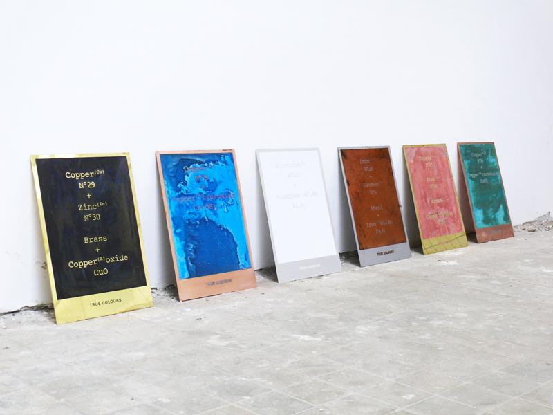
“The project started from the problem I had of choosing colors as a designer,” Pott says. After apprenticeships in the studios of Hella Jongerius and Scholten & Baijings, he explains, “I wanted to work with colors but I never could figure out how to use them in a way that made sense to me. You almost have too much choice — what color do you choose and why do you choose it? With True Colours, it finally made sense. Every metal has its own oxide color, and that color is inextricably linked to the material itself. Therefore the color also provides you with information about what material it is.”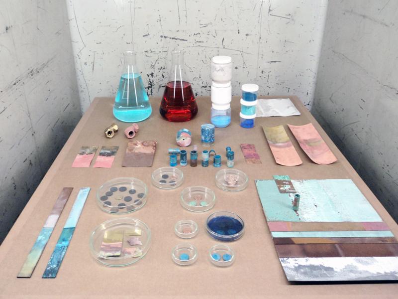
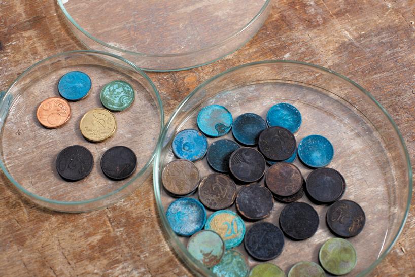
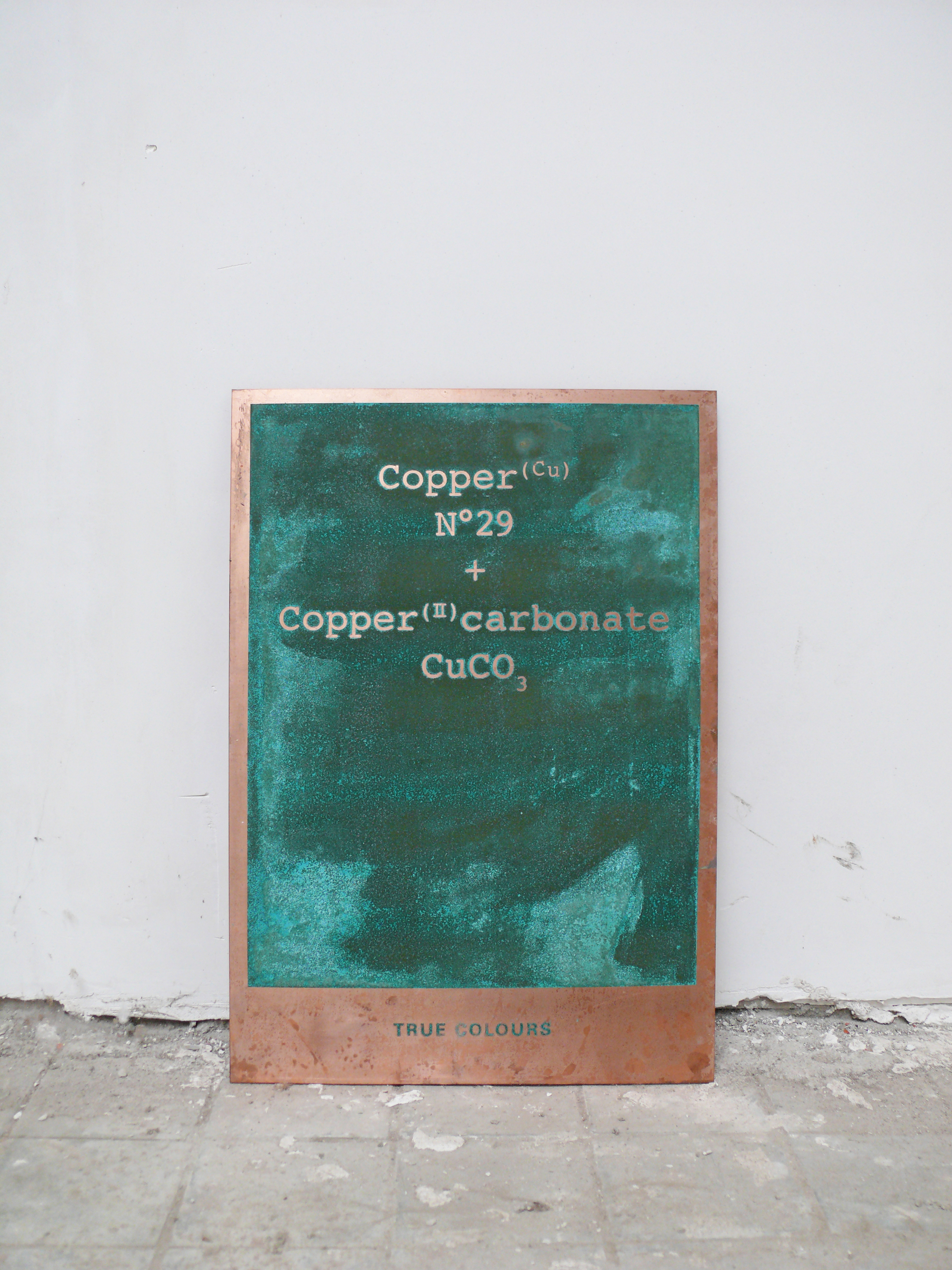
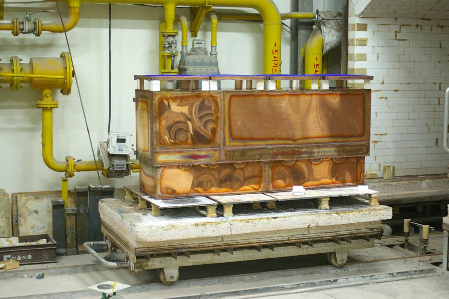
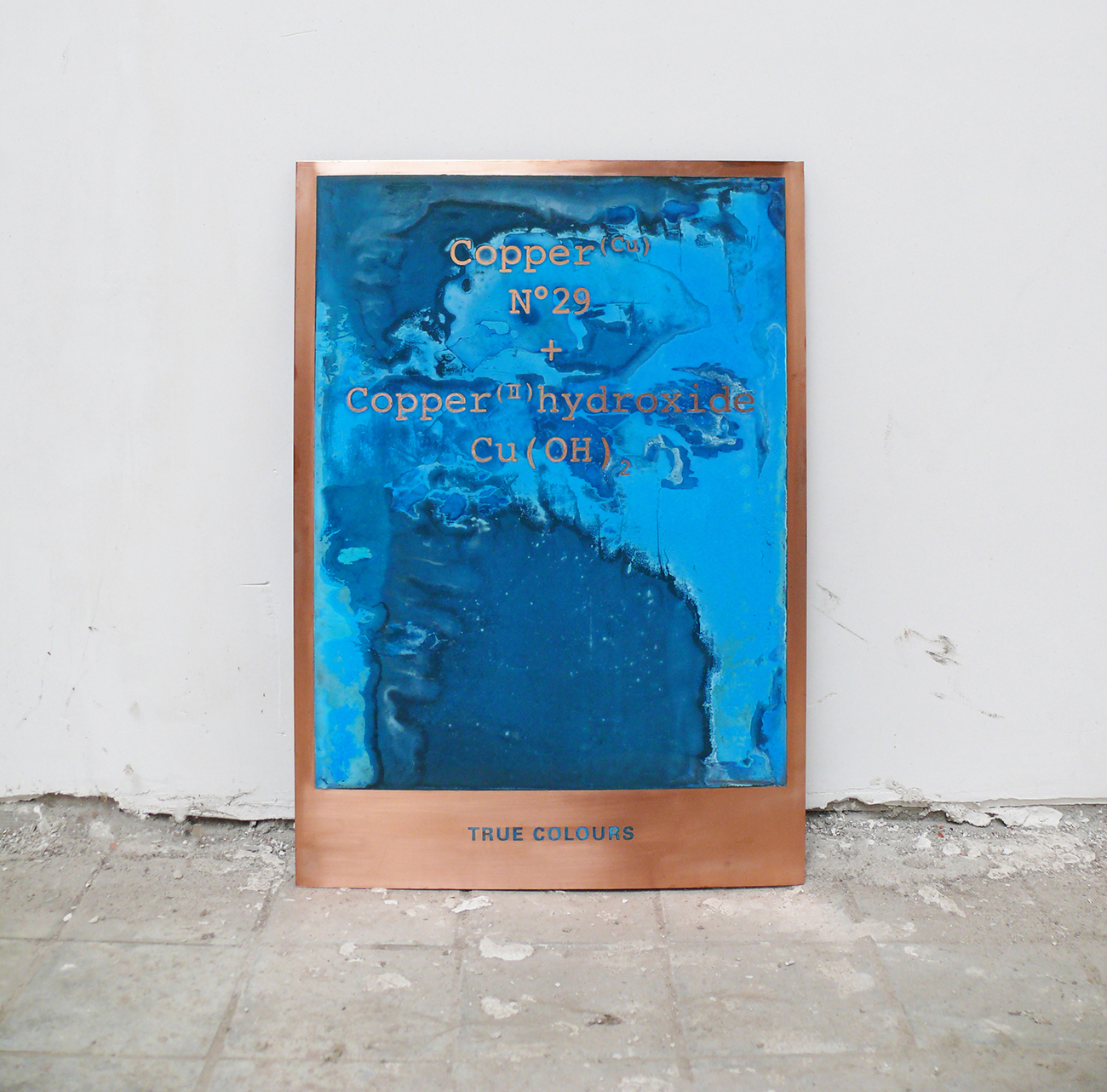
In starting the project, Pott dove into the history of oxidation and in the process became a kind of amateur chemist. “In nature, oxidation depends upon a set of specific circumstances — whether the ore can be found alongside a river or exposed to air, or only to minerals; if it’s dug out deep from the ground or close to the surface,” Pott says. 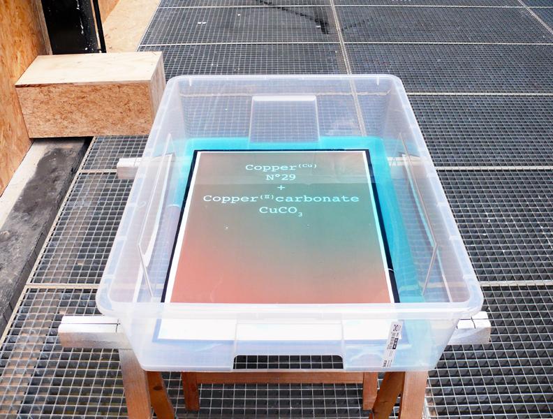 In his studio, Pott created several different situations to mimic nature’s effects, using chemicals like copper sulfate and simple ingredients like salt and ammonia. Some metals he soaked in a chemical bath; others he sprayed with a chemical solution. The blue panel, which is copper, developed after being exposed to gas in a closed box. “What I found so fascinating about the production technique,” says Pott, “is that every color has its own specific creation. For instance I used copper twice because it’s a combination of materials and therefore oxidizes in different ways. Brass is the same way: It’s an alloy of copper and zinc, so it became pink when the copper oxidized red and the zinc oxidized white.”
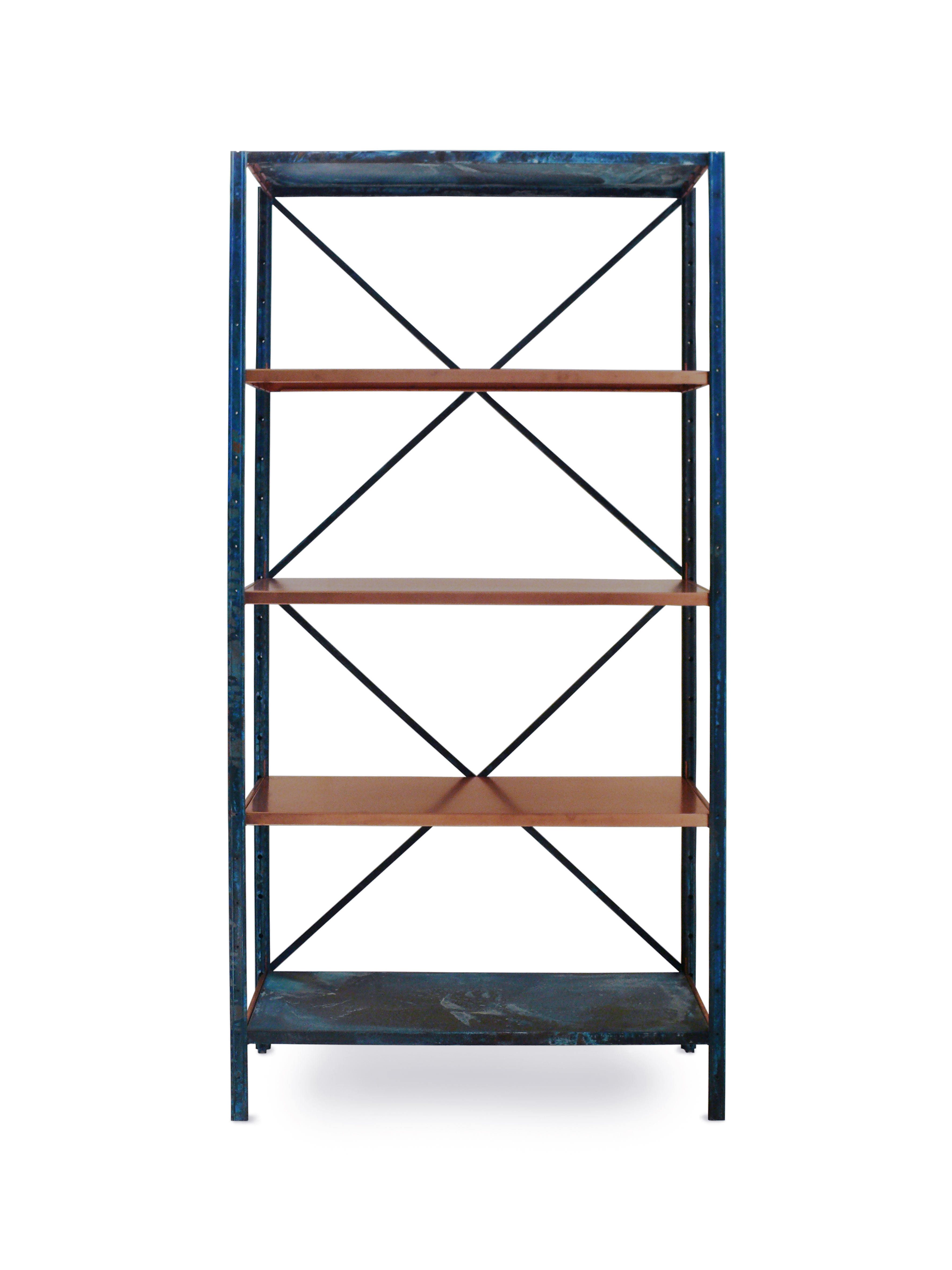
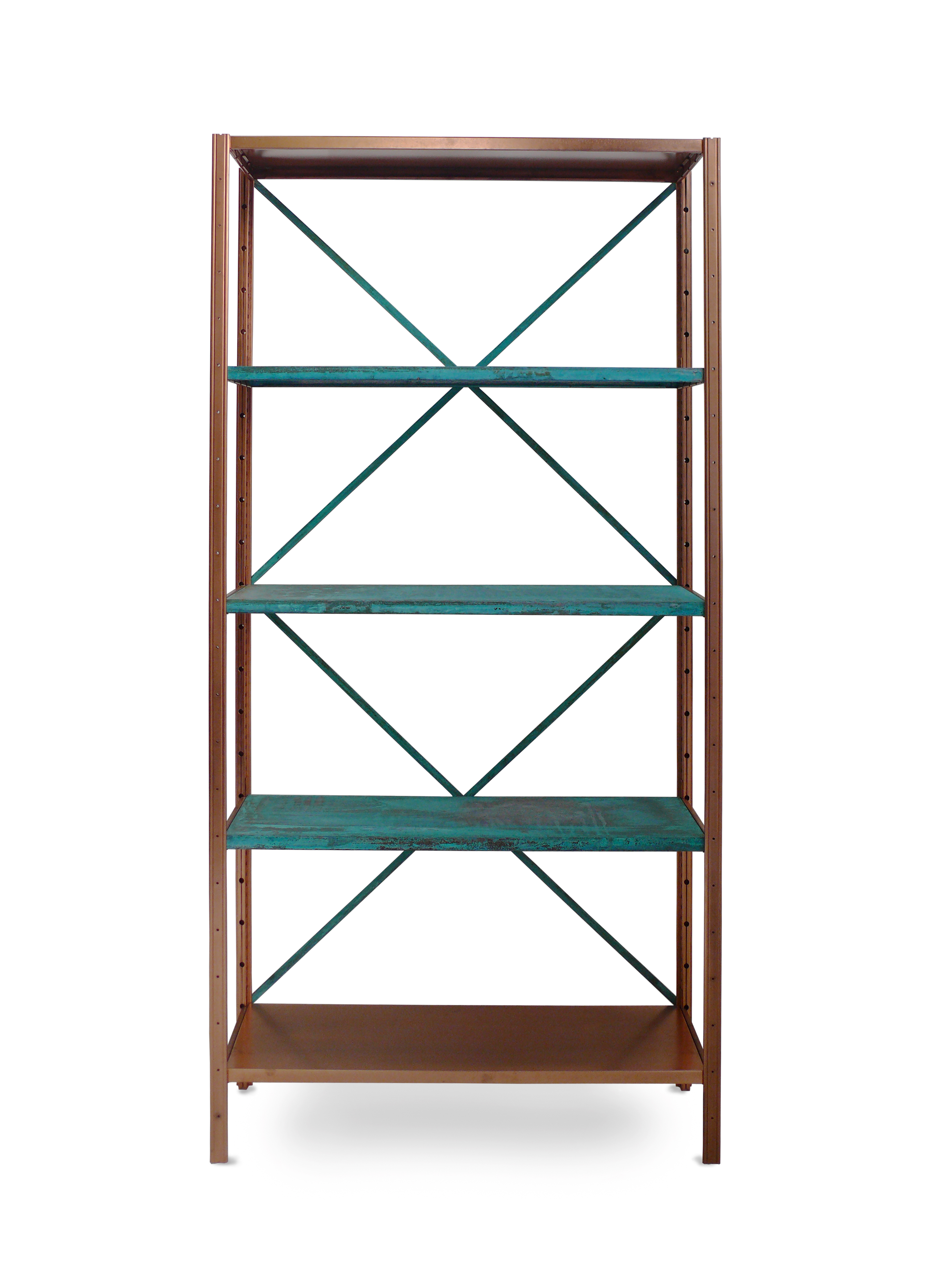
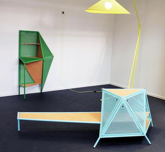
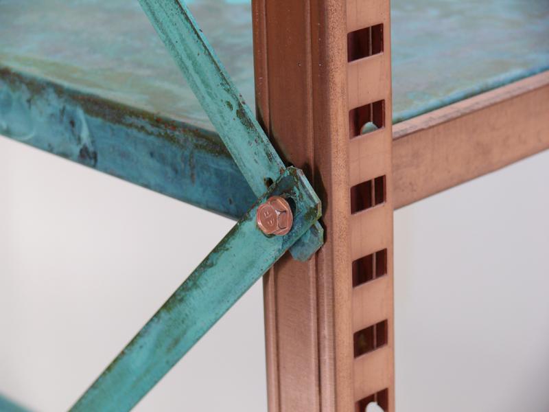 Pott created the series in standard metal frames and applied the technique to industrial shelving units as well, preferring the contrast of an anonymous shape with an uncontrollable, highly organic reaction. But with True Colours, he got even more variety than he bargained for; even if all of the copper sheets oxidized blue, for example, it wasn’t one shade of blue but rather a gradient within the hue. “In the beginning, I was frustrated that each one was unique,” he says. “As a product designer, you work hard to make something you can reproduce. After a while, I began to find it charming that every composition was different. The only difficult part is when people buy them, they buy the ones they’ve seen and complain theirs looks different. I have to explain them the whole story.”