10.23.12
Up and Coming
Josep Román Barri, Graphic Designer
Josep Román Barri‘s latest project happens to be the art direction for a new website that’s in the exact same spirit as our own: It goes behind the scenes in design, focusing on process rather than the final result. Should you ever have doubted that the world needs more of this kind of reporting, though, try searching for behind-the-scenes information on young talents like Román Barri himself, whose work has certainly made the blog rounds as of late but who might scarcely have a turn under the microscope if it weren’t for sites like ours. When we first caught a glimpse of his fledgling oeuvre, all we could glean was that he was a 26-year-old Barcelona-born graphics graduate who studied technical engineering before turning his hand to two-dimensional design, and that he had a way with color and typography. So we emailed him and asked him to introduce his work, and he gladly obliged — now that wasn’t so hard, was it?
1. Describe your most recent project and how it was made.
The most recent project that I made was an identity for a website, the Method Case, which specializes in the world of design, architecture, and visual communication. Its content focuses on methods and process, not just the end result, like we’re so used to seeing in blogs that report on design and only care about shape and function.
The starting point was creating the brand identity, and I wanted to show a solid concept in a simple way, with just a logotype. I built a system with the three words of the site’s name, creating a freeform structure whose elements can occupy various degrees and positions. The idea is for the design to have an unfinished or malleable look. It’s like playing a game with the typography, one that enhances the original idea and easily creates an identity with minimum effort, avoiding complicated effects.
Once I had settled that part, I wanted to create a visual language to make sense of the brand while nodding to the site’s manifesto of showing process. For this I devised a very basic concept based on the transition: using illustrations that transition between two forms, so we see what graphically happens when we extrude from one form to another, such as from a square to a circle. It creates surreal effects with optical games. There are also transitions in the form of color gradients, which are always more interesting than the original or final color themselves. On zero budget, I made a marketing piece for the Method Case to present their new brand identity; it’s a video (pictured above) in which a natural rock gets painted the site’s signature yellow, but you can’t see the process itself — the spray can stays just out of the frame.

2. Describe your next project and how you’re currently making it.
I like to constantly be trying out different disciplines, experimenting and collaborating, so my projects tend to vary substantially either in their subject matter or in the ways they approach those topics. That said, I come from the world of product design, so I tend to collaborate most often with product designers. That’s the case for my next project, which with Guillem Ferran, who’s developing a workshop for glass artisans to get deeper into the creation of functional objects.
I will also be guiding the other participants and giving a lecture in the communication section of the workshop. Eventually all this will be reported and will generate a small catalog showing the final pieces made by the artisans, plus all the other content about the process. We’ve already made some posters to promote the workshop (above) that interpret the glass quite literally, with only basic pieces of the material interacting with the poster, no other photographic treatments or effects. We didn’t know how the pieces of glass would react on the paper, but it worked surprisingly well, obtaining a great impact.
 Román Barri’s thesis project, the design and art direction for Alia magazine
 Objects Through Objects, catalog for Guillem Ferran
3. Tell us one thing that’s been inspiring you lately and why.
One inspiring trend is the realization of two-dimensional visual content based on three-dimensional object compositions and still lifes, which leaves a large space for photography in the field of graphic design. The way we portray objects has evolved, taking them out of context and changing the messages they communicate. This can be seen in magazines such as Apartmento, with still lifes realized in bread or other casual objects, or in the work done by Sarah Illenberger, like her crocheted organs for Die Zeit’s weekly magazine. Pierre Vanni also uses this technique in his work, trying to give his pieces an extra volume using new formats, photography, and other solutions that give a new perspective to the composition; some of his projects that especially interest me are his posters for OMMU.
What I most like about these projects is their decontextualization of content, but I also like the idea of generating compositions and still lifes with objects that are themselves the product being communicated. For example, less than two years ago I discovered the magazine for the fashion brand COS, where one can see a series of still lifes depicting the clothing with a powerful force and exquisite subtlety. That series is the work of the photographer Maurice Scheltens and the visual artist Liesbeth Abbene.

4. Name the one piece of graphic design you wish you’d made, and explain how it has impacted your own work.
The iconic record covers of Peter Saville, like the one for the Joy Division album Unknown Pleasures or the later cover for New Order’s single “True Faith” in 1994. It’s Saville’s way of dealing with the content that interests me, the way he tries to convey and evoke information with minimal gestures, yet still achieves a greater expression. The image for the cover of Unknown Pleasures was actually taken from an astronomy book Saville found, but I think it still takes a good eye and a great sensibility to select and redirect language that technical to generate such poetic and exciting content.
When I was still in school, I had to do a small publishing project where we were asked to make a visual treatment using infographics to portray a topic. I chose to create a biographical piece depicting the passage of Joy Division through the history of music, before, during, and after their existence. I got carried away by the album cover that Peter Saville designed, where the line, with all its expression, was the protagonist in the design language I realized for my booklet (above).
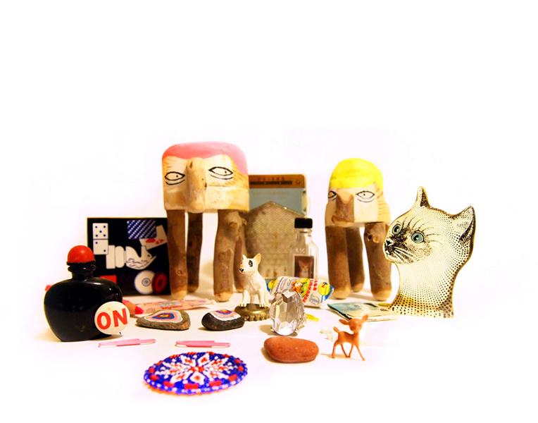
 Promos for the illustration site Poolga
 Lausana typeface
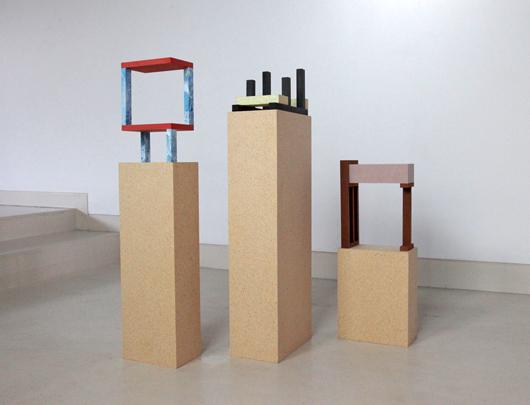
 A classroom exercise at Écal with Helge Hjorth Bentsen and Pierre Benoit