04.02.13
The Essentials
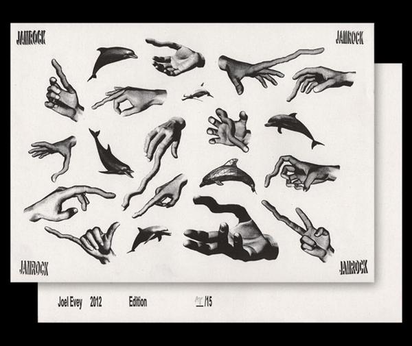
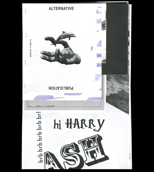
Joel Evey, Graphic Designer
Joel Evey owes his career to Pixar, believe it or not. He made a name for himself as part of the team that was bringing edgy, high-brow graphics to Urban Outfitters back in 2010 — with a style some like to call the “new ugly” — but at age 15, it was Toy Story that changed his life. “I saw it for the first time and was like, wow, that’s crazy! You can do that with a computer?” recalls Evey, who at the time was already about to head off to college early to study computer science. Instead of hard coding, he decided to pursue animation and 3-D graphics instead. “But animations took so long to render that I started to think, ‘Well, what happens when I take this image and just render one of them?’ Then, ‘What if I put type on it? What would that look like?’” The rest, as they say, is history. He started designing crazy neon flyers for the raves he was attending outside school hours, proceeded on to a graduate graphics program at Cal Arts, and helmed his own studio for a bit before he got the call from Urban, where he’s been an art director ever since. We first spoke with Evey over Vietnamese food in South Philly about what it’s been like working for the clothing company, then we asked him to name his essential fonts, graphics techniques, and more.
What exactly are you responsible for at Urban?
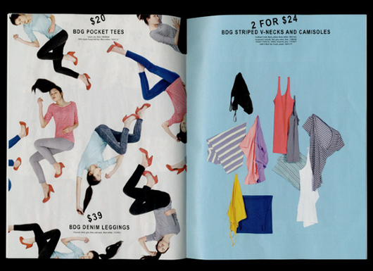
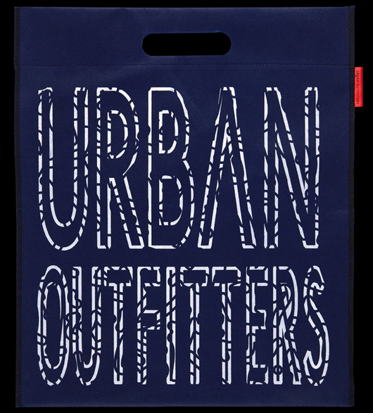
Print, so the presentation of anything printed that’s in our store, whether it’s a hang tag or posters on the wall or type on the window. That’s all got to pass through me, as well as the design execution of the printed catalog.
I feel like there was a point where Urban flipped over into this cool graphics thing. Was that when you got there, or before?
That was around the time. The creative director at the time, Duncan, he was sort of pulling from those things in his personal practice. Me and a few of the other designers there were also interested in the same concepts. Between us as a department and the creative director, we kind of pushed that aesthetic and recruited people to come that we felt like also shared those interests.
How did you sell that aesthetic? Were you like this is what the kids like these days? Did anyone care?
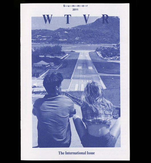
I think people cared. People definitely asked why, but in my mind it felt like it related to our customers. There’s a lot of talk at Urban about the “aspirational customer,” which is the customer that is the coolest one we could imagine shopping at Urban. They can’t quite afford Opening Ceremony, but they’re smart and have good taste. They’re literate in fashion and art and photography. These kids get this sort of aesthetic. We were trying to talk to the top and let that filter down. The cool elements will trickle down to other people. That’s how we sold it, that this is something new. This look was something that was totally outside the more Americana, craft-based design I saw a lot of. Sometimes it was really successful, sometimes it was really weird. But we let it all be what it was.
 How do you describe it? The new ugly?
I hate that term. For me it was more about challenging the status quo. If somebody talks about a design or remembers it, that’s more important. If our sale signs make people think, “How can I look at this?” that’s better than press for say, H&M, because people don’t talk about the H&M sale signs after the fact.
When you started at Urban with Duncan, did you guys have similar influences?
Yeah I would say so. At the time a lot of the choices that were made in those movements were supposed to be a challenge or an antithesis to the established agency, American commercial graphic design. Duncan was already interested in those concepts and how they related to fashion, which was something I was personally interested in as well. Everybody did it together honestly. There was a synergy between me and my buddy Matt, another buddy Shawn, and a couple other people that were there. We were all on the same level, and we were all exploring the same concepts.
Here’s the million dollar question: Did you have that existential moment of, “The minute we bring this to Urban Outfitters, it is no longer rebellious.”
Oh yeah. You have to be okay with the fact that once it’s consumed by mass culture, it’s not going to be as challenging conceptually, but still I think it’s something that stood out in the branding landscape. If you look at Urban versus H&M, or Forever 21 during that time, the graphic design was radically different. It’s always been this sort of punk, DIY thing for Urban. So we always try and shake that up. You have to remember there is a little bit of humor in it, no matter what the visual styling, it’s always going to be a little tongue-in-cheek.
I was going to say it proves that you love your job. The fact that you were willing to take that risk.
Graphic design is just speaking to people in a way that’s visual. The question, who is it that you want to speak to? Is it this customer or that customer, this person or that person? Different people have different tastes, and for me I was interested in trying to talk to people that have this specific taste and see what happens.
How much work have you been doing on the side since you started? Are you always doing other projects?
I have my own graphic design practice on the side. I’m always doing other projects. I don’t know if it’s just that I’m a workaholic or what, but if I’m not doing my own personal projects, I get really antsy. I’m also involved in this weird performative DJ night that we do at this spot in north Philly. Different weird creative stuff, anything that I can do that makes me still feel like my brain’s alive and I’m moving forward.
Where in California did you grow up?
It’s a little town called Morro Bay. It’s a tiny spot on the beach about an hour north of Santa Barbara.
What’s the worst thing you’ve heard said about your work?
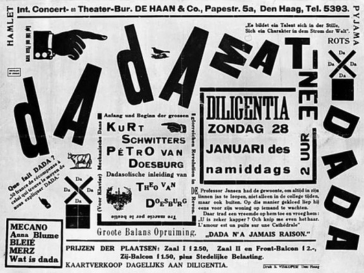
I think the worst thing I’ve heard my work described as, probably that it’s hideous, which to me is not really an insult, because aesthetics are in the eye of the beholder. Arguments I’ve heard about this aesthetic: Is it concept or is it just lazy? There’s a lot of that sort of discussion. Both for me personally and at Urban it was about experimenting outside the norm. I think probably the critique that gets me most is that it’s just a thing or it’s just a style, when has grounding in design history. Look at the typographic work of the Futurist movement, or Dadaism (below).
There must be people that don’t get it.
There are, asking questions like, “Why did you do this? That font looks like crap.” It’s all comments on Facebook mostly, Urban posts a lot of the catalogs on Facebook. They say things like “That’s so weird.” “This looks like my kid designed it.” “I could do that in MS Paint in ten minutes.” always give me a good chuckle.
I’m sure there are Urbans in small towns where people don’t engage with that sort of culture often.
Things with Urban are temporary. We did that style of design for a while, and now with Kevin we’re doing something totally different. Currently things are much more colorful and there’s a lot more vibrancy and humor. It’s all about experimentation. What do the kids want to see now? What’s another way we can speak to consumers? It’s all about trying out new stuff.
What is the new thing?
Bright colors. More hypercolor. Bold line work. Mistral.
Has your personal work changed as well? I mean, is that the goal in your personal work too?
I feel like it has. Most of the personal work that I made recently is much more colorful than it used to be. A lot of it was all monochrome, and there are lot more brights now. Because once I’ve run through a concept for a while, you come to understand it. So what’s something new I can try? How can I continue to challenge myself?
What other projects are you working on now, personally?
I’m part of a pretty wild DJ collective called Wyyldstyle that I do with some friends, it’s fun to get on stage and become a persona sometimes. I’ve also been working on a book with Alex da Corte, i’m really excited about that project, the visuals are unreal. Between that I’ve been doing these really strange collages using bright florescent papers, then collaging them with refrigerator items. A lot of them incorporate grape jelly and printed novelty duct tape, using a squeegee and printing the jelly on there, then putting tape over top of it. They have such an odd quality to them, and they make me slightly uncomfortable. I guess that’s why I like making them.
Do you ever feel like oh shit, I’m out of ideas?
Every once in awhile, but that’s why I’m always trying to work on personal projects. You’re just training your brain. My friend Namik tells a store from his education, an instructor asked the class how many ideas they have in a day, a student responded “1 or 2” and the instructor ejected him from the class saying “you need at least 100 good ideas every day.” I’m working towards that, even if their very small or very unachievable, just the act of having them.
If you had to leave Urban tomorrow, what do you think you would do?
Actually, I really don’t know. I think I might honestly just go do something totally different for awhile. At this point, I’ve been doing graphic design nonstop since I was 17, and I might just want to go live in the woods for a year. Who knows!
JOEL EVEY’S ESSENTIAL:
Font
Recta by Canada Type.
Photoshop or Ilustrator tool
Content Aware Delete in Photoshop — “Your computer on drugs.”
Analog design tool
A toner-based photocopier. The texture and quality you can get from one is really nice.
Typography move
Please, no stretching type!
Website
Therevolvinginternet.com. Great for parties. Make sure to hide the toolbar.
Google image search
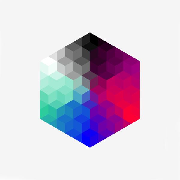
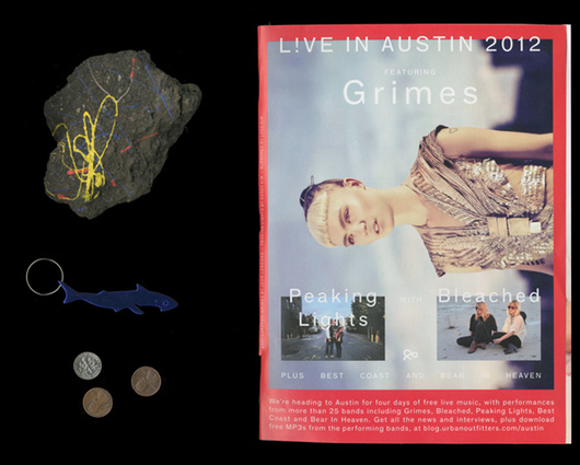
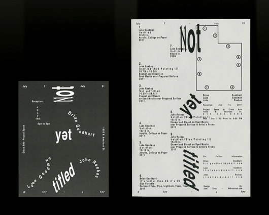
“simulacrum beta blogspot” (selection above) — it’s a digital goldmine.
Print magazine
For the risks they take, PIN-UP. The use of typography as a weapon is really nice.
Bookstore
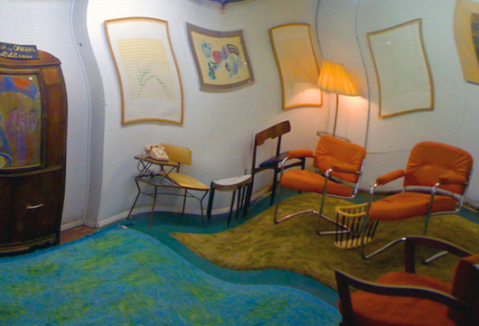
KARMA in New York City, a very nice mix of old and new.
Current book
Robot Poetry Reading by Angelo Plessas; it’s so next level. Interesting use of algorithms on something as romantic as poetry.
Place to read
Anywhere warm and quiet. I find it helps me get in the right headspace.
Color combination
If I’m honest, black and white. BORING!
Art movement
It’s perhaps less of a movement then a microcosm, but right now I would have to say tumblr. It has a zeitgeist all its own.
’80s television show
As a child I loved Denver the Last Dinosaur. Watching it again recently, it’s incredibly surreal.
Live music experience
In recent memory, seeing NU Depth play in a small warehouse. The energy he has is insane. The only way I can describe it is Power Rave.
Symbol or symbol system
The work surrounding the exhibition “Identity” by Dexter Sinister.
Marketing lesson
Know who you’re talking to — always consider the intended viewer.
Philly hotspots
1. The Race Street Pier. A great new design project on the waterfront. Ride your bike there with some wine in the summer.
2. Bodega Gallery. Wonderful people with wonderful dreams. I love their curatorial instincts.
3. Pizza Brain. Great pizza and a really interesting space to boot. Check out the Guinness World Record certified largest collection of pizza memorabilia.
4. The Institute of Contemporary Art. A staple of the Philly art establishment. Good programming; they’ve been killing recently with public-facing programs like Excursus.
5. The Barbary. A gem of a club in north Philly. Shouts to Big Freedia — her show there a few months back was mind-blowing.
This post is part of Sight Unseen’s Philly Week, sponsored by the Greater Philadelphia Tourism Marketing Corporation. Curate your own Philadelphia art and design experience at withart.visitphilly.com, and follow along @visitphilly #withartphl.