06.12.13
Excerpt: Exhibition
New Abstract at The Printhouse Gallery
Is it possible, in this day and age, to have a new movement in design, à la Art Deco, or Memphis? That was the question we posed to our panel of emerging designers a few weeks ago at the Collective Design Fair here in New York City, and the consensus appeared to be no. (As one participant claimed, “Everything just looks like the internet now.”) But this week, a new group show opened in London, curated by Printhouse Gallery’s Ruth Hanahoe and illustrator Saskia Pomeroy, that claimed one such new movement. They call it the New Abstract, and they’ve brought together different media in the visual arts — primarily prints, paintings, and ceramics — all united by a certain aesthetic and informed in some way by the process of making. (To be fair, a lot of the work does look like the internet; perhaps Tumblr is this generation’s aesthetic movement.) We’re still on the fence about whether the name will stick, but the curators do make an excellent case for the commonalities that tie the work together. As they write:
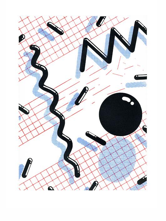
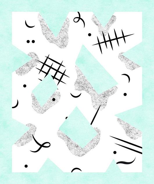
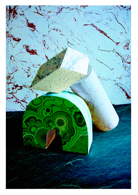
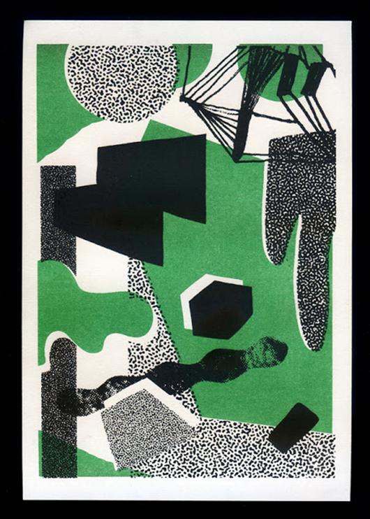
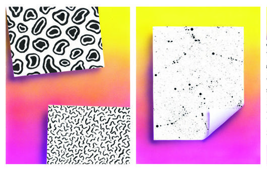
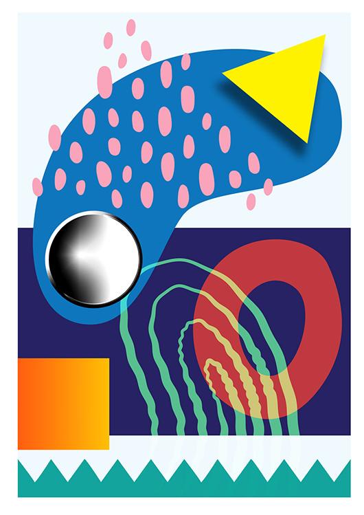
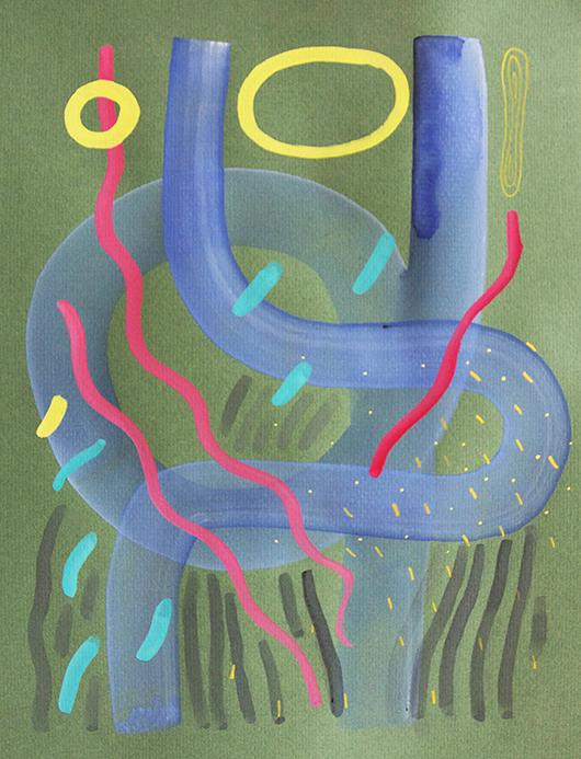
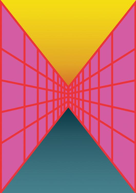
“The print work (like the work of Parisian graphic designer Raphaël Garnier above) is geometric and organic, with color overlays and monochromatic textures. Each artist has approached the use of shapes, objects and perspectives differently. There are two main categories in print. The first: super slick digital effects, postmodern in reference to the graphic design styles of the 1980’s. Chrome effects, grids and gradients are prevalent in this type of work, which is informed by the print process. The second is abstract in merging more organic or accidental textures with spot color overlays. The eye is drawn into the interplay between textures and shapes, colours and negative spaces. This is also true of Annie Strachan’s 3-dimensional work.”
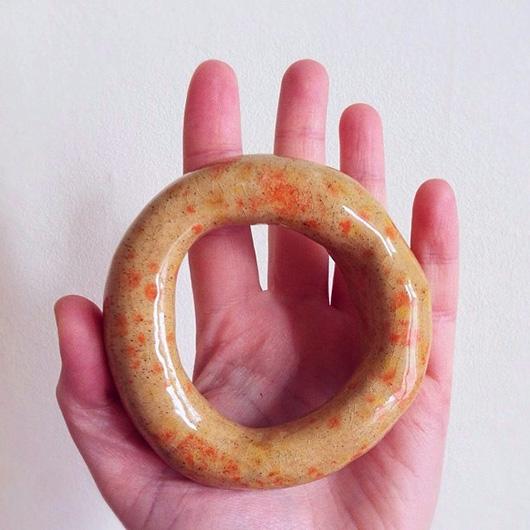
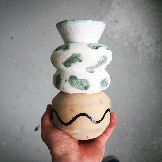
“The use of texture through pattern is also evident in the work of the ceramicist William Edmonds and designer Hazel Stark. Some of the glaze and patterns are deliberately accidental, with spatters and blotches. Others are carefully considered brushstrokes and color placements. The ceramic work is reflecting a burgeoning trend in ceramics, breaking the mold (sorry) of conventional shapes and glazes.”
“The painting work is similar to the ceramics in the way that brush strokes are used to create interest across the image. As before, compositions of colours and texture, dark and light are used to create depth and space, across plains that are not familiar as images but intruiging and interesting nonetheless.”
Saskia Pomeroy
Hazel Stark
Will Harvey
William Edmonds
Clay Hickson
Annie Strachan
Saskia Pomeroy
James Hines![]() Quantum Dot
Quantum Dot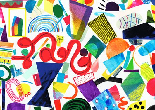 Pat Bradbury
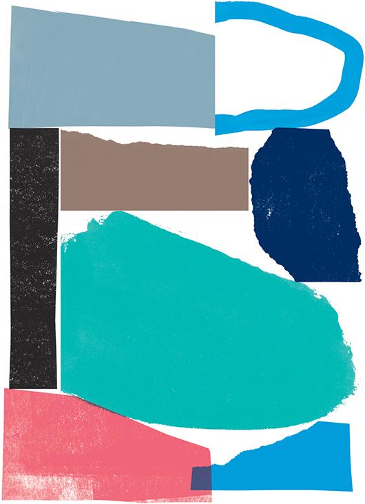 Nicholas Burrow
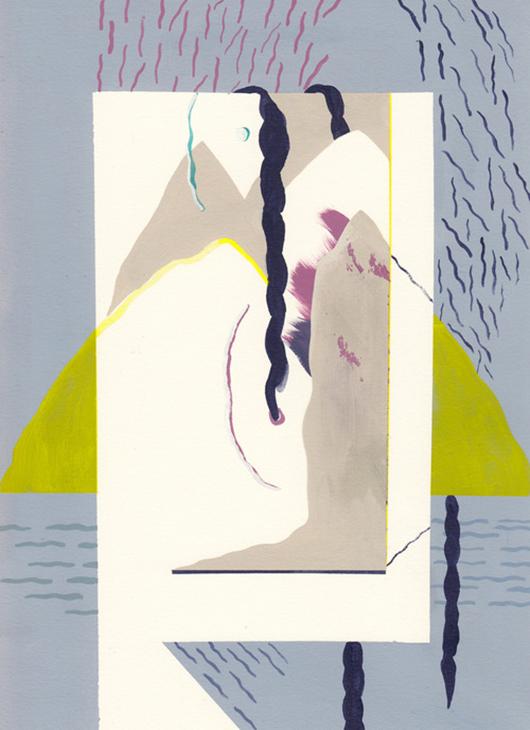 Kim Westfall
 Thomas Murphy