05.18.17
Sight Unseen Presents
Angela Dimayuga on How the Design of Downtown NYC’s Favorite Restaurant Came to Be
This week marks the launch of the first annual Sight Unseen Presents, an event series and magazine meant to increase the visibility of New York Design Week by activating retail spaces and restaurants throughout NYC with design content and programming. We’re featuring some of our favorite features from the magazine here this week. Sight Unseen Presents runs through May 23.
If you’ve ever been to Mission Chinese Food on New York’s Lower East Side, chances are you’ll remember the food — the legendary kung pao pastrami, or that one dish that makes even celery taste delicious. Chances are even better, though, that you’ll remember the experience, from the cocktail topped with flaky, edible Post-Its, to the epically grand piano music, to the friends you happened to bump into late on a Wednesday. The restaurant — now in its second New York incarnation after the original Orchard Street space closed in 2013 — is the brainchild of chef Danny Bowien. But the food, the furnishings, and the high-on-friendship feeling you get while dining there can be largely attributed to Angela Dimayuga, who became the executive chef and of Mission Chinese Food’s New York incarnation not long after it opened in 2012. Dimayuga, who got her start working at Vinegar Hill House in Dumbo, didn’t go to school for design — or cuisine, for that matter, having studied humanities and hotel management in college. But as a cook starting out in New York, she lived near Pratt and befriended a host of up-and-coming designers, whom she tapped for creative collaborations at MCF right from the start.
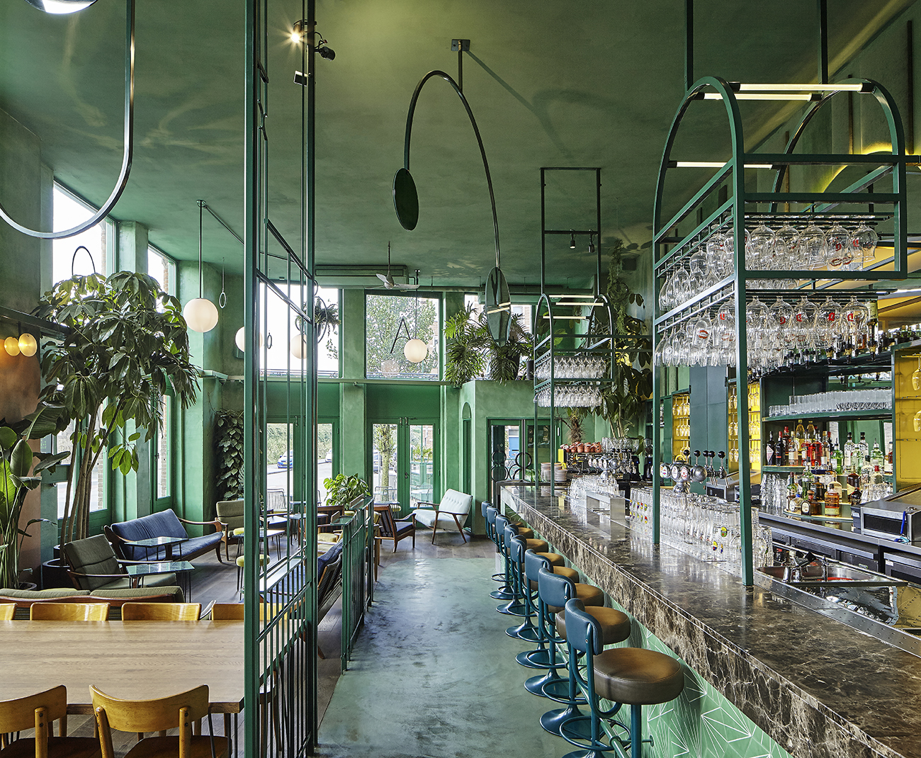
Dimayuga’s biggest canvas is a double-height space that spans both the back of the dining room and the bar underneath it; she likens it to MoMA PS1’s brick-lined Duplex Gallery. As soon as she saw it, she says, “I knew we should have something big there.” The show-stopping installations she’s commissioned for it have ranged from a Mylar-inspired “outer-space cave,” to a forest of Confetti System garlands, to its current incarnation, a delicately-trussed system of silk and wood kites by Jacob Hashimoto.
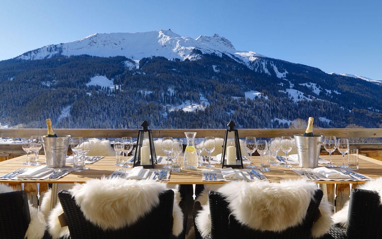
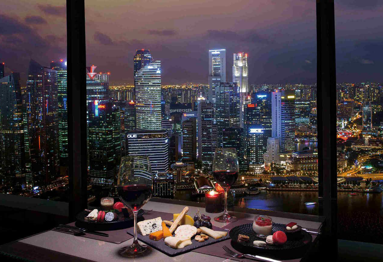
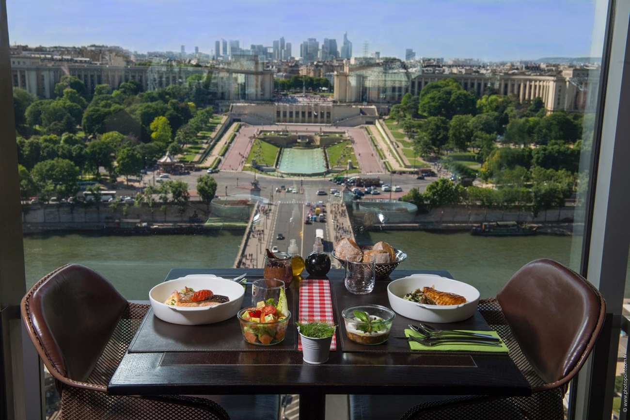
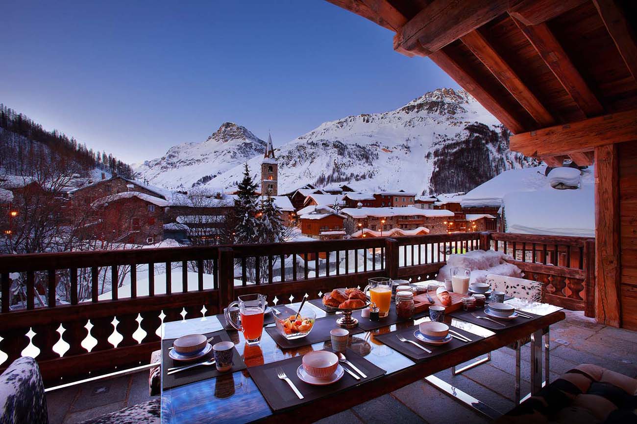
For Sight Unseen Presents, Dimayuga has teamed up with PIN-UP Magazine to create a reel of carefully selected views from famous restaurants, to be projected onto the blank walls of MCF’s subterranean bar. We asked PIN-UP’s Michael Bullock to talk to Dimayuga about the project, or collaborations, and why it might be time to redefine what “good design” really is.
MB: How did you approach the design of Mission Chinese, and how much has it been shaped by your personal aesthetic?
AD: This restaurant has been a fun exercise for me in terms of exploring design. This space was previously a popular club, and it was really gorgeous and well built out. The former tenant was an architect and this was his pet project, so coming into it meant that I could play with a nice structure that already existed.
A few things happened right away: We wanted to think about how to make the space feel more Chinese, because when we moved in, it had a lot of wood paneling, a lounge area, and chandeliers. It felt like a really weird, formal beer hall. One thing we did was to remove this vertical garden in the back bar. It was really beautiful, but it didn’t feel like me. I knew instantly that I wanted it to be a place for rotating art installations instead. After the first year, we decided we wanted to change it with the marking of the Lunar New Year. We hired Grace Villamil, and I was so excited about her Mylar installation because it was really drastic and weird. The next year, we had Confetti System, and now the installation is these silk kites by Jacob Hashimoto.
The cloud ceiling in the main dining room is something that I really had to fight for. I had my friend do it and she painted the entire thing in two days with a brush duct-taped to the end of a broomstick. It’s a less in-your-face version of the ceiling at the Venetian in Las Vegas. We also put a lot of investment into the awning I wanted, because I felt like we needed to have some visibility from the sidewalk. It reminded me of something you would see on the Upper West Side, or on an old, classic Italian trattoria.
MB: Since people in the neighborhood already knew this space, I read those decisions as a way of putting your own stamp on it. Another thing that’s really added character to the space is the collaborations you’ve done.
AD: Yeah, I was super excited about the opportunity to start collaborating with people. I worked with Grace to do the Mylar, and then I asked Chen Chen and Kai Williams to create some stuff because I’ve been friends with them for 15 years, since their Pratt days. They understood the tackiness that I like, but also the thoughtfulness. I did a lot of different things with them, including the silver python banquettes, the bar facade, the fish tank in the front, and eight custom tables in the back. You can arrange those tables so the design is more abstract, but if you put them in order, they form this long, laser-etched dragon, with Mylar scraps and bits of metal embedded in the resin. For the bar facade, they also did resin-poured sheets with things embedded in them, like fish bladders and sea fungus from the Chinese medicinal shops down the street.
For our menus, pens, and matchbooks, I collaborated with Eric Wrenn, who’s the design director at Artforum. I’ve also known him for 15 years. It was fun because I got to work with friends who could add something, and do it cheaply, too. For instance, I really wanted to have this Enter the Dragon–style mirror in the hallway downstairs, and Chen and Kai made it happen by put-ting backing on Ikea mirrors before attaching them to the rail. It looks really good! Those initial collaborations helped me to consider the longevity of what we include in the space, and they also helped me figure out what I like. I’m just a cook, you know? But having this restaurant, I’ve been able to establish relationships with people I admire, and to do work that somehow comes back to what I do serving people in a restaurant. My job is to put food on plates that tastes good, but there’s also that whole experience of walking in and understanding the context of how you’re experiencing the food.
MB: Design with a capital “D” often strives for good taste, which can be boring. Can you talk about your use of tackiness in design — or what you refer to as “fake fancy”?
AD: Yeah, I think about that a lot. I think about dining in Chinese restaurants in America, specifically. There are elements that are really beautiful in these restaurants. Maybe it’s a graphic image of food that they actually serve, but the shot looks really weird. Small details like that. Little vases… For a while the flowers we would offer for restaurant buyouts were always roses and baby’s breath. It’s about reimagining elements that are formally tacky, but that people don’t even think about anymore because they are so overdone. For instance, a lot of people hate restaurant linens, but with us, having them elevates the experience a little bit more.
This is not just with design; it also goes for food. When we started MCF, prime rib was seen as an easy cut. All you do is take a whole prime rib and roast it and slice it. It’s an old-school item that you would maybe have at a wedding. And then you reimagine it and make it sexy, by smoking it for four hours, and finishing it in the wood oven, and serving it with a delicious sauce. Another thing that I did early on was to reimagine the cocktail fountain. It’s this idea that you can create something that’s formally looked at as kind of gross or not interesting and reimagine it in a way that’s fun by putting really great product in it, or surrounding it with beautiful things.
MB: It’s kind of like hearing a remake of a favorite song. You instinctively want to listen because you grew up with it, but then when it works, you’re happy someone modernized it and made it their own.
AD: Yeah, totally.
MB: The restaurant layout recalls New York’s great social restaurants, like the Four Seasons or Indochine. Mission kind of embodies this tradition for our generation — the room is designed to see and be seen, so you always end up saying hello to three or four tables.
AD: It’s fun! It’s the same for anyone who works here, too, where you can see who’s sitting on the opposite side of the room and what they’re enjoying. Our original restaurant on Orchard Street only had 40 seats, and it was really cramped. After we moved to East Broadway in 2014, we realized right away that people wanted to hang out for a long time. They wanted to eat their meals slowly and chat with friends.
MB: It’s funny, then, because the project we’re working on will focus on looking outward rather than inward. How did this project begin?
AD: Sight Unseen asked me to participate, and I didn’t know what I wanted to do except that I wanted to utilize projectors — that way we could function normally as a restaurant and it wouldn’t change service. I wanted to use the space downstairs because it has these empty walls that are essentially a blank canvas. I ended up asking someone who has similarly wacky taste — a neighbor and frequent diner, interior designer Jim Walrod — to work on an immersive projection piece for design week, and I told him I wasn’t looking to change the game or come get a million people to look at it. I wanted it to be more of a surprise for our regulars. He was the one who proposed that we show projections of the views from inside famous restaurants.
We quickly brainstormed a couple of places. He said Windows on the World, and I first thought of the top of the Seattle Space Needle. This all happened while he was eating ma po tofu and we were just laughing and nerding out. I find any project like this to be more inspiring when I’m collaborating with someone, because it becomes something you joke about, and then 20 percent of those wacky jokes become reality.