05.28.20
Offsite Online
A Book on Chromophobia Inspired Estudio Persona’s Most Colorful Collection Yet
This piece is part of Sight Unseen’s 2020 Offsite Offline coverage. To view Estudio Persona’s virtual booth on Offsite Online, click here.
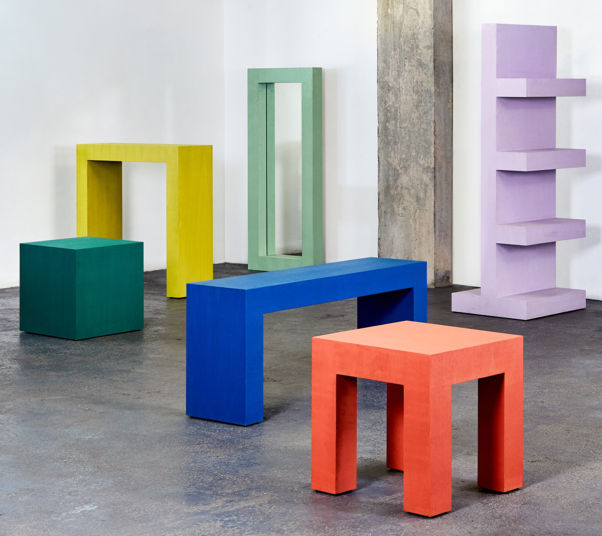
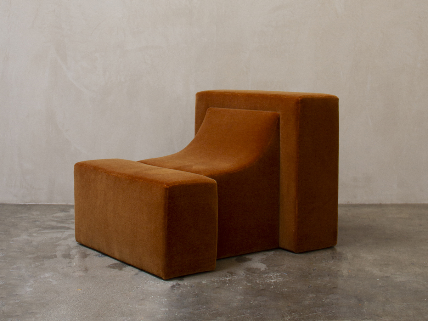
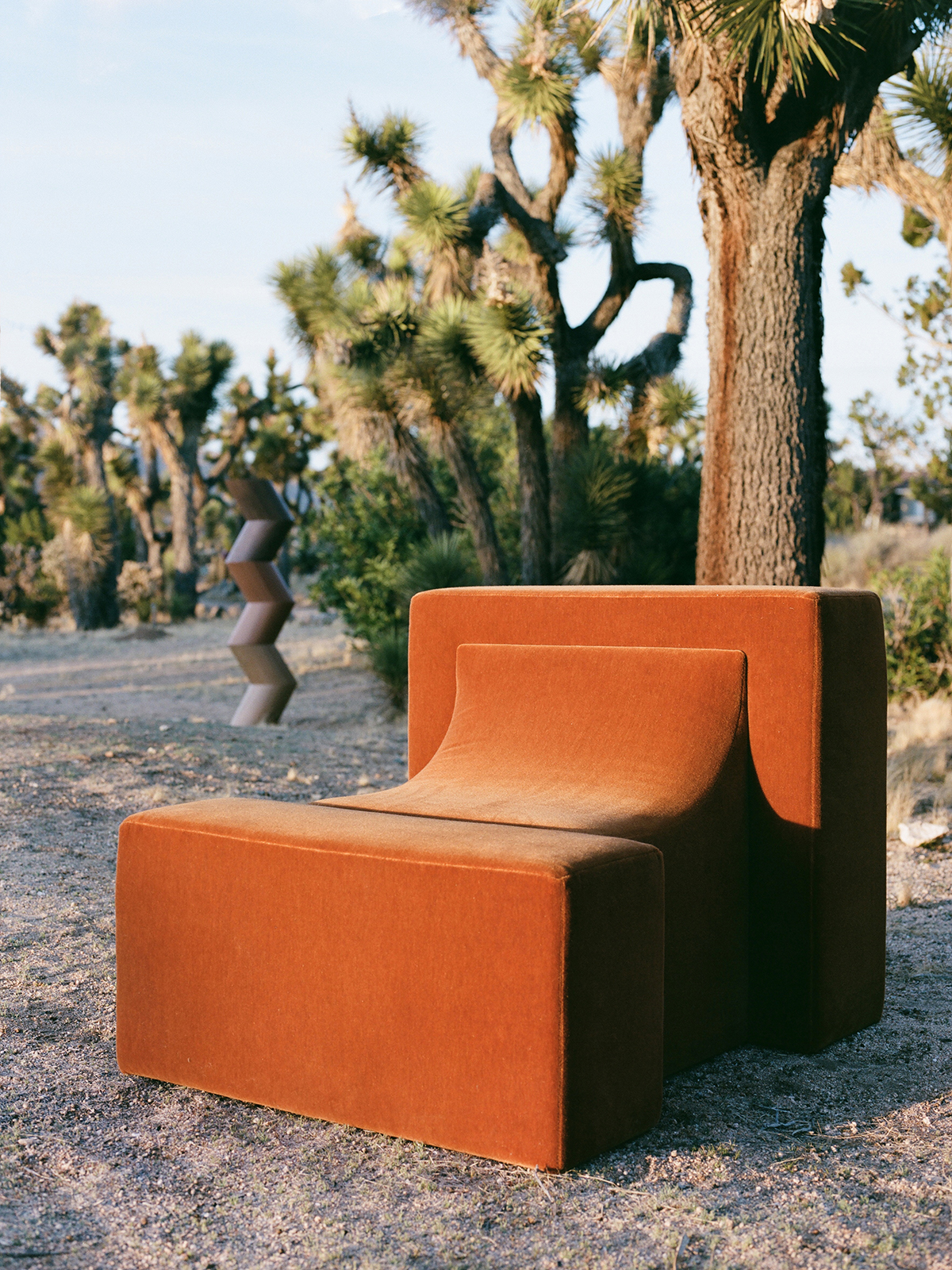
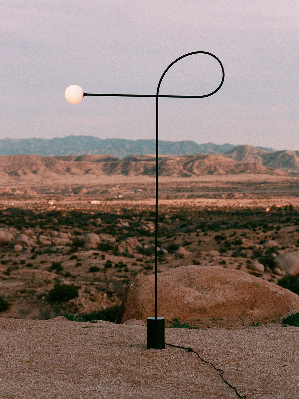
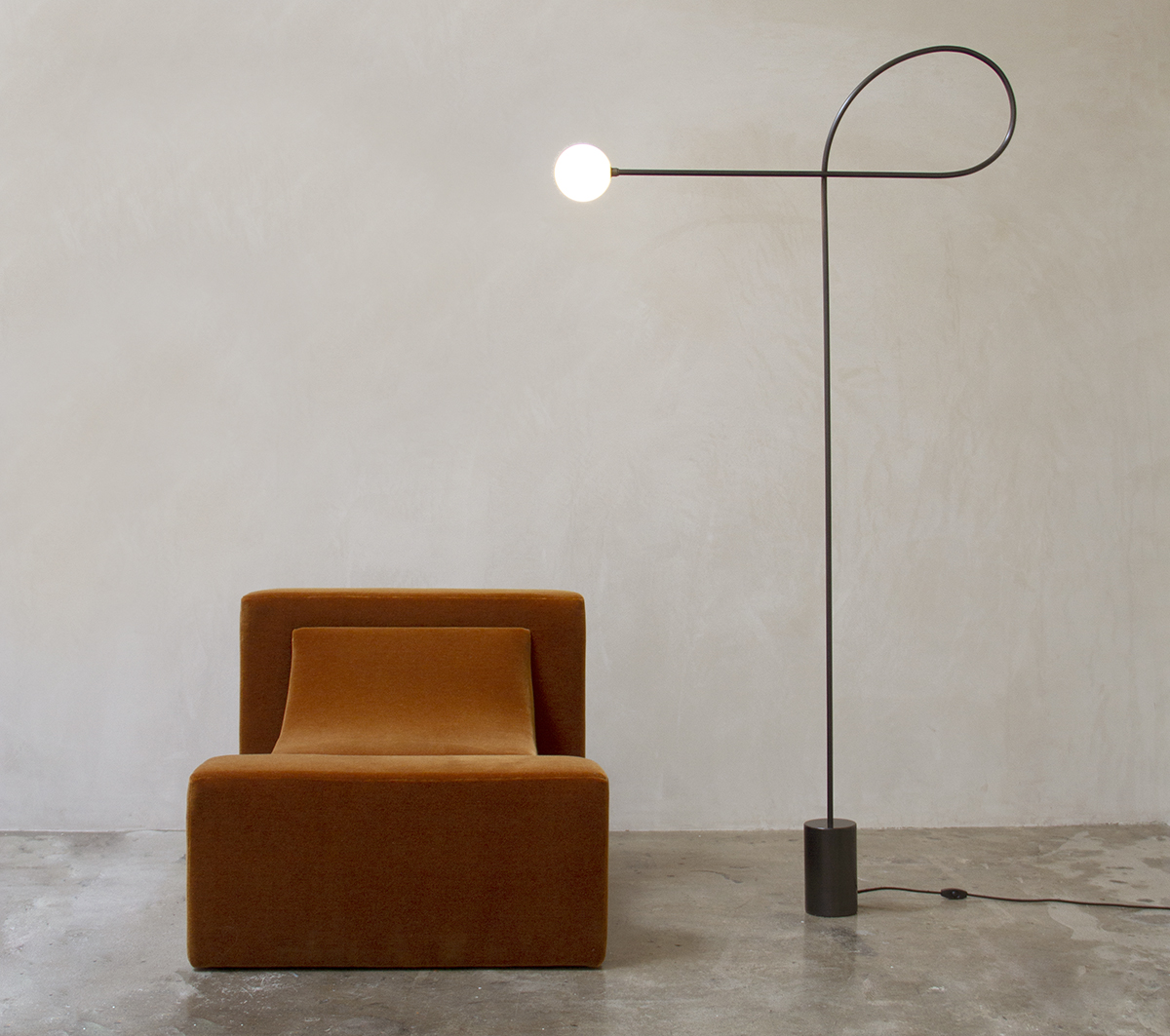
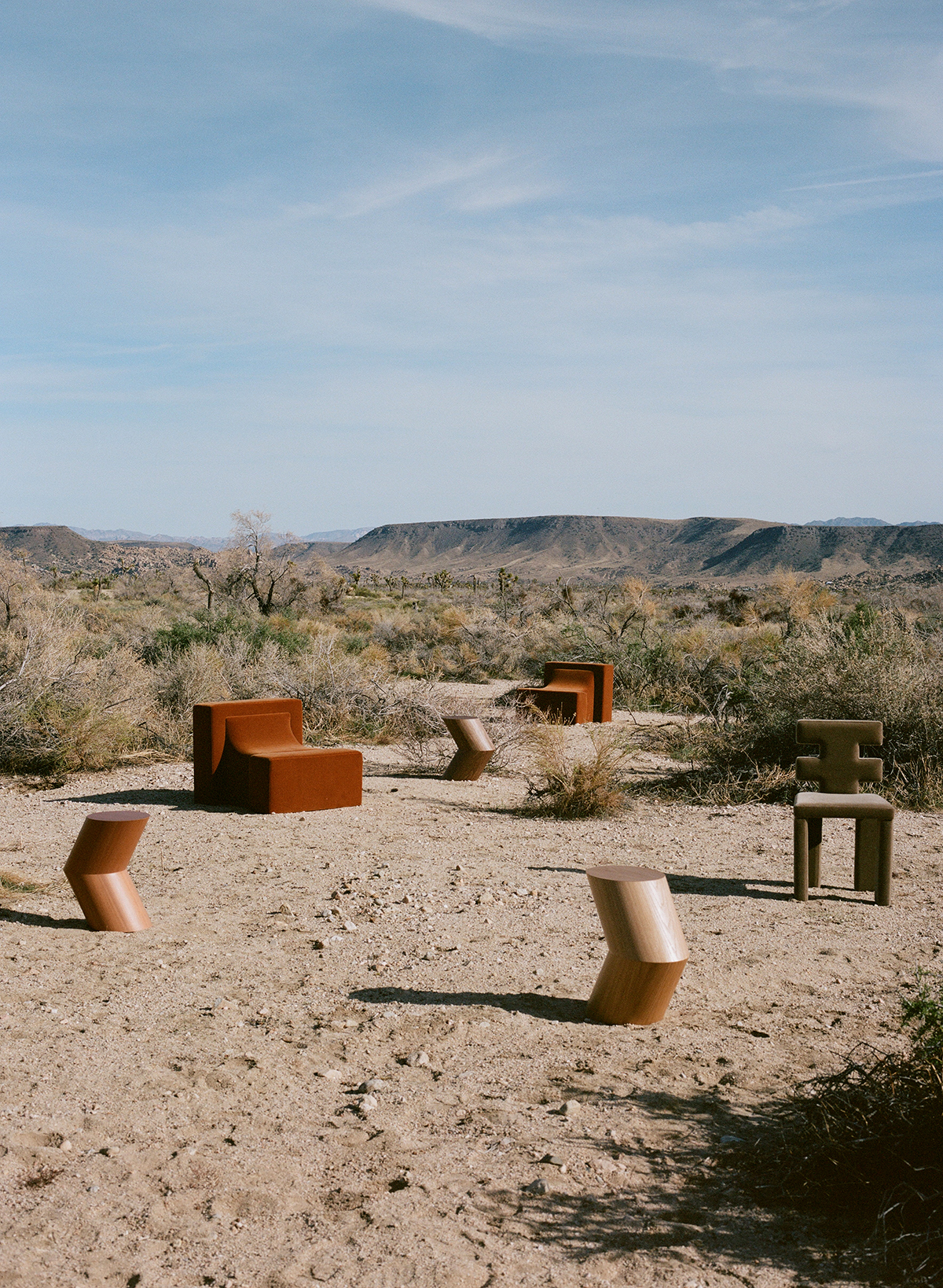
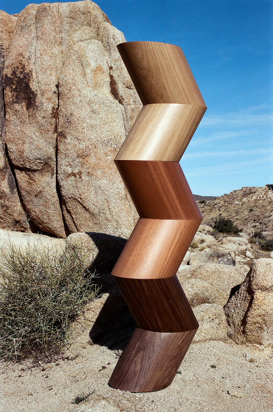
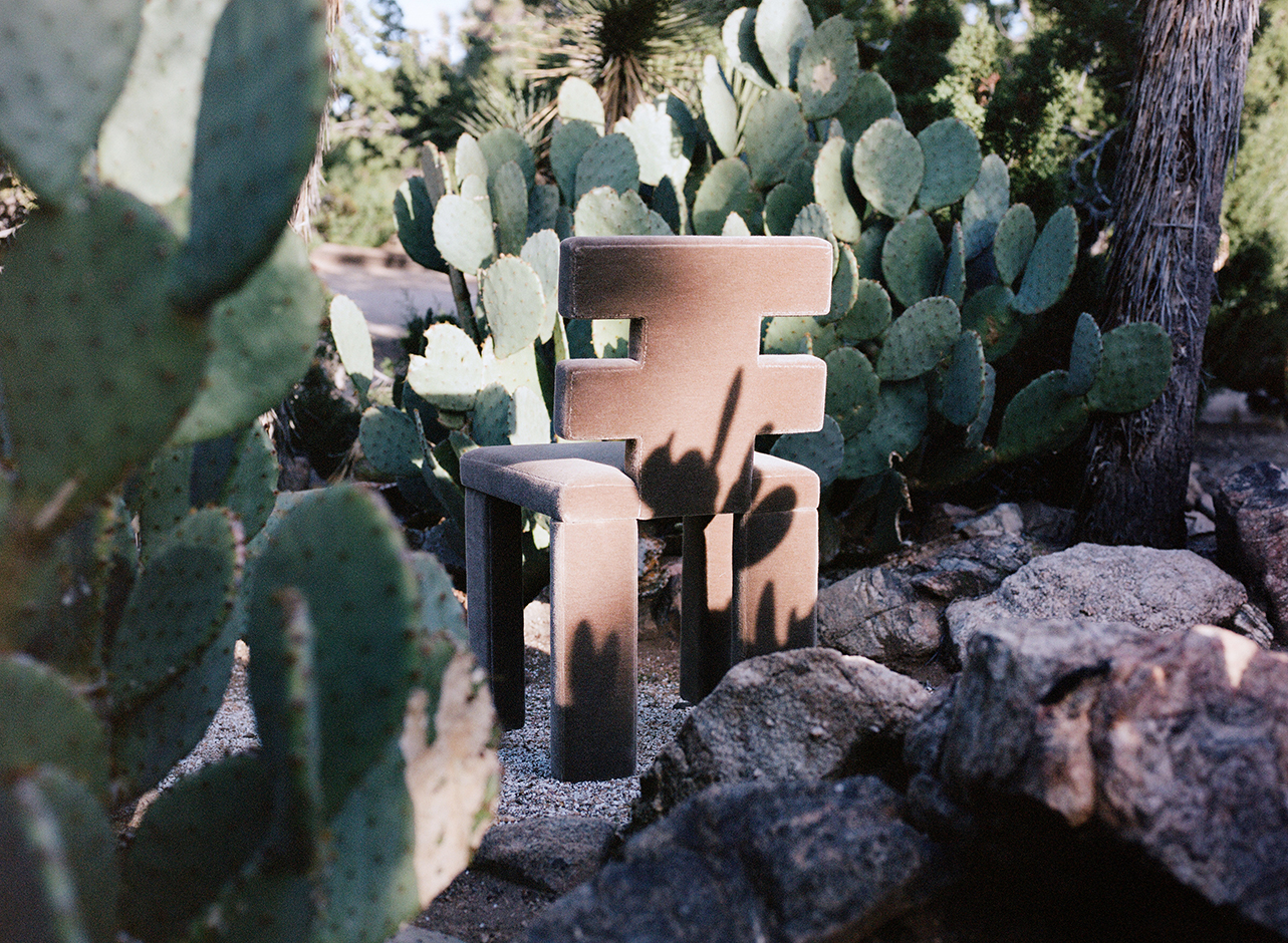
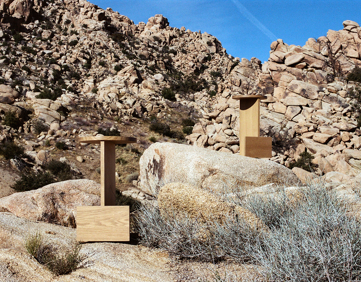
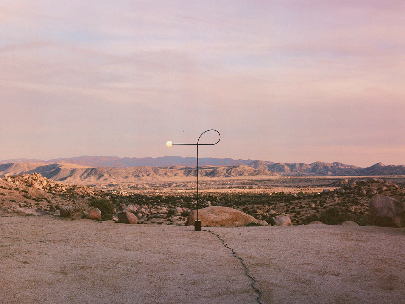
I’m on the phone with Estudio Persona co-founder Jessie Young, who’s currently quarantined in her East LA home having her “ass kicked all day” by her kids, eight and four years old. The Estudio Persona studio is a 15-minute drive away, near LA City College — or “10 minutes now, without anyone on the street.” Young and her partner, Emiliana Gonzalez, recently finished the Connection Collection, the studio’s third offering. Born of an investigation of volumes and building principles and marking the studio’s first foray into color (inspired by a book on “chromophobia,” no less), the pieces in the collection — such as the Block chair, a low-slung lounge upholstered in rust-colored mohair — are meant to elicit a new perspective on their surroundings. Of course, as soon as the collection was ready to be shipped across the country and shown, the country went on lockdown. Luckily they were able to photograph the pieces in the desert outside LA in early March, with the photographer Pia Riverola. Each new introduction is situated amongst rocks and stretched-out desert vistas, a dialogue between the manmade and the natural world. From color theory to cardboard cutouts, Young and I talked about the inspiration and intention behind the pieces.
Which piece in this collection was your starting point, and how did you get there?
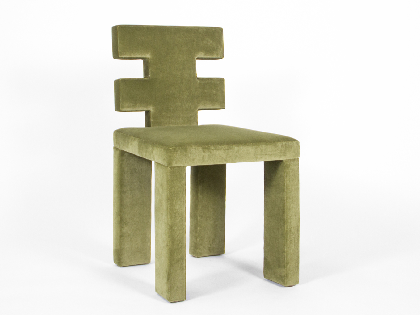
The first piece was the Block Chair. I know it’s politically incorrect to mention Carl Andre, but in reality all of his installations speak to us — his placement of objects and how you have to work around them. We were looking at the Belgicube in particular. We wanted to see how that shape would feel in a living space. The whole idea of interconnecting pieces and placing blocks in a way that can be functional was kind of the interesting point to tackle, or test, for us. We actually started with the shape and then completely changed it. We did like eight different cardboard mutations and ended up in the same starting point. We do that a lot. We work hard on it and it doesn’t feel right and so we destroy it. It comes from the gut. In the end, we usually end up with the first initial sketch, but we need to test it and destroy it and try all of the potential directions it could go to get back to the initial hunch we had, that a-ha moment.
You’ve also talked a little bit about repetition and abstraction and using them as building blocks. Do you physically arrange pieces in your studio to get a sense of how they work together?
Yeah. We usually do our actual-size models in cardboard, strong enough to hold us — with a substrate and everything. We leave it to rest here in the space and then we come back and we keep adding and editing. We’ll do maybe three and then we alter those three until we get to the last one, the final.
I think it’s interesting to think that for you to see what you’re doing you have to step away and revisit it. When you’re modeling the pieces in cardboard, how does that shape and change the way you process these ideas?
I think we always have this idea, even with the new collection and a change in materials and form, that all of our pieces have to speak the same language. And they all have to have a dialogue between them. When we finished the Block Chair in cardboard it had to coexist [with everything]. It couldn’t break through to a point that it didn’t coexist. They have to live together and with us and our conscience and be what we’re proud of making.
Do you work in cardboard when modeling the metal pieces?
No, we did two-dimensional, the actual size on paper — just a drawing and we worked with that. We had a metal worker prototype the piece, and worked with him to change it as needed.
Is that indicative of your working relationship with all of your fabricators?
Usually. For both chairs we worked in cardboard because we needed to take something digested to the woodworker in order for the mistakes to be minimized. Because there’s an expense in production, in producing prototypes. It’s great because we can tame our impulses in the sense that we both have to agree with our decisions. By the time it gets to any worker it has to be really processed.
Do you work on the computer at all?
No, we sketch. For the metalworker, it depends. We might do a drawing. For the table we did a drawing. But usually we do sketches and then cardboard.
How did you see these relating back to the shapes and explorations in your previous collections? Obviously the color is new, but were there other elements you wanted to iterate on or pivot away from?
Our first collection was very graphic, but kind of warm in materials and strong and bold in shapes. The second was more sculptural and more cold. I feel we wanted to go back to that warmth that we lost a little bit in going too sculptural with the shapes. We knew we wanted to have more of a warmth in material and in tones. And I think color and material went together. It’s harder to get colorful with wood or leather, so with fabric we had an option to play a little bit more.
And those pieces are upholstered in a velvet?
Maharam velvet.
And are you doing only that burnt rust color?
No, it’s all COM and COL.
Talk to me about how you were processing David Batchelor’s book Chromaphobia in this collection, and how the work explores that.
It’s fascinating right? There’s always this idea that we’re Uruguayan, but it’s not like we always get inspired by Uruguay. It’s weird — are you inspired by being American? It’s who we are, so I feel we get caught up in this narrative and it’s kind of bizarre. But especially because we moved later in life, we are fully Uruguayan, and it comes out in that we are more toned down and don’t want to be explosive. Uruguay is very socialist, very don’t stick your head up. It’s a great country to live in, but it’s very like…there’s this phrase that is basically engraved in the culture, that the leader of the country, Artigas, says: “Nadie es mas que nadie.” No one is more than no one. So, basically, don’t you dare go crazy.
But for this collection, the book was super interesting. I don’t know if it’s the feistiness but it’s…[I felt like] I’m this whole book. I don’t know if I took it too personally, but I felt I needed work to against my acquired knowledge, my assumption that pure white is a thing. I think we’re still toned down, it’s not a whole explosion of color because we’re still obsessed with having everything tied up, but maybe in five years we’ll have a full blast of color.
I think that was interesting because it has a lot of implications beyond just aesthetics. It’s the moralizing of these patterns of aesthetics and it’s also the moralizing of these choices we make within a specific value system.
And the idea of color being feminine and that we have to be toned down and not too feminine and too crazy and I was like — fuck, why? So I was invigorated, maybe to put the political part of the collection into action, if there is such a thing.
But it’s still a very subdued color story. Tell me about the colors you ended up choosing to be shot for the lookbook.
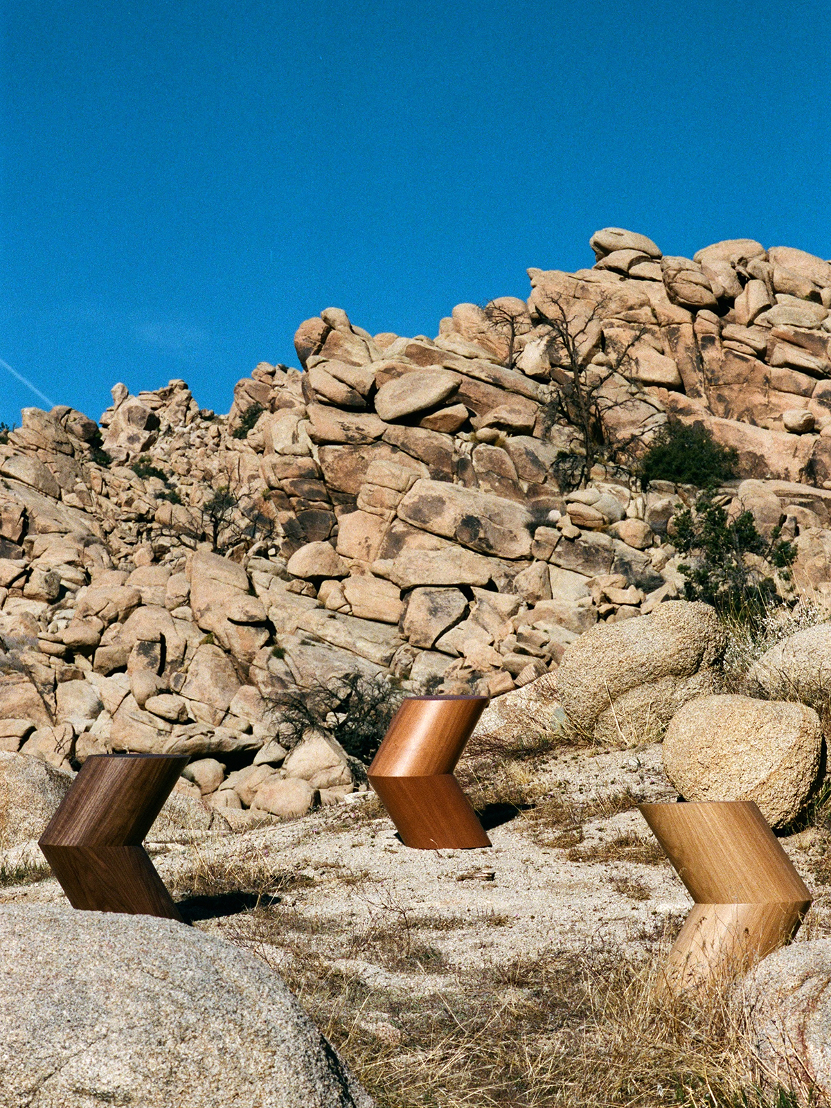
Well, color doesn’t have to be a crazy color to be color. We also wanted — maybe that’s the LA in us, because we really wanted to convey natural colors and an LA feel of desert. I think, for example, the Block Chair could look good in leather, or in white would be conventional. But I think we never — which is not a great thing—but we never look at the commercial outcome of any products. And for this we started looking at white and we felt it was too depressing. And then we started searching for colors and this one spoke to us. And then Pia came to us to do a photo shoot for a magazine, I don’t remember which one, and we met her and were obsessed with her pictures and that connection of producing the piece to do a photoshoot in the desert. Having the dialogue of manmade vs. nature made colors was interesting.
Knowing you wanted to shoot in the desert is what inspired those colors?
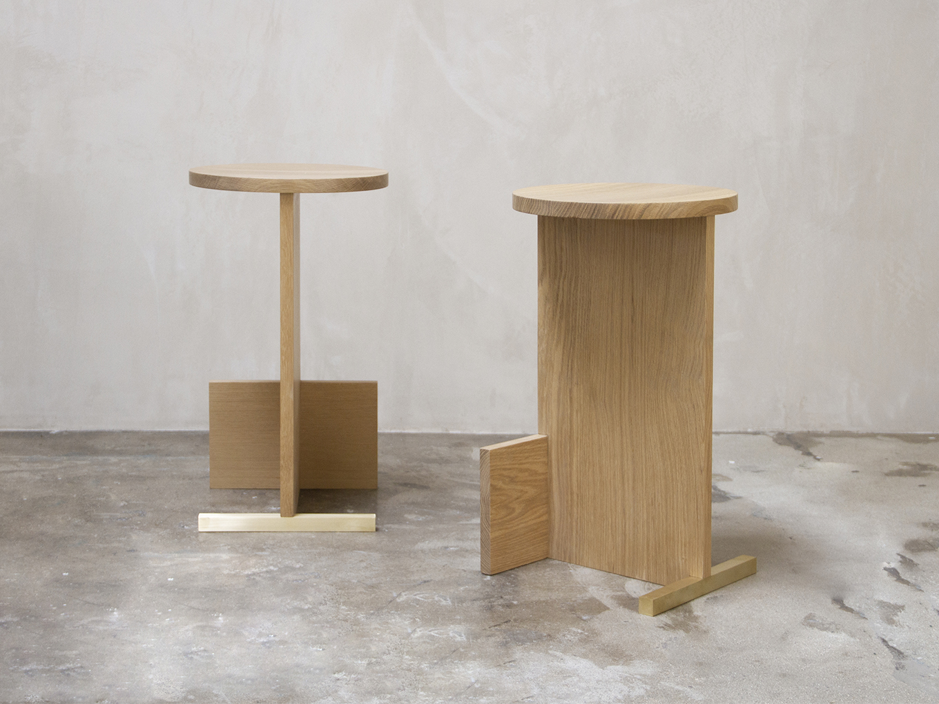
For sure. Because we actually met with her when we had the Block Chair. When we met with her and started to talk about the desert we made the stools in the different tones of the wood so we could have that gradient in the desert. We worked with the green to balance the orange, which are all colors you find in the desert.
How do you want the work to feel for the audience?
Good question. In terms of functionality, I would say that the Arrow stool is the only piece where we were like, ok, we want a graphic form that’s more like a sculptural artistic element in a house. The other pieces are very functional and ergonomically thought out. They have to be used by a human.
Did you get to a point in this where you were looking at all of the pieces in the collection together and, referencing your note about Andre, come away with a different perspective, or find your perspective on the work shifting?
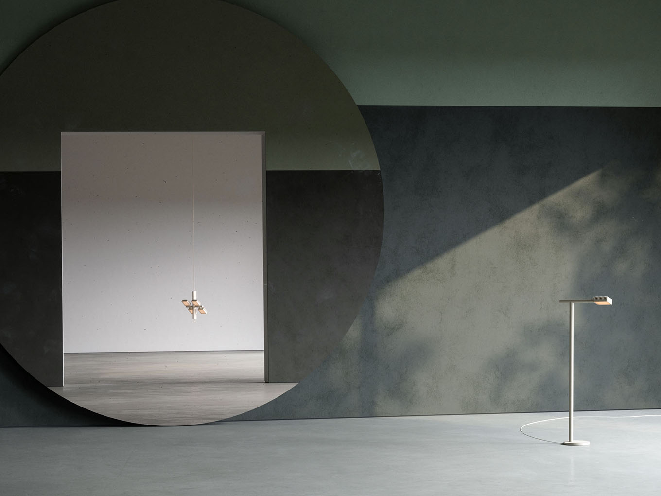
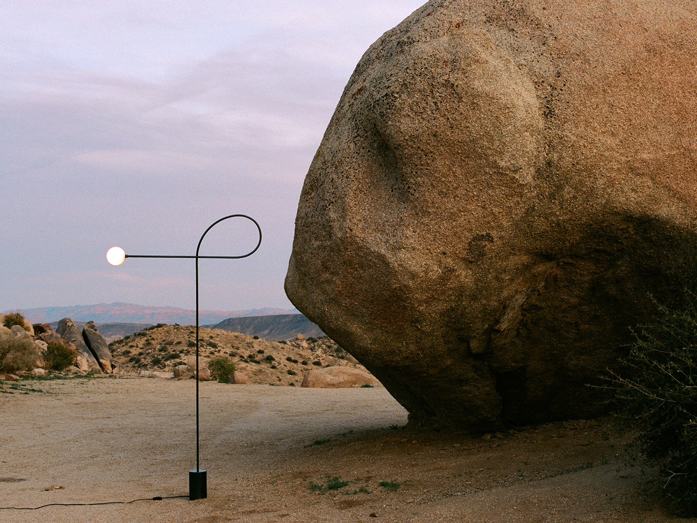
Definitely. So we did the Block chair in cardboard and we were not seeing it. We did thin legs and I was like, I don’t know about this. I was having nausea every morning as we walked to the studio, seeing those legs. It’s not that it looked bad, but it was not our language. It felt foreign. So we started with the arrow and the table. We started piecing it together and we saw it in space and in 2D and in 3D, how it could play the highs and lows and fill up the air—not in the home but in a visual composition. This collection is fewer pieces than the others, but it’s thematically complete in terms of elements that make up that balance we’re looking for; the airy feel of the lamp with the heaviness of the lower-slung pieces.
Would you say that the visual language or the codes of your studio — are they nailed down or are they always in flux?
I think we’re not gonna nail down anything. I think we work in a way, or we’ve developed a dialogue that is, luckily, both of us seeing things in the same way. Both of us agreeing on what speaks to who we are. It’s aligned enough that we can work as a team. I feel like the graphic, non-ornamented forms touch on a lot for me — they touch warmth, honesty. They aren’t pretentious, but they are very well made and well thought through. They don’t scream at your face like luxury. I see this in a space and I want it to be there, very present. I think all of our pieces are very graphic and strong and can stand alone or together without being overbearing. That’s why we take the ornamentation out in order to have this dialogue between forms and shapes.
Would you say the work is restrained?
I hate to admit it but I think it is a bit restrained. I think we have a thing where we try to be honest and loyal to who we are. We’re not artisans, we’re not making the craft. So it feels weird to think about something that is ornamented and accessorized — I love it, but when I see an artist doing it. If we defined ourselves as artists we might struggle. We like to let the products speak for themselves and I think they do speak for who we are. This is our language, something simple and beautiful and bold.