This Dutch Artist’s Warped Archival Photos Are the Break From Reality We Need Right Now

When I first discovered the Dutch artist Koen Hauser, and his Skulptura series in particular, I viewed his work as an escape — moments of disrupted reality, primarily in the form of warps and swirls edited into photos of artworks and artifacts taken from old books and museum archives. And I liked it not only because it was weird and disorienting, but because I had rarely seen that kind of technique deployed to such beautiful effect. Yet there's actually more going on in Hauser's images.
More
Germans Ermics Ombre Furniture

Amsterdam Designer Germans Ermics

The work that Latvian-born, Amsterdam-based designer Germans Ermics does is hardly rocket science — he simply adds gradients of color to planes of glass and mirror, then assembles them into furniture pieces or more sculptural compositions. And yet the results, when we first saw them at the Milan Furniture Fair this past April, totally floored us.
More

Dutch Artist Thomas Raat

Unlike most of his contemporaries, Dutch artist Thomas Raat — whose colorful and intricate compositions recall the great European modernist graphic design tradition — isn't particularly concerned with the emotional aspects of art but instead focuses purely on the visual techniques and functionality of the medium. Referencing a deep and thorough understanding of modernist philosophy and analytical thinking, Raat creates large-scale paintings and sculptures that employ the use of symmetry, repetition, and other basic principles of design to create pleasing and visually stimulating compositions.
More

Michael Schoner, Furniture Designer

Sometimes you can take one look at a designer's body of work and deduce that they have a background in architecture before ever meeting or talking with them. Amsterdam-based Michael Schoner — who worked his way through multiple architecture firms across Europe before settling in Amsterdam and founding his own design studio in 2010 — definitely falls into this category. His approach to design is uniquely architectural, building from a visual vocabulary of simple shapes and forms that are often bisected, stacked, or spliced.
More

New Jewelry by Nhat-Vu Dang

Sometimes we furiously scour the internet or go gallery-hopping for inspiration. But sometimes, new good things just fall into our laps (something for which we’re particularly grateful on these tough days back after a holiday!) Case in point: These amazing new necklaces and brooches by recent Rietveld Academy grad Nhat-Vu Dang, which arrived in our inbox yesterday. It’s no secret we love ourselves a large, mixed-media necklace, and these fit the bill nicely, made from glass, wood, paint, high-density foam, and epoxy (the brooches are foam and steel). The new pieces, on view at the Amsterdam jewelry gallery Rob Koudijs through the end of February, are an extension of Dang’s graduation project: sculptural pieces of jewelry made from gray cardboard, which revealed hidden flashes of color when worn. The new pieces, says curator Ward Schrijver, are even more conceptual but no less covetable.
More

Lex Pott’s True Colours Series

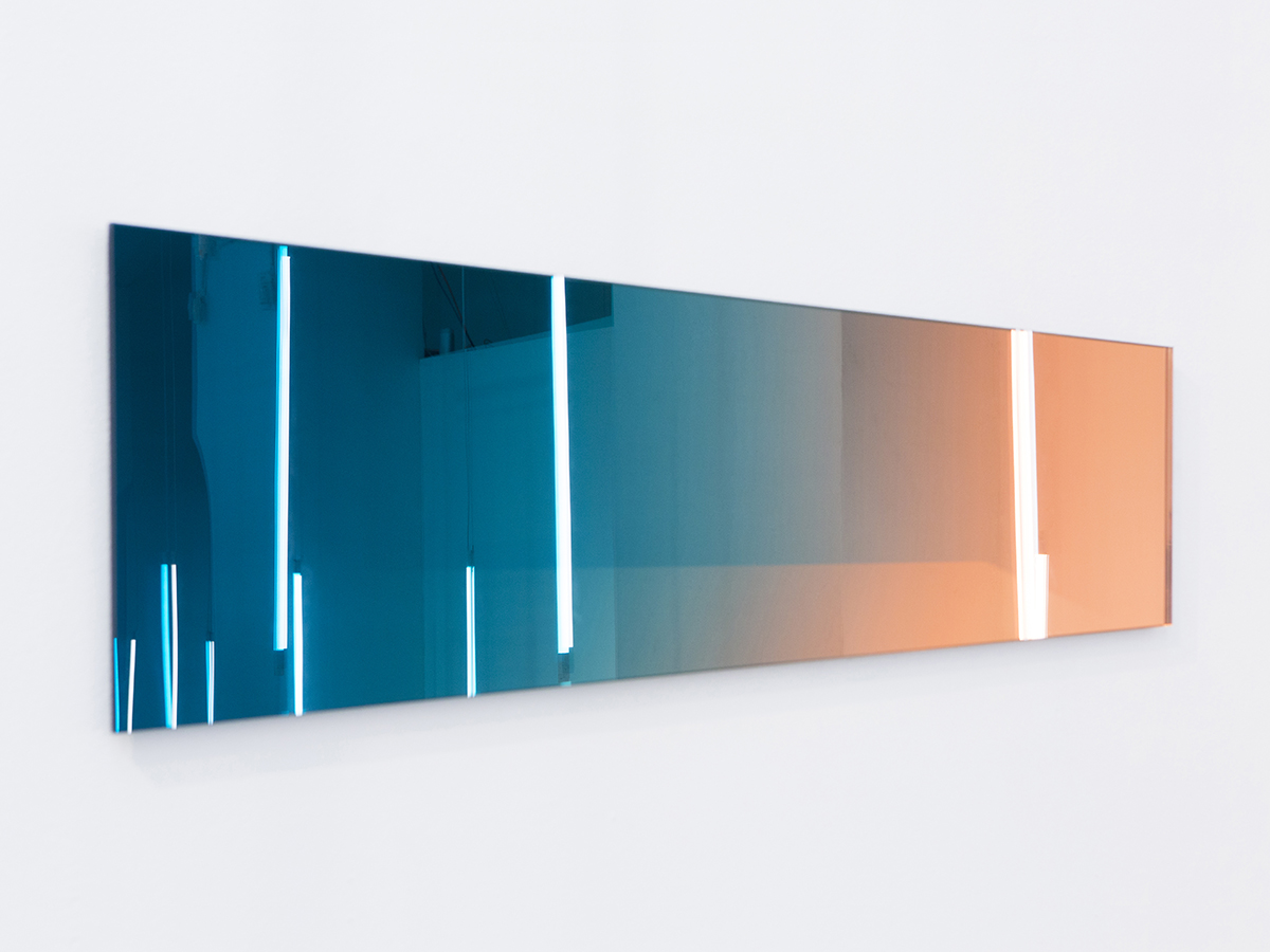
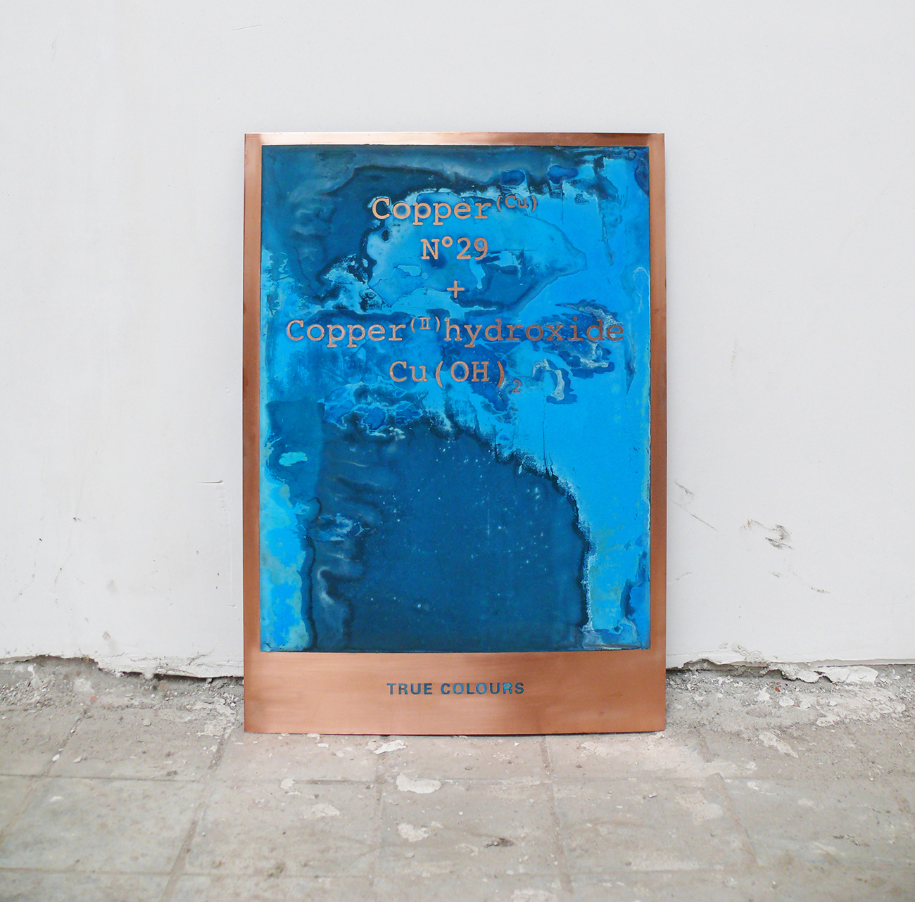
In some ways, it seems fate that Dutch designer Lex Pott would end up working in a studio housed in an old shipyard in the northern precincts of Amsterdam. As a child growing up in Hilversum, 30 miles outside the city, Pott was obsessed with boats, constantly crafting miniature ones from the natural debris he’d find in the forest around his house, and using old plastic bags as sails. And in the short time since he set up his studio, after graduating from Design Academy Eindhoven in 2009, he’s built up a small body of work centered around the very phenomenon that’s known to wreak havoc on seafaring vessels: oxidation. Pott has shot to fame in recent months on the basis of Transience, a series of silvered geometric mirrors designed in collaboration with fellow Eindhoven grad David Derksen. But the project that started it all, True Colours, was less a product than an investigation into the nature of color: Pott took standard sheets of industrial metals — copper, brass, steel, and aluminum — and played with oxidizing them by various methods, in the process creating a highly individualized palette he could, in theory, apply to any metal object.
More

Renny Ramakers, Director of Droog

First-time travelers to Amsterdam — perceptive ones, anyway — need only to spend a day navigating its cobbled streets to notice what makes the experience so singular. The buildings are old and narrow, and many seem perilously cockeyed. With their decorative facades and fanciful gables, they resemble oversized gingerbread houses. And when you walk by them, you witness a sight even more peculiar than all of the above: an unobstructed view straight into the living rooms and kitchens of the people who live inside, who refrain from hanging curtains even at ground level. As a locally based friend explained to me on a recent visit, the Dutch may value privacy just as much as the rest of us, but they also take a certain pride in proving they have nothing to hide. This was the thought running through my mind the day that Renny Ramakers, co-founder and director of the influential Dutch design laboratory Droog, let me wander around inside her home unsupervised, snapping hundreds of voyeuristic photos of her possessions while she worked calmly away at her dining table.
More

Journal de Nîmes no 6: The Dutch Issue

Two years ago, in the Nine Streets shopping area of Amsterdam, two lifelong friends, René Strolenberg and Menno van Meurs, opened a store called Tenue de Nîmes. Like a lot of very hip retailers these days, Tenue de Nîmes is devoted in large part to denim — Nîmes, France being the fabric’s birthplace — and also like a lot of very hip retailers these days, it publishes a semi-annual magazine, this one called Journal de Nîmes. The shop has become widely loved for its expansive outlook and inventory (great denim doesn’t have to be Japanese!, it seems to say), and the magazine, while nominally a vehicle to promote brands sold by the shop, has also become, over six issues, something much more. This is due in part to its excellent art direction and photography, which come courtesy of Another Something blogger Joachim Baan, but also because of its simple, very Sight Unseen–like aims: to reveal the personalities and the stories behind how things are made.
More

Scholten & Baijings, Product Designers

The story of Stefan Scholten and Carole Baijings began, like many Dutch stories do, in a church. In the late ’90s, Baijings was working for an agency whose headquarters were located inside one of the country’s many abandoned houses of worship. Scholten, a graduate of the Design Academy Eindhoven, had a burgeoning design practice nearby. Scholten was asked to design a small bar for the agency’s office, and “the rest is history,” says Baijings.
More

Ten to One, by Sylvie Zijlmans & Hewald Jongenelis

It’s not so inconceivable that a painting or sculpture would take years to complete, accumulating layers of meaning as the artist played with contour or color. But a photograph? Dutch husband-and-wife duo Sylvie Zijlmans and Hewald Jongenelis spent nearly four years on Ten to One, a large-scale photograph on view now at Rotterdam’s Museum Boijmans Van Beuningen.
More