PUTPUT, artists and photographers

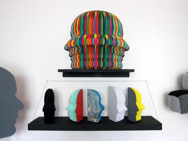
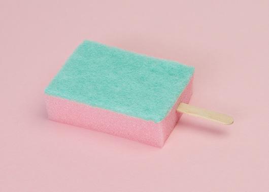
In some ways, the work of the Danish-Swiss duo Putput could be considered a response to sites like this one: If we're constantly bombarded by scrolls of images, the two designers seem to ask, how can we be convinced to reconsider objects that at first glance seem so quaintly familiar? Projects like their Popsicle series (above), which found the icy treats replaced by scrubbing sponges, or Inflorescence — for which the two employed the visual language of still life to depict cleaning implements as potted plants — play with subverting our expectations in a way that could seem cliché if the resulting images weren't so exceedingly lovely. The two work at an increasingly trafficked intersection where photography, styling, art and design meet, which allows creators to control both the product and the way it's presented — both the input and the output, as it were, which is where their clever studio name comes from. We recently caught up with the two recent grads as they were dipping a toe into the contemporary art world and looking for new studio space.
More

Ian McDonald, Artist and Ceramicist

To understand what it was like for Ian McDonald growing up in California’s Laguna Beach, it helps to refer back to one of the greatest television dramas of all time. Not, mind you, MTV’s reality show of the same name, but the heart-wrenching high-school football epic Friday Night Lights — McDonald’s hometown being pretty much the diametrical opposite of Dillon, Texas. “Laguna was founded as an artists’ colony,” he says. “Our school mascot, The Artist, ran around with a brush and palette and a beret. Even the football stars took art classes.” In fact, one of McDonald’s earliest run-ins with the medium that would eventually become his life’s work happened when his own sports-star brothers brought their ceramics projects home from school, where their art teacher was a local studio potter.
More

Ryan Wallace, Artist

To get an idea of how Ryan Wallace approaches materials, look no further than one of the walls of his studio, paneled with the kind of slatboard that a Chinatown souvenir shop might use to stack metal shelves full of I ♥ New York T-shirts. When Wallace found the studio last year, it was perfect otherwise — a clean, well-lit space above Paulie Gee’s pizza in Greenpoint, Brooklyn, right near his apartment. “At first I thought the wall was kind of gross,” he says. But he slowly began to accept it on a purely functional level; the way things could be hung at different heights was ideal for a painter. “I thought, ‘What can I do with this?’ A thing like that gets planted in my head, and eventually it finds its way into the next thing I’m doing.”
More

Kent Fonn Skåre, Artist and Graphic Designer

Being that he's still a student at Konstfack in Stockholm, you've probably never heard of Norwegian artist and graphic designer Kent Fonn Skåre. But his work, even at first glance, is ridiculously easy to love: It's got a heavy focus on materials, lots of marble, and a whiff of Memphis — yes, the three "M"s, the golden trifecta of the current avant-garde, or at least the little corner of it that we're obsessed with, which also includes folks like Clemence Seilles and Jens Praet. We discovered Fonn Skåre via a fleeting image on Pinterest, but found surprisingly little information on him and the ideas behind his work, so we did what we do best, harassing the poor man until we were able to tease out a bit of insight into his practice. Check out the interview and accompanying photos here, then bookmark Fonn Skåre's Flickr feed to browse more of his graphic design work and follow his future projects.
More

Clemence Seilles in PIN-UP #12

Berlin's many charms are hardly lost on your editors. After a sunny, weeklong trip five summers ago, we both fell in love with the German capital — the wide open spaces, the well-situated swimming pools, the way clubbing unfolds as an actually enjoyable activity. But while my partner in crime has returned to the German capital each consecutive summer, I've never been able to find the time to go back. This summer, then, I was lucky enough to visit by proxy through the eyes of Felix Burrichter and his staff of Berlinophiles over at PIN-UP Magazine, which devoted its entire Spring/Summer issue to the changing metropolis. "For very long, Berlin was this one thing: You went when you had no money," says Burrichter, who serves as both editor and creative director of the architecture biannual. "But there’s a cultural elite — a moneyed elite — that has developed there over the past 10 years. Mostly people from out of town or in the art world. So there's an interesting friction right now. When that moneyed elite takes over, the city will lose a lot of its charm. But right now it still feels very raw and budding." The issue was in some ways a homecoming — Burrichter grew up in Düsseldorf — but in the end, the Berlin depicted in the magazine's pages bears more of a resemblance to Burrichter's adopted home in New York. "What fascinates me about Berlin right now is that it's very international," he says; hence the features run to a British architect who recently remade the city's Neues Museum (David Chipperfield), a West African transplant (Francis Kéré), and Clémence Seilles, a Frenchwoman who arrived in Berlin with a singular goal — to assist in the studio of designer Jerszy Seymour — and who never left. We've been fans of Seilles' work for some time now, and her conversation in the magazine with fellow Sight Unseen friend Matylda Krzykowski was too good to confine to print. Burrichter has graciously allowed us to excerpt it today on Sight Unseen.
More

New Work By My Bauhaus Is Better Than Yours

From the start, the young Weimar students behind My Bauhaus Is Better Than Yours gave themselves a crushingly large reputation to live up to. Not their alma mater's creative legacy, mind you, but those tote bags, given away when the collective-turned-production company launched in 2009. Bearing its name in a thin block print, the bags made for the perfect product even before you saw the group's actual work, and for awhile you couldn't turn a single corner at a design event without running into someone wearing one. But to the credit of the now Berlin-based company's founders — graphic designers Manuel Goller and Daniel Burchard — each furniture collection continues to hit the proverbial nail on the head, combining appealingly graphic shapes with just the right dose of functionality. Earlier this week, My Bauhaus re-launched its webshop with a new design, lower prices, and new products, some of which debuted earlier this year in Milan. We asked three of the designers behind those works to send us a list of five things that inspired their piece, from Bret Easton Ellis to solitaire.
More

At Design Miami/Basel 2012

When Design Miami rolls around each winter, it’s hard to resist the siren’s song of sunshine in December, no matter how much you've decided you hate standing in line for parties or how high the hotel rates might balloon during that frenetic week. We’ve been known to pool resources with friends far and wide in order to hop on flights and hightail it out of New York on the promise of a stolen afternoon at the Standard’s pool, or even a press brunch at some Collins Avenue hotel du jour. But we’ve never made it to the event that started it all: Design Miami/Basel and its legendary accompanying art fair. Lucky for us, then, that we alighted this year on the perfect correspondent: Marco Tabasso, known in design circles as Rossana Orlandi’s right-hand man, who took advantage of a rare two-day break (the gallery sat this year out, after having debuted a massive Nacho Carbonell installation in 2011) to zip around the Swiss metropolis, capturing everything he saw for us on proverbial film.
More

At dOCUMENTA (13)

You don't go to Kassel, Germany (population 195,000) to eat delicious food or sightsee, and you certainly don't go there to shop. It's not even the kind of place that has that old-world, small-town charm. Kassel has one thing and one thing only: dOCUMENTA, the massive art show that was founded there in 1955 and takes place once every five years, pairing all the right it-names of any given half-decade's contemporary scene with all the right coolly obscure ones plucked from modern history. Earlier this week, I ventured out to Kassel from my temporary summer roost in Berlin to visit dOCUMENTA (13), curated by Carolyn Christov-Bakargiev; in two days, I managed to see only about a half to two-thirds of the work woven throughout the show's two-dozen or so venues, not including a park full of sculptures and conceptual dog runs that I particularly regret missing. I took nearly 200 photographs, half of which are now posted on Facebook — check out a sampling here, then follow this link over to Sight Unseen's page to see the rest, including an "invisible" installation by the inimitable Ryan Gander that left a very curious byproduct on the floor...
More

At New York Design Week 2012, Part II: Hotel California

How could we have possibly known, when we first decided to host an exhibition of California design during our third annual Noho Design District, that we would be blessed with four straight days of glorious, Los Angeles–style sunshine? (Followed, of course, by a day of downpours, but more on that tomorrow.) Springtime in New York is a fickle beast, and when we first began to plan how best to use the gorgeous second-floor terrace space we’d been given at the new Standard, East Village hotel, we said a prayer for mild climes but also engaged in fretful what-ifs with our hotel ambassadors, talking of contingencies like awnings, tarps, and the possibility of moving everything — save for a nearly 50 square foot teak and rubber fort constructed on-site by Matt Gagnon — inside.
More

ROLU’s Settee X Three at Sit and Read Gallery

It's fitting that the boys from ROLU would choose to introduce the show they opened this past Saturday at Williamsburg's Sit and Read Gallery with this quote from American sculptor Richard Artschwager: "Everything matters. An itchy nose, scratching it; a distant train. A bit of coffee left in the mug. My hand grasping the mug, the thumb providing guidance. Every encounter with another person... etc." Beyond being a mantra as of late for the Minneapolis-based studio, its core message — everything matters — could easily describe the approach they and most of our other design friends took to ICFF weekend: Why do one show when you can cram in three, or four? Thus while Sit and Read's Kyle Garner was installing his hand-dyed Sling Chairs at our Modern Craft show at the Merchant's House Museum, he was also prepping his gallery for the exhibition with ROLU, who were also installing new pieces at the Boffo Show House and at the No Frontier show with Volume Gallery at Mondo Cane in Tribeca. As a working method, everything matters may actually be dangerous to one's health, but when applied to a single design project, it turns out the results are pretty stunning — in this case, a series of furnishings and experiments that will be on view at Sit and Read through July 1. Click through to see what ROLU co-founder Matt Olson had to say about the project, and watch a video documenting how one part of it came to life.
More

Sarah Applebaum, Artist

It’s not every day that one of our subjects answers the phone by giddily announcing she’s just opened the mail to find the Legend soundtrack she ordered and proclaiming that 1985 Tom Cruise fantasy flick to be her favorite movie. But then San Francisco artist Sarah Applebaum has always tended to march to the beat of her own drum: Paying no mind when her work meanders back and forth between craft and art, she mostly uses dime-store materials like yarn, papier mâché, and felt. Unlike most crafters, she often turns those materials into three-dimensional symbols plucked from her subconscious.
More

Jacob Gleeson of The Tent Shop

It would be easy to assume a lot about The Tent Shop, a new online store run by the Vancouver-based artist Jacob Gleeson — namely, that it might be in the business of selling tents. Or, with its deadpan write-ups and roster of vintage ephemera, amateur art, and back-catalog pieces by artist friends, that the shop might be some Canadian version of Partners & Spade, and Gleeson a hyper-aware collector engaging in an art-world prank, à la Claes Oldenburg’s The Store (1961). In fact, neither is quite true. The shop’s name stems from its planned incarnation in the physical world: Gleeson intends to purchase a heavy-duty canvas tent in which he can randomly host events around Vancouver. And as for Gleeson, though he did a stint at Vancouver’s Emily Carr University of Art + Design, he tends to view his new venture through the lens of an anthropologist more so than an artist or even a shopkeeper. “I started with the intention of showing these things together as much as wanting to sell them,” he says. “I’m drawn to the individual objects but something about putting them next to each other makes them even more interesting to me, which is why I leave things up on the site even after they’ve sold. The record of an object’s existence has as much value to me as the object itself.”
More