An Interview With Dan Funderburgh from WRAP Issue #2

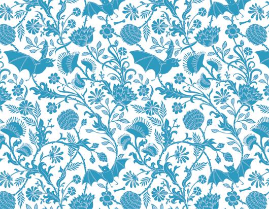
Though it was never intended that way, Wrap magazine might just be the perfect racket. With each 11.7 x 16.5–inch editorial spread backed by an illustration meant to double as wrapping paper, it's practically compulsory to buy two of every issue — one to keep forever, and one to dissect into packaging for your best friend's birthday present. As far as the London-based magazine's founders, Chris Harrison and Polly Glass, are concerned, either approach is perfectly valid. "As designers, the most satisfying feeling is seeing people using and enjoying what you've made," they say. Both began as jewelry designers for brands like Matthew Williamson and Paul Smith, with Glass venturing into furniture design for Innermost before leaving to devote her time to Wrap, which they hope will eventually blossom into an illustration-driven housewares and stationery brand. The pair's first issue launched last fall with stories about and contributions from up-and-comers including Merijn Hos and Sam Harris, and the second issue came out last week, its size bumped from A4 to A3 and its designer interviews even more in-depth. Sight Unseen secured permission to reprint here an interview with the Brooklyn-based illustrator and William Morris disciple Dan Funderburgh, whose wallpaper design pictured above was adapted especially for Wrap.
More

Antonio Ladrillo, Graphic Artist

In the googly-eyed character world created by Barcelona-based graphic artist Antonio Ladrillo, you might see shades of Cartman, or maybe the Lowly Worm from Richard Scarry’s Busytown books. But though the 36-year-old artist counts among his influences illustrators like Olle Eksell, David Shrigley, and Bruno Munari, the one thing he returns to over and over again is Super Mario Brothers, the NES videogame created in 1985 by Japanese artist Shigeru Miyamoto. “It’s fascinated me for years, but I only started to value it as something artistic when I was older,” says Ladrillo. “It perfectly combines my main interests: rhythm, color, shape, and space. I often go to it as a way to find some aesthetic pleasure.” It should come as no surprise then to anyone familiar with Ladrillo’s drawings that, like a videogame artist, he can't help but constantly imagine his characters in motion. “So much so, that for a time I couldn’t draw anything that wasn’t moving because it looked unfinished to me,” he says.
More

Alex Lin, graphic designer

If you were to chart the degrees of separation among young American designers, you might do well to start with Alex Lin. Since 2007, Lin — a Yale School of Art grad and former designer at 2x4 — has created all of the branding and collateral for Brooklyn-based furniture designer Stephen Burks, who often does work for the sustainably minded home accessories company Artecnica, who recently launched a line of pendant lights by Rich Brilliant Willing, who produce their Excel light series with Roll & Hill, who shared an exhibition space at this spring's Noho Design District event with Areaware, who commissioned a special 5-year anniversary piñata from Confetti System, who did the set design for United Bamboo’s Spring/Summer ’09 campaign. Confetti System also happen to share an 11th-floor Manhattan studio with Lin, who is the mild-mannered, super-talented graphic designer at the vortex of this Venn diagram–gone-haywire. Lin has headed up his own shop for only two years, but in that time, he’s worked with every creative on this list and then some.
More

Spaces, By Frankie Magazine

When it comes to its namesake subject matter, Spaces magazine doesn’t discriminate: There are live-work lofts in the wilds of Brooklyn, warehouses in Australia turned into artist communes, cafes in Hamburg lined with vintage shoe lasts and gumball machines, and even a section of so-called wall spaces, where entire spreads are devoted to close-ups of textile, teacup, or taxidermy collections. “We wanted an eclectic mix, somewhere between vintage, designy, and handmade,” says Louise Bannister, managing editor of the cult indie lifestyle magazine Frankie, who co-produced Spaces as one of the magazine’s twice-annual special projects. While past editions have included a recipe book or a small photo album filled with 110 snapshots culled from contributors around the world, the editors chose to focus on interiors after the success of Frankie’s only section devoted to them: Homebodies, where they feature casual portraits of the homes of musicians. For Spaces, the team scoured the internet from their homebase in Melbourne looking for creatives of all stripes, pairing large-format images with personal interviews about how they found their space and what they keep in it.
More

Mason McFee, Artist, and Jess Clark, Graphic Designer

When Mason McFee and Jessica Clark decided to name their new company Crummy House, referring to their own charmingly ancient one-bedroom rental in Austin, Texas, it was mostly out of admiration rather than denigration. Sure, the paint is cracked in places, the garage has an uneven dirt floor, and in the winter, the cold night air blows through with no regard for shuttered windows. And it was a bit of an inconvenience when, two months after they moved in, an old tree fell directly onto McFee’s car. But with two desks in the living room, a workshop in the garage, and the kitchen basically converted into a studio, the house has become a kind of creative haven for the couple — a getaway from McFee’s responsibilities as an art director at the ad agency Screamer, and Clark’s as a graphic design student at Austin’s Art Institute. They spend weekends making art there, side by side, and with Crummy House they’ll start their first true collaboration.
More

MVM interviews David Shrigley

Sighted on Robot shop's website: Norwegian graphic designer Magnus Voll Mathiassen and Glasgow-based artist David Shrigley have an open-ended discussion about art, illustration, Lou Reed, rulers, and art versus branding. Of the latter, Shrigley says: "I sometimes think of my work as always the same, but then at the same time always different. It's the same aesthetic and maybe the same attitude, but (then) if there wasn't something different in there; if there wasn't some kind of surprise each time, I would probably stop doing it."
More

Death Magazine, Issue #2

The funny thing about Death magazine — a thrice-yearly publication inviting designers, artists, and writers to use humanity's darkest subject as a creative catalyst — is that it's not really all that morbid. You'd get more depressing stuff asking musicians to write songs about love. While Portland-based graphic designer Forrest Martin was moved to found the magazine last year in part by a deep-seated fear about his eventual demise ("I'm an agnostic worrier raised by a professional hypochondriac," he told a blog at the time), his contributors filter the issue at hand through all kinds of artistic lenses, some of them masterfully subtle. In Death's recently launched second issue, Michael Zavros's lush large-scale charcoal drawings of young male models with their faces scratched out could just as easily be from an artsy spread in a fashion glossy as they could a death threat from a homicidal stalker, while photographer Jason Lazarus's super-saturated color fields, sprinkled with the cremated remains of the late artist Robert Heinecken, on first glance resemble star systems photographed in deep space.
More

Monika Wyndham’s Funny Cool File

Many artists claim to need restriction in order to thrive — Matthew Barney famously made a series around the subject — and find the idea of freedom paralyzing, like standing at the edge of a vast creative abyss. Vancouver native Monika Wyndham, on the other hand, seems to be energized by endless possibility. In February, she left a full-time position art-directing interiors for the Canadian clothing chain Aritzia to move to Brooklyn and freelance, and she's taken to the professional vacuum with a kind of giddy abandon, flitting among dozens of ideas she finally has time to follow through on — even if she's unsure as to what end. And then there's the high she gets from losing herself in one of her biggest sources of artistic fodder: Google Images. "It’s just baffling to me how much information exists on the internet, and the fact that you can enter funny combinations of words and yield the most insane multitude of search results," she muses.
More

Art of McSweeney’s

To an extent, Art of McSweeney’s — an oral history of the San Francisco–based quarterly, from Chronicle Books — is about the quirky illustrations, charts, graphs, and covers that have defined the look of Dave Eggers’s publishing venture for the last twelve years. But even more, it's about the art of book-making, which in this case means reproductions of original sketches; odd detours to visit Arni and Bjössi, the Icelandic printers who produced more than a dozen issues before McSweeney’s moved its printing facilities to Singapore and North America; interviews with authors and artists; charts of printing specs; drawings of pensive clouds; and guides to reviewing unsolicited material.
More

James Victore, Graphic Designer

Not everyone knows this about James Victore, but he actually doesn't use Sharpies anymore, his weapon of choice back when he first started scribbling dirty words and other provocative drawings across plates and hand-made posters. He packed them all up in storage a few years ago, opting instead for paint pens, and more recently, Japanese Sumi-e brushes. "Sharpies are a line I know," the Brooklyn-based designer explains. "I'm doing a job right now for Bobbi Brown cosmetics, and using a Sumi-e brush with India ink precisely because I suck at it. It's so much more interesting than being good at something — I like the idea of chance and mistakes. I can't wait until I’m 80 and have that shaky old-man handwriting."
More

Kostya Sasquatch, graphic designer and artist

The 28-year-old graphic designer Kostya Sasquatch makes thick, vector-like graphics on a PC, all cartoon colors and geometric shapes, odd logotypes that create iconographies for systems that seem to exist only in the designer’s mind. (He has a whole series called Donut Control.) They’re the kind of designs that could be from anywhere, but they might not have looked anything like they do if Sasquatch wasn’t from Moscow.
More

JP Williams, Graphic Designer and Archivist

Someone like JP Williams has enjoyed plenty of validating moments in his 20-year career as a graphic designer: Getting to study under one of his design heros, Paul Rand, at Yale; winning more than 100 awards for projects like his kraft-paper tea packages for Takashimaya; discovering that his collection of baseball cards from 1909 was worth enough to buy his wife and business partner Allison an engagement ring. All well and good, however none of it really compared, he admits, to the feeling of being validated by Martha Stewart.
More