Archivo Diario by Melinda Santillan and Marco Rountree Cruz

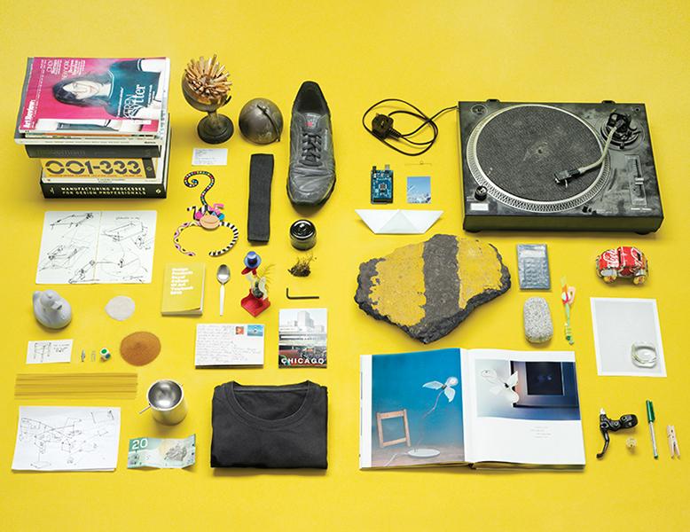
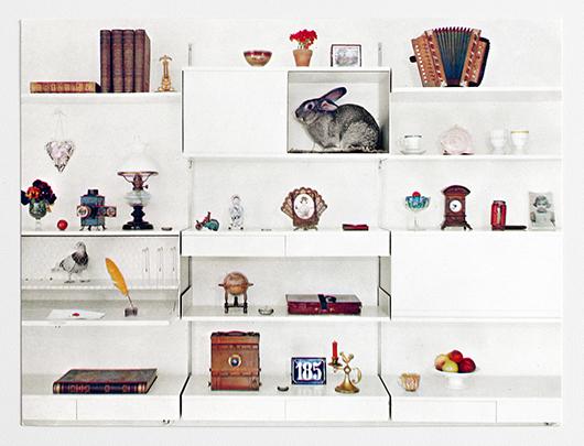
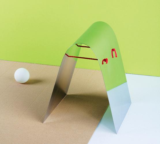
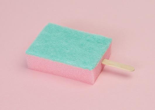
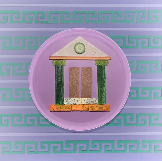
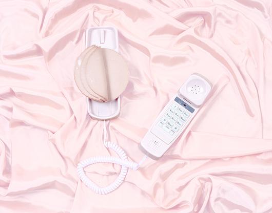
If you're the kind of person who pays attention to Pinterest, you may have spotted the playful image above making the rounds there as of late. But we can pretty much guarantee you don't know the story of the two Mexican artists who created it — and the blog it's pulled from, Archivo Diario — which turns out to be one of the more amusing tales we've heard in awhile. We were lucky enough to meet Marco Rountree Cruz and Melinda Santillan at a party thrown this fall by Jennilee Marigomen of 01 Magazine, and we decided to keep in touch with the Mexico City–based couple, who launched Archivo Diario three months ago both as a way to force themselves to create something new every day and to try their hand at working together (Cruz being a successful installation artist and Santillan more of an art director). But when we dug a little deeper, we found out that the endeavor was technically their second collaboration, and was in many ways a direct reaction to the failure of first: an elaborate script for a stylized telenovela that they dreamed of actually producing, but that has since languished in their desk drawer. We were so impressed by the couple's boundless creative ambitions — just wait until you hear about the crazy project Cruz is working on now — that we begged them to tell us everything
More

Table of Contents, Portland

Table of Contents is a concept shop that sells clothing and objects from a storefront just inside the gates of Portland’s Chinatown, opened in September by two local designers. So when one of them, Joseph Magliaro, told us that “the goal of TOC is to produce an expanded notion of what a publication can be,” well, you can’t blame us if we were a smidge confused. But it turns out that Magliaro and his other half, Shu Hung, prefer to look at their store as a kind of magazine come to life — a place where the things we’re all reading about now, or should be, are actually there to have and to hold, and where every fashion season brings a new “editorial” theme.
More

At London’s Frieze Art Fair

Which furniture designs do discerning art dealers truly prefer? Not to sell, but to sit in? That was the age-old question that photographer Sanna Helena Berger set out to answer while traversing the aisles of last month's Frieze Art Fair. Her utterly unscientific answer? Four out of five discerning art dealers prefer Friso Kramer, or failing that, some variation on mid-century bentwood. Quelle surprise. A Swedish photographer based in London, Berger chose to hone in on the subject after her maiden voyage to Frieze — tagging along with a friend's art class — proved otherwise underwhelming. “The space itself is divided into cubicles, very much like an overcrowded office, except that everything is crisp, bright, and white and within the cubicles the office wear is of a higher standard,” she explains. “Obviously I don’t claim that there was no worthwhile art there, because there certainly was, but the environment, the space, and the curation were not for me.” Instead of complaining, though, and jeopardizing her friend’s happy experience, Berger pulled out her camera and devoted the rest of the day to documenting art-booth furniture. Then she decided to share the results with usThen she decided to share the results with us, in a behind-the-scenes exposé that will no doubt put a lot of curious minds at ease, once and for all.
More

Designers of the Future Photo Essay

And now for some ridiculously old news: At Design Miami/Basel this past June, the three W Hotels Designers of the Future awardees included Tom Foulsham, Markus Kayser, and Philippe Malouin, each of whom were handed a commission with a very meta, very Sight Unseen-style brief — to devise a project that would somehow illuminate their creative process, like Foulsham's merry-go-round propelled by balloons and hair-dryers, or Malouin and Kayser's differing takes on daylight-mimicking lamps. Even if you weren't in Basel yourself, you probably read all about it earlier this summer, whoop-de-doo. But what you might not have seen is the hefty catalog Design Miami's organizers produce for every show, which was handed to us belatedly last week during a pow-wow with head curator Marianne Goebl, and which contained an article that was so up our alley we were surpised no one had shown it to us sooner: a photo essay wherein Kayser, Foulsham, and Malouin were asked to respond to questions like "A sketch" and "An object you find useful" by handing over the sketches and objects themselves.
More

Cabinets of Wonder

Back in 2006, when Freeman's opened in New York and Jason Miller's Antler chandelier was selling like hotcakes at The Future Perfect in Williamsburg (it probably still is), that whole taxidermy thing hit hard — stuffed deer heads suddenly becoming the de facto symbol for a style movement dedicated to the return to nature, the embracing of all things old-fashioned, and in many cases, the compulsion to dress like a bearded woodsman. Six years later, some of the less meaningful elements of that trend have subsided, while its obsession with authenticity and craftsmanship have, thankfully, hung on strong. We would also argue for the longevity of another development that arose around that time but strikes us as evergreen: the fascination with curiosities, and cabinets of curiosity, that may have hit its modern fever pitch recently but seems somehow endemic to the human psyche. We are by nature collectors, prone to hunting, preserving, and displaying our treasures both for our own amusement and to impress others. And most of us, too, have a dark side — the kind that can't help but find beauty in bones, bugs, and dead things, provided they're presented to us in the right context. That's why we felt so compelled to share with our readers the contents of a new book out on Abrams this month called Cabinets of Wonder, which is a full-color romp through the world of natural oddities, memento mori, and other dark artifacts.
More

Vitsoe’s Tumblr

If you have a particularly sprawling design-book library, or if you religiously follow things like Mondo Blogo or Herman Miller editorial director Sam Grawe's Instagram feed, you may be relatively familiar with the heaps of amazingly designed archival ephemera that original modern furniture brands tend to generate over the decades. But the rest of us still get giddy when we come upon a gem like Vitsoe's brand-new Tumblr, which the 53-year-old German stalwart launched last month to show off rarely seen bits and bobs pulled from its company files. Every couple of days, staffers dig up old invitations, promo items, photographs, and catalogs and post them alongside a snippet of information about their origins; with Dieter Rams as Vitsoe's lead designer and Wolfgang Schmidt behind its graphic identity, there's been no shortage of eye candy on the site so far. A few of our favorite examples are shown here, but we advise you to bookmark the site and visit it often — we have a feeling the Vitsoe folks are just getting started, and there's no telling what they might turn up once they really dig in.
More

Zrcadlo: The Mirror by Okolo

If you go strictly by the numbers, nearly any product typology could be said to be having a moment at the Milan Furniture Fair each year. Sofas? There are always hundreds. Cabinets? Wall clocks? Yup, those too. But scan the recent fairs not just for mirrors but for amazing mirrors, and you might be inclined to agree with Adam Štěch and Klára Šumová, curators of a show at this week's Prague's Designblok festival that reflects on the genre's recent creative uptick. (These three hand mirrors alone totally slay us.) "The exhibition not only brings together our friends from the design world but also tries to define the typology of a mirror based on quite varied styles and design approaches," says Štěch, one of three co-founders behind the creative agency and online magazine OKOLO. He and Šumová comissioned 30 designers — 15 of them international and 15 Czech — to design a new mirror for the installation, from Maxim Velčovský's wall mirror bordered by cheap plastic store-bought varieties to Marco Dessí's mirror that doubles as the top for a jewelry box.
More

PUTPUT, artists and photographers

In some ways, the work of the Danish-Swiss duo Putput could be considered a response to sites like this one: If we're constantly bombarded by scrolls of images, the two designers seem to ask, how can we be convinced to reconsider objects that at first glance seem so quaintly familiar? Projects like their Popsicle series (above), which found the icy treats replaced by scrubbing sponges, or Inflorescence — for which the two employed the visual language of still life to depict cleaning implements as potted plants — play with subverting our expectations in a way that could seem cliché if the resulting images weren't so exceedingly lovely. The two work at an increasingly trafficked intersection where photography, styling, art and design meet, which allows creators to control both the product and the way it's presented — both the input and the output, as it were, which is where their clever studio name comes from. We recently caught up with the two recent grads as they were dipping a toe into the contemporary art world and looking for new studio space.
More

A 20th Century Palate in The Gourmand Issue 00

In the summer before starting Sight Unseen, one of us had a very brief flirtation with the idea of attending culinary school. Along with design, food is our great love, so we were pleased this week — and maybe even a little bit jealous — to stumble upon a new magazine out of London that unites the two disciplines in the most fantastic of ways. Called The Gourmand, the first issue tackles subjects ranging from David Shrigley's new cookery-themed opera to Jeff Koons's recipe for apple dumplings. But our favorite feature — plucked from the site's website, which has a sprinkling of teasers for the print edition as well as practical food recommendations from artists, contributors and London's culinary cognescenti — has to be this collaboration between art director Jamie Brown and photographer Luke Kirwan, which depicts 20th century art and design movements in foodstuffs like American cheese and pink wafer cookies.
More

The 2012 Parsons Thesis Site

As curatorial hunter-gatherers, we're always on the lookout for new and unseen talents, and there's no better place to spot them than at school thesis shows. But as workaholics who seldom have time to leave our home offices, much less attend these shows, they all too often remain off-limits to us. It's a rare yet celebrated occasion any time we're either sent a clear, comprehensive accounting of projects by graduating students, or become aware of a website that successfully catalogs them. Last week, we received an email from Parsons with just such a treat — the new multi-disciplinary Parsons thesis site, part of the two-year old Parsons Festival which flings open the doors of the school to the public each May for three weeks of exhibitions, workshops, and fashion shows. Grateful to have access to the event's couch-potato version, we sifted through all the projects on the site and found the six we liked best: humorously cloying photographs of weird dollar-store finds by Antonia Basler, a series of poured-concrete side tables made in fabric molds by Isaac Friedman-Heiman, dresses that pay homage to Muybridge and Noguchi by Kaoru Oshima, photos by Charlie Rubin that blur the line between the real and the artificial, and minimalist versus maximalist origami garments by Yingshi June Lin and Si Lu. Have a look at the slideshow here, which is annotated with selections from the students' thesis statements, then clear your calendar for next May so you'll have no excuse not to join us at next year's festival.
More

Bec Brittain’s Lattice Candelabra

When we last did a studio visit with Bec Brittain, we made a brief mention of her new candelabra design, which — as depicted in that slideshow — was just a formless pile of metal tube segments at the time. While it's still something of a work in progress, Brittain decided to share it with Sight Unseen readers today anyway, originally planning to photograph it on the High Line and then ultimately finding inspiration a bit closer to home. And when we say home, we mean the building that houses her Red Hook studio, also referenced briefly in our March story: the E.R. Butler headquarters and production facility, which we only got a quick glimpse of that day, but whose awesomeness we may have failed to properly convey. It's a 10,000 square foot renovated warehouse with a hauntingly beautiful courtyard and the kind of gritty factory floor most makers go nuts for, and in the photos she shot for us, Brittain borrowed that industrial scenery to use as a metaphor for her own working process.
More

Jennifer Parry Dodge of Ermie

Jennifer Parry Dodge is a Los Angeles–based designer, whose beautifully printed textiles are often the result of photographs or scans of vintage textiles that have been manipulated in Photoshop. Her online store Ermie, named after a great-aunt Ermengarde who encouraged her creativity, encompasses a collection of works ranging from braided embroidered belts to watery cool crepe de chine garments made from her own textile creations. In addition to creating textiles, she maintains a blog that documents her transforming fascinations with color, textures, food, the desert, and her trips abroad. The first time I met Jennifer over coffee in downtown Los Angeles, I was immediately struck by the intensity of the colors in her work — colors that vibrated in the California sun, and intensified as the sun grew stronger. "Each pattern or print that I design has a history, however brief, of how it came to be. I’m sure the meaning for me differs from that of the viewer/ wearer/ user, but I hope some of the story comes through," she says.
More