When designers say they like to make things with their hands, they’re not usually talking about chocolate. But for Mary Matson, a former senior designer at Kate Spade who now works freelance from the Brooklyn home she shares with her husband and co-conspirator Matt Even — an art director at Wieden + Kennedy — food has always been part of the equation. “When you’re in art school, everything is critiqued, every moment, every mark,” Matson says. “I loved painting, but I wanted to do something physical where every nuance wasn’t commented on. I was in Boston for graduate school, I’d done some kitchen work — and somehow I bullshitted my way into a job as a pastry cook.”
And so a few years ago, when Matson and Even began toying with the idea of opening an online shop, they naturally kept coming back to the idea of sweets and chocolates, and in 2009 Chocolate Editions was born. Under the name Mary & Matt — as the two call their company and blog, which chronicles their collections and obsessions, from plastic New York deli bags to Yves Klein blue — they began producing candy bars from their Brooklyn kitchen. They started out with pop-inspired confections, like a slab of dark that resembles a block of Scrabble tiles, and soon moved on to 3-ounce solid bars and simple striped ones in nostalgic flavors like Neopolitan, a selection of which are now for sale at Partners & Spade. (It helps that while at Kate Spade, Matson did design work for the famed New York chocolatier Jacques Torres, who’s become a bit of a mentor in exchange for continuing package designs from Matson.) Artisanal, home-based production has become something of a trend lately, particularly in Brooklyn, but for Mary & Matt, it was never about locavorism or Slow Food or any other Sunday Styles sort of buzzword. “We’re totally on the other side of things,” says Matson. “We want to use good ingredients, too, but our take is a little more pop, a little sweeter — more what you remember as a child.”
Matson and Even met as skate-obsessed high-schoolers in the D.C. suburbs, and after so many years together, the two have developed a shared set of references that pop up in everything from their chocolates to their identicallydesigned websites to their home, which I had the pleasure of visiting last month. We’re calling their aesthetic “unsentimental nostalgia”; click through to see what we mean.
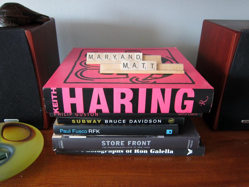
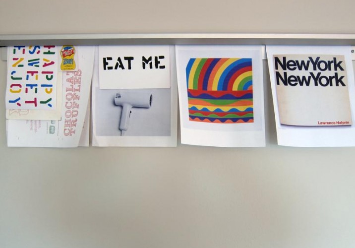
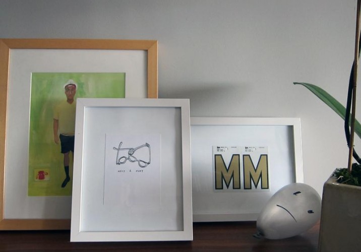
Home base for Matson and Even is the 10th floor of a pre-war building that looks out over Brooklyn’s Grand Army Plaza. (From their living room they can see the fireworks that shoot off over Coney Island on Friday nights.) Shown here is a typical Mary & Matt vignette: bright colors, nostalgic titles, and the simple typography of Scrabble tiles, which inspired their first dark-chocolate bars. “It was huge on the internet until Scrabble nixed it,” says Matson. “But in a way, that was kind of cool — getting a cease-and-desist from Scrabble?”
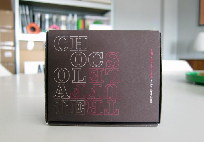
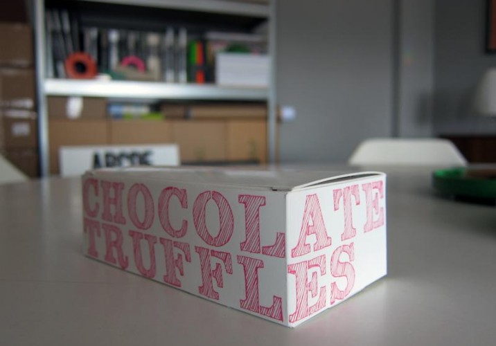
Chocolate Editions formally launched in 2009, but the process began long before that. “Every year for 10 years before we started selling chocolates, we made our own for Christmas,” says Matson of the packaging precursors shown here. “Your family gets bigger and you don’t feel like buying gifts for everyone.”
“We made this one the year I got the job at Kate Spade. I gave one to Alan Dye (then design director at Kate Spade, now creative director at Apple) and he thought it was great. I kind of thought that sealed the deal.”
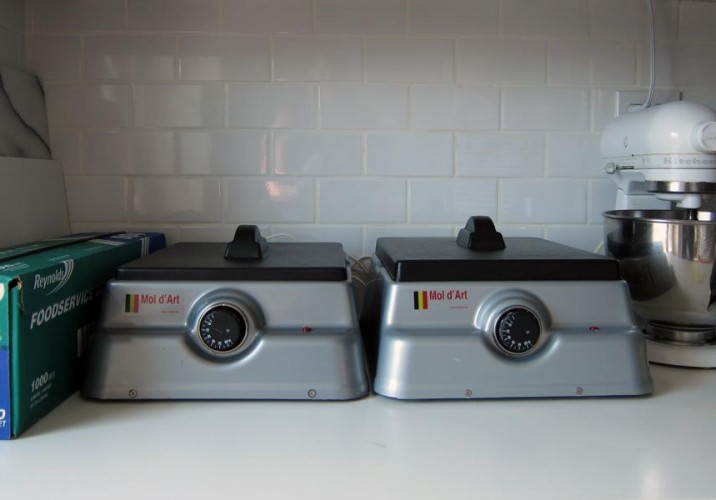
Mary & Matt chocolates are now made in batches in these Mol d’Art Belgian warmers, recommended by Jacques Torres himself. The two make around 100 bars a week, to ensure that each bar arrives fresh to customers. “It’s going to be hard to do the chocolate here in the summer, so Jacques is going to give us Mondays in his kitchen,” says Matson.
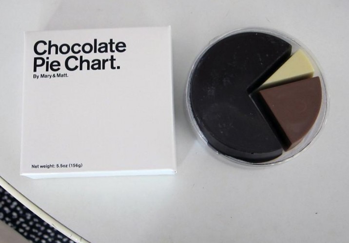
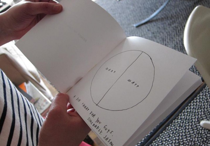
Best-sellers include caramel (we can vouch for its tastiness), Neapolitan, tangerine stripes, and the popular pie chart shown here.
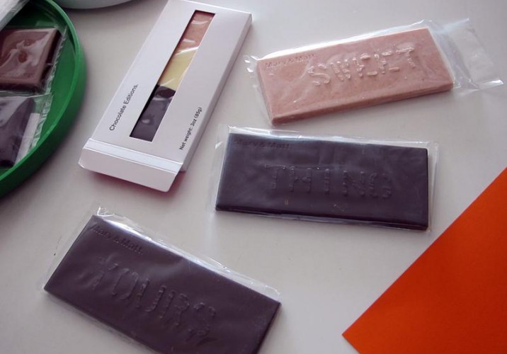
The chocolate sets in “cheapo” plastic molds made by “Rick the mold man from Pennsylvania,” as Matson calls him. “We thought it was cool to make something simple at first and then you can build on it.” Bars are available plain, or stenciled with phrases like “Yours,” “Mine,” and “Eat Me.”
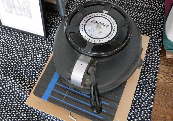
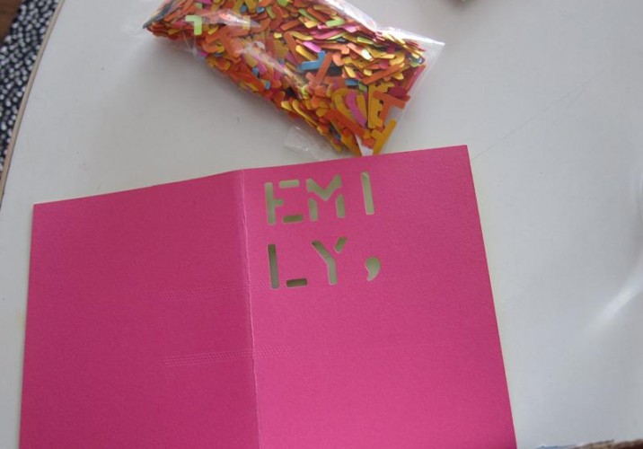
The stencils are cut from an old Diagraph machine Matson and Even bought off eBay from a machinist in Vermont. (It’s the same device that’s used to make metal stencils for lettering military uniforms.) “On the bars, we can do only seven letters at a time, but that means we can customize each one if we wanted to,” says Matson.
“We basically bought the Diagraph because we had so much money in our PayPal before we LLC’ed ourselves,” says Matson. “The thing has been amazing. We made a whole series of stencil notecards…”
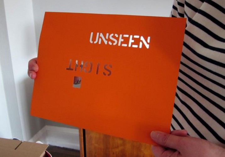
… and an on-the-fly Sight Unseen Diagraph original.
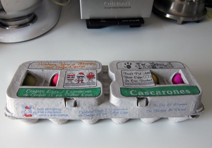
In every corner of the apartment are colorful bits that inspire the Mary & Matt aesthetic, destined to be photographed for their blog. When I visited, the two had recently spent time in San Antonio during Fiesta, and they’d picked up this carton of cascarónes — dyed eggs filled with confetti — at the local H.E.B. (a Texas chain whose acronym stands for Here Everything’s Better.) “As a kid, I was obsessed with these,” says Matson. “Having a cascarón broken over your head is said to bring good luck.”
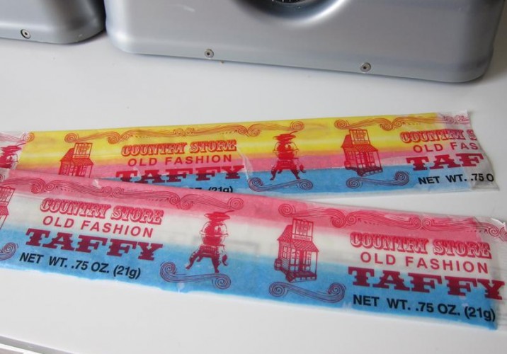
They also picked up these colorful taffy strips at an old-school candy shop down in Texas.
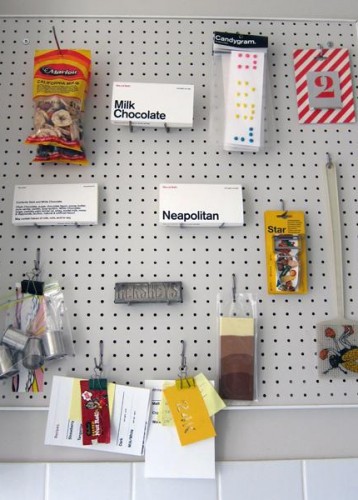
A pegboard in the kitchen hung with various ephemera: Early packaging examples, candygrams for a drawer the two curated at Partners & Spade last Valentine’s Day, a Helvetica inspiration from Joe Ades, the late Swiss vegetable peeler peddler in Union Square, and fly swatters from Chinatown, picked up by their friend Matt Singer, a former creative director at Jack Spade.
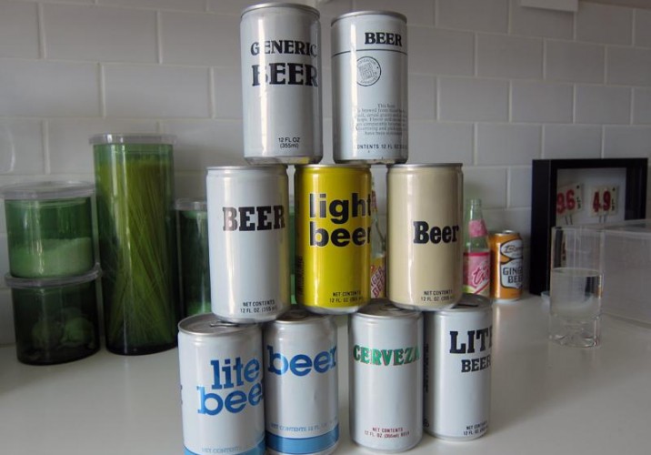
“Generics are a big-time inspiration,” Matson says of the Repo Man–style beer collection Even has acquired mostly through eBay. “I think a lot of these are from Ralph’s in California. When Matt was a kid, his dad had a JR beer can — people would just collect beers.”
“These I found in my mom’s kitchen cabinet and couldn’t believe how old they were,” Matson says. “My parents live in Reston, Virginia. My mom was a schoolteacher and my father worked for the government — that’s pretty much Washington, D.C. in a nutshell.”
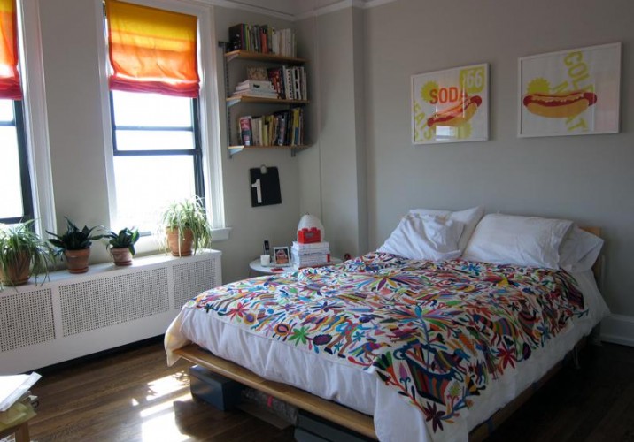
In the bedroom, more evidence of Mary & Matt’s color philosophy — as Matson puts it, bright and fun, but never carnival. “I did the prints above the bed when I first moved to New York in 2002,” she says. “I’d always wanted to live in New York, and I was really attracted to the graphics of, like, bodegas and hot-dog carts. When you first move to a place, you see things so fresh.”
“All swipe for looking ahead to 2011. Reminders of where the levels should to be set: simplicity, fun and color.”
Matson and Even’s apartment is full of eye candy but isn’t exactly hoarders territory. On the topic of collecting, Matson says, “Lately we’ve been purging a lot and taking pictures of things we’ve bought over time. The beer cans are something I want to hold onto for a while. I keep books or Japanese magazines; I collect art, I collect bandannas. This I found in the window of a bookshop — I knew that Chermayeff & Geissmar designed it, it’s MoMA. It’s an example of something that’s really plainly designed but stands out. I’ll keep it.”
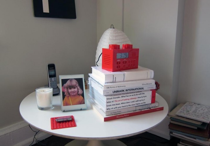
The Lego clock was a birthday present. Of their penchant for color, Matson says: “I think our take on things is a bit more happy. I hate saying Japanese, but I think if we were to speak to the world, we’d want it to be from a happy fun place.”
The living room is anchored by a dining set of Saarinen knock-offs inherited from one of Matson’s coworkers and a gorgeous set of Danish furniture gifted from her parents. “I lived in Germany for a few years as a kid. My parents bought the furniture in Denmark in probably 1977. They had great taste, and took great care of them.”
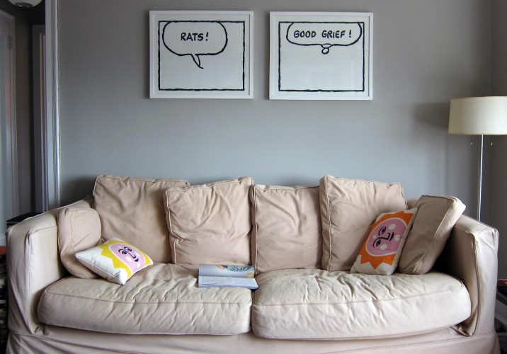
Home sick for a spell this winter, Matson created this gouache-on-paper homage to Charles Schulz. “My side of the couch is ‘Rats’ and Matt’s is ‘Good Grief.’” The pillows are options from old Kate Spade bags that were on the verge of being thrown out.
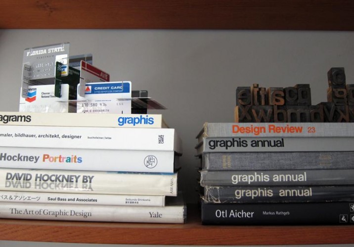
On the top left, the House of Credit Cards Mary & Matt made for Partners & Spade, inspired by the Eames House of Cards and the bad economy.
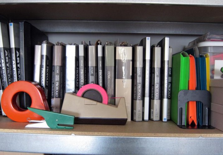
There’s a whole network of talented New York designers who used to work for the Spades; “Andy just really knows how to hire people,” Matson marvels. One of them is Abby Clawson Low, who also worked for Sight Unseen favorite JP Williams. “The stapler is from Abby; the tape dispenser is from JP. Both of them are total nerds when it comes to office supplies,” says Matson.
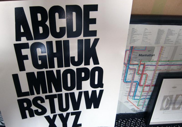
And the alphabet poster was a gift from Reference Library’s Andy Beach.
From left to right, a Maira Kalman gouache, a Jason Polan drawing, and Ms from New York store Kiosk. Balloon of unknown origin.
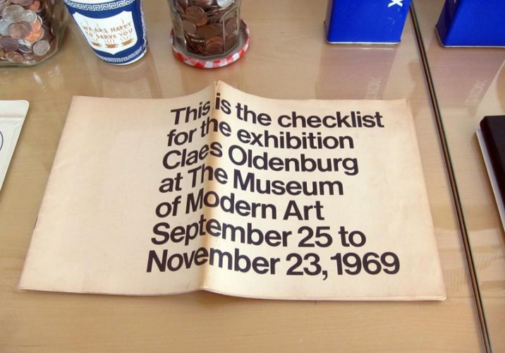
A friend of Mary & Matt’s, Polan is a New York illustrator whose book Points of Interest (above) paid homage to the pair’s pie chart. “Right now, he’s doing a project where he’s trying to draw everyone in New York. We’d love to start collaborating with people on the chocolates, and he would be great,” says Matson. “Or we could have, like, Tom Sachs make a machine. I want to be supreme of chocolate.”
It takes the Zürich-based fashion duo Ikou Tschüss a full week to hand-knit the blankets from their winter collection — each ringed with dangling sleeves to appear as though it’s hugging the bed — and maybe a day to knit one of their bulky sweater dresses. Even silk shifts are hand-printed and edged with rows of crochet, the pair's signature trope. Add to all that labor the fact that Carmen D'Apollonio spends the majority of her time in New York, where she’s been the right-hand-woman to Swiss artist Urs Fischer for the past eight years, and it’s a good thing she and partner Guya Marini have help. “Most of our knitting is done by Swiss grandmothers now,” says Marini.
The story of Stefan Scholten and Carole Baijings began, like many Dutch stories do, in a church. In the late ’90s, Baijings was working for an agency whose headquarters were located inside one of the country’s many abandoned houses of worship. Scholten, a graduate of the Design Academy Eindhoven, had a burgeoning design practice nearby. Scholten was asked to design a small bar for the agency’s office, and “the rest is history,” says Baijings.
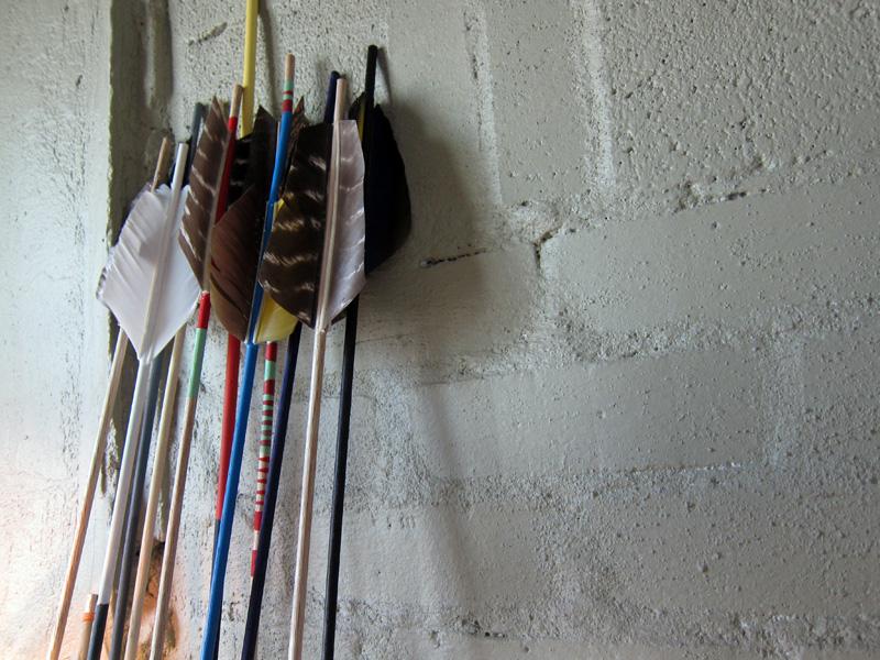
For a studio that crafts objects evocative of summer-camp bliss, Fredericks & Mae have an awfully dark creation story. For the last eight months, Gabriel Fredericks Cohen and Jolie Mae Signorile have been hard at work fletching, painting, and spinning bright polyester thread around their custom-made arrows, which sell for $95 apiece at boutiques like Maryam Nassir Zadeh and Partners & Spade. But when they met senior year at Oberlin, says Signorile, “Gabe was really into the apocalypse and I was obsessed with nostalgia. When we got into it, we realized they were kind of about the same thing: a fear of the future.”