01.15.13
Excerpt: Exhibition
Das Wilde Denken: Depot Basel in Berlin
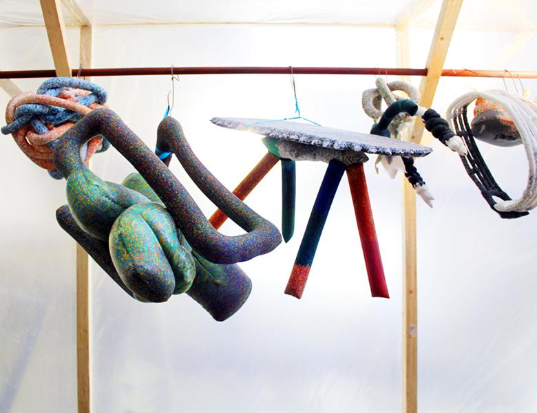
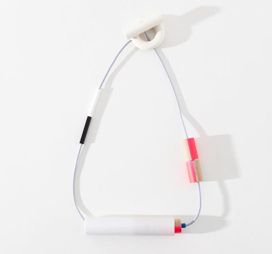
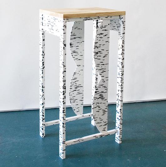
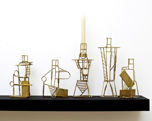
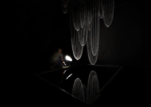
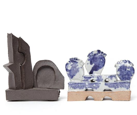
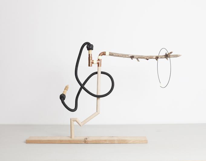
There's an easy way to tell whether or not you were born to be a maker: sit down at a table piled with random junk and scraps of material, and see how long it takes you to conjure something useful and/or beautiful. For the Das Wilde Denken workshop last month, Matylda Krzykowski and the team behind Depot Basel joined forces with my favorite design/fashion boutique in Berlin, Baerck, and invited a handful of local designers to spend two days doing just that. The results, of course, were amazing — where an observer like myself couldn't really make the mental leap past a jumble of discarded trolley wheels and wooden boards, this group envisioned lamps, sculptural table mirrors, jewelry trays, and stationery sets. The curators saw it as a chance for the designers to get back to basics and enjoy the simplicity of an open-ended crafting session, but they also likened the experience to reconnecting with childhood, when making wasn't goal-oriented but immediate and spontaneous — hence the name Das Wilde Denken, which means "wild thinking." (Momentary flashback to Malin Gabriela Nordin's children's workshop, which we featured last month.) All of the pieces created during the session, a selection of which are featured in the slideshow after the jump, will be on view and for sale at Baerck through February 2.