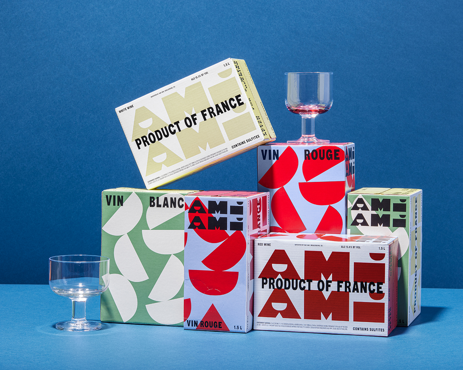
Meet Ami Ami, the Boxed Wine Whose Packaging Channels 1920s Italian Futurism

If you came of age, like I did, in the '80s or '90s, boxed wine probably means one thing — and one thing only — to you. But while in the past few years there's been something of an arms race to see who can make the best boxed wine — and turn that ubiquitous Franzia into nothing but a memory — there's only one new contender that tastes delicious and also has the kind of loose, contemporary, slightly kooky vibe that we'd actually want to display on our counters or in the fridge when guests come over: Ami Ami, a new, DTC, minimal-intervention boxed wine whose playful packaging and super-memorable logotype (the dots in the I's and the negative space in the A's are meant to resemble wine glasses) were both designed by the LA- and Montreal-based studio Wedge.
More

A Surrealist Wine Label, and Other Graphic Design Picks For June

Each month The Brand Identity shares with our readers a selection of the most interesting studios, packaging designs, and branding and identity projects featured recently on their site. This month: an uptown hotel with a new downtown vibe, a Mallorcan yoga studio identity inspired by Joan Miró, and a Surrealist wine label that celebrates the unexpectedness of every vintage (above).
More

A Pollution-Inspired Skincare Identity, and Other Graphic Design Picks for January

Each month The Brand Identity shares with our readers a selection of the most interesting studios, packaging designs, and branding and identity projects featured recently on their site. This month: a chic rebrand of a construction company, an art museum logo that mirrors the historical monogram of its building, and a skincare brand whose identity abstractly channels the air pollution it's designed to fight (above).
More

A Playful Pét-nat, and Other Graphic Design Picks for July

Each month The Brand Identity shares with our readers a selection of the most interesting studios, packaging designs, and branding and identity projects featured recently on their site. This month: Colorful packaging for a sustainable beauty line, a photographer with a font inspired by the early 1900s, and a playful identity for a Ukranian wine brand (above).
More

A ’70s-Inspired Sunscreen, and Other Graphic Design Picks for June

Each month The Brand Identity shares with our readers a selection of the most interesting studios, packaging designs, and branding and identity projects featured recently on their site. This month: An identity for a Black- and women-owned L.A. bookstore, a quirky custom typeface for a London underwear brand, and colorful, '70s-inspired packaging for a sunscreen brand (above).
More

A New Identity For an Australian Designer, and Other Graphic Design Picks For May

Each month The Brand Identity shares with our readers a selection of the most interesting studios, packaging designs, and branding and identity projects featured recently on their site. This month: culture-driven visuals for a Brooklyn menswear brand, a website for a tribute album to a famed Russian Poet, and a flexible graphic identity for an Australian multi-disciplinary designer (above).
More

A Roberto Burle Marx book, and Other Graphic Design Picks for March

In a new column, each month The Brand Identity will share with our readers a selection of the most interesting studios, packaging designs, and branding and identity projects featured recently on their site. This month: A book on the work of iconic landscape artist Roberto Burle Marx, the design of a favorite Spotify playlist series, an identity for an experimental Australian tea house, and more.
More

Waka Waka Gets a New Identity, and Other Graphic Design Picks for February

In a new column, each month The Brand Identity will share with our readers a selection of the most interesting studios, packaging designs, and branding and identity projects featured recently on their site. This month: New branding for the LA studio Waka Waka, a chic identity for a moving image museum, colorful bottles for a Ukrainian soda line, and more.
More