05.06.21
Graphic Design
A New Identity For an Australian Designer, and Other Graphic Design Picks For May
Our new Graphic Design column is guest-edited by the team at The Brand Identity, a graphic design resource and publication, as well as the producer of customizable backdrops made for designers to showcase their work. Each month, they’re sharing with our readers a selection of the most interesting studios, packaging designs, and branding and identity projects featured recently on their site. This month: culture-driven visuals for a Brooklyn menswear brand, a website for a tribute album to a famed Russian Poet, and a flexible graphic identity for an Australian multi-disciplinary designer (above).
Projects
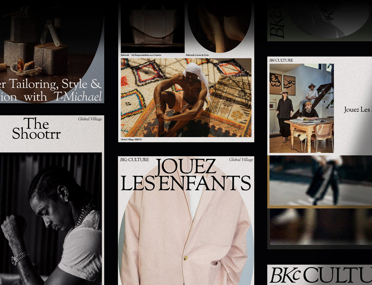
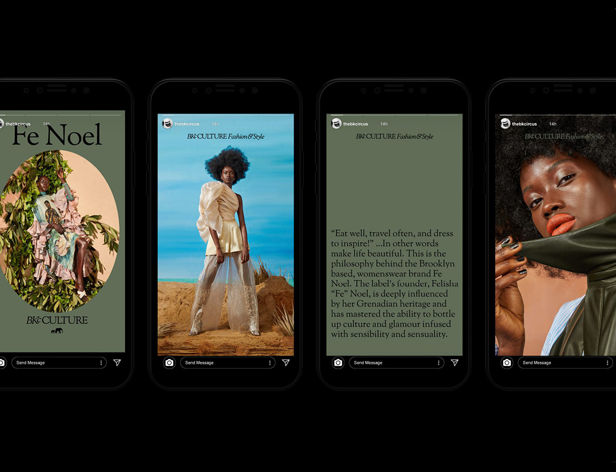
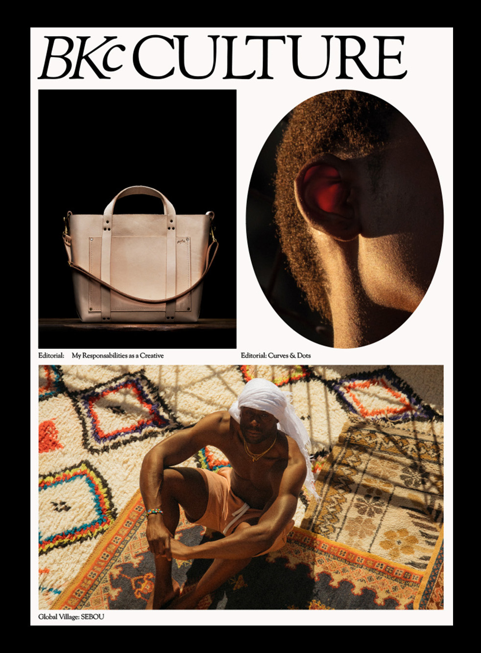
brooklyn circus by new studio
Linking up with Ouigi Theodore’s menswear fashion label The Brooklyn Circus in 2019, New Studio have since been working hand-in-hand with the company, determining its next steps as a brand and how best to introduce the company’s accumulated cultural significance to the identity — and help expand upon it. The Studio has worked in tandem with the brand to develop an identity that is both refreshing and referential, like the (literal) elephant in the room. “The elephant logo already existed and we decided to keep it,” New Studio told us, capitalizing on the recognition of the logo mark, as well as the meaning behind the animal itself. “Elephants are herd animals; they take care of their herd, and they’re gentle giants, loving to their offspring. All these characters perfectly suit BKc.” Alongside the elephant, New Studio crafted an identity that’s supportive of The BKc rather than the focus, paring down the more graphic elements, such as color palette and type choice, in favor of the brand’s primary focus on photography, products, and stories.
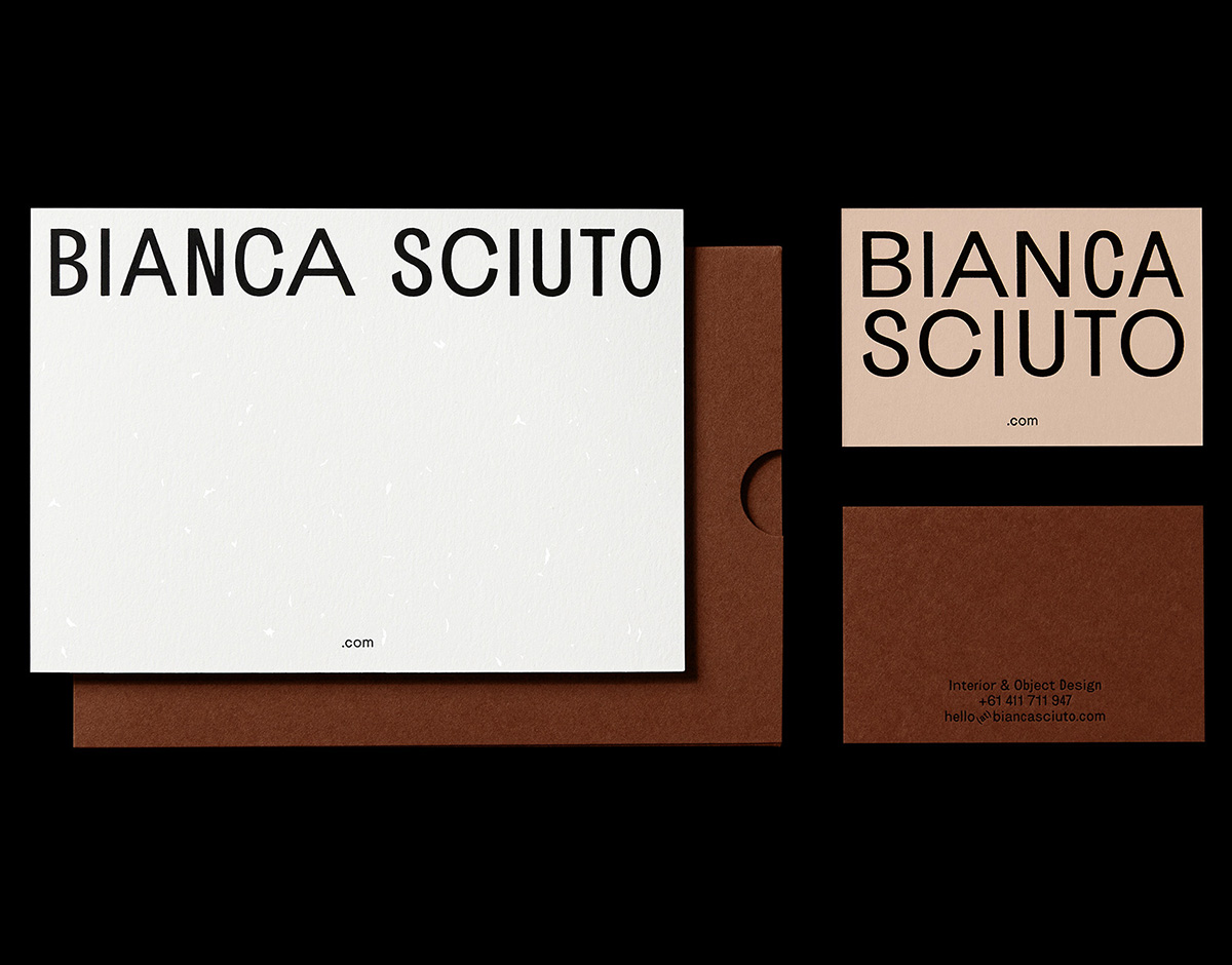
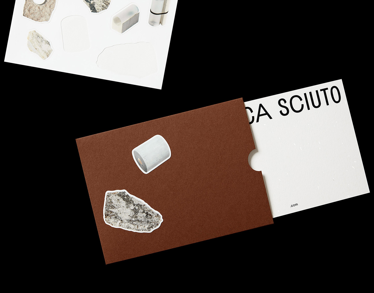
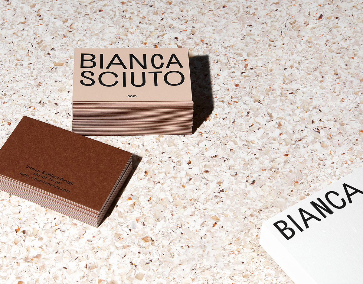
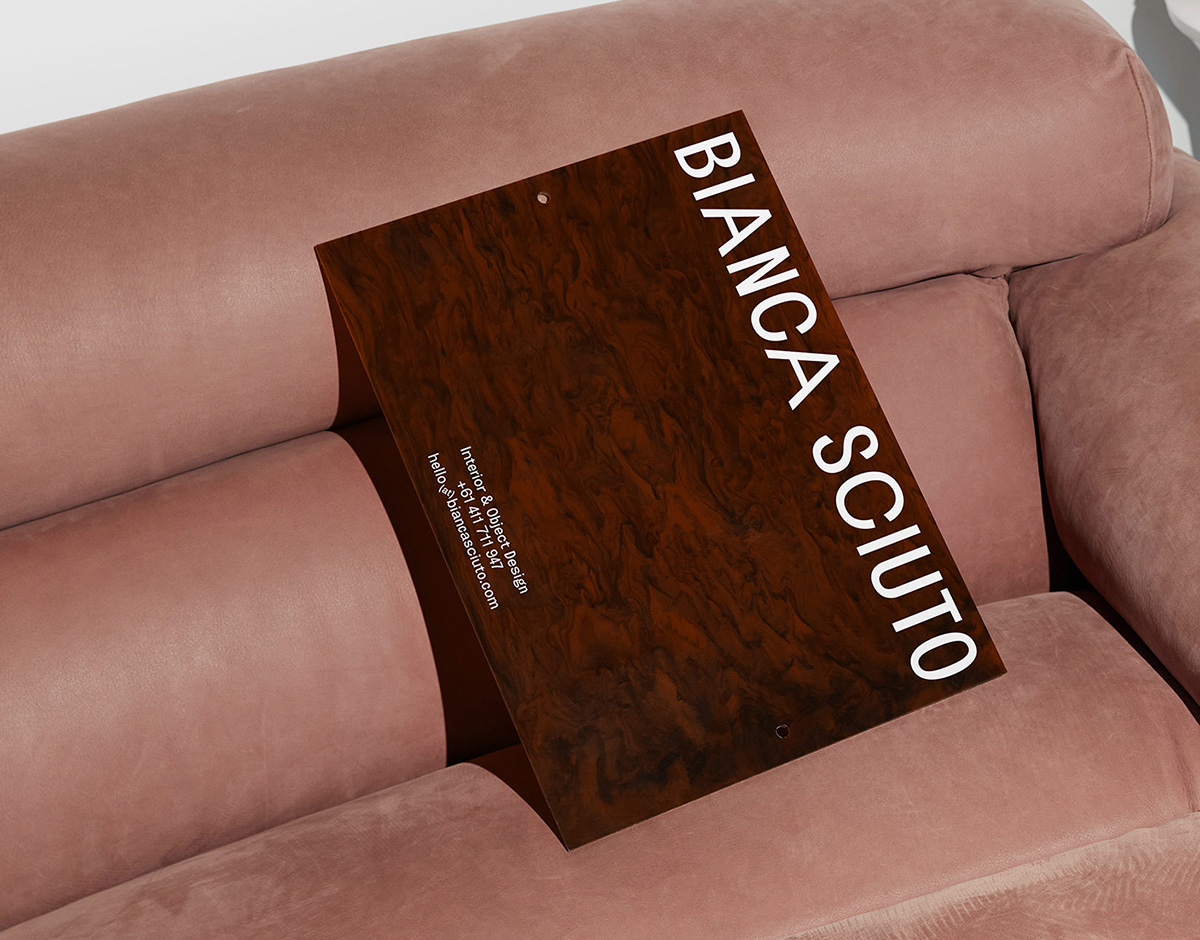
bianca sciuto by both
In her Brunswick-based creative practice, Australian designer Bianca Sciuto explores the intersection of interior, spatial, and object design, with a particular focus on rocks, the natural environment, and the tactility of landscapes. When approached to create Sciuto’s identity, Melbourne-based studio Both were inspired by her experimental approach to push typographic convention, primarily through their choice of typeface — Dennis Grauel’s Brunswick Grotesque — which also provides a nice reference to the location of Sciuto’s studio. Utilizing the typeface’s five distinct and fluid widths for her wordmark, Both’s solution mirrors the naivety and charm of Brunswick’s signage and shop fronts while stepping away from the idea of what a logo is or should be. As a result, each application of the wordmark is different, leading to a system that successfully conveys the focus of Sciuto’s practice.
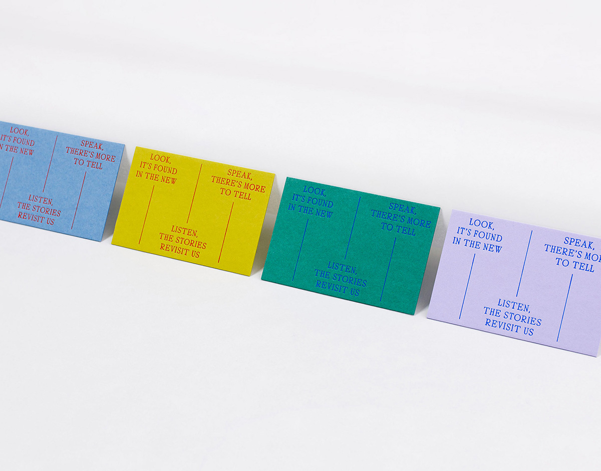
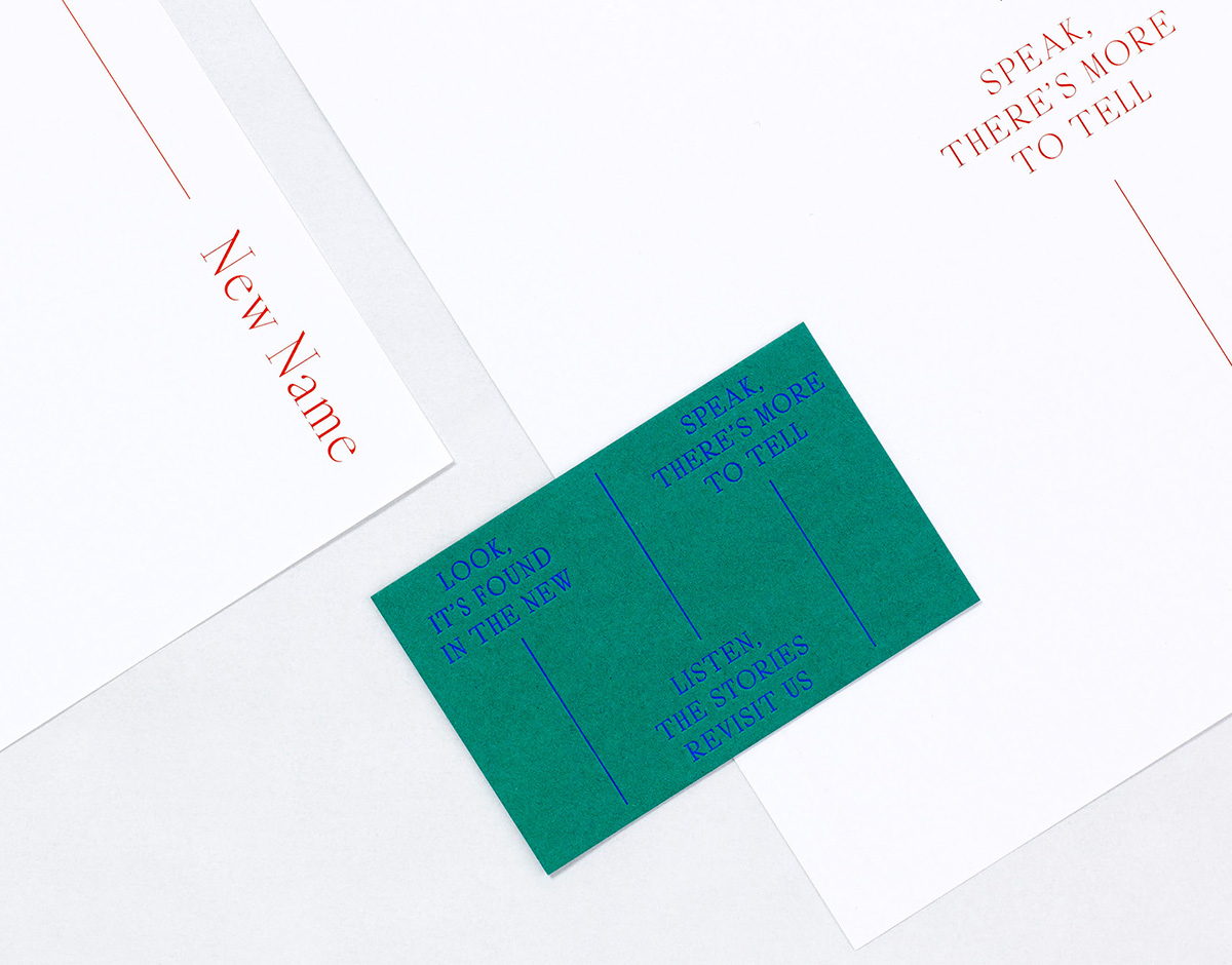
new name entertainment by a practice for everyday life
Established in 2020, New Name Entertainment is a production company whose work focuses on curating, directing, and producing thought-provoking original content for curious minds — most noticeably the popular dark comedy podcast Soft Voice. Working closely with founders Naomi Spence and Jordan Spence, the London design studio A Practice for Everyday Life devised New Name’s identity, print collateral, and website as an elegant and vibrant typographic spectacle. The key component of their solution is a short passage of text that reflects the company’s passion for storytelling and its focus on uncovering new and unheard voices. This text is divided into small, intriguing snippets that appear across the brand ephemera — along with unexpected color combinations and linear details — as a subtle connecting reference to the different contributors involved in New Name’s output.
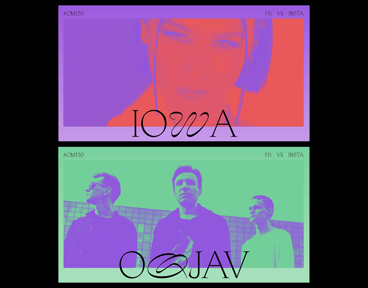
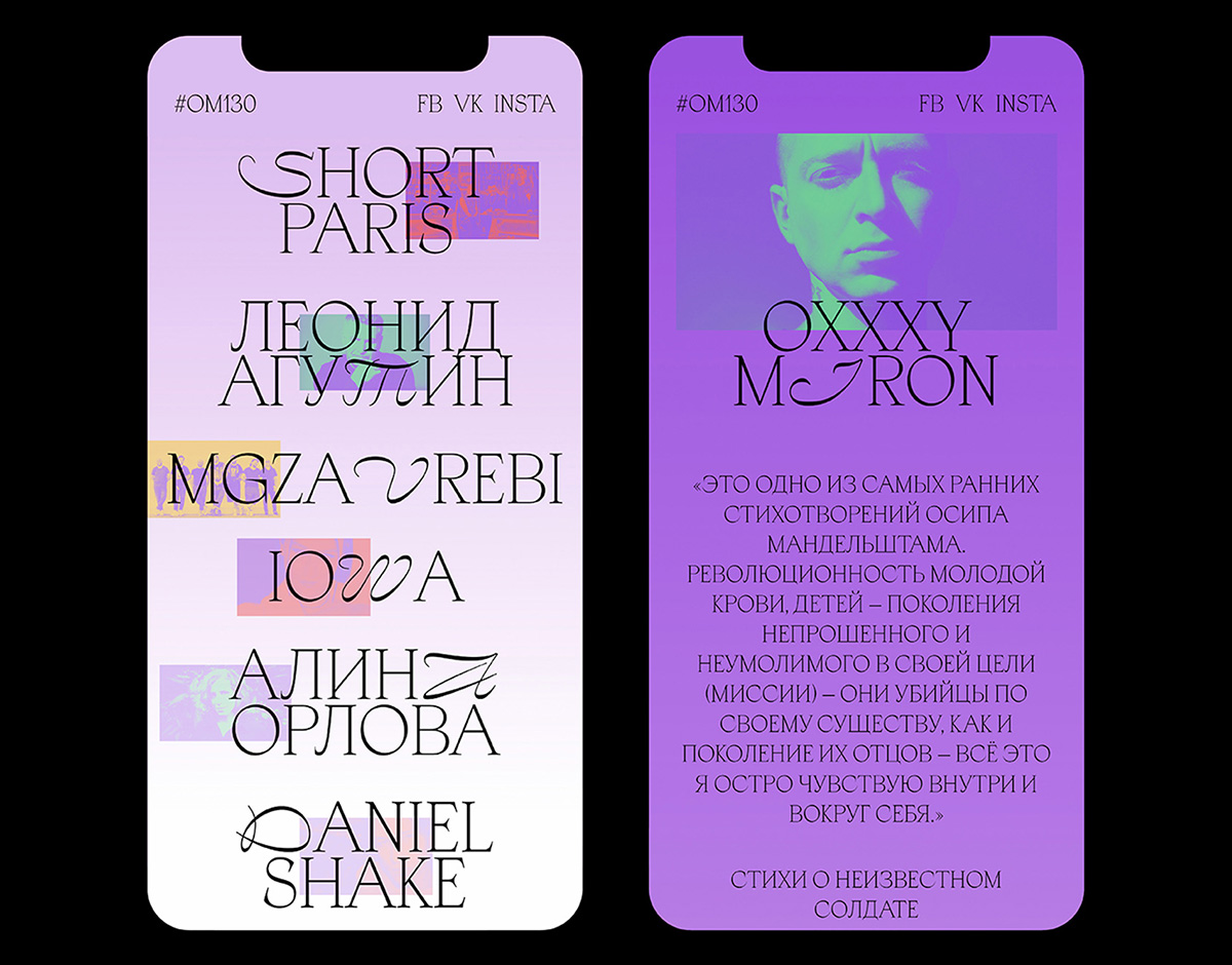
om130 by tuman studio
OM130 is a tribute album celebrating the 130th anniversary of Russian poet Osip Mandelstam, consisting of 21 original compositions arranged in chronological order. Moscow-based branding agency Tuman Studio were commissioned to create the visual identity and website for the project, for which they decided to utilize a striking combination of two typefaces to represent Mandelstam’s multi-generational career: Blaze Type’s Apoc and Lucas Descroix’s Nostra, a pairing chosen for the similarity between Mandelstam’s poems and Greek and Roman inscriptions. “The combination of these typefaces forms a mystical plexus of historical and handwritten forms reimagined in a contemporary context,” says Irina Kosheleva, art cirector at Tuman Studio. “They reflect the essence of the OM130 project — Mandelstam’s poetry transmitted through the optics of contemporary musicians.”
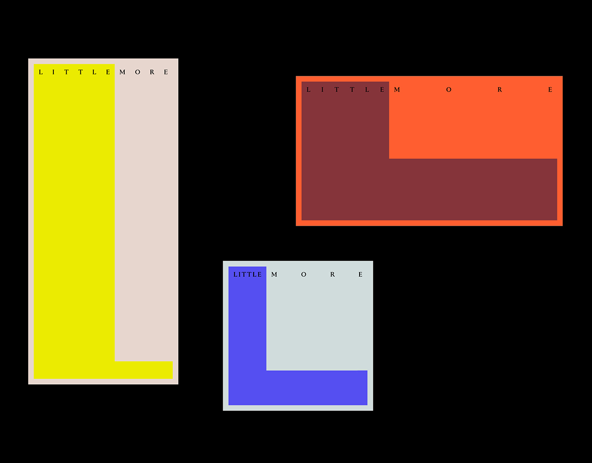
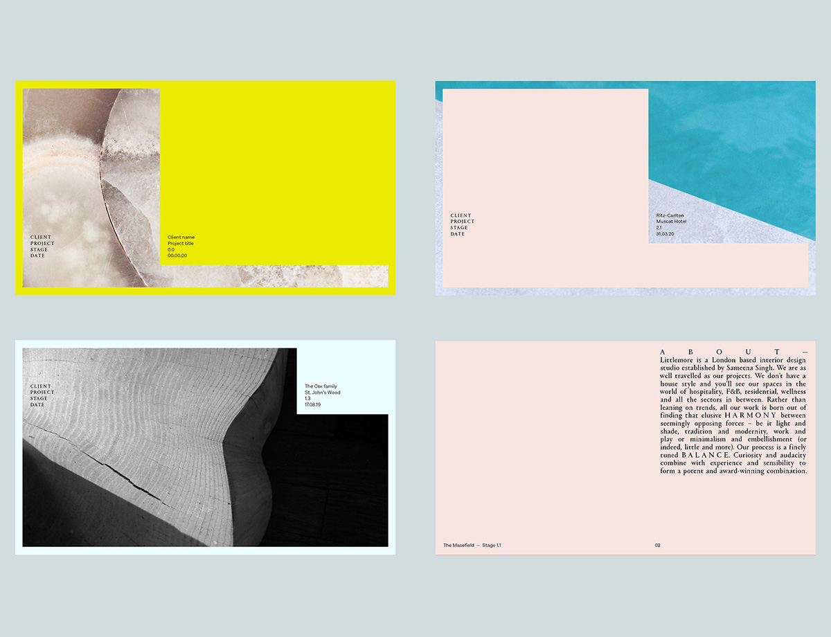
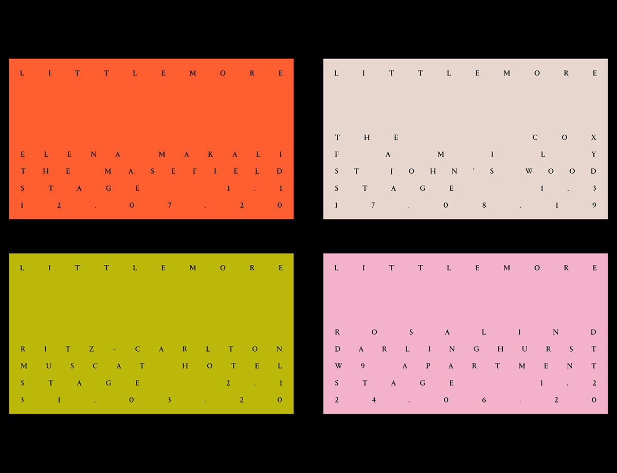
Littlemore by dutchscot
London-based design studio DutchScot have produced an ultra-considered and charming visual identity system for Sameena Singh’s London-based interior design studio Littlemore, referencing her efforts to find a harmony between opposing thematic forces such as tradition, modernity, excess and minimalism. Highlighted through the use of justified, edge-to-edge typographic layouts, DutchScot’s work distills an airy aesthetic, a featherweight feeling that gives both the audience and Littlemore’s work space to breathe. The hero typeface is Commercial Type’s Portrait, a stern but simultaneously animated typeface that adds tradition and sophistication to contrast the arrestingly contemporary application of shape, color, and motion at the core of the identity. The shapes in question take the flexible form of Littlemore’s ‘L,’ a letter that not only references the studio’s initial but also acts as a grounding device, framing the brand and its content in a dynamic and malleable manner.
Studios
gemma mahoney
Gemma Mahoney is a freelance graphic designer based in Melbourne operating on both a local and international scale. Learning her craft in a wide variety of agencies and design studios before transitioning to working independently, she has not only created visual identities, printed materials, and exhibitions for a global list of clients, but also ventured into type design. Her typefaces are genre-bending and experimental, serving as a place for her own education alongside their creation.