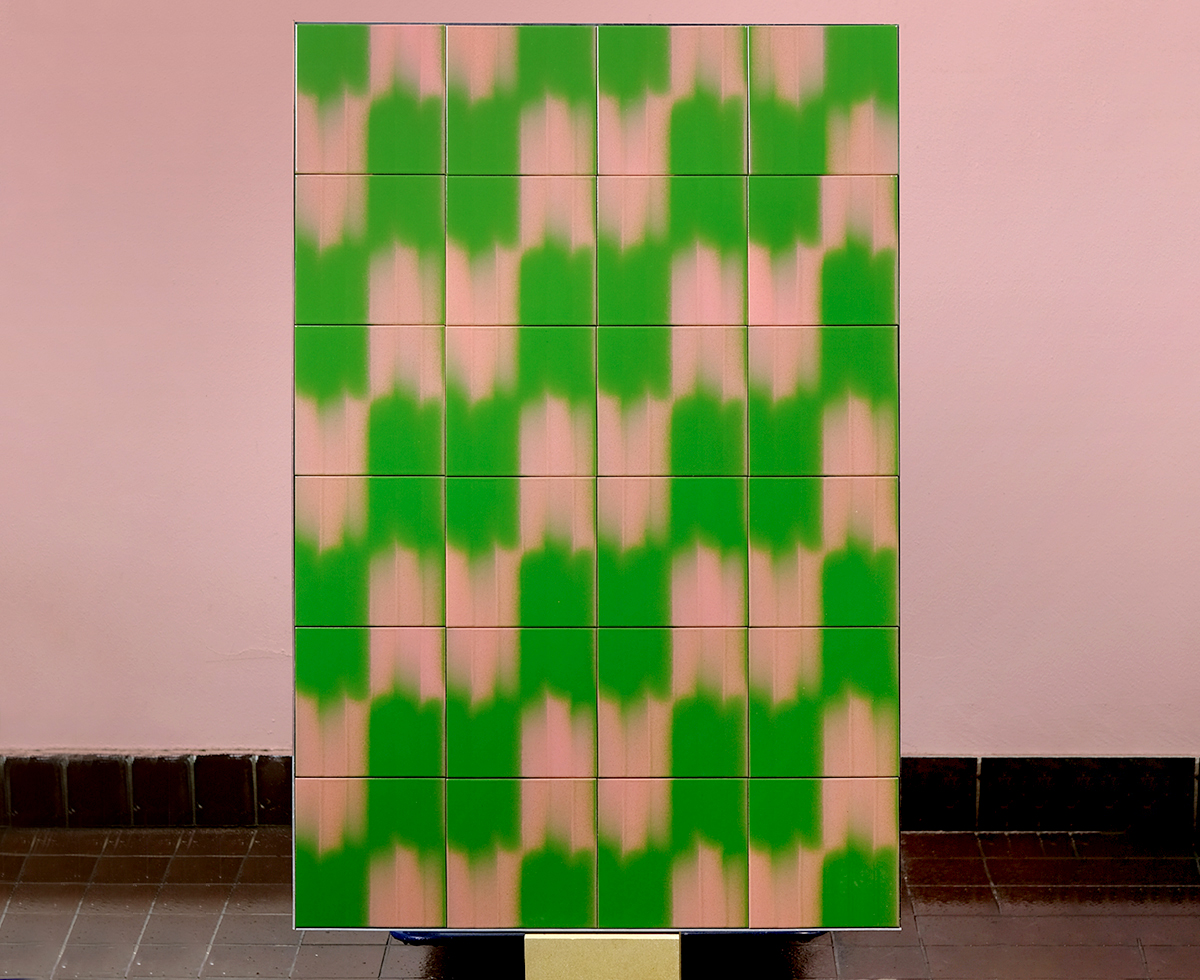
This Graphic Designer–Turned–Cabinetmaker’s Dyed-Wood Furniture is, Well, To Die For

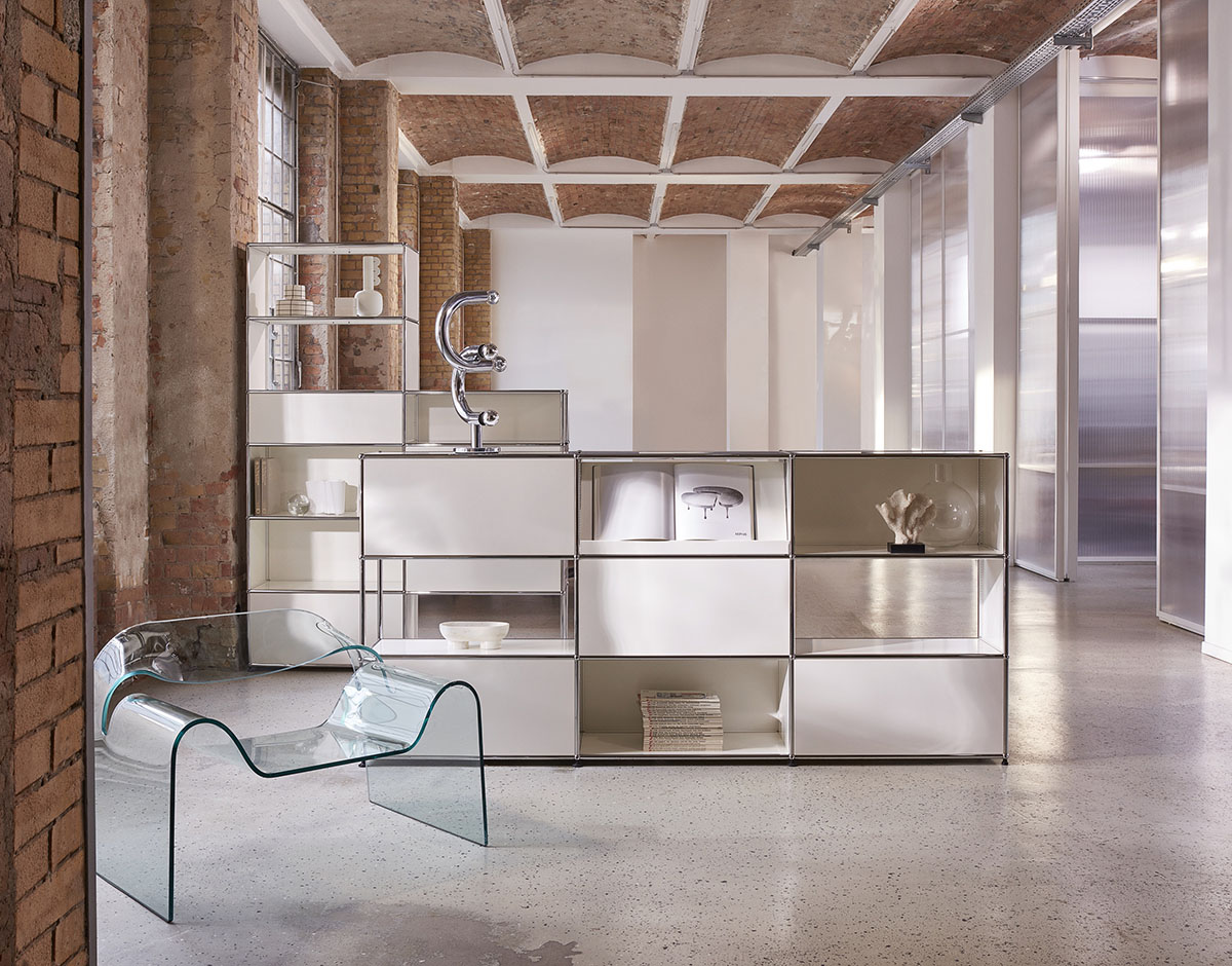
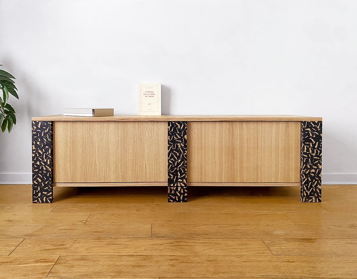
Paris-based designer Jonathan Cohen has been working in wood for only a couple of years. Initially trained as a graphic designer, his eye for flat compositions naturally transferred into the three-dimensional world of furniture, with his creations quickly catching the eye of top architects and designers and local galleries. “When you have knowledge of good proportion, shape, and balance, you can design a letter or furniture,” Cohen says. “For me, it’s almost the same.” What lends the designer's work a certain je ne sais quoi, however, is the unique dye treatment he uses, applied in various techniques to bring out the grain and texture of the wood — forming patterns reminiscent of those created by Memphis artist Nathalie du Pasquier. 
More

Meet Ami Ami, the Boxed Wine Whose Packaging Channels 1920s Italian Futurism

If you came of age, like I did, in the '80s or '90s, boxed wine probably means one thing — and one thing only — to you. But while in the past few years there's been something of an arms race to see who can make the best boxed wine — and turn that ubiquitous Franzia into nothing but a memory — there's only one new contender that tastes delicious and also has the kind of loose, contemporary, slightly kooky vibe that we'd actually want to display on our counters or in the fridge when guests come over: Ami Ami, a new, DTC, minimal-intervention boxed wine whose playful packaging and super-memorable logotype (the dots in the I's and the negative space in the A's are meant to resemble wine glasses) were both designed by the LA- and Montreal-based studio Wedge.
More

Meet the Duo Making Psychedelic-Patterned Ceramic Tiles With a Machine They Built Themselves

Back in 2017, best friends Gilles de Brock and Jaap Giesen decided they wanted to make patterned ceramic tiles. They knew nothing about tiles or ceramics, but driven blindly by passion for the idea, they spent more than three years developing their own CNC glaze-printer — and accommodating its peculiarities within their design process — until they were finally able to launch Studio GdB earlier this year, offering an array of customizable tiles in bold colors that feature a signature psychedelic ombré look.
More

A Surrealist Wine Label, and Other Graphic Design Picks For June

Each month The Brand Identity shares with our readers a selection of the most interesting studios, packaging designs, and branding and identity projects featured recently on their site. This month: an uptown hotel with a new downtown vibe, a Mallorcan yoga studio identity inspired by Joan Miró, and a Surrealist wine label that celebrates the unexpectedness of every vintage (above).
More

A Playful Pét-nat, and Other Graphic Design Picks for July

Each month The Brand Identity shares with our readers a selection of the most interesting studios, packaging designs, and branding and identity projects featured recently on their site. This month: Colorful packaging for a sustainable beauty line, a photographer with a font inspired by the early 1900s, and a playful identity for a Ukranian wine brand (above).
More

A ’70s-Inspired Sunscreen, and Other Graphic Design Picks for June

Each month The Brand Identity shares with our readers a selection of the most interesting studios, packaging designs, and branding and identity projects featured recently on their site. This month: An identity for a Black- and women-owned L.A. bookstore, a quirky custom typeface for a London underwear brand, and colorful, '70s-inspired packaging for a sunscreen brand (above).
More

A New Identity For an Australian Designer, and Other Graphic Design Picks For May

Each month The Brand Identity shares with our readers a selection of the most interesting studios, packaging designs, and branding and identity projects featured recently on their site. This month: culture-driven visuals for a Brooklyn menswear brand, a website for a tribute album to a famed Russian Poet, and a flexible graphic identity for an Australian multi-disciplinary designer (above).
More

A Roberto Burle Marx book, and Other Graphic Design Picks for March

In a new column, each month The Brand Identity will share with our readers a selection of the most interesting studios, packaging designs, and branding and identity projects featured recently on their site. This month: A book on the work of iconic landscape artist Roberto Burle Marx, the design of a favorite Spotify playlist series, an identity for an experimental Australian tea house, and more.
More

Milanese Set Designer Elena Mora Has Perfected the Surreal

If you followed the now-defunct Icon Design Italy in its final few years, you would know exactly who Elena Mora is. The Milanese set designer and interior stylist’s cinematic spreads were always a highlight of the Italian design magazine. Recognizable for her lush use of color and irreverent bordering on surreal scenarios, Mora’s work is always so much more than just a product round-up.
More

Waka Waka Gets a New Identity, and Other Graphic Design Picks for February

In a new column, each month The Brand Identity will share with our readers a selection of the most interesting studios, packaging designs, and branding and identity projects featured recently on their site. This month: New branding for the LA studio Waka Waka, a chic identity for a moving image museum, colorful bottles for a Ukrainian soda line, and more.
More