02.02.21
Graphic Design
Waka Waka Gets a New Identity, and Other Graphic Design Picks for February
Our new Graphic Design column is guest-edited by the team at The Brand Identity, a graphic design resource and publication, as well as the producer of customizable backdrops made for designers to showcase their work. Each month, they’re sharing with our readers a selection of the most interesting studios, packaging designs, and branding and identity projects featured recently on their site. This month: New branding for the LA studio Waka Waka, a chic identity for a moving image museum, colorful bottles for a Ukrainian soda line, and more.
Projects
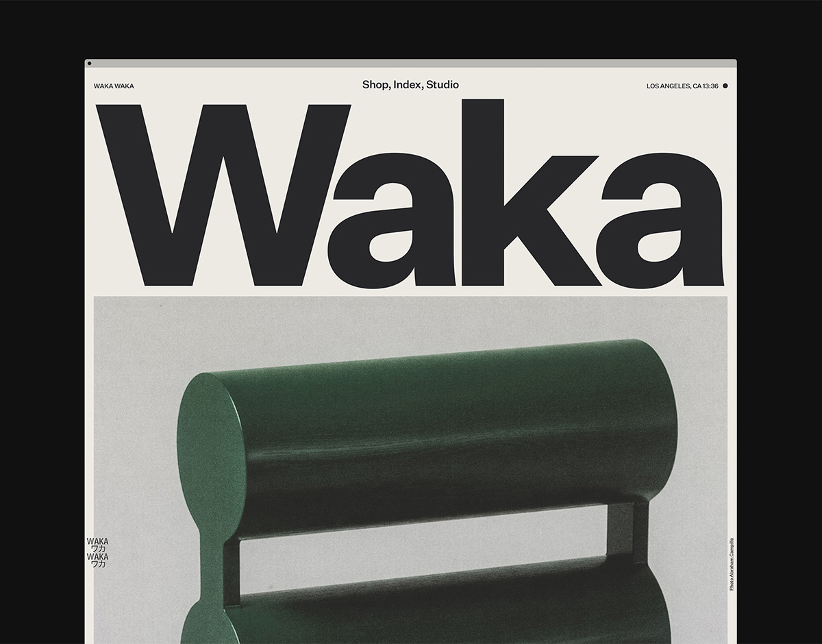
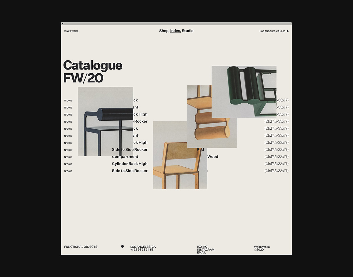
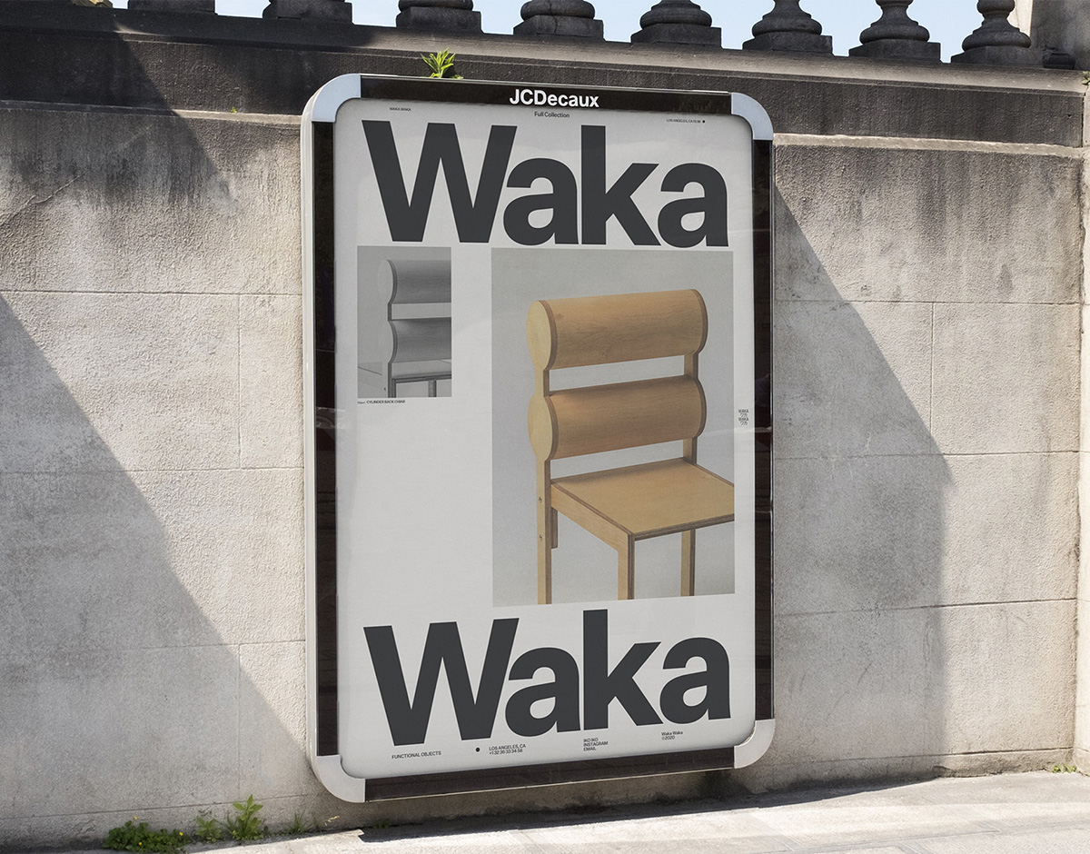
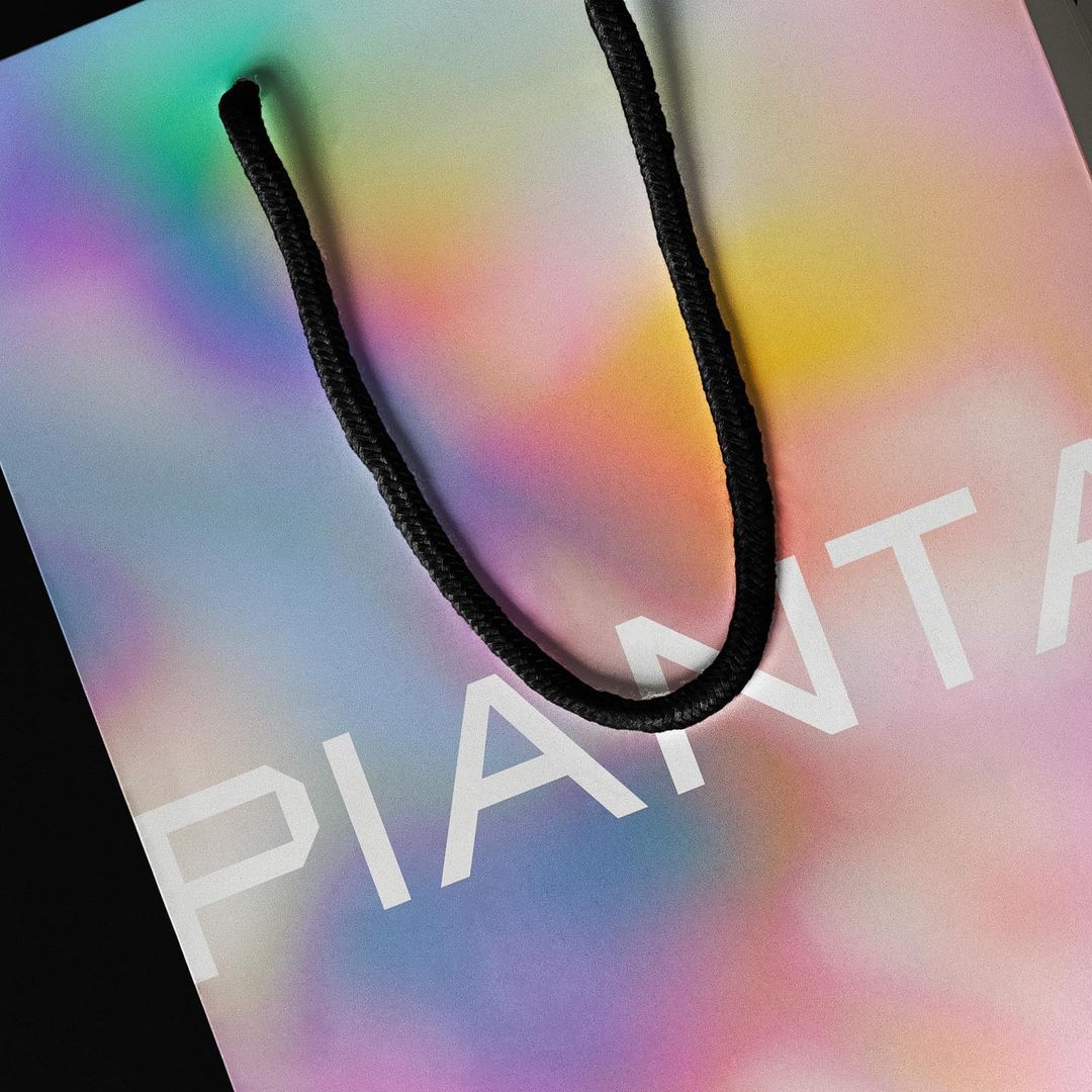
WAKA WAKA identity — MOUTHWASH STUDIO
Operating under the name Waka Waka, Los Angeles-based Japanese designer Shin Okuda demonstrates simplicity in form, subtle detailing, and a unique interpretation of proportion through the production of seating concepts, utilitarian objects, and interiors. Looking for a visual identity in line with his work, Okuda tasked L.A.’s MOUTHWASH Studio with creating a functional yet playful e-commerce experience to house his full range of products.
With its muted colors, contemporary typography, and fluid transitions, the resulting identity represents an unusual combination of past and present. “A lot of the graphic solutions we came up with were inspired by print media, which when we transitioned over to the web, created a unique contrast between the two mediums,” says MOUTHWASH’s Ben Mingo.
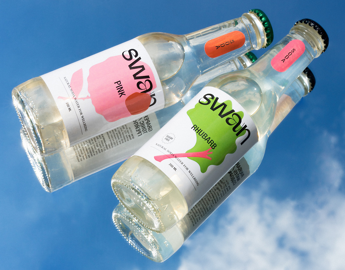
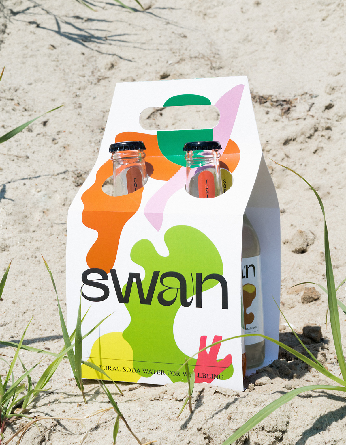
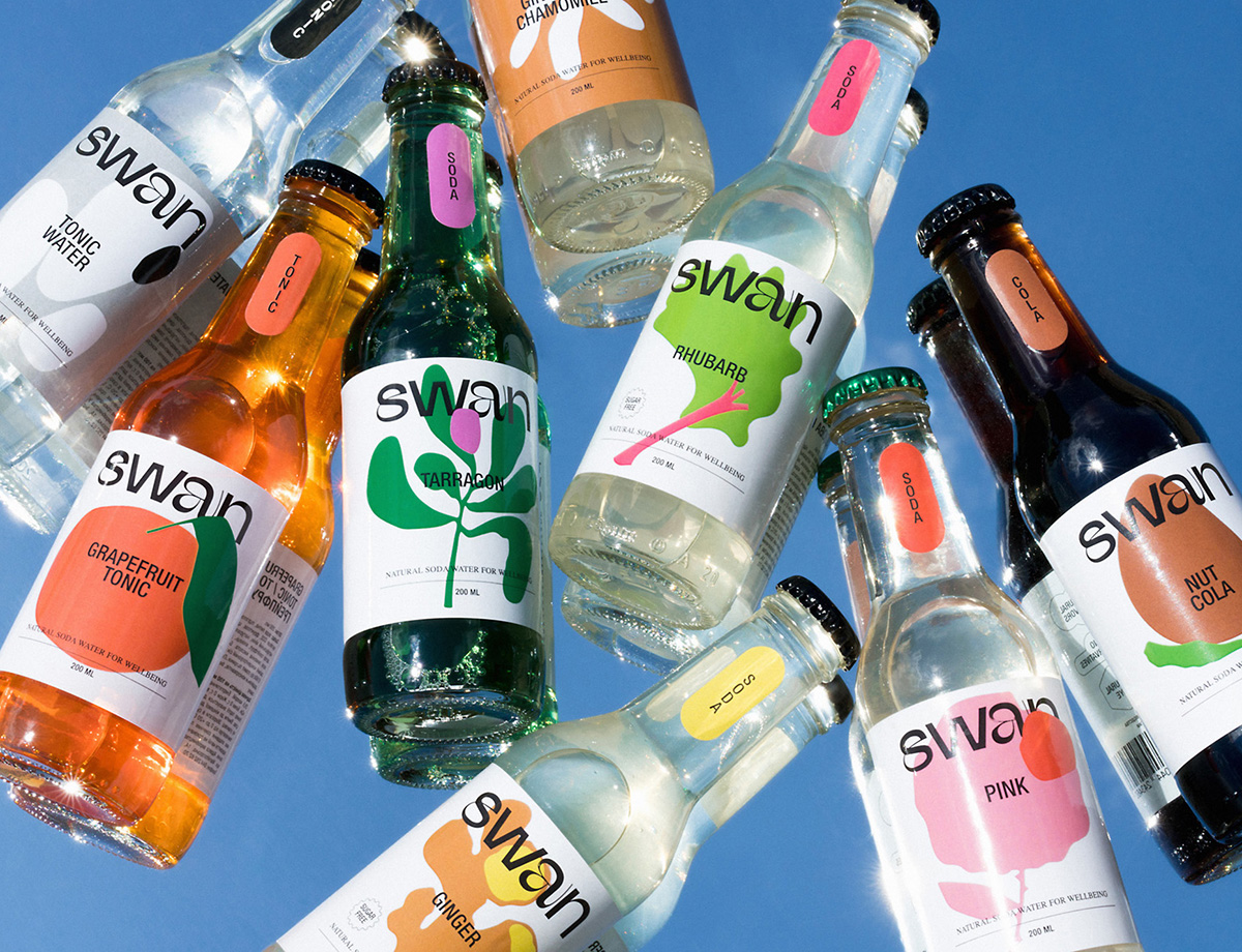
Swan sodas — ORCHIDEA
Swan produces sugar-free soda water in a range of flavors, from nut cola to grapefruit, made with all-natural ingredients and dyes. Created by Artem Lebed, the company was inspired by a childhood memory in which his sister found herself in trouble after consuming a slew of sugary beverages. Working in close collaboration with Lebed, Kyiv-based agency Orchidea designed Swan’s identity and packaging with a balance between elegance and brutalism in mind. The logotype, which is a custom version of Afronout Regular, contains graceful details through the S and A, while wholesome illustrations represent each flavor in an accentuated manner.
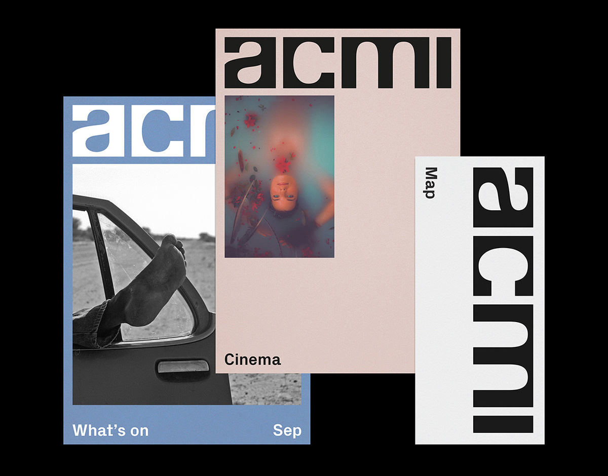
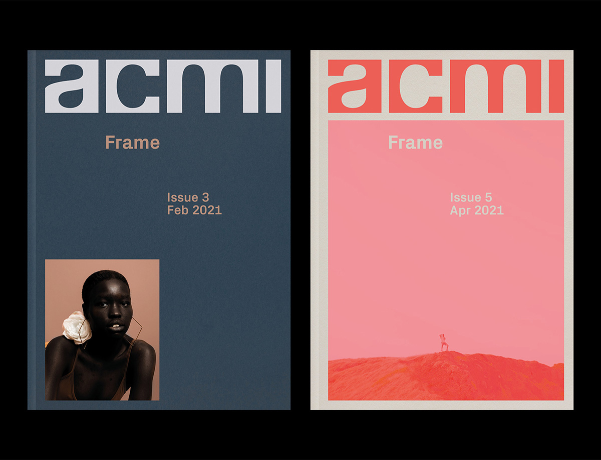
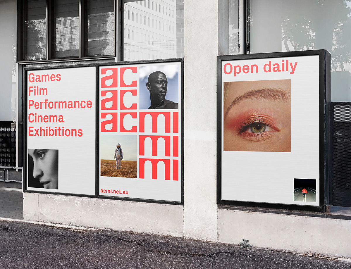
ACMI identity — NORTH
In time for its post-COVID reopening, Melbourne’s ACMI museum of screen culture turned to the London-based design studio North, famous for their work on arts and culture identities, to give it a new life. Influenced by the defined, rigid restrictions of screens, be it a television set or a multiplex cinema, the new wordmark for ACMI is there to make a statement. Rather than standing to the side — in a secondary role to the identity, like many museum brands — ACMI’s logo is bold and to be noticed. Jonathan Leonard, designer at North, explains how this registers a shift in how the museum now approaches its identity, as “the strong geometry of the logo enables it to become part of the creative content, rather than reside in the corners of the format.”
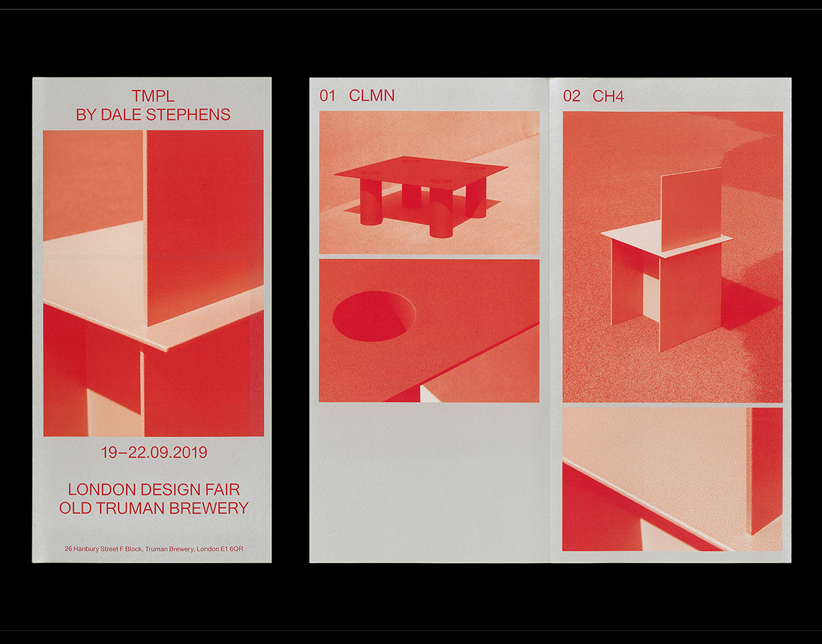
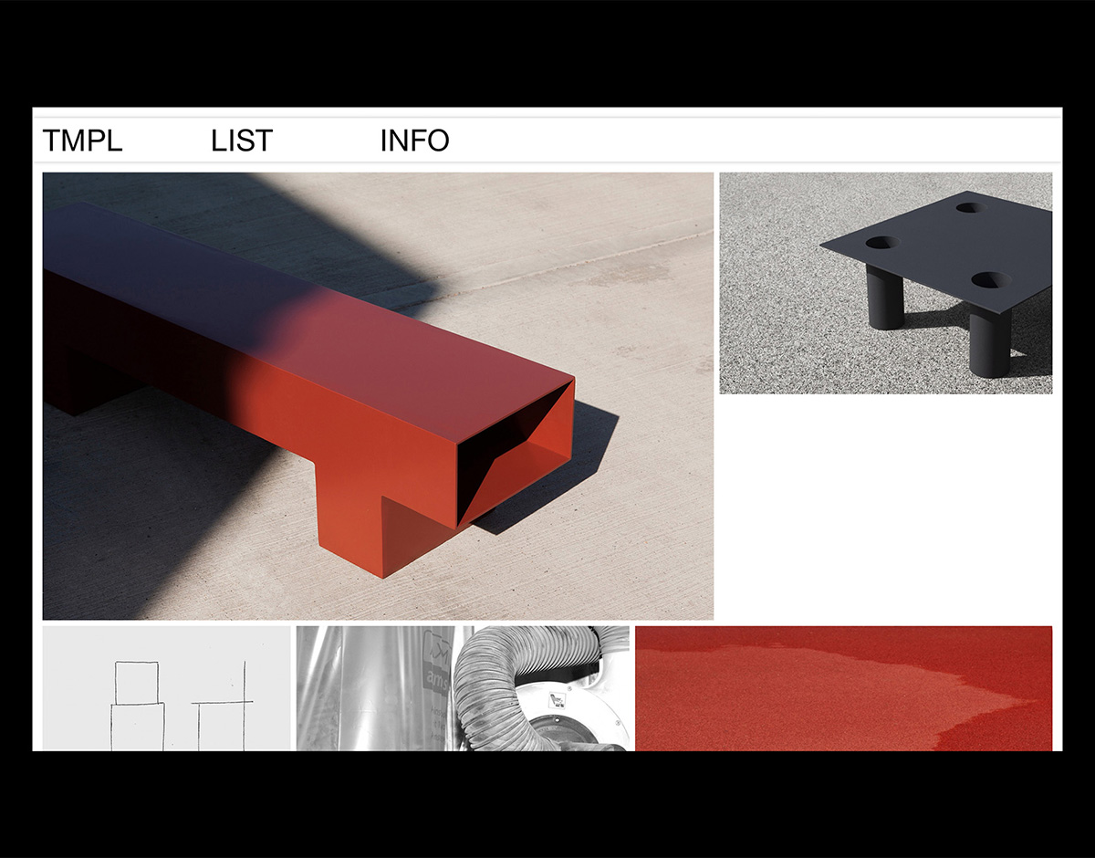
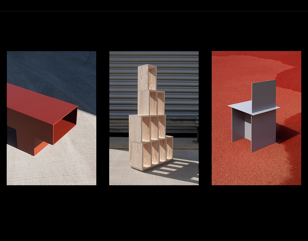
TMPL Brochure — STUDIO FAX
Founded in 2018 by designer and maker Dale Stephens, London-based design studio TMPL creates high-quality objects with a forward-thinking aesthetic. The studio’s visual identity, which was developed by local design practice Studio FAX, comes to life on an elegant two-color, eight-page leaflet created specifically for TMPL’s appearance at the London Design Fair. Straightforward and clean in layout, the 105mm x 210mm booklet focuses on four of Stephens’ designs, including a coffee table, chair, bench, and shelving unit. “We wanted people not to associate the pieces with a too-specific environment, but rather with something that conveys a similar sensibility to materials, textures and colours,” FAX’s Dario Gracceva explains about the product photography that he art directed alongside photographer Anna Garforth.
Studios
BRUCH — Graz, Austria
Bruch—Idee & Form is an Austrian graphic design studio located in the capital city of Graz. Their work in the fields of visual identity, strategy, editorial design, type design, packaging, and signage for clients around the world has seen them awarded on both a national and international scale. Their work sits in a unique place between distinct unusuality and refined sophistication, no doubt down to their dedication to creating flexible, new, and authentic solutions.
AN OPEN UNDERSTANDING — Amsterdam, Netherlands
Based in Amsterdam, An Open Understanding is the design practice and “creative-thinking company” of British graphic designer James Kirkup. With over 10 years of experience in the industry, Kirkup works with both established brands and start-ups, rejecting a traditional agency style approach in favor of a more fluid and adaptive way of working. His work is characterized by an unapologetic approach to layering, in which he seamlessly marries typography and image together in endlessly playful yet elegant combinations.