04.07.21
Graphic Design
A Norwegian Alcohol-Free Wine Identity, and Other Graphic Design Picks For April
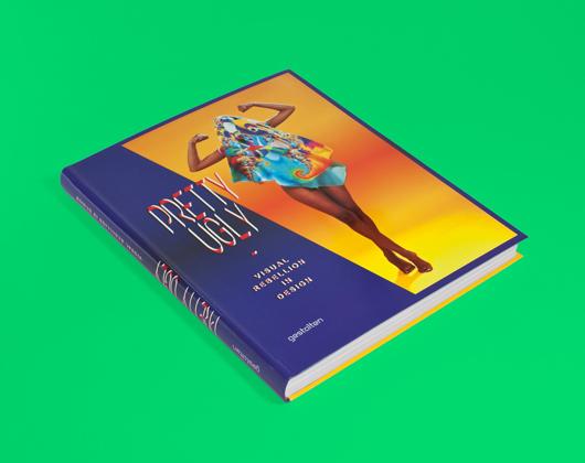
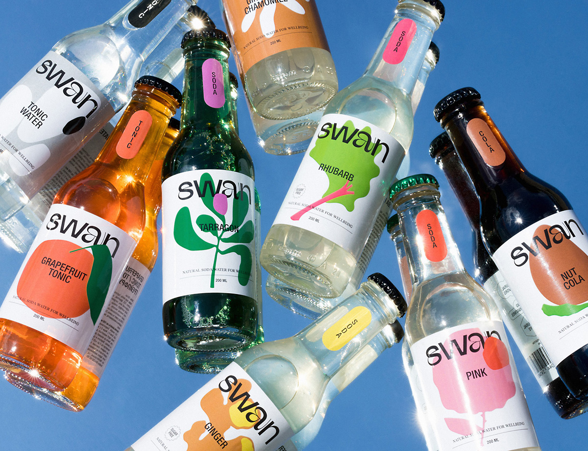
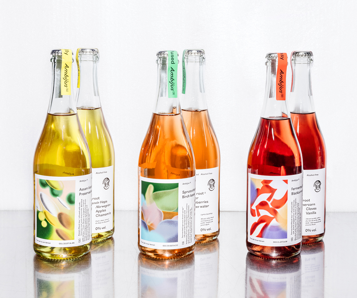
Our new Graphic Design column is guest-edited by the team at The Brand Identity, a graphic design resource and publication, as well as the producer of customizable backdrops made for designers to showcase their work. Each month, they’re sharing with our readers a selection of the most interesting studios, packaging designs, and branding and identity projects featured recently on their site. This month: Identities for a Mexican CBD line, a Canadian projection-mapping festival, and a Norwegian alcohol-free wine brand (above).
Projects
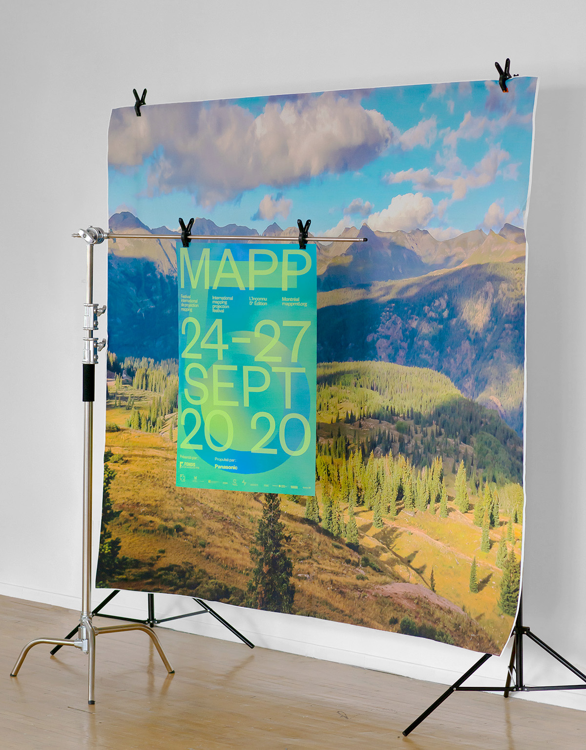
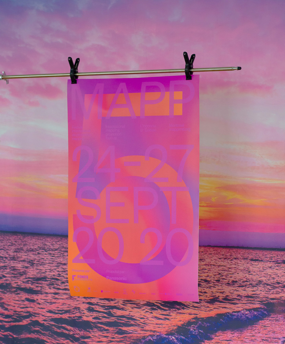
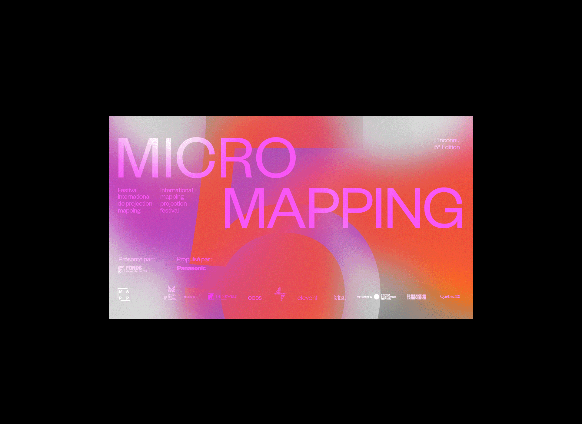
MAPP 2020 — DEMANDE SPECIALE
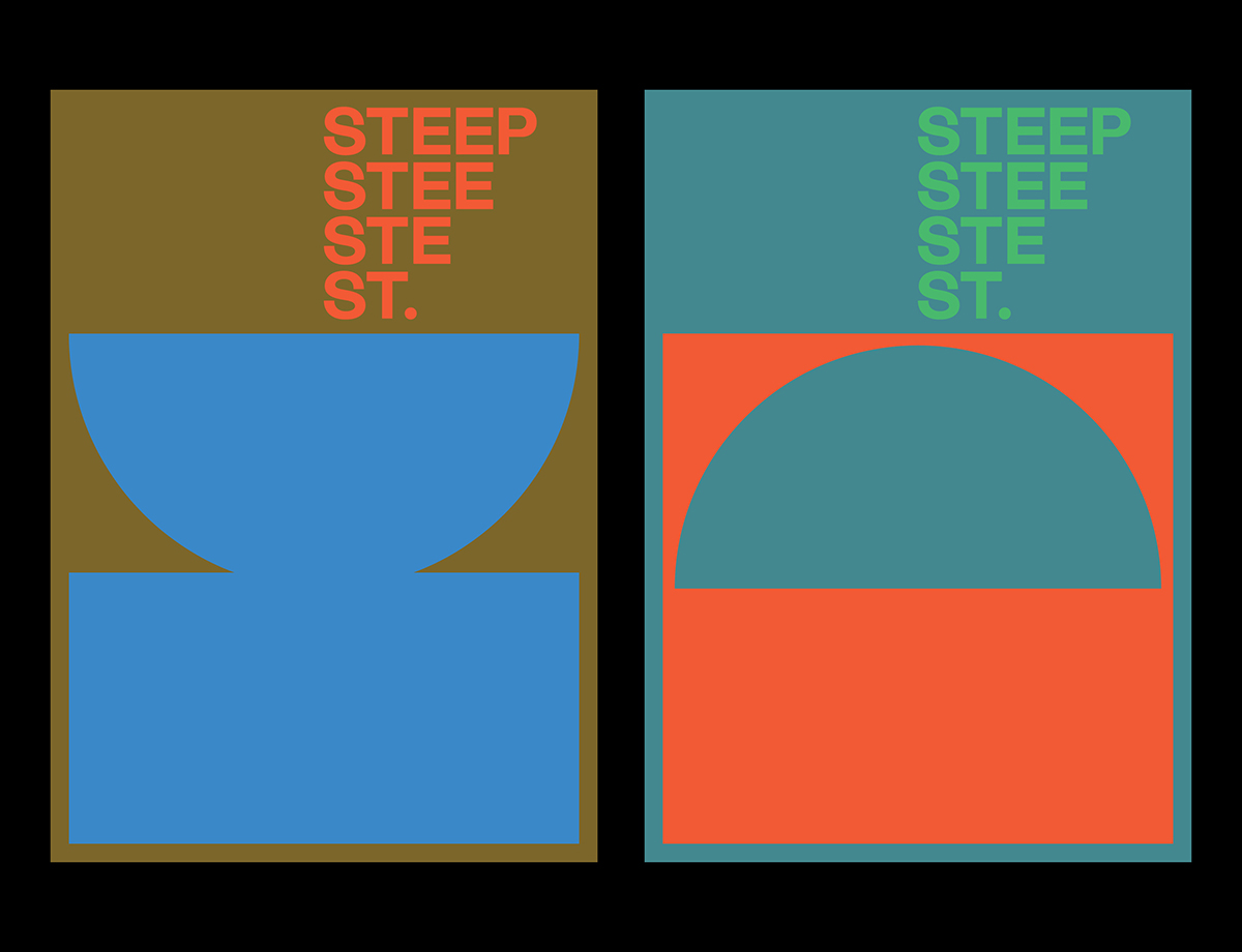
Celebrating its fifth year, MAPP MTL — a yearly festival dedicated to showcasing the art of projection mapping — has once again turned to Montreal-based design studio Demande Spéciale for its campaign. Each year’s festival has a theme, this one being “unknown,” reflecting 2020’s ever-present uncertainty; Demande Spéciale played with gradients and colors to abstractly suggest an uncertainty and vagueness, finding the absence of color as important as its presence. The vibrant and lively palette provides a beautiful contrast to the climate the pandemic has created, with a feeling akin to the warmth of a fire on a winter’s day. This is similarly reflected in Demande Spéciale’s documentation of the posters, photographing them in front of scenic backdrops the likes of which we can only wish to be within right now.
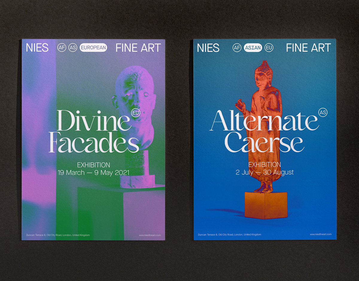
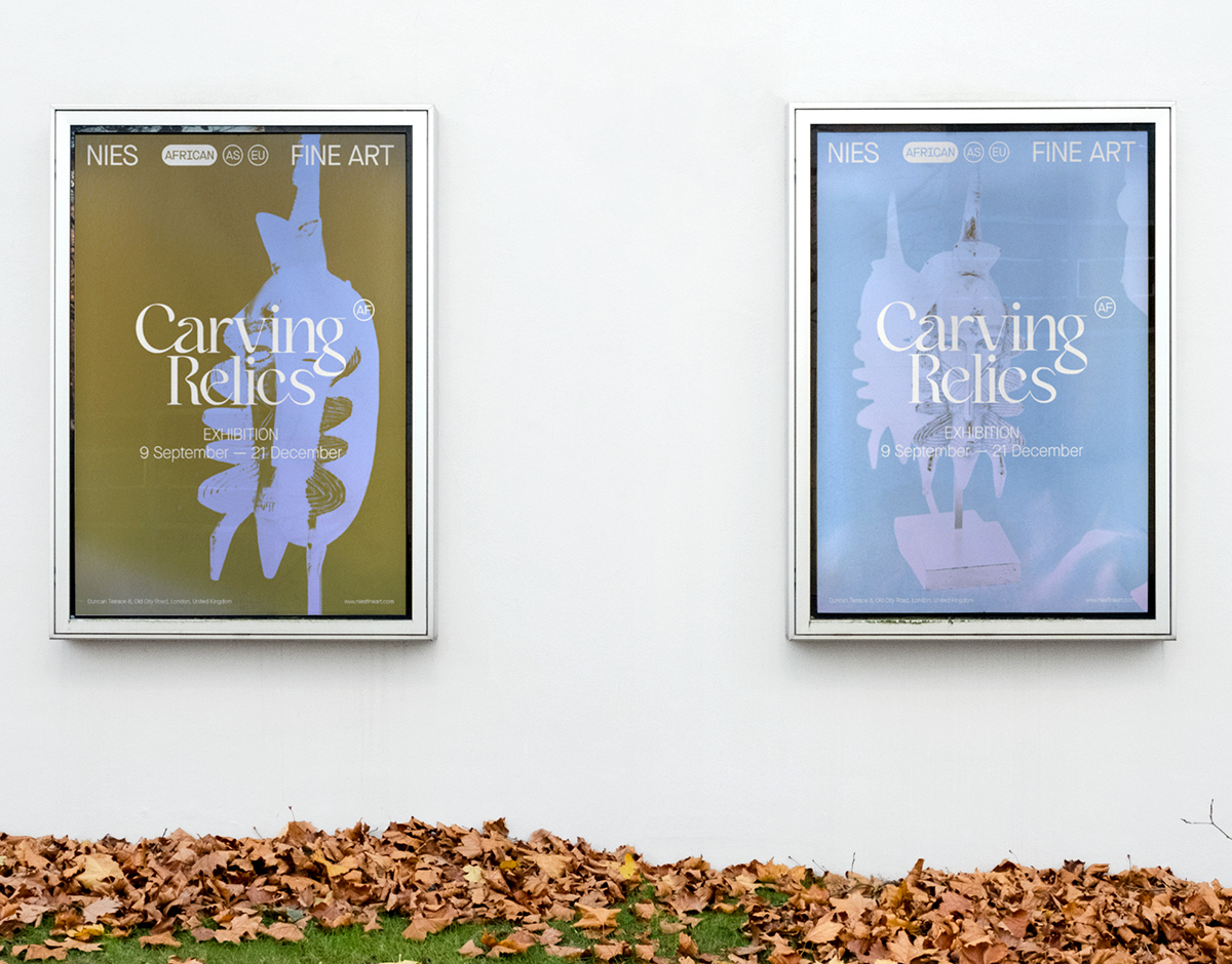
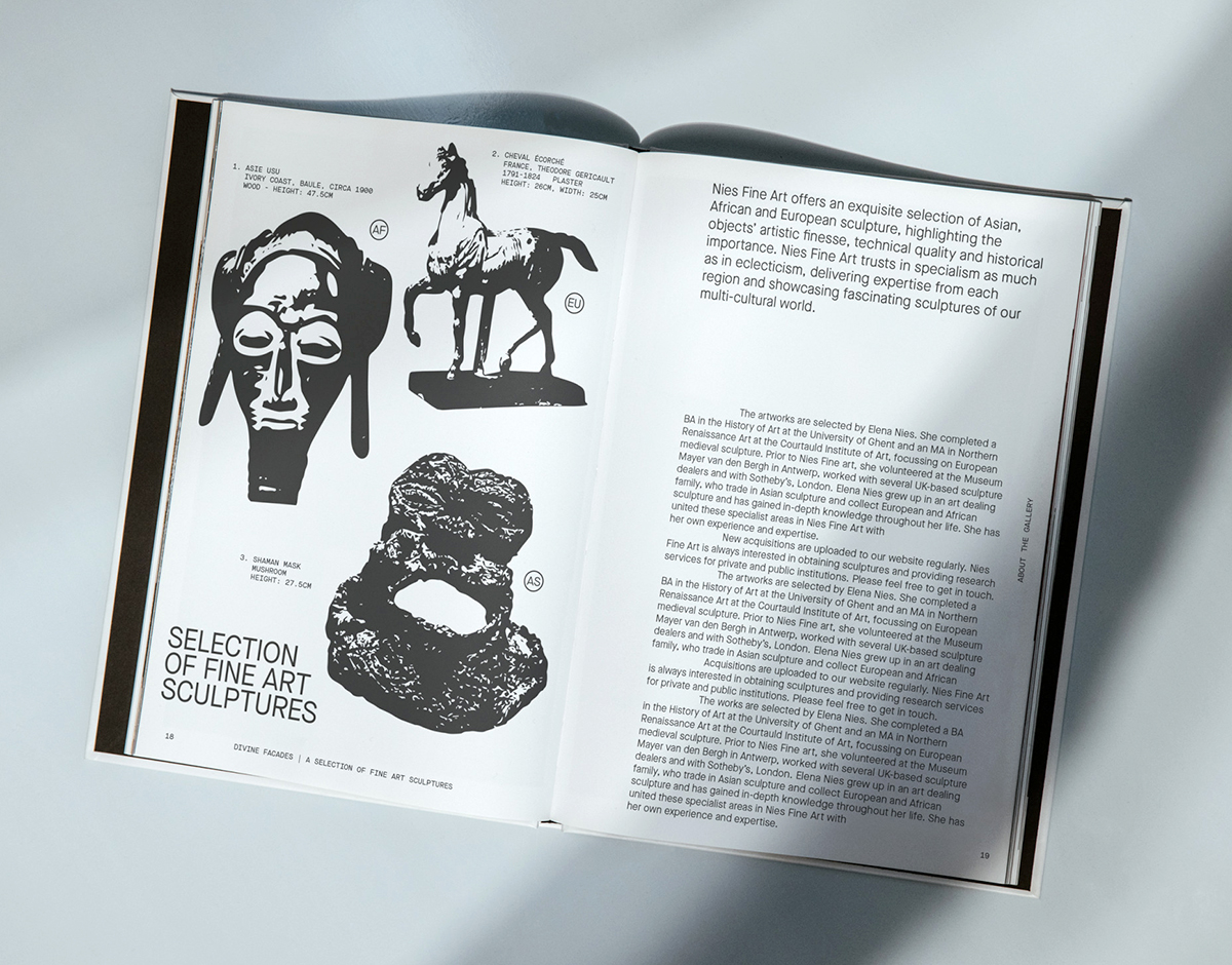
NIES FINE ART — SSNN
Founded by Elena Nies and located in London, Nies Fine Art offers a curated selection of Asian, African, and European sculpture, providing expertise from each region for buyers and paying special attention to the historical importance, technical, and artistic quality of each object. For its identity, Antwerp-based creative agency ssnn devised a modular graphic system that allows the three different origin regions to be seamlessly highlighted. Subtly shifting in relation to each artwork, the identity is suitably supportive while packing considerable typographic punch, combining the fluid curves of Victor Bartis’s Kaftan Serif with the clean lines of Milieu Grotesque’s sans serif Maison Neue.
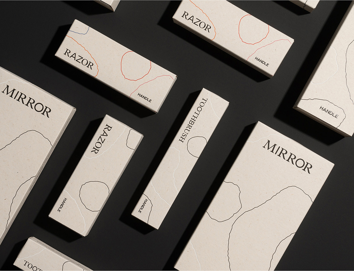
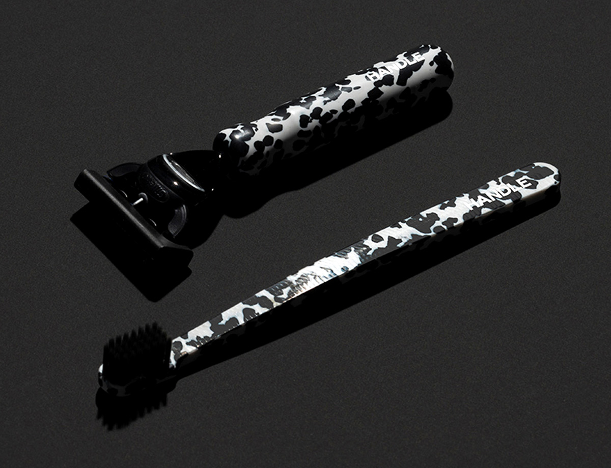
HANDLE — IYA STUDIO
Innovative start-up Handle questions our consumer-driven culture and the inclination we have for disposal: In a unique circular business plan, it uses waste from the beauty industry as its raw materials, collecting an array of plastics from consumers, salons, and retailers and recycling them into handles for its razors, mirrors, and toothbrushes. Brought on from the very beginning, London-based IYA Studio have crafted an equally amalgamated identity that thrives on the unpredictable and captivating textures, forms, and patterns of the brand’s rescued and compressed materials. Tying together IYA’s combination of delicacy and disarray is their notable choice of typefaces, Colophon Foundry’s sans-serif Mabry and the classic serif Plantin, creating an identity that blossoms in the refined and the recycled.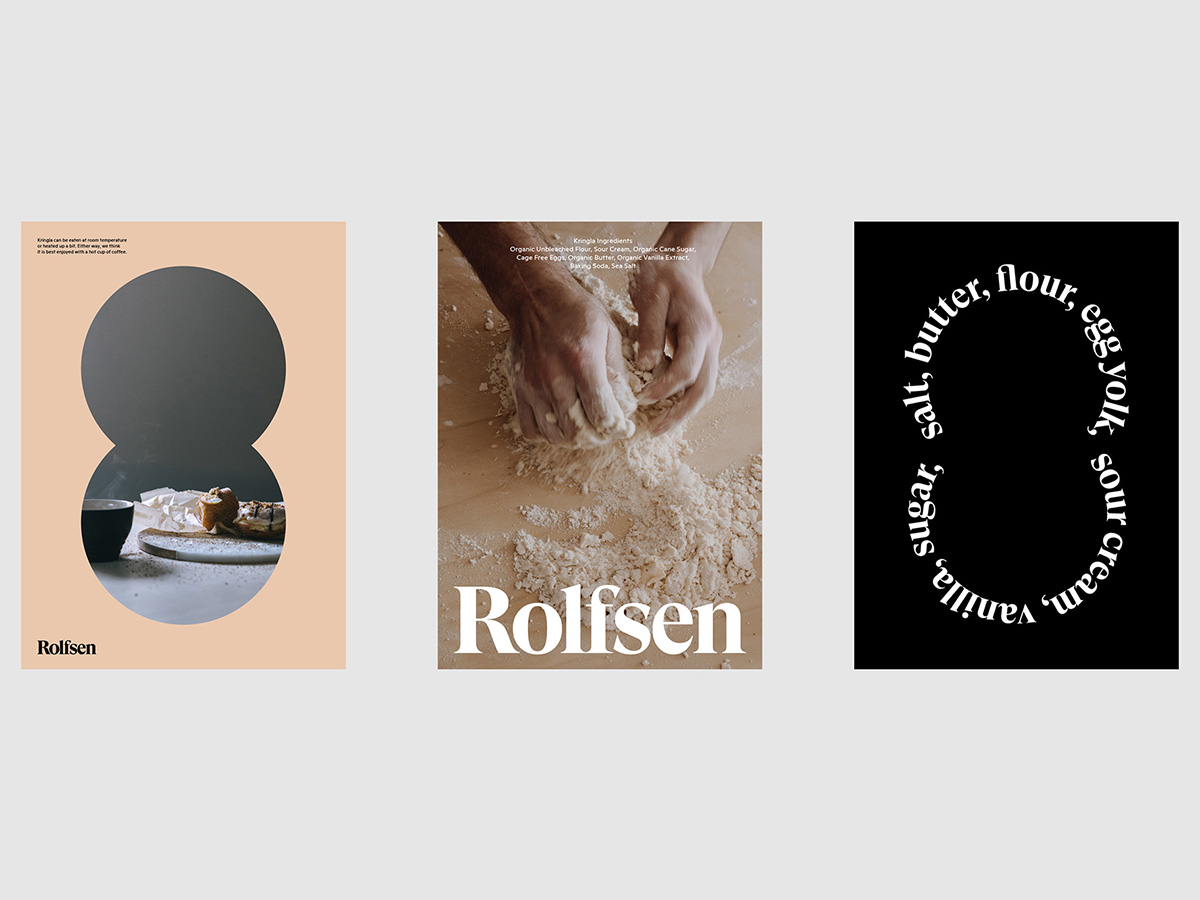
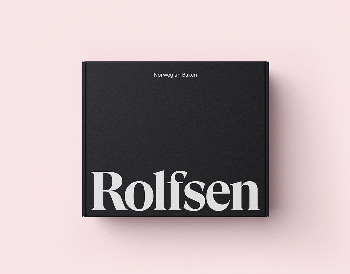
Rolfsen — A LINE Studio
Family-run Norweigan bakery Rolfsen have brought a contemporary twist to their traditional roots with an identity by the London- and San Francisco–based brand strategy and design studio A LINE, while also bringing the Kringla, a pretzel-esque Norweigen pastry, to the shores of the US. With an identity calibrated to highlight the Kringla as its unique selling point, A LINE chose a dream-team of typefaces to draw as much attention as possible to — without detracting from — the baked goods themselves, utilizing GT Super Display Bold and Ginto Regular as their primary and secondary typefaces. “GT Super has a warmth and personality, as well as having the right balance of forward-leaning and timeless that felt spot-on for the brand,” James Trump of A LINE says.
Studios
MONUMENTO STUDIO
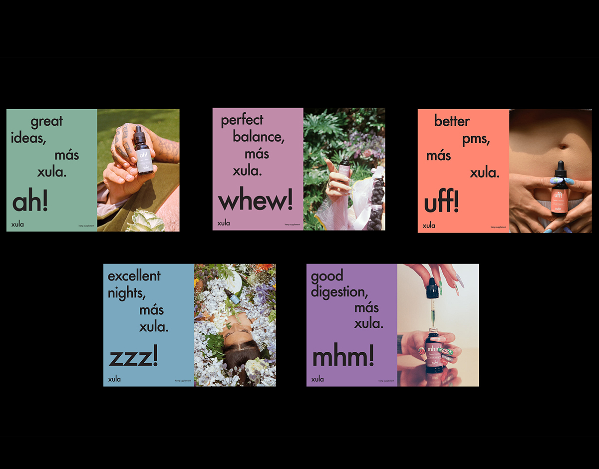
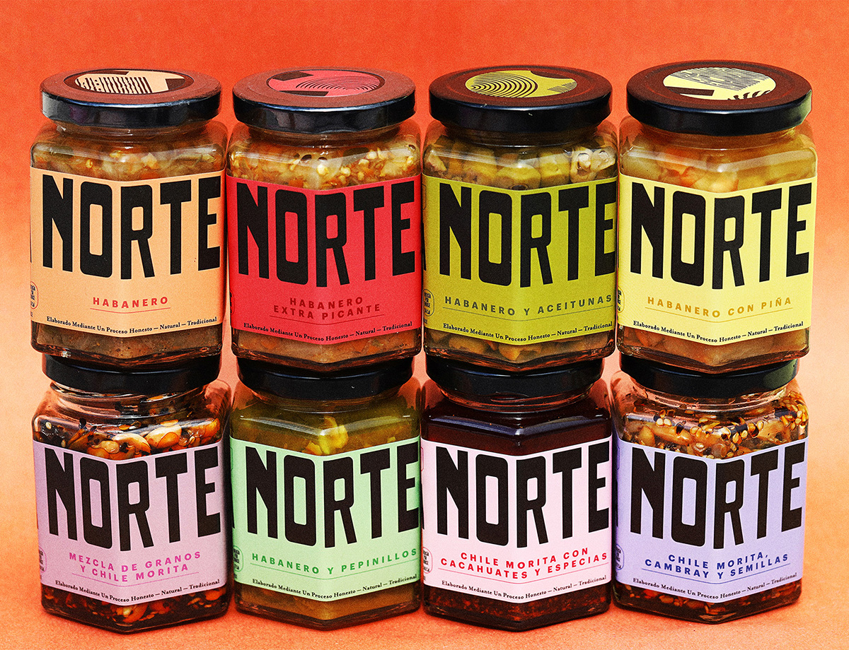
Operating from a “little black house” in the Mexican city of Monterrey, Monumento is a multi-disciplinary creative office and consultancy practice specializing in design-driven projects within the mediums of branding, environment, print, and digital. They work closely with a global network of collaborators to produce work that’s not only beautiful but timeless, functional, and distinctive, instilling a design process built on research and strategic thinking. Their collaborative approach has seen them devise visual identities for companies of all shapes and sizes, from a salsa brand owned by two close friends to Xula, a Mexican CBD brand, to a premium pet store in New York — as well as Materia, their very own concept store for crafts, publications, and objects. 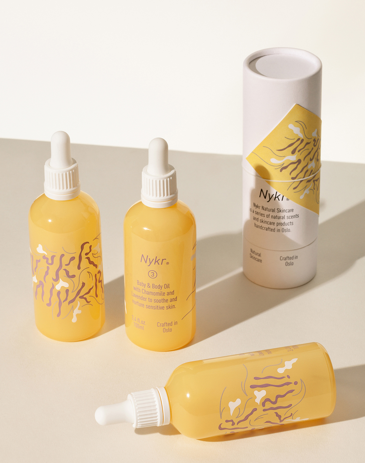
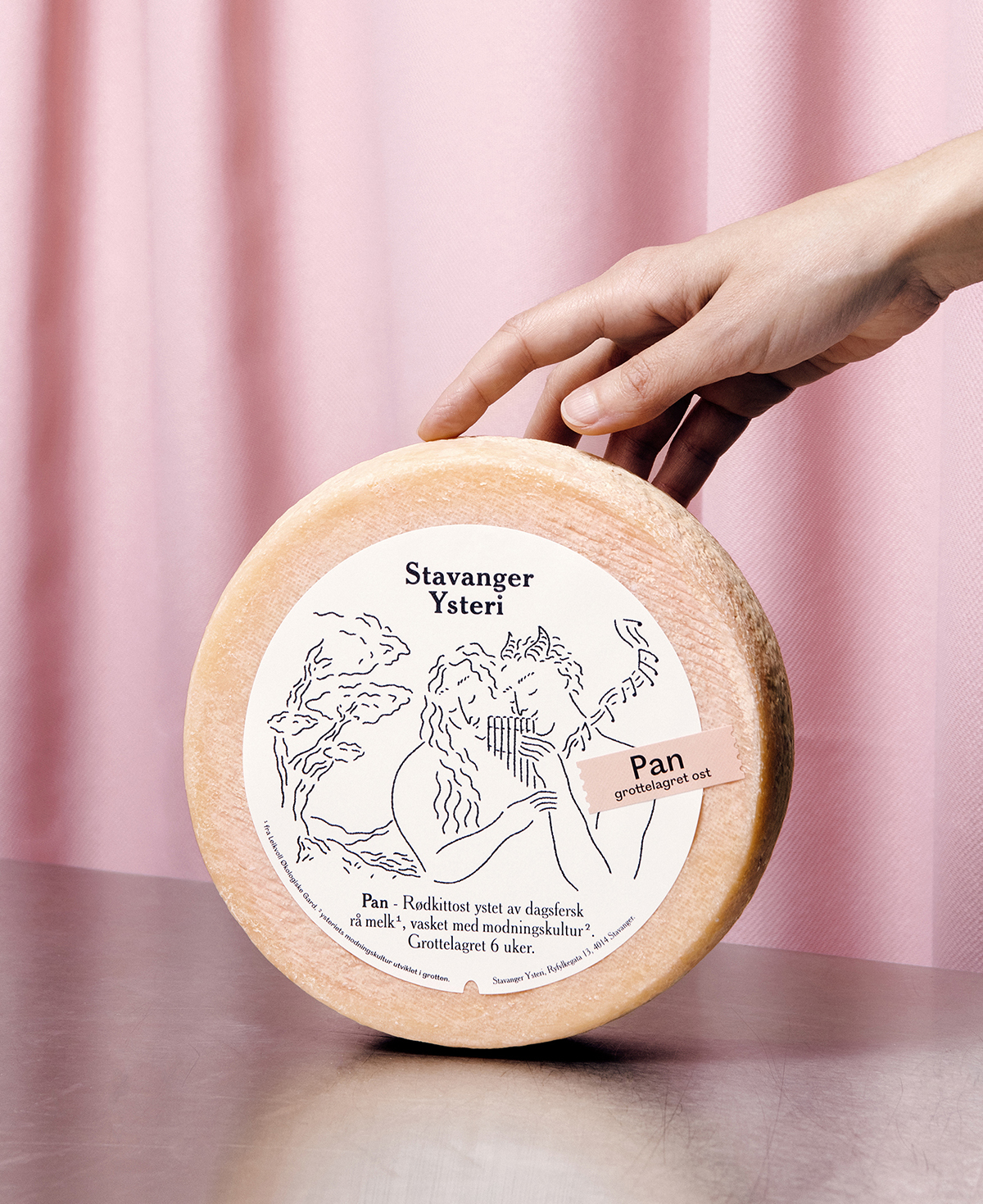
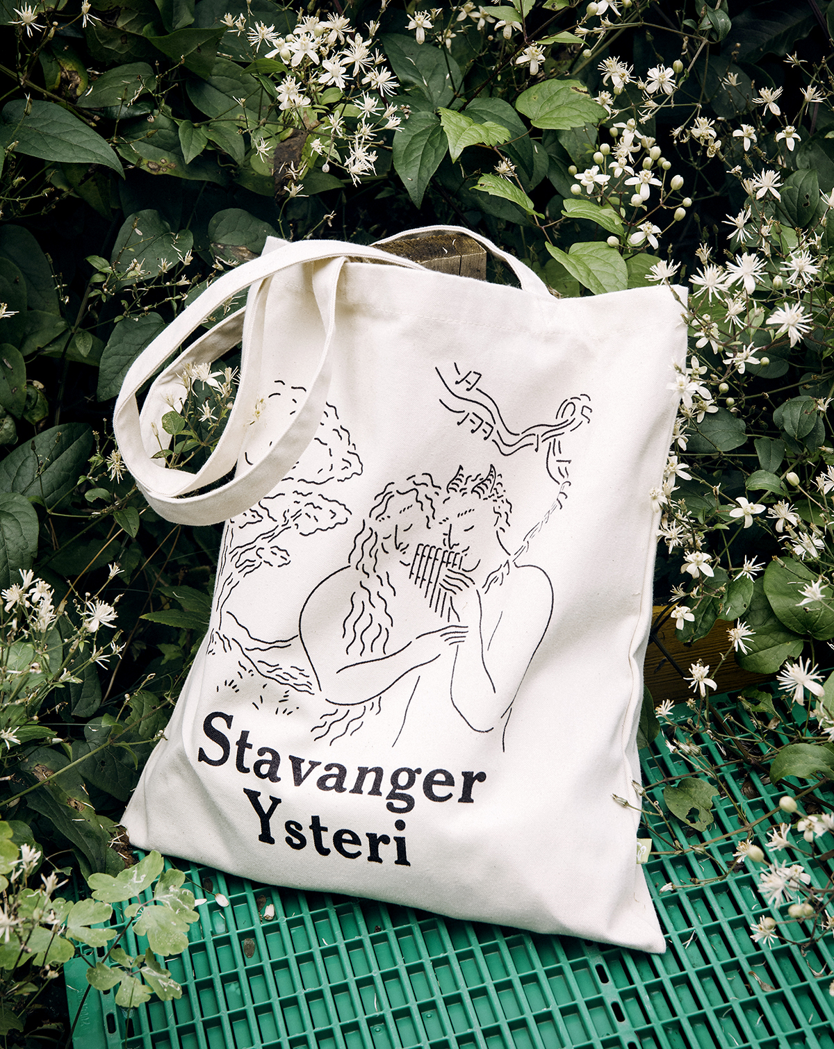
Olssøn Barbieri
Since 2012, Norwegian design studio Olssøn Barbieri have collaborated with small family companies and large corporations, both in Oslo and on a global scale. Through it all, they’ve stayed true to their belief that there is a better way to make products and empower a world of mindful consumers. They hope their work, which never fails to include a delightful combination of typography and illustrations, will help question our society’s relentless addiction to consumption and abuse of resources, and therefore contribute to a positive and purposeful shift.