A Surrealist Wine Label, and Other Graphic Design Picks For June

Each month The Brand Identity shares with our readers a selection of the most interesting studios, packaging designs, and branding and identity projects featured recently on their site. This month: an uptown hotel with a new downtown vibe, a Mallorcan yoga studio identity inspired by Joan Miró, and a Surrealist wine label that celebrates the unexpectedness of every vintage (above).
More

A ’70s-Inspired Sunscreen, and Other Graphic Design Picks for June

Each month The Brand Identity shares with our readers a selection of the most interesting studios, packaging designs, and branding and identity projects featured recently on their site. This month: An identity for a Black- and women-owned L.A. bookstore, a quirky custom typeface for a London underwear brand, and colorful, '70s-inspired packaging for a sunscreen brand (above).
More

A New Identity For an Australian Designer, and Other Graphic Design Picks For May

Each month The Brand Identity shares with our readers a selection of the most interesting studios, packaging designs, and branding and identity projects featured recently on their site. This month: culture-driven visuals for a Brooklyn menswear brand, a website for a tribute album to a famed Russian Poet, and a flexible graphic identity for an Australian multi-disciplinary designer (above).
More
Japanese Printmaker Kumi Sugai

Japanese Printmaker Kumi Sugai

As anyone familiar with our Pinterest account (or our archive content) is well aware, we kind of have a thing for unearthing vintage gems. So we were pretty psyched when Ryland's internet searching led us to the Japanese painter and printmaker Kumi Sugai, who died in 1996 but whose work remains completely contemporary and relevant today.
More

Week of April 13, 2015

A weekly Saturday recap to share with you our favorite links, discoveries, exhibitions, and more from the past seven days. This week: While the international design community (including Jill and Monica) convened in Milan for the Salone del Mobile, we put Ryland on the case to round up a few of his favorite finds, ranging from the dark, moody objects of Blackman Cruz at Wright (pictured above) to a Technicolor Instagram account involving pool noodles and sneakers.
More

Mike Meiré, Art Director

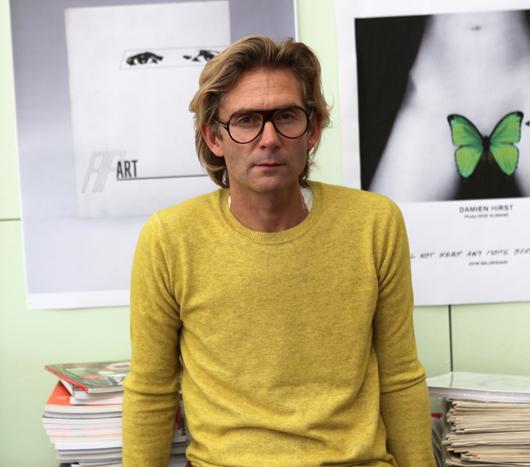
History isn't always kind to guys like Mike Meiré — become the poster child for a rebellious and polarizing creative movement like the "New Ugly," which rocked the graphic design world in 2007 with its stretched typography and defiantly awkward layouts, and you're practically begging for an expiration date. To achieve the kind of unqualified success that Meiré has since he started his career in Cologne 25 years ago demands two basic personal attributes: The ability to talk about even your most controversial work in a straightforward, no-bullshit manner, which helps people believe in what you're doing, and the talent to excel at a diverse range of projects just in case they don't. What you learn from reading interviews with Meiré, or in our case, sitting across from him at a dinner party hosted by Apartamento magazine during the Milan Furniture Fair, is that he's driven far less by the desire to make a statement than by an earnest ambition to offer people products that are different from all the other ones already available to them. You also realize that the same guy who made his name art-directing publications like Brand Eins and 032c — and who most recently helped Russian doyenne Dasha Zhukova launch her latest project, the art and fashion magazine Garage — is just as likely to spend his time hanging pheasants inside modern farmhouse installations for Dornbracht, or collecting and exhibiting street food carts from around the world. In other words, even with the hype surrounding 032c having long abated, and that of Garage conspicuously angling to take its place, we still think Meiré's a fundamentally interesting guy, so we asked him to share some of his favorite tools and inspirations below.
More

A to B at Toronto’s MKG127

There’s no object too mundane to catch Micah Lexier’s eye. He collects scraps torn off cardboard boxes, envelopes and papers lying in the street, even bathroom-cleaning checklists at restaurants — anything that deals with the passage of time or with systems, the driving forces behind his own work as an artist. “I love garbage day,” he says. “It’s hard for me to walk home and not find things. I keep a knife in my pocket just in case.” It’s not that Lexier necessarily uses these found items in his own pieces, like the 1994 series in which he photographed 75 men from age 1 to 75, all of whom were named David. They’re just another part of his lifelong fascination with the aesthetics of order, a way of seeing the world that was mapped out perfectly in the show he recently curated at Toronto’s MKG127 gallery, where curiosities from his collection sat alongside sequentially themed works by other artists.
More