There’s no object too mundane to catch Micah Lexier’s eye. He collects scraps torn off cardboard boxes, envelopes and papers lying in the street, even bathroom-cleaning checklists at restaurants — anything that deals with the passage of time or with systems, the driving forces behind his own work as an artist. “I love garbage day,” he says. “It’s hard for me to walk home and not find things. I keep a knife in my pocket just in case.” It’s not that Lexier necessarily uses these found items in his own pieces, like the 1994 series in which he photographed 75 men from age 1 to 75, all of whom were named David, and then photographed them again ten years later. They’re just another part of his lifelong fascination with the aesthetics of order, a way of seeing the world that was mapped out perfectly in the show he recently curated at Toronto’s MKG127 gallery, where curiosities from his collection sat alongside sequentially themed works by other artists.
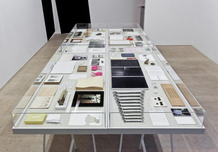
Called A to B, the exhibition — which closed yesterday — included 70 items arranged inside four glass vitrines of Lexier’s design, from a triptych of dot matrix–inspired oil paintings down to a tiny bottle cap he threw in at the last minute. (It came from the floor cleaner he bought to spiff up the gallery pre-show, and featured a 2-step instruction graphic indicating its removal.) Each was chosen for its own unique A to B progression, whether abstract or literal: A series of art postcards designed to be mailed sequentially, a before and after shot of a mortician’s handiwork, a dim sum ordering card, a sign printed in two different languages. “They zing back and forth in surprising ways,” says Lexier, who laid the objects out in ways that often furthered the subtle connections between them. But since there was no gallery guide explaining each item’s provenance, Sight Unseen asked Lexier to revisit the exhibition and describe how and why certain curiosities made the cut. Here are his answers.
A to B, curated by Toronto artist Micah Lexier at the gallery MKG127, consists of more than 70 pieces of art and found ephemera meticulously arranged inside four custom-made vitrines. Even the show opening last month fit the theme: It ran from 1:23 to 4:56 in the afternoon.
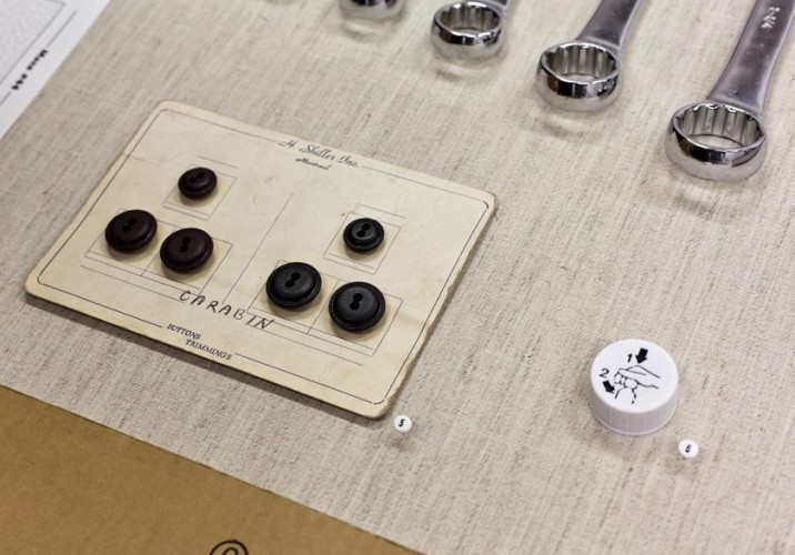
Button sample [L], bottle cap for HG Stain Remover [R]: “I saw this card of buttons and liked that it has three brown and three blue,” says Lexier. “So the A to B is both the color of the buttons and also the size. I like sets within sets.” The cap at right was added to the show at the very last minute. “I bought a product to clean the gallery floors with, and the bottle top was so fucking amazing I included it. Instead of A to B, it’s 1 to 2.”
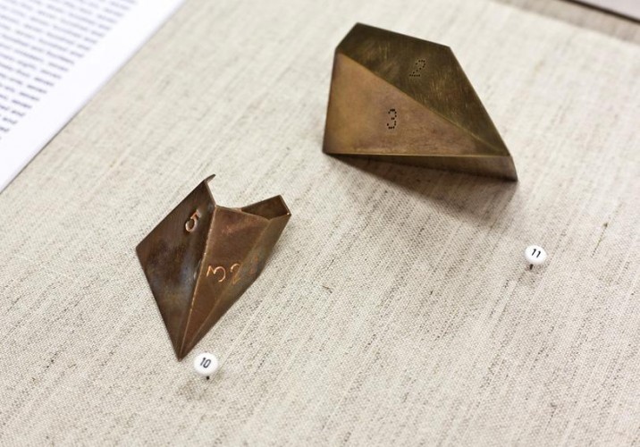
Micah Adams, “Folding Test,” 2007 [L], Micah Adams, “Untitled Prototype,” 2010 [R]: “Micah plays with shapes and forms and enumeration,” says Lexier. “He doesn’t come from the art world so much as from the craft world. I was on the jury at an outdoor art fair when I discovered his inventive, quirky jewelry objects, and then my friend Joy Walker — the curator of the storefront window gallery QueenSpecific — invited him to make a display of glass shelves covered in hundreds of neat little things, some found and some made. One of them was the copper shape on the left.”
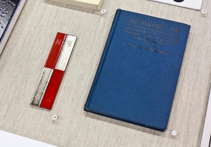
Pair of bar magnets [L], Growing Up: The story of how we become alive, are born and grow up by Karl de Schweinitz, 1930 [R]: “The book has this wonderful title, which I loved just because it represents the ultimate A to B — birth to death. It connects the theme of A to B to our lives. I bought it at this amazing curated bookstore Monkey’s Paw in Toronto, where quite a few of the books in show are from. Most of the time I’ll buy them for the binding or the typeface or the cover and never even look at what’s inside; I bought this one for the cover, specifically for this show.”
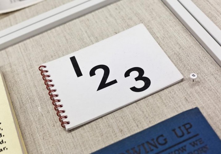
123 by Hanna Little, 2004: “One of my friends works at Type Books, a classic indie bookstore in Toronto, and on certain days of the week this woman Miss Hanna reads stories to kids there in the basement. She’s in her 70s or 80s and lives down the same street. One day I was looking around and sure enough, there was this children’s book Miss Hanna had made and self-published. She probably does it at Kinkos, this little spiral-bound thing with a plastic cover.”
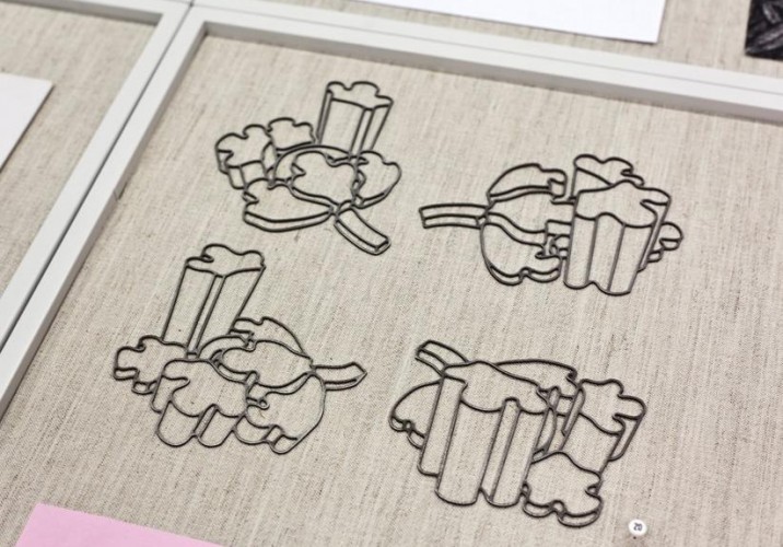
Jeannie Thib, “Complex – Four Views”: Line drawings rendered in waterjet-cut steel, “these relate to Thib’s ongoing body of work, which focuses on generating architectural models from two-dimensional ornament,” says Lexier. “It’s probably an ancient floral pattern, which she first turned into a sculpture made out of thick pieces of metal stacked at various heights. She then photographed one section from four different views and made this new work referencing her own sculpture.”
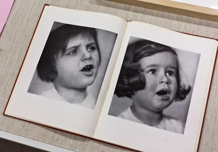
Spread from Mother and Child by Hadda Walther, 1931: “I like how the two images in this spread from a photographer’s book aren’t twins, or a before and after, but just two related images that aren’t actually related. By the cropping and side-by-side placement, there’s a forced connection there. It’s about how A is different from B.”
Toy consisting of five red-painted wood discs with drilled holes: Purchased at the New York store Kiosk, the Disk Game was designed in 1970s Finland “as a way to teach young children coordination skills and size differences,” according to the shop’s website.
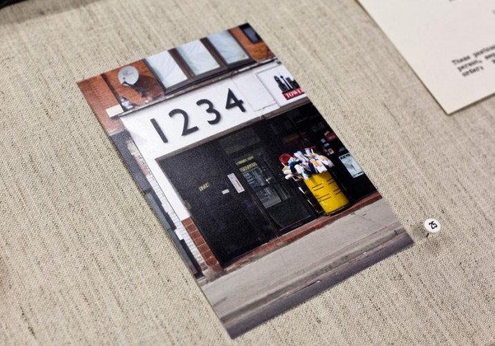
Micah Lexier, photograph of the sign at 1234 Bloor Street West, Toronto: “Well before I did the show, I had waked by this sign numerous times and was always drawn to it. A lot of people know it because Bloor Street West is a big street. I’m not sure what’s in there but it looks like some kind of supply store, with the mops out front.”
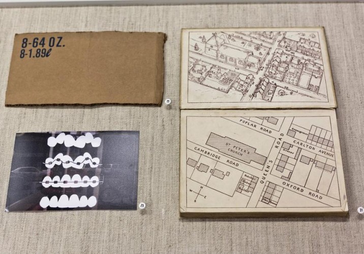
Piece of printed cardboard [upper L], a photograph by Micah Lexier [lower L], endpaper from The Wonderland of Common Things by Rosa E. Jones, 1938 [R]: “The cardboard piece addresses the notion of conversion between different systems of measurement — ounces to liters. The orthodontist’s office in the photograph is very close to 1234 Bloor Street, and its sign depicts the four stages of fixing teeth: crooked, to crooked with braces, to straightened with braces, then straightened without. Isolated from the context of the office, it’s a very beautiful graphic. One of my favorite reasons for collecting books is what’s printed on the endpapers, and this one had a 3/4 view of the extruded buildings on one side, while the other was just the plan. You can lay the plan over the 3-D drawing and they relate exactly.”
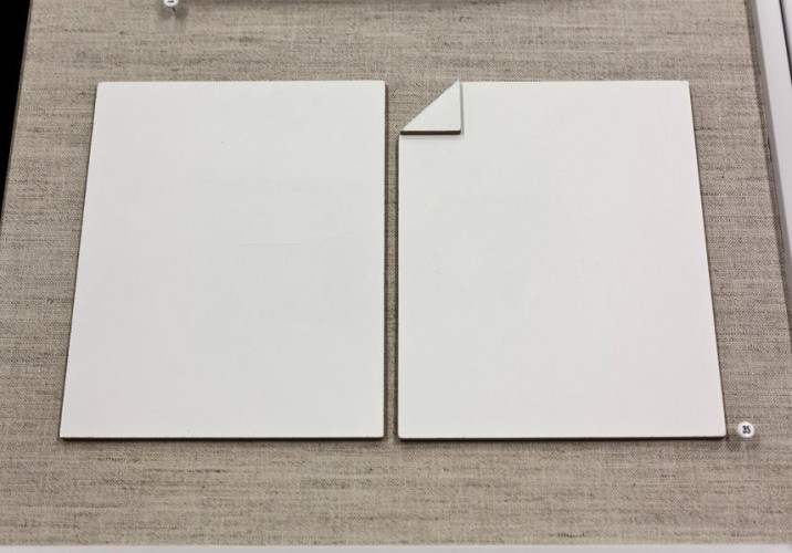
Michael Dumontier, One and Another (With Folded Corner), 2010: “This was made speifically for the show by an artist I really love. It’s a piece of paper made from painted masonite, and the second one has its corner folded. It could be two different pieces of paper, or one in various stages. The sides are painted brown, but if you look at the one that’s folded over, the folded edge is white — he addressed the materiality by painting it to imply it’s a folded edge instead a trimmed one, which is a subtle detail a lot of people miss.”
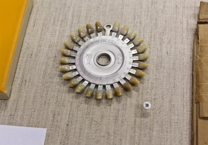
Dentist’s shade guide: “I picked this up at an unusual junk shop in New York’s East Village called Obscura. It’s an old circular shade guide for dentists when they’re giving you replacement teeth, but over the years the chemicals they used to create the various shades have reacted differently to the material, so it’s not a perfect gradation anymore. It echoes the orthodontist’s sign but also the toilets [at the end of this slideshow]: from beaten up to pristine.”
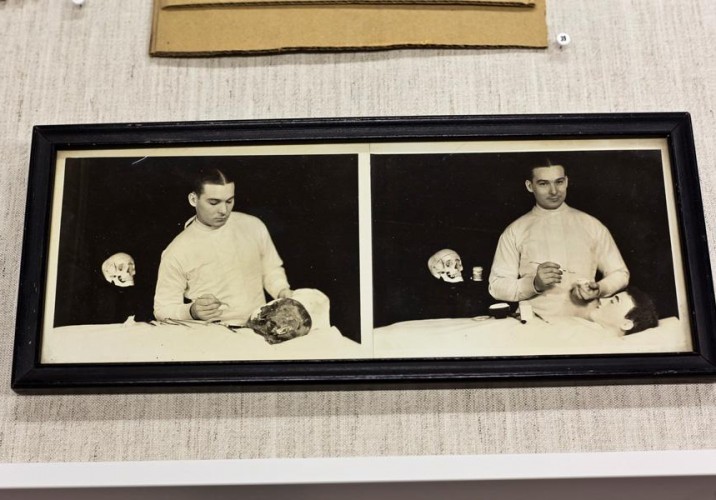
Forensic mortician before and after photographs: “This is also from Obscura. It caught my eye because I wanted an amazing before-and-after for the show. I also love that the mortician is looking down in the first picture at this very decomposed face, and his expression is plain as well. But in the second photo the face has been made up, and the mortician is so proud of his handiwork he’s grinning, so that both faces have actually been transformed.”
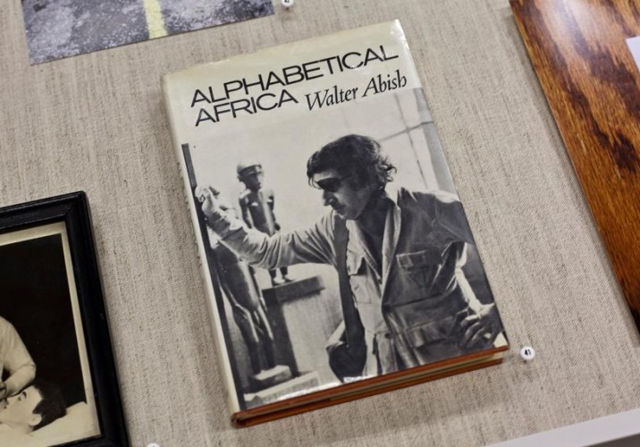
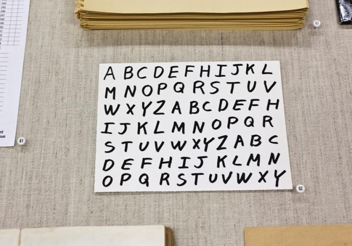
Alphabetical Africa by Water Abish, 1974: “This book is divided into 52 chapters. The first consists of only words that start with the letter A. The second consists of only words that start with the letter A or the letter B. This continues until the 26th chapter, in which any words can be used. Letters start to get eliminated in chapter 28, starting with the letter Z and ending with A. The author is still alive and lives in New York; I contacted him on my last trip there about working on a project together — possibly looking back at an earlier work of his and setting the same problem to contemporary writers.”
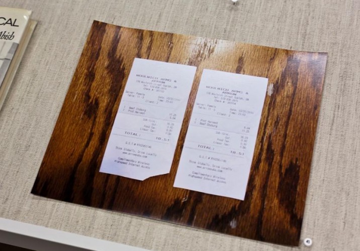
Ryan Park, “What You’re Having (03/31/2010),” 2010: “I was going to put a receipt in the show from the coffee shop I go to in the morning. Every day I have the same thing, and it always comes to $6.70. But another artist showed me these receipt pieces by Ryan, who just graduated from the University of Guelph, and I put them in instead: Whenever he’s out to eat with friends, whatever someone else orders, he’ll order the same thing. If you order a lemonade and grilled cheese, he’ll order it too, then photograph the two receipts on the surface you ate that meal on. It’s fantastic.”
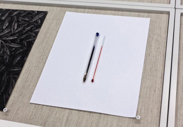
Ingo Gerken, “The Inner and the Outer Condition,” 2009: “Ingo is an artist from Berlin and one of the most talented people I’ve met. He does quirky pen drawings, so I asked if he wanted to send me one. Then in the mail I get this pen and thermometer — he’d found a really nice connection between the two objects. The thermometer is a little smaller than the pen, so they’re not identical, but close enough. And the ink and thermometer level are about the same at room temperature. It comes with hand-drawn instructions showing how to install it: Just tape it to the wall with clear Scotch tape.”
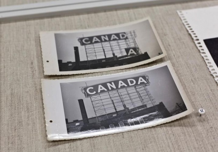
Erecting the Canada Bread sign at Dundas Street West and Bloor Street, Toronto, 1951: “I bought this unidentified photo from a dealer, and it’s two images of either installing or deinstalling the Canada Bread sign. It’s hard to tell if it’s going up or going down, but likely someone was documenting the installation. I don’t know if Canada Bread exists anymore, but it was an old local bakery.”
Greg Curnoe, “‘niin’, Feb 1, 1992 (Ojibwa, Miig Wa Niin),” 1992: “Greg Curnoe is a really important artist from London, Ontario, who passed away tragically in a bicycle accident. This piece is nice because it looks very much like a mirror image, but in fact the ‘n’ is facing forward. It’s just a palindrome. The word is one in a larger series, written in the Ojibwa tribe’s native language.”
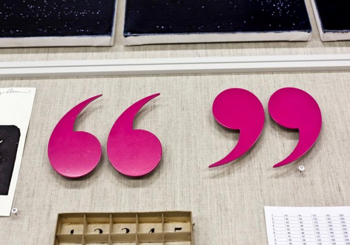
Laurel Woodcock, “untitled (quotation) highlighter pink,” 2005: “These open/close quotes are normally mounted to the wall further apart so that what’s quoted is not stated, but in the context of this vitrine we put them closer together. The artist has a love of language and the forms of punctuation, so she’s made works with check marks and various others. For me it was a formal choice, but the A to B is the beginning of the quote to the end.”
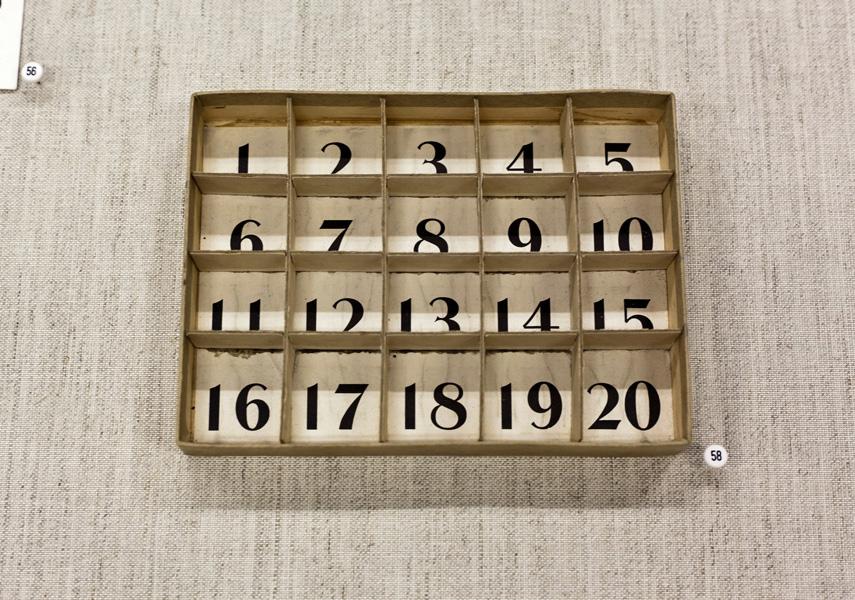
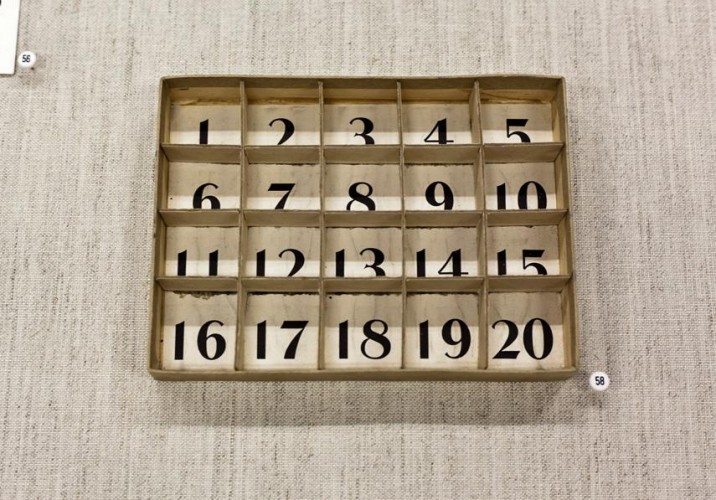
Box divided into twenty compartments: “I think this came from some kind of dentist — there was stuff in each compartment at some point, little remnants of fillings and other things. That’s what I love about objects that have been removed from their original context: There’s a reason why they were made a certain way, but when you take that reason away they’re just decoratively beautiful and unknowable objects.”
Ken Nicol, Counting Squares (Book), ink on existing book: “This is a book of graph paper the artist bought, and he numbered in ink every square inside it — more than 75,000 of them. He likes repetitive exercises and the beauty that can come from them, and what kind of headspace they put you into. For one of his works, ‘The Button I Pressed a Million Times,’ he attached a button to an analog counter and pressed it one million times. Here, each individual square has been attended to, so it’s an object that has this incredible power, this energy from someone having invested all that time into it.”
Michael Buckland, “G,” 2008: “The publisher Art Metropole did a project where each artist was assigned a letter to make a piece around, and they were reproduced in a box set. Michael Buckland’s was the alphabet with the letter G missing. I love how simple it is, and I love his handwriting, and I love how you don’t notice anything’s missing right off the bat. I’m a big fan of handwriting, and of systems, and this is a nice combination of the two. Pen on card — it doesn’t come much simpler than that.”
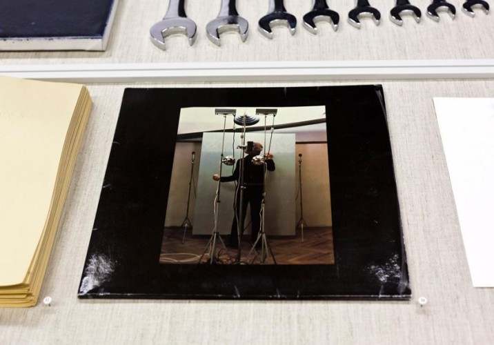
Roman Opalka, 1965/1-∞ record cover, 1977: “Since 1965, Roman Opalka has been counting up from the number one to infinity by painting the numbers in white paint on a grey background. Each time he paints a number, he records his voice saying that number, and at the end of the day he photographs himself standing in front of each painting. This record documents the audio recordings of Opalka reading numbers 1987108 to 2010495 on side one, and 2136352 to 2154452 on side two.”
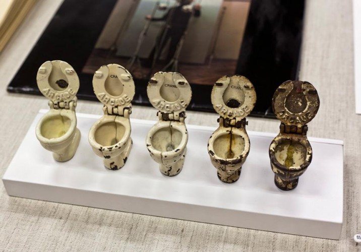
Spring Hurlbut, “Arcade,” 2010: “She’s an artist who works with old found objects, and she bought these on eBay. We think they’re toy toilets for a doll’s house maybe. She found them individually over the years and ordered them by condition, with no alterations, so now it’s an artwork. Because they’re toilets, the mess becomes almost literal even though it’s only a piece of enameled metal that’s chipped.”
Sighted on MoMA's Inside/Out blog: "Many of MoMA’s employees aren’t just guardians of the Museum’s collection: they are artists in their own right, and have found inspiration for their own work through their engagement with artwork shown at MoMA ... This new series of blog posts will focus on a few of MoMA’s many employee/artists, and will address the ways in which they have incorporated their daily work experiences into their own artistic processes."
“I was so dim,” says Greg Krum. It’s a Sunday afternoon, and Krum, best known around New York as retail director of the wonderfully quirky Shop at Cooper-Hewitt, is puttering around the sun-drenched kitchen of a renovated 1890s townhouse he shares with two roommates in Greenpoint, Brooklyn. He’s trying to recall the origins of his other career: that of a photographer about to mount his first solo show this May at New York’s Jen Bekman gallery. “Growing up, I was always attracted to making art, but I didn’t think I could do it because I couldn’t draw. I was like, ‘Okay. That’s out.’ Then I finally realized it’s not about that. It’s about living a life of ideas.”
Is it times of trouble that attract us so keenly to the nostalgia of souvenirs — the snow globes, the ticket stubs, the ubiquitous museum totes? At the end of a chaotic decade, a rash of exhibitions has popped up dedicated to the kitschy takeaways of travel. The largest of these, “The Souvenir Effect,” curated by Òscar Guayabero for Barcelona’s Disseny Hub design museum, opened at the height of Spanish tourist season in July and comes to a close this Sunday.