06.09.21
Graphic Design
A ’70s-Inspired Sunscreen, and Other Graphic Design Picks for June
Our new Graphic Design column is guest-edited by the team at The Brand Identity, a graphic design resource and publication, as well as the producer of customizable backdrops made for designers to showcase their work. Each month, they’re sharing with our readers a selection of the most interesting studios, packaging designs, and branding and identity projects featured recently on their site. This month: An identity for a Black- and women-owned L.A. bookstore, a quirky custom typeface for a London underwear brand, and colorful, ’70s-inspired packaging for a sunscreen brand (above).
Projects
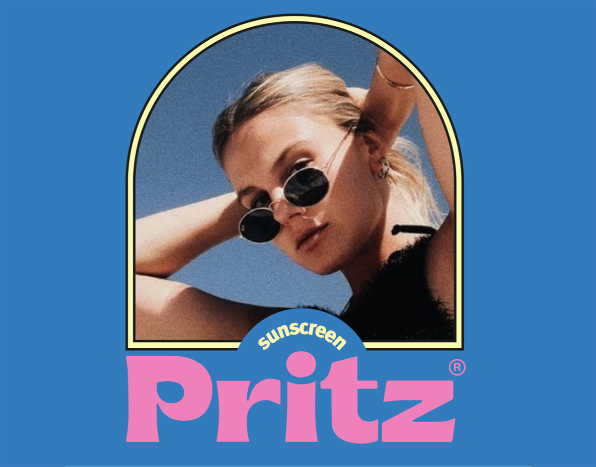
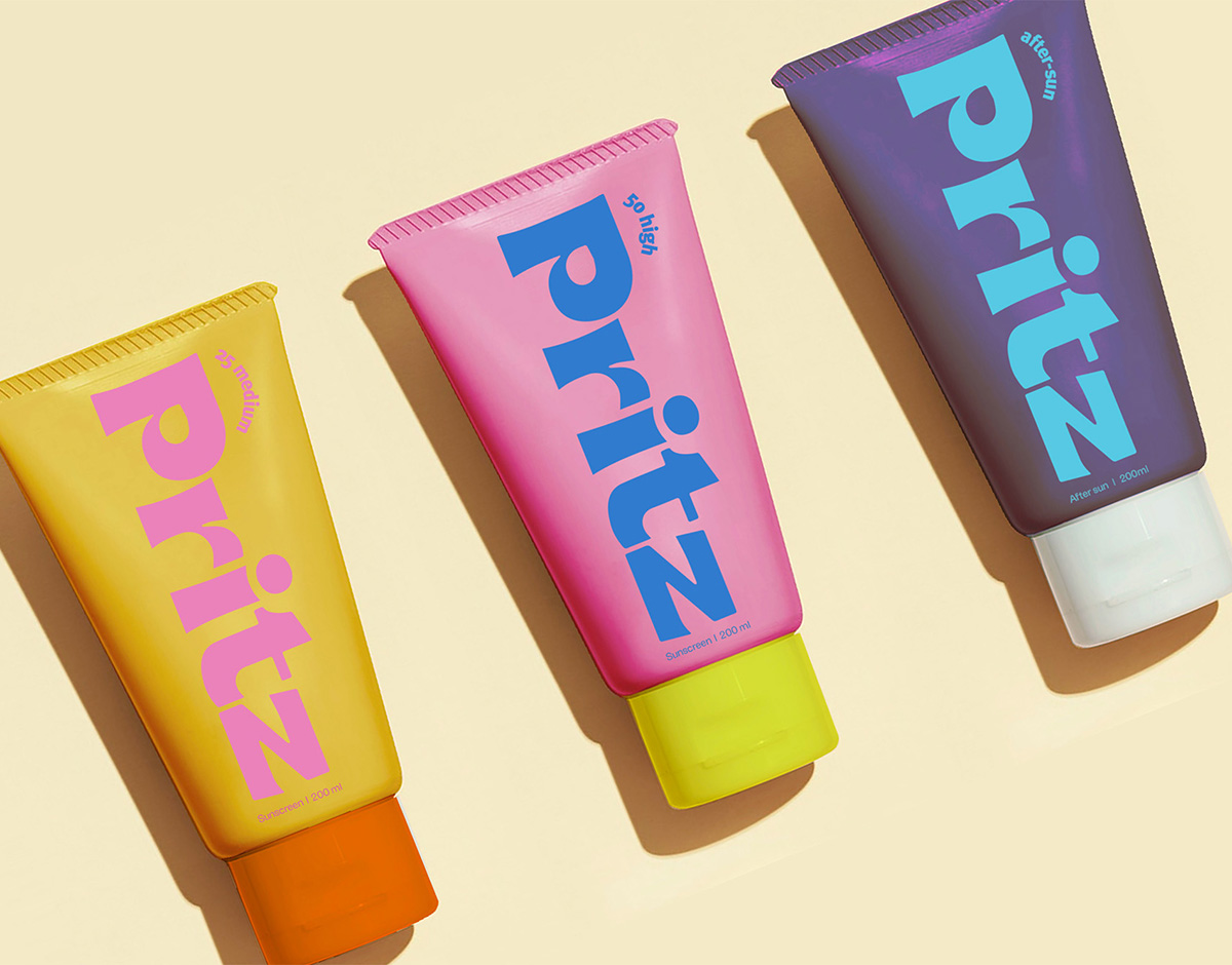
Pritz sunscreen by lex & turner
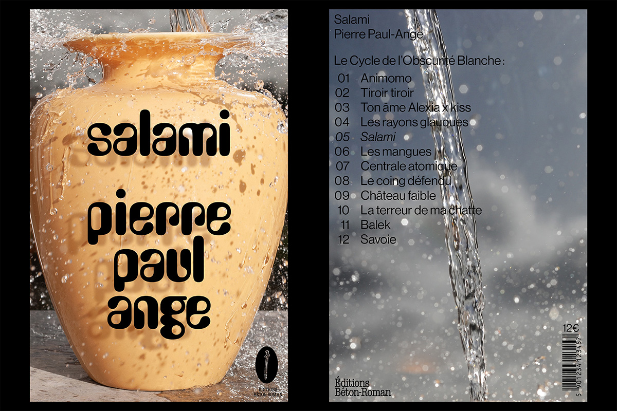
Aiming to evoke an “instant holiday feel,” Belgian branding agency Lex & Turner have crafted a vibrant concoction of color with their packaging for sunscreen brand Pritz. Their work revolves around Studio Sun’s Brice Bold, an eccentric display typeface chosen as a “big fat nod” to the 1970s, in order to give the brand an unapologetically retro feel. The name of the brand itself is an onomatopoeia — a word that phonetically imitates the sound it’s being used to describe. Pritz!
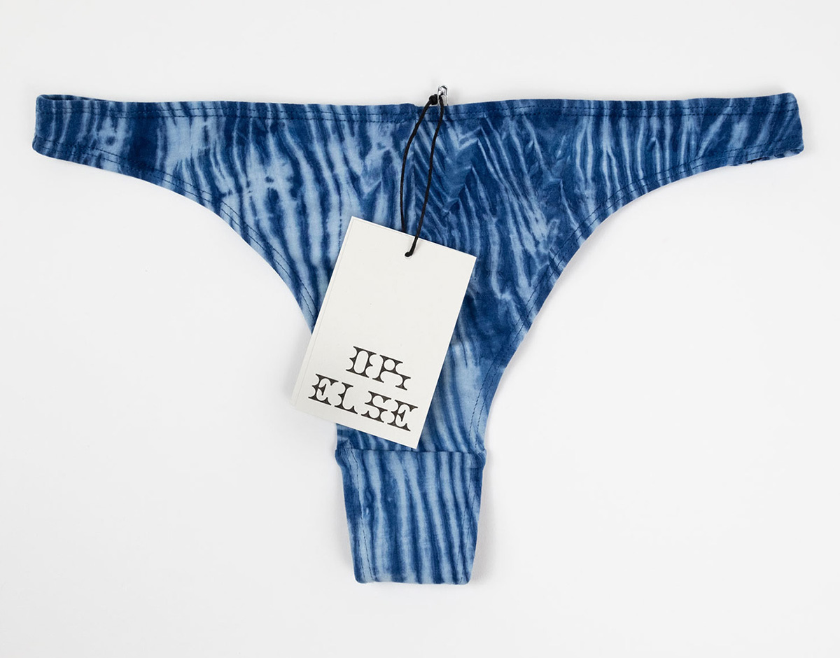
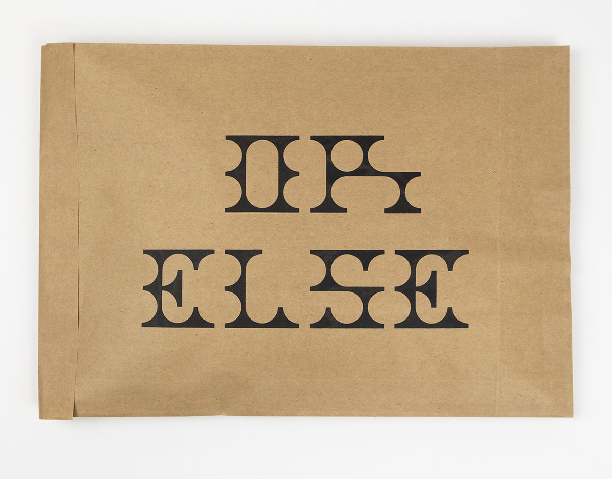
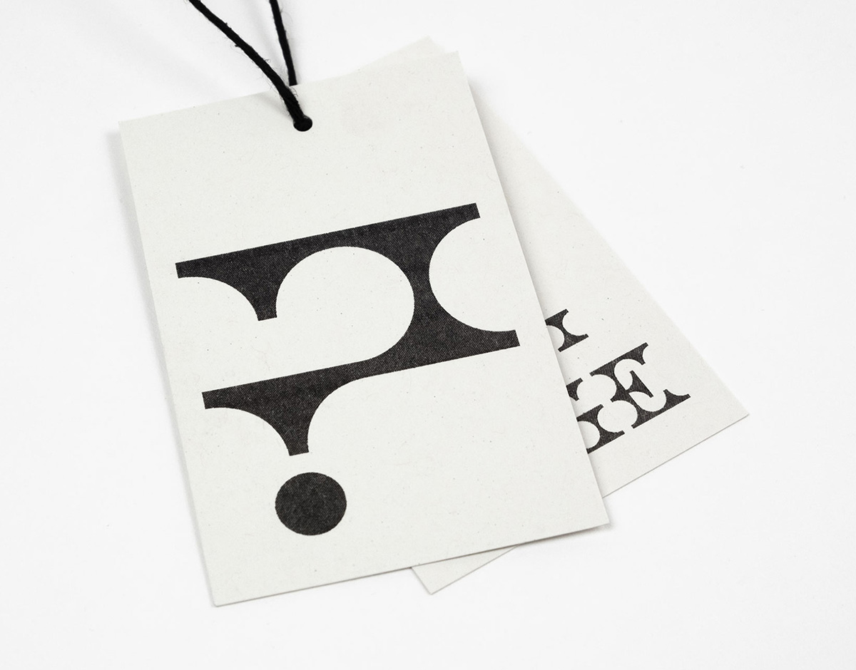
or else by ashley kinnard
Hand-crafting fun, colorful, and sustainable underwear, London-based makers OR ELSE pride themselves on the quality of their garments, the comfortable experience of wearing them, and the uniqueness of its items, each of which undergoes a hand-dyeing process. Requiring an identity that matches not only the enthusiasm for process but also the tone of the products themselves, OR ELSE turned to London-based designer Ashley Kinnard, who created a bespoke typeface for the identity — one whose beautiful aberrations and unusual, yet immediately striking construction mirrors the personality and vibrancy of the brand itself, achieving a playfulness without falling into naivety and crudeness.
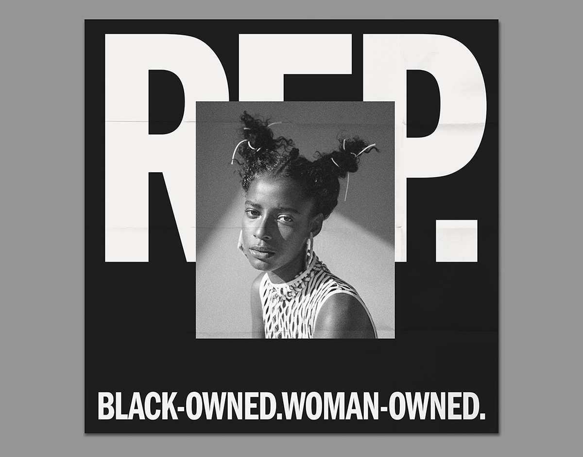
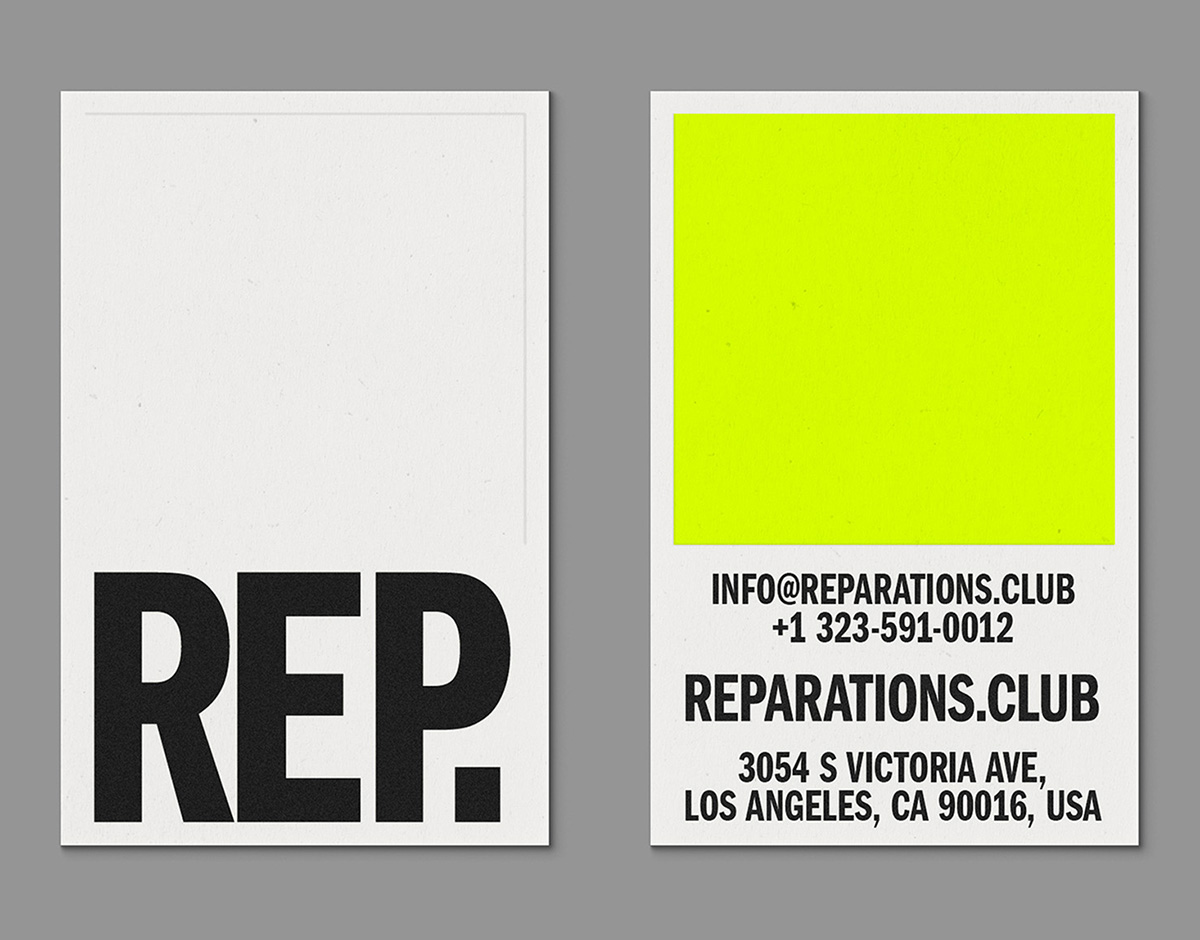
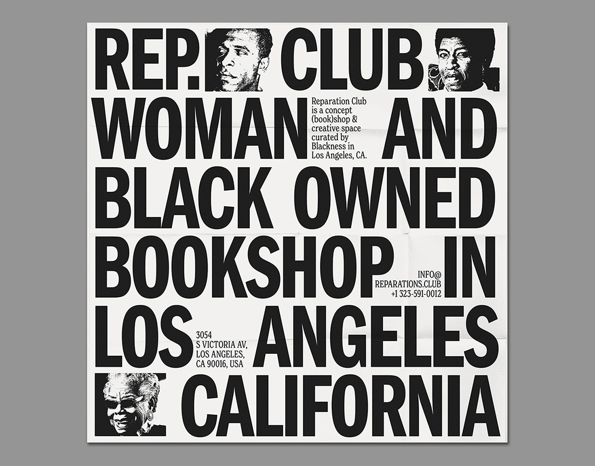
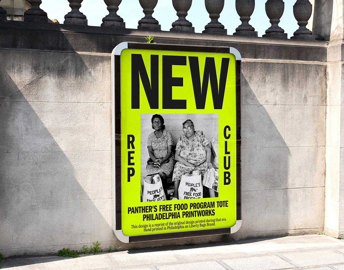
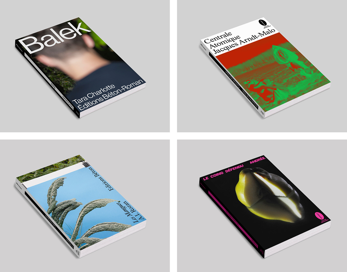
REPARATIONS CLUB BY Sometimes Always and Estúdio Daó
In partnership with São Paulo-based studio Estúdio Daó, Marseille-based studio Sometimes Always have created the identity, website, and printed matter for the Los Angeles concept bookstore Reparations Club, a Black- and women-owned store that celebrates the cultural creations and literature of BIPOC individuals. The design duo faced the challenge of crafting an identity that’s contemporary but historically referential, making sure they understood the racial issues felt specifically in the US. Referencing the typefaces found within their historical research, they opted for Newlyn’s New Spirit Condensed alongside Franklin Gothic, creating a beautiful typographic contrast that’s not only striking in its construction, but also equally representative of Reparations Club’s break from the norm and forming of their own convention.
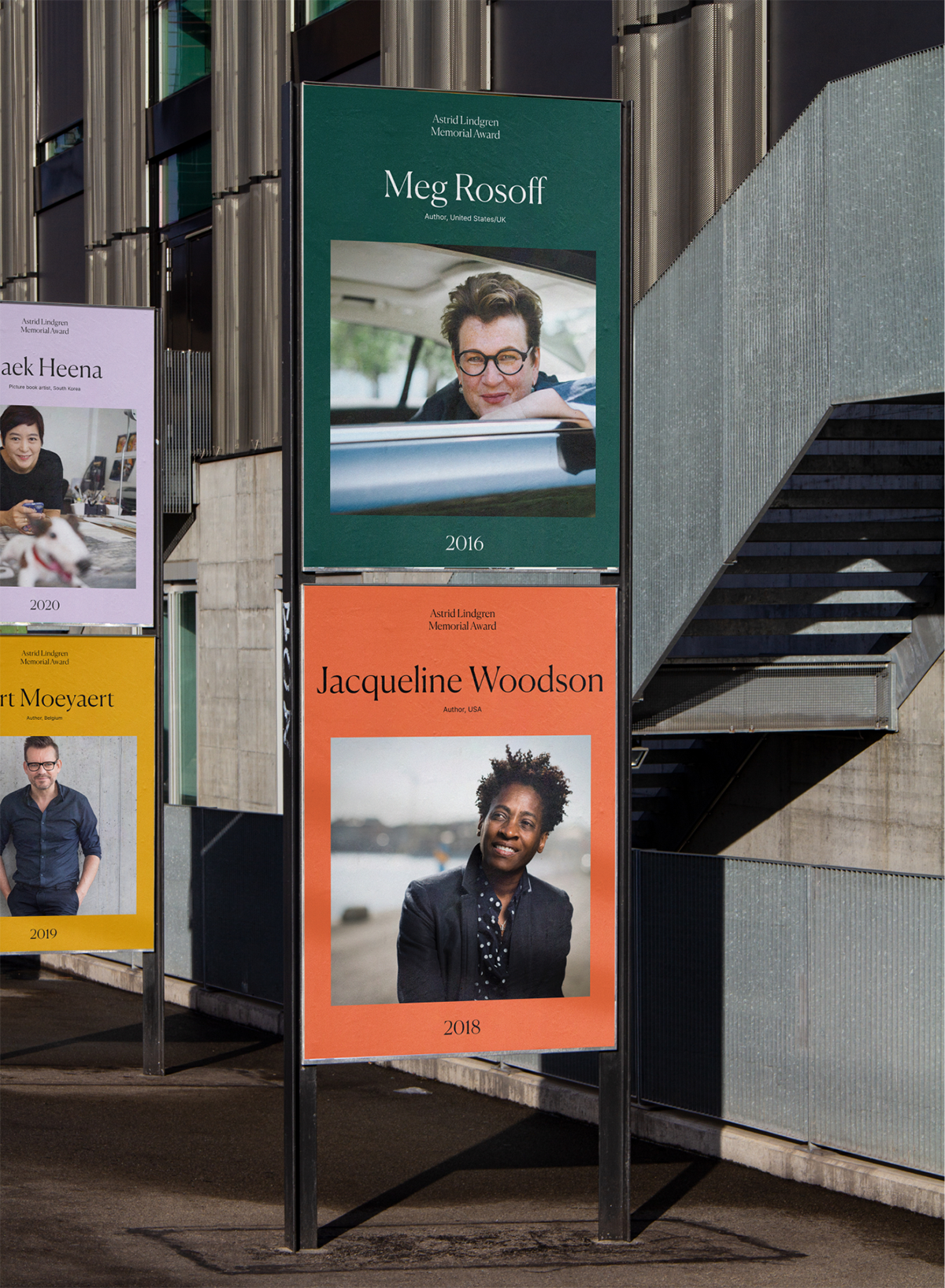
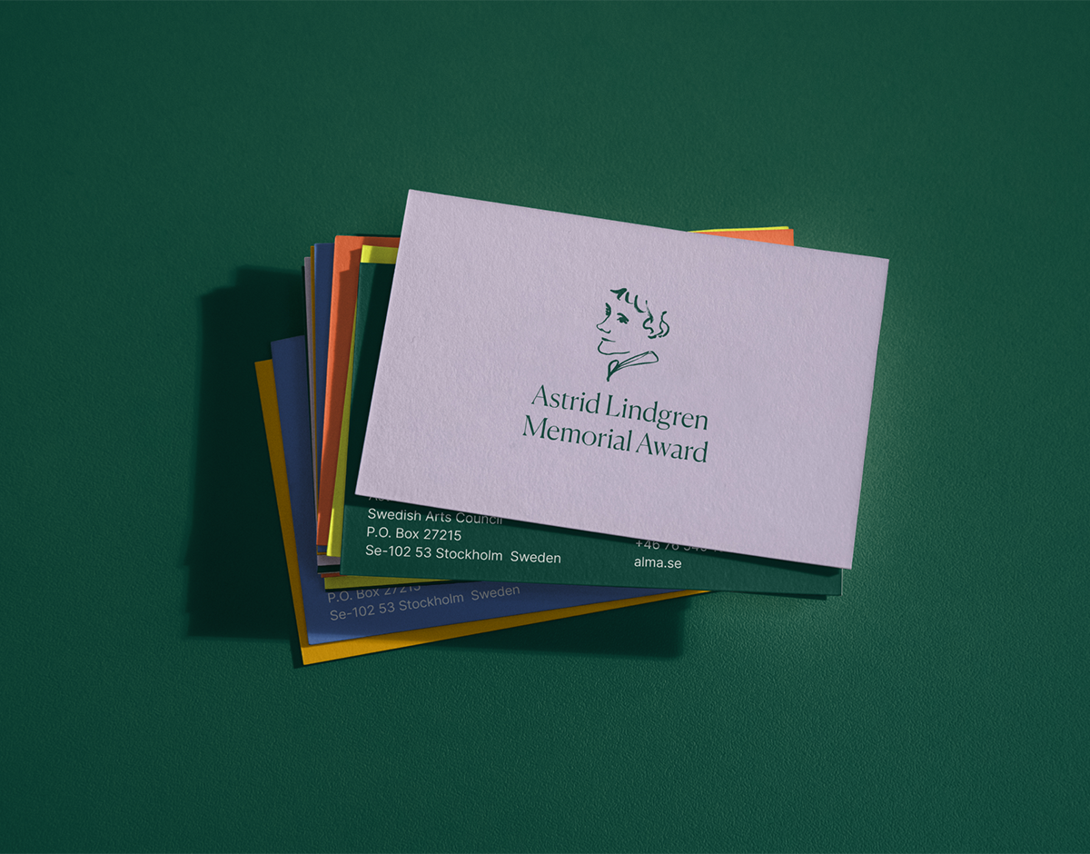
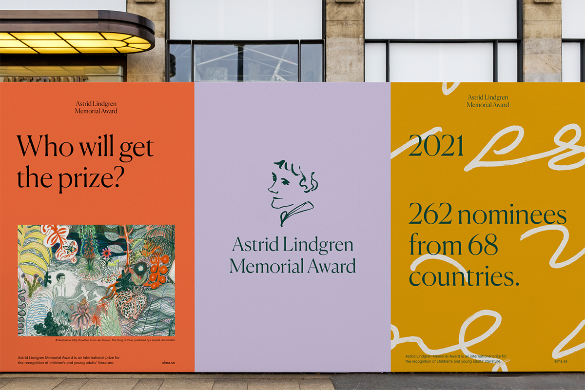
Astrid Lindgren Memorial Award by Happy F&B
Created in 2002, the Astrid Lindgren Memorial Award is an annual literary award given by the Swedish Government in memory of famed children’s writer Astrid Lindgren, with a cash prize of 5 million Swedish Kronor intended to support and expand access to children’s literature. Commissioned to rebrand the award in line with its growing international reputation, Swedish agency Happy F&B developed a distinctive solution centered around a custom-drawn portrait of Lindgren, as well as a sophisticated palette of warm colors and an elegant combination of serif and sans serif typography. Lindgren’s very own cryptic shorthand writing appears as a graphic pattern, adding a decorative texture to layouts while subtly hinting at the story behind her iconic writing process.
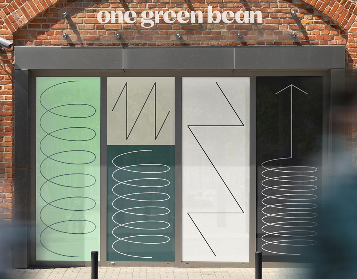
ONE GREEN BEAN BY HOW & HOW
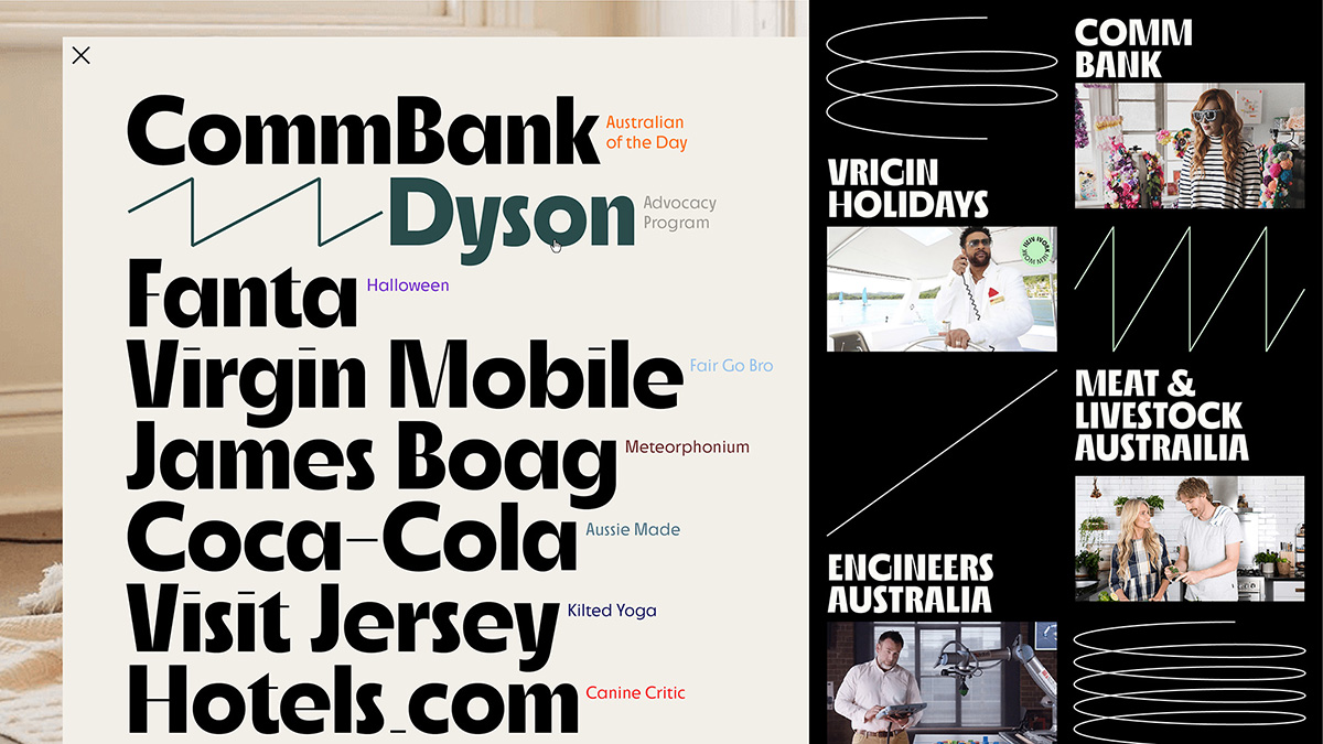
International media specialists — and owners of an incredible company name — One Green Bean enlisted the help of Lisbon- and London-based design studio How & How for the creation of an exuberant identity that reflects the character of the company and the scale of its projects. Applied across the brand’s digital and physical touchpoints, How & How’s elementary but intelligent spring motif references the company’s core principle of being two steps ahead of the rest. In tandem with the playfulness of the springs, and a refreshing mint green palette, is the use of Roba High Bold as the prominent typeface. Immediately recognizable, Roba High is seldom employed as successfully as it in One Green Bean’s identity, which uses the quirk of the typeface to its advantage without drowning the brand in overtly idiosyncratic layouts.
Studios
EUROPIUM
Born in 2020 amidst the COVID-19 pandemic, Europium is the Paris-based creative direction, photography, and design studio of graphic designer Ghazaal Vojdani and photographer Julia Andréone. They first met while studying graphic design at Central Saint Martins in London in 2010, parting ways to develop their independent practices throughout the US and Europe. Together again as Europium, the creative duo combine their skills to explore the wide possibilities of image-making, devising original content for clients in the art sector through a unique combination of photography, typography, and texture.