03.03.21
Graphic Design
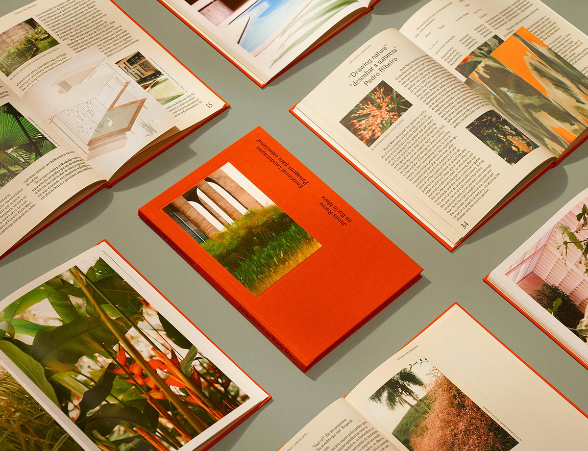
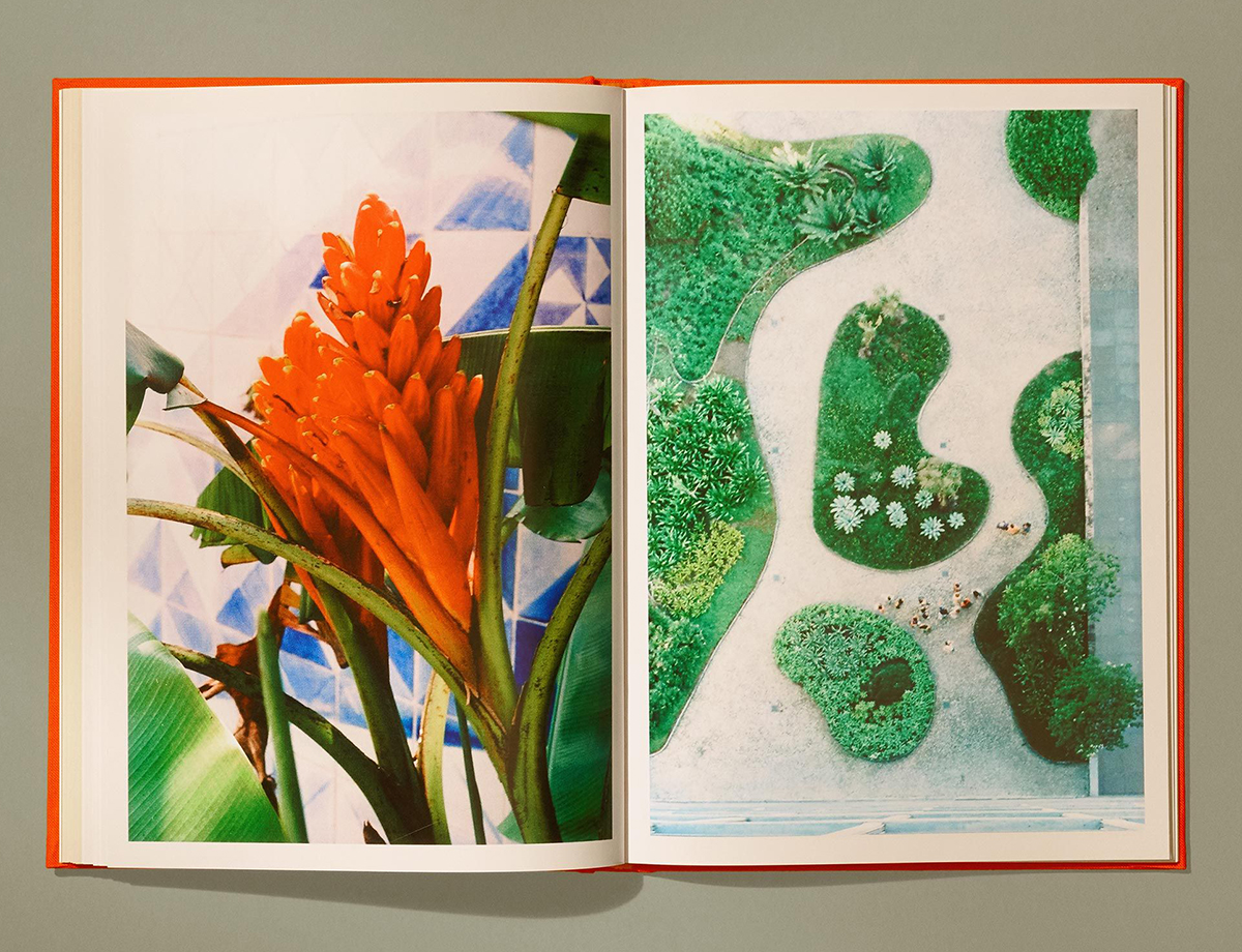
A Roberto Burle Marx book, and Other Graphic Design Picks for March
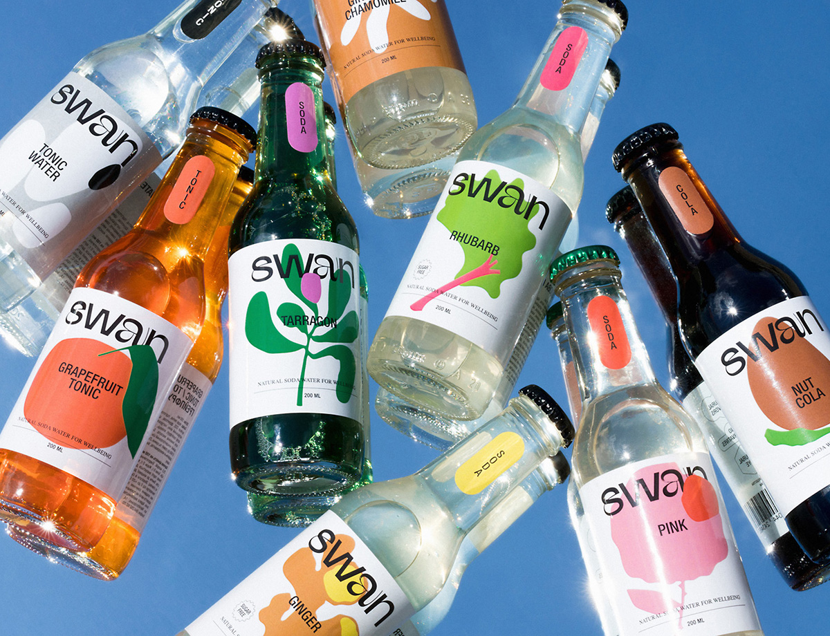
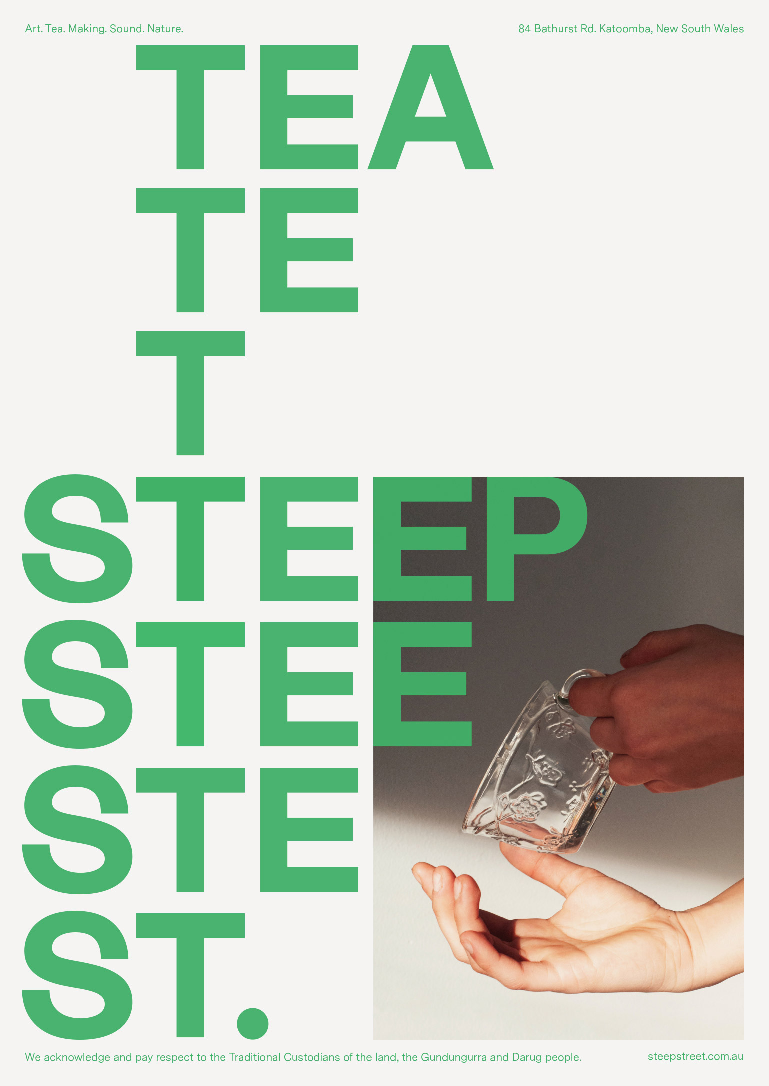
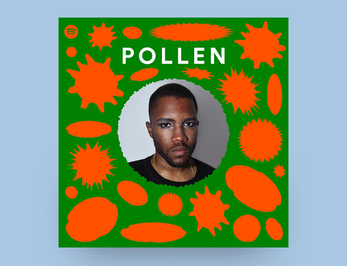
Our new Graphic Design column is guest-edited by the team at The Brand Identity, a graphic design resource and publication, as well as the producer of customizable backdrops made for designers to showcase their work. Each month, they’re sharing with our readers a selection of the most interesting studios, packaging designs, and branding and identity projects featured recently on their site. This month: A book on the work of iconic landscape artist Roberto Burle Marx, the design of a favorite Spotify playlist series, and an identity for an experimental Australian tea house (above).
Projects
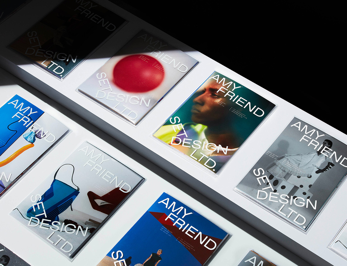
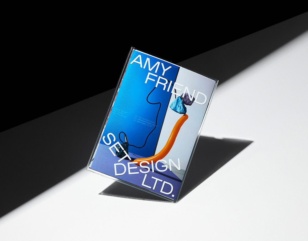
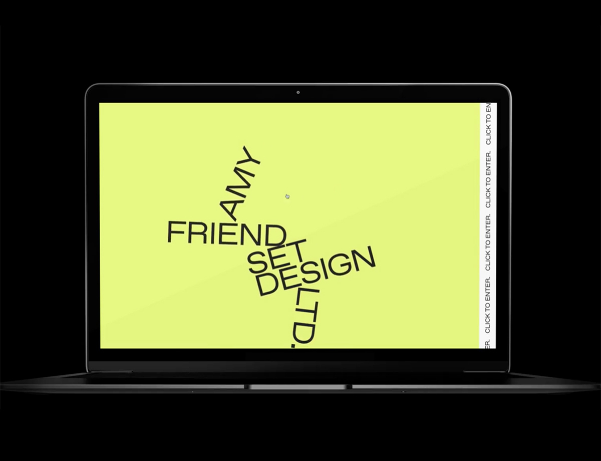
AMY FRIEND SET DESIGN Identity — ALEX HUNTING STUDIO
Cementing the success of simplicity and conciseness, London-based creative agency Alex Hunting Studio have created an identity across digital and print for fellow Londoner Amy Friend, a set designer whose practice encompasses fashion, film, and more. The intelligence of Alex Hunting Studio’s design comes in its balance between function and liveliness — it’s characterful and expressive while ultimately being an actively supporting and bolstering counter to Friend’s work. This is achieved not simply through Hunting’s dexterity in crafting an impactful and elemental graphic language, but also through a compelling combination of typefaces. “We tried to create a fun and loose aesthetic by playfully arranging the typography,” Hunting recalls. “We wanted to create a framework to showcase her work that subtly echoes her visual methods in the design.” He ultimately chose Dinamo’s Favorit due to the subtle quirks found within its rigid, geometric form.
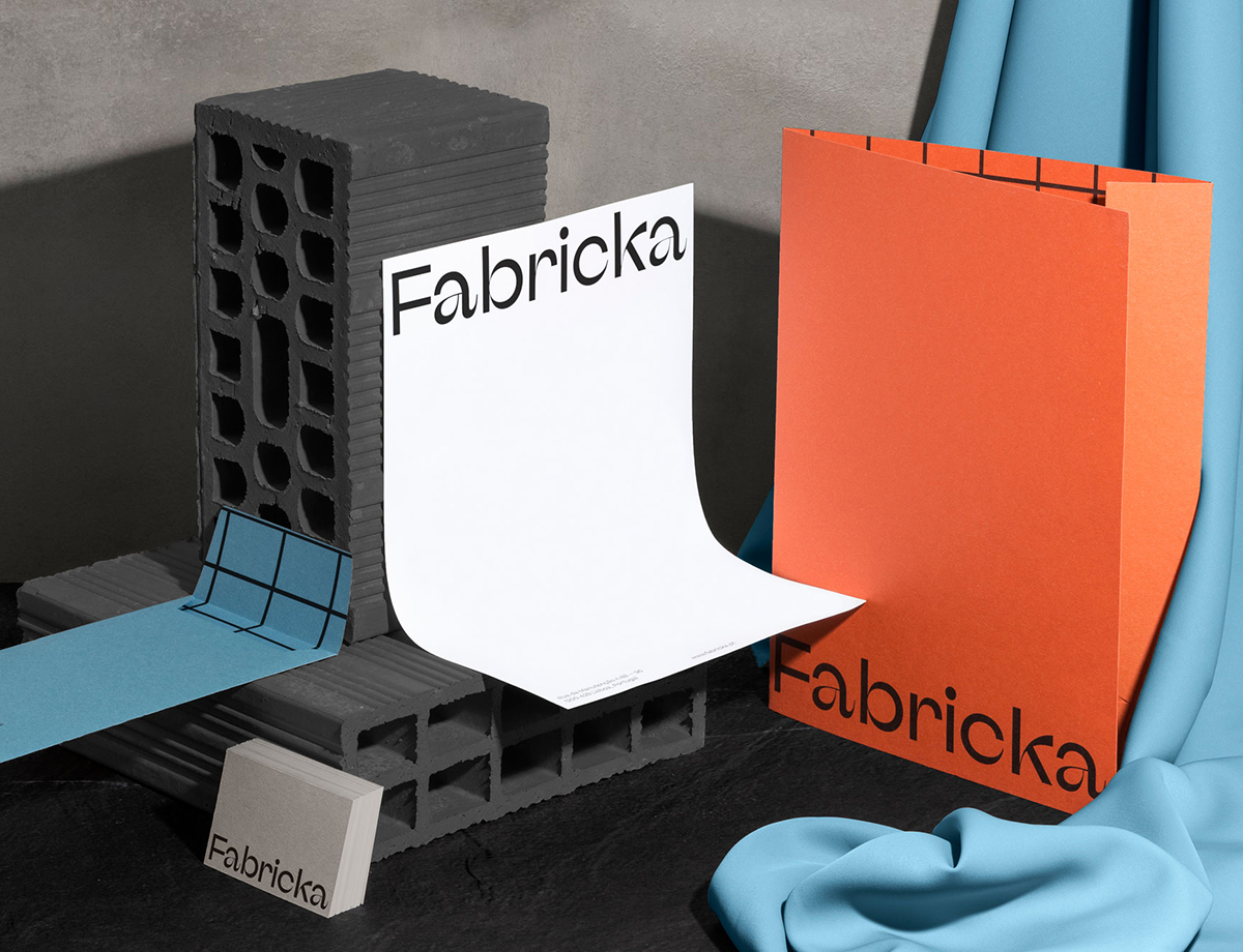
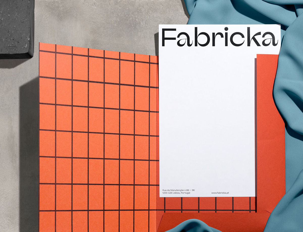
FABRICKA IDENTITY — LOVE ST. STUDIO
Taking inspiration from the Xabregas creative district it resides in, Barcelona-based Love St. Studio has created the identity for the millennial-focused Lisbon real estate project Fabricka, which consists of a contemporary hotel, co-working spaces, and apartments. Discussing the area itself, Love St.’s Carmo Mineiro tells us “this was a forgotten part of the city for decades, but in the last couple of years several artists and designers established their studios there, making east Lisbon one of the main creative hubs of the city.” Influenced by Xabregas’s architecture, topology, and innate contrasts, Love St. crafted a bespoke typeface for the wordmark, to convey the individuality of its locale. “The letter F doesn’t have any thin lines, because of its balance and morphology,” Mineiro explains. “As a symbol, it assumes a strong and bold presence, exactly as the building does near the smooth Tagus river.”
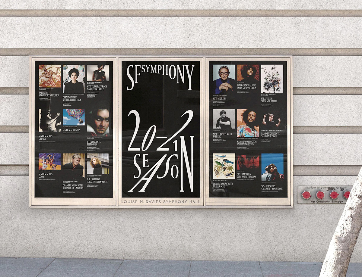
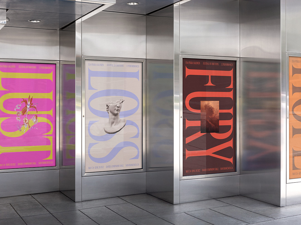
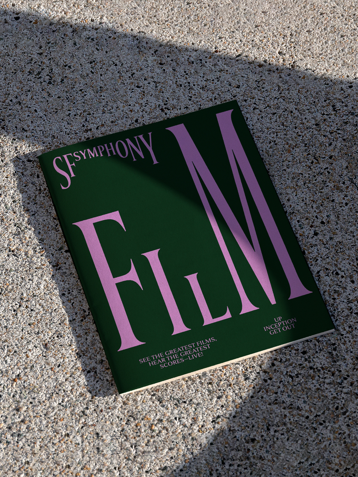
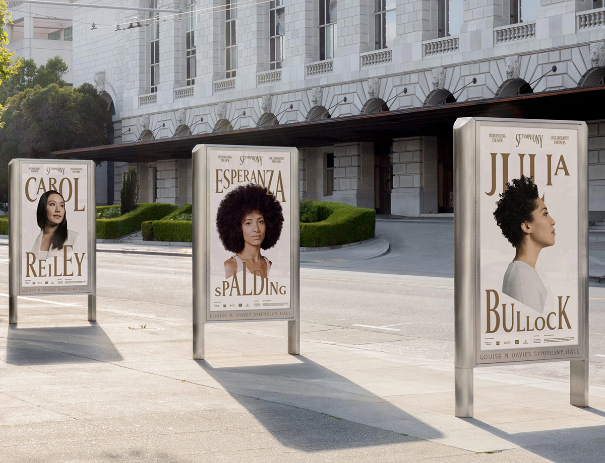
SF SYMPHONY — COLLINS and DINAMO
A century-old cultural landmark, the San Francisco Symphony is an American orchestra that, since 1980, has been a resident at the Louise M. Davies Symphony Hall in the city’s Hayes Valley neighborhood. Aiming to maintain the significance and artistry of the classical music genre for the institution’s rebrand, New York– and SF–based design company Collins devised a typeface and identity system that is as dynamic and flexible as it is rigorously striking and unapologetically cool. To channel the Symphony’s sonic, experimental, and indefinite practice, Collins teamed up with Dinamo — a Swiss type foundry renowned for pushing typographic expectations — to develop a bespoke typeface that reflects this energetic and responsive attitude. Through a provocative variable structure that flexes to the needs of its application, and to the sound of music, the typeface is grounded in the heritage of classical music, with a sophisticated serif that seems both delicate in its construction and powerful in its presence.
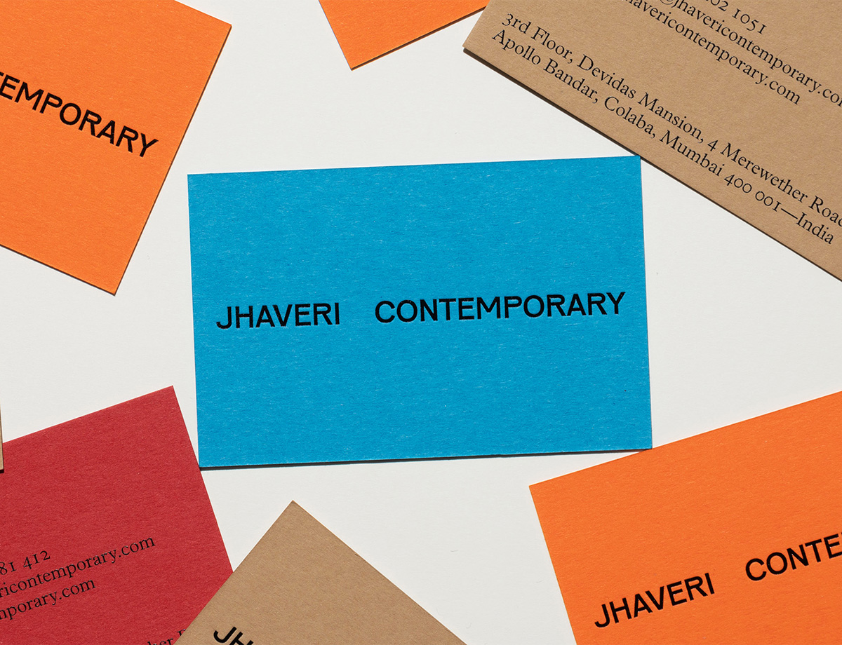
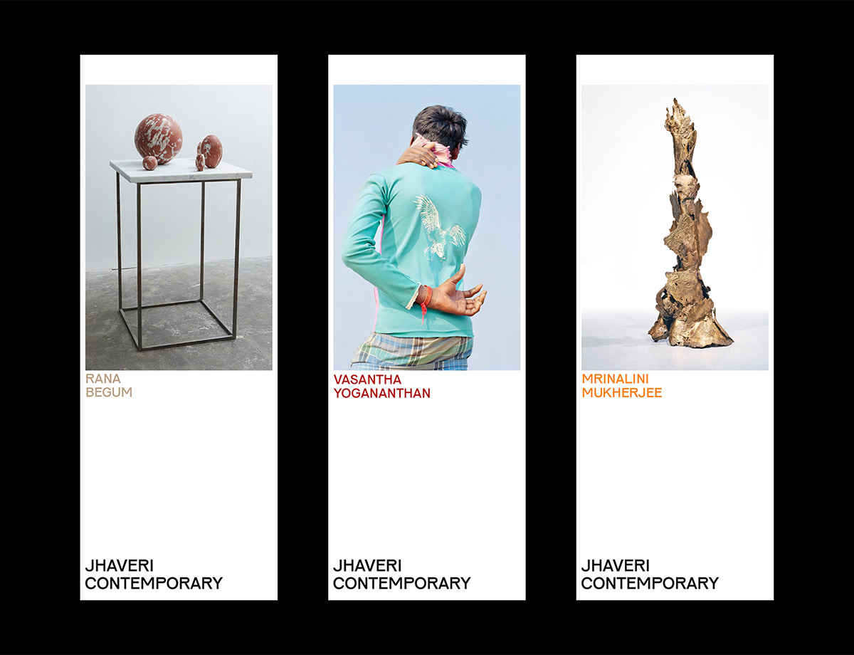
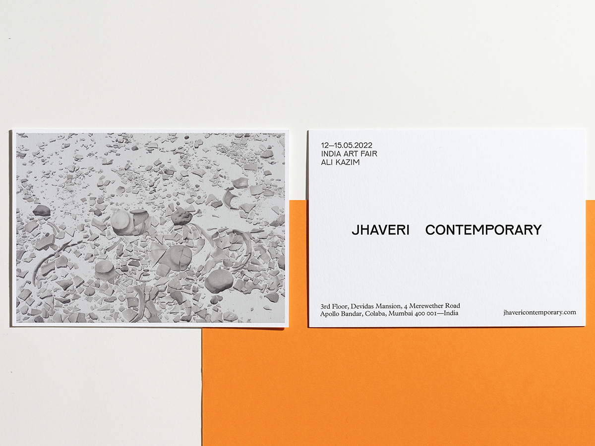
JHAVERI CONTEMPORARY Identity — STHUTHI RAMESH
After a decade using its prior identity, the Mumbai-based contemporary gallery Jhaveri Contemporary decided it was time for a fresh face. It turned to London-based designer Sthuthi Ramesh for a new look. “The brief was to create a brand that encapsulates young, modern India and the nuances of midcentury/post-independence design aesthetics,” she says. Using Karel Martens and Jungmyung Lee’s Pirelli typeface as the wordmark, she drew on the typeface’s innate charm and imperfection to give character to the gallery, leading the audience to see it as it is – “confident, smart, and simple,” she says, adding that the design also captures nuances from the gallery’s interiors. The purposeful spacing of the wordmark is indicative of the brand’s intentions of offering space to highlight and support the work it advocates; it simultaneously creates a system for infinite flexibility to adapt to application and layout.
Studios
CHRISTOPHER DOYLE & CO. — Sydney
Christopher Doyle & Co. is an independent creative studio in Sydney, Australia, with a particular expertise for everything connected to branding, from visual and verbal identities to naming, advertising, and digital design. Studio founder Doyle himself is an internationally recognized designer with over 18 years of experience. His work is known for its vibrant simplicity and clever-but-not-too-clever copywriting – a feat possible due to Doyle’s collaborative approach, which sees him teaming up with the world’s best writers, strategists, photographers, motion designers, and developers.
PORTO ROCHA — New York
Founded by Brazillian duo Leo Porto and Felipe Rocha, Porto Rocha is a New York-based design studio with a vibrant portfolio ranging from global identity systems for Airbnb and Nike to contemporary printed publications on queer culture and political belonging. The studio builds on the pair’s status as immigrants with the founding principle that global perspectives are vital to developing relevant brands. They strive to create work that inspires and provokes meaningful changes, whether it be through large-scale projects that reach significant audiences or through culturally-motivated initiatives. Their website puts their own spin on the now-ubiquitous iOS interface, resulting in a timely take on digital connectivity in a world of remote work.