06.13.22
Graphic Design
A Surrealist Wine Label, and Other Graphic Design Picks For June
Our Graphic Design column is guest-edited by the team at The Brand Identity, a graphic design resource and publication, as well as the producer of customizable backdrops made for designers to showcase their work. Each month, they’re sharing with our readers a selection of the most interesting studios, packaging designs, and branding and identity projects featured recently on their site. This month: an uptown hotel with a new downtown vibe, a Mallorcan yoga studio identity inspired by Joan Miró, and a Surrealist wine label that celebrates the unexpectedness of every vintage (above).
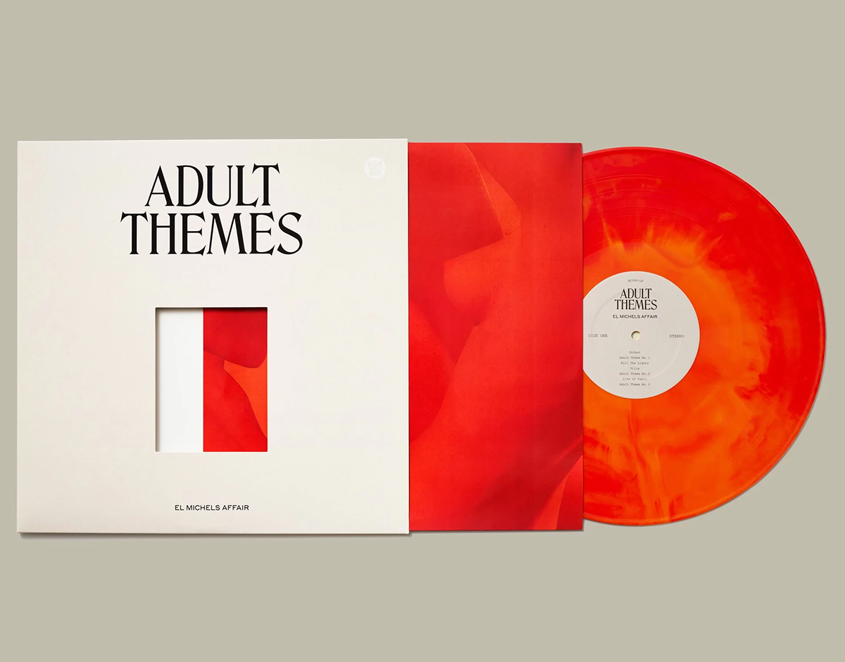
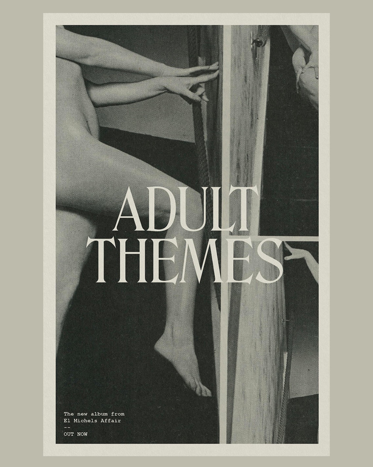
Adult Themes, by High Tide
Leon Michels’s career as a multi-instrumentalist, bandleader, and songwriter has seen him collaborate with The Black Keys, Beyoncé, JAY-Z, Adele, Freddie Gibbs, the Wu-Tang Clan, and Lana Del Ray – to name a few. His solo offering Adult Themes, which was released in the summer of 2020, was largely inspired by the moody works of ’60s film-score composers, such as Francois de Roubaix, and dense instrumental orchestrations from artists including David Axelrod and Moondog. Taking on the task of art directing and designing the album’s packaging, New York-based creative studio High Tide developed a sophisticated and seductive approach that embraces the cinematic sensibilities behind Michels’s inspirations.
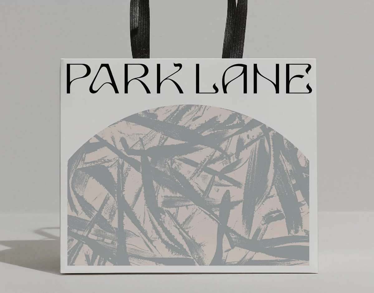
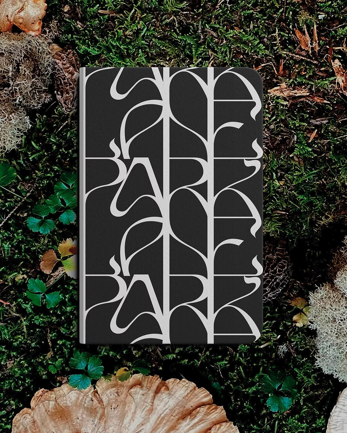
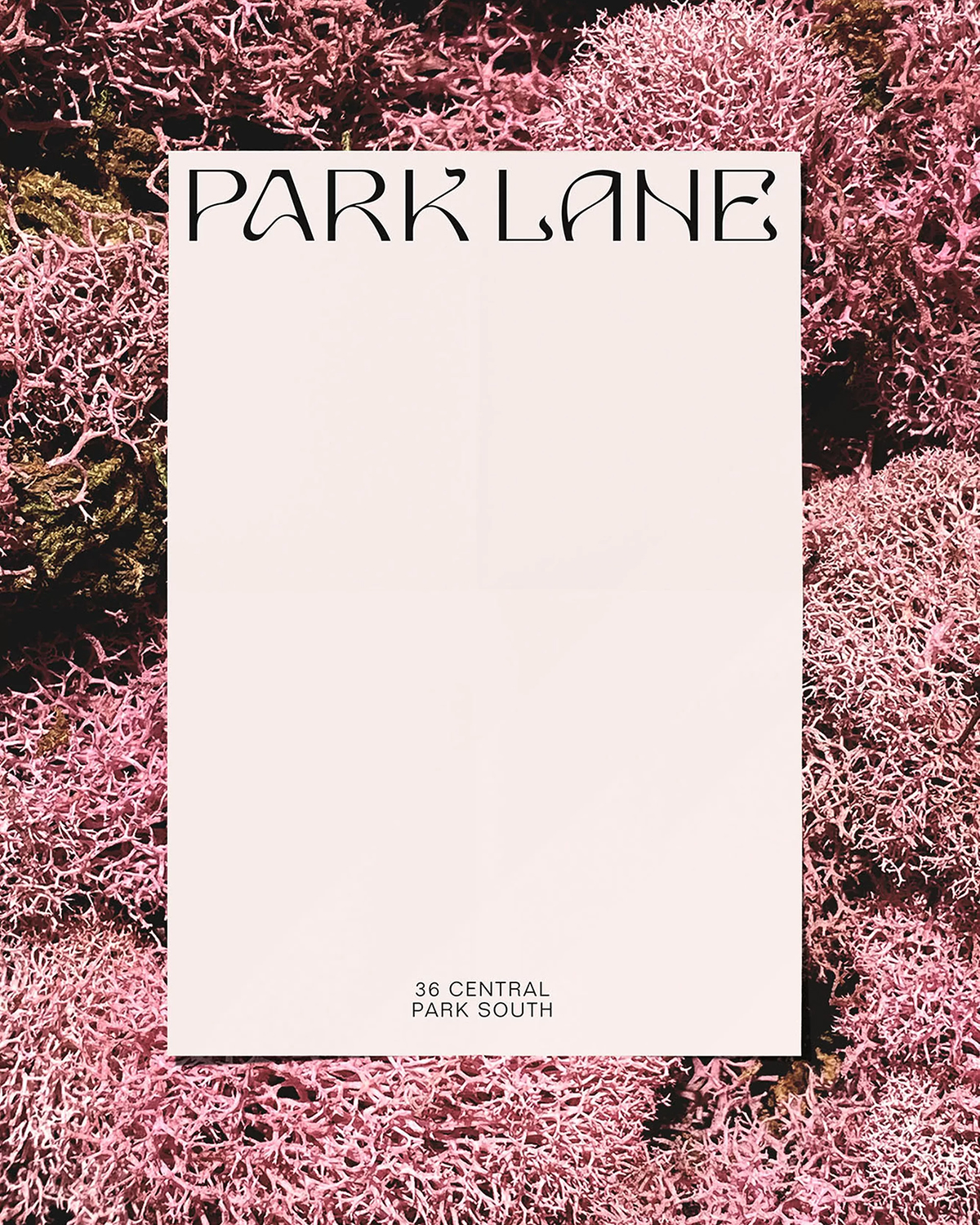
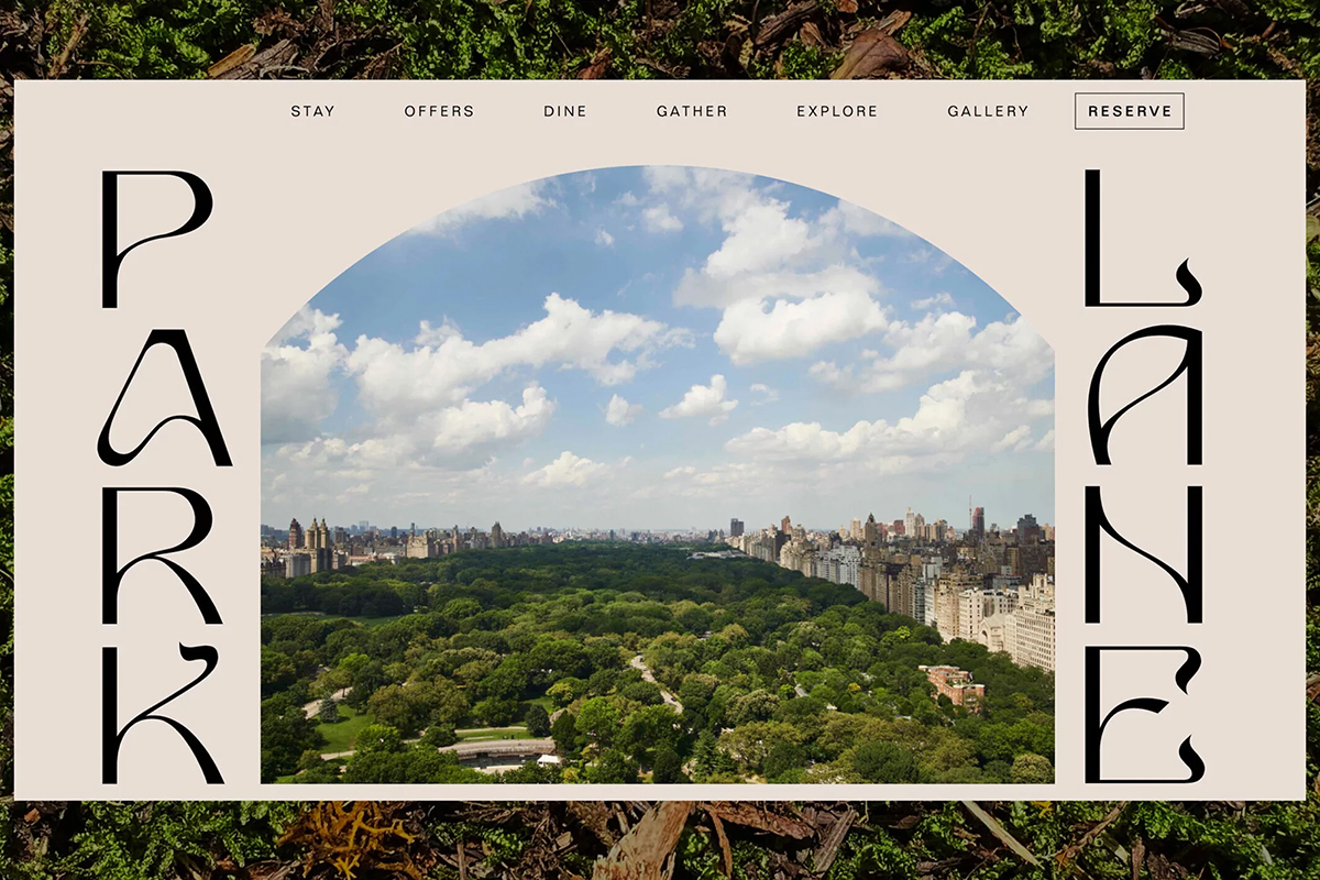
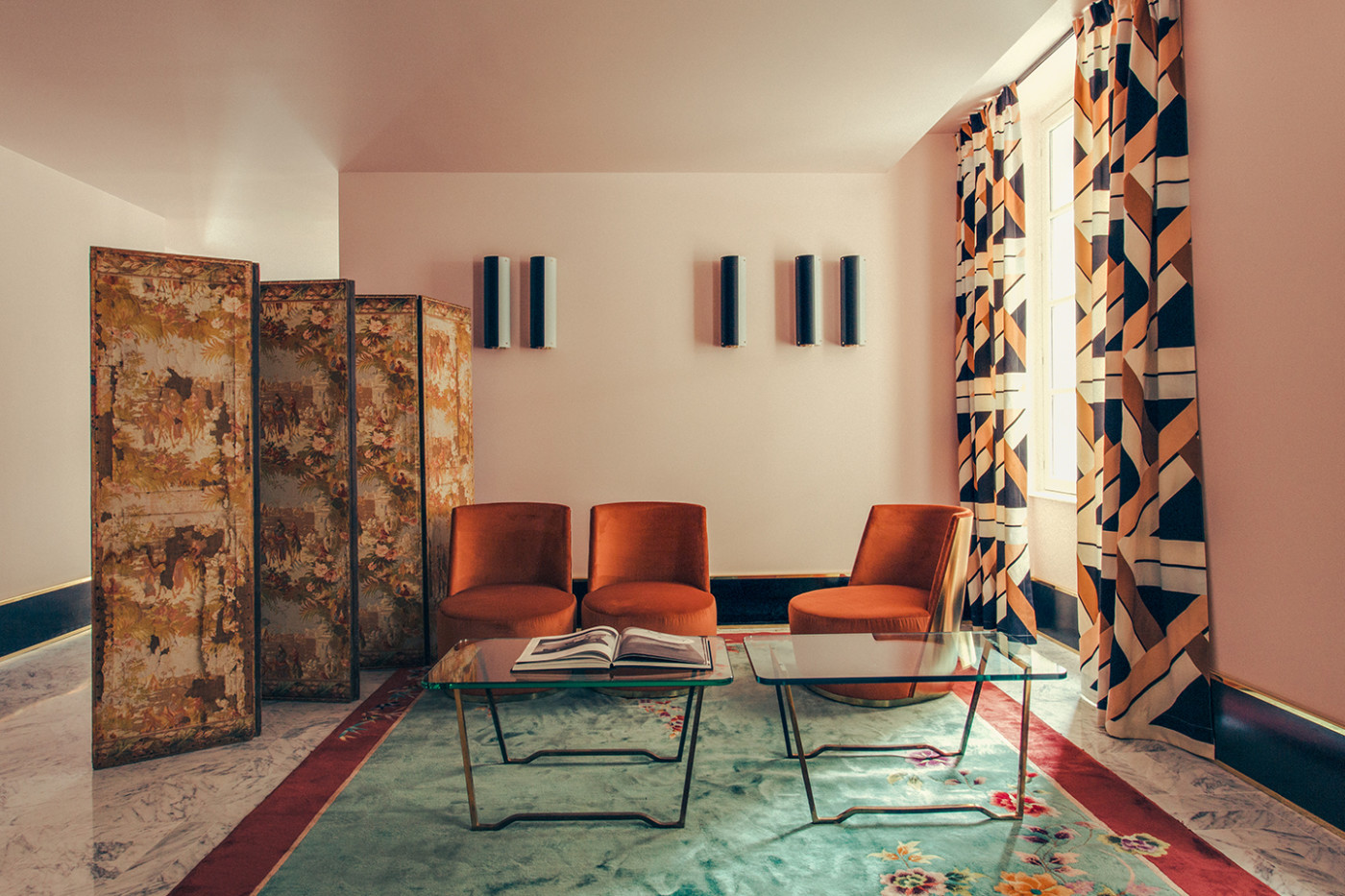
Park Lane, by Mother Design
Calling the luxuriant uptown of New York its home, the 47-story Park Lane hotel was first built in 1971, in line with the nearby properties known as “Billionaire’s Row.” Yet having found itself bogged down in historical outlooks on luxury, the hotel was in need of an identity that shed the weight of antiquated traditional characterizations and its fuddy-duddy visual coherence. Instead, embracing the uniqueness and individuality of the building, the identity crafted by NYC- and London-based studio Mother Design champions a contemporary take on luxury, drawing inspiration from the hotel’s historical and environmental context. Drawing from the innate eccentricity of Park Lane’s interior, textures, and colors, Mother Design translated this flamboyancy into a nebulous and opulent wordmark. “Our main point of inspiration is Central Park, adjacent to the hotel,” says creative director Matt van Leeuwen. “The meandering paths of the park reflect themselves in the wordmark,” whose fluid, baroque construction draws further influence from Art Nouveau typography.
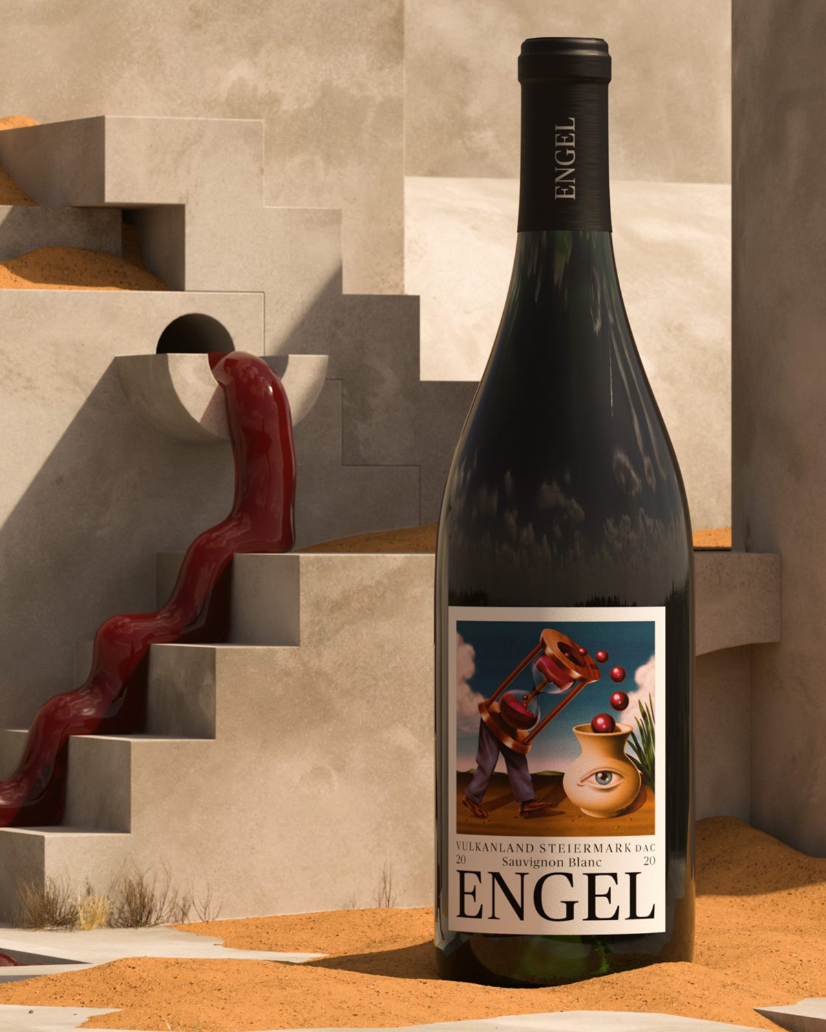
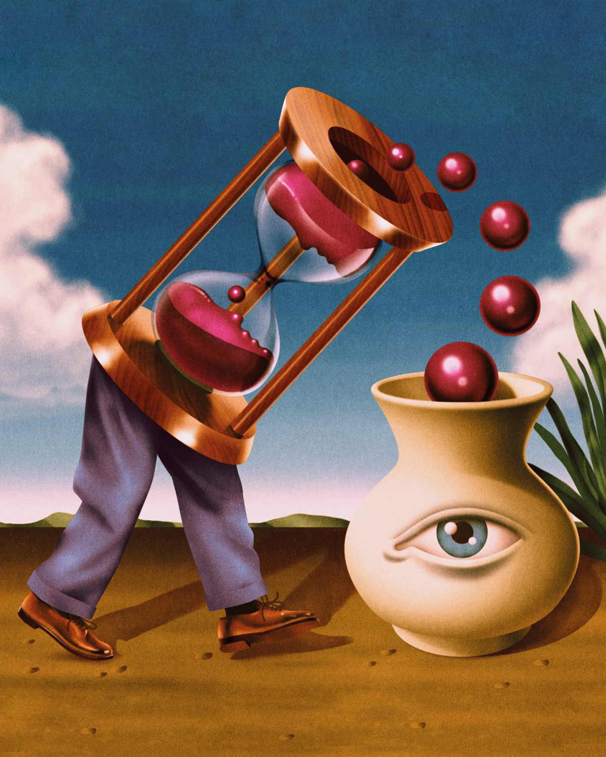
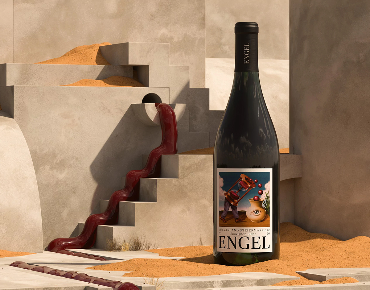
Engel 21, by Studio Bruch
At Austrian winery Engel, every year is unique for both the wine and the people behind it. Sometimes the flavors are loud and powerful, other times they’re soft and subtle. To reflect this in the design of Engel’s 2021 bottle label, Graz-based Studio Bruch worked in close collaboration with illustrator Max Löffler to create a surreal image based on the idea of new encounters and unusual interactions. A walking hourglass meets a vase with an eye, communicating the flexibility of time while playing with scale, distance, and perception.
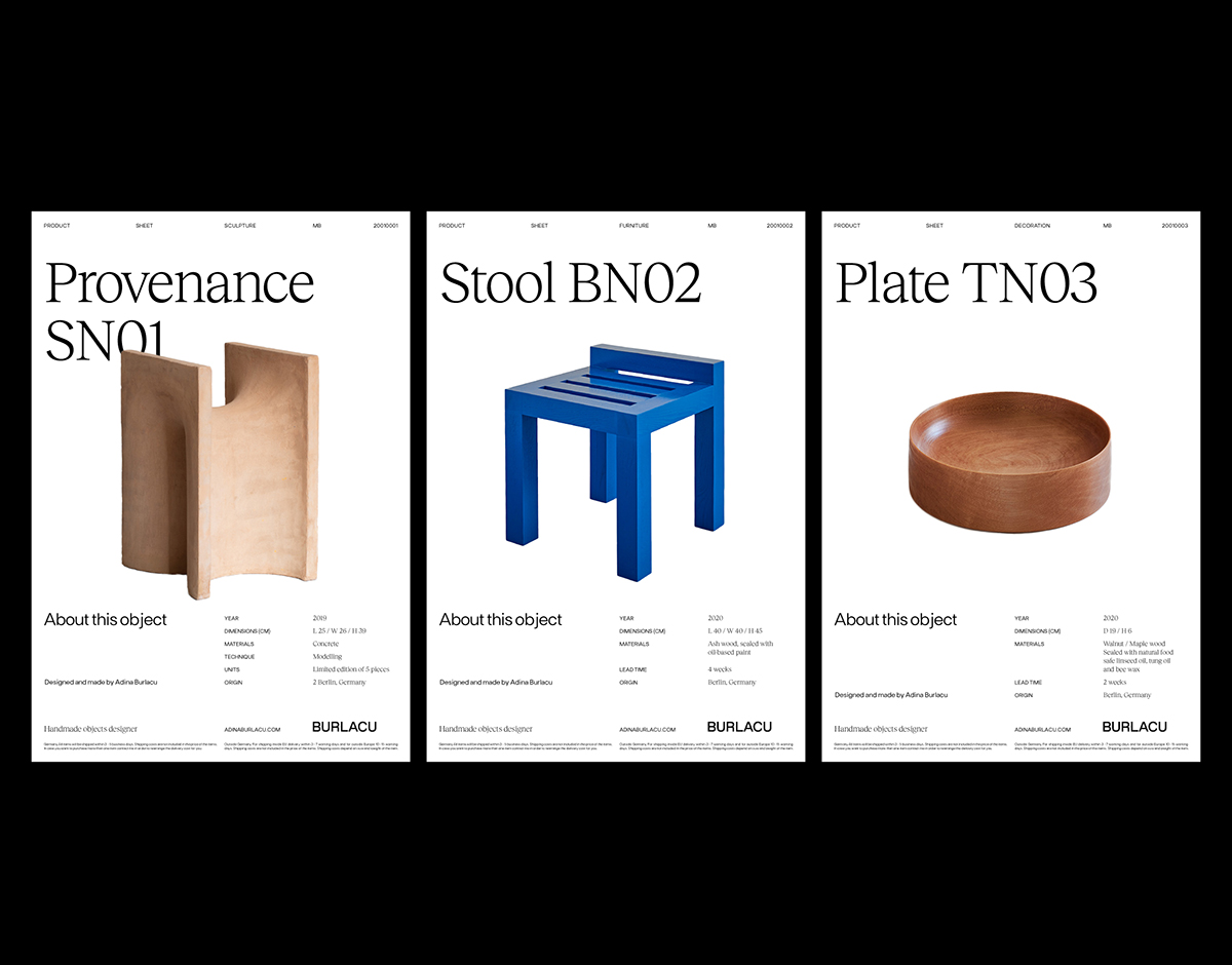
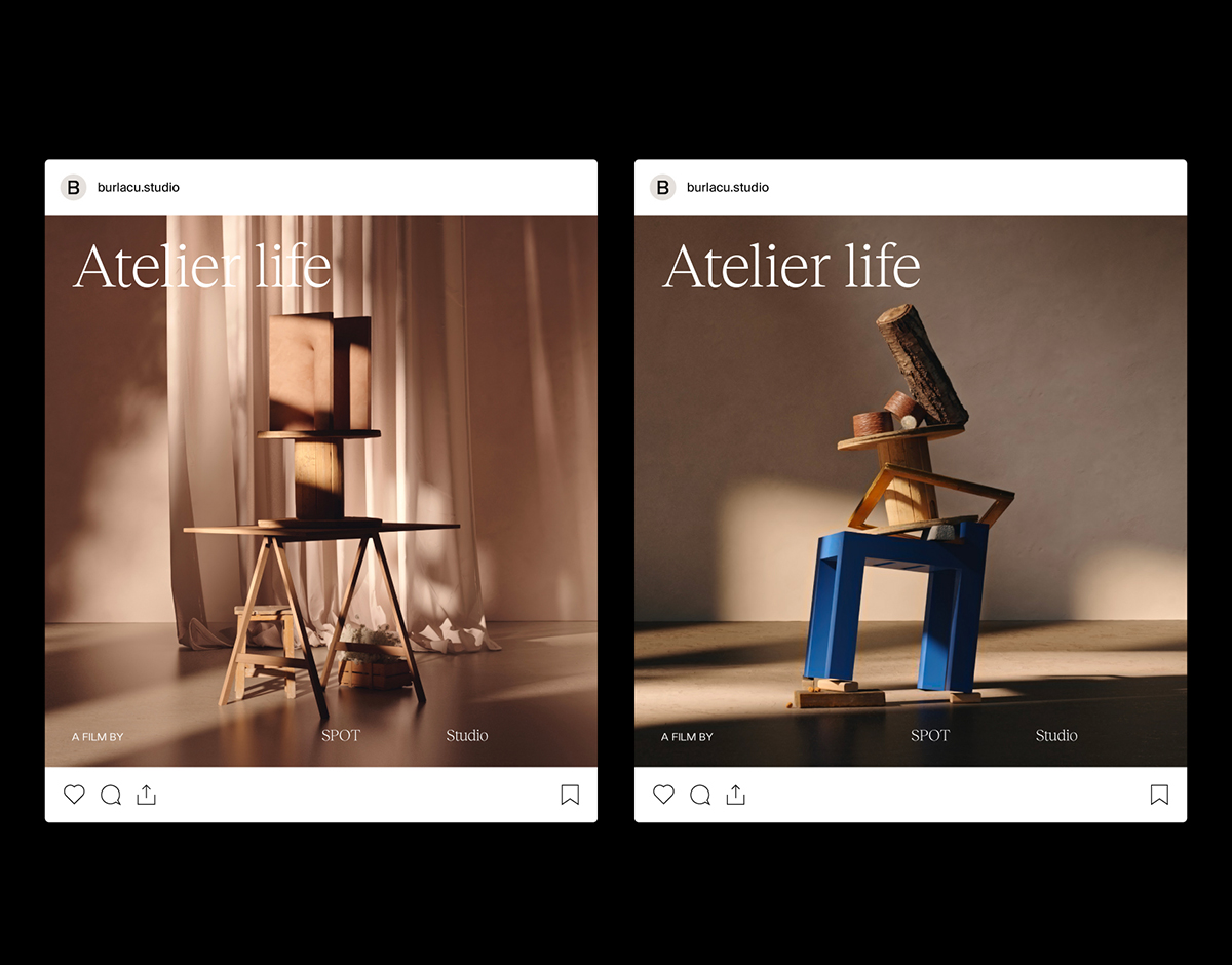
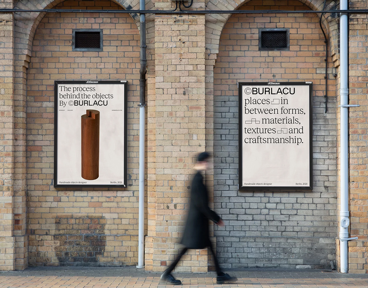
Adina Burlacu, by Mateo Buitrago
Blurring the lines between craft and industrial design, Berlin-based artist Adina Burlacu produces an eclectic array of handmade objects, including chairs and plates. Madrid-based designer Mateo Buitrago was commissioned to devise the visual identity for Burlacu’s work, finding the brutalism and clean lines of her creations to be the ideal starting point. This led him to a modular system, both for the stacked wordmark and in the form of an ever-changing selection of geometric shapes. “The modularity of the wordmark, as well as the shapes system, speaks of her ability to create different pieces but always maintain the same essence,” Buitrago tells us, adding that the shapes also mirror the “boldness” that Burlacu’s objects possess.
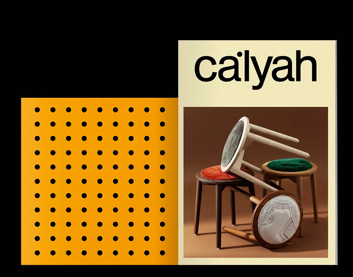
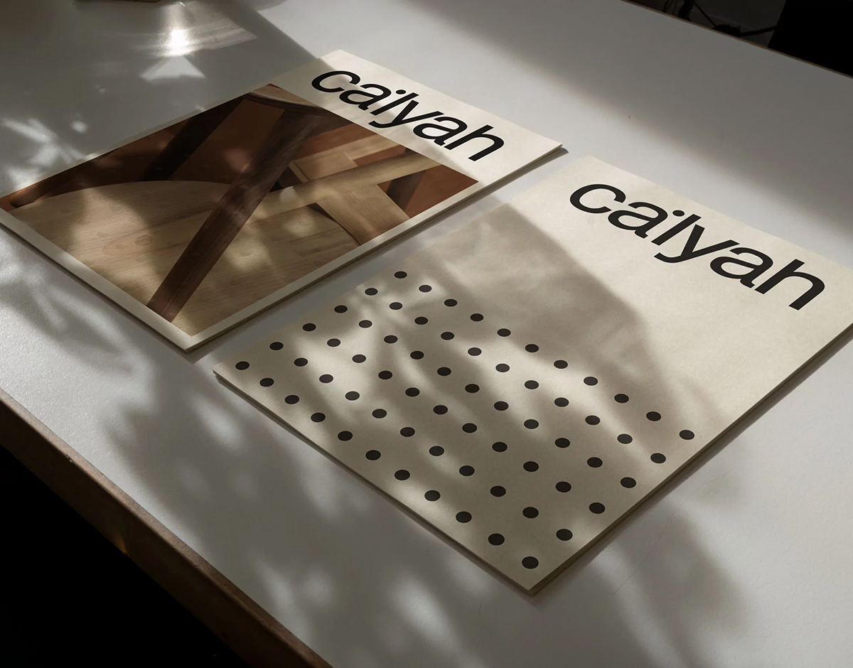
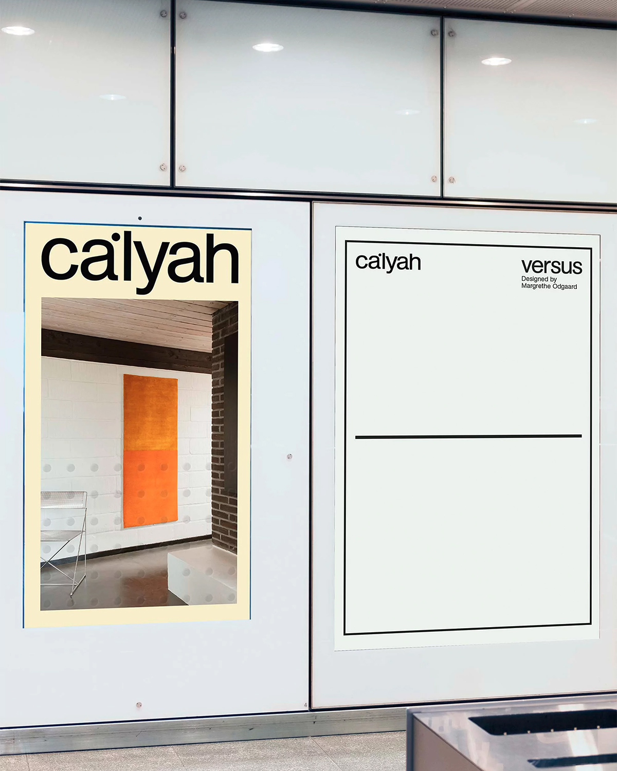
Ca’lyah, by Kiosk Studio
Copenhagen-based furniture brand Ca’lyah — known for its combination of international artistry and homegrown Nordic style — has collaborated with fellow Danish creative agency KIOSK STUDIO on a refined identity, calling upon a slick, serene, and Swiss-like typographic composition to convey Ca’lyah’s core principles and direct the emphasis onto the products themselves. Compositionally stark, Ca’lyah’s minimal design draws interest towards a series of lines and patterns meant to convey a theme of unity, through single and united dot arrangements that signify tolerance and openness. This sense of transparency, similarly evident in the cultural dialogues created within Ca’lyah’s products, is also bolstered by the use of Günter Gerhard Lange’s 1969 AG Book for the brand’s typography.
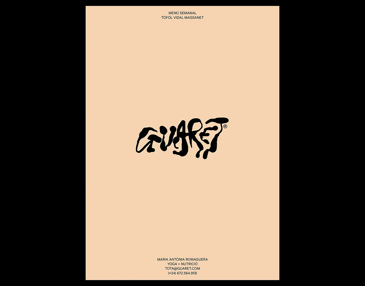
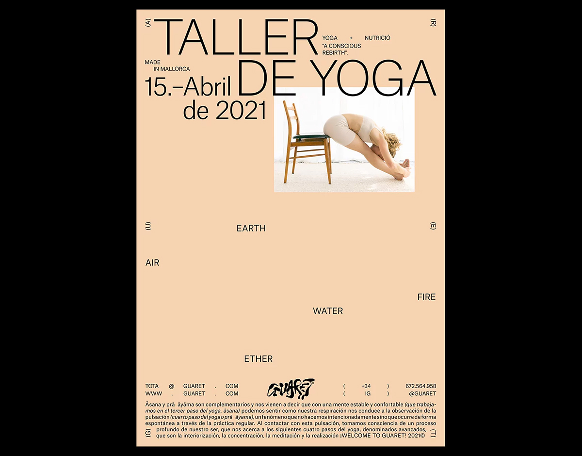
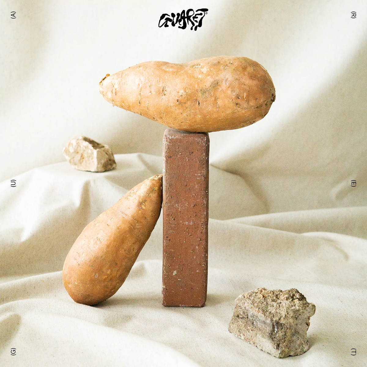
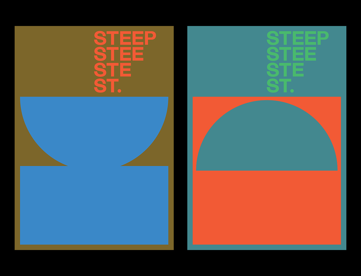
Guaret, by Codea Studio
Barcelona-based creative agency Codea Studio have explored all five earthly elements in their refined yet contrary identity for Guaret, Mallorca’s premier yoga and nutrition hotspot. “For a starting point, we wanted to relate yoga and Guaret to Mallorca, and to the organic feeling of its landscapes,” says Codea founding partner and CCO Alex Martí. That mood and expression is uniquely captured in the brand’s charmingly crude wordmark, which was designed in reference to a local legend. “The style of Joan Miró appeared as a perfect reference,” Martí adds. “We took the style of his strokes to represent the island and its natural and organic flair” — in doing so crafting a mark in keeping with the spirit of the company.