06.05.12
Q+A
With Martin Lorenz, Co-Editor of Pretty Ugly
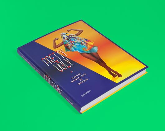
There are moments, when leafing through the pages of Pretty Ugly, that you’ll feel a little perplexed. Not by the stretched and layered type that practitioners of the New Ugly graphics movement use to obscure the messages contained in their work, nor by the fact that brands and organizations are trying to sell themselves with these deliberately obtuse images. What you’ll find so confusing, rather, is just how beautiful most of the projects appear, despite their creators’ best attempts at visual rebellion — a fact acknowledged by the book’s editors, Lupi Asensio and Martin Lorenz of the Barcelona-based firm twopoints.net, in its oxymoronic title. There are two reasons for this, Lorenz revealed when Sight Unseen sat down to interview him about the project: The first and most obvious is that we’re closer to the end of the New Ugly movement than the beginning, which is precisely what made the couple feel the time was ripe for a retrospective. Steven Heller has written about it, Urban Outfitters has embraced it, and we’ve gotten increasingly used to it — and desensitized to its shock value — ever since Mike Meiré used it to redesign 032c magazine in 2007. The second reason, and the one your editors found particularly compelling, is that somewhere along the line the New Ugly actually became less about rule-breaking and more about documenting process, with designers creating works that aim to expose the mechanics behind their boundary-pushing techniques. Read more of Lorenz’s thoughts about Pretty Ugly in our interview, then follow this link to purchase a copy of the book.
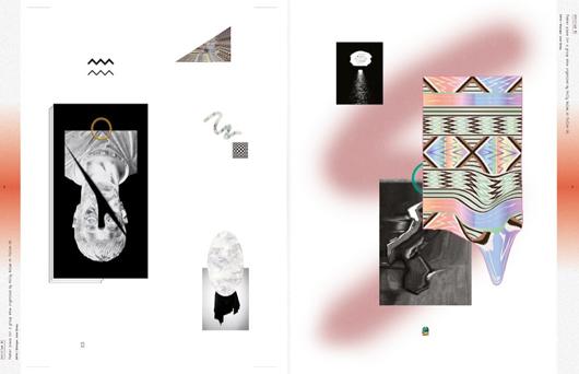
Joel Evey, spread from Pretty Ugly
Pretty Ugly is a nice play on words — how did you decide that would be the name of the book?
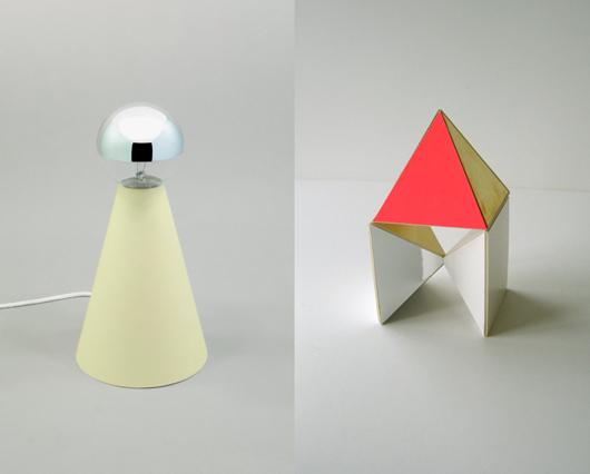
We were definitely playing with the title: For us it’s not pretty ugly, it’s pretty/ugly, and how little a difference there is between the two in this movement. But actually the book isn’t about being pretty or ugly at all. The whole New Ugly movement in the beginning was about trying to rebel against the established rules, and finding aesthetics that could trigger that effect in people. But now it’s not as much about trying to be rebellious, it’s more a contemporary methodology of working. It’s process-based; it’s thinking about the context in which your work is going to be shown. If you look at the examples of industrial design we included in the book, like Nacho Carbonell’s work or the Belgian couple Cox and Grusenmeyer, their aesthetic is really rough, and they do things that were forbidden before. But if you talk to them, they don’t say, “I want to do something ugly so I shock people.” They say, “What I’m doing is really honest — I’m showing the methodology behind my work.” Their work is constantly changing; it’s not something finished and super-polished that goes into a museum and can’t be touched anymore. They’re opening up and exposing something that maybe wasn’t shown before.
And is it the same for graphic designers? That they’re focused on showing the seams of their work?
Yes, they’re creating work that looks rough and unfinished — something that’s still in progress. What’s interesting is that by showing this process and working with programs and typefaces like Arial that everyone can use, in a way it opened up the design process to young designers. You see this in fanzines, where people are doing graphics in Excel, and taking programs that are typically used by non-designers and using them to create sophisticated design.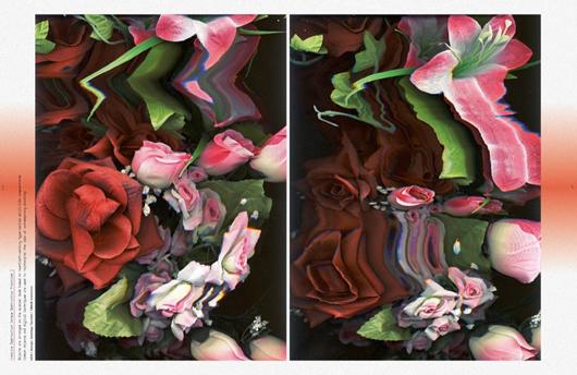 Santiago Taccetti, spread from Pretty Ugly
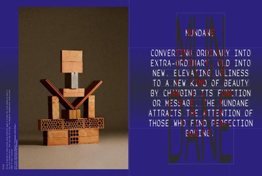
Right, a title page from Pretty Ugly using stretched type; left, an Apartamento photo by Nacho Alegre
Can you describe some of the actual techniques and touchpoints behind New Ugly?
Aesthetically speaking, certain visual effects are always repeating. So you have the Photoshop gradient, and the airbrush, and using that gray-and-white checkered Photoshop background. Then it’s using typefaces like Arial or Times, system fonts that everyone has. I haven’t seen Comic Sans—yet. The origins of that probably lie in the default design movement, which happened a decade ago in Holland. It was really popular to do design that didn’t look designed, using Times and Arial. This movement merged with the New Ugly movement. Then you see a lot this photocopy aesthetic: taking an image and photocopying it and having this bad texture, and sometimes moving the images while you’re copying them. This was done a lot in schools in the ’90s as an exercise, with photocopy machines. Nowadays since most of the young designers don’t have access to a photocopier, they do it with a scanner; in the book there’s a designer who refers to Renaissance paintings by putting roses on a scanner and moving them (above top), so you have this idea of nature against the artificial. The New Ugly movement really encompasses everything considered ugly, so using a Greek sculpture or column, or ’80s colors like mint and lilac, or Memphis-like textures as well.
I think everything in the book is beautiful.
That’s why we love the title so much. The publisher told us we shouldn’t tell anyone the title until the end, actually, because they thought the subjects in the book might get offended by it. Which of course wasn’t the case.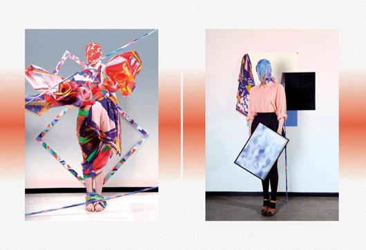
Killian Loddo, spread from Pretty Ugly
What do you think is actually ugly these days?
People still send us stuff trying to top each other in ugliness, but it’s really difficult to make something really ugly. You can do something pointless, or boring, but you can’t say that this is really ugly. This was part of the objective of this movement, to push the boundaries, and to get people to accept things they wouldn’t have accepted before. But what’s really important now is humor, and not taking yourself too seriously. It’s not like a ha-ha joke, and wanting to do funny things, but a kind of self-irony—saying, “We’re not going to take ourselves that seriously anymore. We’re going to put something out there, even if people inevitably say oh you’re such a bad designer, why are you using this font.” It’s a lot about that.
Most people point to Mike Meiré’s redesign of 032c as the turning point for New Ugly. Was that the moment it became recognized as a movement?
I think what 032c were doing by distorting type was certainly part of the New Ugly movement, but the function was totally different. Visually, of course, it was one of the first examples, but now the methodology behind the work is more important. Meire wanted to create an identity that looked nothing like other magazines out at the time; he used the design to differentiate it, but he wasn’t really opening up his process to others. It was a gesture. What you’re seeing now is different. When you look at Metahaven, for example, who did covers for Print magazine and a proposal for the Wikileaks identity, you see this multilayered design, a flexible visual identity that can be worked with in many different ways. It’s like the designer creates a toolbox for the client, and the client can create his own application.
Who else has played a key role?
For one, a school like Werkplaats Typografie, in Arnhem, where Armand Mevis and Karel Martens are teaching. If you go through their students’work, every second piece could be considered part of the New Ugly movement. A lot of people in Pretty Ugly did their postgraduate degrees there.
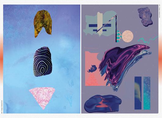 Andreas Ervik, spread from Pretty Ugly
What work in the book do you think the average person would find the most jarring or confusing?
Maybe Andreas Ervik’s illustrations—in all the other pieces you can understand what the objective of the designer is, what he or she wants to express, but his work is really hard to read. A lot of the works in the book, if you see them for the first time, you might wonder if it’s actually design. In the context of the book, it’s obvious, but if you only saw one work in the context of everyday life, you probably couldn’t tell if the designer did it ugly on purpose or not, or whether it was done by an amateur. Most of the designers are trying to look amateur, and working really hard to forget everything they know. If you look at the books that Rob van den Nieuwenhuizen did for Onomatopee, for instance, he’s doing everything a good typographer would do, but then deliberately making it hard to read.
I think some people would be surprised to find that you included examples in the book that aren’t graphic design.
The graphic designers are maybe the most mainstream examples, but there are fashion designers who are doing even more interesting work within the movement, precisely because they’re not graphic designers — when they do illustrations, then it’s really getting ugly. They work a lot with textures, so at the end you don’t see anything anymore of their clothes, you just get a feeling for their work. Fashion designers like Andrea Crews often create two different presentations of their works: one normal shoot where they just present their line, and then a more abstract shoot. There’s also a New Ugly strain in industrial design, and we could have found examples in architecture as well. We really wanted to make this a fluid mixture between all the different disciplines. It happened in all of them at the same time.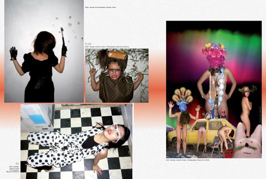 Andrea Crews, spread from Pretty Ugly
That’s when you see that it’s a real movement — because it’s happening everywhere. It’s not just Mike Meiré who started something and everyone thought it was genius. It’s something that people felt the need for, to do something different and do something considered ugly, at least in the beginning. Everyone’s constantly trying to push the boundaries of what their profession is, and what they learned at school. Everything goes in waves. We went from strict rules to loosening up the rules, and most likely after that we’ll return to something strict again.
What rules people were they reacting against, exactly?
One of the most obvious is that typography is holy, and you never would choose any system typeface, or use a Windows program to design something. Within my personal experience, it all makes sense. We both studied in Darmstadt under a Swiss designer, and we learned the Swiss design rules, or really the German-Swiss design rules. Our professors were very strict about typefaces—you could use Univers, Frutiger, Helvetica, or if you wanted to be classic you could use some serif typefaces like Garamond, but these are all properly drawn typefaces. It’s not like someone who has a PC and needs to do a party flyer for his daughter’s kindergarten, with a bad version of Times or Comic Sans, and because he needs it really big, he stretches it to fill the whole page. Doing something like that was totally forbidden. And yet at that moment you still think you have all the freedom in the world—and then Mike Meire comes along and does this stretching typefaces thing that you’ve seen before on record sleeves like Gangstarr, or some ’90s bands, and then you see it in a magazine that’s supposed to be for intellectuals, and it feels kind of shocking. To many of us it was actually just shocking that there was still something to shock with; a big part of the attraction to that style comes from the fact that designers considered to be good broke rules we didn’t even know still existed.
What’s the status of the New Ugly now? Is it trendy? Is it becoming passé?
If a certain style gets popular, it inevitably becomes a trend, and then it starts to become empty. What’s more interesting is what the designers were actually doing when they were practicing it. Yes, it’s a trend now—when we were doing our research, we had over 120 people participating, and our first version had 900 pages and was very difficult to boil down. So you can see that it became a massive trend for young designers. Having Metahaven doing the covers of Print magazine—that wouldn’t have happened five years ago. It’s not mainstream, of course, but for many people inside the design world it means something’s established, you’re not just a freak anymore. There are people that accept what you’re doing. There’s also the work of Zak Kyes, who designs all the publications for the Architectural Association school in London, and of course Urban Outfitters. A lot of people in the book, like Joel Evey, have worked for them, and they did pretty trashy things for them as well. But we thought that now was a good time to make this book, because first you get a distance to what happened over the last 10 years, and then it’s to the point that it’s really interesting, and you start learning from it. We think that in a few years people will become tired of it, and the ones that are most interested in it will try to get distance from it and do something new again.
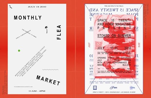 Joel Evey for Urban Outfitters, spread from Pretty Ugly
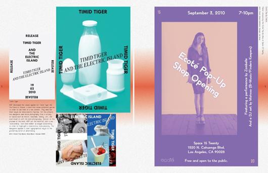 Left, HORT for Sony Music; right, Joel Evey for Urban Outfitters. Spread from Pretty Ugly
When that happens, what do you think will be New Ugly’s lasting effect?
You can’t go back anymore to a non-context-driven version of design, because this is the time we live in. Everything we do has an immediate response. Look at the social networks, and how institutions move inside these social networks—it’s not anymore one static message sent out by a company, you have to be much more flexible in the way you’re reacting. Seeing design as a process is a movement that can’t be stopped.
What one day will stop is this kind of anti-aesthetic; people won’t consider this as ugly anymore. They’ll get used to it, and they’ll need something else to move on to, something else to excite them. It’s really hard, even now, to do something ugly. Designers were fighting so hard to destroy the last rules in design, but it’s not that interesting anymore to fight against the established rules, because there are no rules anymore—everyone can do what he or she feels like doing. And this type of typographic treatment that you see now, with stretched typefaces, it actually all happened before. If you look at record sleeves in the ’80s and early ’90s, it was already there. In this New Ugly movement you also have a lot of references to Memphis design. Most of the people working with these kinds of elements weren’t even born at that time.
Lupi and I see a lot of repetition there. Of course it works, because some time has passed and it’s new again, and of course the young designers do different things with it. Times have changed, and the message has changed even though the aesthetics might be similar. So it’s working, in a way. But we think it’s pretty clear that one day there will be overload of empty messages using these aesthetics and people will get bored. You’re already starting to see some of the Photoshop effects and visual gestures repeating over and over again, and there’s less and less space to explore new things within the movement. The more they’re repeating, the bigger the feeling grows that this will come to an end.
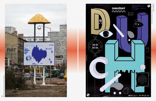
Anymade Studio, spread from Pretty Ugly
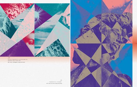
Antti Uotila, spread from Pretty Ugly
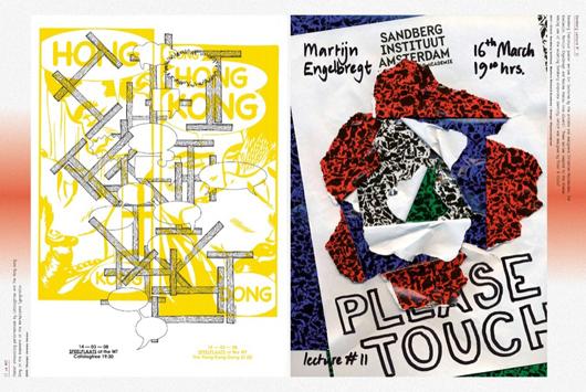
Ohyescoolgreat, spread from Pretty Ugly
