02.10.21
Q+A
Milanese Set Designer Elena Mora Has Perfected the Surreal
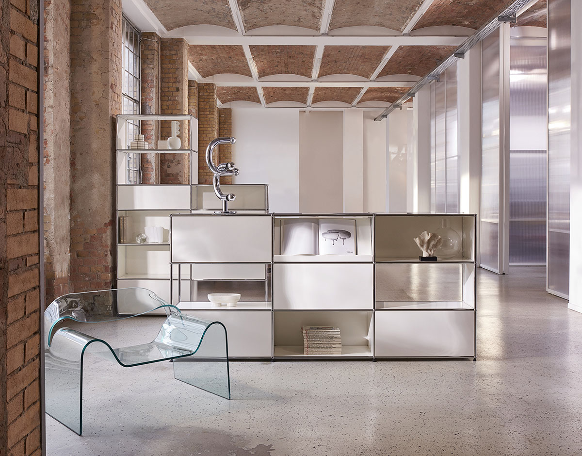
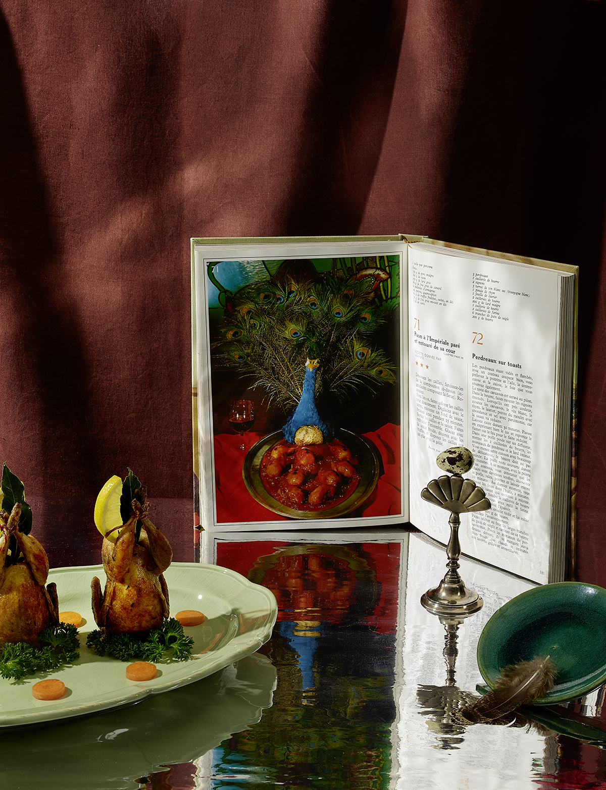
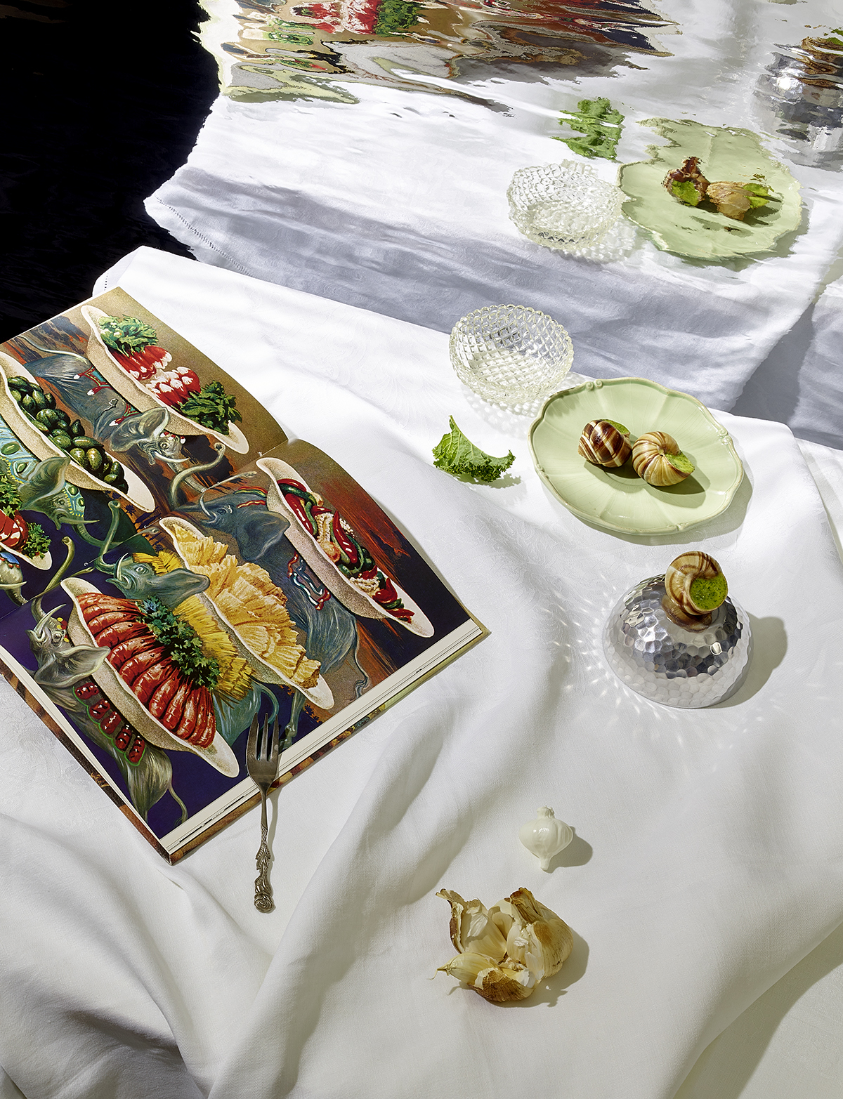
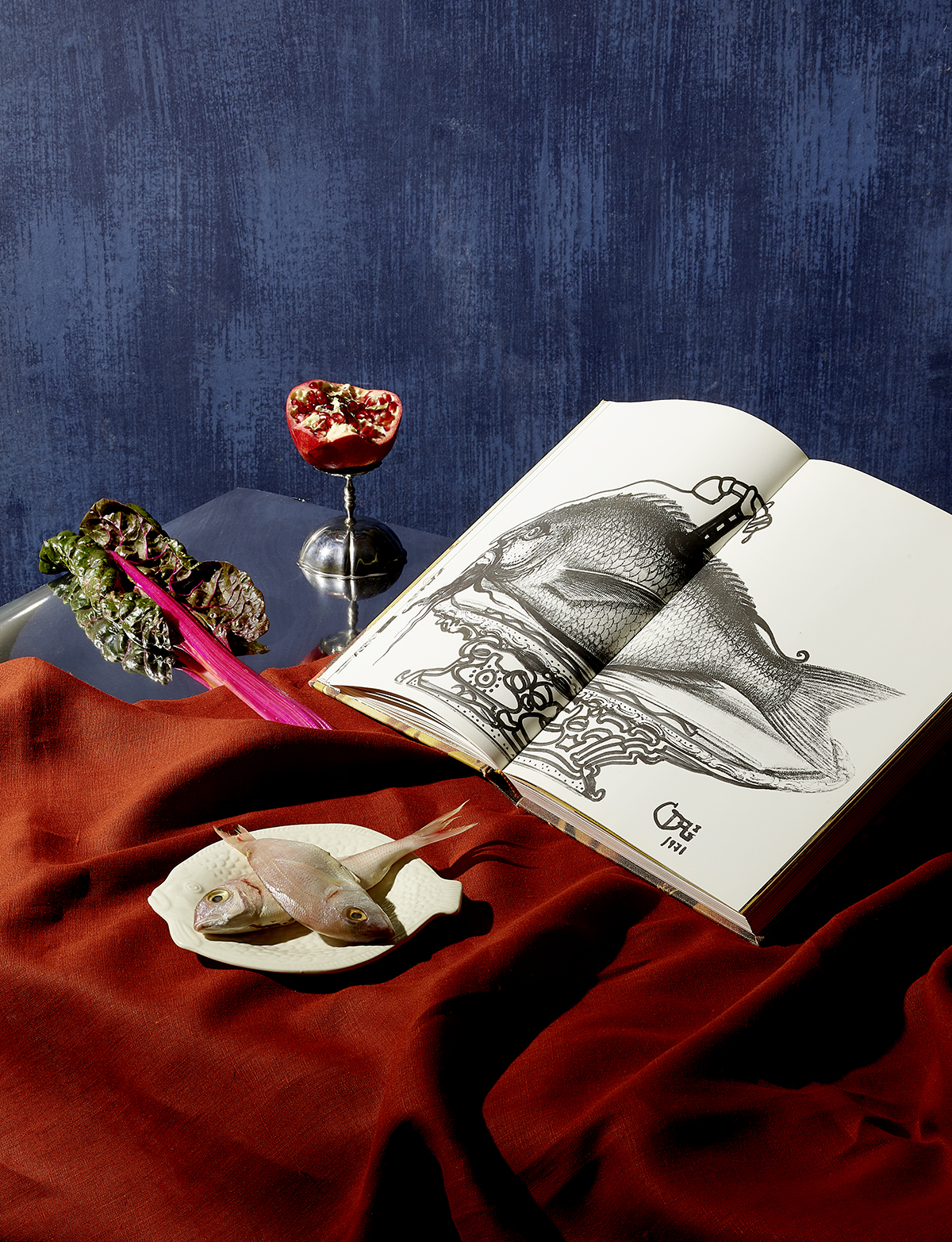
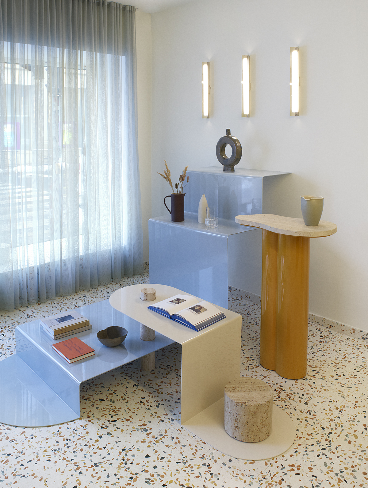
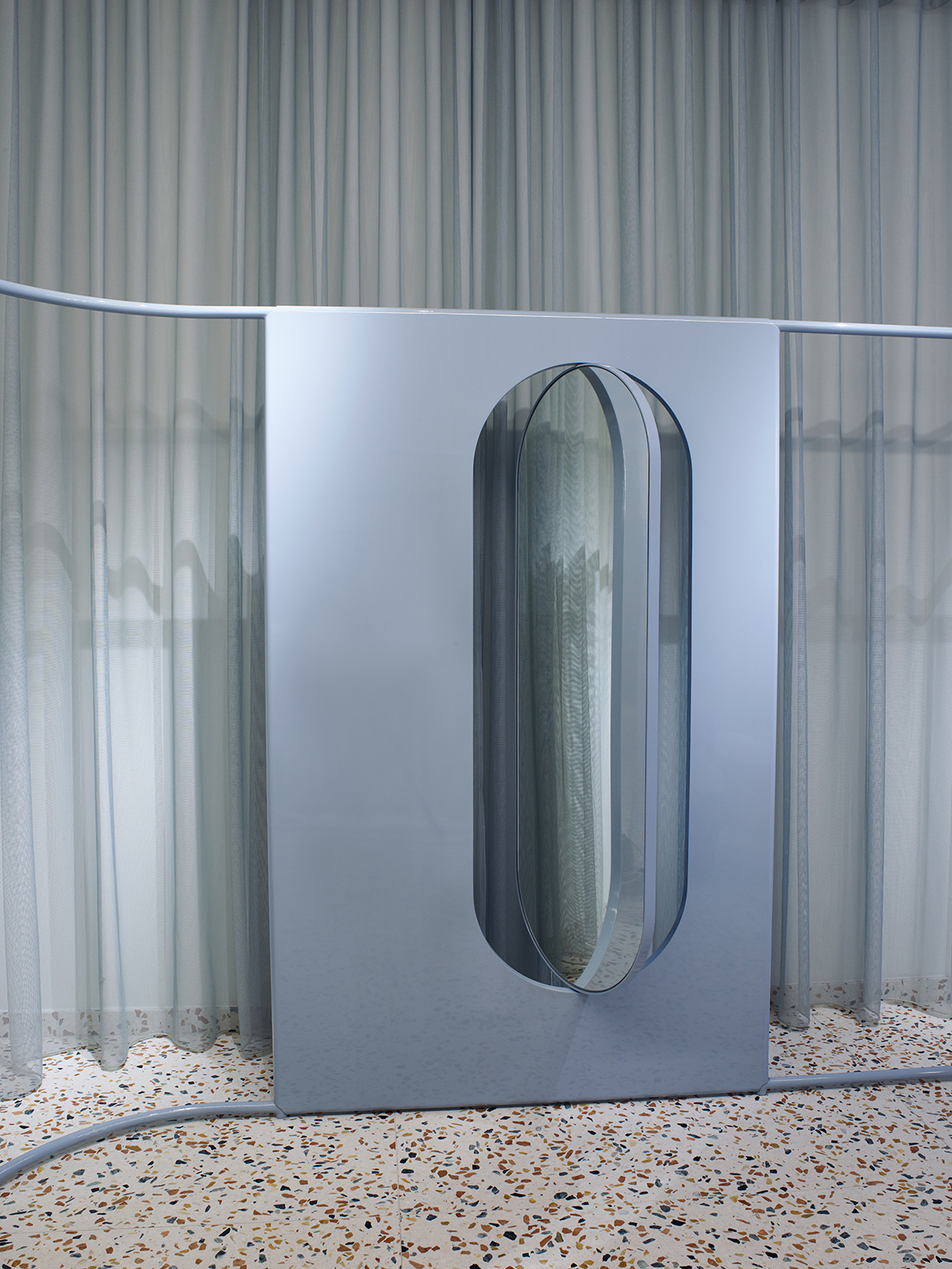
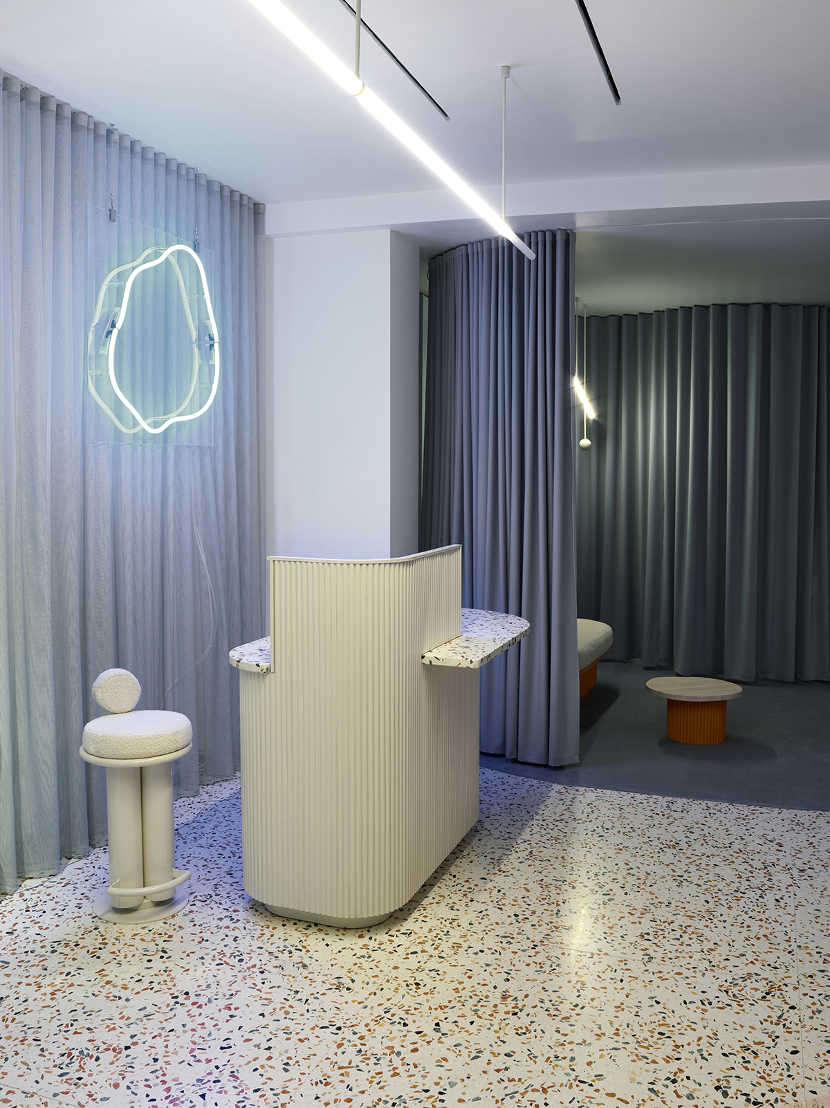
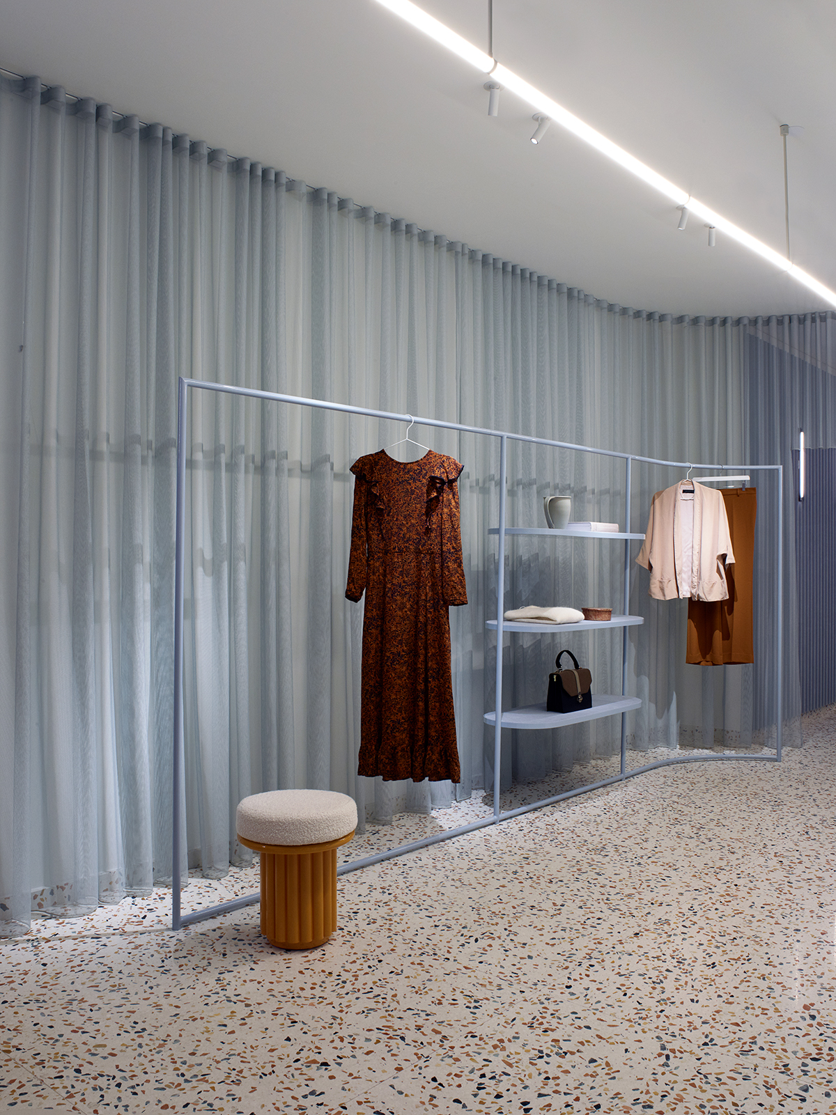
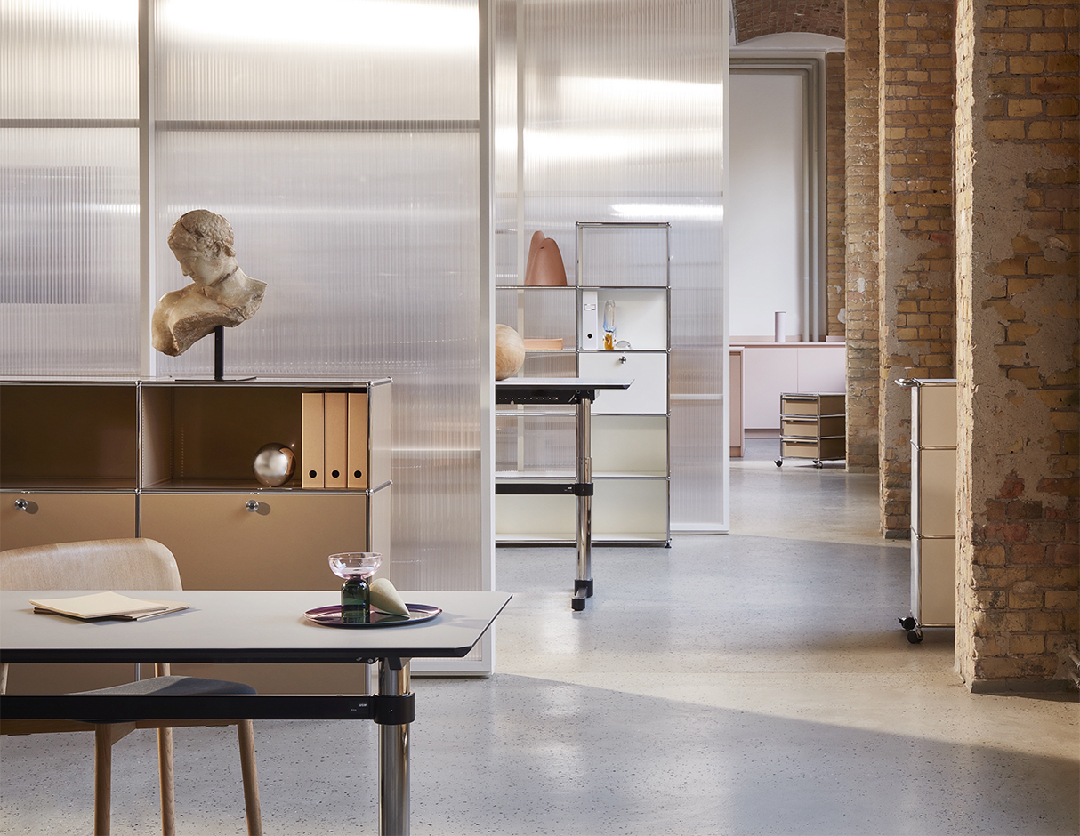
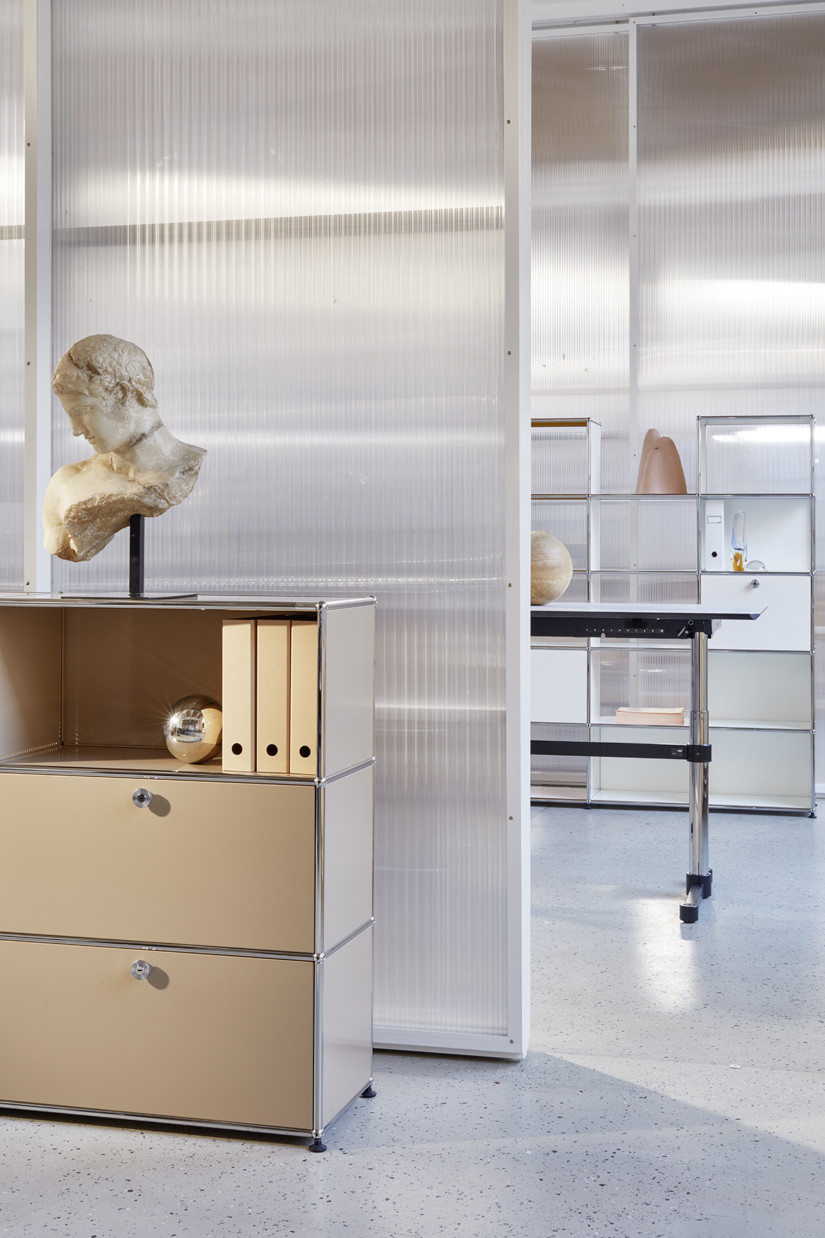
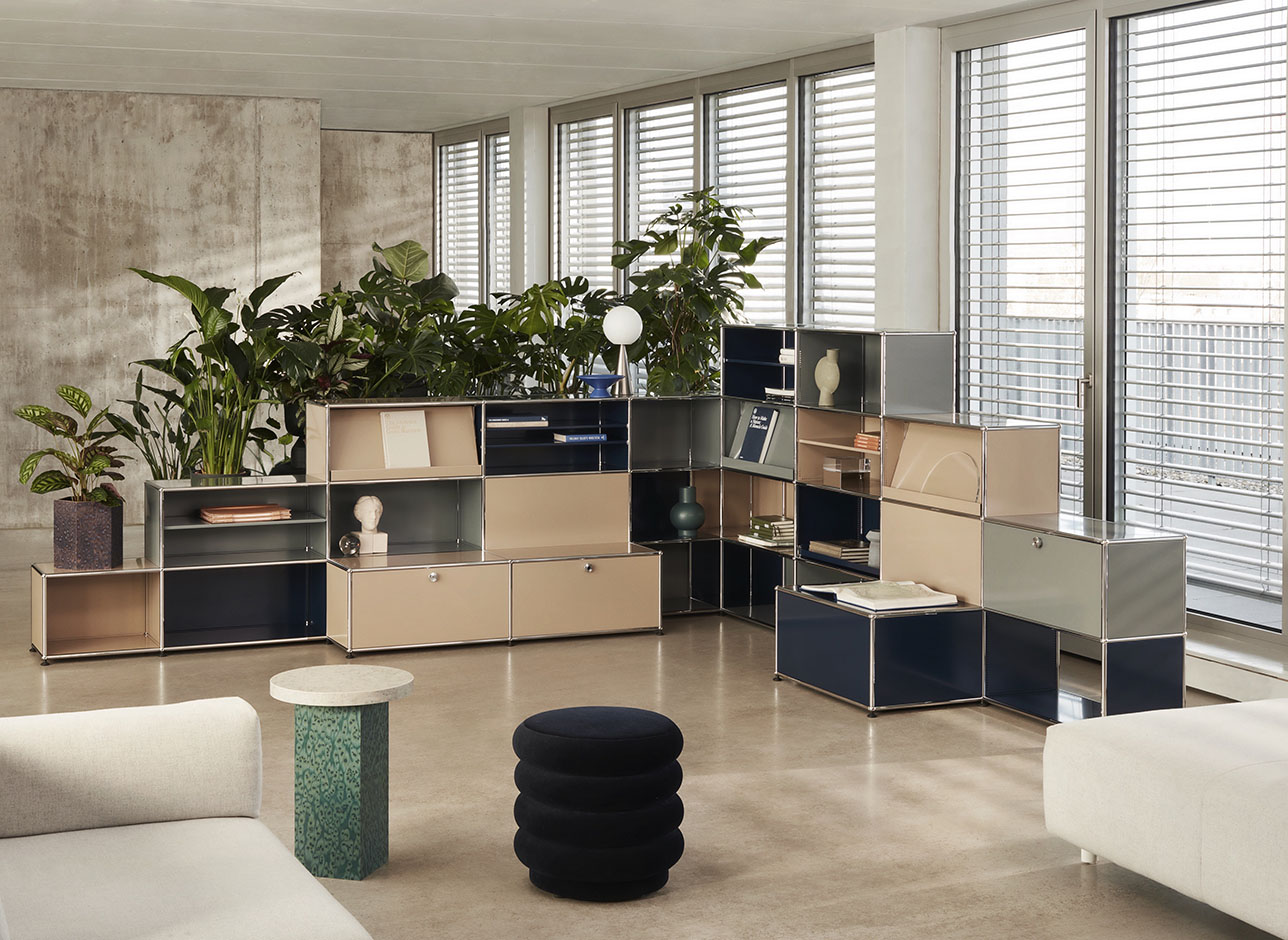
If you followed the now-defunct Icon Design Italy in its final few years, you would know exactly who Elena Mora is. The Milanese set designer and interior stylist’s cinematic spreads were always a highlight of the Italian design magazine. Recognizable for her lush use of color and irreverent bordering on surreal scenarios, Mora’s work is always so much more than just a product round-up. Based between Milan and Hamburg, in addition to her editorial work and a recent retail concept for the Manalena shop in Luxembourg, Mora has collaborated with brands like USM, Herman Miller, Caesarstone, YOOX, Audi, and Adidas to create visuals for ad campaigns and video projects.
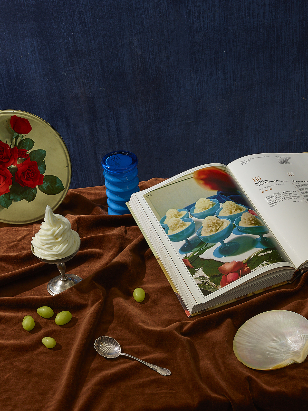
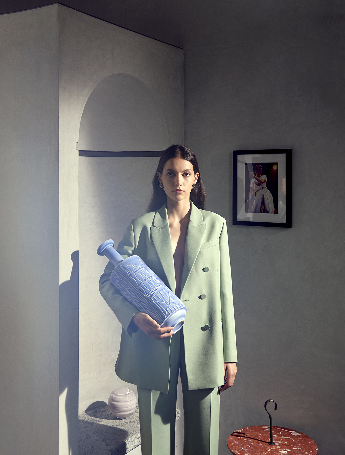
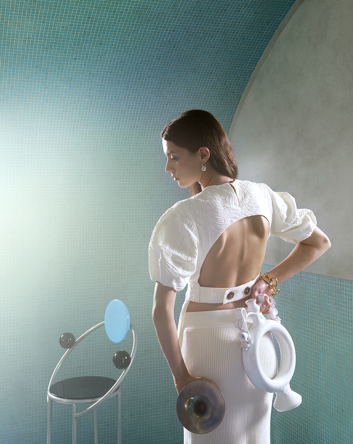
Though her spreads may be exhaustively researched and narrative-heavy — for example, hauling an array of all-white furniture to a dinosaur sculpture park or conjuring up a backstory based on a series of illicit rendezvous — her real talent lies in the uncanny way objects and furniture come to life under her hand. Which, in image-making terms, feels less Dutch still life and more Dalí painting: always with a sense of humor and some element of the unexpected. We chatted with Mora about how she got into styling, spontaneity on set, and her obsession with all things glass.
![]()
![]()
![]()
![]()
Tell us a bit about your background. How did you get into styling? What did you study?
I started at Politecnico, which is the design University here in Milan. I first studied product design, but I realized that at the end of my three years I was much more interested in communicating the project than actually doing a design project itself. So I did my Masters in Visual Communication, which is another branch of the design university. I did a period of studies in Finland, which was really fun. Their approach was much more free and experimental than what I was used to in Italy. I then moved to Berlin to work on my thesis, where I worked in some graphic offices and did some internships. My first “real” job was working as a graphic designer for Mousse Magazine, which is a contemporary art magazine here in Milan that also publishes art books and does some exhibition design.
How did you make the transition into set design?
I was sure since the beginning that I wanted to go more into set design, which in the end is very connected to what I had already been doing. When you do graphic design, you’re working on the grid, compositions on paper. Set design is just three-dimensional composition, which was, for me, much more interesting. So I started to contact set designers all around the world to see if someone would take me as an assistant. And the only one who really answered me offering me something concrete was in Irina Graewe in Hamburg, so I moved there. After this I just started doing free productions, contacting photographers, and making small productions by myself in order to make a portfolio, because I didn’t have one. I did a lot of free tests, basically for myself, but I got to know a lot of photographers, and little by little I got started.
What was your first big project?
My first big work came after less than a year from Wallpaper* Magazine, which was really exciting. It was ten years ago, but they found me from a little story that was written about my work on the blog Trendland, which eventually made its way onto Pinterest and ended up getting me a lot of attention.
I first remember coming across your work in Icon Design Italy, where we were both contributors. I always found your work to have a really cinematic feel to it, and quite different from the standard set design we’re used to seeing in shelter mags.
These were definitely the most creative things I was working on at the time. The best way I can describe the process was that they never really gave me a precise brief. I was able to do whatever I wanted, so it was like a creative gymnasium where I could experiment and create sets in the style I wanted. In terms of process, I would create a concept, have it approved, then research the colors and products I want to include. But the most important part, for me, is on set. I may think ahead of time what kind of movement I want to see or find references in magazines or in films, but in the moment it’s very much spontaneous. I like to have an idea of what we’re going to do but I need to be free on set in order to have that creative flow. I think that’s what probably makes my works look like its always coming from the same person or gives it a specific style.
Let’s talk about some of those Icon spreads because they’re really fun. The most memorable one for me is the shoot at the dinosaur park — how did that come about?
The process for this shoot was interesting because there was a moment that I really liked to shoot in studios, or build up studio sets with color palettes and texture, and so on. After a few years of this, I started to be more into shooting in real locations. So I did some research and found the location and thought, wow, I love this location, how can I use it in the best way? How can I make a story from this?
![]()
![]()
![]()
![]()
Is that something that’s important to you? To always have sort of a strong concept going into the shoot rather than something that’s based solely on, say, color or texture or a type of product?
Definitely. It’s very easy to do still lifes. You can just use some nice objects, put them in the picture, and it becomes anything you can already find on Pinterest. But, for me, it’s important to have a concept behind it. You need to know, okay, she’s using these elements because this story is about this thing or that. It’s also important for me as a guide when I’m working, that I know exactly what the story is so I can better plan the shoot. For example, the first shoot I did for Icon was about beds. I had this small story in my brain that there was someone inhabiting these rooms. So in every picture, there is an element that that is not really connected to the product. So there is a cigarette in one picture and there are some gloves in another picture, there is some fake hair on the bed. It’s something that helps me to tell the story.
So you have a narrative that ties together all of the scenes?
Mostly, yes. For example, in another shoot I did for Icon, ‘Rendezvous,’ with the photographer Thomas Brown, where you always have in the front of the frame these out of focus flowers as if someone is watching from afar. They’re all situations that are about people meeting secretly. So you have a table set up like someone is eating, or like an office situation. This concept helps you to build up the story and to choose the right products to create the mood.
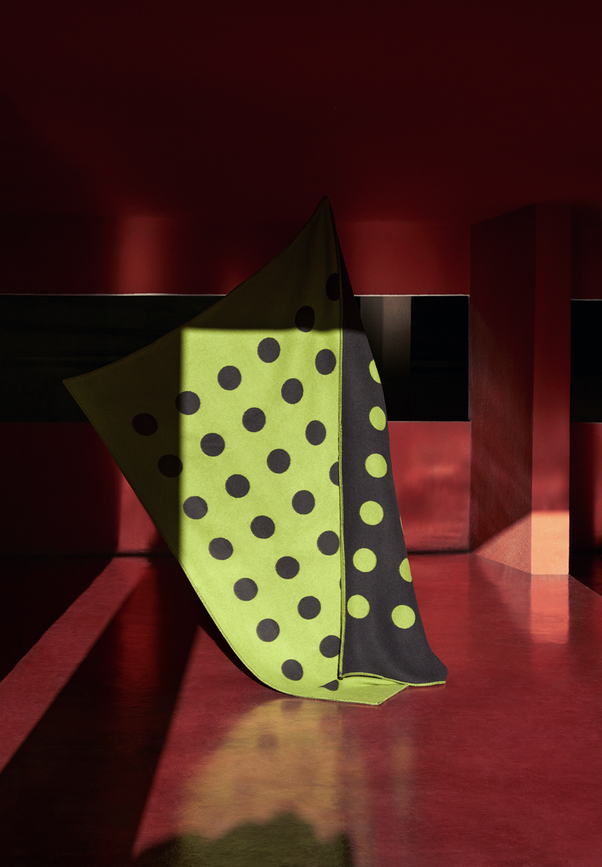
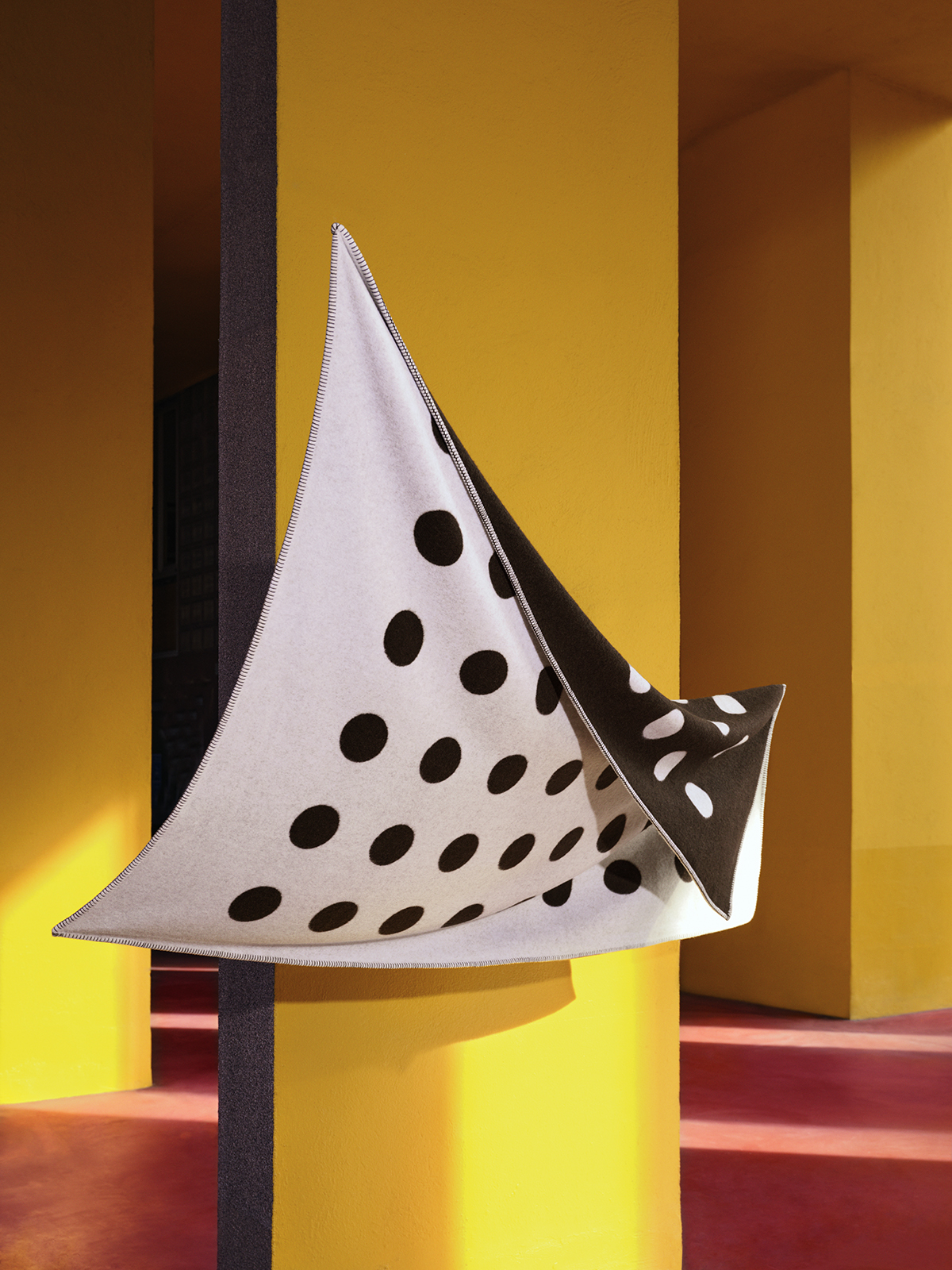
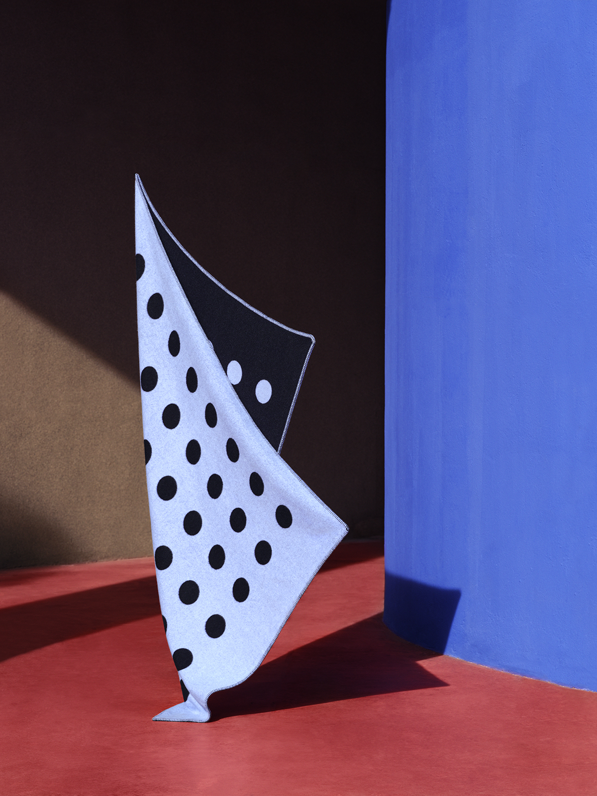
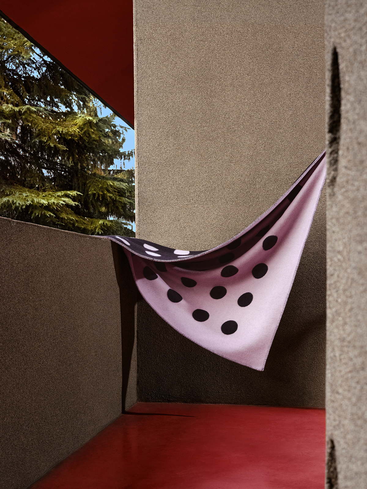
I also really like your recent project with textiles brand LaneRossi, which was shot at one of my favorite buildings in Milan, Aldo Rossi’s Quartiere Gallaratese social housing block. Talk us through that one.
The blankets are actually a reissue of a classic design from 1933; they were originally shown at the Triennale of that year. So the client wanted to have a location with strong color blocking that lived up to that heritage, so that’s why we went there. But it is a super iconic location and everybody knows it, so we tried, with the photographer Ilaria Orsini, to find corners that weren’t so recognizable and create the images a little bit close up and obscured. We also tried to insert a natural element, so in some pictures, you can really see the trees or the sky, which is a nice contrast with the super square, color-blocked location. But even though we had planned out everything ahead of time, what we shot ended up being done very randomly because when we were there shooting, we just thought okay, maybe this is better here and or maybe this is better there. Because especially with a product like this you can’t really know how you’re going to hold it or fold it. So it was super free and super nice. You can’t tell but I’m hiding behind the blankets nine months pregnant holding them up — I actually gave birth three days later!
![]()
![]()
![]()
Let’s talk about another project of yours, Common Sense Common Sense, the Instagram platform for glass objects you’ve been curating.
It was an idea I came up with two years ago when I began to be interested in glass objects — not so much vases or functional pieces, but objects. I always find them to be magical, the way they create these amazing shades and lights and reflections, especially when they’re photographed. And besides this, I was thinking, okay, ceramics have had a moment, it’s an interesting material with a long history, but glass is so much more difficult to work with than ceramics, and thus so much more interesting. It’s also slowly becoming a lost art. So I started collecting vintage pieces that I found in flea markets, or on eBay, or when I was traveling and started selling them through the Instagram account. At the moment I’m working on creating an e-commerce site with my brother [Art Director Alberto Mora] to sell the pieces.
Is glass something you’re planning to explore more in your practice as well?
Yes, what I would like to do next is to start collaborating with glass artists and to make my own designs. I’ve already met with some artisans, mostly based in northern Europe, like Stockholm or in Denmark. I’d like to start a collaboration with them and maybe also resell some of their products through Common Sense.
Looking to the future, what sort of projects do you have coming up?
I’m working on a new LaneRossi catalog and I have a new interior project, a private residence, coming up, which is something I’m hoping to do more of in the future. I love the whole process of designing a space: looking for samples — fabrics, colors, materials — and creating a huge mood board is super fun.
![]()
![]()
![]()
![]()
![]()
![]()
![]()
