Milanese Set Designer Elena Mora Has Perfected the Surreal

If you followed the now-defunct Icon Design Italy in its final few years, you would know exactly who Elena Mora is. The Milanese set designer and interior stylist’s cinematic spreads were always a highlight of the Italian design magazine. Recognizable for her lush use of color and irreverent bordering on surreal scenarios, Mora’s work is always so much more than just a product round-up.
More

How Do You Capture Kinetic Motion in a Still Photo?

That's the challenge Kinfolk magazine recently gave London-based photographer Aaron Tilley for its current Architecture issue. Tilley's work is often concerned with motion or the moment just before motion begins; his subjects include bread whose slices appear caught in mid-tumble or paper sheets that seem to be floating on a table's edge. For Kinfolk, however, the still-life photographer was asked to create the effect of a Rube Goldberg machine — a series of photos in which one action triggers another and another until the payoff in the final frame.
More

10 Designers on Their Favorite Dining Chairs

When you love design as much as we do, it can be hard to choose your favorite, well, anything. If asked to choose our favorite dining chair of all time, for example, would we pick a luxurious Milo Baughman? Or something more classic like Breuer's Cesca chair? That's exactly the question we posed to 10 designers around the world in our role as guest editors of the second-ever issue of MOLD Magazine.
More
contemporary furniture editorial Pippa Drummond Urbis Magazine

A Contemporary Furniture Editorial Inspired by Baldessari, Moholy-Nagy, and More

As you might have guessed from yesterday's story, there's nothing we love more than turning the lens on our own contributors — if only because to interview someone is to get to know them in an intimate way that casual conversation often can't approximate. Case in point: an Q&A and photo essay from earlier this year with one of our favorite SU photographers, Pippa Drummond. Called Gravity's Rainbow, it's a joyful, color-filled editorial that features contemporary and vintage furniture from the likes of Bower, Anna Karlin, Apparatus, Gino Sarfatti and more.
More
Trending colors AD France

The “It” Colors of the Season, According to AD France

A new AD France photoshoot, created by creative director Thibaut Mathieu in collaboration with photographer Peter Langer, focuses on this season's color palettes — which, according to them, include "soap bubble" shades, dense blues, golden hues, intense reds, and copper. It was too good not to repost here.
More

The Houses of Prickly Mountain, from Collective Quarterly 2

Collective Quarterly is a niche journal that deep-dives into a different locale with each issue. In Vermont, the journal pointed its camera lenses at a region known as the Mad River Valley, spotlighting the craftspeople and personalities based in the area, from puppeteers to knife-makers to the brilliantly quirky architects whose profile we're excerpting today.
More

The Spectrum Issue of Gather Journal

Since its launch in 2012, each issue of the biannual food journal Gather has been organized around a theme, but this summer's is by far our favorite. We're excerpting a story from “Spectrum,” an entire issue devoted to color.
More

Week of August 10, 2015

A weekly Saturday recap to share with you our favorite links, discoveries, exhibitions, and more from the past seven days. This week: jaw-dropping jewelry, desktop wallpaper from Baggu, and the latest and greatest in Scandi design, including the new brand AYTM, pictured above.
More

Anders Ruhwald in PIN-UP No. 18

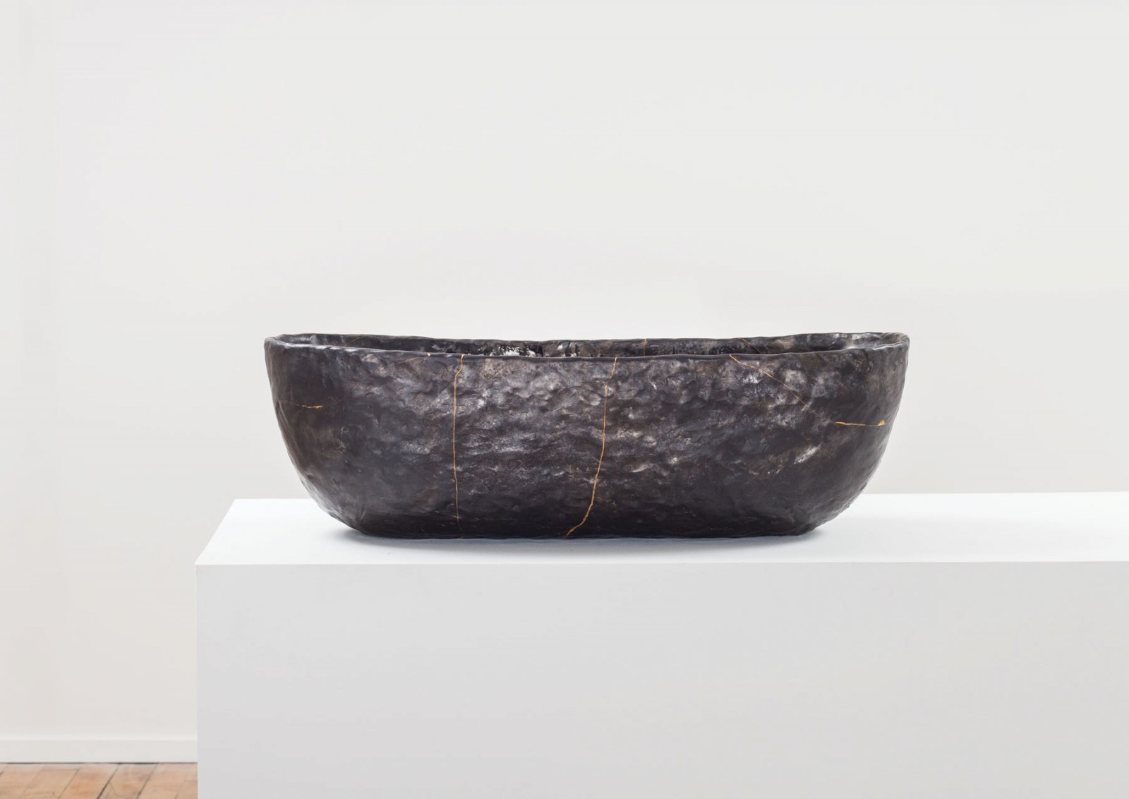
In the lull between Milan and the frenzy of New York design week, it's easy to become a bit myopic about what's going on elsewhere in the design world. But we'd be remiss if we didn't point out an exhibition happening right now with one of most fascinating concepts we've ever come across: At Chicago's Volume Gallery last week, the Detroit ceramicist Anders Ruhwald opened "The Charred Room," an exhibition that explores "the aftermath of a fire – objects as they should be, recognizable to an extent in shape and position in relation to one another – but charred. Slumped, melted and morphed the objects lose their direct references that create comfort, leaving the viewer with renderings of domestic detritus vaguely familiar." We had the pleasure of speaking with Ruhwald about the lead-up and the process behind that exhibition earlier this year, on assignment for PIN-UP, and with the magazine's permission, we're excerpting that story here today.
More

Week of March 23, 2015

A weekly Saturday recap to share with you our favorite links, discoveries, exhibitions, and more from the past seven days. This week: two amazing but different geometric mirrors (including this beach house–ready one by Alex Drew & No One), a digitally rendered interior that has us ready to move in, and vintage napkin rings that look like cool-girl jewelry — by none other than Nathalie du Pasquier.
More

Ron Nagle, Ceramicist

One of the best things about ceramics' recent ascent in the art world is that a brighter light has been shone on designers who were practicing in the medium long before "urban claymaking" was ever a thing. The latest artist to experience a massive upswing in attention is Ron Nagle, the San Francisco–based postwar ceramicist who, in his 70s, still adds to his already massive body of work at an amazing clip. Shown at the last art Biennale in Venice, Nagle is currently the subject of both an exhibition at the San Diego Museum of Art and a lovely feature in the new issue of PIN-UP Magazine, who writes of Nagle's process: "Each [piece] boasts the presence of a monument covered in variations of fine stucco textures sprayed with layers of pastel, blush fields often overtaken by thick glazed pools and electric pinstripes. The pieces begin as collections of hand sculpted elements, and are slip cast, carved and fitted to each other, gaining their deep beds of color from multiple firings that are finished with chinapaint. The forms have shifted in theme through his career: from lean green tendrils hailing from ikebana to diorama scenes housing pulsing red cubes." We're particularly fond of a recurring trope in Nagle's work that resembles glassy spears of asparagus, so we've rounded up a few of our favorite examples here.
More