06.03.19
Up and Coming
Meet Greta Cevenini, The Best Italian Interiors Stylist You’ve Never Heard Of
If you happened to be in Milan this year, you could be forgiven for thinking that Milanese style is defined exclusively by extreme drama: Think Dimorestudio’s thumping nightclub vibes, Elisa Ossino’s hyperbolically moody interiors, PalermoUno’s neon color-scapes or Studiopepe’s recent portal to another dimension. But while these designers undoubtedly push the agenda forward — and make for an entertaining visit during Salone — there is a softer side to Milanese design.
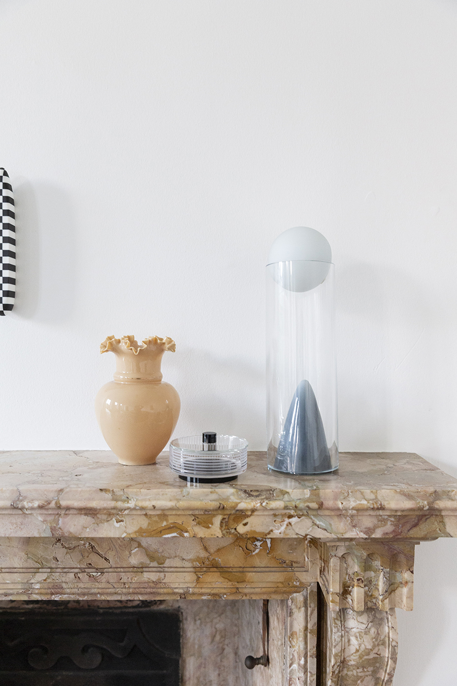
Italian interiors stylist and set designer Greta Cevenini has that ground covered. The Milan-based stylist has been quietly circling behind the scenes of the Italian design world for the past few years, styling lookbooks for Spotti and cc-tapis and envisioning spreads for Icon Design; she most recently took the helm for Cassina’s new catalogue, which was released during Salone. Her work is quiet — cool and rich with light-touch visual references well before they become ubiquitous, leaning more on texture and subtle color variations rather than dramatic, scene-stealing statements. This pared-back style is most clearly on display in her Milan apartment — an understated mix of contemporary pieces and vintage furniture all wrapped up in a charming neutral palette.
Originally from Bologna, Cevenini moved to Milan almost a decade ago to study architecture at the Politecnico but quickly pivoted to styling as a way of finding a freer creative outlet. “I was scared of the idea of entering into an architectural firm and not being able to follow a project all the way from concept to the choice of furnishing details,” she explains of the choice to move into set design, “I’m pretty sure I would have died of boredom.”
We recently spoke with Cevenini about her creative path, what inspires her aesthetic, and what she predicts might be the next big thing in interiors.
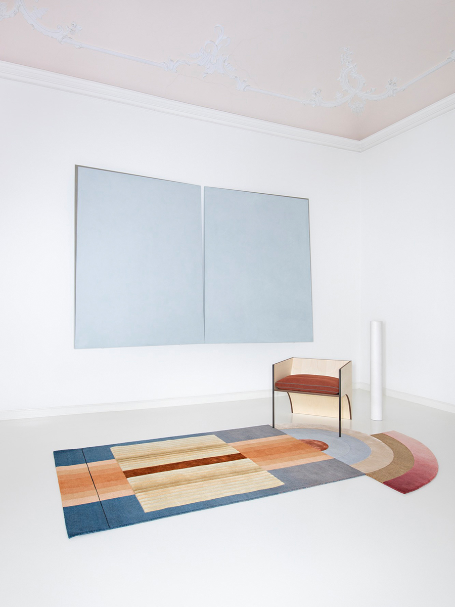
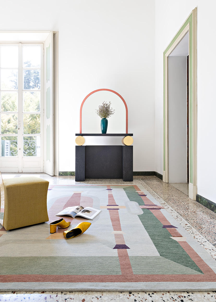
Above: Greta Cevenini for cc-tapis
How do you approach a new concept or design? What’s the first step?
The first step is research: I usually start from an inspiration or a feeling that I would like to have in the story, and then I begin to design and create mood boards and concepts, alone or with an art director, depending on the type of project. During my creative process I usually find inspiration from an interesting light in an image, a mood in another, a composition in a third, and so on. From this, I create my interpretation and my mood board.
What drives the choices you make in your work — color, textures, shapes, symbols, patterns, mediums?
I generally prefer delicate palettes. For me, color is important but not a rule; I love reflective surfaces and transparencies. But my work is not particularly identified with certain color combinations, materials, geometries, and shapes. I like to think I have a freer approach than one defined solely by the project and the story I want to tell. I tend to start with the inspiration of a mood. I often like to look to architecture and the set design of the ‘80s and ‘90s and reinterpret materials and shapes with a contemporary twist.
![]()
![]()
![]()
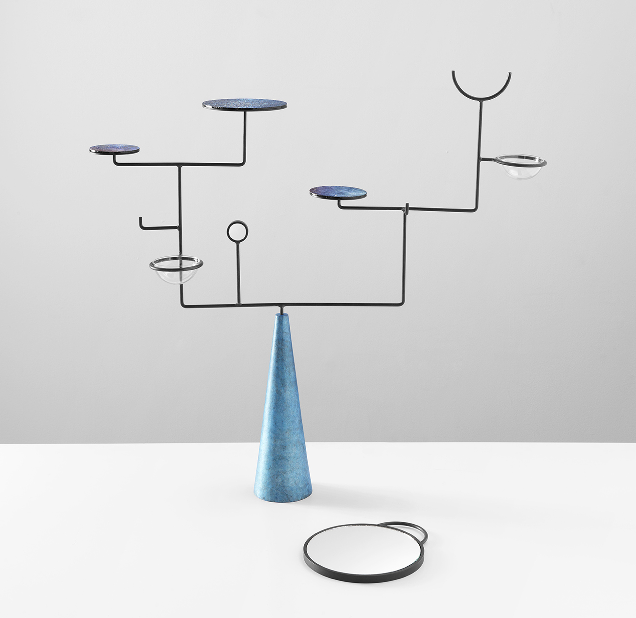
Above: Greta Cevenini for Icon Design
What sorts of things — for example, specific books, movies, or art — inspire your designs?
My work has no well-defined limits; I take inspiration from what surrounds me and from what moves me. I find inspiration in many different thing: the color combinations of unexpected objects, films and movie sets, nature with its design, the choice of materials in ancient architecture, or just some junk left rusting on the sidewalk. My creative approach also varies a lot depending on the type of work I’m doing. For interiors and exhibitions, I try to take inspiration from magazines and catalogues in order to have a vision that is always informed by the contemporary landscape is in terms of materials, furniture and accessories. On the other hand, for my personal research, especially at an editorial level, I try to take inspiration from elements and references that are more foreign to my field, such as art, architecture and fashion.
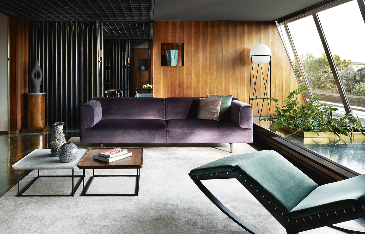
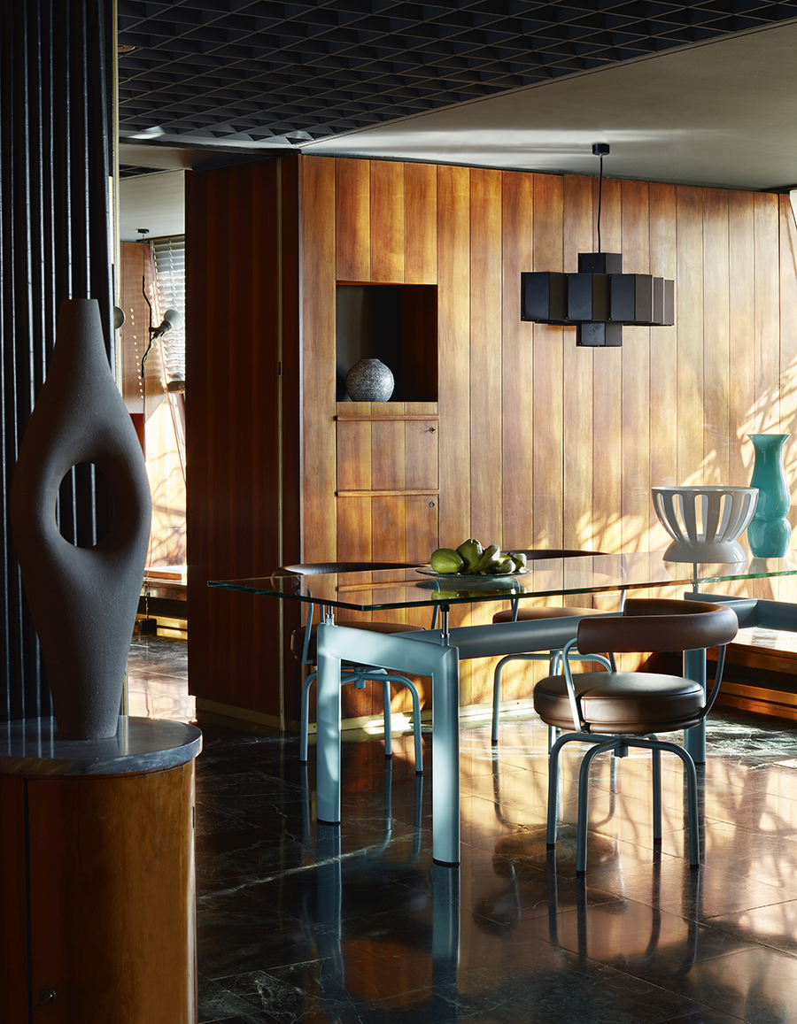
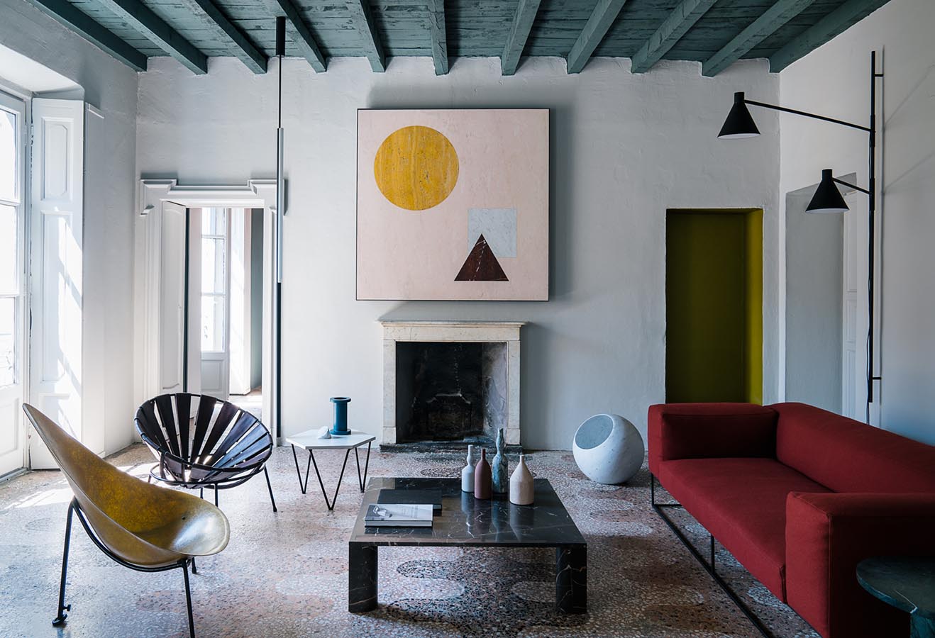
Above: Greta Cevenini for Cassina © DePasquale Maffini
Can you tell us about some recent projects you have worked on?
My most recent project is the new Cassina catalogue. Collaborating with an institution in the world of Italian design — a brand in a continuous dialogue between past, present and future — was very interesting and stimulating. With the creative team, we’ve tried to put together a more truthful concept of set design that best represents Cassina in real-life environments, influenced by works of art, sophisticated styling and characterizing locations.
My favorite images are those taken in a historical residence in Milan. The union between Cassina’s pieces and the architectural details of the apartment is a perfect mix and very characteristic of the Milanese style.
What do you think is going to be the next big trend in styling?
In my opinion, it’s definitely the idea of being freer and leaving behind the codes of a false and tightly structured beauty, re-evaluating even those that are the objects of our daily lives, in order to create a fresh styling that is able to tell a story. It’s part of my creative language to try to mix objects of different nature and form, as well as re-evaluating unexpected objects of everyday usage. It always depends on the assignment and the theme, but I love looking for props in 99-cent stores or flea markets (which I’m crazy for) and mixing them with design objects.
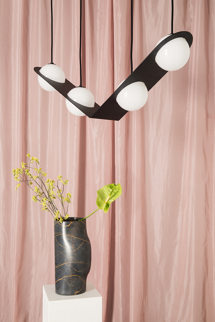
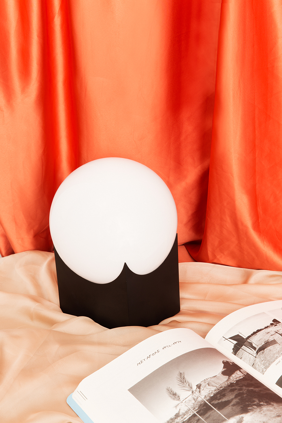
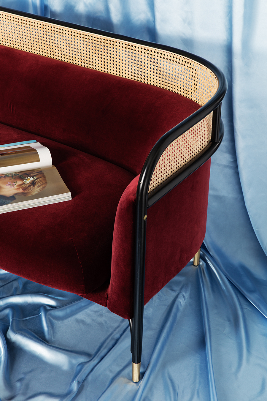
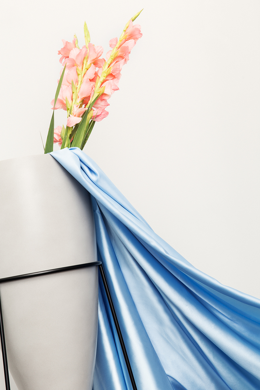
Above: Greta Cevenini for Spotti
What would be your dream commission?
I’d say a photographic project for a brand but addressed with a more editorial approach and concept. Very often brands — when telling their own story — can be heavy-handed in representing the product for commercial purposes. I think it’s important instead to give a broader and more identifiable vision of a mood and an atmosphere that reflects the brand’s identity, with a complete creative consultancy from concept to realization.
Your house seems like a really perfect encapsulation of many of your ideas. How did you land on this particular aesthetic?
The essential element for my home was to create a delicate and relaxed atmosphere by using the natural brightness of the rooms through a palette of neutral tones and natural materials.
I wanted a space that lived on subtle variations of light and color, combined with traditional natural materials such as the terrazzo tiled floor for the bathroom and the corridor, typical of the old Milanese apartments of the early 1900s. I experiment a lot in my work and I wanted my house to be a white box layered with objects and furniture that represent me the most right now.
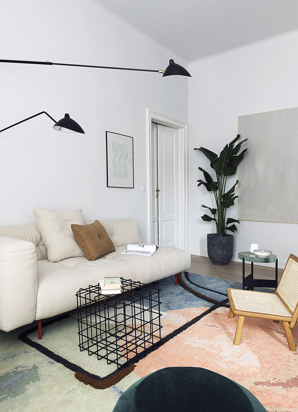
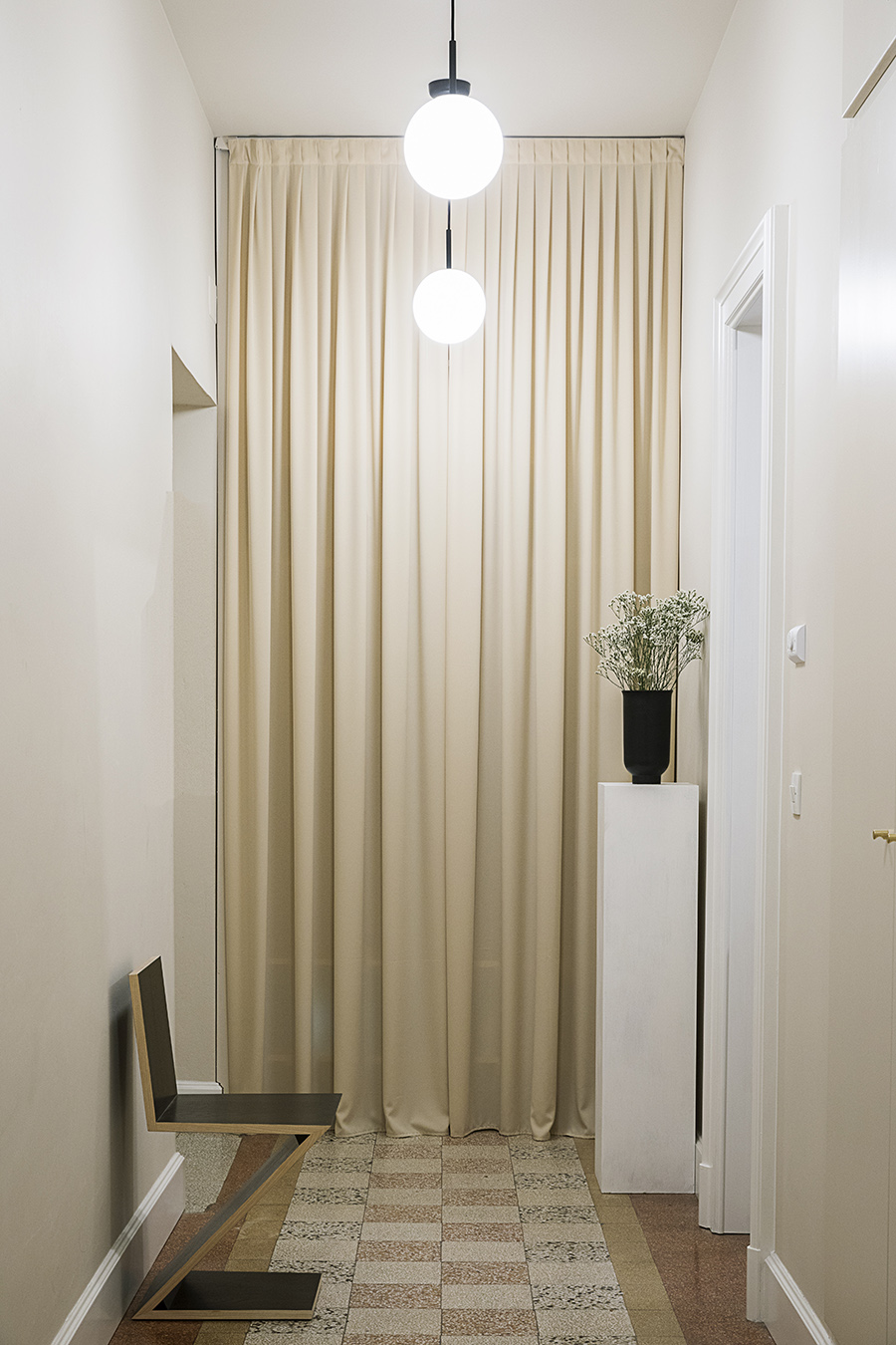
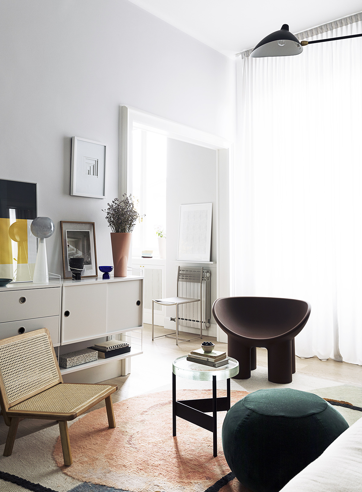
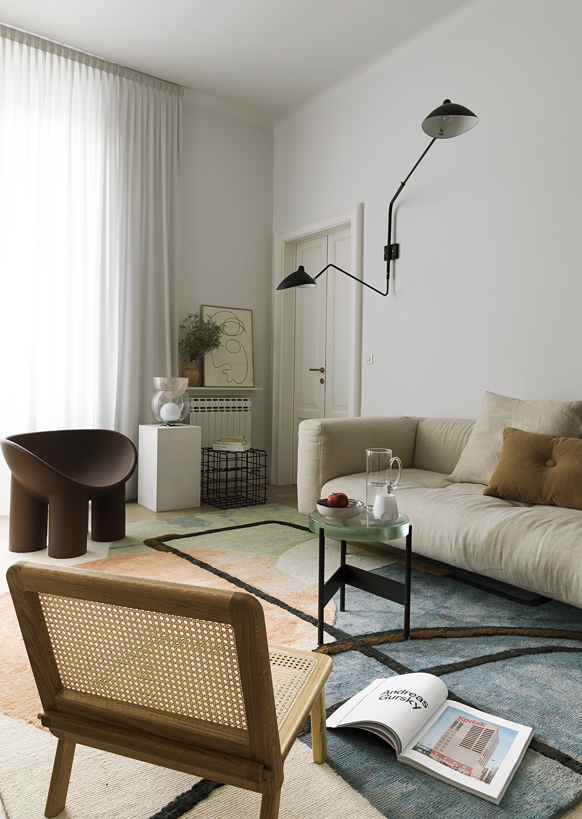
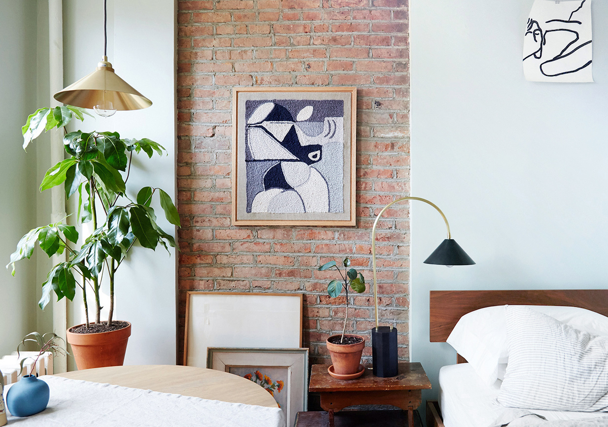
Above: Greta Cevenini’s Milan apartment
In general, what is most important to you when designing a living space?
I generally believe that the most important thing is to start from the concept of space and how it is interpreted and lived. My studies in architecture have definitely had a big influence over this. Even in my house, I have changed a lot the distribution of space and the connection between the various rooms, to best suit my needs. Even in an installation or a set-up, it’s important to have a defined spatial concept. Everything, however, must be linked together by a strong project identity, which can be read in the choice of materials, colors or furnishings.
What’s your favorite detail of this space?
I think it’s the mix of design pieces and no-name pieces that coexist together. I like to stratify, using pieces of different shapes, colors and materials. My overall favorite piece is the bed, I got it from a ‘svuota cantine’ (second-hand furniture outlet), I love it because it’s borderline between trash and a contemporary aesthetic.
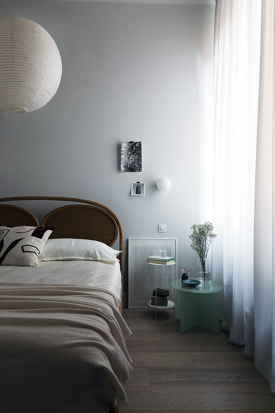
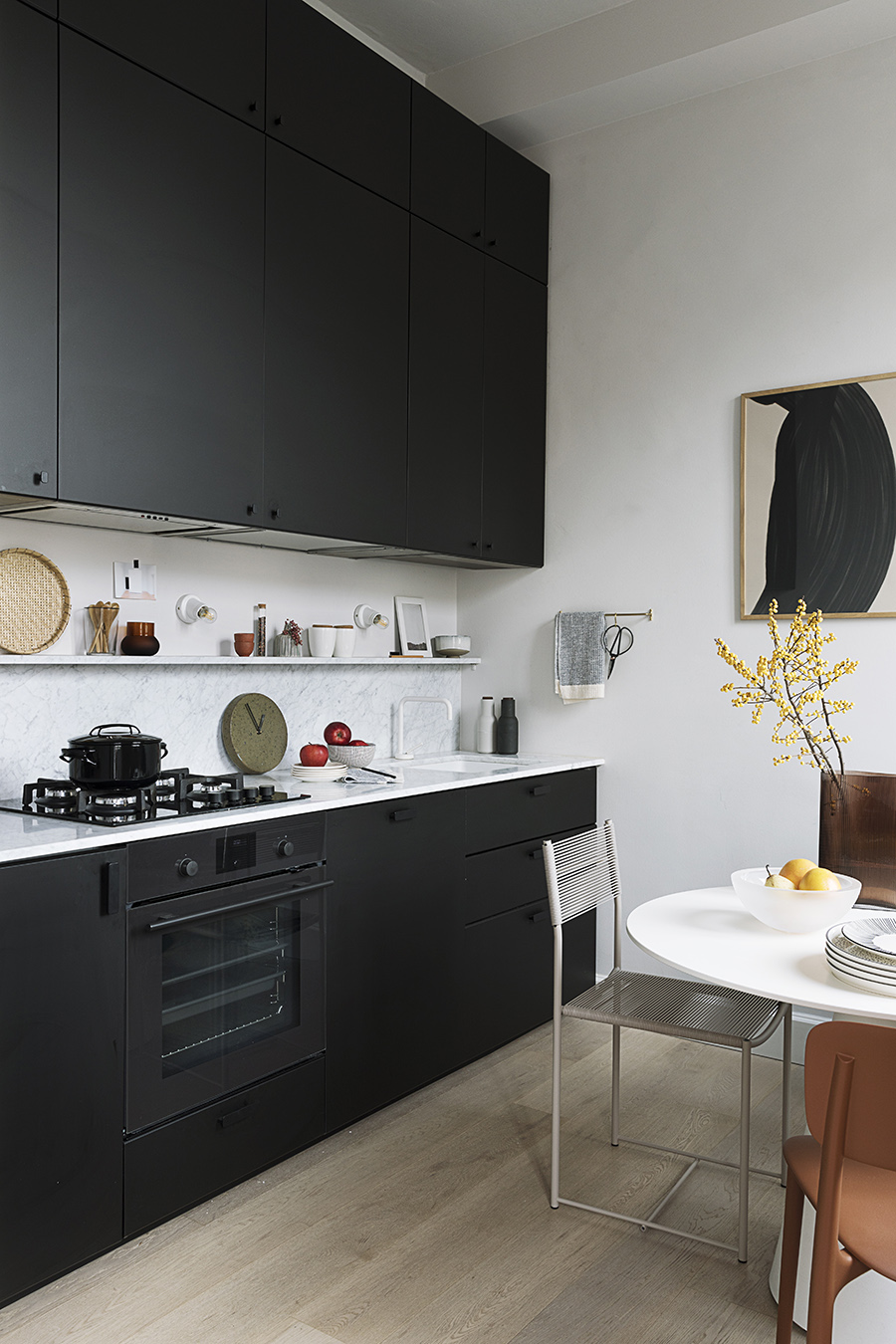
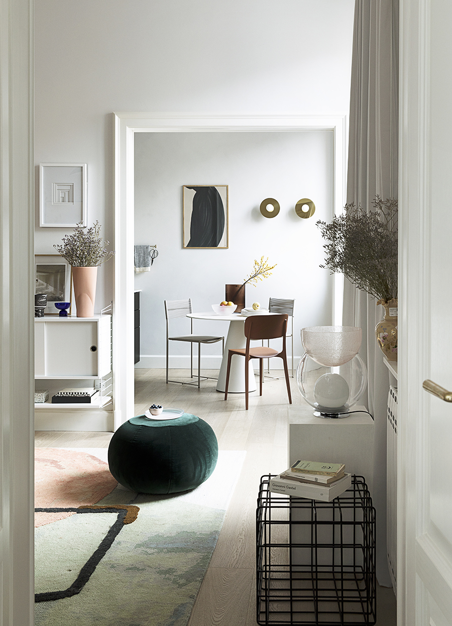
Above: Greta Cevenini’s Milan apartment
What’s next for you?
Right now I’m working on several interesting projects, both editorial and interior. I want to direct myself more and more towards interior projects and set-ups for next year, but I’d like to have more time for personal and research projects.
![]()
![]()
![]()
![]()
![]()
![]()
![]()
Above: Greta Cevenini for Icon Design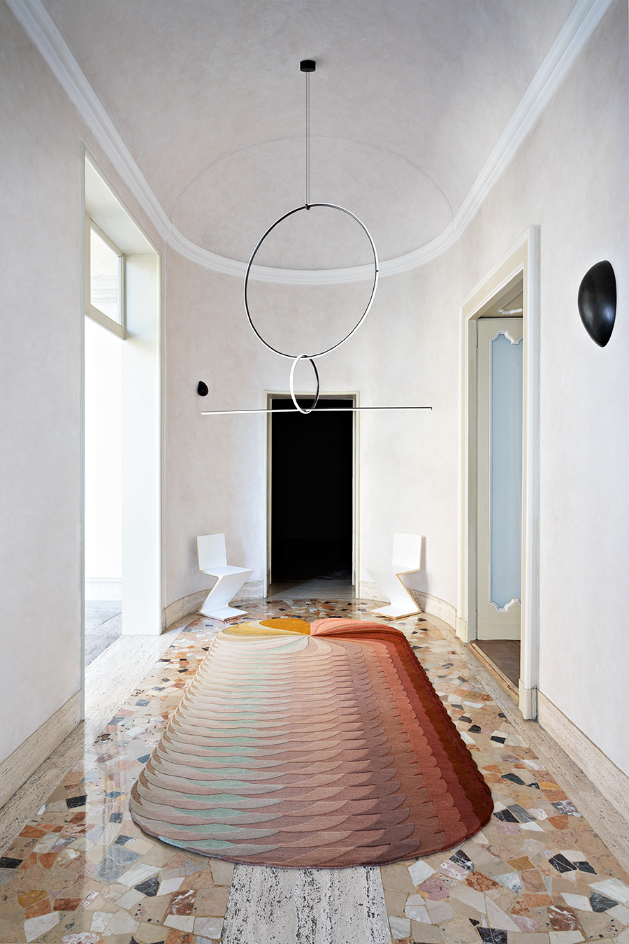
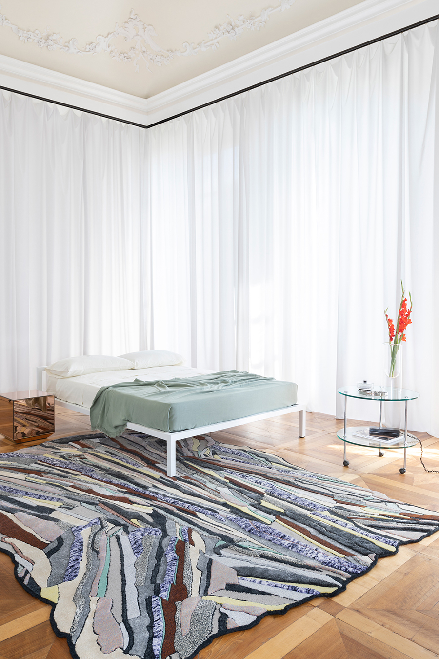
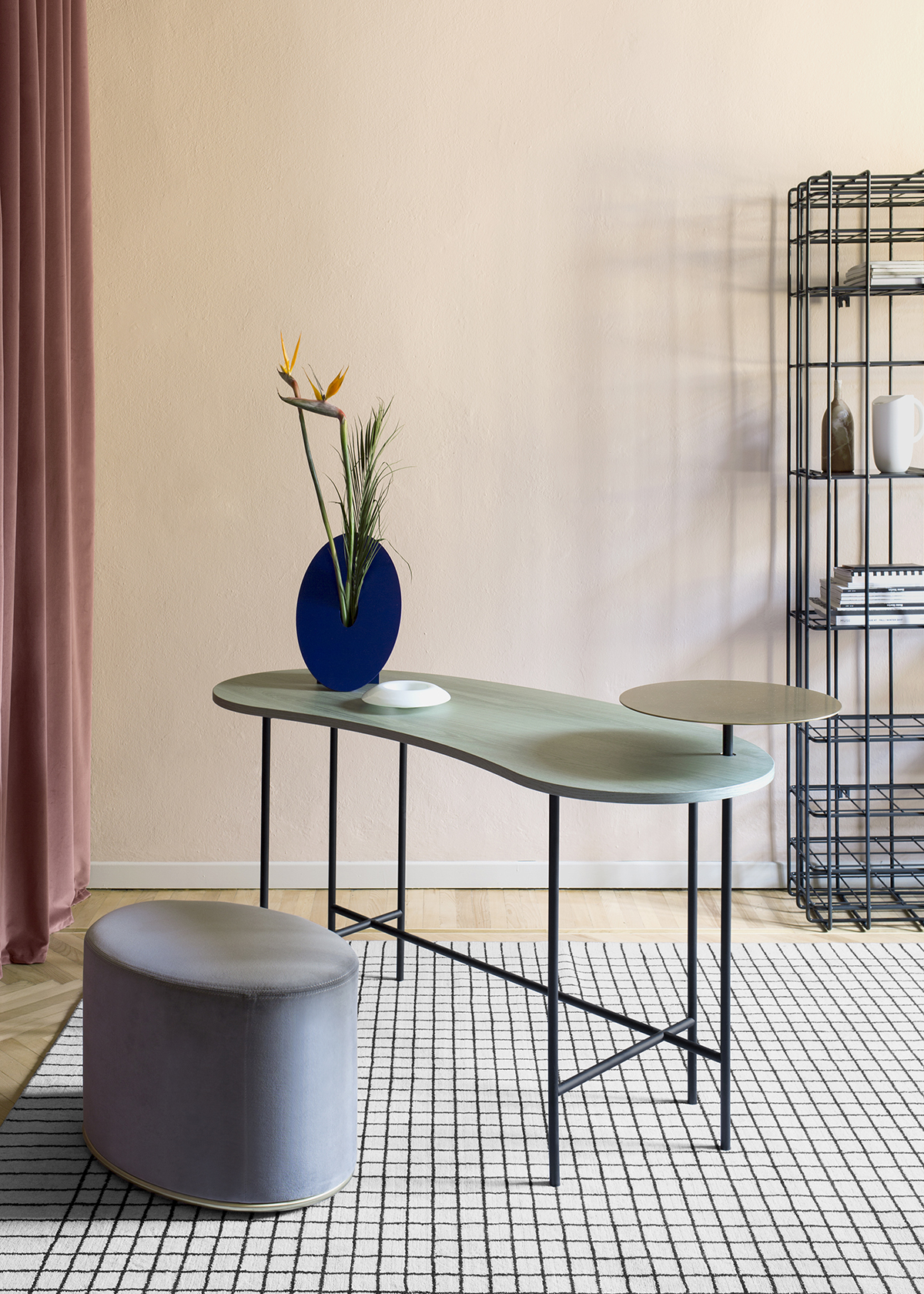
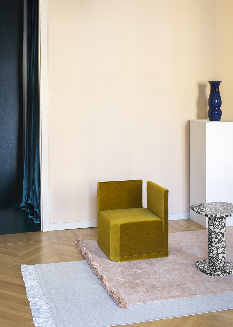
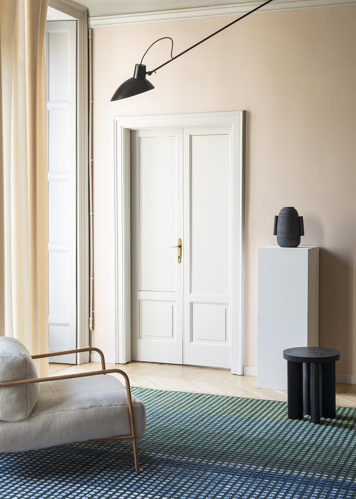
Above: Greta Cevenini for cc-tapis
![]()
Above: Greta Cevenini for Icon Design
