09.26.11
Q+A
Faye Toogood on Assemblage 3, for Phillips de Pury
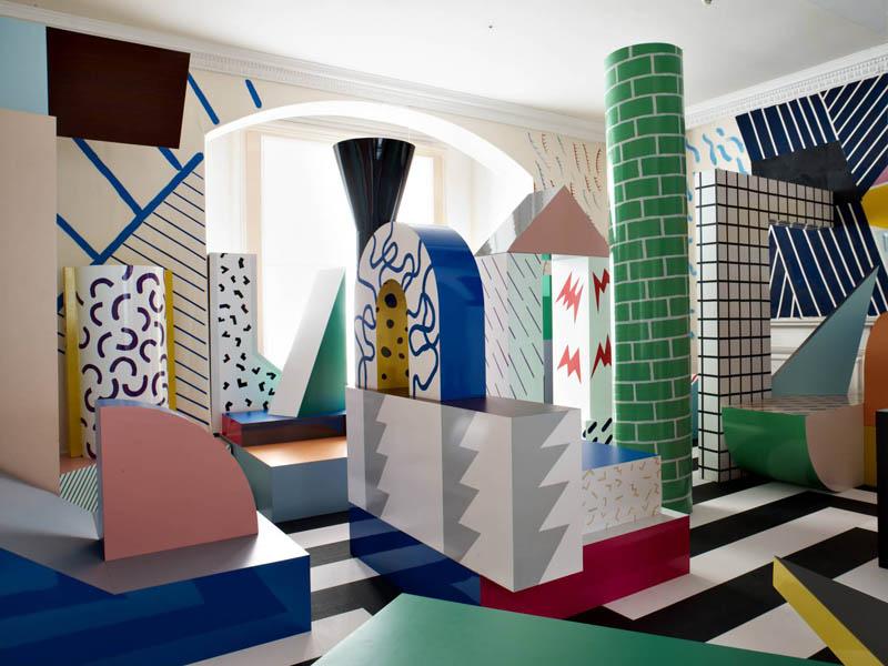
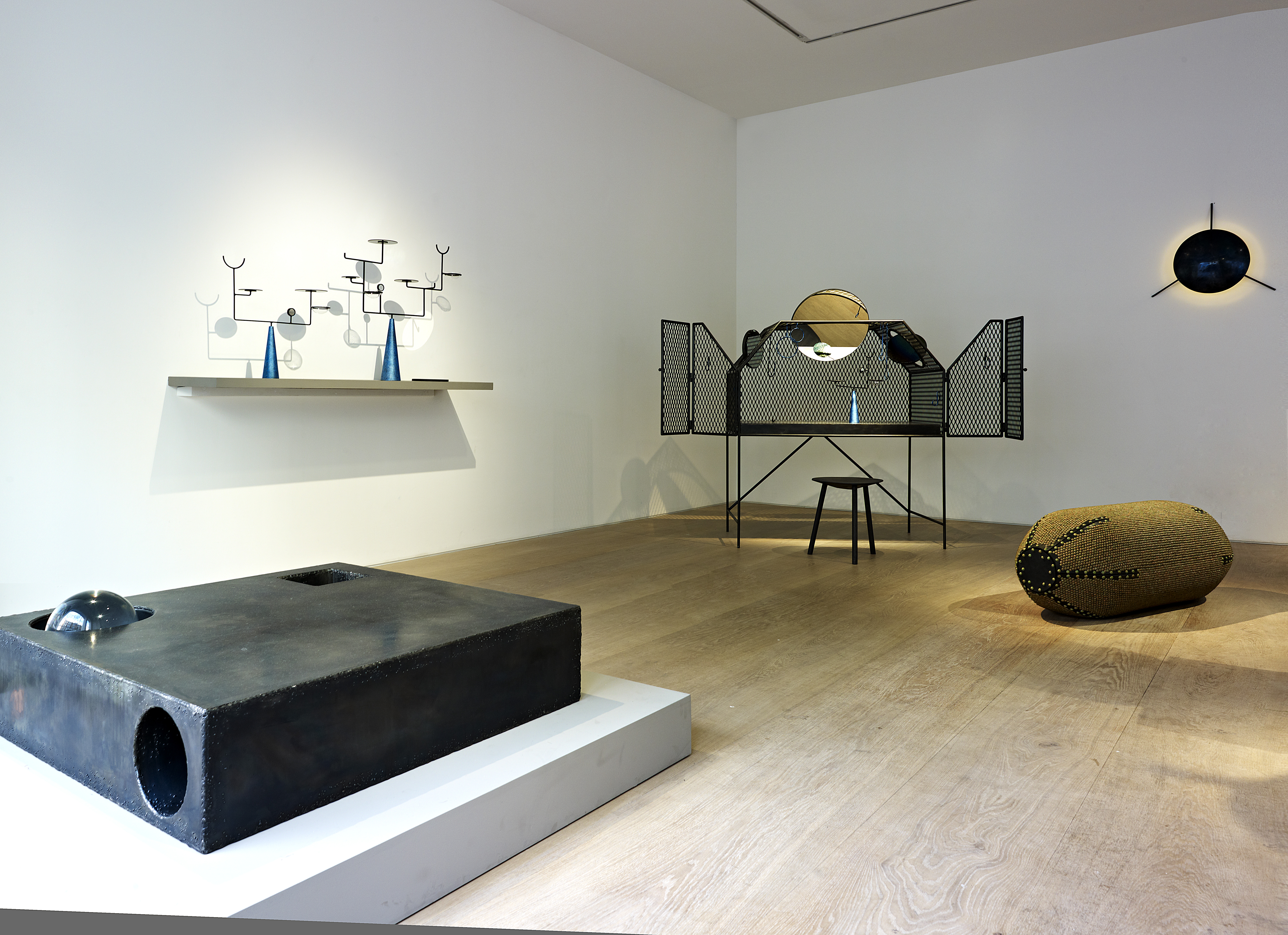
When we — and the rest of the design world — were first introduced to her at the 2009 London Design Festival, Faye Toogood already seemed like Superwoman: Having just left her post as a stylist at the UK shelter magazine World of Interiors and cast out on her own, she’d engineered a coming-out party for herself that included a collaborative installation with Gallery Fumi featuring designs made from corn, a Memphis-inspired playroom with an Arabeschi di Latte egg bar, and a temporary shop for Tom Dixon that showcased how she’d begun to transform his brand image. Just seeing her do it was enough to make us feel stressed, and that was before we knew that she was about to reinvent herself again, this time as a furniture designer. Her first collection, Assemblage 1, was inspired by modernist sculpture, British craftsmanship, and her childhood growing up in the English countryside; it gave way to Assemblage 2 in Milan earlier this year, which took a darker, edgier turn. Finally, with Phillips de Pury last week, Toogood unveiled the third chapter in the series, and the most ambitious to date — it’s based around her fascination with iridescence, and it took a motorcycle fabricator, a gun maker, and a studio full of assistants in gas masks to complete. I was asked by Phillips to conduct an in-depth interview with Toogood to appear in the show’s catalog, and so Sight Unseen received special permission to reprint that interview here. It’s lengthy, but it offers a good deal of insight into the mind of one of the most intriguing and ambitious personalities working in design right now.
PHOTOS COURTESY OF PHILLIPS DE PURY
Your first transition came when you left your job styling editorial shoots for World of Interiors in order to launch Studio Toogood, where you immediately added physical spaces to your repertoire. What was the thinking behind your most recent shift into designing furniture and objects for the first time?
When I started working at World of Interiors I was 21, and I’d just come straight out of university, so I was always working within these larger institutions. I don’t think I ever thought so much about self-expression. Throughout the eight years I was at the magazine, I was learning from a group of people who were not only interested in the same things as me but exposed me to aspects of history and design I never knew about. Whether it was a 13th-century church or a 1950s chair, I learnt to appreciate them equally. Also at that time I was mainly preoccupied with concepts, so working with photographers, designers, and other people’s objects was an amazing and enlightening way to realize those concepts. That way of working kept me creatively stimulated for some time. I didn’t feel the desire to make anything myself during that period.
It was three years of working more commercially, once I started my own studio, that made me realize I had to have some outlet for myself or I’d get frustrated. When you’re designing spaces there’s always a client involved, whereas designing furniture and objects provides me with a moment of sanctuary, I guess. It’s more of a self-portrait for me. I think that after such a long time living in London, perhaps I’m reconnecting with my childhood a bit; maybe with maturity those things become more relevant and you realize they’re the making of you, and for some reason I feel the need to express that. I’m using all the different disciplines I can get my hands on, and all the different materials, and all the different ways of constructing things to communicate something that is more personal to me.
What would you say is the thread that unites all three of your professional identities—the stylist, the interior designer, the object designer?
Not adhering to the rules when it comes to the process of design. In all of my work I’ve tried to link the conceptual to the visual, although it’s much harder with the objects and furniture because they have to work, whereas a photograph only needs to evoke an emotion and a space an experience. I’m also trying to challenge the perception of materials and constructions and our emotional connection with the objects we choose live with. Not in a worthy way that will change the world, but just in a way that allows people to look at things differently.
Are there influences that have followed you throughout your career as well?
When I started working at World of Interiors, I’d studied art history, so I had some sense of what had come before, but I was subsequently exposed to a much broader range of periods, traditions, and disciplines and somehow all of that has melded in my head to create a single vision. Being very close to antiques and witnessing the way that really fine, traditional objects were made definitely had a strong impact on my current preoccupations: Even then I knew I wanted to make hand-made furniture and work with craftspeople, and some of the artisans I’m collaborating with at the moment — metalworkers, woodworkers, and recently, experts in bronze and patinas — I was aware of whilst working on the magazine. I’ve also been interested in minimalist sculpture since University. The pure sculptural forms of British Modernist artists including Barbara Hepworth have always been a very big inspiration on my work, in particular the way she dealt with heroic scale and the way her use of materials was so strong and uncompromising. With all these inspirations, the real challenge for me now is to make my objects modern, relevant and not a pastiche.
Are there any multidisciplinary heroes from the past who helped convince you that you could try it all and get away with it?
Probably the Italians from the ’50s through the ’70s, predominantly architects like Gio Ponti and Ettore Sottsass. They turned their hand to everything around. Tiles, door hardware, the chairs you’d be sitting on, the lights — Ponti embraced all those things, and I have a great respect for that. It must have given him a real sense of freedom, I’d imagine. For me adopting that same liberal approach allows me to tell stories: to go deeper into the narrative. There is also no hierarchy to the materials or genres I use to tell that story — photography, film, jewelry or even fashion are all relevant when it comes to design. During my stylist days I was creating compositions with other people’s objects, now I get to create compositions with objects I’ve designed myself. It’s a greedy process, I guess. I feel quite greedy because I want to try everything.
You studied art history in school, though, not product design. What knowledge gap has tended to present the biggest challenge for you?
My lack of knowhow when it comes to combining materials. It’s easy to work in a single material, but the moment you want to contrast wood with metal or plastic with metal, you really need to understand how those elements can be brought together. My first Assemblage collection was quite pure — I focused on wood, stone, and brass, but kept those elements separate because bringing them together was beyond my expertise. Also I wanted the first Spade Chair to be in pale sycamore wood but with an extremely thin, fragile, and elegant profile, and so the craftsman I was collaborating with had to advise me on how thin I could go with the profile without it falling to bits whenever someone sat on it.
Have you had moments where you realized your lack of a maker’s knowledge turned out to be an asset?
When I re-edited the Element table for my second Assemblage collection, I knew I wanted it to be a block of resin where the sphere was floating inside but the cylinder and square were channeled out, reversing the volumes and voids of the first edition. I went through four or five manufacturers before I found one who would take it on. If I had former training in the limitations of materials and construction, I might not have pursued that piece in the first place. The months of trying to get it done were quite painful, but in the end, the results were worth it. Sometimes ignorance is bliss.
Let’s talk about the concept behind the very first Assemblage collection (above). Earlier you described your furniture as being more personal than your interior design, and the first series had an obvious link to your biography, with the binocular satchels and the furniture carved by woodworkers in the English countryside.
It was definitely an obvious interpretation. My father’s a great bird watcher, so as a child I spent many nights up in a high tree waiting for the dawn chorus to start. At the time I didn’t understand why I was in a tree in the middle of nowhere, but now I realize those were beautiful moments. I don’t want to go back to the kind of isolated environment in which we lived — I’m happy in the city — but some of the principals I had as a child started to feel relevant again. The second collection, on the other hand, was about me being more aware of the destructive, dark side of nature. The world had just experienced a string of natural disasters, so that sweet, idealistic take on the countryside and foraging for food became slightly irrelevant for me. I became more preoccupied by chaos, and the fragility of life. Everything went dark. But it was also partly a subconscious reaction to the fact that after that first collection, I was suddenly being lumped in with the British wood group, which I very much respect and admire but which I didn’t particularly feel like I fit into. That’s the story of my life as well—fighting against pigeonholing. As a result people are always grappling with finding the right words to describe who or what I do and indeed my style: multidisciplinary, creative polymath. I jump around a lot, but it stops me from getting bored and boredom is my biggest fear.
But your experimentation with different aesthetics — like the way you launched your company during the 2009 London Design Festival with one installation inspired by Memphis and another full of objects made from corn — might also lead people to describe your work as fashionable, which I know designers dread. It has the same kind of ineffable cool factor, and sixth sense about what’s coming next, that drives the fashion world.
Well styling is about reinvention, and about picking up on what’s going on. If you’re a particularly good stylist, you pick up on it before anyone else does. While I hope that my objects and furniture aren’t fashionable or trend-based, I do think they appeal to people for the same reasons my styling does—it’s intuitive, it captures the attitude of its time, and it’s coming from someone who is obsessed with observing the world around us. I think those are the qualities that give my work relevance and longevity. I’m much more interested in longevity now that I’m designing three-dimensional spaces and objects. After working on magazines and the transient image, one ambition I had for the pieces is that they have permanence; they shouldn’t be something you tire of. Perhaps their heaviness also helps imply that, as they’re not easy to move and thus won’t be easy to get rid of.
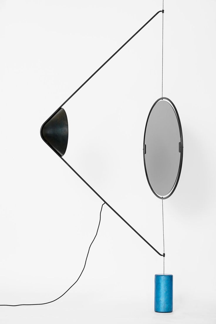
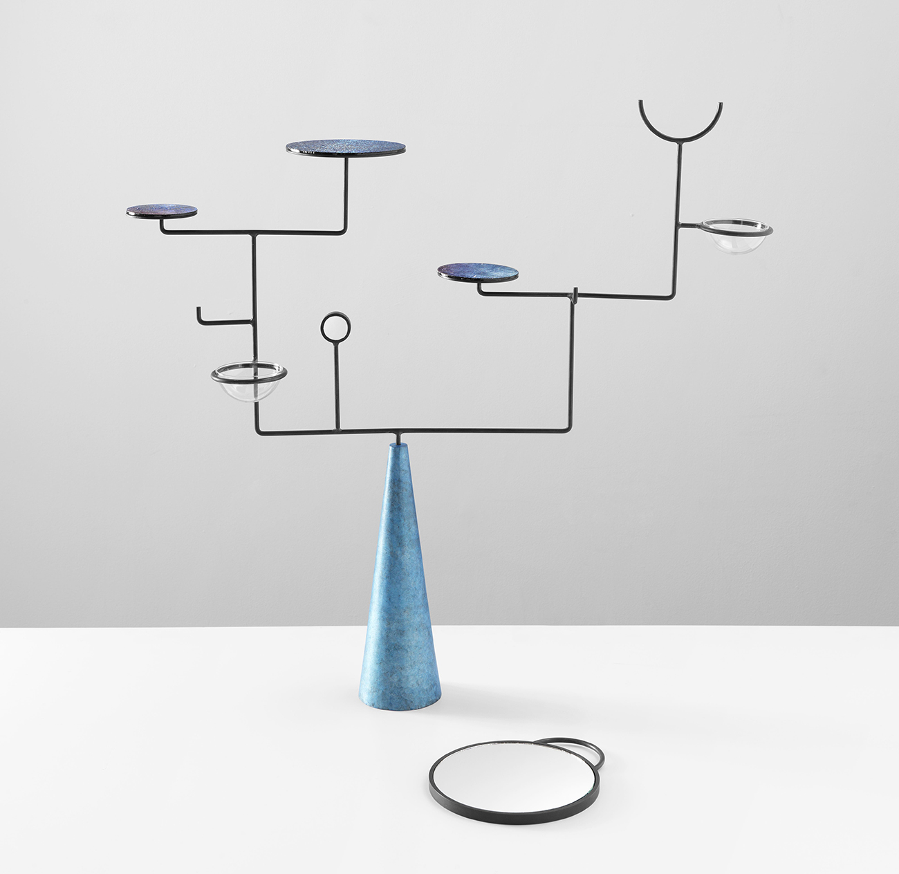
Heading into the third Assemblage collection (Wing Light pictured above), what ideas were you picking up on that would distinguish it from the second?
What tends to happen with me is that I become obsessed with an idea or type of object and start collecting everything relating to it. When I began work on the third collection, I realized I had a whole shelf full of iridescent things and was wanting to wear my favorite sparkling jumper everyday of the week, so I began to find out more about what iridescence is and why it felt so appealing to my magpie existence. I started to look at its role in nature because so many of the items I’d collected were beetles, bird feathers, crystals, and stones — the sorts of objects I’ve been gathering since my childhood days of arranging found objects on my bedroom table. I realized that naturally occurring iridescence performs a variety of functions, two of those being attraction and protection: Attraction having to do with appearing, and protection, disappearing. There’s quite a fine line between the two, and if an animal or insect is to get that fine line wrong, it could be quite fatal. So the shimmering butterfly attracts a mate using its amazing iridescent wings, but it also uses the same device to confuse its predators. The fish uses its iridescent scales to keep the members of its shoal moving in the same direction, but those same scales attract the predator that’s about to eat it. I became fascinated with this concept.
So how did you manage to translate those ideas, which are so complex and so peculiar to the natural world, into the materiality of a series of inanimate, man-made objects?
In my research I discovered that natural iridescence isn’t created by pigments, but by light itself, and how various layers of cells reflect light differently to create different wavelengths. That’s why the colors shimmer and change with your viewing angle — it’s a structural concept called color interference. The word interference itself I thought was quite beautiful, so I set out to use and employ chemicals to interfere with the surfaces of the furniture. And yet I wanted it to be a delicate interference, so the materials themselves would still reveal their own nature; I avoided iridescent paints, which would put a barrier over them. By using certain chemicals, you can get an iridescent effect which is purely achieved through oxidization. The materials I’ve used are steel, resin, aluminum, and glass, and with the glass for example, you get iridescence by applying these chemicals to its surface and reheating it. It’s a kind of outmoded type of glass not really used since the decorative arts of the early 20th century. With the steel, we’ve applied chemicals in several layers, and the oxidization creates a kind of oil-like surface. So where the first collection was quite idealistic, and the second dark, this one’s more about alchemy. I think I was feeling more optimistic this time around.
This collection has a dark side as well, though—all the chemicals you’ve used to create the iridescence are extremely toxic, deadly even. How did that figure into your overall concept?
The idea that to achieve this beautiful, natural iridescent look you have to use toxic chemicals is interesting to me. Obviously its not unusual for designers to use chemical based products and paints on furniture but the cold patina technique I employed really gave me a awareness of how much chemical waste was involved. The chemicals are unstable and unpredictable giving the surfaces a transient quality, which for me provide the perfect contrast to the heaviness and permanence of the overall piece. These objects should not be disposed of or replaced easily and certainly not without conscience.
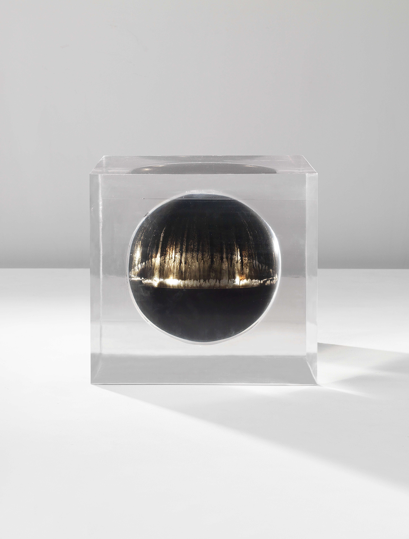
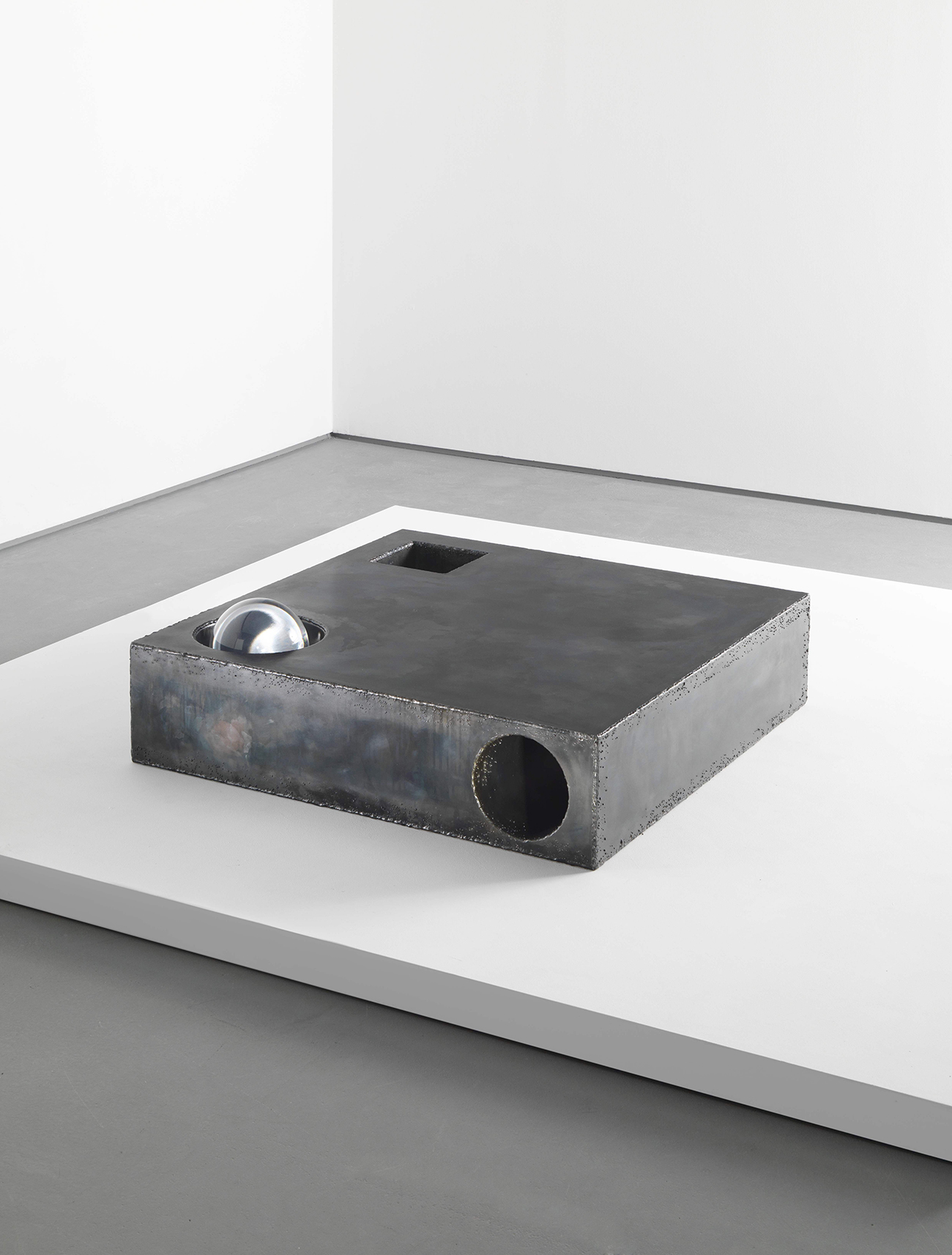
One of the key things you find an iridescent effect in is oil, the moment you mix it with water. I couldn’t recreate that particular surface on the furniture, but decided to represent it by encapsulating actual oil: One of the pieces (above) is a cube of resin that has a floating sphere of oil in it, oil being both dangerous and precious at the moment. There ended up being something quite beautiful about preserving and protecting it and capturing it in this cube of resin where it will stay trapped forever, it won’t evaporate. Resin also has a long tradition of being used to preserve insects and natural history objects, so it felt like the fitting material.
That piece also represents the closest your work has come so far to having a political message, which almost puts it more in the realm of art. Does it signal any kind of new direction for you?
If I read into it, there’s definitely a message there, but I honestly don’t want to make big political statements with my designs. It’s not a hugely considered way of working on my part. Everything I’ve ever done is intuitive, and is a reaction to how I’m feeling at the moment, so that’s probably where the meaning comes from. It’s the same with the boundaries between art and design in my work — I’m not conscious of any erosion of those boundaries, it’s all coming out of pure self-expression. Perhaps because I don’t have a design background where I’ve been taught to follow rules about showing your process and making sure that form follows function, there’s not always a rhyme or reason or sense to where my pieces ultimately lay.
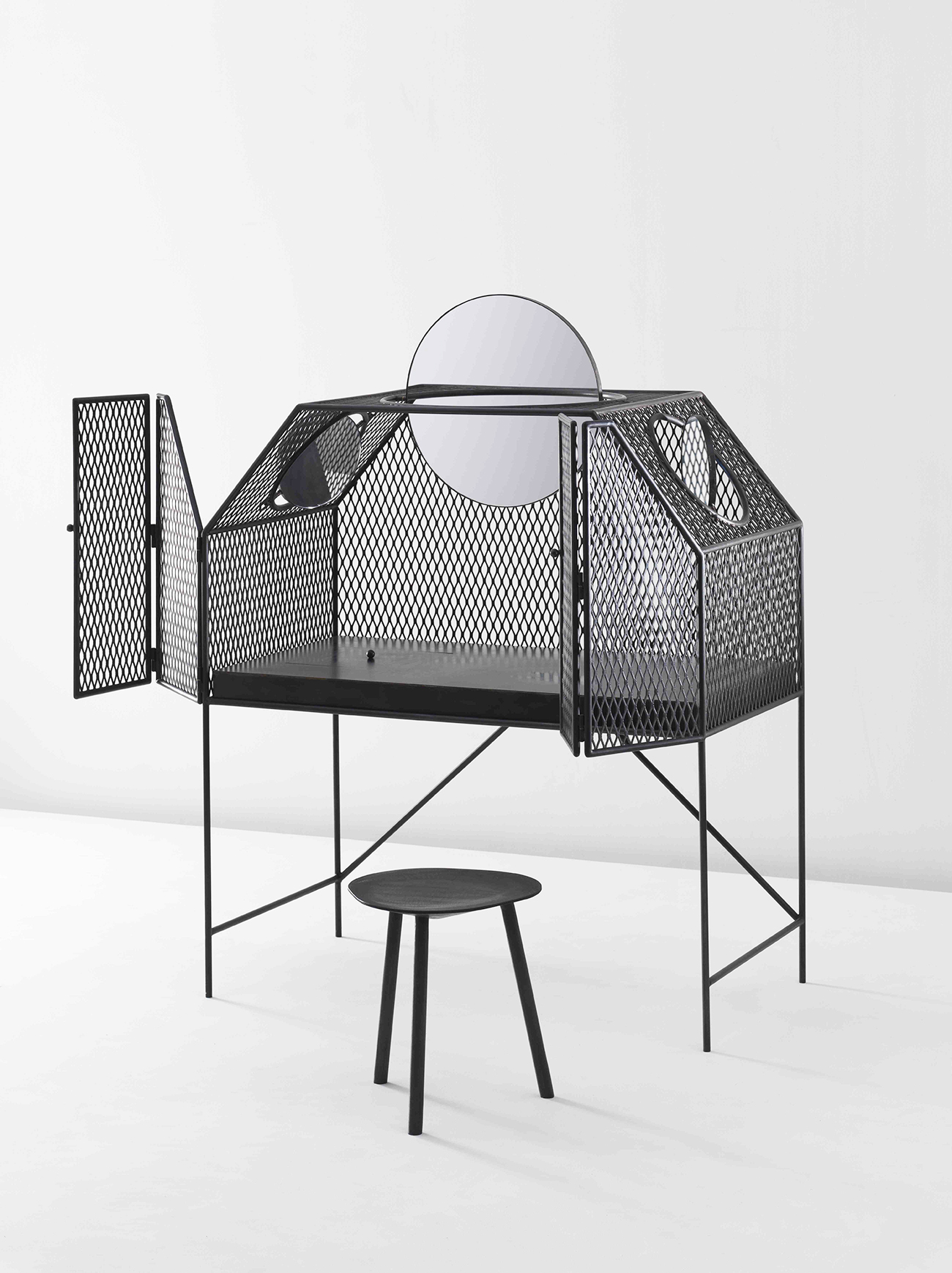
The dressing table (above) is almost the opposite — an object that’s purely about beauty and vanity. And yet you designed it in a way that captures the same attraction/protection dichotomy as the rest of the collection.
Basically I really wanted a dressing table myself, maybe because I’m at that age, but I quite like being able to have that private moment in the morning to get ready. I couldn’t find a modern one that wasn’t twee, or that felt relevant to my life, so I decided to make one. The piece itself is almost like a cage, which you have to open up — there are fine folding doors which resemble the wings of an insect when they’re open. They’re made from very fragile, very thin solid steel that’s been welded together, with this cage mesh providing your personal protective space in which you can make yourself attractive in the morning. I chose mesh normally used for security grills, so you can see inside but not fully, and there’s an element of voyeurism. You also get a moiré effect as you see through the various layers of the cage, which goes back to the idea of interference.
For both the vanity cage and the Element Table Cage, which has been reedited in mesh for this collection, I worked with a welder who normally makes motorbikes, partly because he had particular metalworking skills but also because I wanted to reveal a raw, industrial element. I’ve kept all the welding quite messy, and yet when you open the doors of the vanity, you can see the beautiful leather jewelry box, solid bronze hooks and the mirrors backed in iridescent glass inside, which are really special pieces.
The motorbike-maker also fabricated a pair of wall lights for the collection. How were those made?
The wall lights are basically a steel and aluminum dome which I’ve had hand-beaten in the manner of a motorbike shell. Each one has three thin legs that hold it slightly away from the wall, like a hovering insect. When it’s turned on, there’s this halo of light cast on the wall around it. The aluminum light will be fade-anodized — we found a man that normally fade-anodizes guns. The guns don’t have anything to do with it, but it’s the sort of thing only people with guns experiment with, and it’s a chemical way of mimicking the movement of color found in iridescence. The steel version we’ve given the same oily patina as the Element Table Steel.
The latest incarnations of the Element Table (above) are interesting, they’re a bit more visually complex than the previous iterations.
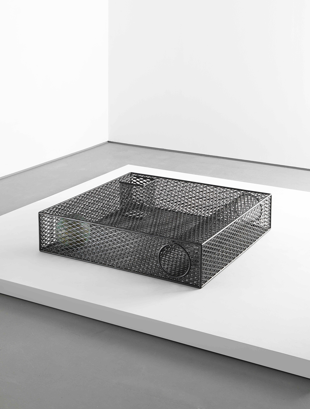
I’ve designed two Element tables this time, actually: one is steel mesh-cage based and the other is welded steel sheet. The mesh version is similar to the resin one that I did, in the sense that it explores volume and void. The cylinder and square are themselves made out of mesh, so you get a moiré effect within the table. The sphere, on the other hand, is a solid ball rolling around inside the cage, so in my mind the table is capturing this precious object, a jewel within the cage. You want to grab it and you want to touch it, but you can’t — it’s protected and out of reach. The other Element table we’ve done is a simple configuration of volume and void, but made out of sheet steel that’s been roughly welded together, so the cylinder is rolled out of steel sheet as well. The sphere is a clear resin ball sitting inside a crater in the steel top. The surface of the steel version has that oil-like iridescent patina I mentioned, and the solid resin sphere sitting inside it almost magnifies that patina like the eye of an insect.
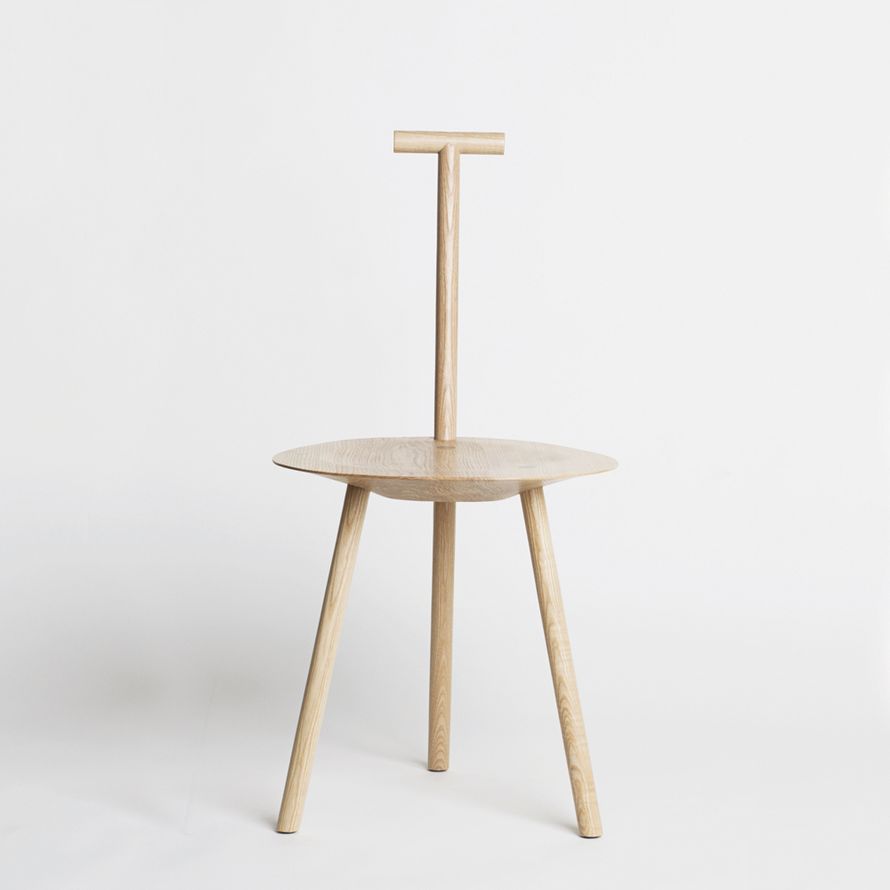
The Element Table and Spade chair have become a kind of barometer for each collection, a backdrop against which the viewer is able to track the evolution of your concepts. Was that intentional?
At first I couldn’t see past that initial collection, no I had no idea what would come next. My experimentation with those forms began with the second collection, as a way to break from my initial use of wood. And then I really began to wonder what the chair would look like in a completely different material. Many people had said to me that the chair has its own personality, almost like a person in the corner of the room, so it has become interesting to me to delve into the depths of that personality. I started to feel like a child with a new box of toys, changing the meaning of the piece just by changing its material, colour, or fabrication. In the second collection I worked with a fetish designer to cover it in leather, so it looked erotic and raw and sexual in a way the wood version never could have looked. I also rendered it in black, sand-cast aluminum, so it was extremely heavy with a coal-like surface. When you look at it, it looks like a very slim, black chair, but you go to pick it up, and it’s 10 kilos of solid metal. For the new collection I’ve done one in solid bronze that weighs 30 kilos. I quite like the fact that it looks fine and delicate but weighs a lot, which makes it feel more permanent. Permanence is important.
One of my favorite aspects of the third collection is that you’ve left the dirtiest job for yourself — applying the toxic iridescence chemicals to the various steel surfaces, including your new Spade chair (above).
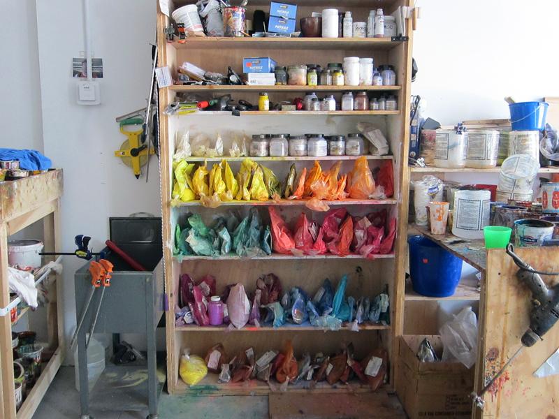
We’re doing it all in the studio, we’ve got the gas masks, gloves and everything. It’s taken a lot of little tests and experiments, and it’s certainly a lesson in chemistry, but we finally got it. Of course we didn’t know how the final pieces were going to turn out until we tried them, so it was a total surprise really, but with surprise and the unexpected comes beauty. The last time we did any production in-house was for the second collection, where we sand-cast pewter to make our Lunar Landscape plates — four girls boiling pewter in the kitchen and then pouring it into sand in the back garden of my house. We also made small vessels filled with a candle wax for the Natura Morta exhibition in Milan, that smelt like tuberose, a flower that’s only flowers at night. This project was the most ambitious, though.
Do you have aspirations to get even more ambitious when it comes to involving yourself in the making process?
At the moment I am into experimentation and so working with different craftsmen allows me to do that, but I actually enjoy making, and at some point I would love to be able to hold the welding torch in my hand or carve out the perfect joinery detail. I imagine that will come when and if I feel the need to specalize in a single material, investigating one material more thoroughly. I’m not sure which material that will be, but I have a thing for stone and sculpture, and I think it would be amazing to reveal something from a single block — I really respect the sculptors who can do that.
Why are you so attracted to modernist sculpture, and how do think it relates to the work you’re doing now? It was definitely visible in the early Element Tables and lights.
I’m always attracted to simple, graphic geometry, so maybe that’s why some of the modernist sculptors appeal. The geometry is very clean, and often it’s the materialization that gives the piece meaning or impact. I think the last 10 or 15 years have seen a lot of biomorphic, futuristic forms in design, which I don’t personally respond to. I feel closer to the artists and designers of the twenties and the thirties who used very simple forms so it became more about the beautiful contrast between materials. The geometric shapes I use function as simple building blocks; I don’t feel they need to be messed around with. It’s more about the way that you assemble them that I find interesting. That comes from my background creating visual compositions, maybe. It also helps give my furniture a sense of timelessness — hopefully you can never tire of a sphere or a cube.