01.11.22
Graphic Design
A Pollution-Inspired Skincare Identity, and Other Graphic Design Picks for January
Our Graphic Design column is guest-edited by the team at The Brand Identity, a graphic design resource and publication, as well as the producer of customizable backdrops made for designers to showcase their work. Each month, they’re sharing with our readers a selection of the most interesting studios, packaging designs, and branding and identity projects featured recently on their site. This month: a chic rebrand of a construction company, an art museum logo that mirrors the historical monogram of its building, and a skincare brand whose identity abstractly channels the air pollution it’s designed to fight (above).
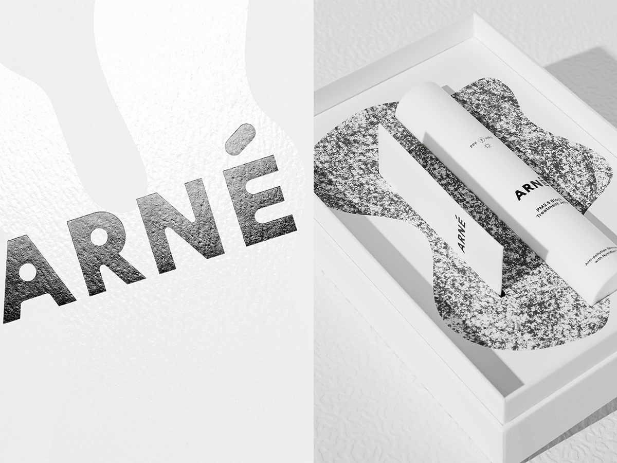
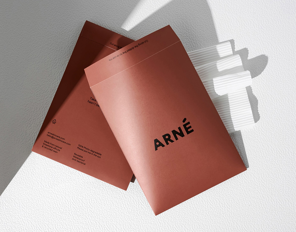
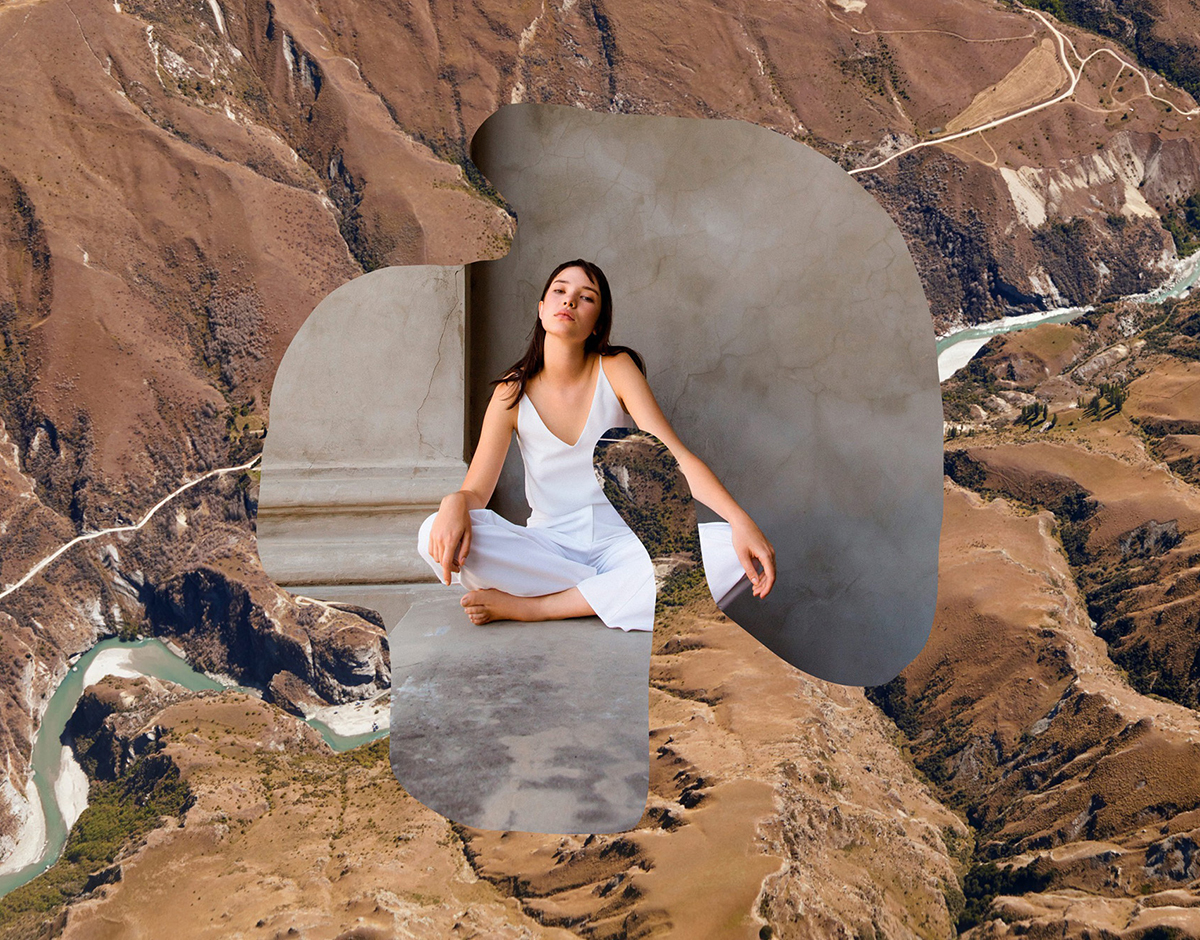
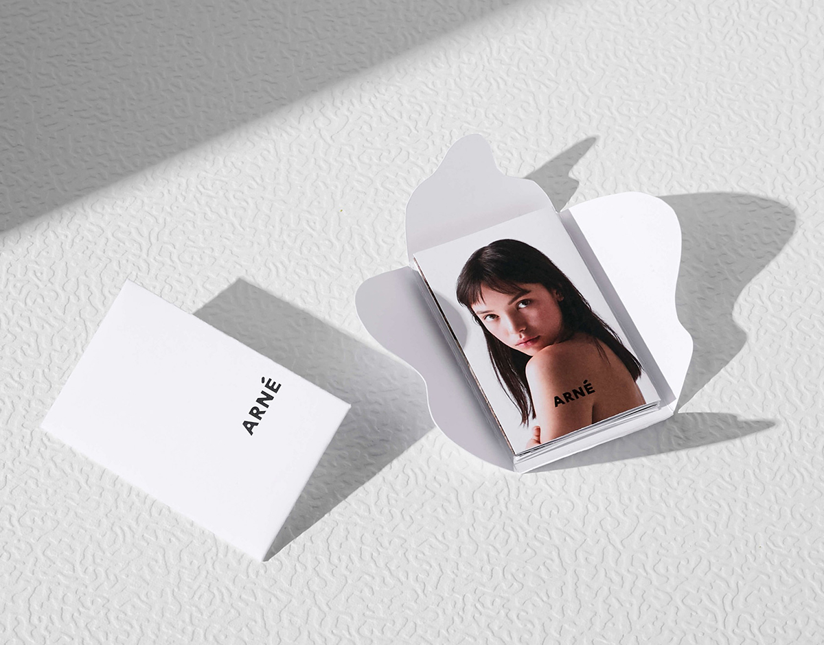
Arné identity, by A Friend of Mine
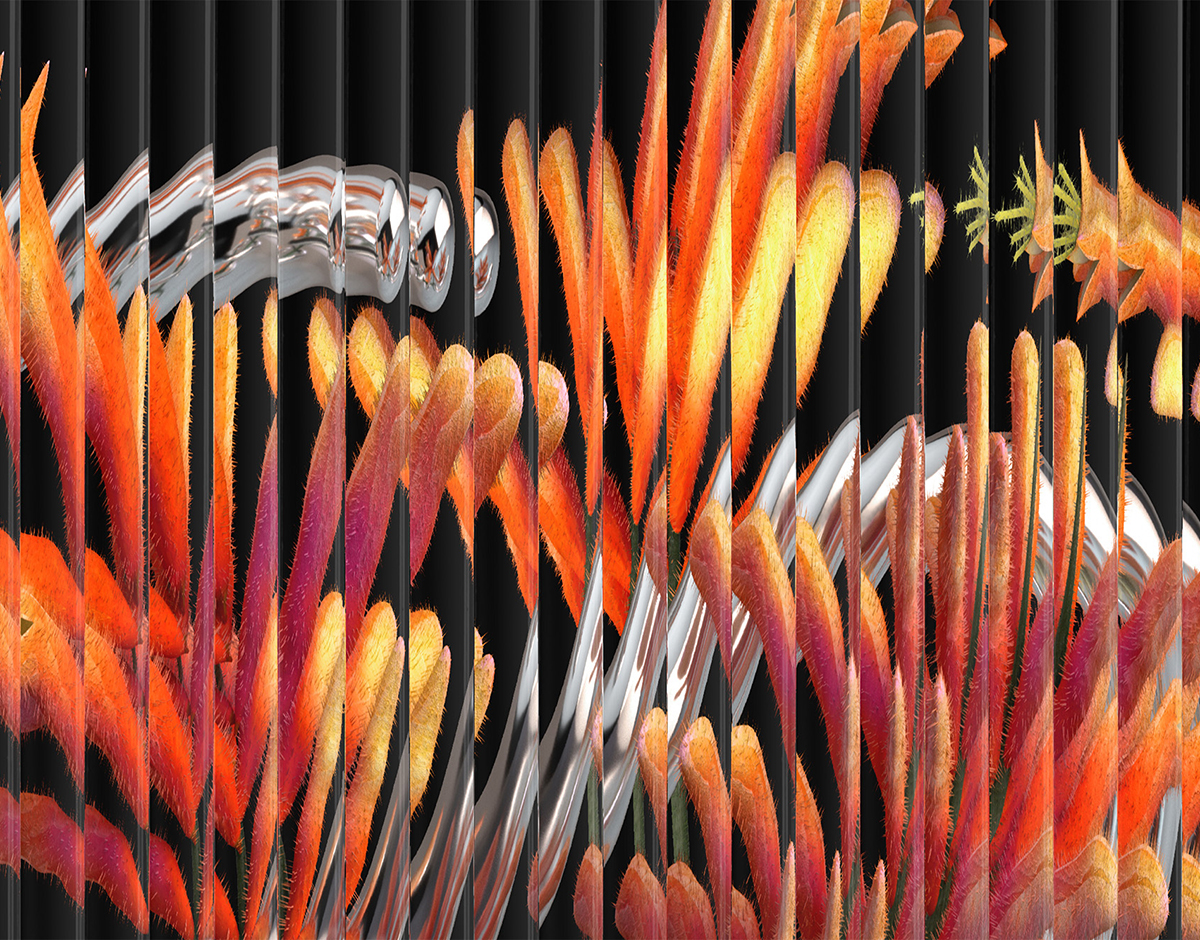
Melbourne-based design studio A Friend of Mine have worked with Kiwi skincare brand Arné to develop a serene, typographically-led identity that uses texture and simplicity to achieve a tranquil tone akin to the brand’s organically-oriented, anti-pollution products. With this environmental focus in mind, A Friend of Mine’s Creative Director Suzy Tuxen says “we created a custom logotype with circular counters in the ‘A’ and ‘R’ that reference the hole in the ozone layer caused by air pollutants” — a graphic device that also references the microscopic holes within Nutrifilm, the active solution in Arné’s products. This duality and contrast exhibited in the logomark is an underlying theme laced across the identity, similarly manifesting in the use of charcoal textures to abstractly represent the pollution Arné is fighting against, plus the use of a stark, monochromatic color palette.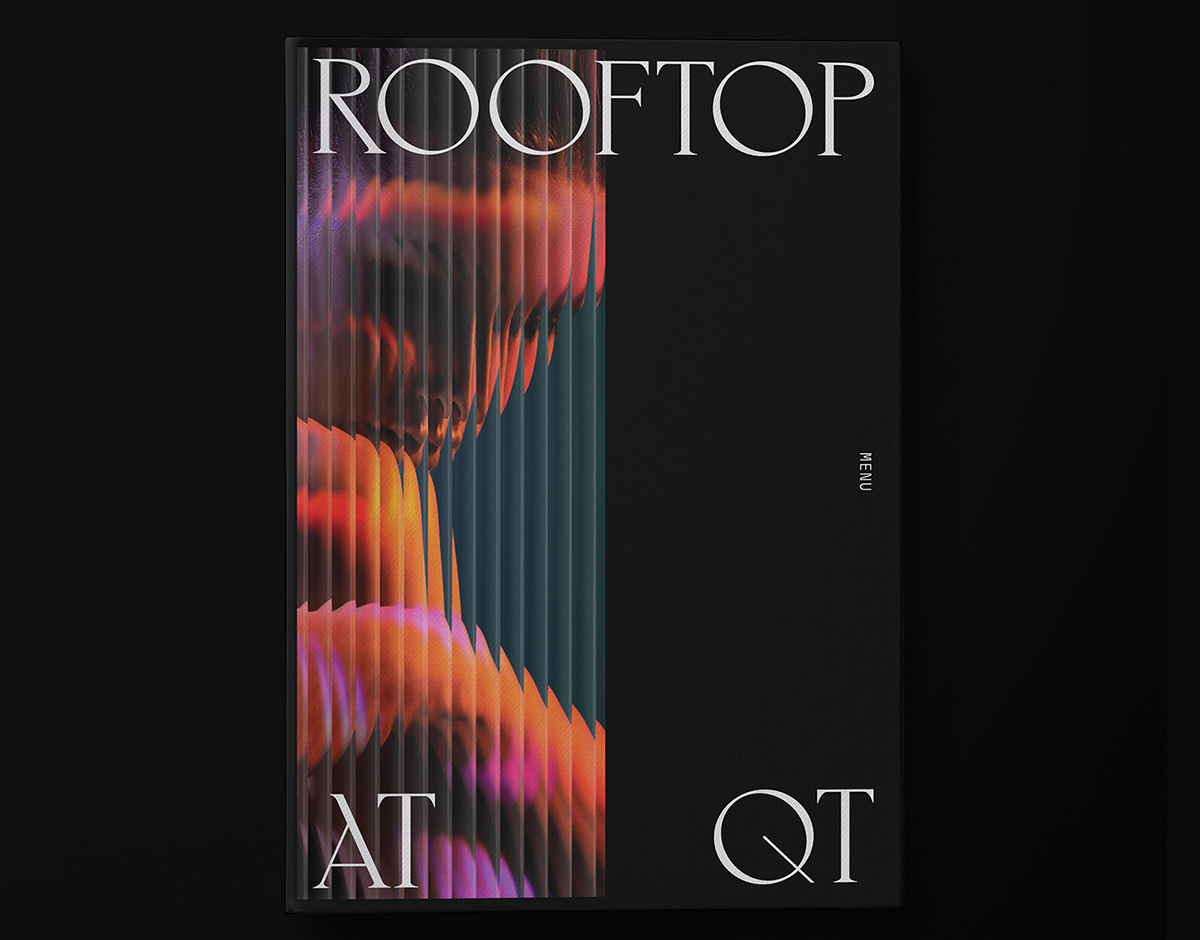

Rooftop at QT identity, by Toben
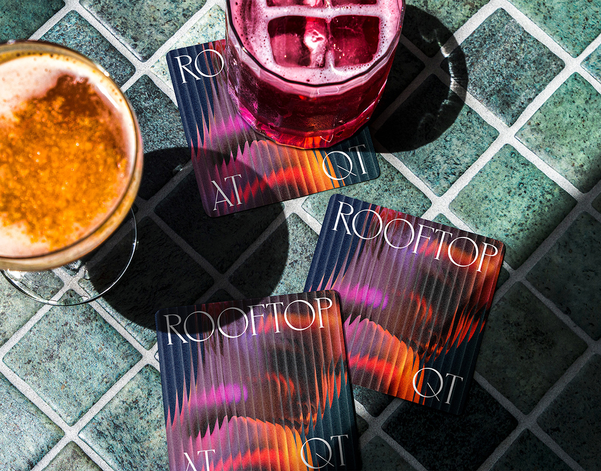
New South Wales-based design studio Toben have rebranded Rooftop at QT, a sub-brand within the QT family of luxury hotels across Australia and New Zealand. Seeking to develop an identity that is recognizable, inspires a sense of customer loyalty, and celebrates the individuality of the sub-brand, Toben have created a system that flexes to the specific narrative of each bar’s location. With an overarching master typographic system, aesthetic, and logo, the modular identity uses the notion and physicality of the bars — and their locations on the roof — to frame bespoke typography which is then fixed across all brand applications.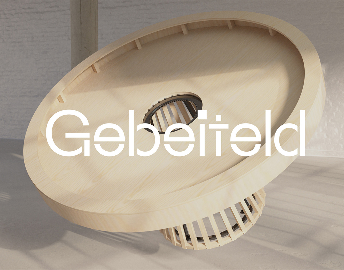
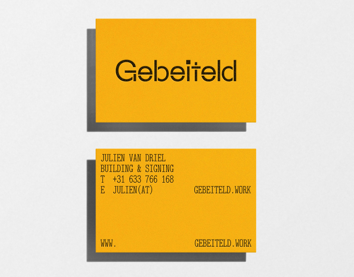
Gebeiteld identity, by Molden
Antwerp-based design studio Molden have rebranded the construction company Gebeiteld following a name change from JvD. The result is a showcase of functional elegance, with a trio of contrasting typefaces and a pared-back color palette leading the way alongside a refined selection of materials. The centerpiece of the identity is the wordmark, which is set in Soft Machine’s furniture-inspired stencil typeface Maxeville Construct. “The stencil type resembles bulky proportions and constructed forms,” studio founder Cedric Janssen tells us, adding that “these forms are usually found within identities for construction businesses and woodworkers.” It’s the perfect typeface to visualize Gebeiteld’s association with these industries “without compromising the aesthetic part.”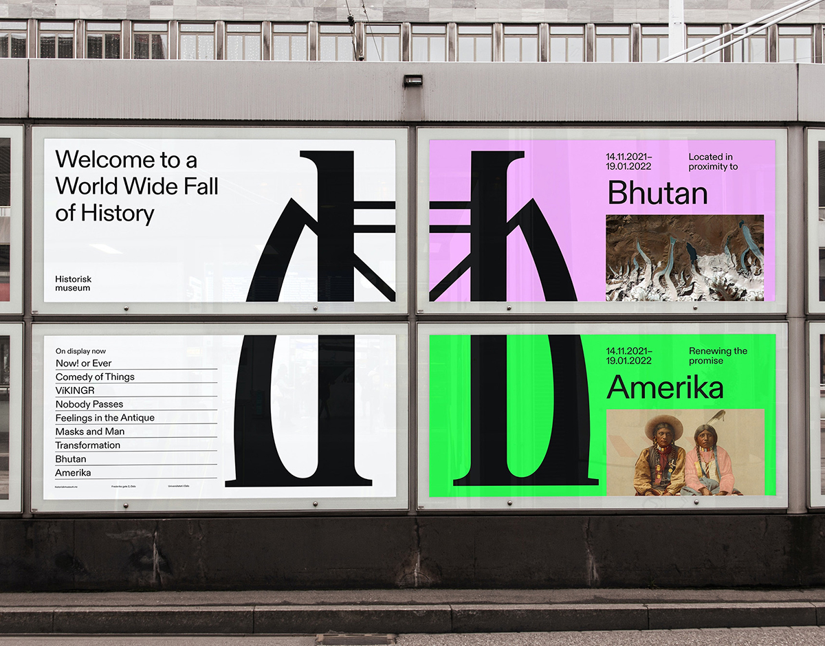
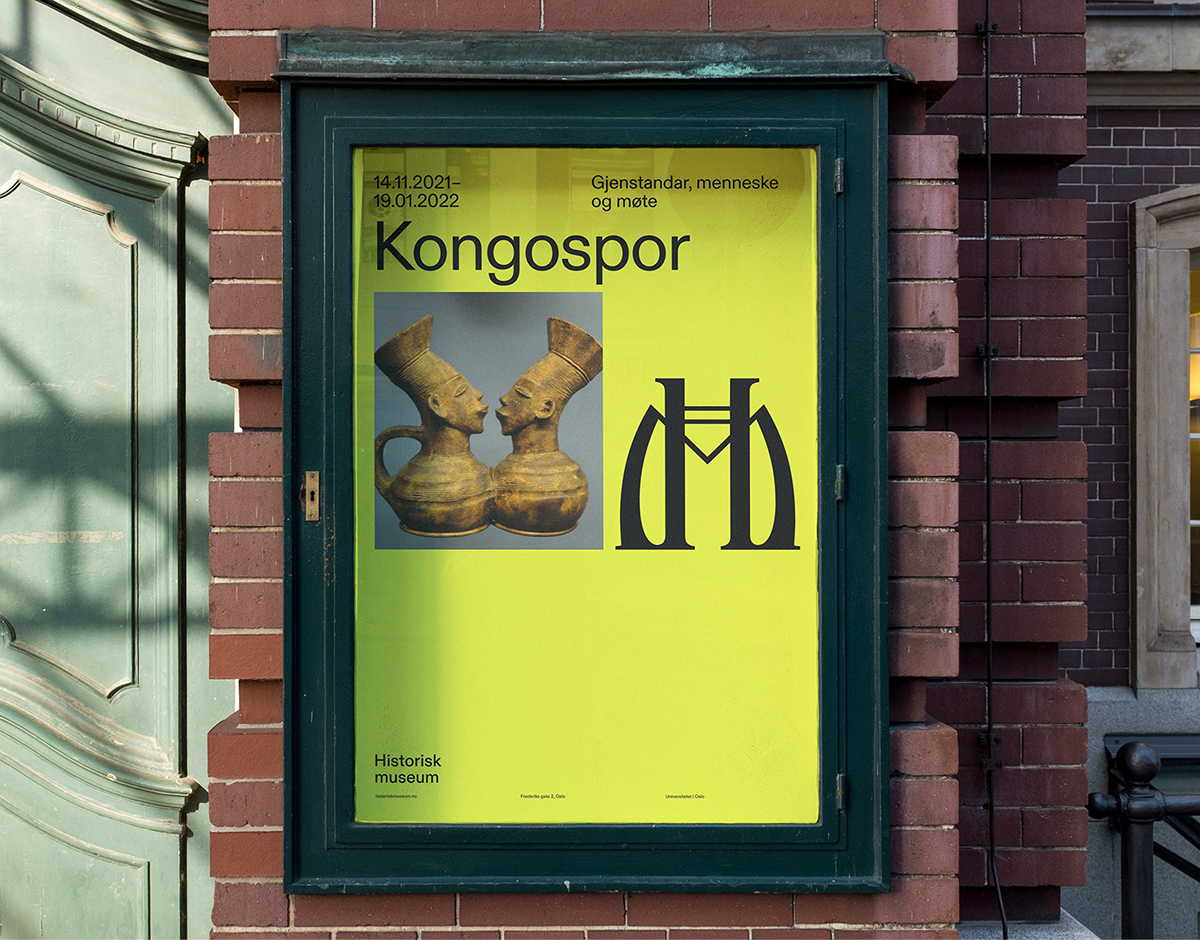
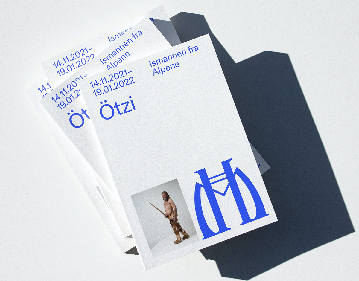
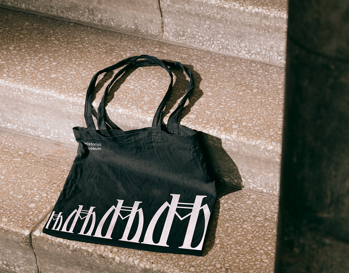
Historisk identity, by Bleed
First opened in 1904, the University of Oslo’s Historisk Museum is home to Norway’s most substantial collection of historical ethnographic artifacts, contextualizing the country’s remarkable history within its contemporary culture. Tasked with developing the museum’s identity, Oslo- and Vienna-based design studio Bleed turned to the building itself for inspiration, beguiled by the variety of monograms created for and adorned across the museum by its architects. The resulting logo, much like the museum’s approach to its own archives, takes what came before and cements it in the modern-day, combining a calligraphic finesse with pragmatic contemporary sensibilities to craft a stoic mark that exhibits the promise of what it represents. “The monogram became an integral part of the process,” Bleed’s Halvor Nordrum says, “as we neither wanted to, nor could, remove it from the architecture.”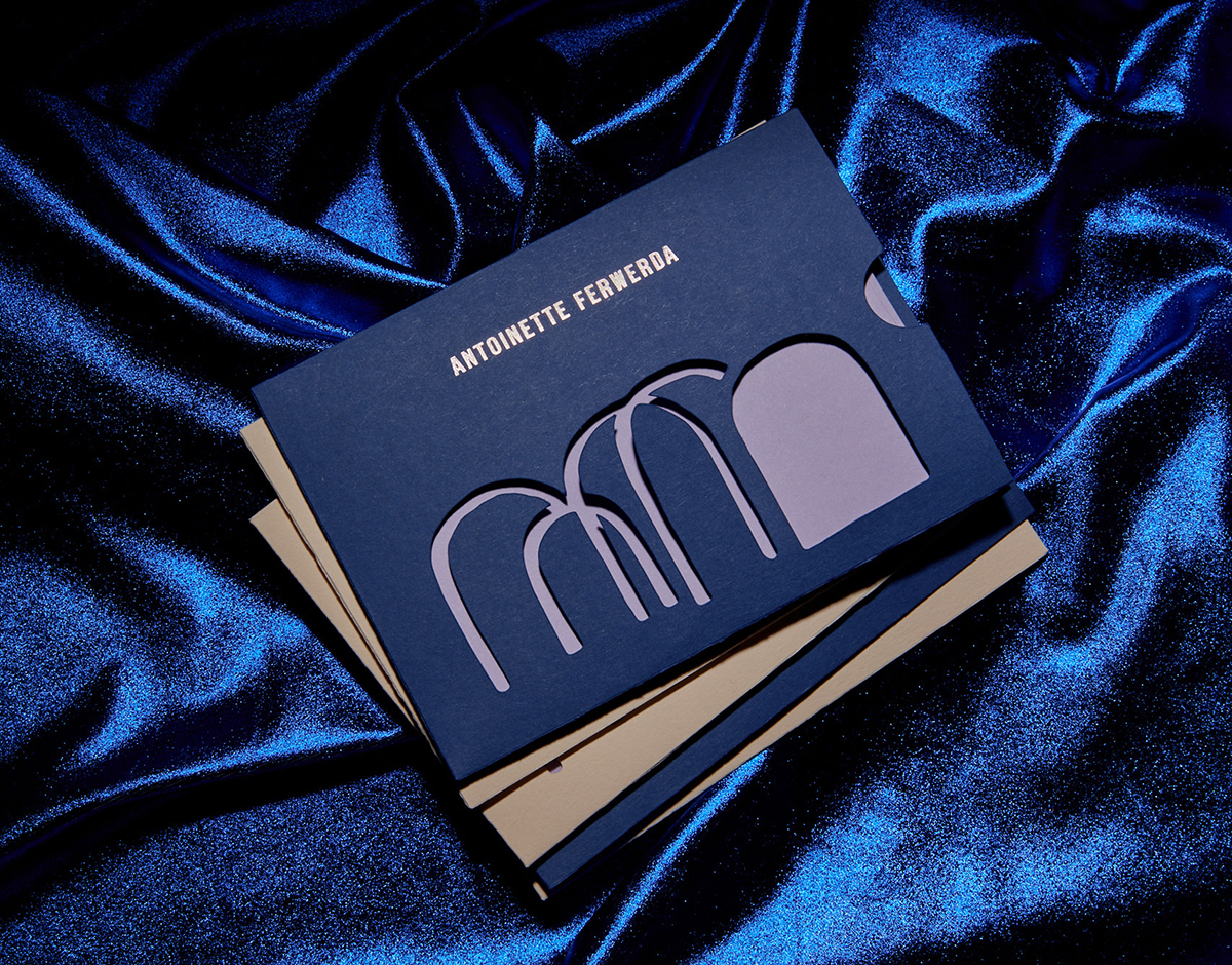
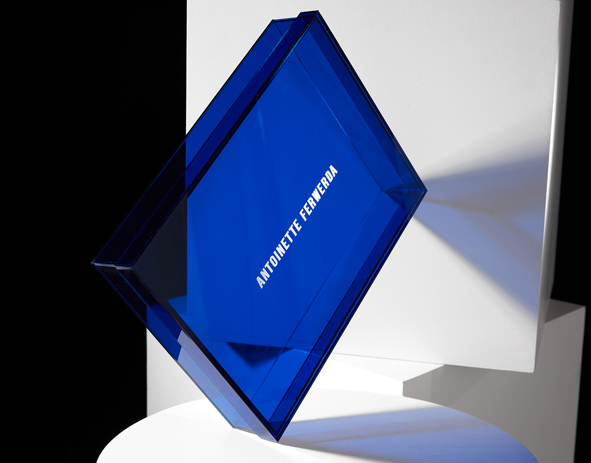
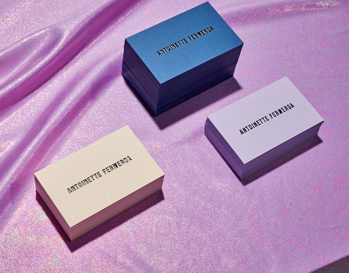
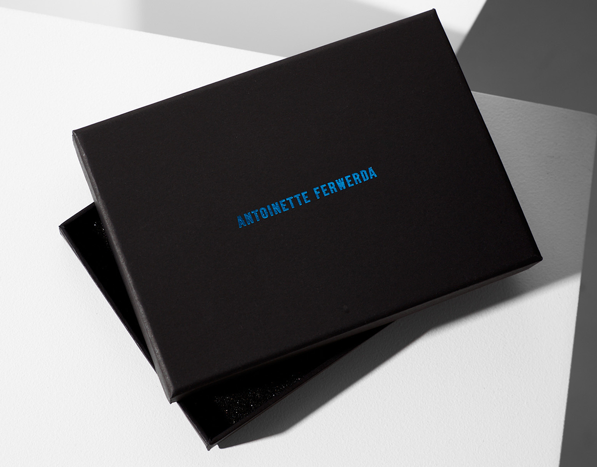
Antoinette Ferwerda identity, by Studio Sly
In making the move from independent artist to independent gallery owner, Australian artist Antoinette Ferwerda — known for her command of light, form, and reflection — turned to Melbourne-based Studio Sly to craft the identity for her venture. The branding firm was inspired by the artist’s exuberant, colorful, and eccentric work; creative director Lauren Finks says “the brand refresh is almost a coming-of-age event,” noting the significance of reflecting Ferwerda’s growth and the elevation of her work within the identity. Finks and her team opted for a bespoke blend of Eng Gothic and Right Grotesk in the wordmark to showcase the breadth and character of Ferwerda’s work in the process. “The brand needed a strong presence that was equally refined,” Finks explains, “so using a condensed style achieved this balance.” The studio customized the horizontal bars of the typefaces to achieve graphic consistency.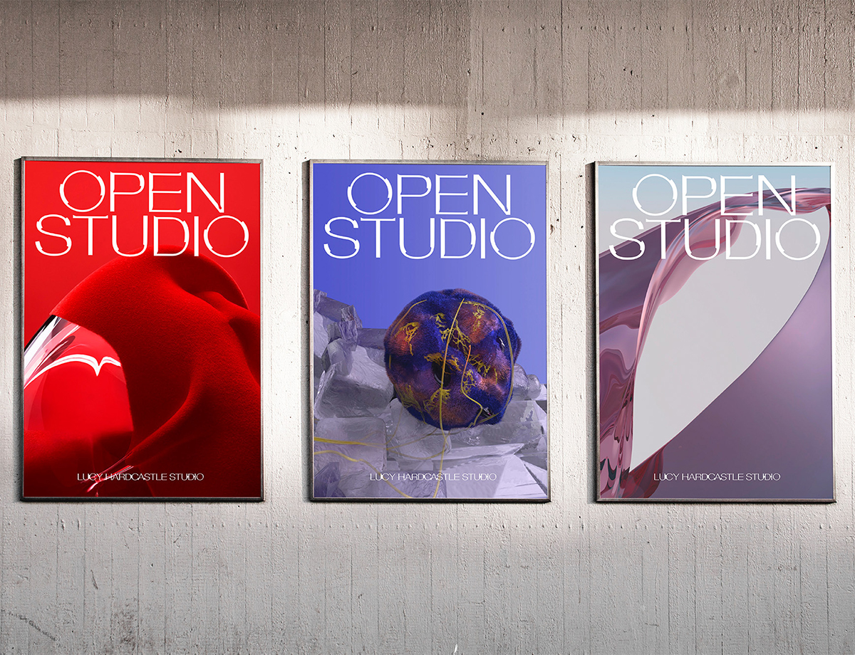

Lucy Hardcastle identity, by Oli East
Based in London, Lucy Hardcastle Studio is a multidisciplinary design practice using interactive technologies, 3-D visuals, and moving images to tell complex and emotionally resonant stories. The studio redesigned their own identity in collaboration with graphic designer Oli East, developing a custom display typeface inspired by the importance of human presence and interaction within the studio’s practice. Utilizing Helvetica Extended as their starting point, Hardcastle and East used wearable devices to track responses to materials, capturing data points from their brains, hearts, and breathing. This data then informed the fluid forms of the ever-changing custom typeface, driven by the idea of living data “inhabiting” the identity system.