03.12.26
The Weekly
Inside Formafantasma’s first runway design for Marni, a room divider round-up, and more
Welcome to the new Sight Unseen, a weekly newsletter that delivers the best of the design world — news, trends, shopping advice, interviews, travel recs, and more — straight to your inbox. If you’re not subscribed, follow this link to sign up. Want to partner with us, advertise, or submit your work (guidelines here)? Email us at hello@sightunseen.com.
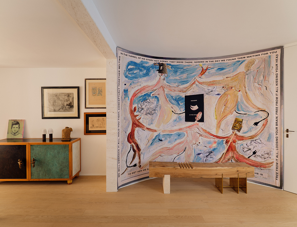
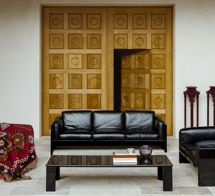
An ’80s-Era Fireplace, a Matisse-Like Tapestry, and a Sculptural Staircase Are the Highlights of This High-Drama Triplex
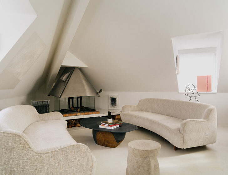
A penthouse triplex in Paris, renovated by Sophie Dries, features an artist-built fireplace, metal and leather chairs, and a Matisse-like tapestry, among other details. Photos: Florian Thouzet
You might recall I wrote a little blurb about that fireplace, pictured above, when this Sophie Dries–renovated interior first appeared in Milk Decoration a few months ago. Built on-site in the 1980s by Philolaos, a Greek sculptor who was friends with the art-collecting owners of this historic Parisian home, it sent me on a classic deep dive. But when Dries’s full renovation passed through our inboxes earlier this month, we decided to feature the whole project, considering how many other lovely details she incorporates here. Owned by a couple whose children have recently flown the coop, the house has been reconfigured into a penthouse triplex — one floor for the primary suite, one floor for guests, and the top dedicated to entertaining, with two terraces leading out to a view of the city. But as much as the words “penthouse triplex” might lure us in, it’s the details that make this particular space: the whimsical, Matisse-like tapestry by Laure Prouvost; the bronze buffet by Garouste & Bonetti, its left door rubbed to a blackened finish and its right a patinated green; the metal and leather furniture by Odile Mir; the drawings by Picasso; and the many pieces by Dries herself, including her welded brass Styx mirror. A sculptural staircase spiraling around the elevator serves to unite volumes that were previously fragmented but also lends the space even more of a melodrama–meets–modernism feel.
Formafantasma’s Runway Design for Marni Was a Heightened Meditation on What is Real and What is Imagined
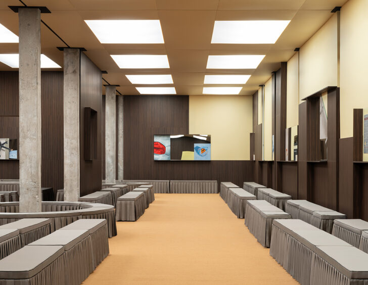
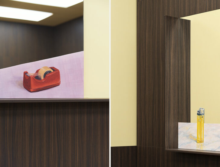
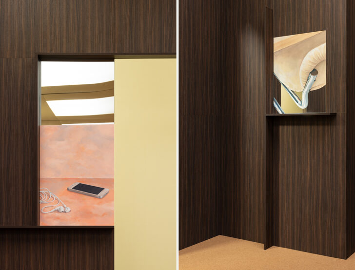
Formafantasma’s set design for Marni’s F/W26 show, creative directed by Meryll Rogge
It feels only fair, after years of fashion brands showing up to furniture fairs, that our biggest design stars should begin to colonize some of fashion’s tentpole events. In recent seasons, Bottega Veneta has called upon furniture whisperers to line its runway with experimental or avant-garde chairs; in Paris this month, it was Max Lamb and his panoply of polystyrene seats but in the past, it’s been Gaetano Pesce’s swirling and smiley-faced resin, or 6:AM’s brutal cast-glass stools. And of course Rem Koolhaas had a long and fruitful partnership with Prada. But perhaps no set design has been as cohesive or conceptual as the one Formafantasma debuted last month with Marni at their F/W26 show in Milan.
Called Dioramas of Everyday Life, the set was built around a collection of benches dressed in stiffly pleated gray skirts, walls sheathed in buttery paint and dark wood veneer, and a floor that was essentially one big doormat. The walls were punctured, though, by mirrored surfaces and panels, hand-painted with fragments drawn from daily life, including a tube of toothpaste, the base of a task chair, a CCTV camera, a squeeze bottle, and a half-peeled orange. The show was centered around the idea of what’s “real” in fashion, and by combining reflection and painting, the mirrors could not simply reflect the models and the audience, but rather “situate them within a field where representation and presence become indistinguishable… In this convergence, garments are neither isolated as spectacle nor reduced to documentation. They exist within a layered visual condition that mirrors contemporary experience, where lived moments and their representations continuously merge.” The set felt simultaneously like world-building and like a commentary on the world we’ve already built — so much more than simply a stage. I hope this, too, is the beginning of a long and fruitful partnership.
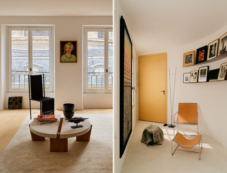
Katja Pargger Renovated This 19th-Century Hunting Estate With Cinematic Precision
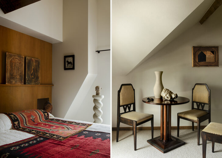
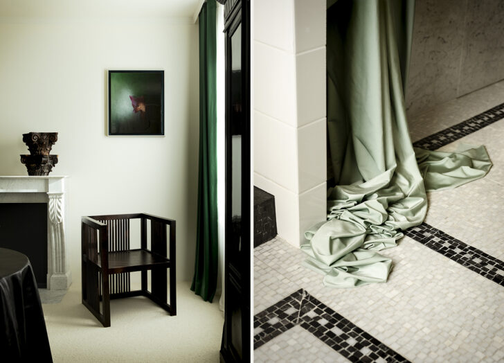
Classic and contemporary references are accentuated throughout this country estate by cinematically draped curtains and fabrics. Photos: Alice Mesguich
This is perhaps the biggest difference — interiors-wise, of course — between America and an old-world country like France. In America, an interior designer is often tasked with softening or giving character to a bland, box-like space, or with fixing the mistakes of a previous owner with bad taste. In France, an interior designer can be asked to renovate a full 19th-century hunting estate, complete with the restoration of a Napoléon III-era château. Katja Pargger, who is quickly becoming one of our favorite designers, makes this look easy in a Sologne estate near the Loire Valley.
Inspired by Jean Renoir’s 1939 film The Rules of the Game, which was set in a similar aristocratic country house, Pargger layers historical and contemporary references with cinematic precision: checkerboard floors, enamel tiles, tapestries, and classical busts mix seamlessly with chairs by Studioutte and high-gloss lacquered coffee tables; materials are deliberately left unfinished or worn to create a patinated aesthetic. The one detail that takes you out of the reverie is Pargger’s repeated use of draped fabric and exaggerated curtaining. In the bathroom, rather than a traditional shower enclosure, cream-colored curtains pool elaborately on the floor (can’t speak to the utility of this choice, but it looks amazing). Elsewhere, a chair is covered in a rubbery glass-green sheet as if awaiting the return of its city-dwelling owner. A pedestal is hung with what looks like shiny leather the color of eggplant, and a latex kimono is displayed on a 19th-century Japanese stand. These are weird, idiosyncratic choices — and exactly what an interior like this needs to elevate it above the level of pastiche to something resembling art.
A New Exhibition Examines Two Dutch Design Movements That Defined the Early 20th Century
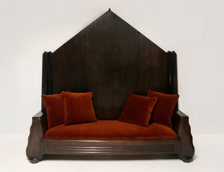
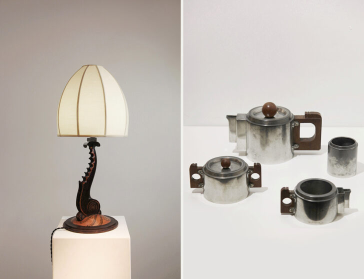
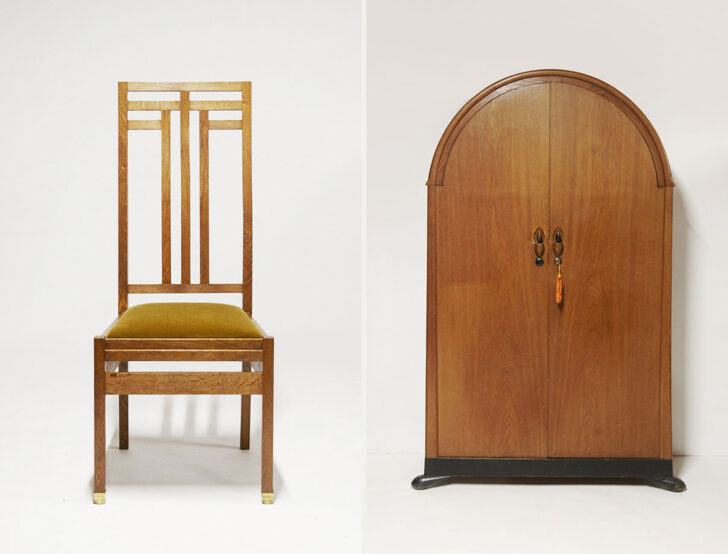
Top: Sofa by Pieter Kramer; middle: lamp by Hans Steinpatz and tea set by Johan Daalderop; bottom: chair by Cornelis Van Der Sluys and wardrobe by Willem Penaat Photos: Galerie Romain Morandi
Sometimes, we come across an exhibition that encapsulates why we do what we do: Opening today at Galerie Romain Morandi in Paris is AMSTERDAM / THE HAGUE, 1920, a show that juxtaposes two design and architecture movements that developed in close proximity to each other in The Netherlands of the early 20th-century — and that, we’re pretty sure, had major beef (a conjecture that’s possibly supported here but who knows!). I had very little knowledge of either of these movements before today, so it’s a joy to both learn about them and to see their works presented side by side.
The Amsterdam School, whose de facto leader was Michel de Klerk, favored a more expressionistic approach, where each building or piece of furniture was designed to evoke a strong emotional response — think curved lines, asymmetries, and symbolic motifs inspired by nature or folklore. The New Hague School, on the other hand, took Frank Lloyd Wright as its patron saint, more focused on clarity, order, and geometry. Furniture and interior designs were conceived to be ergonomic and modular, and beauty arose from the harmony of compositions. These weren’t merely stylistic affectations, however; they represented a fundamental division regarding the purpose of architecture and design, “between artistic expressiveness and the pursuit of functionality.” To the modern eye, the differences between the two styles are of course evident, but time has perhaps collapsed the chasm that once existed between them. Until April 18.
Book Yourself Into This Architecturally Significant Retreat in Upstate New York
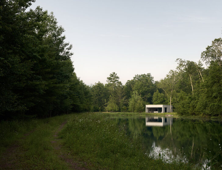
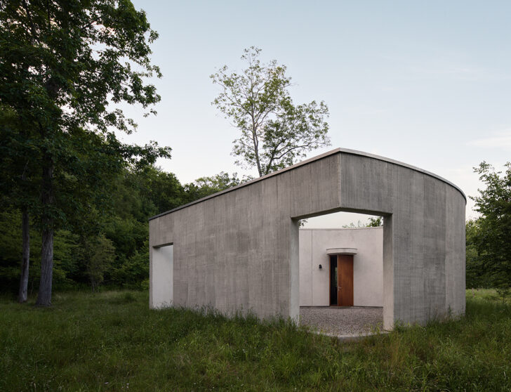
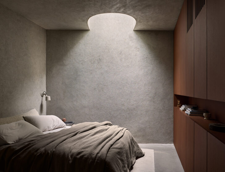
The new Vipp guesthouse in Upstate New York, designed by Johnston Marklee. Photos: Eric Petschek
As much as it is my job to create experiences for myself in architecture and design — all the better to inform my writing and to impart actual, real-world wisdom to our readers — I’m very bad at seeking out design-led spaces for vacation. I’m typically bringing along a family of four, so I’m often looking for the most frictionless option that’s still pleasant enough. I’ve never stayed at the Ghent House by Thomas Phifer; I’ve never visited Hôtel Le Corbusier in Marseille; and I’ve never vacationed at Sea Ranch (although I’m excited to rectify that this spring!). But there’s something about the newly opened Vipp guesthouse in rural Upstate New York — the Danish design brand’s first retreat in the United States, designed by architecture GOATs Johnston Marklee — that led me to immediately say: Yes, please, take me there now.
Situated on the edge of a pond in the middle of a 16-acre forest two hours northwest of New York City, the Vipp Pavilion is remarkably bucolic, even among destinations that bill themselves as a retreat into nature. But it’s the house itself that’s most intriguing. Johnston Marklee say they were inspired by Villa Malaparte, which sits perched on a cliff on the isle of Capri. Though both structures are distinct from the landscape in which they sit, they’re still in harmony with their surroundings. (To me, though, the structure that most comes to mind is the Pavilion on the Pond at Philip Johnson’s Glass House, a longtime fave.) The house is built using a combination of smooth and ribbed stucco, and its form is based on two tangent ellipses that echo the contours of the adjacent pond. “At first glance, the building resembles a stone on the pond; initially solid, but slowly revealing its volumetric form on the approach,” explains Sharon Johnston. Inside there’s a cavalcade of Danish furniture — including Vipp’s anodized aluminum kitchen — and above, a green roof seeded with native plants. Opening this month, and bookable here.
Editors’ List
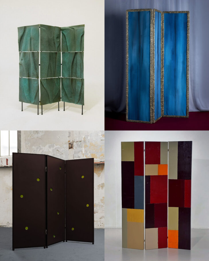
The room divider — essentially a giant canvas where designers can show off their painterly chops, their skill with marquetry, their dexterity with a certain material, or even their unusual obsessions — has long been one of our favorite furniture typologies. Today I’m devoting my Editors’ List to four recent discoveries in a genre that appears to be on the rise. Whether they’re a random blip in the design landscape, or a harbinger of things to come, only time — and next month’s trip to Milan — will tell.
CLOCKWISE, FROM TOP LEFT:
–
On view at Collectible in Brussels this weekend with Marion Galtier’s curatorial space Casa Soler is this absolute stunner by Polish designer Agnieszka Owsiany, in hand-hammered and patinated copper. After working for several years primarily in textiles, it’s the designer’s first large-scale piece in metal. (You last saw her in this newsletter with her forged pieces — the candle snuffer of everybody’s dreams — for the Copenhagen-based Aarticles!) The metal appears almost draped, another current trend in design, but the effect is quite timeless rather than trendy.
–
This one, in bronze and painted linen, won’t launch until Nilufar Depot’s Grand Hotel concept in Milan next month, but we’re giving you a sneak peek here. It’s part of Allegra Hicks’s Trame di Confine collection, in which each piece is built around the idea of a perimeter. “Bronze frames enclose decorated surfaces, tracing boundaries that do not seek to impose limits but rather to create a space of protection and listening. The perimeter becomes a threshold, a place of passage between inside and outside, between the visible and the invisible.”
–
I don’t know much about this screen, made from recycled wood and industrial lacquer by Dutch designer Pepijn Fabius Clovis for the Amsterdam concept shop The Frozen Fountain. But you’d better believe I smashed the save button on Instagram the instant I saw those color fields. Reminds me of the painting I just bought by Colt Seager.
–
Lastly, I love this divider by Montréal-based designer Clara Jorisch, part of a showcase with Numeronovantasei presenting works by Jorisch, Pavel Golik, and Verre D’Onge for Matter & Shape’s “Hors Les Murs” program. (It’s on view until March 15 at Galerie Mercier & Associés in Paris.) The screen is from the designer’s Opa Collection, featuring geometric silhouettes pressed into leather surfaces or high-gloss lacquered wood and spherical feet that echo the Secessionist heritage of Jorisch’s native Austria.
News
Let’s all move to this Gareth Hutchison–designed house, on the market now outside of Edinburgh. Photo: The Modern House
–
There’s a nice interview this week with Sophie Pearce of the London gallery Beton Brut on the site of Aucoot, a British real-estate firm that focuses on beautifully designed properties. As one of our favorite curators of vintage finds, we love hearing what Pearce has to say in general, and she gets into things like the first piece she ever sourced, or the chair that took the longest to find. The interview also contains a book recommendation I plan to follow: Marc Augé’s Non-Places: Introduction to an Anthropology of Supermodernity. (Which I’ll get to right after I read Strangers! Sight Unseen Book Club, anyone?)
–
I’d never seen the work of architect-sculptor Jacques Couëlle before reading this article about the recent renovation of one of his remaining residences in France; here’s another piece if you, too, were unfamiliar with his work. Sprayed concrete, Schlegel-esque fireplaces, incredible murals… hits every note.
–
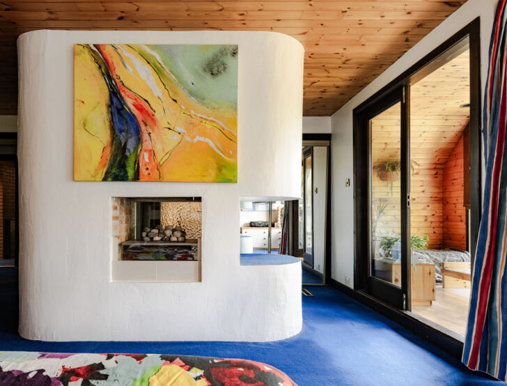
Speaking of British real-estate firms, does anyone want to move to Scotland? The Modern House featured this insane 3-bedroom property outside Edinburgh this week, pictured above. Built in 1980 by Gareth Hutchison, it spotlights all of my favorite elements from Modernism: an oculus, a spiral staircase, cylindrical interior volumes, a freestanding fireplace — plus, I’d ask the current owners if I could keep that sick painting.
–
I recently wrote on Substack about my complicated relationship with the South African designer Carrol Boyes, in a newsletter called On Learning to Love the Thing You Hate. I was tickled this week to see my sentiments echoed by Anna Solomon in Wallpaper magazine, writing about the designer eliciting admiration and debate among design enthusiasts (just me!). We love to incite a news cycle!
From the Collection
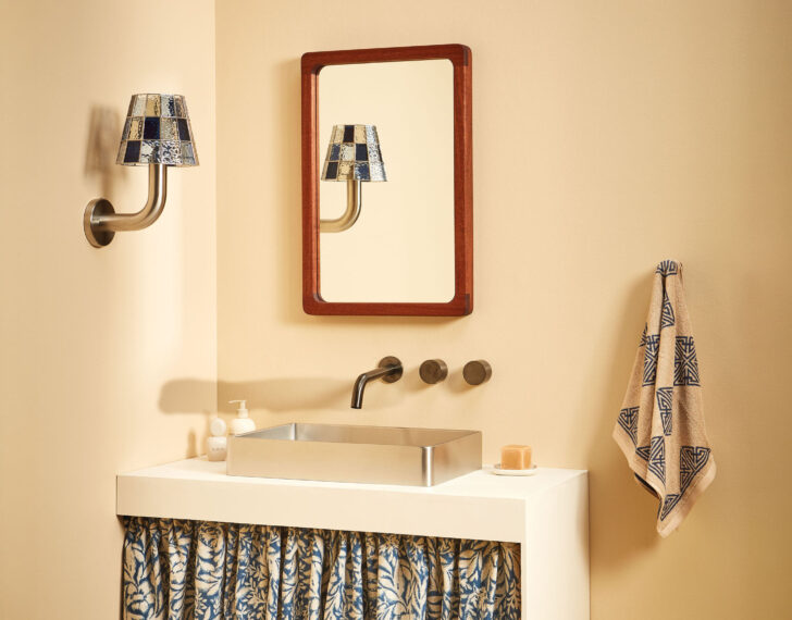
THE FUN GUY WALL LIGHT BY FRANGERE STUDIO
With its chunky tubular metal base and handmade stained-glass shade, the Fun Guy Wall Light by Frangere Studio cheekily mixes the essential and the ecclesiastical. Each shade is made of 32 pieces of glass — all meticulously cut, foiled, and soldered by hand by designer Carina Webb at her studio in Auckland, New Zealand — and is available in a range of colors, tones, and metal finishes. Custom colors and finishes are available upon request, and the lamp itself is available in sconce, table, floor, and pendant varieties as well.