07.02.26
The Weekly
SPOTLIGHT: A centuries old Murano glassmaker reinvents itself for the modern era
Welcome to the new Sight Unseen, a weekly newsletter that delivers the best of the design world — news, trends, shopping advice, interviews, travel recs, and more — straight to your inbox. If you’re not subscribed, follow this link to sign up. Want to partner with us, advertise, or submit your work (guidelines here)? Email us at hello@sightunseen.com.
Today’s Spotlight newsletter is presented by Barovier&Toso, but all thoughts and editorial content are our own. Thank you for supporting the brands that support Sight Unseen!
A Glow-Up for Barovier&Toso As the Murano Glassmaker Approaches Its Eighth Century Doing Business
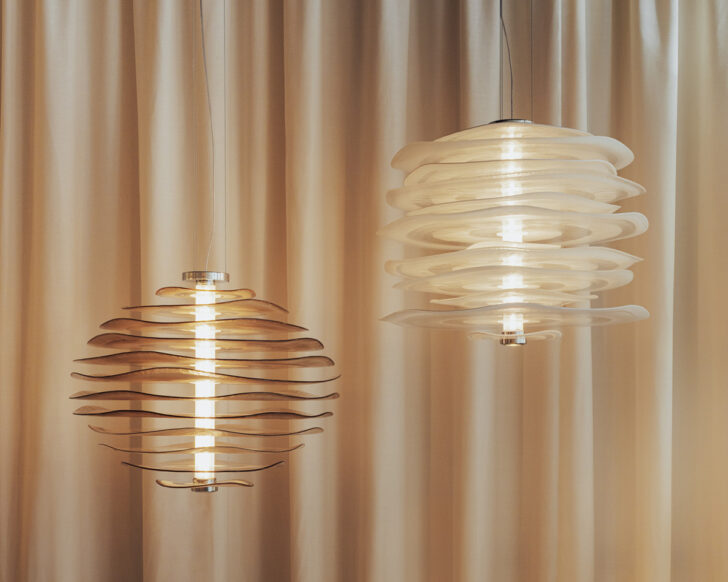
Top: Etime by Luca Nichetto (left) and Agave by Garcia Cumini; middle: Profilo by Nichetto; bottom: Etime by Nichetto and Agave by Garcia Cumini (left) and Aurora by Nichetto. Photos: Mattia Parodi, Cameranesi + Pompili
Few brands can claim as storied a history as Murano glassmaker Barovier&Toso, which started around the time of the Renaissance, one of the oldest family-run businesses in the world. The company’s output in those early days — as evidenced by the wealth of objects in its archive — were strikingly innovative, even now reading well ahead of their time; in recent years, though, it focused so much on tradition that it began to lose a bit of what made it special. Aspiring to that level of prescience once again, Barovier&Toso recently underwent a reinvention, hiring Andrea Signoroni as its first CEO, Luca Nichetto as artistic director, and creative agency Studio Blanco to develop its new visual identity. The resulting collection, which debuted this spring in Milan, nimbly taps the past as a resource, yet fully inhabits the present.
It’s hard to imagine someone better suited to his new role than Nichetto, whose work across mediums finds its origins in glass. “I was born in Venice and raised in Murano,” he says. “Ninety-nine percent of my friends and relatives were connected to the glass industry. My approach to design was born through glass; it’s a part of me.” But that connection can also make Nichetto sensitive to the way the term “Murano” gets thrown around. Referring to this past year’s Salone, he says, “you can see the result of many people mentioning Murano without really knowing what to do with it.”
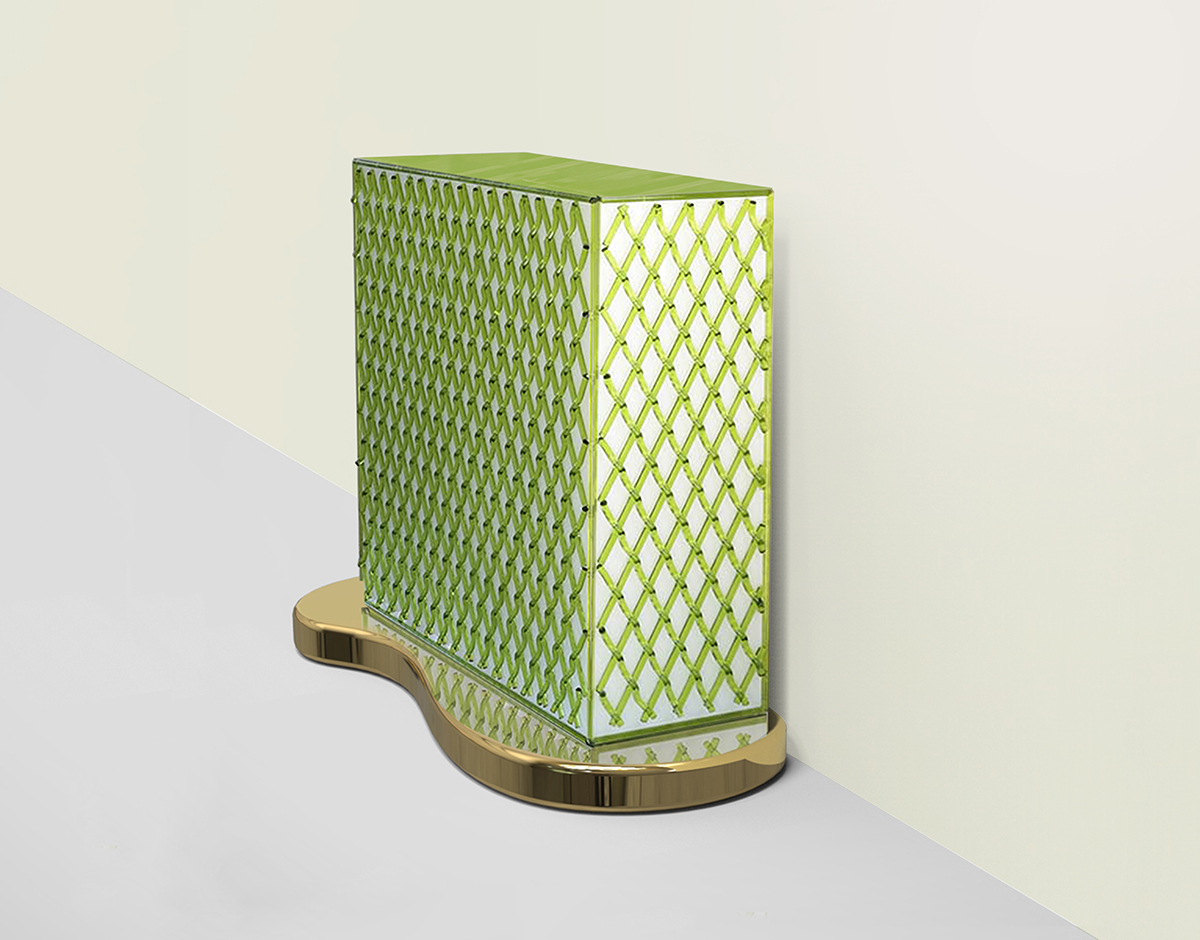
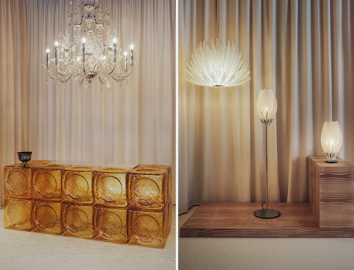
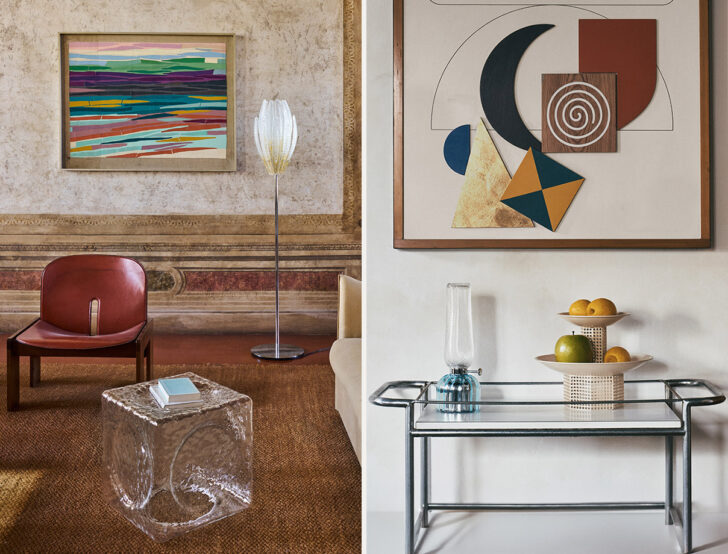
The pieces unveiled at Salone, for Barovier&Toso’s first launch since the reboot, show that Nichetto knows exactly what to do with it, as well as how to embody the tensions and contradictions inherent in glass — between fragility and permanence, transparency and weight, in a material whose cool gloss is achieved through immersion in a furnace. From Nichetto’s own studio comes Etime, a collection of volumes that look like colorful ice cubes etched with circular stamps. His Aurora table light reimagines an oil lamp with a ribbed glass base and diffusers that generate a subtle optical waviness. And with his Profilo suspension lamp, layered glass discs form a curvy, organic silhouette resembling a cairn of stacked flat stones.
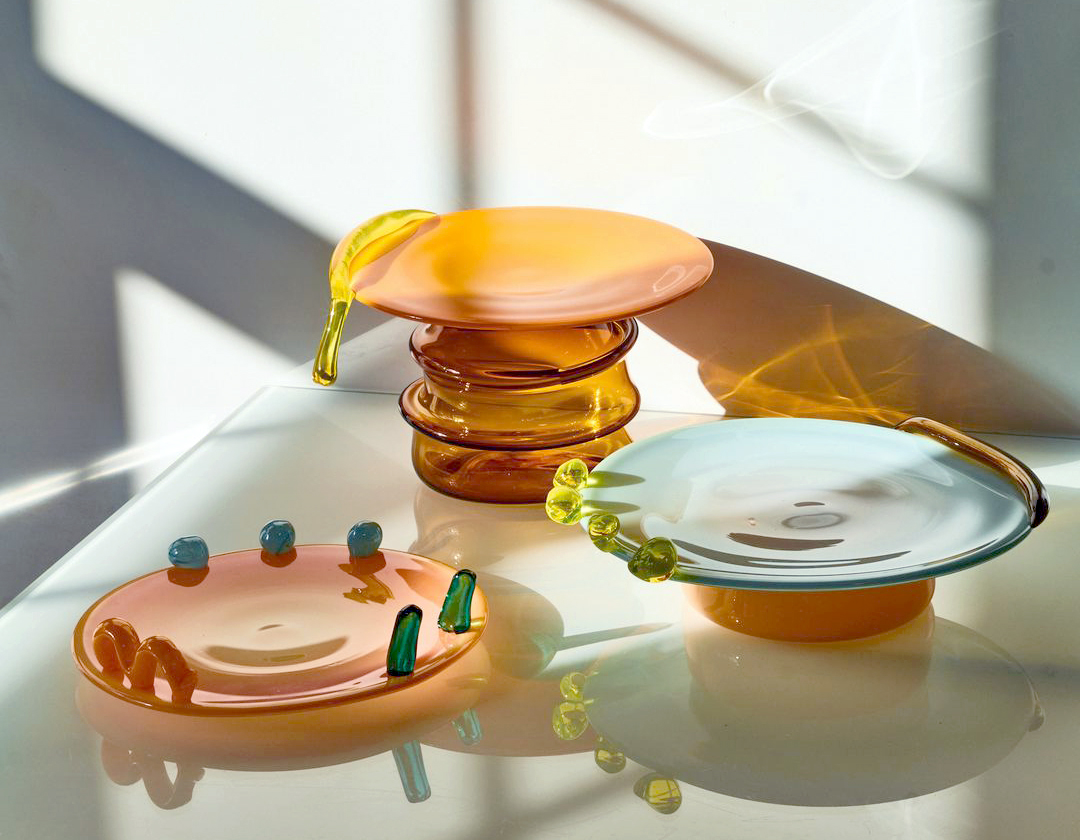
Nichetto commissioned works from other designers as well: spiked lights with a gradient effect from García Cumini and hourglass-shaped vessels by Studio Lani, inspired by traditional neck ornaments in Nigeria. Keiji Ashizawa’s vases reference the art of ikebana, while those by Emmanuel Babled understand glass as a geological substance. The lidded vases by Stockholm’s Claesson Koivisto Rune can be stacked architecturally and are blown using the corteccia technique, which gives glass a bark-like texture. Contemporary as they are, these pieces still rely on glassmaking methods that have evolved over centuries — fresh takes that pay tribute to what’s come before.
Lagoon Tones and the Transparent and Tactile Qualities of Glass Inspired This Rebrand
Studio Blanco’s Barovier&Toso new logotype and branding materials took cues from the glassmaker’s early 20th-century waterfront headquarters in Murano.
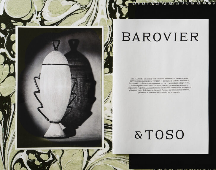
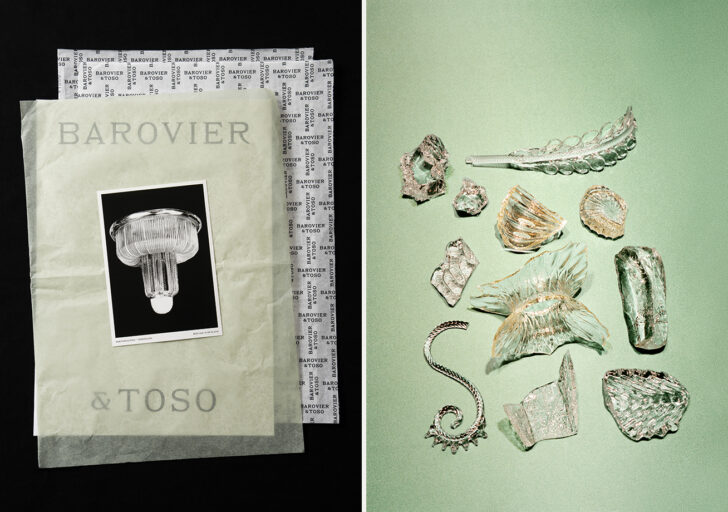
The Italian agency Studio Blanco, founded in 2005 by Sara and Valerio Tamagnini, knows how to give language and form to what is so often ineffable: feeling and atmosphere (aka vibes). When Barovier&Toso asked them to create a revamped visual identity, they went straight to the astoundingly rich source — Murano, a place so steeped in history and aesthetics that the mere word calls to mind an entire visual language, like when people say “Eames,” or “Beyoncé.” When the pair stumbled across signage from Barovier&Toso’s early 20th-century waterfront headquarters, Fondamenta Vetrai 28, it became the basis for a new logotype: slim, curving caps with a slight serif that embodies both a weight and a lightness. From there, they conceived of a broader universe inspired by lagoon tones and the tactile textures of glass. “We were interested in qualities such as transparency, reflection, and precision, which informed both the visual system and the redesign process itself,” they say. “Even the evolution of the logotype followed a logic similar to glassmaking: reshaping an existing form rather than replacing it entirely.”
Studio Blanco’s process centers on identifying what’s distinctive and meaningful about a client, even if those elements have become fragmented or diluted over the years. “We try to understand what gives a brand its internal coherence,” they say. ”But it’s equally important to recognize what no longer works: visual habits, excesses, or past decisions that may have weakened the perception of the brand. Very often, those inconsistencies become useful signals,” guiding what needs to be removed, clarified, or reinterpreted. For Barovier&Toso, that meant working “through subtraction and calibration: refining proportions, clarifying details.” They collaborated with artist Sarah Martinson on a texture inspired by historic Venetian paper-marbling techniques, and with photographers Matthieu Lavanchy, Mattia Parodi, and Piergiorgio Sorgetti, they set a specific mood. Milanese creative consultants Cameranesi & Pompili contributed to the set design. While their efforts are rooted in Barovier&Toso’s birthplace, it was also important to Studio Blanco to look outward. “Part of the work,” they say, “was translating the emotional and material richness of Murano into a language that could still resonate with someone who may never experience that world directly.”
The Story of Barovier&Toso’s Archive is Intertwined With the History of Murano Glass
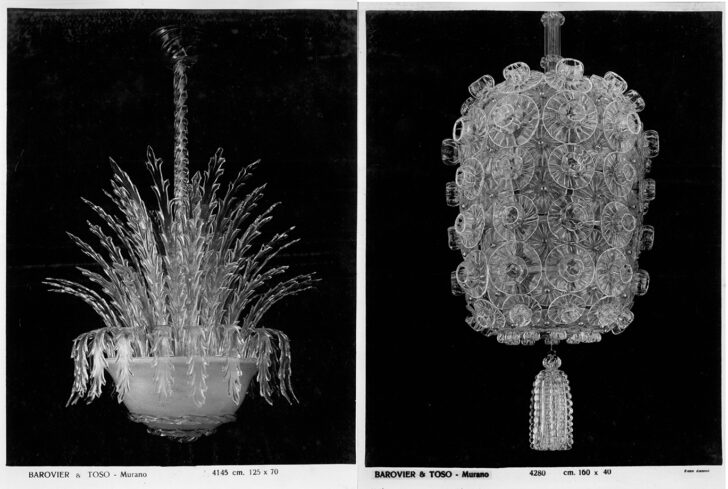
Barovier&Toso chandeliers unearthed from the brand’s archive, which dates back to the 13th century.
While glassmaking in Venice dates back to the Roman Empire, Murano glass originated at the end of the 13th century, when a new law required all glassworks be contained to an island just north of the city. The Barovier name has been intertwined with Murano glass ever since. At the height of the industry’s first flush of popularity, in the mid-15th century, glassmaker Angelo Barovier invented a formula free of lead and arsenic that resulted in unprecedentedly clear glass (“vetro cristallino”). Around this time, Angelo also created the famed Coppa Barovier wedding goblet — deep blue glass intricately decorated with polychrome enamels and gold in a process still used today, and “where the craft of glass is pushed to its highest level,” says Nichetto.
Shifting trade routes, international politics, and competition from other parts of Europe led to Murano’s eventual decline in the centuries that followed, but it never completely disappeared. And when, in the mid-19th century, six brothers opened Fratelli Toso, they focused on historic glass-making methods, marking the beginnings of a revival for Murano glass in general. In the 20th century, another Barovier — Ercole — helped usher Murano glass into stylistic modernity. His work was highly experimental, like the crackled Primavera series from 1930, which was the result of a chemical mix so accidental it could never be precisely replicated (such pieces are highly sought after at auction). He also became known for using thick glass and a technique called colorazione a caldo senzafusion, leading to his 1930s collections Laguna Gemmata, Marina Gemmata, and Autunno Gemmato. Serving as head designer for the companies that had merged to become Barovier&Toso, Ercole experimented with rostrato glass, transforming “the surface of glass into a sculptural element, made of spikes, reliefs, and refractions,” says CEO Andrea Signoroni. “It’s a very clear example of Barovier&Toso’s ability to innovate from within tradition, taking the material beyond its decorative dimension and transforming it into an autonomous expressive language.”
Spanning centuries, the Barovier&Toso archive is full of pieces whose beauty is matched by cultural density. “Each object carries with it the hand of the master, the memory of the furnace, the trace of living imperfection, the rarity of a specific series and its connection to a precise historical moment,” says Signoroni. “A great Barovier&Toso piece is never anonymous; it belongs to a genealogy.” The challenge now, as Signoroni sees it, is not to preserve this history “as something static, but to keep it alive through contemporary design, new collaborations, and a language capable of speaking to an international audience without losing the depth of our origins.
Shopping For…
VINTAGE GLASS PIECES BY BAROVIER&TOSO
In 2014, a wobbly gridded vase edged in aventurine designed by Ercole Barovier — Barovier&Toso’s head designer from the 1920s to the 1970s — went for $317,000 at a Wright auction in Chicago. Luckily for us, there are still wildly interesting pieces from the company’s archive available on the secondary market for a semi-reasonable (or at least not Warholian) price. If you’re itching to acquire historical Barovier&Toso pieces of your own and are curious which works are considered significant from a collectible standpoint, CEO Andrea Signoroni identified a few that convey “the soul” of the brand:
-
“Ercole Barovier’s Primavera series, created between the late 1920s and the early 1930s, is one of the most fascinating episodes in the history of Murano glass: a material effect born from experimentation. Its rarity, combined with its visual delicacy, makes it one of the most sought-after expressions of Barovier’s work.”
-
“The rostrato glass works are important because they show Barovier&Toso’s ability to transform the surface of glass into an almost architectural and sculptural element. Glass is no longer only transparent or luminous. It becomes relief, vibration, living matter.”
-
“The great chandeliers and lighting works that have defined Barovier&Toso’s identity over time are important because they translate the artistic vocabulary of Murano into space. A chandelier is not simply an object. It’s a presence, a relationship between glass, architecture, and light. But my advice would be not to start from the market, but from the eye. One needs to observe extensively, compare pieces, understand the techniques, and train the eye to recognize proportions, colors and finishes. Murano glass is a world of nuances. And while rarity matters, it’s not enough on its own. A collectible piece should have a strong technical or artistic identity and say something: about the furnace, the historical period, the author, and the evolution of glass.”
Below are some examples of our personal favorite archival Barovier&Toso pieces, some of which are available — at least for now!
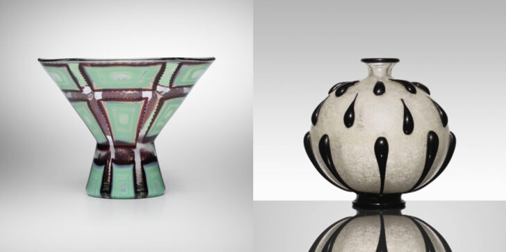
Egeo vase (left) and an important Primavera vase (right) by Ercole Barovier that sold for $293,000 in 2016
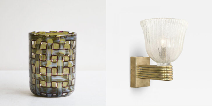
Ercole Barovier Argo vase (left), and fluted sconce (right), $2,475
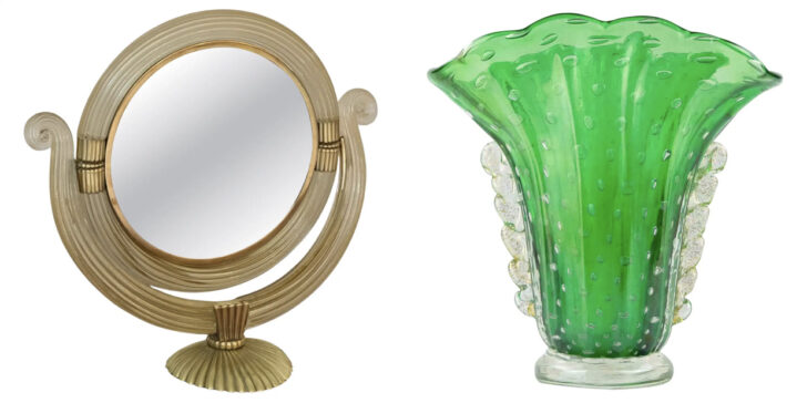
Barovier&Toso brass vanity mirror (left), $5,000, and vase (right), $1,628
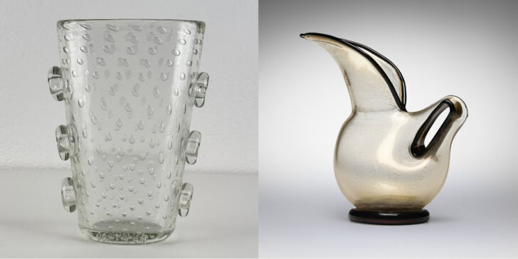
Barovier&Toso Pulegoso vase (left), $8,385, and Eugenio pitcher (right)