08.10.26
The Weekly
An Iconic Midcentury Hotel Reborn, a Belgrade Hi-Fi Listening Bar, and More
Welcome to the new Sight Unseen, a weekly newsletter that delivers the best of the design world — news, trends, shopping advice, interviews, travel recs, and more — straight to your inbox. If you’re not subscribed, follow this link to sign up. Want to partner with us, advertise, or submit your work (guidelines here)? Email us at hello@sightunseen.com.
A Listening Bar Where Yugoslav Modernism Meets Japanese Hi-Fi Culture
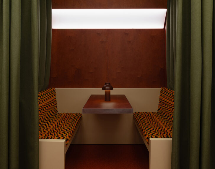
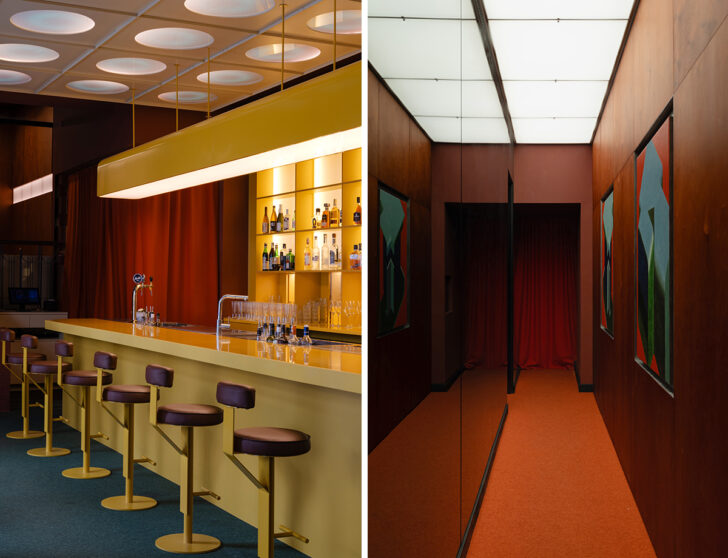 Supaform’s interiors for EJE incorporate his furniture and art, plus original London Underground textiles, vintage speaker systems, and more. Photos: Varvara Toplennikova
Had you visited Yugoslavia in the 1970s, you would have seen thousands of modular structures dotting the streets, instantly recognizable by their rounded, space-age exteriors and large central picture windows. Expandable to encompass anything from newspaper stands to copy shops to small cafes, these were the iconic K67 kiosks, envisioned by the Slavic architect and industrial designer Saša J. Mächtig in 1966 and now altogether more rare in the country. It was these stands — along with Yugoslav brutalism and futurism in general, plus the aesthetic and sound design of Japanese listening bars, that inspired the interiors of Esthetic Joys Embassy, or EJE, in Belgrade. Comprising a bar, a restaurant, a DJ booth, a vinyl library with listening stations, and a dance floor that’s attached to a hotel, EJE was designed by Supaform, and features not only principal Maxim Scherbakov’s furniture designs but his artworks as well, as seen in the lower right photo above. Other key details include a pair of vintage JBL 4435 studio monitors, an iconic Japanese train station clock called the Dulton Double Face, and archival Mischa Black upholstery fabric — used on the London Tube in the 1970s — that Scherbakov’s team sourced from the original London mill that made it. The idea, he says, was to transform the space into a utopia that inspired both nostalgia and optimism; “a futuristic, autonomous station of aesthetic pleasures.”
One of Athens’s Great Midcentury Landmarks Enters a New Era
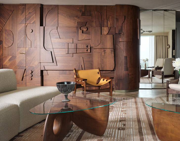
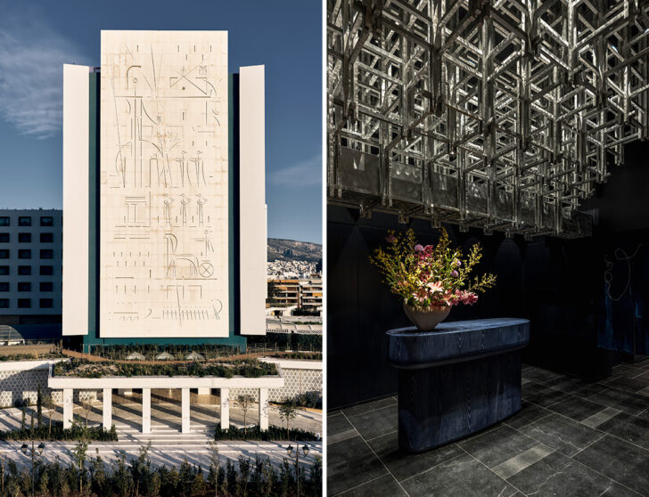 At top, a suite at the newly renovated Conrad Athens the Ilisian; bottom, its original 1963 facade and a shot from its Yabu Pushelberg–designed Onuki restaurant.
Back in 2024 we asked the Greek design studio Objects of Common Interest to compile their 10 favorite modernist buildings from around the country. The Hilton in Athens was not one of them, but it easily could have been; Hiltons these days may not be the first thing you think of when you think “design hotel,” but this one was built in 1963 by prominent Greek architects Prokopis Vassiliadis, Emmanouil Vourekas, and Spyros Staikos, who hired artist Yiannis Moralis to adorn its front facade with an iconic, very midcentury-coded display of Greek hospitality-themed engravings. Add to that its landmark 82-foot pool, and the modernist building was long venerated both as a hotel and a piece of cultural history. Now, having undergone a four-year restoration and renovation, it has reopened to much fanfare as Conrad Athens the Ilisian, its 278 guest rooms and public spaces reimagined by AvroKo — with a restaurant by Yabu Pushelberg.
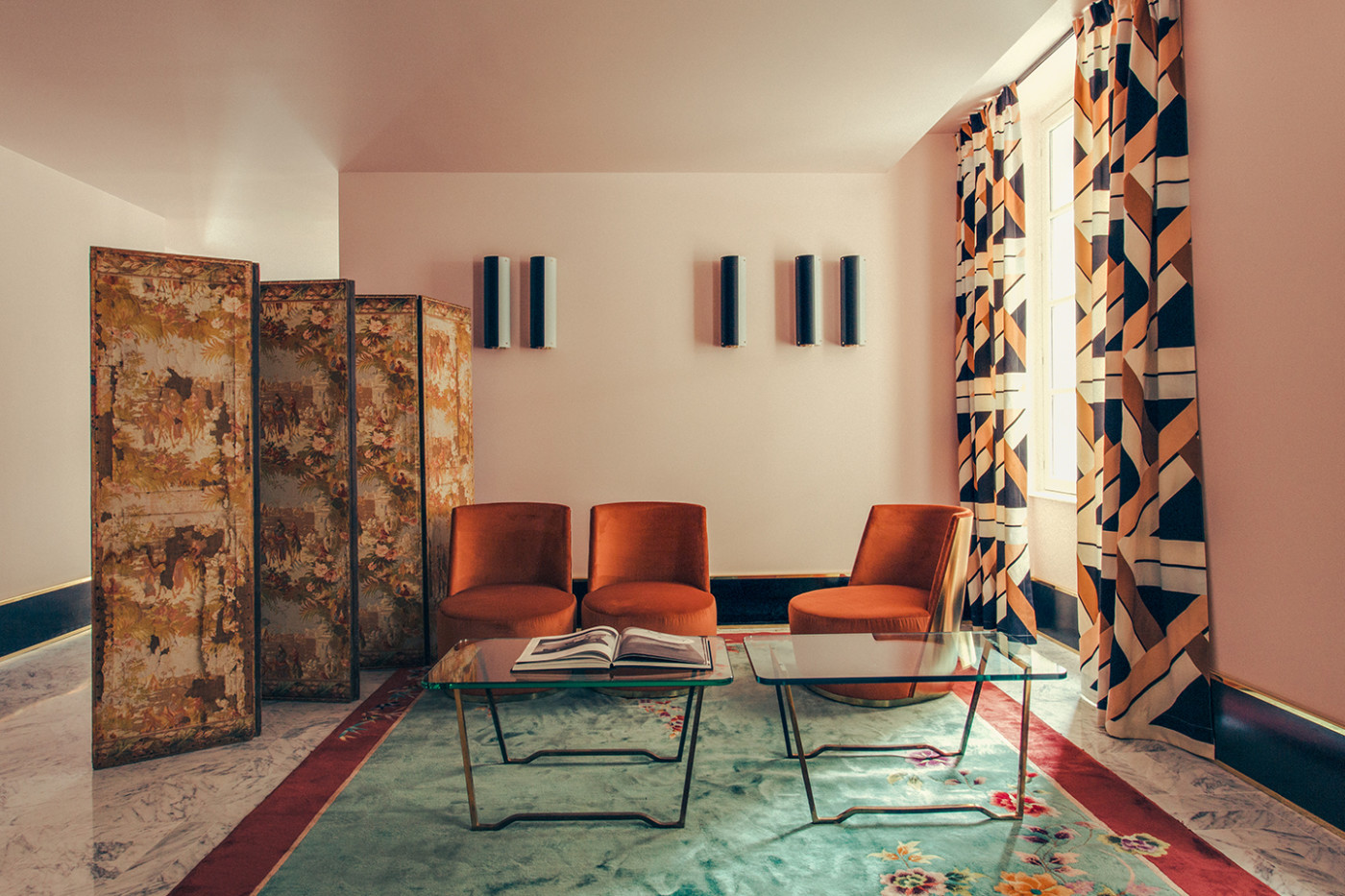
While the new interiors definitely have that luxury-corporate-hotel vibe in some areas, there are lots of nice midcentury touches — both original and inspired by the original. The former are concentrated in the hotel lobby, where bronze snail-shaped fountains from the original pool, by Moralis and Bouba Lyberaki, have been repositioned into a long water feature that runs down the center of the space. At one end is a fully restored 1963 ceramic mural that Moralis created for the Hilton’s rooftop Galaxy Bar. The hotel’s suites feature elements like the Praying Mantis lamp that Francois Rispal designed in 1950, plus a newly created wood relief wall mural, pictured above, that clearly pays homage to the era. The art throughout — curated by Mare Studio — was also selected to highlight Greek and Greek midcentury artists, though guests who have stayed at the hotel since its opening in April report that none of it can really compete with the art on display through its oversize windows: sweeping views of Athens itself.
This Highly Personalized Art Deco Apartment Takes Cues from Vermeer and Balkan Textiles
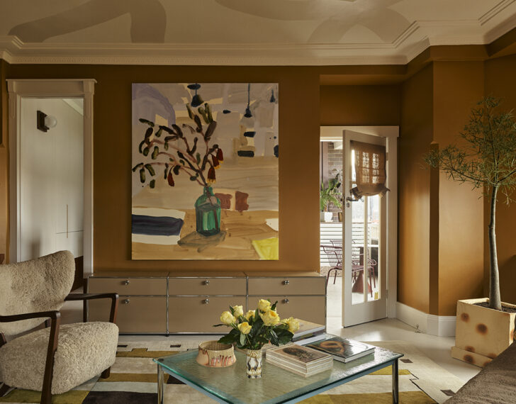
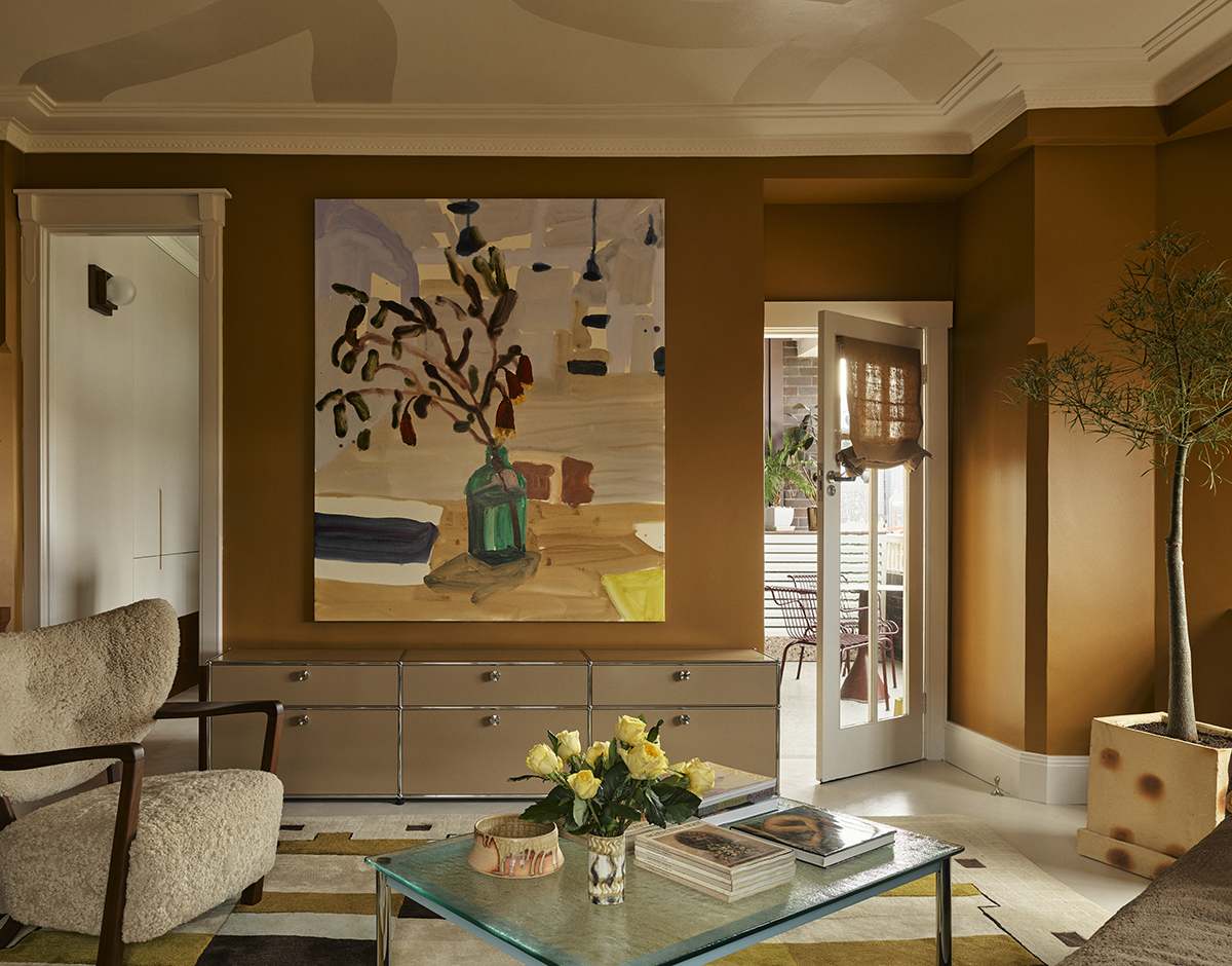
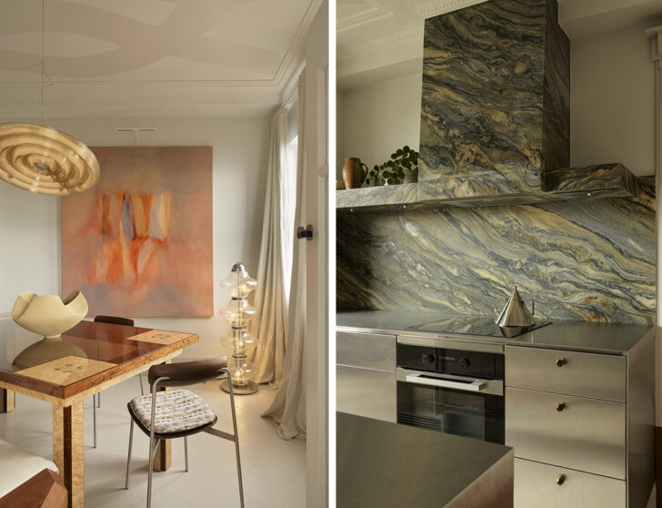 Some of our favorite details in the Gentleman apartment by YSG include a painting by Laura Jones from Chalk Horse Gallery and a custom polka-dot ceramic planter by Remy Pajaczkowski-Russell (top), plus the most stunning galley kitchen we’ve seen (bottom right) and a dining room anchored by a vintage floor lamp (bottom left). Photos: Anson Smart
Sometimes I feel like all I ever do in these newsletters is write about apartment renovations in Art Deco–era buildings (mostly in Paris), all of which look impossibly glamorous and full of sleek metal surfaces and expensive period pieces sourced from high-end dealers. I love all of the ones I’ve featured here, of course, but it’s interesting to see a project that departs from the mold a little bit. This space, a 950 square-foot apartment in a landmarked 1929 building in Sydney, was unburdened of past wayward renovations by the firm YSG in order to return to its Art Deco clarity, but then warmed up to something much more layered, colorful, and unexpected.
Two points from the project description caught my interest in particular; first, that the clients, a couple, have a thing for Vermeer, so the designers painted the walls in one of the Dutch painter’s favorite colors, lead white. They also incorporated his muted yellow and ultramarine blue into the upholstery of a piano chair, and into a custom rug with ochre accents. Second, they chose some of the apartment’s other colors, along with many of its textiles and textures, as a way of paying homage to the Bosnian/Croatian heritage of one of the owners. That includes the window treatments and bolster in the primary bedroom, and the upholstery in the dining room. Plus geometric symbols taken from ancient rugs that YSG incorporated into the wood marquetry on their design for the dining table, symbols that dovetail with some of the forms found in — you guessed it — Art Deco. See more photos of the project here.
A Helsinki Restaurant Interior Gives Scandinavian Restraint a Delightfully Weird Twist
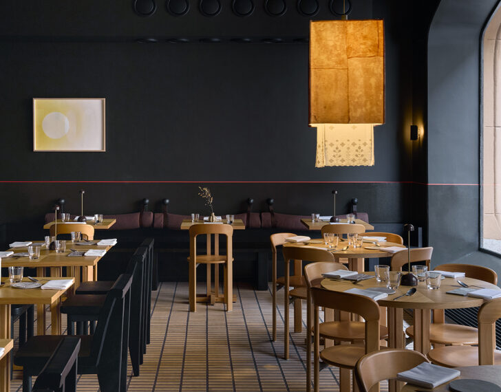
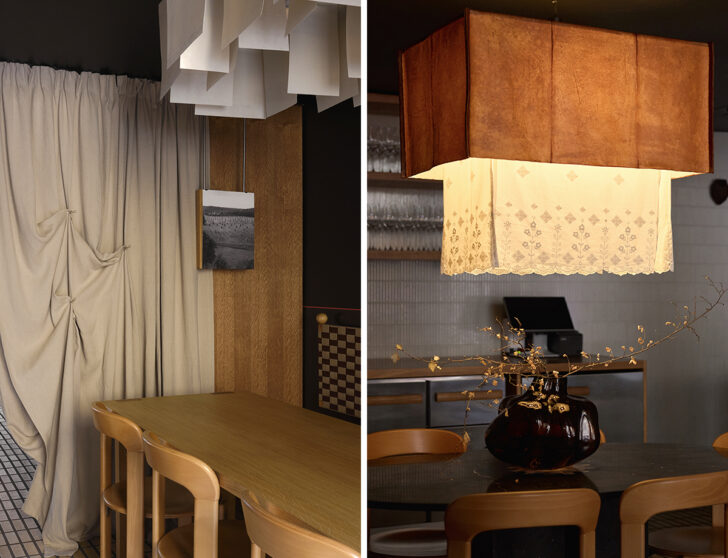 The restaurant Boreal, with interiors by Treivas Architecture Bureau, mix common materials and Finnish design principles with special details like lights made from kombucha and broderie anglaise. Photos: Sofia Kulianu
At first glance, Boreal restaurant in Helsinki looks quintessentially Scandinavian, with neutral tile floors and unfussy wooden chairs from the Danish brands 101 Copenhagen and Hay. And to be sure, the designers — Treivas Architecture Bureau — say that the project was partly inspired by very Scandinavian things like the natural beauty of northern landscapes, Finnish user-friendliness, and a simple materials palette that feels at once local and universal. But if you look closely, they say, you’ll also notice unusual, delightful details, and it’s those elements that motivated us to feature Boreal here this week even though it opened at the start of the year. The most obvious standouts are the large, lacy pendant lights, which pair rough-hewn kombucha leather at the top with delicate broderie anglaise dangling out from underneath. There’s also a tile-clad column encircled with metal shelves for service supplies that are held on with red nylon straps, and fun artistic interventions on the walls like a single carved wooden fish by Helsinki artist Carlo Raymann and clusters of flower forms by Japanese ceramicist Yukari Hotta. In the bathrooms, custom vanity mirrors have doors printed with Finnish forest and lake scenes, and the designers say they used diffused amber-toned lighting throughout the space to channel the Northern Lights, “its reflection in the dark glossy tile” of the column evoking “the mysterious surface of the lake.” Boreal recently got a Michelin star for its food; we’ll give it five stars for the charm of its interiors.
Shopping For
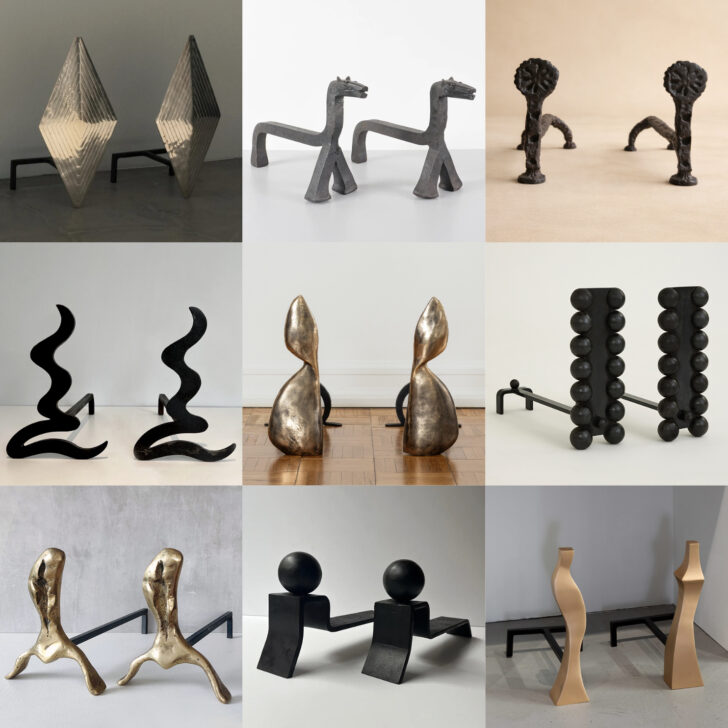
FIREPLACE ANDIRONS
Besides my childhood home, where it was strictly ornamental, I’ve never lived anywhere with a proper fireplace. But if I did, considering how it often serves as the visual focal point of a room, I’d be pretty discerning about its accoutrements — viewing them as yet one more opportunity for interior curation. And while a working fireplace obviously requires well-designed fire tools, even a non-working one can be inset with striking sculptural andirons, of which there’s a plethora on the market right now. Here are nine of my favorites, both contemporary and vintage.
1. Custom andirons by Courtney Applebaum Design, inquire for price, courtneyapplebaum.com
2. 1960s andirons, $1,285, 1stdibs.com
3. Andirons by Rafael Triboli, inquire for price, aalvogallery.com<
4. 1970s French andirons, $1,663, pamono.com
5. Winged andirons by Simone Bodmer Turner, inquire for price, emmascullygallery.com
6. Flecto andirons by Muhly, $1,850, muhly.studio
7. Brutalist brass andirons by David Marshall, about $740, studiosale.uk
8. Minimalist andirons by Jacques Adnet, $3,505, 1stdibs.com
9. Flame bronze andirons by Jacques Jarrige, $13,000, 1stdibs.com
News
 –
–
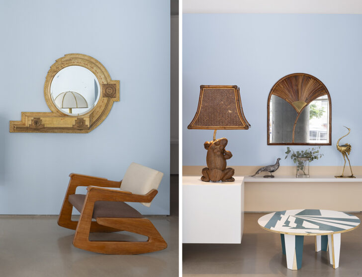
Last week marked the opening of the second collaboration between Milan’s Nilufar and New York’s Galerie56: Grand Hotel Vista Mare, a follow-up, in Galerie56’s Tribeca space, to the Grand Hotel exhibition Nilufar showed during Salone this past April. This one — inspired by Luchino Visconti’s 1971 film Death in Venice — dispensed a little with the opulence and the dark, saturated colors of the Milan presentation; vintage icons and oddities are here presented in a simpler environment that channe ls the colors of the beach and Italian summers. Highlights include a 1902 golden mirror with drawer by Carlo Bugatti, a 1940s wall shelf by Gio Ponti, and an amazing 1973 wicker frog lamp by Gabriella Crespi. On view through October 16.
–
I know this is not news in any way shape or form, but more of a PSA for those who aren’t aware: Obviously our Modernist Travel Guide is the best resource for visiting modernist architecture in big cities around the world, but if you’re venturing beyond city limits, or just want to have a fun armchair tourism moment, don’t forget about the Iconic Houses Network website, which has a map of 200 20th-century architect’s houses and house museums that are all actually open to the public. I was browsing it when I found out about this Richard Meier beauty I was previously unaware of, though my email to its owners has as yet gone unanswered. Still holding out hope!
–
Hoping to make it to this show in Tarrytown, New York, sometime soon — luckily it’s on view until March of next year! It features eight tapestries inspired by Picasso paintings, created by Jacqueline de la Baume Dürrbach between 1955 and 1975 (and sanctioned by Picasso himself, of course). Each tapestry was hand-woven in silk and wool and took one full year to complete.
–
Come September 9, I’ll also be paying a visit to an exhibition a little closer to home: a show that will explore artist Gordon Matta Clark’s printed projects, primarily Walls Paper, at Printed Matter’s space in Chelsea. Walls Paper was published in 1973 and is an artistic presentation of the photos he took of half-demolished tenements in the South Bronx and Lower East Side. The gallery notes that it “shares the structural and conceptual daring of the early architectural interventions that Matta-Clark performed in response to the dire conditions of economic crisis, systemic neglect, and widespread urban decay of New York City in the early 1970s.”
:max_bytes(150000):strip_icc():format(webp)/TAL-lobby-conrad-athens-the-ilisian-CONRADATHENS0526-a82ac39824ef4f6cbe21e7dc0db25fe4.jpg)