When asked if the mountainous landscape of his native Norway influences his art, 24-year-old graphics artist Andreas Ervik suggests it’s actually the opposite: Growing up in Aalesund, a small city of about 40,000 inhabitants, he says, Norway’s cold, dark climate is what kept him indoors playing on his computer, surfing the net, and perfecting his craft — a mix of distorted prints and digital collages in which geological representations form an overarching motif. In fact, the internet has played such an integral role in the development of his aesthetic that Ervik admits he’s developed carpal tunnel syndrome in his wrists. Like a true millennial, he says, “I feel like I’m always connected. If not with hands to keyboard or touchscreen, I’m there online in spirit.”
Still, pain and inflammation haven’t deterred Ervik — who studies aesthetic philosophy at a university in Oslo — from 12-hour days spent typing art critiques, tunneling through design blogs, designing his own digital illustrations, and curating an ongoing webart exhibit called Google Skills, for which he manipulates Google Images with satiric dexterity. (A sample jpeg: Justin Bieber, with his signature side-swept coif growing in wisps across his entire face). Ervik discovered his knack for graphic arts as a teenager after attempting to make an album cover for a compilation of his noise collages — ambient electronic sound recordings of chirping birds and running water with titles like Lethargic Day and Peyote, which he describes as “melodic, experimental song-like stuff. I tried doing some visual stuff to accompany the sounds, but I didn’t know how to make anything interesting until I tried digital drawings.” The resulting drawings, with their drippy typography and distorted nature scenes, seem to go hand-in-hand with the psychedelic ambience of his anomalous recordings. “The correlation between my music and collages has more to do with the way I work: When making a visual piece, and when working with sound I attempt to capture a composition that already exists in the real world.”
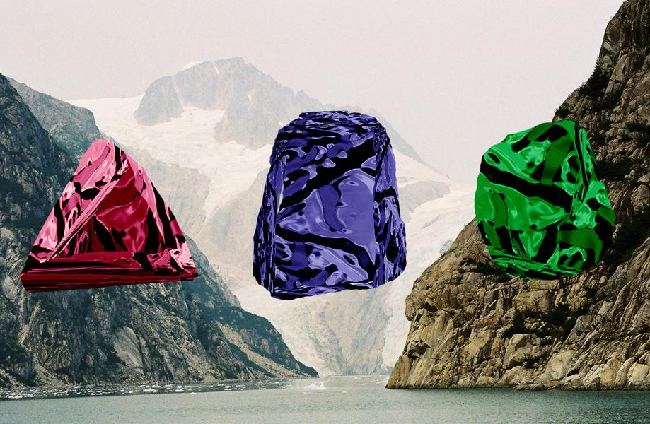
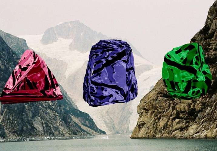
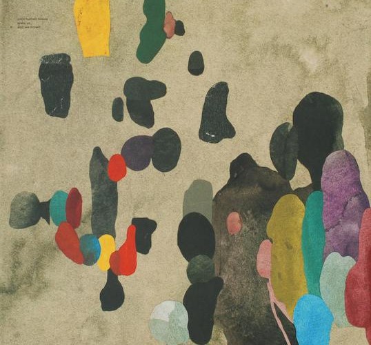
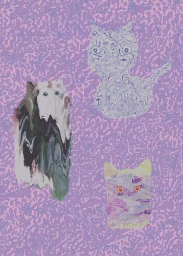
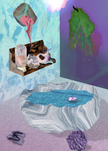
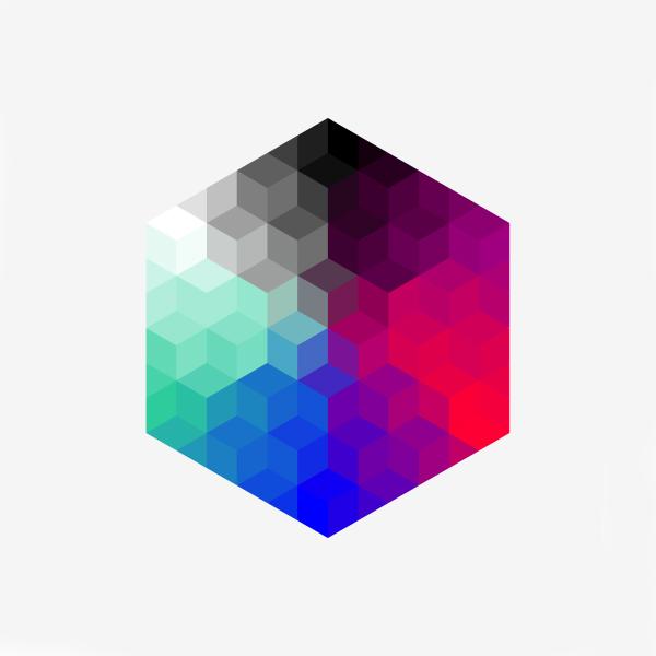
For Ervik, those compositions tend to nearly always be of geological origin. “When I started making collages, I Googled microscopy and mineral images for inspiration,” he says, and those obsessions are obvious in works like “Meta Material,” a digital illustration in which a marbleized pattern covers both the hovering stone at its center and the composition’s background. Nature’s influence becomes even more apparent when Ervik is probed about the purple/pink/turquoise color scheme ubiquitous throughout his creations. “The colors I choose are all very warm, tropical, fun— very different from Norway’s climate. Yet these shades are also the same colors that light up the sky during the Northern Lights. If you’ve ever seen the Northern Lights, you know how beautiful these colors can be.”
Although collage has been Ervik’s primary medium, he is excited to explore new venues. “There’s something about the flatness of collages that I both love and hate,” he says. “Sometimes I dig the two-dimensional aspect and sometimes I really want to break free from that.” He’s been molding objects in concrete; exploring new shapes and textures, and giving spray paint a go. “I started doing more tangible pieces as a way of kind of materializing some of my ideas. But I definitely still prefer digital work. It’s more fluid.”
First thing you ever made: “When I was 5 years old, I made a graphic novel about a character who was part ostrich, part octopus (which made sense as a pun in Norwegian, where Octopus is blekksprut and ostrich is struts – combining them made blekkstruts). He was a painter.”
Most inspiring place you’ve ever been to: “Sometimes when I’m crazy tired and all I want to do is sleep, I start slipping into sleep, but instead it feels like I’m entering another dimension. It’s kind of creepy.”
A sample recent to-do list: -Read Guy Debord’s Society of the Spectacle -Surf the web looking for smooth digitalness
-Find recordings of marine animals
-Finish the big cat for print
-Buy flowers for girlfriend
-Make hummus
-Finish the cover for Skyway
-Remember to meditate & chill out
-Get some solarium time
-Get a haircut
If you had an unlimited budget for a single piece, what would you make? “I’d make a replica of the inside of the spaceship in 2001: A Space Odyssey. I really like the clean white surfaces, with its screens and interfaces and shining displays and buttons. Then I’d cover all of it with loads of greenery: plants, lichen, fungi, moss. A living room as an actual living breathing space, merging technology and nature.”
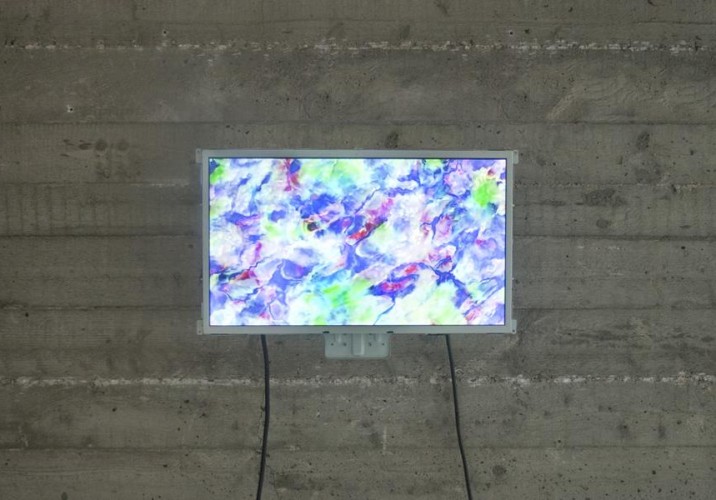
What inspired your Digital Permutations series? “The word ‘permutation’ is derived from mathematical theory and it means ‘to rearrange objects or values.’ I call them permutations because they aren’t paintings, but they aren’t really collages either. The inspiration for each piece comes from a range of different sources: the hypnogogic sleep phase, sci-fi movies, surfing the web, Donald Duck comic strips, clouds, bacteria, fungi, water, rocks, and crystals.”
“Digital permutations, metamaterials: This is the scientific lingo I’ve adopted to describe my work. Wiki says ‘Metamaterials are artificial materials engineered to have properties that may not be found in nature.’ I think that description fits my work, as I digitally alter pictures, often images of nature, to give them non-natural properties.”
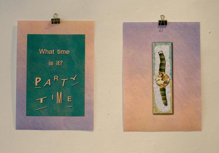
Design or art hero: “I don’t really have any heroes, per se. I post art and design by cool people regularly on Portalen Portalen, and the thing about hanging out online all the time is that I find so many artists to enjoy that the list just keeps getting bigger. A few recent likes: 5 Fruits, Steve Bishop, Nicolas Ceccaldi, and Travess Smalley.” (Pictured: Travess Smalley’s Trance Puddle Nocturne)
Design movement you most identify with: “Archizoom Associati, a collective of Italian architects and designers who were part of the radical architecture movement of the 1960s and 70s. I like their style, with its crazy color patterns and marble and waves. But I’m most fascinated by their grandiose dream of the futuristic No-Stop-City. It was to be an endless, artificially lit, and air-conditioned city, modeled after a supermarket. This would have been a pretty nice place to hang out, I think. Archizoom describes their intentions: ‘Considering architecture as an intermediate stage of urban organization that has to be overstepped, No-Stop-City establishes a direct link between metropolis and furnishing objects: the city becomes a series of beds, tables chairs and cupboards; the domestic and urban furniture fully coincide.’”
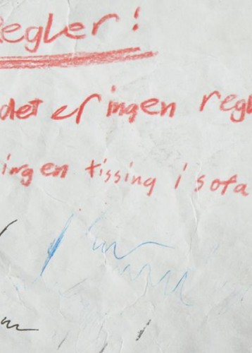
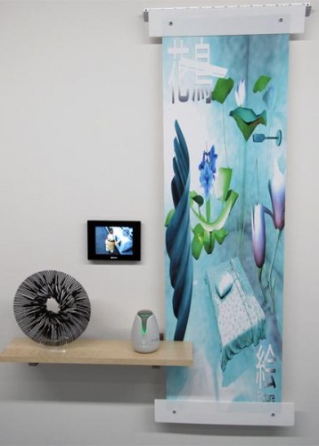
Objects you keep around your studio for inspiration: “My studio is also my apartment. Right now I have some real plants, some fake ones, a plaster mask with dried-up slime on it, fruit, one round lamp with a blue light, one large blue glass diamond and some smaller pink ones, a fluffy Pikachu, and a porcelain moomin as well as some sculptural things. I’m working on lots and lots of vinyl and zines and books. I also have this note, a philosophical paradox that my little brother wrote some years ago. The note says (in Norwegian): ‘Rules 1. There are no rules 2. No peeing in the couch.’”
The note was exhibited in a solo exhibition called Philophopherph Phone that Ervik had last year in Oslo.
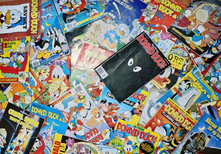
What do you collect? “My visual world is really inspired by Donald Duck stories. I like their use of simple forms and striking color combinations. In the stories people always tend to get something on their face or fall into the mud, making it look like their faces are melting, and the characters often travel to mysterious places. The environment appears to be constant, but is actually changing from story to story; for instance, the interior of Donald’s house and the size of Duckburg are both really unstable.”
First example of graphic design you ever loved: “Album covers for Rune Grammofon by Kim Hiorthøys, a Norwegian electronic musician and graphic artist. I used to really really love his stuff. A friend of mine told me she started crying one day when she was drunk because she realized she would never make as nice things as Kim Hiorthøys.”
Send us a screen shot of your computer desktop: “I keep it clean. No icons except the recycle bin.”
Favorite Photoshop tool: “Invert + Liquefy”
Color theory: “I like the in-between colors. In between white and red: pink; in between blue and green: turquoise; in between red and blue: purple. They tingle my senses. I sometimes feel I use too much color. But then I just add some filters and make it look a bit washed out.”
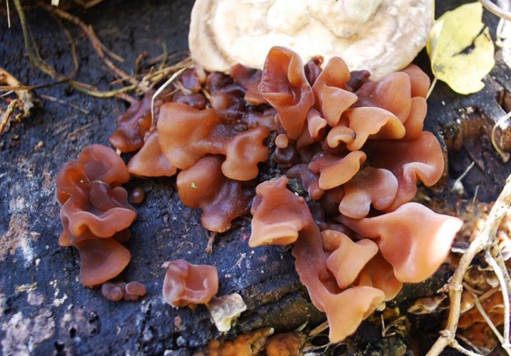
Favorite Google image search: “Beautiful fungi.”
First thing a stranger who saw your work would say: “This looks Photoshopped.”
Last great exhibition you saw: Most of the great exhibitions I’ve seen have been online, and one of my favorites was Jasper Spicero’s exhibit Intriors @ Appendix Project Space. Very mind-over-matter stuff. It was accompanied by a blog, which showed where the aesthetics of the exhibition come from: 3D animation, contemporary interior design, technological gadgetry, all connected to some sort of wish for a spiritual awakening — like getting closer to nature through extreme artificiality.”
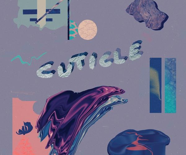
Right now, Andreas Ervik is: “Really psyched about having designed the cover for Cuticle’s Mother Rhythm Earth Memory, released on Not Not Fun.”
When Mason McFee and Jessica Clark decided to name their new company Crummy House, referring to their own charmingly ancient one-bedroom rental in Austin, Texas, it was mostly out of admiration rather than denigration. Sure, the paint is cracked in places, the garage has an uneven dirt floor, and in the winter, the cold night air blows through with no regard for shuttered windows. And it was a bit of an inconvenience when, two months after they moved in, an old tree fell directly onto McFee’s car. But with two desks in the living room, a workshop in the garage, and the kitchen basically converted into a studio, the house has become a kind of creative haven for the couple — a getaway from McFee’s responsibilities as an art director at the ad agency Screamer, and Clark’s as a graphic design student at Austin’s Art Institute. They spend weekends making art there, side by side, and with Crummy House they’ll start their first true collaboration.
The 28-year-old graphic designer Kostya Sasquatch makes thick, vector-like graphics on a PC, all cartoon colors and geometric shapes, odd logotypes that create iconographies for systems that seem to exist only in the designer’s mind. (He has a whole series called Donut Control.) They’re the kind of designs that could be from anywhere, but they might not have looked anything like they do if Sasquatch wasn’t from Moscow.
The artist William Hundley — known for photographing plumes of fabric hovering enigmatically in mid-air and strange objects balancing atop cheeseburgers — recently began experimenting with self-portraits. Which wouldn't be out of the ordinary, except that Hundley happens to hate letting people know what he looks like, so he obscures the photos of his face with collages of weird body parts and other incongruous images. He’s also been playing with masks, shooting the results of elaborate tribal-inspired face-painting sessions with his fiancée. “There’s this perception that I’m this badass artist who doesn’t give a fuck, this imagined character,” says Hundley, a boyish Texas native who lives deep in the suburbs of Austin. “But I work at a hospital in IT. So that’s why I don’t like putting images of myself or a biography out there — I mean look at me, I’m all-American white-boy looking. It would ruin the illusion.”