02.01.11
Studio Visit
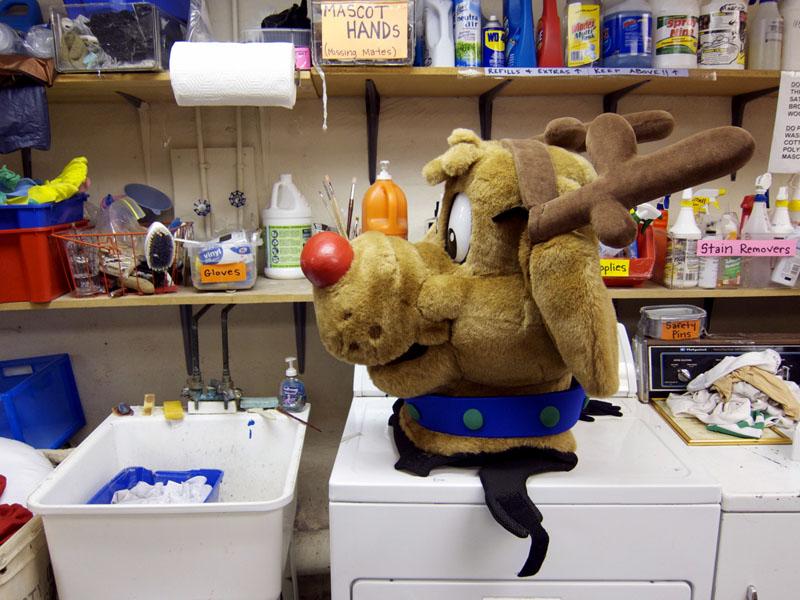
Pierre’s Costumes
So you’ve decided to dress up as a pirate for Halloween. But have you given any thought as to whether you’d like to be a bloody pirate, a pirate captain, a captain’s mate, a cutthroat pirate, a Caribbean pirate maid, a pirate man, a pirate mistress, a pirate maiden, Lady Hook the Pirate Wench, a sea dog, a sea scoundrel, or Will Blackthorn? If you live in Philadelphia, and you’re plagued by these sorts of questions, you're probably already a customer of Pierre’s Costumes in Old City, which has been in its current location near the Wexler Gallery for more than a decade and in the costuming business since 1943, when the Philadelphia Mummers came ringing at this former medical and restaurant uniform-supply shop. But for the uninitiated — like Sight Unseen's editors were when we stumbled into the store quite by accident midway between Halloween and Christmas last year — Pierre’s is something of a revelation: a labyrinthine, two-floor facility housing thousands of rentals, professional mascot costumes, Santa suits, make-up kits, wigs, and accessories, with a workshop in back where seamstresses and tailors work furiously on repairs and custom designs for everyone from Fruit of the Loom to Bam Margera to Toys ‘R’ Us.