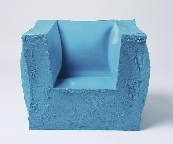
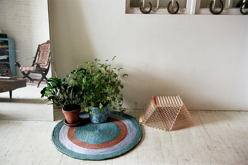
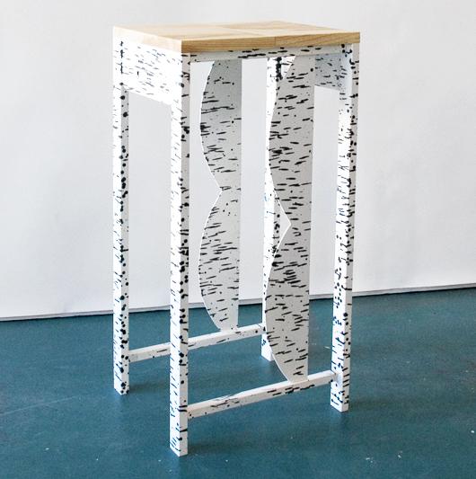
The Fancy World by Matt Paweski

If there was ever a time when artists and designers could remain shrouded, Wizard of Oz-like, behind a curtain of mystery and intrigue, that time — partly thanks to sites like ours — is almost certainly past. Granted most artists still don't have their own websites, and most of their galleries are pitiful at conveying background info, but this being the information age, some blogger or curator never fails to come along and connect the dots. In the case of Matt Paweski, it may very well end up being Sight Unseen that gets to do the honors. While the Los Angeles–based artist is showing an exciting new body of work called "The Fancy World" at South Willard at the moment, so far there's very little to be gleaned about him anywhere online. We fell so in love with the new pieces, which are furniture-like in form if not entirely in function, that we set the wheels in motion for a more in-depth studio visit with Paweski in the spring. You'll get to know him better at that point, but for now, the Michigan-born talent was kind enough to tell us more about "The Fancy World," whose pieces are pictured in this post: "The fine line between something working or not is a place my work constantly returns to," he says.
More

Benetton: The Art of Knit

Tourists emerging from the Broadway/Lafayette subway station in New York’s Soho were in for a shock this fall: Perched atop an old garage behind the BP gas station were two life-sized mannequins, clad in knitted wool and engaged in a rather un-family friendly act. (New Yorkers, used to such things, weren’t particularly fazed.) The artwork was part of the Lana Sutra series by Fabrica artist-in-residence Erik Ravelo, and it was commissioned for a Benetton pop-up shop that opened in the space this past September and closes at the end of this month. But once you stepped inside the 2,200-square-foot garage, you realized that though the knit sculptures were the attention-grabbers, the space was actually full to the brim with ingenious objects that offered clever takes on color and wool, created by the young talents at Fabrica — Benetton’s Treviso, Italy–based designer-in-residence program — under the creative direction of Fabrica’s design head Sam Baron and Benetton’s brand-new creative director You Nguyen. “The concept was to adapt Benetton’s DNA to a more modern vision,” says Baron.
More

Lost Time by Glithero for Perrier-Jouet

In the tent at Design/Miami last week, nearly everything came with a price tag. RO/LU walnut and Formica bookcases: $3,800. Michael’s Genuine Ultimate Caprese Sandwich: $14. Even one of Snarkitecture’s upholstered foam benches, which welcomed tired fairgoers in the courtyard outside, could be snagged for a mere $5,000 from Chicago’s Volume Gallery. But there was one thing that wasn’t, that couldn’t be, for sale: The London-based studio Glithero’s Lost Time installation, which unfolded in a dark hallway near the café, the result of a commission from first-time Design/Miami sponsor Perrier-Jouët (who was kind enough to sponsor this editor’s plane ticket down as well.) There, the duo installed a series of looping weighted silver chains, which hung in perfect parabolas from the ceiling and, lit from below, cast reflections in a still clear pond beneath.
More

Merijn Hos at Beginnings Gallery

Could New York’s best new gallery be in Greenpoint, Brooklyn? We’re beginning — no pun intended — to think it just might be so. Beginnings, a small storefront gallery on a side street off Greenpoint’s main drag, opened earlier this fall, the brainchild of seven like-minded friends and artists (two of whom are erstwhile members of Philadelphia’s artists-for-artists gallery Space 1026). At the outset, the goal was to create a warm, welcoming space that would be a home for emerging artists but also a place where even first-time art buyers might be encouraged to actually make a purchase. In their inaugural exhibition, the curators asked questions like: “What’s art for anymore? How can contemporary art be bought and sold in a healthy, progressive way? How can new artists support/be supported in their community? In the 21st century, what are the most satisfying and effective roles of the gallery? The gallerist? The gallery-goers?” The refreshingly honest answer? “We got no idea, but we’re happy to present this art and these artists.”
More

Gabriel Orozco’s Asterisms at the Guggenheim

It may look like a staging area for the production of Stuart Haygarth chandeliers or Massimiliano Adami cabinets, or possibly an excerpt from the website Things Organized Neatly. But the comely technicolor garbage pile pictured above is actually a piece by the Mexican art-star Gabriel Orozco, who's known for his use of humble materials and found objects, and it's moving into New York's Guggenheim museum as of this Friday. Asterisms is a process-oriented installation — our favorite kind! — featuring thousands of objects Orozco collected from two separate sites: a sports field near his New York home and a wildlife reserve on the coast of Baja California Sur, the latter of which happens to enjoy a constant flow of industrial backwash from across the Pacific that every so often yields bits of aesthetically pleasing detritus.
More

Moss: Dialogues Between Art & Design Auction

Yesterday at Phillips de Pury in New York, the auction "Moss: Dialogues Between Art & Design" raked in more $5 million and smashed records for work by the likes of Maarten Baas, Hella Jongerius, and Patricia Urquiola. But while we're always pleased to see design taken a bit more seriously, it wasn't this auction's star power but rather its conceptual conceit that intrigued us so. Curated by Murray Moss — with many of the selections coming from Moss's own personal collection — the auction paired art and design pieces that seemed to share a common DNA, whether by virtue of material, technique, or appearance. The pairings were surprising and lovely, with the curves of Mattia Bonneti's plump purple velvet sofa echoing Luciano Castelli's reclining red nude, or the colored striations of Julien Carretero's To Be Continued bench causing the same sense of vertigo as Doug Argue's obsessive lines in (Untitled): Strata, 2011. (You can view the full catalog for yourself online here.) Perhaps best of all, the catalog was prefaced by an unusually personal story from Moss himself, who can seem a bit of a cipher to those not in his inner circle. We found the whole thing so interesting we've reprinted it in full here. Read on below, then follow our slideshow to see some of the highlights from last night.
More

Kiosk’s Obama 2012 Souvenirs

In 1960, there was a noisemaker that said “Click with Dick,” endorsing Richard Nixon for President. In 1964, a canned novelty beverage promoted Barry Goldwater's candidacy (“Gold Water: The Right Drink for the Conservative Taste”). But these days, with Shepard Fairey’s once-inescapable "Hope" poster on the wane, you’d be hard-pressed to find an election souvenir of note beyond the usual bumper stickers, commemorative mugs, and buttons. Enter Kiosk, New York’s go-to retailer for quirky housewares and objects from around the world. This week, Kiosk owners Alisa Grifo and Marco ter haar Romeny released a collection of five pro-Obama souvenirs, which sport cheekily retrograde slogans and riff on American-made objects the shop already had in stock.
More

Isabel Wilson on Freunde Von Freunden

There must have been something in the air back in 2009, because Freunde Von Freunden, the Berlin-based website whose voyeuristic, photography-based interviews are of a piece with our own obsessions (i.e. barging in on people's home and workplaces and showing ourselves around) — started just a few weeks before Sight Unseen's launch at the end of that year. "We never look for apartments but for people," they say, and that's always been our mission as well — to get at the personality behind the product, and the narrative behind each new release. To that end, since we introduced you last week to Isabel Wilson's textile and jewelry line with Chen Chen — and considering we've more than covered her partner in crime — we figured it was high time to get to know the RISD grad's incredible,intricate work. Luckily FvF beat us to it, with a gorgeously photographed editorial by photographer Brian Ferry, which appeared on the site just last month, and which we're excerpting on Sight Unseen today.
More

Kyouei’s Dish of Light and Random Musical Box

When the latest projects from the Japanese design company Kyouei came across the transom this weekend, we felt a bit like grandmothers. Which is odd, because we're not old enough to be anyone's grandmother, much less a Japanese product designer and sound producer who's nine years our elder. But there was still a burst of "my how you've grown" pride bubbling up, considering we discovered Kouichi Okamoto's firm back in our early I.D. magazine days, when he was still doing clever little Droog-ish housewares like light bulb–shaped paper lanterns and bowls that imitated crater lakes — before the vast majority of our fellow Americans even knew Kyouei existed. And look at Okamoto now! Making sophisticated sound machines, musical tables, and these amazing iron lamps that evoke modernist sculpture.
More

A 20th Century Palate in The Gourmand Issue 00

In the summer before starting Sight Unseen, one of us had a very brief flirtation with the idea of attending culinary school. Along with design, food is our great love, so we were pleased this week — and maybe even a little bit jealous — to stumble upon a new magazine out of London that unites the two disciplines in the most fantastic of ways. Called The Gourmand, the first issue tackles subjects ranging from David Shrigley's new cookery-themed opera to Jeff Koons's recipe for apple dumplings. But our favorite feature — plucked from the site's website, which has a sprinkling of teasers for the print edition as well as practical food recommendations from artists, contributors and London's culinary cognescenti — has to be this collaboration between art director Jamie Brown and photographer Luke Kirwan, which depicts 20th century art and design movements in foodstuffs like American cheese and pink wafer cookies.
More

Study O Portable’s Neon Alphabet

Whereas most of us may never fully grasp the meaning behind the testicular descension metaphors and self-referential glyphs woven throughout Matthew Barney's Cremaster Cycle, the message behind his Drawing Restraint series — which has seen the artist challenge his creation process with obstacle courses and 270-pound dumbbells — couldn't be more relatable: creativity flourishes in any struggle with limitations. Many designers, for example, profess to do their best work under the pressure of client briefs; then there are those, like the London duo Bernadette Deddens and Tetsuo Mukai of Study O Portable, who in the absence of such briefs will invent their own rules to work around. Since they started their studio in 2009, the couple have been using the alphabet as a testing ground for aesthetic and material experiments, producing letter sets in various combinations of wood, leather, and plastic that must conform to strict, self-imposed standards of size and legibility. "It's really satisfying to work on the puzzle an ABC poses depending on one's materials and techniques," says Deddens. Their most recent is the Neon Alphabet, "a cross between signage, jewelry, and a font" that debuted at Design Miami/Basel this June with Belgian gallerist Caroline van Hoek.
More

The 2012 Parsons Thesis Site

As curatorial hunter-gatherers, we're always on the lookout for new and unseen talents, and there's no better place to spot them than at school thesis shows. But as workaholics who seldom have time to leave our home offices, much less attend these shows, they all too often remain off-limits to us. It's a rare yet celebrated occasion any time we're either sent a clear, comprehensive accounting of projects by graduating students, or become aware of a website that successfully catalogs them. Last week, we received an email from Parsons with just such a treat — the new multi-disciplinary Parsons thesis site, part of the two-year old Parsons Festival which flings open the doors of the school to the public each May for three weeks of exhibitions, workshops, and fashion shows. Grateful to have access to the event's couch-potato version, we sifted through all the projects on the site and found the six we liked best: humorously cloying photographs of weird dollar-store finds by Antonia Basler, a series of poured-concrete side tables made in fabric molds by Isaac Friedman-Heiman, dresses that pay homage to Muybridge and Noguchi by Kaoru Oshima, photos by Charlie Rubin that blur the line between the real and the artificial, and minimalist versus maximalist origami garments by Yingshi June Lin and Si Lu. Have a look at the slideshow here, which is annotated with selections from the students' thesis statements, then clear your calendar for next May so you'll have no excuse not to join us at next year's festival.
More