08.20.12
Sighted
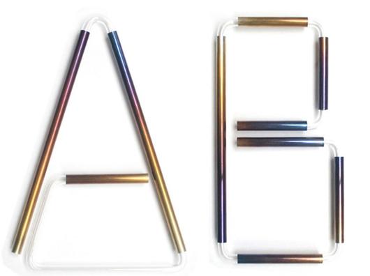
Study O Portable’s Neon Alphabet
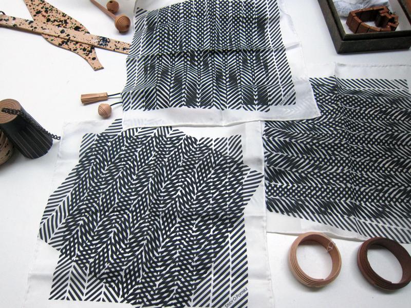
Whereas most of us may never fully grasp the meaning behind the testicular descension metaphors and self-referential glyphs woven throughout Matthew Barney’s Cremaster Cycle, the message behind his Drawing Restraint series — which has seen the artist challenge his creation process with obstacle courses and 270-pound dumbbells — couldn’t be more relatable: creativity flourishes in any struggle with limitations. Many designers, for example, profess to do their best work under the pressure of client briefs; then there are those, like the London duo Bernadette Deddens and Tetsuo Mukai of Study O Portable, who in the absence of such briefs will invent their own rules to work around. Since they started their studio in 2009, the couple have been using the alphabet as a testing ground for aesthetic and material experiments, producing letter sets in various combinations of wood, leather, and plastic that must conform to strict, self-imposed standards of size and legibility. “It’s really satisfying to work on the puzzle an ABC poses depending on one’s materials and techniques,” says Deddens. Their most recent is the Neon Alphabet, “a cross between signage, jewelry, and a font” that debuted at Design Miami/Basel this June with Belgian jewelry gallerist Caroline van Hoek.
Each 10-inch-tall, wall-mountable letter in the alphabet is constructed using patinated and waxed sterling silver tubes slotted onto bent borosilicate glass tubes, which makes them look a bit like neon signs — one of the inspirations behind the series. “We intended to make our own version by inverting the material structure of neon signs, reflecting light instead of emitting it,” the designers write in their project description. “We were fascinated by the mysterious light that’s encased within the glass tubes of neon signs, almost as if the gas inside is a physical representation of the message the signs carry … Using the ancient technique of patination on silver, which produces a seemingly modern ‘neon colors,’ we tried to create an effect that isn’t specific to a time and place but has its own space in the history of visual technologies. Like a font, the shape and character of each letter is informed and negotiated through the formal quality of each part used in the letters, creating a unified outlook while remaining legible.” In Basel, Study O Portable presented an ABC and XYZ, but they’ve since made a K and a T as well; any letter can be made to order through the gallery.