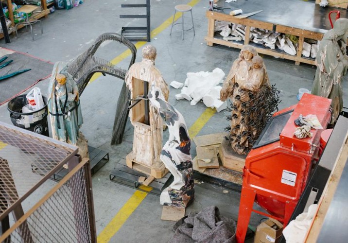
Visit Nick van Woert’s massive studio in Greenpoint, and in all likelihood you’ll find a cluster of white people standing in a corner, naked and clutching each others’ butts — these artificial neo-classical statues have been a recurring theme in the Nevada-born artist’s work since shortly after he began his career in earnest in 2006. Many of them get tipped over and enveloped in a cascade of colored resin that hardens in mid-drip; in one series, he hollowed out their midsections and let the wind give them garbage guts. “It was like a little trap, and the wind would blow weird shit in there that accumulated outside my studio,” van Woert says. “Anything from Doritos bags to Monster Energy drink cans. The DNA of the world outside.” It was his most literal manifestation of the mantra that drives most of his practice: You are what you eat.
Figuratively speaking, the idea is that the world we’ve built for ourselves is only as good as the materials we’ve used to build it — these days, that means all manner of plastics, strange chemicals, and the hollow plaster that replaces stone in the replica statues van Woert repurposes. He’s preoccupied with materials, and the way modern society has by and large found a way to substitute bad ones for pretty much all the good ones, a condition he mirrors in his own work. One of his more recent projects is a series of strange topologies made from coal slag, kitty litter, or urethane mixed with orange cola. Other pieces employ Plexiglas boxes full of Pine-Sol and Mr. Clean. “The colors are reminiscent of the early Hudson River School painters and Albert Bierstadt, who painted landscapes hours away from where I grew up in Reno, Nevada,” van Woert says. “Things aren’t the same anymore. It’s like trying to understand what this material shift is, and why it’s happening.”
Van Woert sees that shift most acutely in the world of architecture, which he actually studied in grad school in Reno before moving to New York (picking up an obsession with the work of Thom Mayne along the way). “We’re no longer interested in building with monolithic materials like stone or wood,” he says. “Architecture’s moved from stone to Styrofoam.” The classical sculptures he stockpiles are, again, the embodiment of that downgrade: “It’s like this desire to keep the past alive visually but not materially, and that’s the opposite of the way I look at artwork or the way I look at the world in general — how things are made and what they’re made from, not what they look like.” And yet van Woert can’t deny that he has an architect’s eye for scale and composition, even when he’s working with garbage or aquarium rocks, which is what drew us to his work in the first place. We dragged SU contributor Brian W. Ferry to his studio with us to take a closer look.
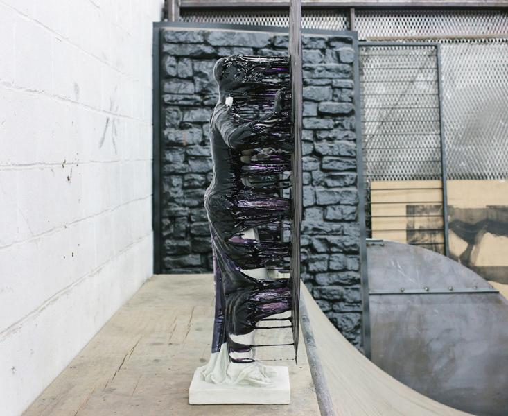
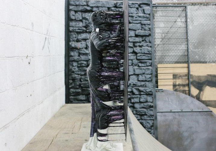
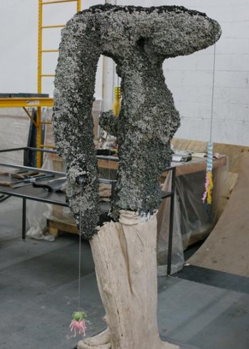
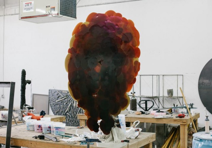
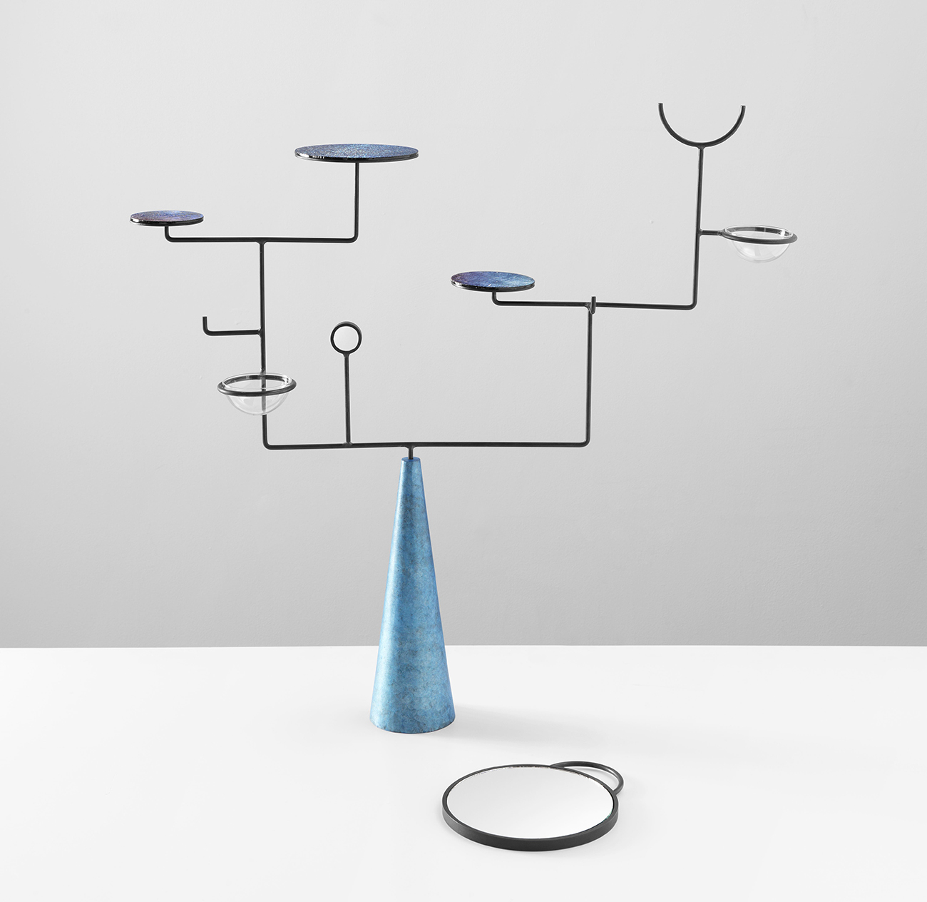
A piece from Nick van Woert’s best-known series, in which he lays a plaster neo-classical sculpture or bust face-forward on the ground and pours a pool of colored urethane over it, making it look like some nightmare out of the Matrix once it’s placed upright again. “Urethane is a material I use all the time which is in absolutely everything we buy and build now,” van Woert says. “It’s like the Coca-Cola of our lives.”
When we visited, van Woert was hard at work on his current show at OHWOW in Los Angeles, “No Man’s Land,” which is still on view through April 6. The title piece — shown here — is coated in a mixture of urethane and neon aquarium rocks.
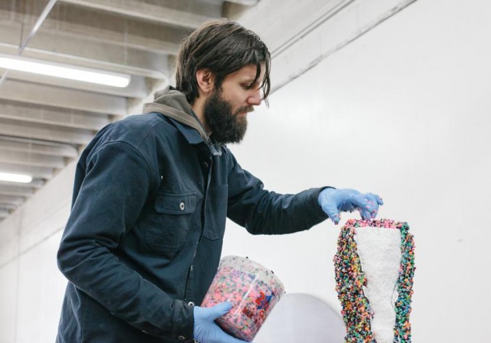
The aforementioned aquarium rocks. Van Woert’s studio is in the middle of an industrial area in Greenpoint, Brooklyn, but he rarely takes advantage of local manufacturing capabilities, preferring to make everything himself. “I’m extremely impatient, so dealing with other people and making phone calls and emails, it drives me nuts,” he says. “If someone else can make the figure then we can make it, and we just go for it.”
Another sculpture from “No Man’s Land,” this one covered in kitty litter and cat toys. The toys are a reference to a tool used by ancient Romans to grid the landscape for development, which had plumb bobs hanging from it. “It also goes back to the materials that I see and touch every day that are a part of my landscape,” he explains.
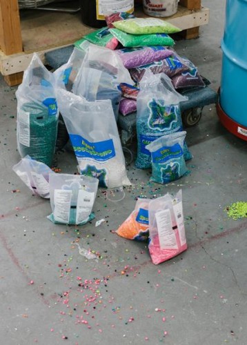
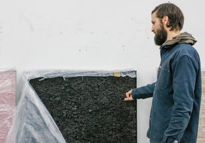
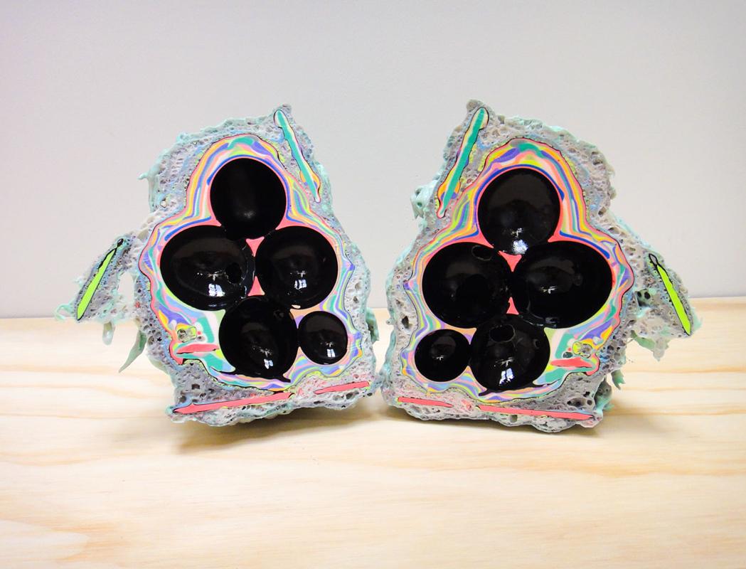
For this series of “paintings” from the show, van Woert mixed urethane with materials like kitty litter (pictured), coal slag, and orange soda and sculpted the concoctions into topographies inside steel shadow boxes — modern day landscapes. There are also frames that contain barbecue rocks, Formica, and a piece of sheet rock he used as a BB gun target.
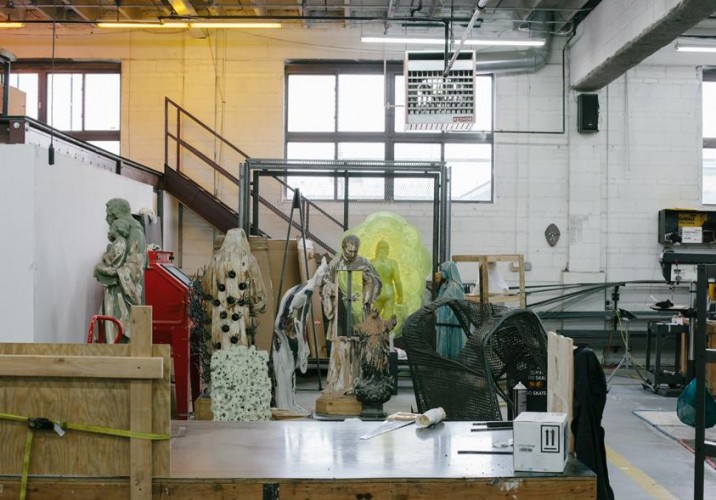
A cluster of past sculptures in the middle of the studio.
An early piece in which van Woert cut sections from a sculpture and let it accumulate trash outside his studio, illustrating his central theory: you are what you eat. His fascination with the idea stems from Etruscan soothsayers, who inspected animal entrails to determine whether the land they lived on was suitable for human habitation. “It’s a super empirical way of understanding something’s relationship to its environment,” he says. “I took that idea and applied it to my art.”
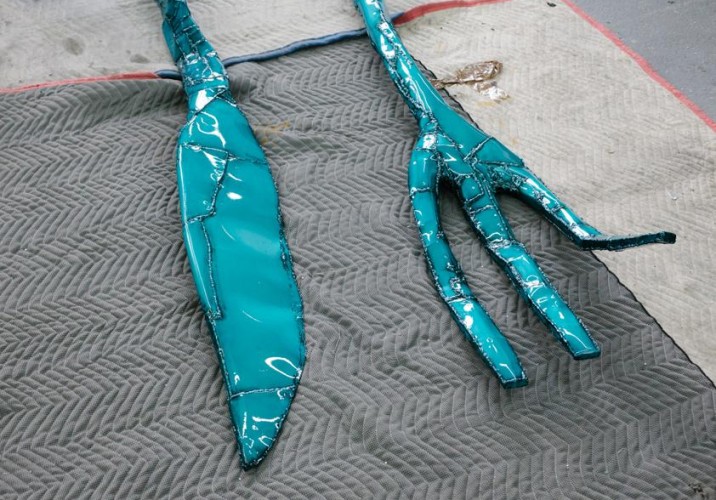
Another literal interpretation of the idea: a giant powder-coated steel fork and knife van Woert had just finished for “No Man’s Land.”
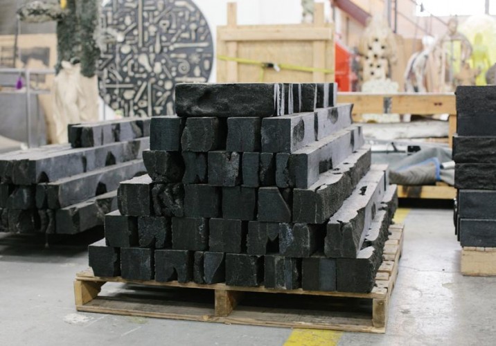
These cast logs are made from coal slag. “The coal slag is a material that’s leftover from mining, and they bag it and sell it for sandblasting material. There’s absolutely no other use for it. It’s industrial waste that will never go away.” While the logs are stacked into a 20-foot-long wall in the OHWOW show, they’re the precursor to a full cabin that van Woert eventually hopes to construct.
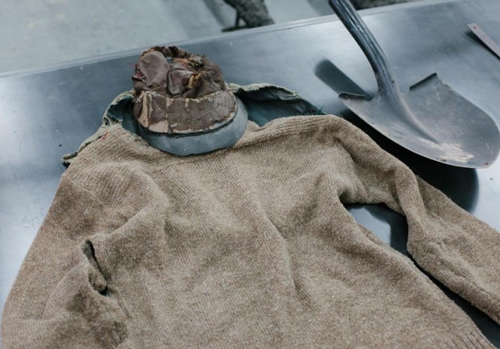
The cabin has to do with his obsession with the Unabomber, whom he likes to compare to Henry David Thoreau. “They both had this idea of seeing what life would be like with all the modern amenities stripped away, which is something I’ve always been interested in,” he explains. “That’s also what I latched onto in architecture, the idea of letting the materials speak for themselves.” A few years ago, van Woert went so far as to purchase items actually owned by Ted Kaczynski, pictured here.
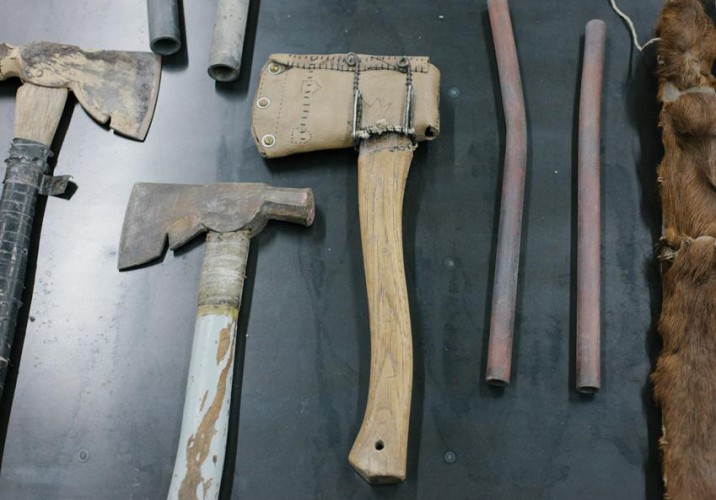
More Unabomber artifacts.
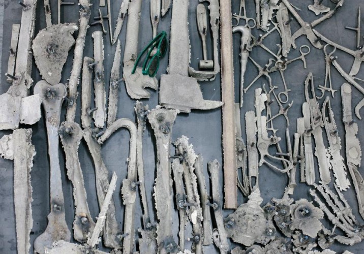
The studio has a furnace in which van Woert and his assistants can cast bronze in sand molds — that’s how they made these objects, which are replicas of Unabomber tools, old medical clamps, and more.
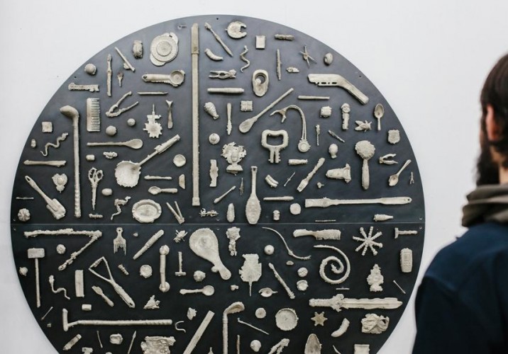
The same process was used to make this piece from 2012, called “99¢,” but with different source materials: cheap, everyday household objects.
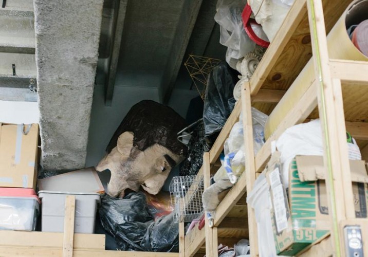
A strange unidentified head hiding in the corner of a storage space.
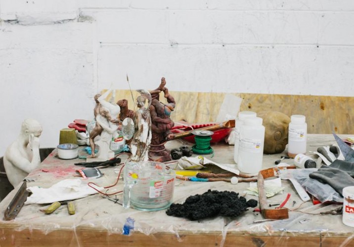
A table full of tools, models, and some of the chemicals van Woert’s team works with on a daily basis. When asked whether some of his sculptures would be toxic to live with, he laughs, “Once it’s set, it only off gasses for like 20 years. No, I don’t know.”
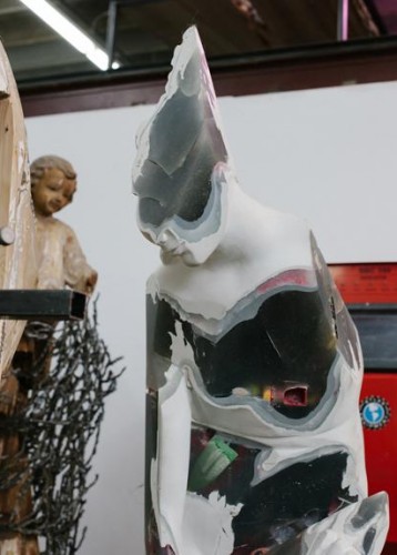
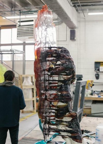
A front view of one of his urethane-encased classical sculptures. Despite having an architect’s type A personality, van Woert doesn’t have 100% control over the outcome of these pieces. “The whole idea behind them was to try and make something like things are made in nature,” he says. “Like the way an icicle is formed — it’s a combination of weird forces coming together at the same time. The shape of the figure’s supposed to determine the shape of the way the plastic falls. There are ones I don’t like and ones I love. It all has to do with proportion.”
The back of the same sculpture.
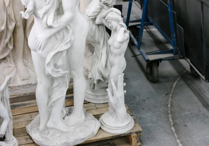
A cluster of the raw material van Woert uses to make them: crappy, hollow-plaster figures that he calls “the world’s worst sculptures.”
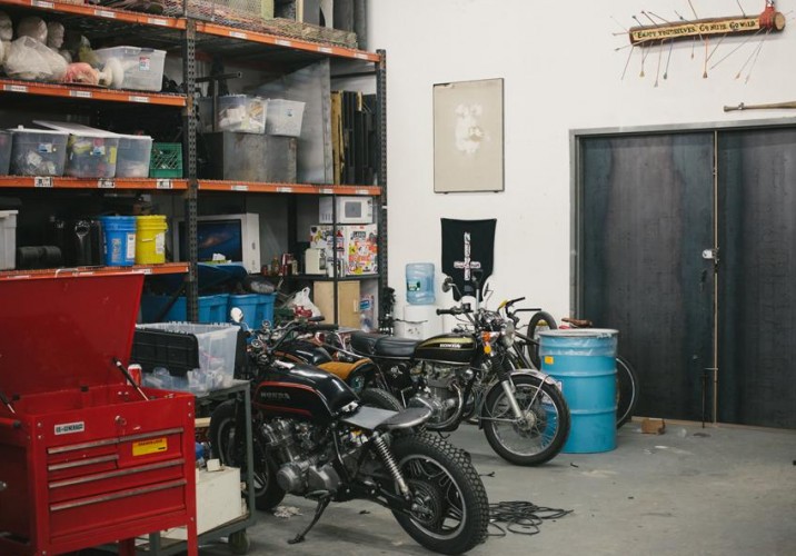
One of the artist’s current projects involves cutting up broken-down motorcycles and turning them into sculptures.
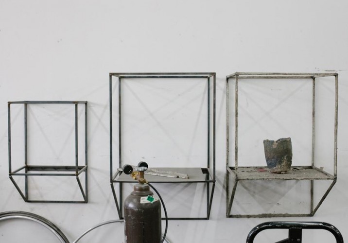
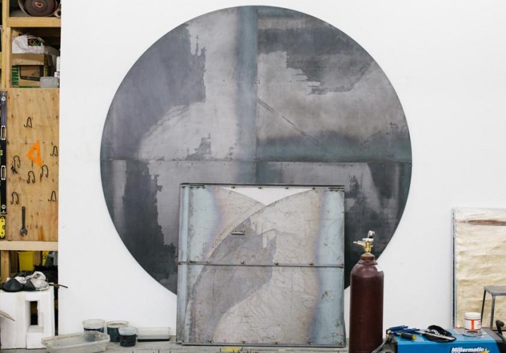
Van Woert’s design background peeks out at times in the presentation of his pieces; some are just super graphical and well proportioned, others actually either take the form of or rest on functional items like shelves and pedestals.
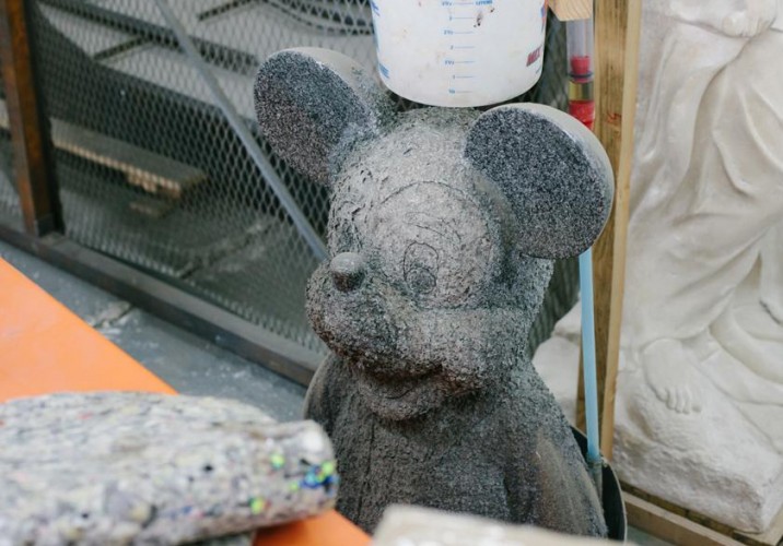
Van Woert is also heavily inspired by the book Field Guide to Monkeywrenching by Dave Foreman, which is basically full of DIY at-home recipes for destroying and/or blowing things up, like a highly flammable mix of chlorine and hair gel. In one studio experiment, he allowed a slow, constant drip of corrosive chemicals to fall on a Mickey Mouse statue, eating away at its face.
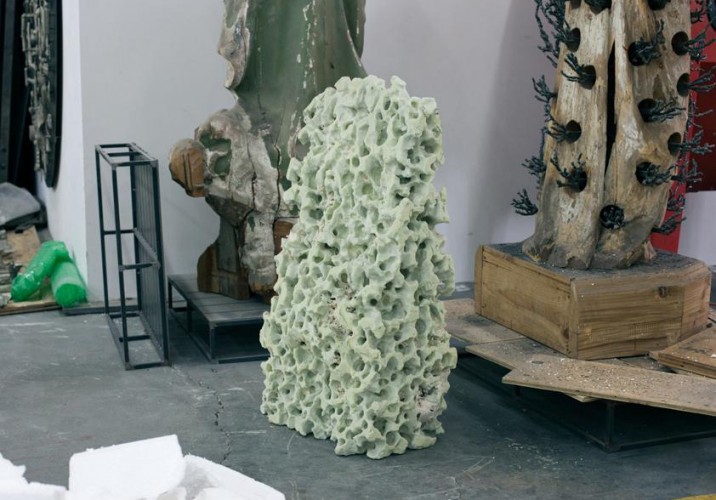
Another strange material experiment.
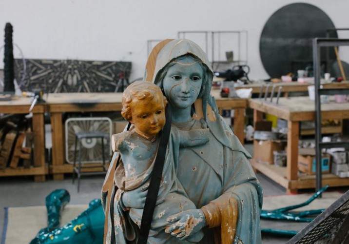
A modified Madonna and child.
An aerial view of some of van Woert’s past experiments. “One of my next projects is a weight lifting system,” he says. “It’s like a four-sided gym with a leg press and bench press. For me, it’s a figurative sculpture that has roots in classical sculpture as well, and that kind of monolithic understanding of the human body. It acts like a floor plan, because every part of the body is articulated. We’re maybe going to make the weights with coal slag, kitty litter, and other materials, and they’ll be shaped like rocks.”
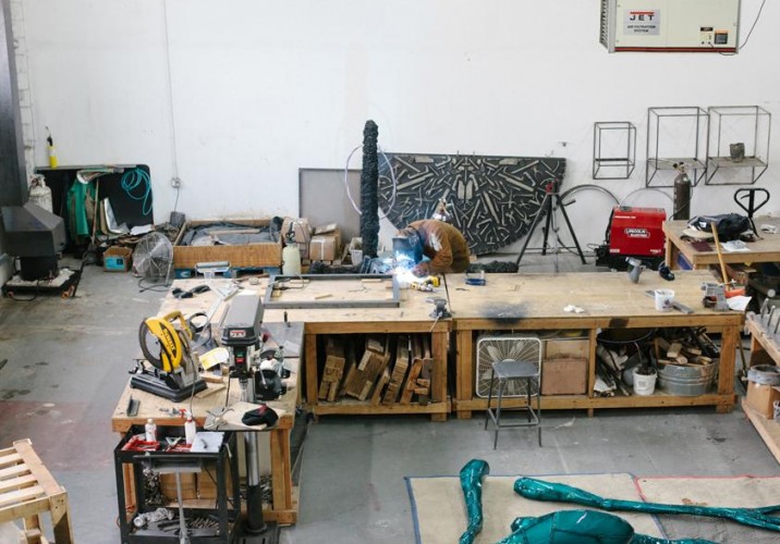
The largest part of his studio is devoted to actually fabricating works, with the aforementioned furnace plus saws, drills, and welding equipment.
Some recently-welded objects awaiting powder-coating and their eventual transformation into finished works.
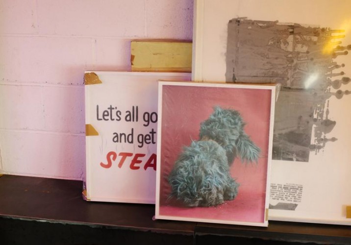
Van Woert’s office is lofted above the studio floor, atop a room he built for his girlfriend to paint in. It holds not only his computer but his personal art collection; at left and center are two pieces by the photographer Christian Patterson. “He has a book called the Redheaded Peckerwood about these teenage killers, a mixture of fact and fiction. When one of the teens was sentenced to death via electric chair, his family was in the courtroom. Right after they announced it, the dad turns around to the family and says, ‘Well, let’s all go out and get a steak.’ I was like, what the… I’ll buy that.”
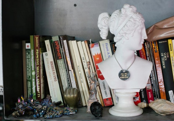
Other office knick-knacks, including a pendant that reads “You will die of something.”
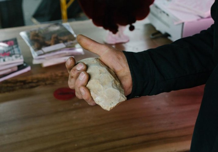
A 5,000-year-old hand axe he bought at Evolution in New York. “I got a dinosaur tooth there, too, but I don’t know where it went.”
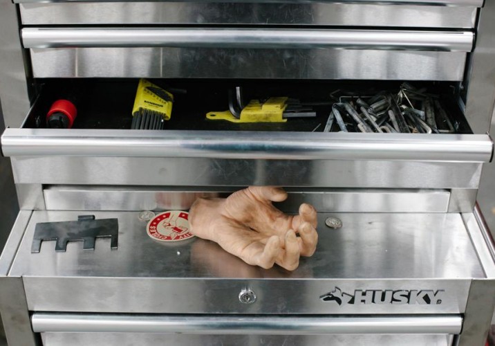
An artificial hand that greeted us when we walked into the studio, and later ended up attached to the aquarium-rock sculpture in the OHWOW show.
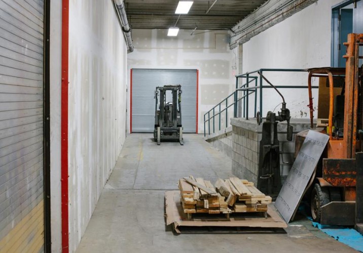
The hallway leading to van Woert’s studio, whose size is a rare luxury for a New York artist.
When we — and the rest of the design world — were first introduced to her at the 2009 London Design Festival, Faye Toogood already seemed like Superwoman: Having just left her post as a stylist at the UK shelter magazine World of Interiors and cast out on her own, she'd engineered a coming-out party for herself that included a collaborative installation with Gallery Fumi featuring designs made from corn, a Memphis-inspired playroom with an Arabeschi di Latte egg bar, and a temporary shop for Tom Dixon that showcased how she'd begun to transform his brand image. Just seeing her do it was enough to make us feel stressed, and that was before we knew that she was about to reinvent herself again, this time as a furniture designer. Her first collection, Assemblage 1, was inspired by modernist sculpture, British craftsmanship, and her childhood growing up in the English countryside; it gave way to Assemblage 2 in Milan earlier this year, which took a darker, edgier turn. Finally, with Phillips de Pury last week, Toogood unveiled the third chapter in the series, and the most ambitious to date — it's based around her fascination with iridescence, and it took a motorcycle fabricator, a gun maker, and a studio full of assistants in gas masks to complete. I was asked by Phillips to conduct an in-depth interview with Toogood to appear in the show's catalog, and so Sight Unseen received special permission to reprint that interview here. It's lengthy, but it offers a good deal of insight into the mind of one of the most intriguing and ambitious personalities working in design right now.
It seems fitting that we were first introduced to Elyse Graham’s Geodes during our Hotel California show at last year’s Noho Design District. After all, there’s something distinctly Californian in the born-and-bred Los Angeles artist’s work. In her Geodes project, for which Graham casts layers of colorful urethane around a balloon mold, there are hints of the desert, psychedelia, yoga, and the wind. If that all sounds a little fuzzy, the objects themselves are not: Sawed open, they reveal incredibly beautiful swirls of color and texture that are the result of a process that's somehow both carefully calibrated and entirely left to chance. We asked Graham herself to explain how she achieves that effect, and to take us through her entire process.
It's been a tough two years for Dutch design. First a newly elected right-wing government slashed the tiny country's legendary arts funding, causing seemingly irreparable damage to its institutions and grant programs, and then a series of high-profile resignations called into question the inner workings of Eindhoven's hallowed Design Academy. But even if there are signs that the fairy-tale may not last — that creativity and experimentalism can't elude the death-grip of capitalism forever, even in a place where designers still benefit from squatters' rights — we still look forward to Dutch Design Week as a reminder of the happier consequences of those values. While we couldn't attend this year ourselves, we asked our faithful contributor Marco Tabasso, who's second-in-command at Rossana Orlandi gallery in Milan, to report back on his experiences at the festival — from his mixed feelings about the Design Academy show to the paella dinner he and Rossana shared with Nacho Carbonell in the designer's studio, above.