03.14.16
Sighted
Dusen Dusen x Highlow Jewelry = Instant Outfit Magic
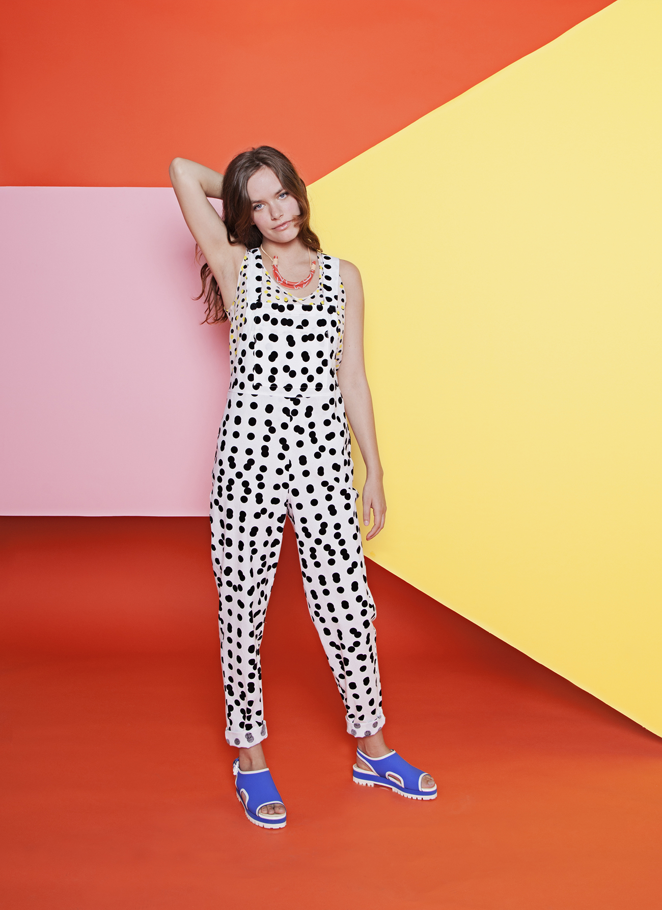
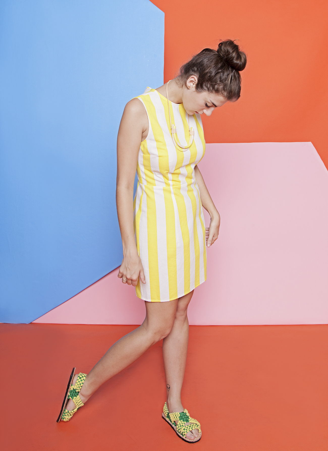
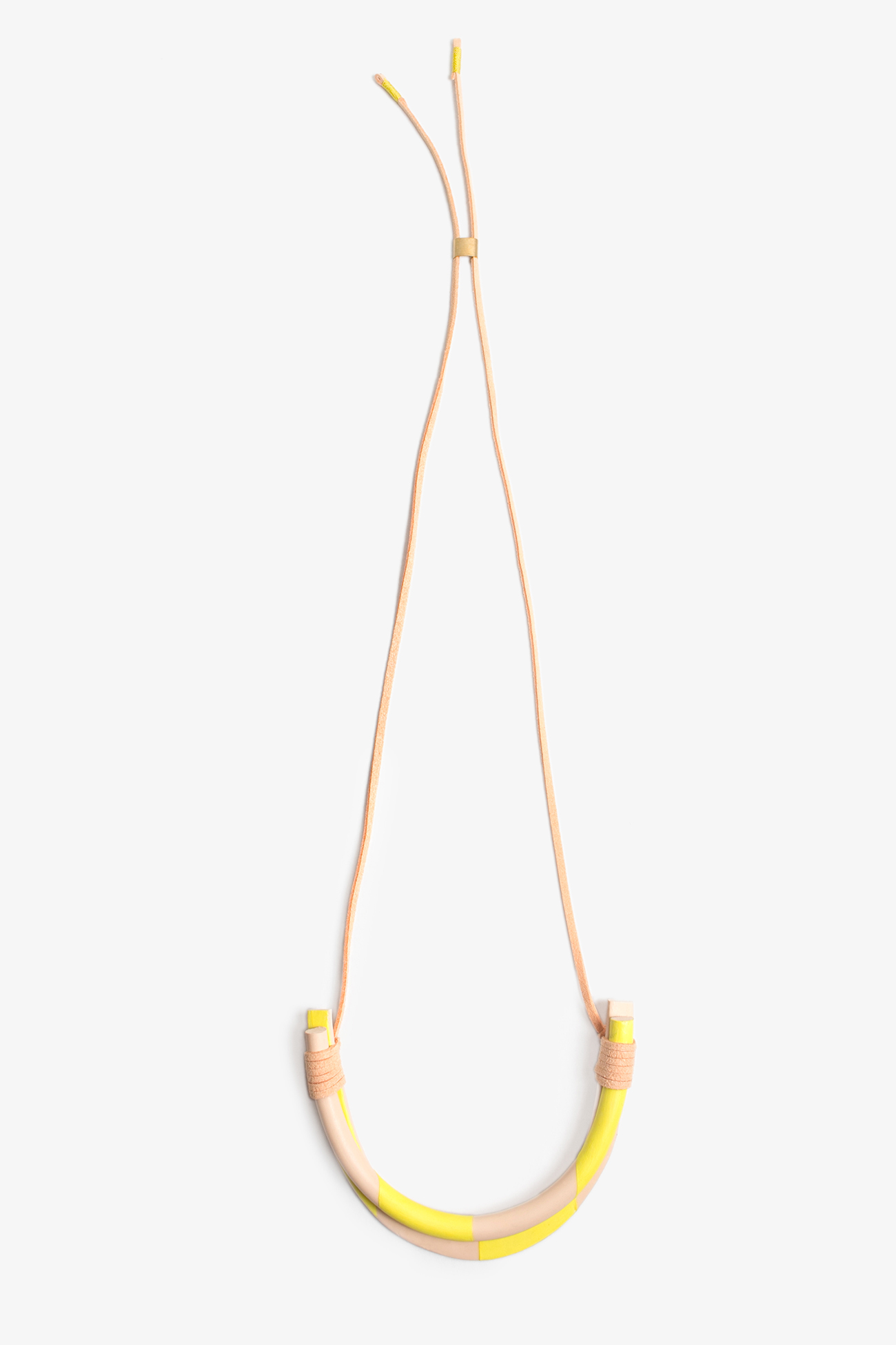
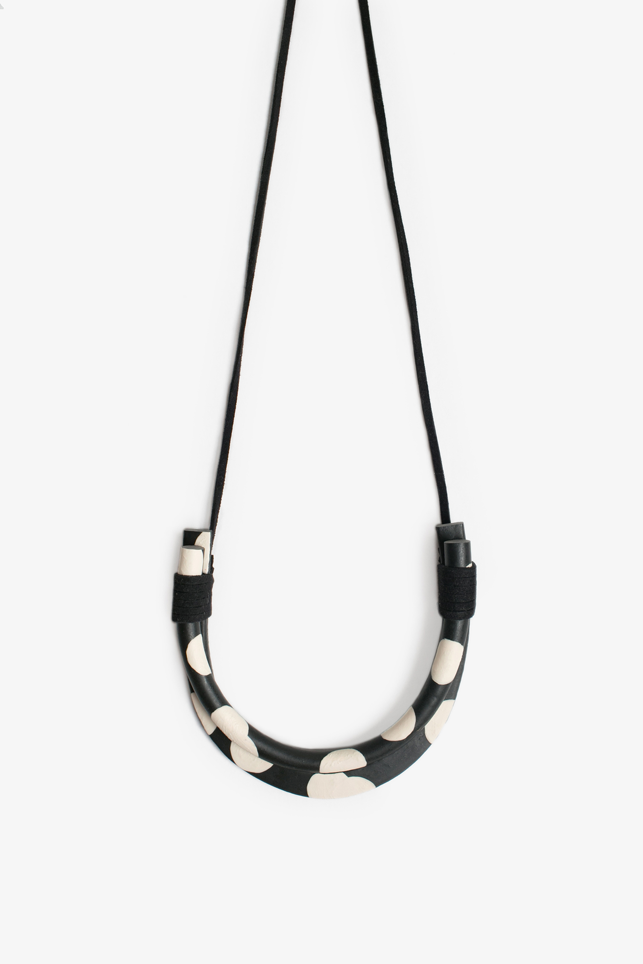
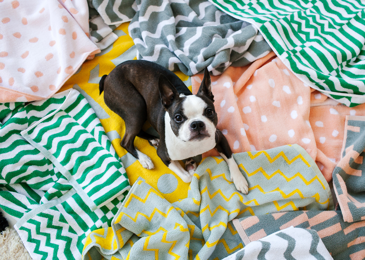
It might not seem, at first, that Brooklyn-based textile designer Ellen Van Dusen and LA jewelry designer Sonya Gallardo of High/Low would be kindred spirits. Dusen Dusen is best known for an endlessly colorful collection of cheerful graphic prints while Highlow is best-known for a polymer clay and silk cord necklace that’s been marked, painted, and sculpted into different, neutral-palette iterations. But when the two are paired together, something magical happens: Gallardo’s necklace is rendered even more poppy and graphic while Dusen Dusen’s prints — which are far too statement-making for dainty gold jewelry — meet their match. When the two designers began noticing more and more people pairing the two items on their own, they knew something special was brewing, and a collaboration was born. We recently spoke to the two designers to find out more.
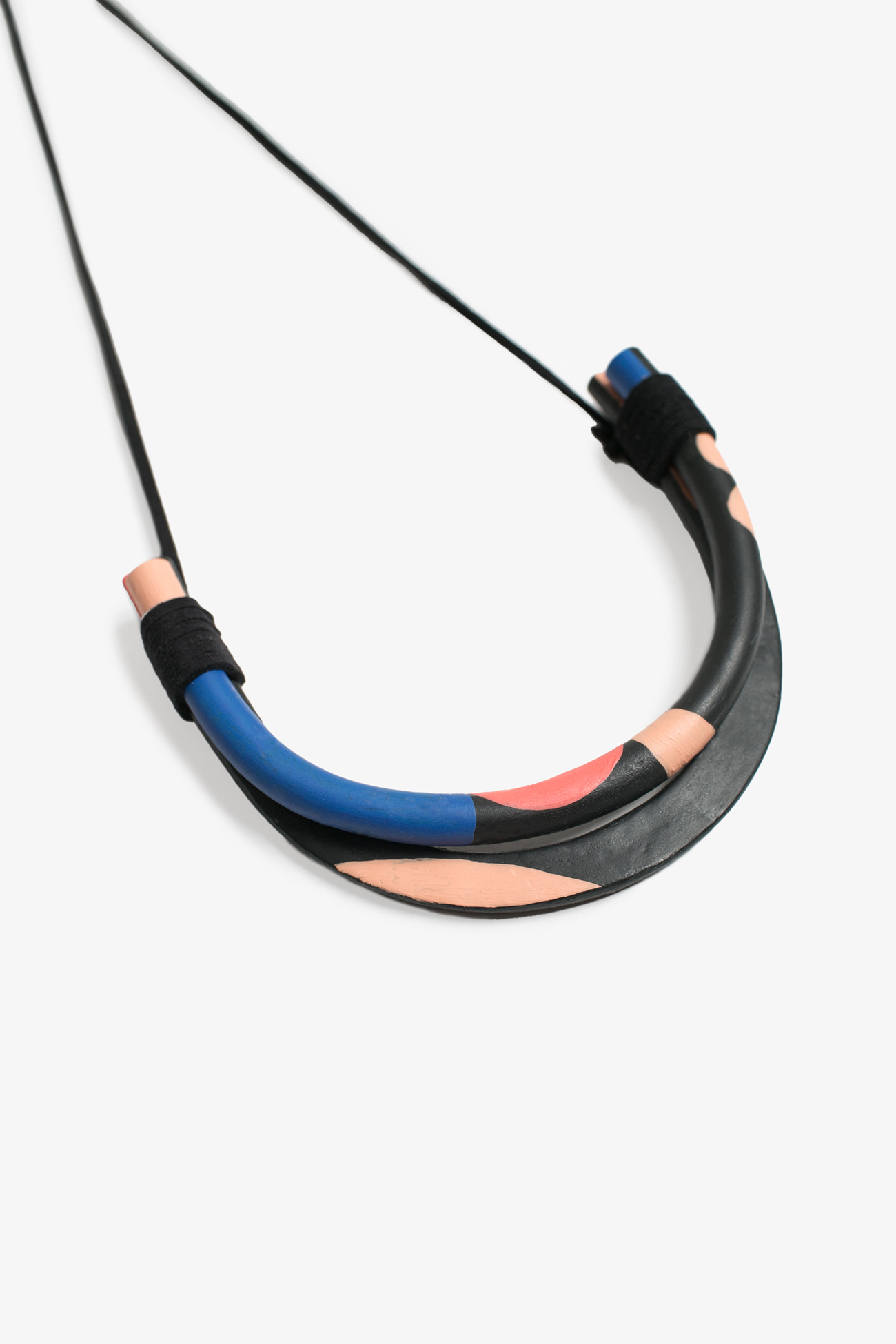
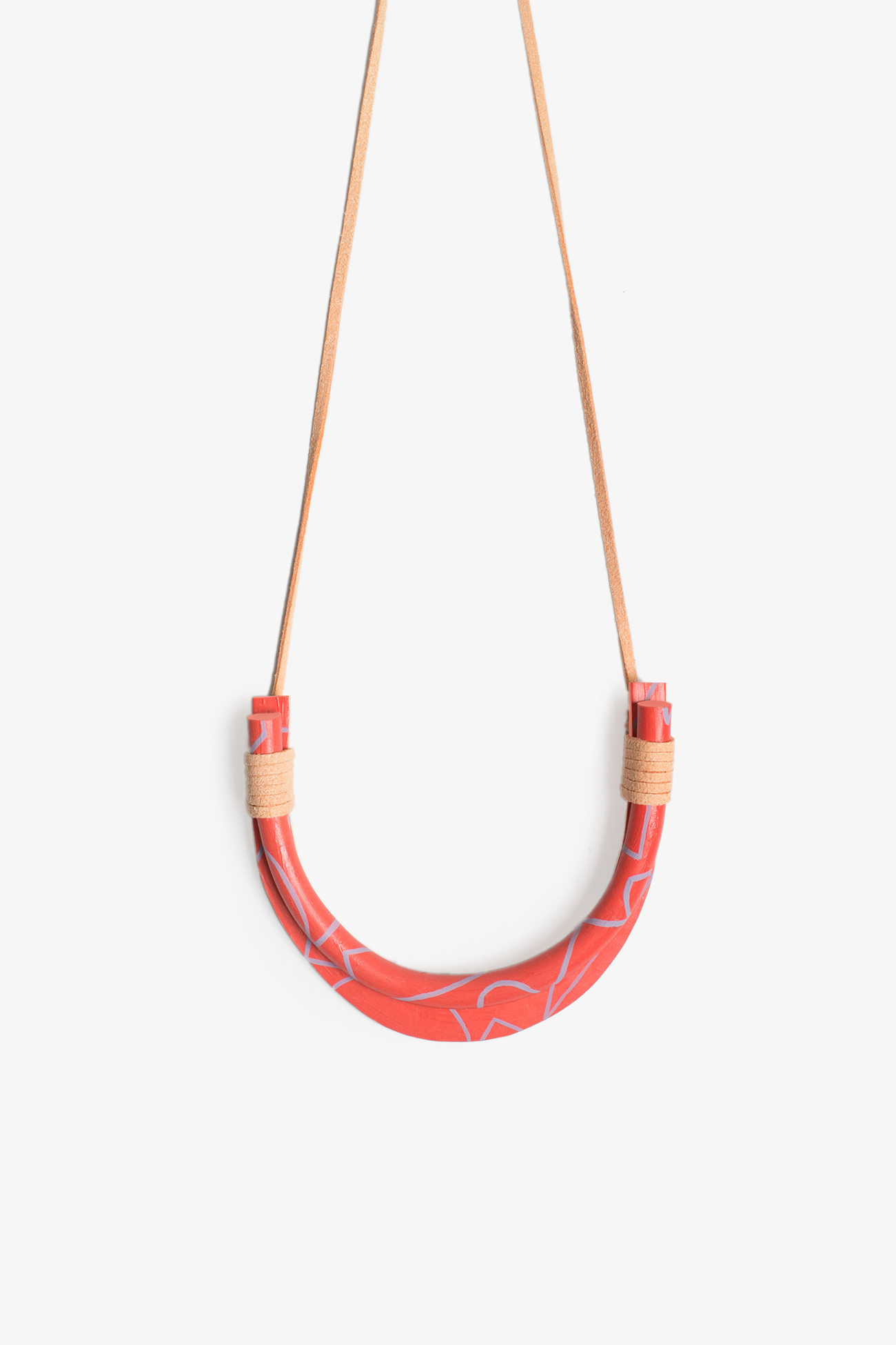
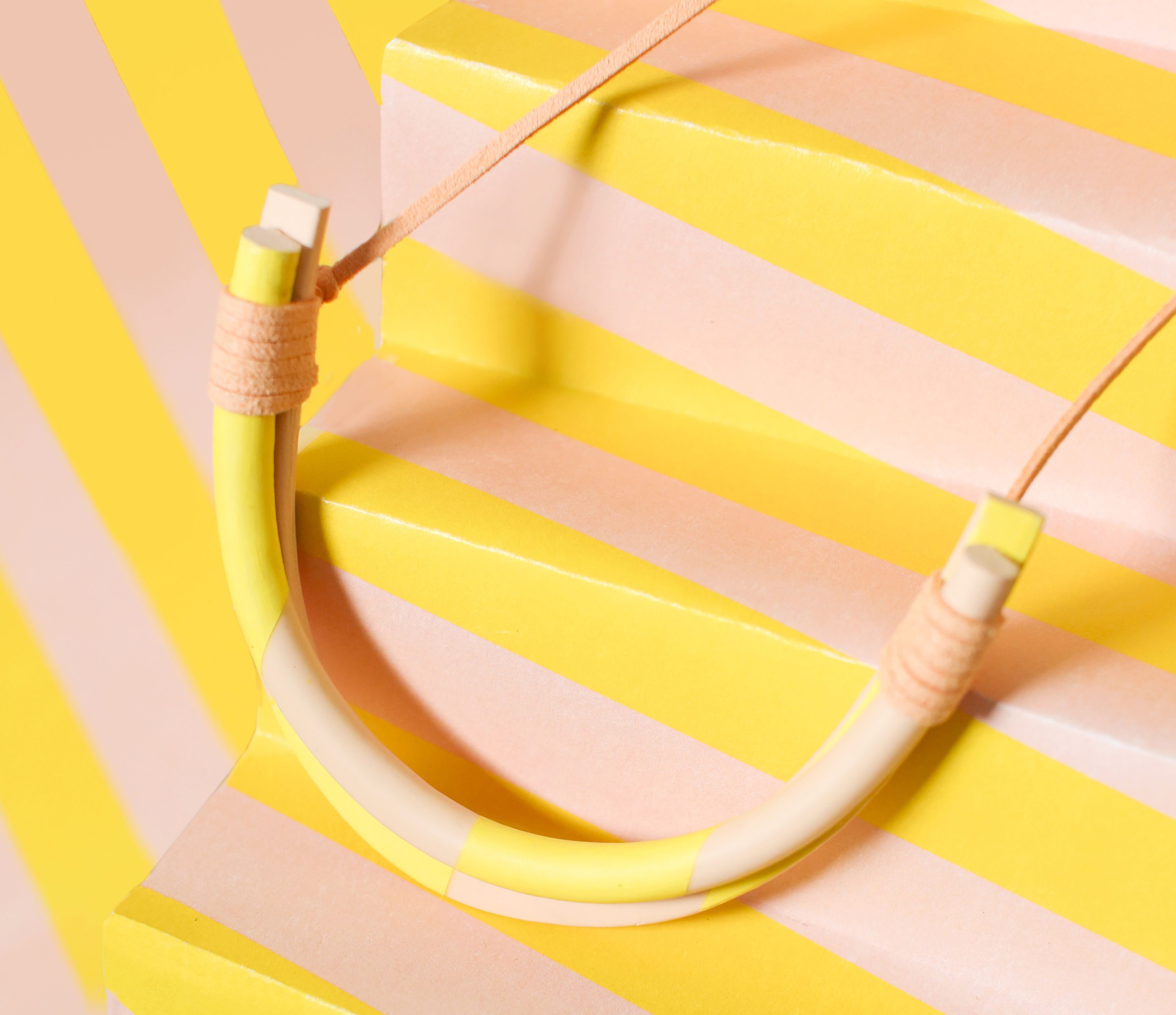
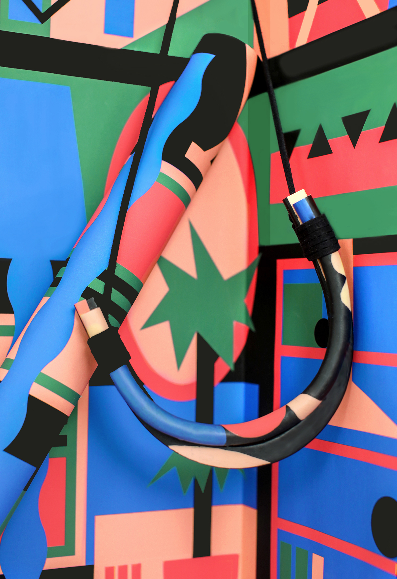
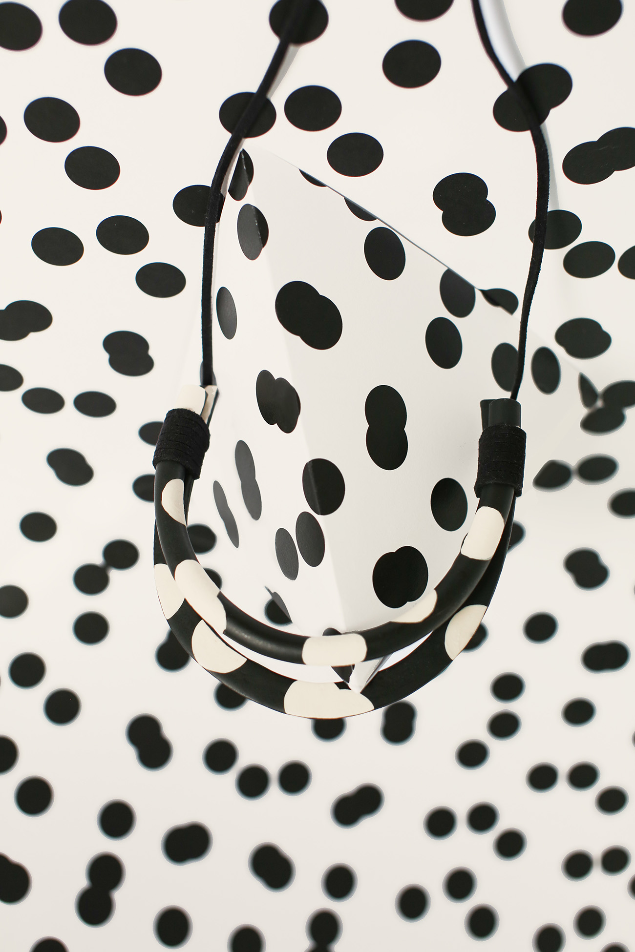
Necklace photos by Kourtney Jackson / Dusen Dusen lookbook photos by Amanda Jasnowski
Tell us a little bit about what inspired the collaboration.
Sonya: I met Ellen through Instagram, though I’m not sure exactly how long ago, or how we came across each other. Over time we became Instagram friends, and eventually traded one of her dresses for some jewelry. (Best trade ever!) After we traded, I wore her dress all the time with my Ardor Necklace, and I saw that Ellen did, too. A friend of mine wore both to a wedding, and other friends had come up with the same combo on their own. I was seeing it more and more, even running into people wearing it out in the world. It was fascinating to see how many people this made sense to. Then one day, you (Jill) actually commented on an Instagram of someone wearing a Dusen Dusen top and a Highlow necklace, saying, “You should sell these as a package.” I realized there was something special happening there. That comment lingered in my mind for over a year! It took me a while, but eventually it inspired the right idea.
Ellen, what were your inspiration points for the collection?
Ellen: With the recent launch of my home collection, I was thinking a lot about interiors, placement in space, and what that looks like on a flat plane. The most literal translation of this is the living room print — I put everything in my living room into a print. It has chairs, a table, a rug, plants, a bookshelf, some tennis balls… you name it, it’s there. I looked a lot of Dieter Roth books, too, which play with layers and colors, and that felt right at home with what I was thinking about with interiors. This season has almost every ROYGBIV color; I figured it’s spring, people should have some fun!
So then Sonya, how did you go about composing and refining your designs?
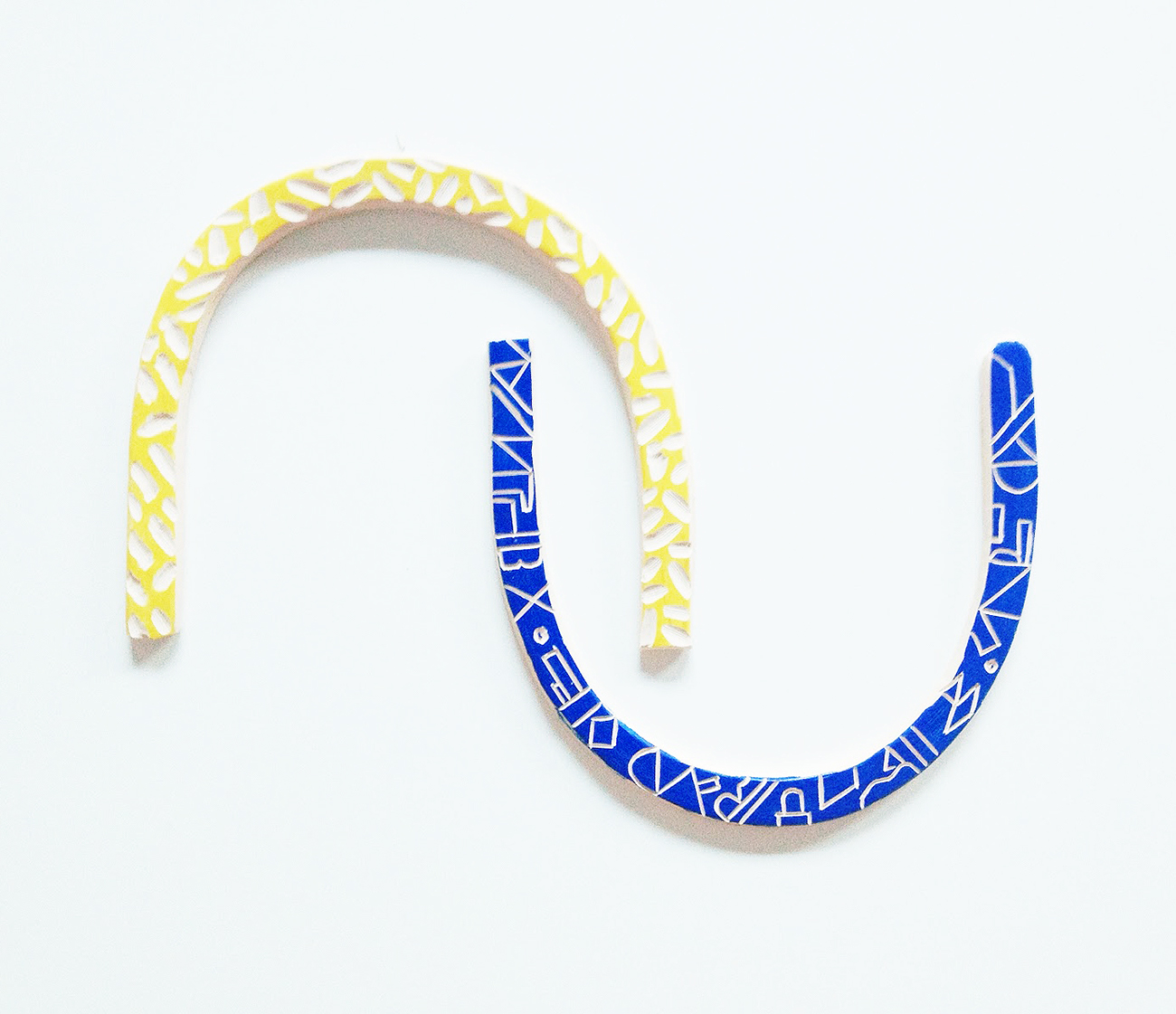
Sonya: I knew that I wanted to apply her patterns onto the clay itself, either by hand-painting it, or carving it out of the clay. My designs are very much process-driven, so I rework things over and over again until I find myself getting excited about what I am making. It’s got to feel right, or I keep reworking. In my first experiments, I had used my printer to print out Ellen’s textiles, not realizing that the scale and color would be off. The blue piece shown here has the Blockhead pattern carved out. Later, Ellen sent me swatches of all the prints. I stared at these for a while, but having these is what really helped inform what to do with the necklaces.
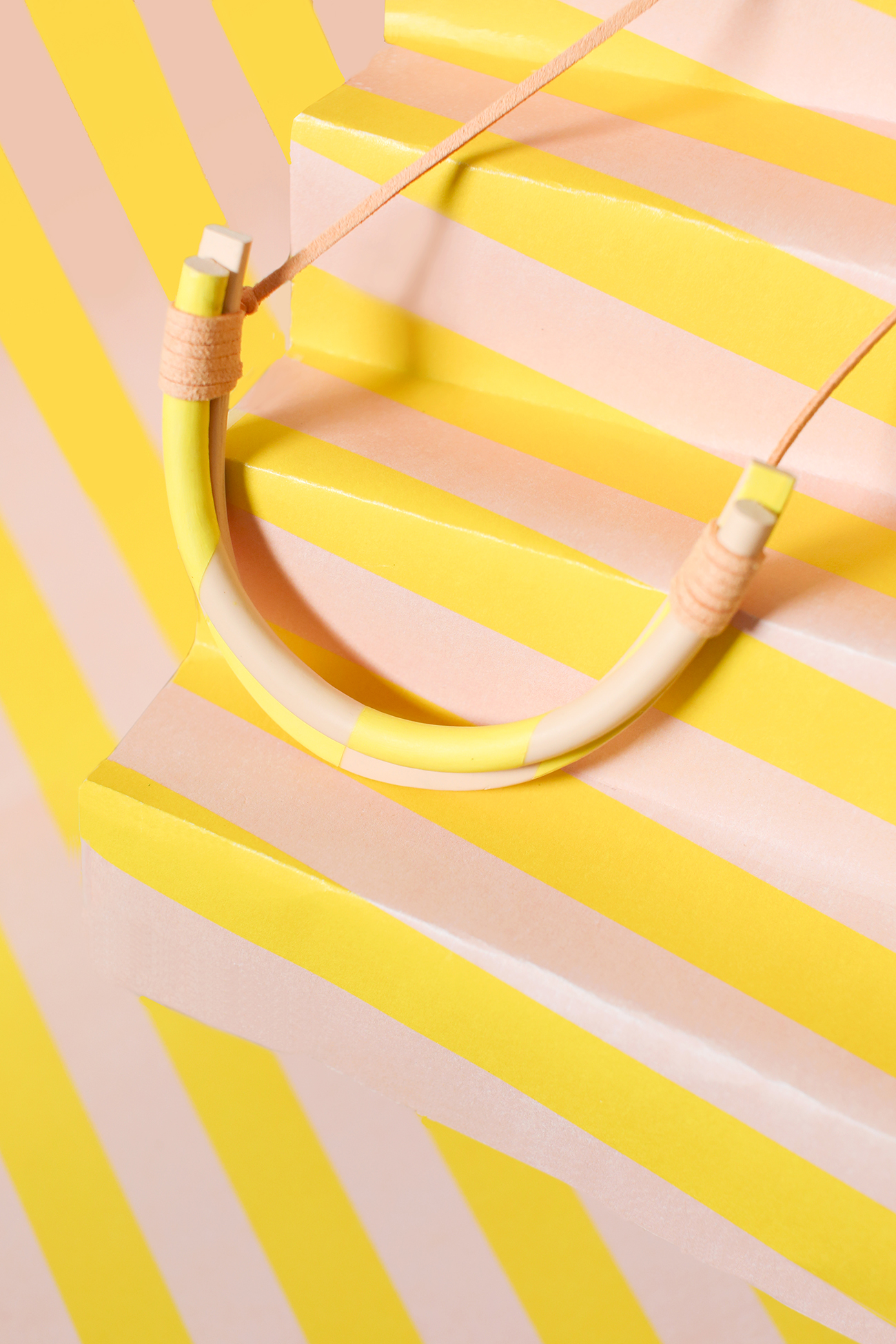
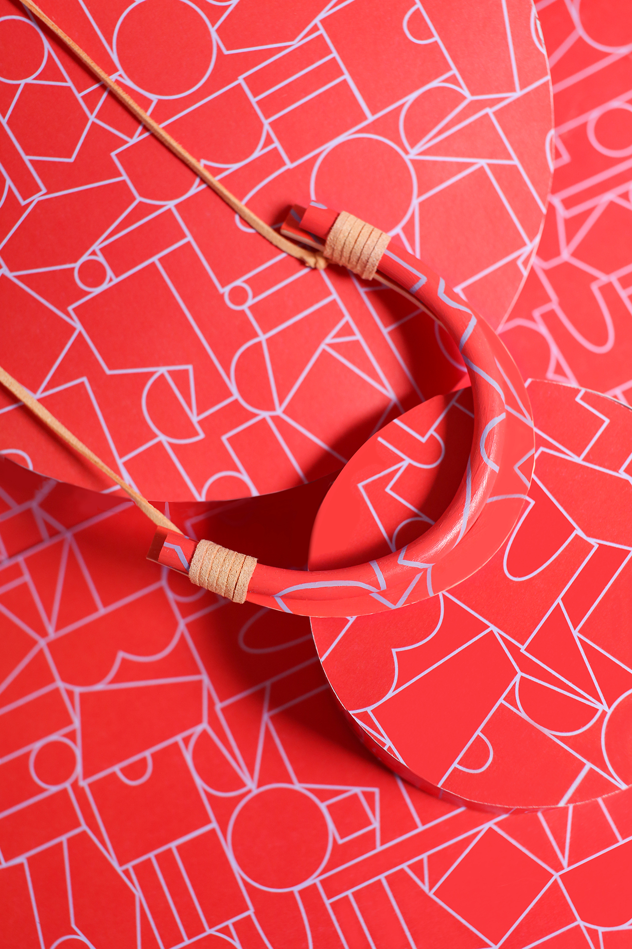
We knew that we wanted the necklaces to match the prints, and after a few prototypes we thought it would be fun if they not only matched, but camouflaged right into the prints. When we hit that point, it all started to unfold and it started feeling like we were onto something. Once I made the final samples, I was really happy with the result. I shipped them over to Ellen, and when she got them, I received an email from her in all caps and exclamation points. We were both super excited!
Has the collaboration changed the way either of you work?
Sonya: Definitely. I tend to use color, but usually they are more neutral, or it’s used as an accent. I loved working with bold, bright colors this time. I don’t think I would have ever thought to make a bright red necklace before this. It’s opened me up to wanting to continue this play with bright colors. I also loved thinking of jewelry in a different way. My jewelry is sculptural, and that makes it bold. It is often the statement-making piece in someone’s outfit. Interestingly, applying these bold colors and patterns made the jewelry almost invisible, which was an unexpected twist.
Ellen: I loved the zoomed-in version of the prints that Sonya ended up working with. I especially love her take on the living room print — there is nothing in there that is literal at all, she just took small shapes from what was already there and made something that I think is so beautiful and totally different from the print itself. It made me think about scale and process. Like maybe next season if I have a print that is reading too literal to look at just the shapes, isolate them and edit from there.