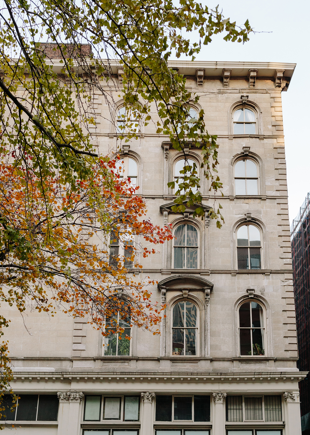
When PieterJan Mattan moved to New York from Belgium in 2012, he arrived without a single piece of furniture. But the 28-year-old creative director, graphic designer, and digital nomad did have plenty of connections. He landed first in a modern high-rise overlooking the Hudson River, then moved to a less-than-exotic fifth-floor walk-up in the West Village. But by the end of that year, a friend renting a loft in Tribeca had announced he was moving, and Mattan jumped at the chance to relocate. “I loved this apartment immediately because it was so quintessentially New York,” Mattan says. “This building was an old umbrella factory. Upstairs there’s an amateur theater and dance school, and downstairs is an outlet store, selling Calvin Klein and Levi’s. There used to be a horse-saddle factory next door and one for typewriters across the street.” Of course, having a more permanent space also meant Mattan could begin decorating in earnest.
He began slowly at first and for a while, the apartment was filled with giant inflatables just to have something to sit on. But when Mattan began working in e-commerce (he was creative director of Fab in its heyday), he says, “curation was the job. You got to know a lot more product than you usually do.” It also meant he could take things home from work — props and bits from photoshoots, or collaborations he’d spearheaded. If you follow Mattan on Instagram, you’ll have seen over the years that the apartment has played host to everything from an embroidered teepee (now in storage) to a giant trampoline (currently sitting on its side in the hallway, it made visitors feel like they were in a real-life version of Tom Hanks’s loft in Big). “To me, a home is never done or ready,” Mattan says. “The way it is today is different from the way it was when we shot it and the week before that it was different again.”
We recently caught up Mattan to chat about his recent work with Hem — the rapidly growing, Stockholm-based design label he consults for and calls “more edgy, more fun, and more experimental than most” — as well as the story behind his very inspiring, ever-changing stuff.
“When I lived in Europe, my apartments were way more serious than they are here,” says Mattan. “If I’d had a trampoline in my apartment in Belgium, I’d have been sent to a psychologist. But here in New York, we can be true to ourselves. Our home can become a lens for self-expression.”
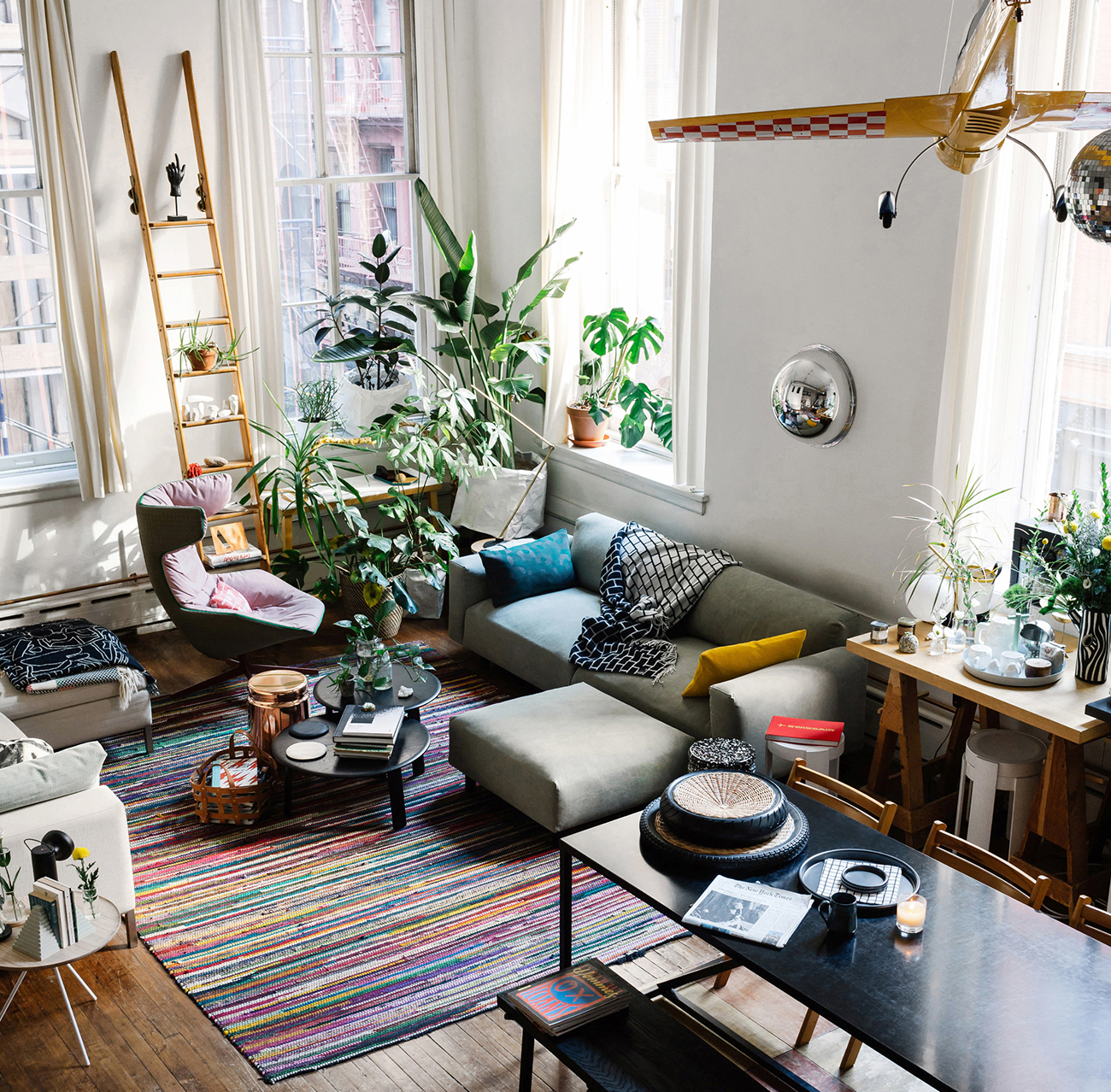
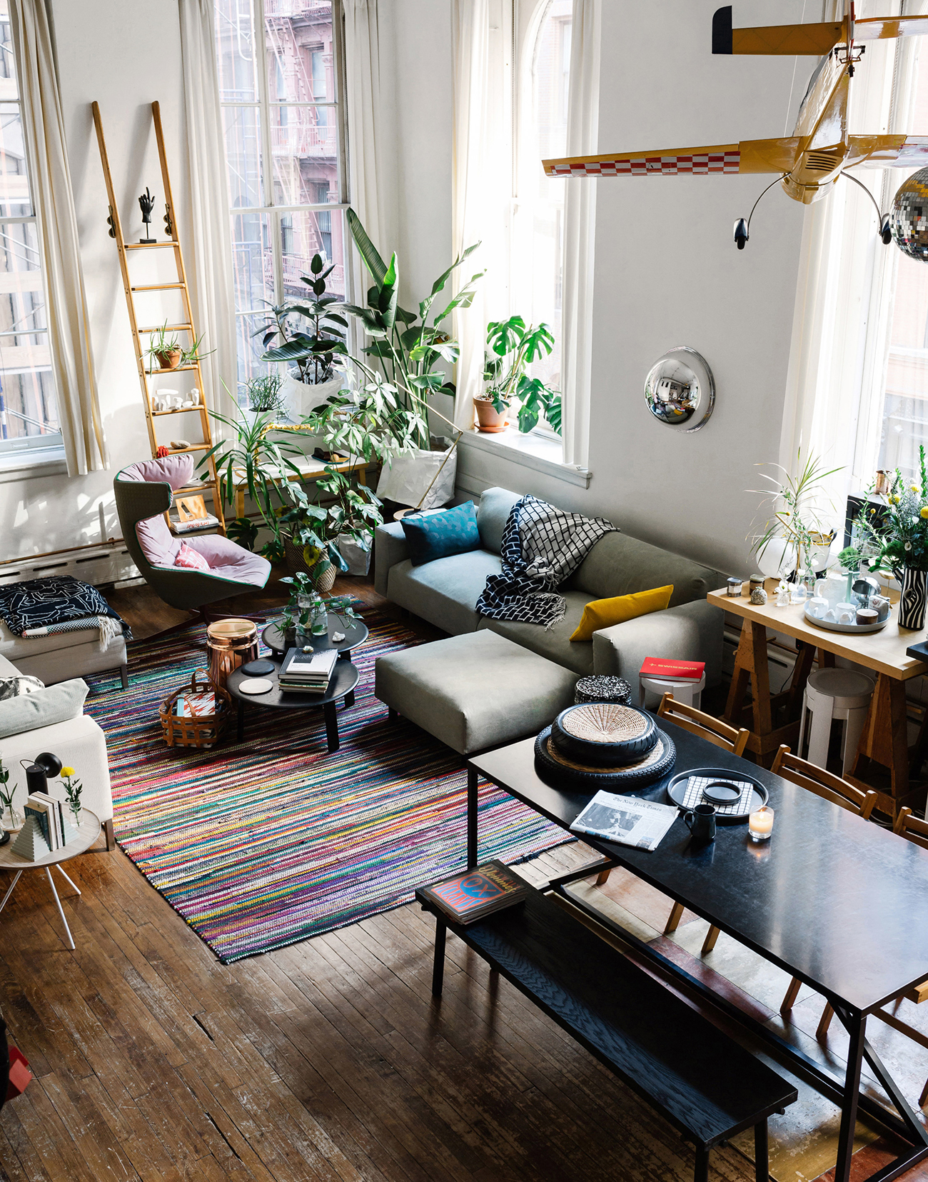
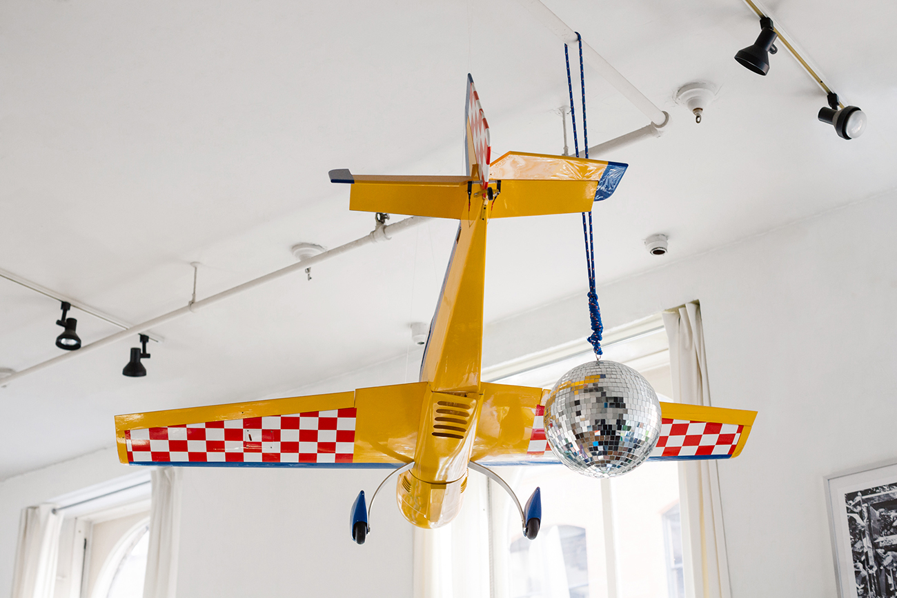
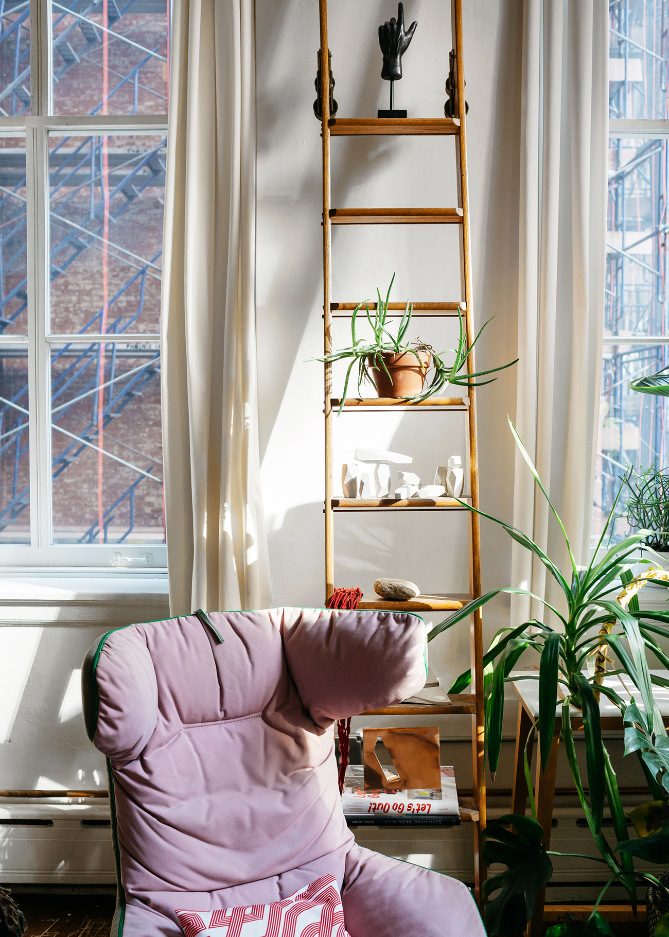
The centerpiece of the apartment is an old remote-controlled airplane Mattan inherited from a friend who used to be a visual merchandiser for Jack Spade. “I’m obsessed with airline travel and airplanes; I even have my single-engine license, though it’s expired. So this was a gift — one of the very first, very useful things I got,” Mattan laughs. “I walked it over all the way from Park Avenue because it didn’t fit in a car or a subway. There was no UberXL back then.” The disco ball Mattan calls “a classic design object.”
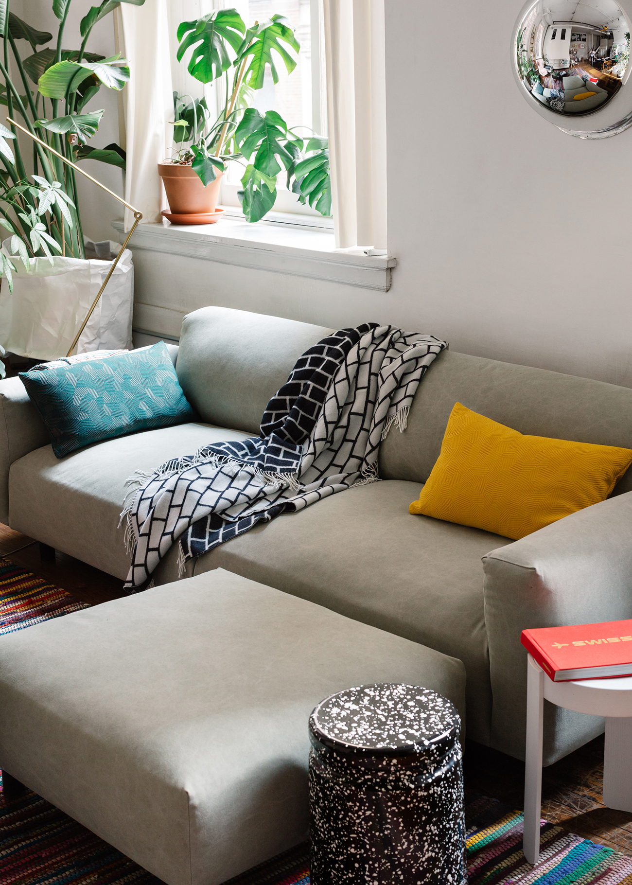
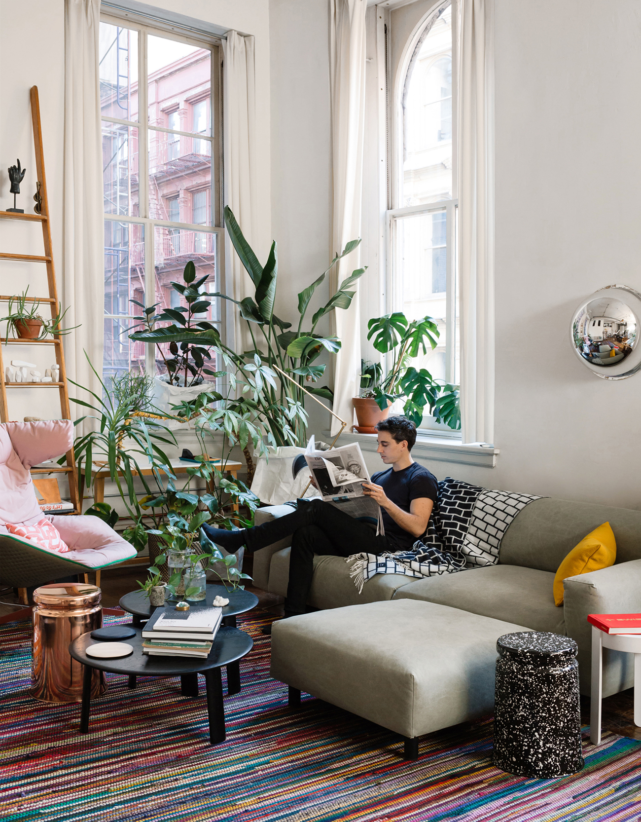
A graphic, black-and-white Brick Throw by Sylvain Willenz for Hem sits atop a Form Us With Love sofa, also for Hem. The silver hemisphere — which visitors to the apartment often mistake for an art object, is actually a giant dome Mattan picked up from Canal Street Plastics. The splatter-painted stool is by Max Lamb, and the white stool is by Hallgeir Homstvedt, both for Hem. The red, vintage Swiss Air book is a nod to Mattan’s aeronautics obsession.
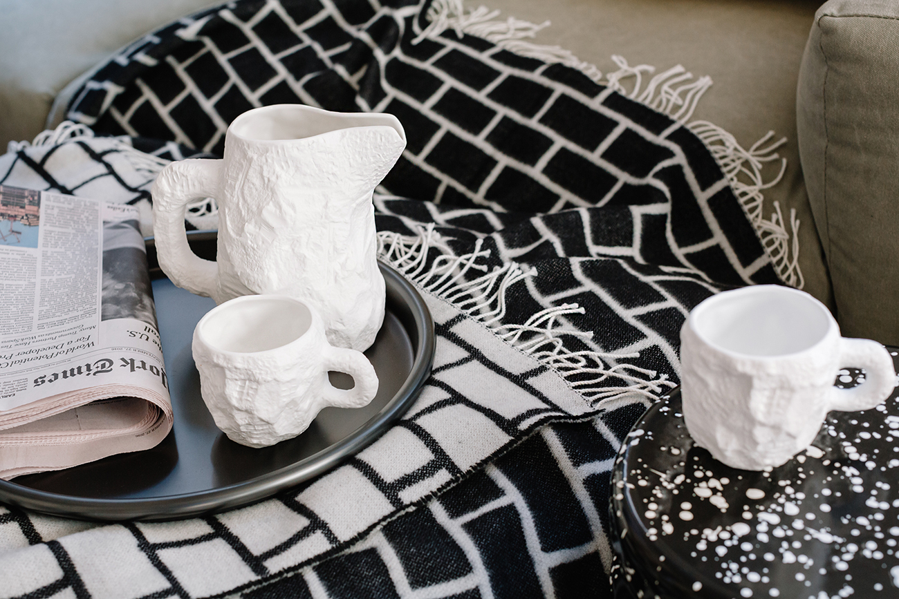
Sitting atop a Pauline Deltour Roulé tray for Hem is a Max Lamb crockery set Mattan picked up from the Shop at Cooper-Hewitt, a client of his.
A portrait of Mattan in his ever-changing interior.
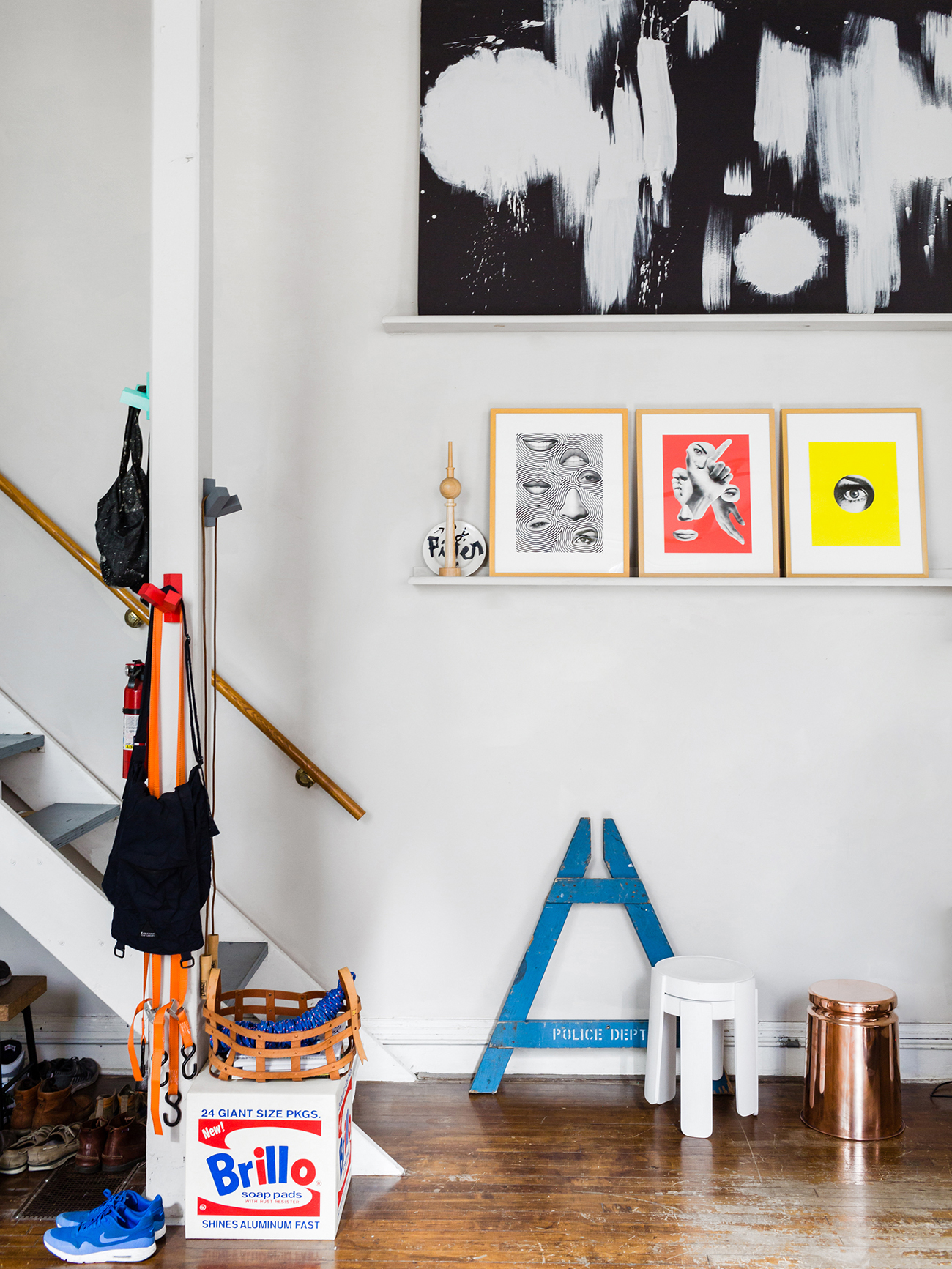
The Brillo pouf is a collaboration Mattan helmed back in his e-commerce days. The black-and-white canvas is a backdrop Mattan painted for a photoshoot, and the plate is a James Victore memento from a dinner party. The canvases are by Tyler Spangler, and the stools are both from Hem. Mattan’s most prized possession in this photo, however, is the blue piece of a police barricade. “Someone told me they were going to replace the old wood ones with plastic, and I felt like I had to save a piece of New York history. It’s also a beautiful piece of graphic design.”
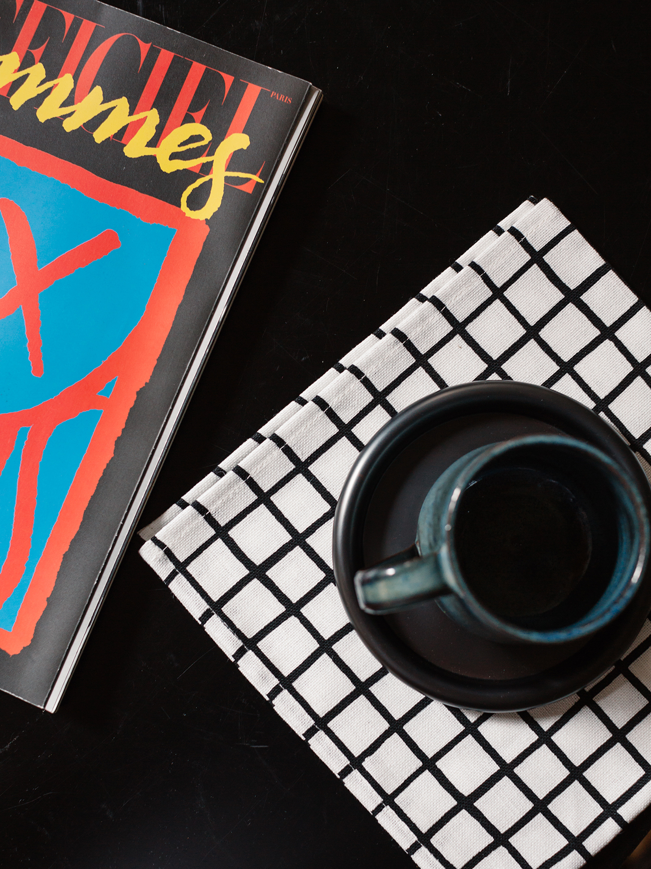
Grid napkins and tray for Hem with Mattan’s own mug and a pop of color — a copy of the French fashion magazine L’Official Hommes with a cover by André Saraiva.
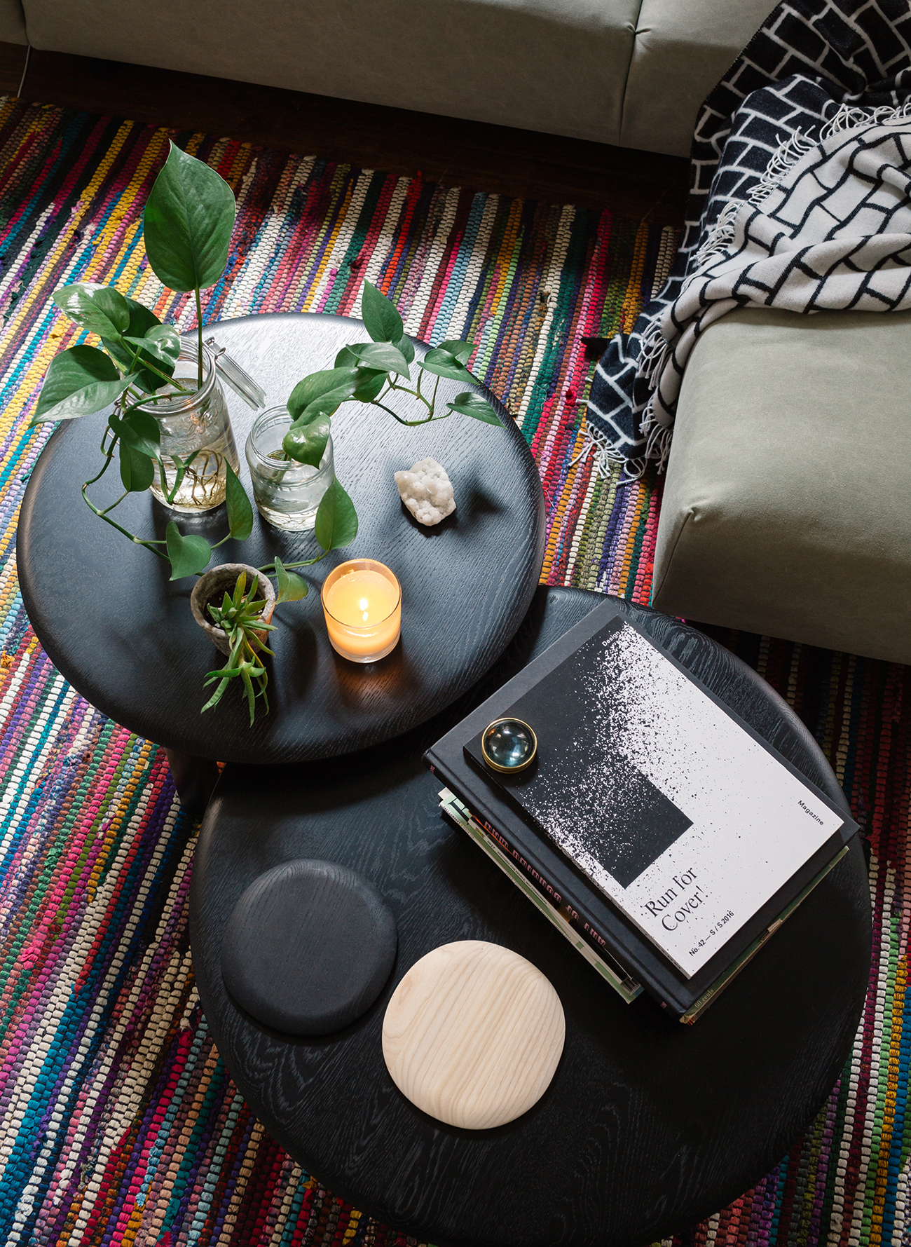
Coffee tables by Staffan Holm for Hem and serving trays by Nao Tamura
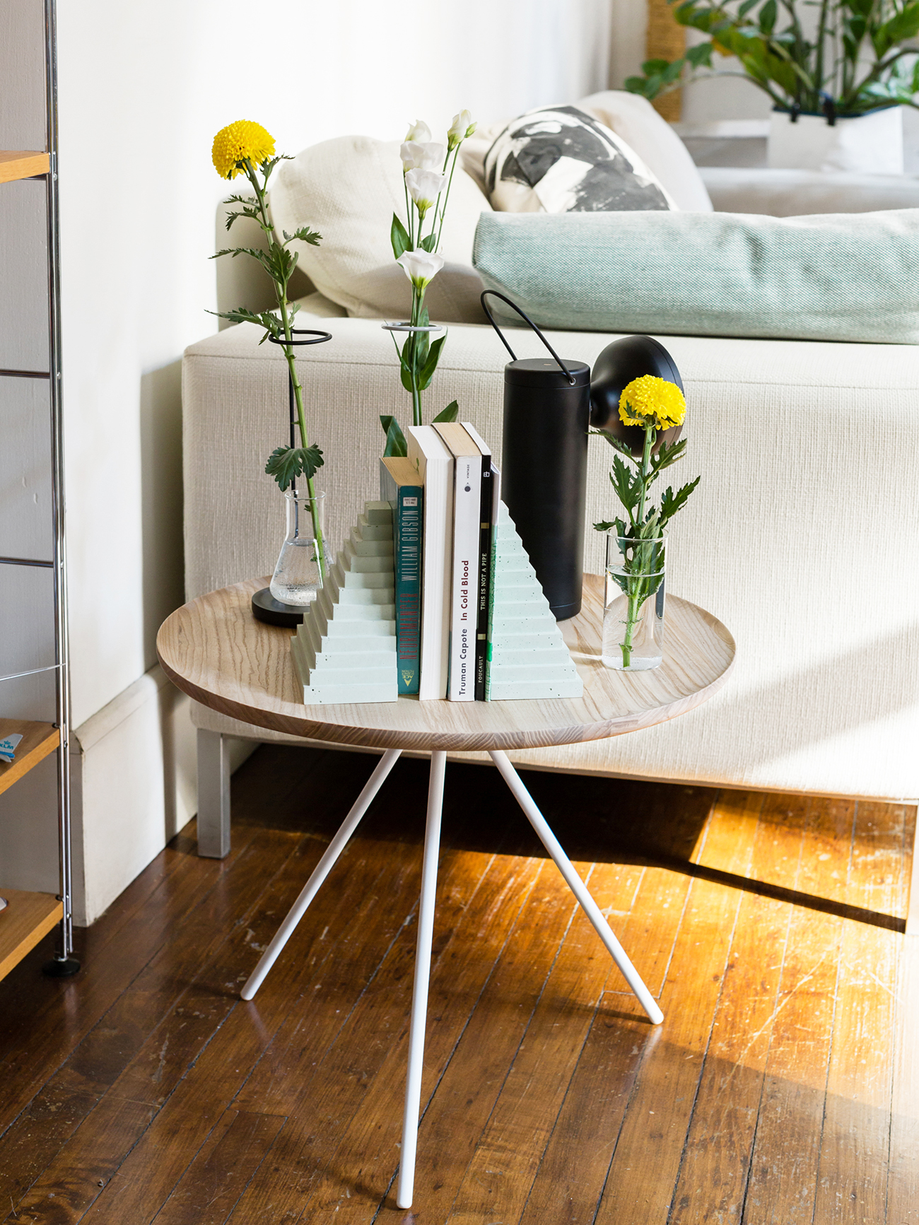
The portable black miner’s lamp is by Juniper Design, and the seafoam ziggurat bookends are one of our favorite pieces ever, by Klemens Schillinger for Hem.
A Mayday lamp by Konstantin Grcic for Flos hangs upon a shelving unit by Mikko Halonen for Hem.
It’s hard to see here but behind all the greenery is a bell jar with astronauts and rockets inside (gifts from his boyfriend) and a diorama of the moon landing. When I asked Mattan what appeals to him so much about air travel, he thought for a minute. “I’m very much a dreamer,” he mused. “I don’t like reality; I can’t calculate the tip at a restaurant. But I easily get drawn into a different world or visual language. Plus, old airline branding is so strong. It wasn’t super-serious. Braniff Airlines had planes in 10 different colors. I don’t want to be that kid who doesn’t grow up but at same time it’s important to have that playful aspect in everything you do.”
Mattan calls this his Brooklyn corner: Fort Standard Balancing Blocks, a copper mirror by Good Thing, and, behind the chair (Alfredo Häberli for Moroso), a red net by Best Made Company, a Tribeca neighbor.
Though the building is 200 years old, Mattan associates it and the neighborhood with a more ’70s or ’80s vibe. “There’s something very dreamy about these old spaces,” he says. “Across the street was the Mudd Club, where Warhol, Bowie, The Talking Heads, and Lou Reed used to hang out. And Keith Haring’s old gallery on top of it. There’s a 97 percent chance that David Bowie peed against our façade,” he laughs.
This post was created in collaboration with Hem, but all thoughts and editorial content are our own. Like everything at Sight Unseen, our partner content is carefully curated to make sure it’s of the utmost relevance to our readers.
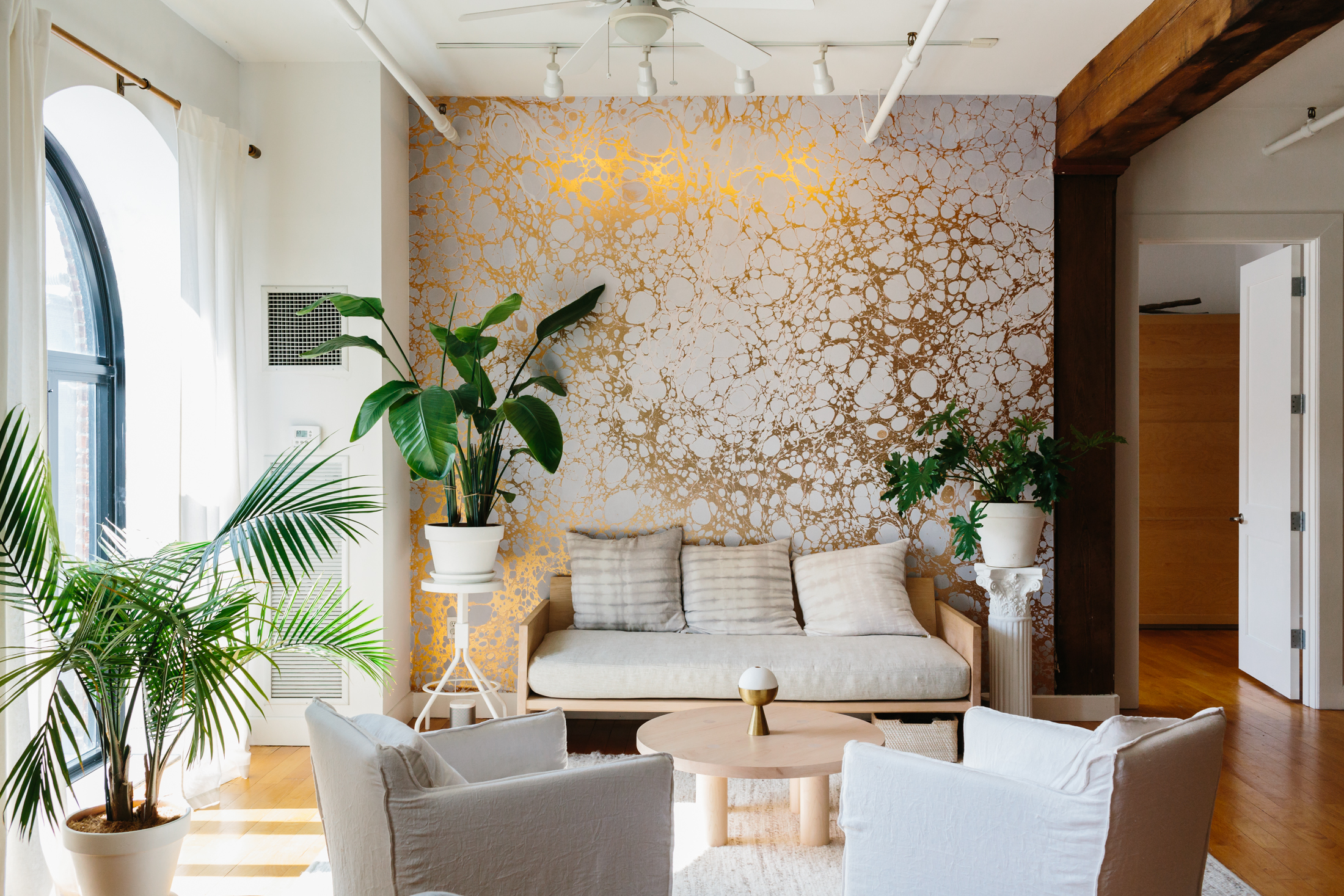
In hindsight, it feels almost like fate that Nick and Rachel Cope would end up in the sprawling, historic Red Hook loft they now call home. After all, where else in New York City could they have found the room to showcase not one but six of the wallpaper collections they've created since 2012 as partners in the Brooklyn-based Calico?
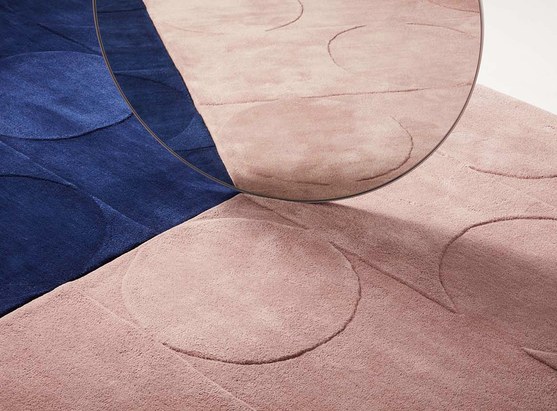
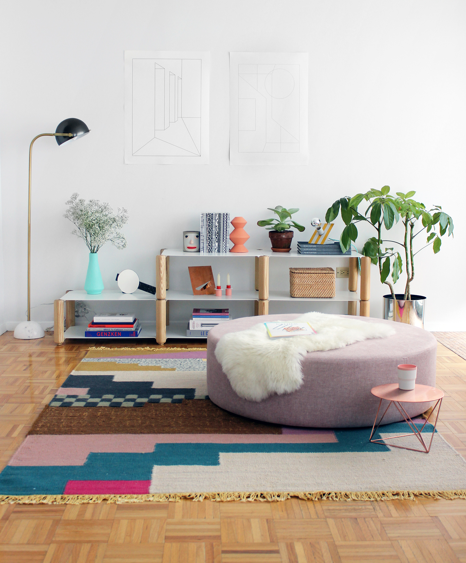
Launched at Matter during New York Design Week, these gorgeously sophisticated rugs designed by Studio Proba and Aelfie Oudghiri strike a much-sought-after — but rarely achieved — aesthetic balance: They're basic enough to go with almost anything, but stylish enough to anchor a well-designed room. The holy grail of rugs.
This winter, designer Eunsun Park was living with her boyfriend in a sunny studio apartment on New York's Lower East Side that contained almost no furniture. That's when she spotted the auction we were hosting on eBay in partnership with Paypal, which offered a personal home makeover by Sight Unseen's editors to the highest bidder. Forty-eight bids later, Park emerged the winner, we got to make over her tiny apartment from top to bottom — see the before and after photos after the jump!