09.21.23
Q+A
Sabine Marcelis on Her Newest Collaboration, Her Material Research, and Her Complicated Feelings About the Color Blue
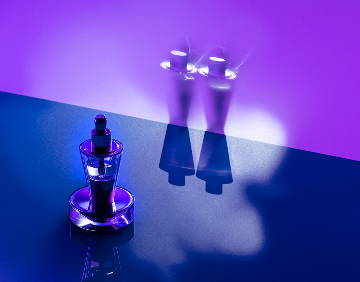
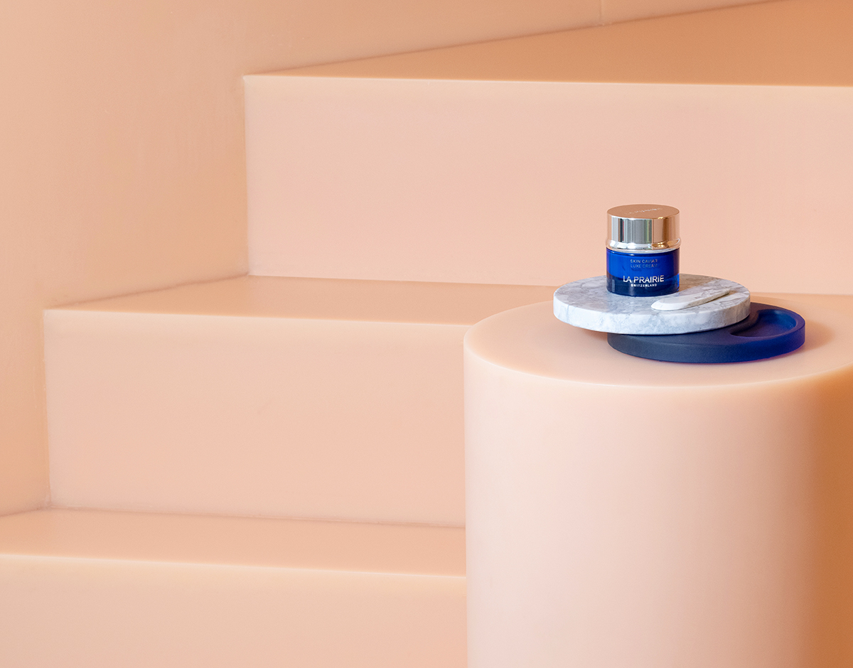
In 2015, we wrote a short piece about the Rotterdam-based designer Sabine Marcelis, on the eve of her debut with Victor Hunt gallery at Design Miami, having discovered her work two years earlier through the mirrors she made with Brit Van Nerven as students at the Design Academy Eindhoven. We still chuckle about the ending of that piece — “We’re predicting a Design Miami breakout star” — because eight years later, it feels like such an adorable understatement. Marcelis has become a design breakout star, period, her minimal-yet-colorful work in glass and resin having penetrated the worlds of architecture, fashion, music (Candy Cubes onstage with Lorde), and TikTok, thanks to a collaboration with Ikea that generated untold levels of hysteria on the platform. Now she’s conquered yet another realm of wider culture — beauty — through a major collaboration with the Swiss skincare brand La Prairie, with whom she’s just launched a vanity tray that marries her signature use of resin with the brand’s signature shade of cobalt blue.
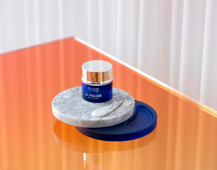
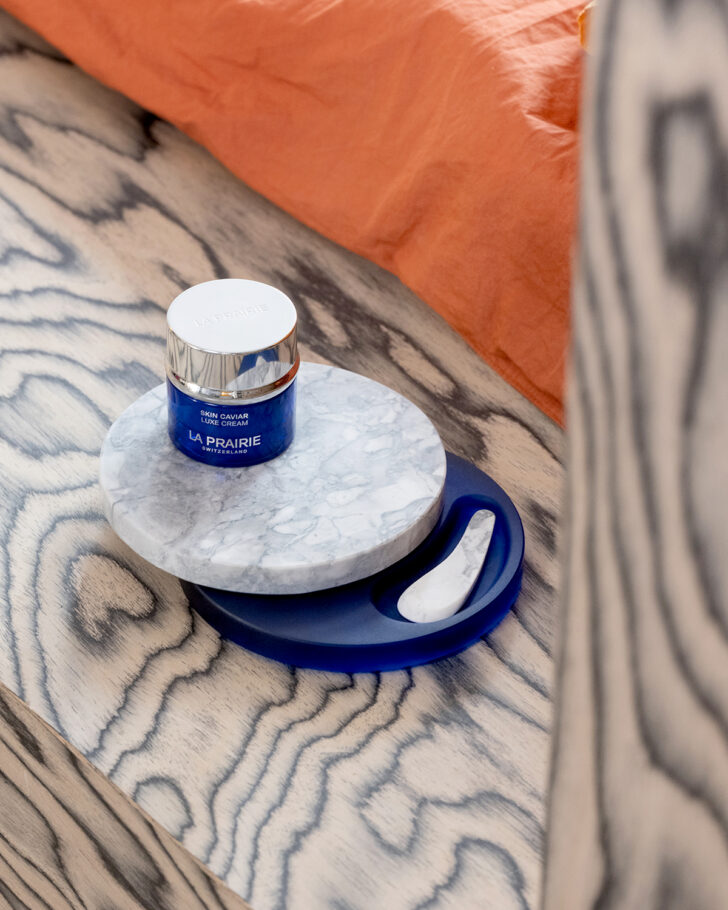
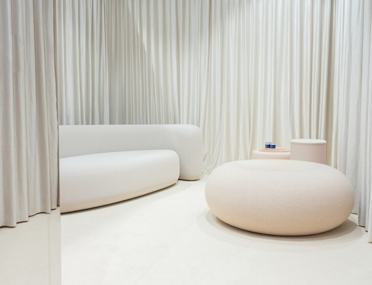
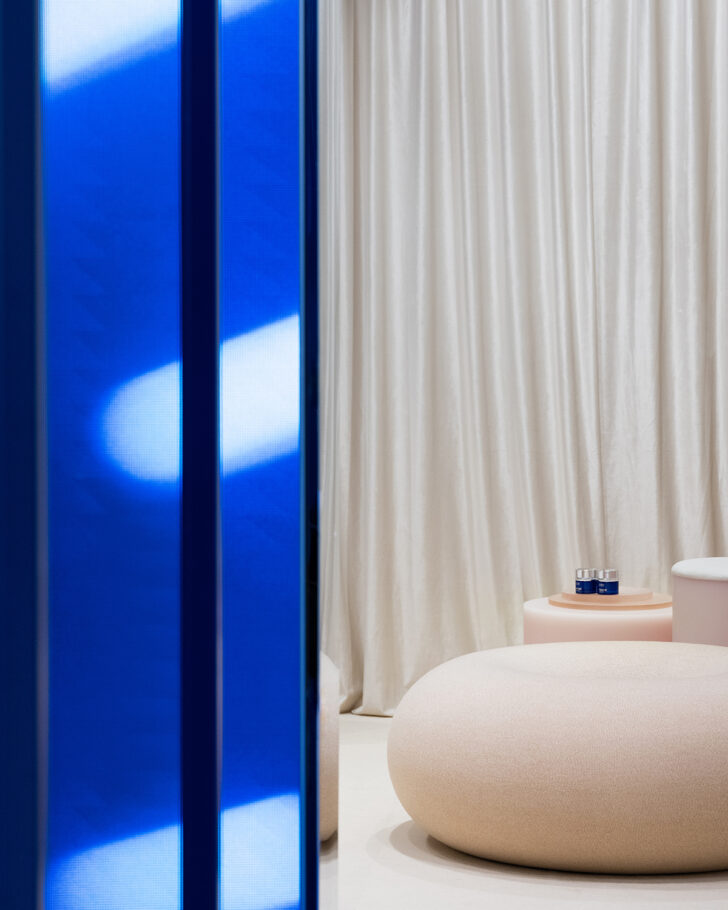
The tray, intended as an artful display and application tool for La Prarie’s Skin Caviar Luxe Cream, is part of a larger relationship between Marcelis and the company that began back in 2020. The designer was teaching in ECAL’s luxury masters program, which pairs students with real-world clients, and it went so well that in 2022 La Prairie independently invited her to helm its Women Bauhaus Collective, mentoring five female designers through the process of making work inspired by the famed school. But this year was the first time Marcelis actually turned her thinking towards the skincare products themselves. In June, inside the Design Miami collectors’ lounge, she created the Cobalt House, a pavilion whose blue-glass walls and soft, beige-colored interior mirrored the experience of opening a Skin Caviar jar. And then she unveiled the tray itself, which elevates the use of the high-end cream into a thoughtful beauty ritual — an object worthy of spending time with, even to someone like Marcelis whose own beauty routine previously consisted of soap and sunscreen.
We decided it was a good moment to catch up with Marcelis, and talk to her not only about this project, but also about what materials she’s been experimenting with lately, how she feels in the wake of all the social media hype, and why she — cobalt excluded, of course — doesn’t actually like the color blue.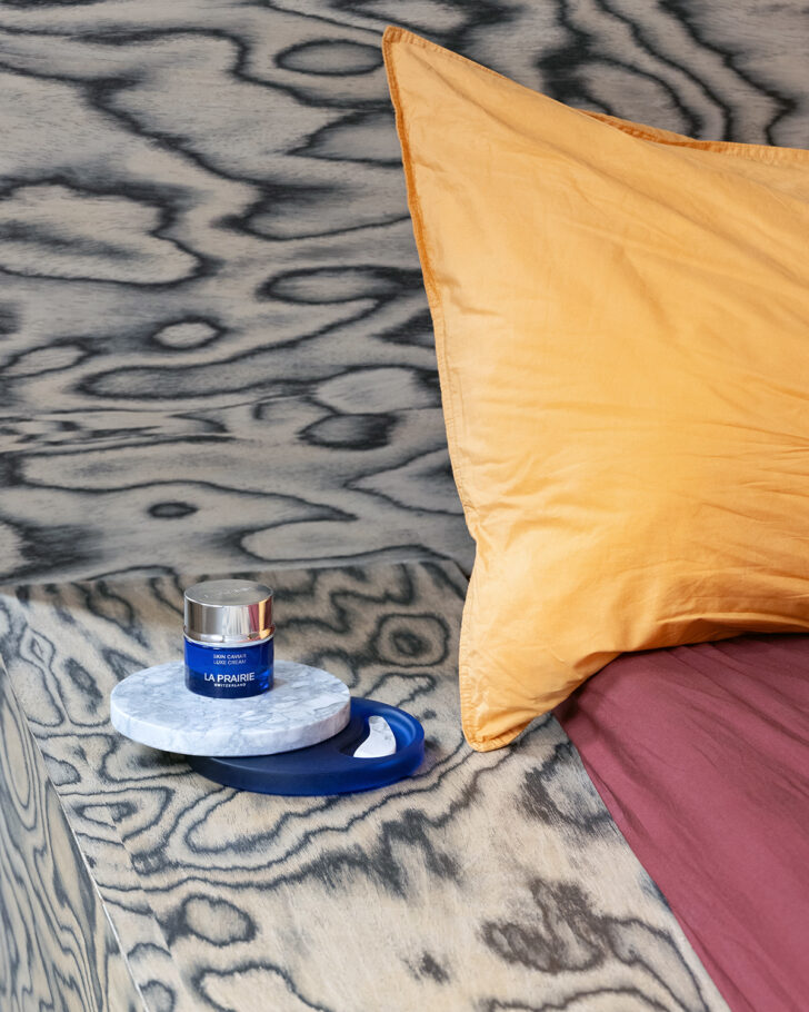
This is your second formal collaboration with La Prairie, after your Women Bauhaus Collective project last year. How did your relationship with the company come about?
Back in 2020, I was teaching at ECAL in the Luxury and Craftsmanship masters program, and that was the first time I was in touch with La Prairie. They wrote the brief for project I was tutoring. We got really good results, so they asked me to do more mentoring with the Bauhaus project, which was nice because instead of it being about “Look at me and my work,” it was about championing other female artists and architects. That’s really what I look for in commercial collaborations, that I can build a good relationship with the client over time. The same thing happened with Fendi. It wasn’t just one project that we did together; each one built on the last. You really get to know the brand and where your worlds meet. So with La Prairie it was great that they asked me to work on a much bigger project this year. At that point you know the team so well that it doesn’t feel as client-based anymore. It starts to feel like teamwork, which is not always the case with brands.
Now you’ve made this skincare ritual tray — tell us more about it.
The object acts as a pedestal for the product, and when you rotate it, it opens up and reveals a tool to apply the cream with, which also doubles as a gua sha tool. It’s very small scale for me, and especially since it’s used in such close proximity to the body, I had to get really into the details while designing it. I had to make sure that the curve of the tool would fit many people’s facial structures. I had to think about, how does the tool sit in your hand? How do you take it out of the object? When you rotate the object open, how does it feel? The little click it makes. This is how hardcore industrial designers work — how car designers can spend two years on the sound of the door closing. You get obsessed with these tiny details, like the way the top rotates, and how heavy it needs to be so that it feels smoother when you push it open. The obsessing was really fun for me. I’m quite used to making grand gestures, but this was the opposite. It was the small details that made up the totality of the design.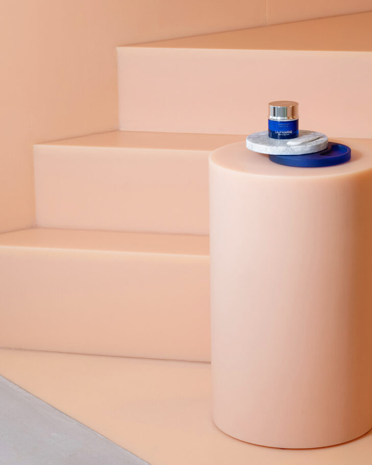
 Photos above shot in Sabine Marcelis’s home by Titia Hahne
What about the concept itself? How did you develop it?
The brief was to create something that would enhance the routine of applying the skincare, so I started out thinking, would it be a handheld mirror, or an hourglass, to time how long you need to massage your face with the cream? All of those ideas either felt too mundane or too complicated — would you really do that? I’m super no-fuss when it comes to skincare. Since working with La Prairie, only now am I aware of what I should be doing with my face besides washing it and putting on sunscreen. So it felt insincere to create something I would never use. It also has a presence, it’s not just something. I’m always cautious of designing an object where someone can think, I don’t like that anymore so I’m going to chuck it out. It has to demand its own worth. Yet it should also be a little anonymous, so it can fit in many different styles of bathrooms. So I was trying to strip everything back as much as possible. I used super simple shapes, paired with the cobalt of La Prairie, and marble to give it the juxtaposition of manmade versus nature-made. I also wanted it to have a tool that you would actually use, where it’s not just extension of your finger but actually has a discrete function.
I wouldn’t call it anonymous! Maybe sculptural.
In general I’m really interested in that typology of object where you don’t need to know what it is unless someone points it out to you. It has a hidden function. It’s like the bee house I made recently for an SZ magazine charity auction ¬— it’s a sculptural object, a mirrored box, but it’s also a bee house. So if you want to have a bee house, you’re not forced to live with the aesthetics of what that means.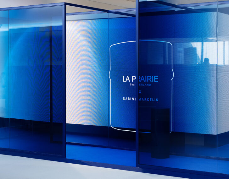
You also created a glass pavilion for the La Prairie project, the Cobalt House, which is basically like physically walking into a jar of Skin Caviar.
A brand like La Prairie is very specific in how they communicate. The color use is set and you can’t veer out of it much. But I actually quite like that. I also do that with my own projects. You have to set restrictions in order to be creative within them. In a way there were extreme restrictions for this project — all of it, including the spatial element, was based around the product and its cobalt packaging. It’s an epic color, so I was happy to work with it. And I feel like I used the restrictions in a super literal way, translating the product quite literally into a spatial experience. The pot is blue glass, this cold material, with a chrome lid, but when you open it up there’s this super-soft, luscious cream inside, with a creamy color. So I translated that directly into a material space, and thought about how those materials create your sensorial experience. If you’re walking through a maze of glass walls, and then you enter an enclosed room filled with soft sofas and carpets, your whole acoustic world changes.
When you posted about Cobalt House this summer on Instagram, before its launch at Art Basel, you wrote, “I’ve never been a huge fan of the color blue, but cobalt blue is in a league of its own!” Do you really never use blue in your work?
It’s not a conscious thing, but I never design anything blue. I’m just not that drawn to the color. Maybe a hint if I’m referencing a sky, but it’s very rare that an object of mine is blue. And there’s absolutely nothing in my house that’s blue. I’ve never been a big fan. But I almost don’t think of cobalt or Yves Klein blue as being part of the realm of blue. It’s its own thing, light highlighter yellow — it doesn’t belong to the yellow universe, it’s its own color. Cobalt has a crazy intensity to it that really pops in a wild way. Though I’d actually never used cobalt before this project, either.
It’s interesting that La Prairie’s use of cobalt actually comes from the late artist Nikki de Saint Phalle — she was the one who suggested they use that color for their branding, in the 1980s. They refer to it as being gifted to the brand by her.
Do you have personal references or memories around blue that drove your feelings about it? Or any other colors, for that matter?
I have preferences for certain colors because of the way they turn out in material use. It’s not so much the emotional connotations of colors, but how they act within a material. Obviously I’ve done a lot of colors inside glass or mirror, but this color has been the strongest ever to work with. Somehow it made the whole materiality of the work something else. You want to keep staring at it. There’s something hypnotic about it. And it just seems to contain more layers than other colors have.
Similar to blue, I’ve never been very into green, but now I’m really into green. I recently traveled to Japan for the first time, and we went to all these temples with a million different kinds of moss, in so many nice shades of green. Now we’re doing quite a few green projects. I like colors that complement the greige interior, where you’re not getting too crazy, but it’s still not beige.
I have to ask about the Ikea collaboration (above top) — it generated such a crazy level of hype, especially on Tiktok. How did that affect you?
I like that it’s broadened access to my work. That said most of the time when people find your work, it’s more about your practice, whereas with Ikea it was just about the objects, not about me as a designer. People that had no idea who I am bought it, and then the other day someone was like, “No way, you’re the one who did the donut lamp!” I don’t have Tiktok, so I didn’t see most of the content that was on there, but it was pretty crazy how all-reaching it was — I never considered that’s what would happen. I did definitely want those designs to be an invitation to whomever buys them to be creative themselves. I saw people that had bought multiples of the wall lights and installed them together to create the illusion of an arched hallway. And everyone’s been sending me this person that made an everything bagel out of the donut lamp. It’s bedazzled. It’s not my vibe, but good on you! That’s cool if it inspires creativity.
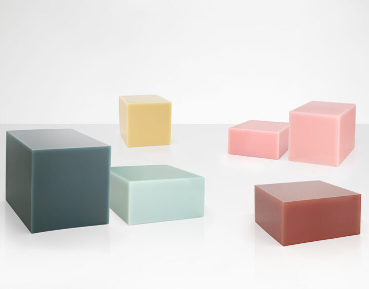
Going back to the sculptural simplicity of your work, I’ve seen you talk about how much technical development goes into your designs, but they do seem so simple when you look at them — for example your Candy Cubes (above bottom), aren’t they just square blocks of poured resin? Can you explain a bit about the complexity that goes into the fabrication of your pieces?
I have quite a unique studio setup, where I’m in the same building as my production facility. We develop methods with the production teams to be able to realize our designs. That cube is anything but simple — it’s a single cast, it shrinks, you have to get the interior mold out of the exterior mold right at the exact time, and slow down the hardening of the resin to the exact speed. It’s a science to get it to work. Right down to the thing that makes it more special than any other cube, which is that it has a slight translucency to its edges, so they have this glowy effect. A lot of work goes into fine-tuning those things.
Now we’re working with a glass factory to try to integrate solar panels into glass in an invisible way. I’m excited about it; it’s the future of public artworks. If you’re going to put something in an outdoor space, it should be doing something more than just looking nice. If it’s exposed to the sun all day, it should harness that to generate energy. Most solar panels have this aesthetic that’s not very nice, but we’re developing methods to put them behind a layer of glass in a way that the sun can still get through, but you can’t see through to the panel itself. We can create objects that are anonymous and super aesthetic, so if no one told you, you wouldn’t know that they’re generating energy to light themselves at night.
I have a project coming out next month in Egypt, in front of the pyramids, that will generate its own electricity. It’s an off-grid installation that will power itself to light up at night. In the market I mostly design for, which is big villas, you’ll create an object that’s for outdoors, and then the clients will need to bring electricity to it. This eliminates all that.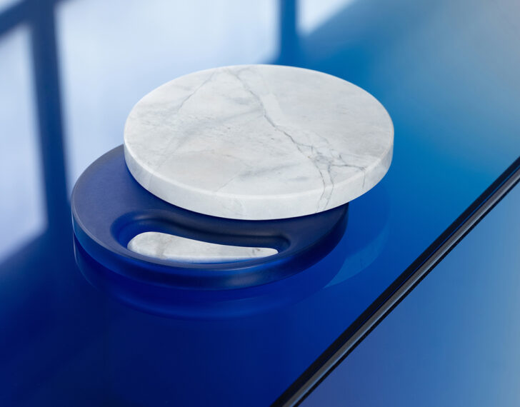
Are you experimenting with any other materials at the moment?
First, obviously we all have this huge responsibility to be aware of what we’re working with, and resin is not an amazing material, other than what you can create with it. But the more of the material we order, the more of a voice we’ve been able to have with the supplier on what we can demand from it. We’re up to 40% recycled polyester in our resin, so almost half of it comes from a non-virgin source. Then, in parallel to our work with glass and resin, we’re also investigating all sorts of other materials. Mycelium is super interesting, especially the degree to which you can get away from the aesthetic it has now. The designs that currently use mycelium I don’t get too excited about; where else can you take it? As a designer that’s my role. It’s constant research and trying to push it further until you do get a good result. Mycelium is just an example — there’s a ton of other stuff we’re trying things out with.
What other projects are you working on that you can tell us about?
I’m going to present new pieces at PAD London next month, and I’m definitely really into outdoor space at the moment. I have a public project in New Zealand that will be unveiled in February outside the National Museum in Wellington. Every two years a designer or artist presents pieces on these large plinths, and I’ve designed something that will stay there for two years, open to the public. It’s a little bit of a turn following the Ikea project, from mass-produced object design to the opposite: unique, site-specific artistic interventions in public spaces. ◆  This post was sponsored by La Prairie, but all thoughts and editorial content are our own. Like everything at Sight Unseen, our partner content is carefully curated to make sure it’s of the utmost relevance to our readers. Thank you for supporting the brands that support Sight Unseen.