04.05.26
The Weekly
Your new favorite lighting collection, right this way
Welcome to the new Sight Unseen, a weekly newsletter that delivers the best of the design world — news, trends, shopping advice, interviews, travel recs, and more — straight to your inbox. If you’re not subscribed, follow this link to sign up. Want to partner with us, advertise, or submit your work (guidelines here)? Email us at hello@sightunseen.com.
Murano Glass and Modernist Forms Meet in a New Collection by Blue Green Works
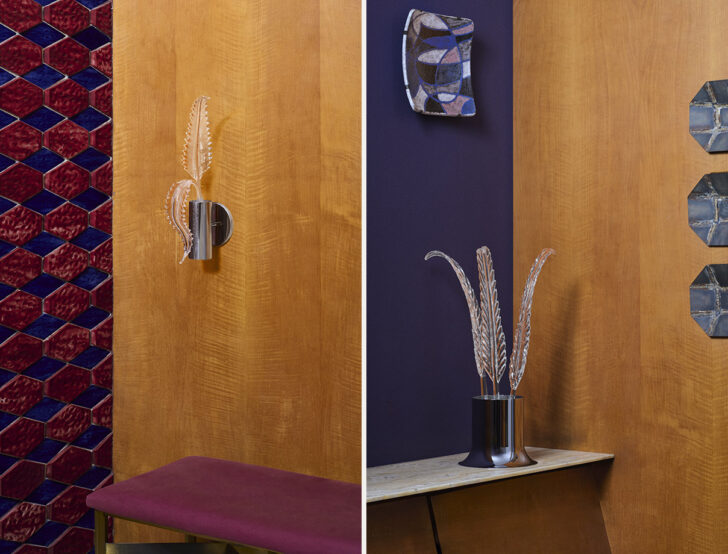
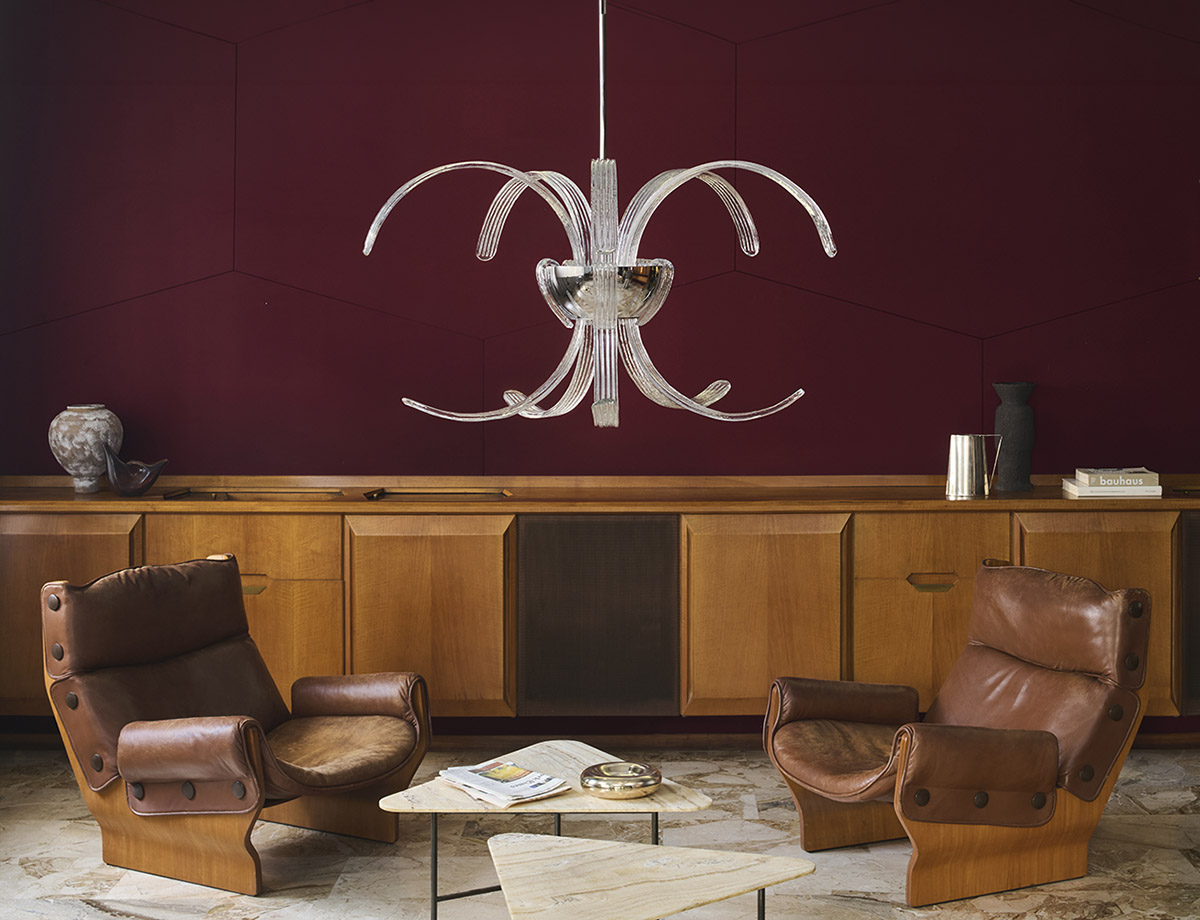
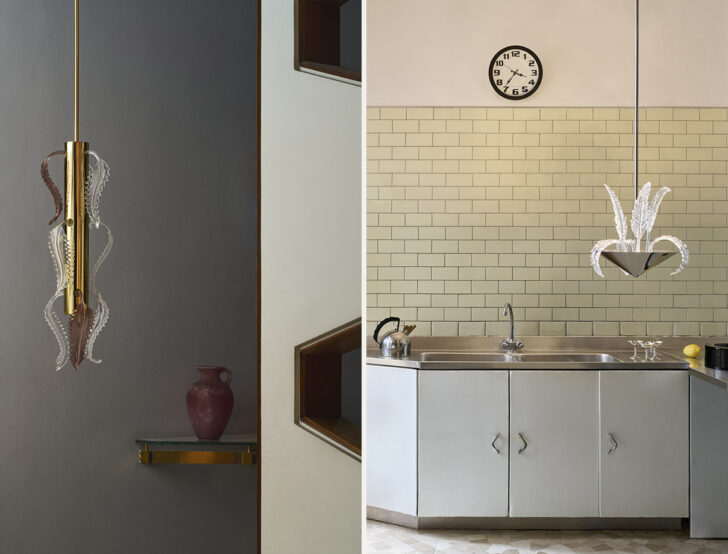 For his new Garden collection, Blue Green Works’ Peter Staples worked alongside Murano glass artisans for the first time. Photos: Paola Pansini
When Peter Staples released Palm, his first lighting collection under the studio name Blue Green Works, in the spring of 2021, it was an instant smash. Made from sheets of fused glass and inspired by a kind of beachy modernism — sea glass, palm trees, the cedar-plank architecture of the Fire Island Pines — the lights readily found a home in all kinds of places, including my own living room. Though Staples’ new Garden series also plays with floral visual motifs — its fern-like fronds are a more delicate version of Palm’s slabs — the new collection feels different from that first outing in every way but one: It, too, feels destined to become a classic.
With Garden, Staples worked for the first time in Italy alongside Murano glassblowers, using an iconic feather-and-leaf motif that’s more often seen in ornate chandeliers like this one. Over seven pieces, Staples pairs these Baroque petals with modernist elements in mirror-polished brass and steel, creating a delicious tension. But perhaps Garden’s biggest departure is what inspired it: Whereas earlier works called upon a rubric of visual references, Staples here turned inward, using what he calls the borrowed “emotional vocabulary of another language” in the wake of his mother’s death. And yet even though the pieces are steeped in heartbreak, they appear to the casual observer as curious, even exuberant. In one resplendent chandelier, clear petals erupt from a central core, like the fountains in Miss Piggy’s fantasy. In another, petals bend and nod along a central axis, like workers having lunch atop a skyscraper. (The filmic references may not be coincidental; Staples studied cinematography as an undergrad.) But perhaps none of this is surprising, because Staples’s truest talent as a designer is his ability to channel a bounty of highly personal references — from tattoos to queer beach communities to his own private grief — into a fixture that’s evocative but not cliché, allusive but never nostalgic, and pleasing to damn near anyone.
A Birdhouse Exhibition in Brussels Asks “What Makes a Home?”
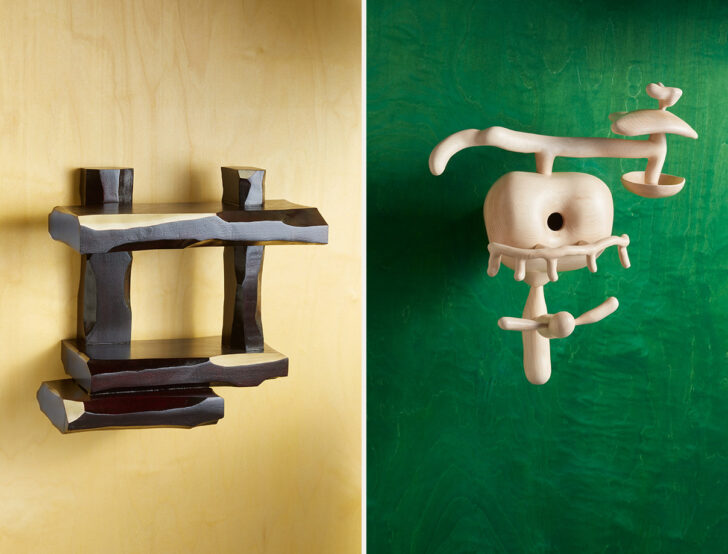
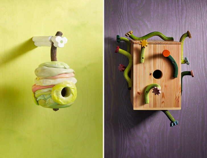
Selections from the birdhouse exhibition at MAD Brussels include Linde Freya Tangelder and Audrey Large (top) and James Shaw and Studio Hanna Whitehead (bottom). Photos: Sam Gilbert
In recent years, there have been countless object-specific exhibitions devoted to things like ashtrays, paperweights, hooks, and candleholders — even one, at the Brooklyn Botanic Garden, of site-specific birdhouses. However, none of that prevents us from taking extreme delight in Home Sweet Home, a new birdhouse show at MAD Brussels, curated by Swiss designer Connie Hüsser. In addition to showcasing what these sorts of exhibitions usually do — i.e. the varied talents and identities of its participating designers — Home Sweet Home explores the very idea of a dwelling place, using the perches of our tiniest creatures to extrapolate meaning. “What does ‘home’ mean today? And for whom does it truly exist?” the exhibition asks. “In uncertain times… a home is more than a physical place; it is a refuge, a space of safety, identity, and care.”
It is also extremely cute. Hüsser asked 75 designers to take part, and the birdhouses on view include a beehive-shaped, extruded-plastic cone by James Shaw; a series of ledges made from gouged and lacquered tulipwood by Linde Freya Tangelder; and an Addams Family–style goth house in black moiré fabric by Jenna Kaës. Some designers were more literally houselike in their contributions; Philippe Malouin made a roofed vessel highlighting the beauty of endgrain, while Julien Renault and Levi Dethier offered a corrugated aluminum structure that recalls a temporary shelter. Others were more conceptual. In Rein Reitsma’s trio of boomerang-shaped structures made from woven climbing rope, a circular central void is the only nod to its intended use. Shishi San’s birdhouse is essentially a textile teapot. And Adrianus Kundert wove a house from gift ribbons, curled into ringlets on top — just the thing to attract little magpies. And speaking of care, though Swedish designer Simon Klenell made his birdhouse in glass, a gridded “brick” pattern would prevent creatures from ever smashing into its walls, confused. On view until April 25.
Kalon’s New Pieces Are a Subtly Chic Take on a Classic
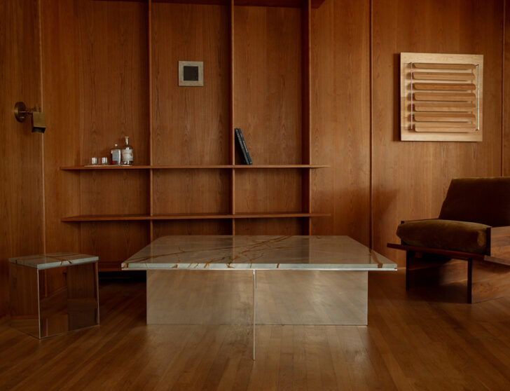
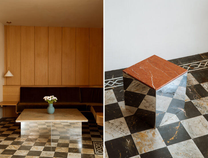
Kalon’s Material Studies II series re-envisions a beloved collection in mirrored aluminum and richly pigmented stone.
In most designers’ practices, there is the fanfare of a collection release and then a period of retrenching, where the designer can explore new themes, new references, and new forms. But the LA-based studio Kalon works differently. Their new works often revisit existing ones; they’ll keep the essential DNA of a piece while exploring the way different materials can reshape perception. “There’s constant pressure in our industry to introduce [novelty],” says Michaele Simmering, co-founder of Kalon. “We’re more interested in whether a form can endure — whether it can move through different spaces, contexts, and cultural moments and still hold its integrity.”
Kalon’s latest example of this methodology comes via their Material Studies II collection, which launched last week and includes a coffee table, bench, and stools. The new collection is based on the forms of their solid timber Cube + Void series, but here the pieces are reconceived in mirrored aluminum and gorgeously veined quartzite and marble. But rather than simply sub in new materials, Simmering and her partner Johann Pauwen redesigned the pieces in response to them. In a new materials palette, the pieces could be slimmer and more delicate; more Bauhausian and less Arts & Crafts-y; more aware of how they play off of one another, with a knowing wink at their past. In this way, Kalon’s methods remind me of the kind of spiral curriculum that’s popular in today’s progressive schools (as well as programs like Duolingo!). But they also remind me of what’s happening at a brand like Chanel right now, with Matthieu Blazy remaking the classic Coco suit using elements like ribbed knits, chains, and iridescence. Proving that best brands know that the way to move forward is by always keeping an eye on the past.
A French Architect’s Furniture Pieces Were Once Incredibly Scarce. A New Series of Editions Seeks to Change That.
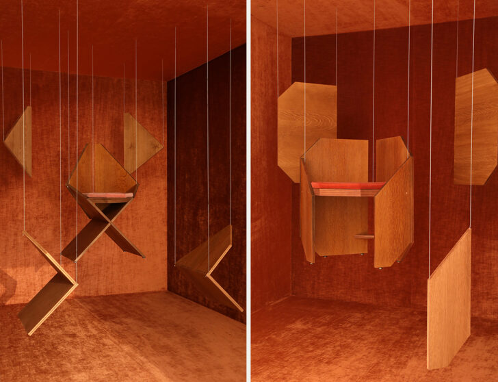
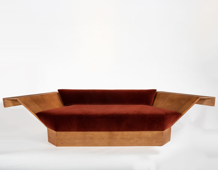
A new series of editions, by Magen H Gallery in collaboration with the estate of Hervé Baley, is on view in New York.
I had never heard of the French architect and designer Hervé Baley before sitting down to write this story, but it turns out there’s a good reason for that. Though Baley — who rejected his countryman Le Corbusier’s thinking in favor of Frank Lloyd Wright’s more organic principles — realized around 20 houses and buildings in France at the height of his career, the majority of his furniture pieces were often specific to the projects for which they were built. As a result, the 120 or so works he designed in the mid- to late-20th century suffer from an incredible scarcity in the market.
A new series of editions, launched by Magen H Gallery in New York in collaboration with the late artist’s estate, seeks to change that. On view this month at the Greenwich Village gallery is a selection of 14 pieces, all faithfully reconstructed in plywood from Baley’s original drawings, models, and archives; no new stylistic flourishes were introduced. And why should they be? The new editions are not only kinda perfect as-is — a favorite is the sofa whose arms stretch out like wings — but one look at these images and it’s clear that Baley’s designs have been a low-key inspiring today’s generation of French interior designers for years. Baley was concerned with how his works would function in harmony with the space they were in, but it turns out they could be universally appealing as well. A rich scenography by Alban Roger — where the individual panels that make up a chair are hung from strings like marionettes inside a diorama — completes the exhibition. On view through April 24.
Editor’s List
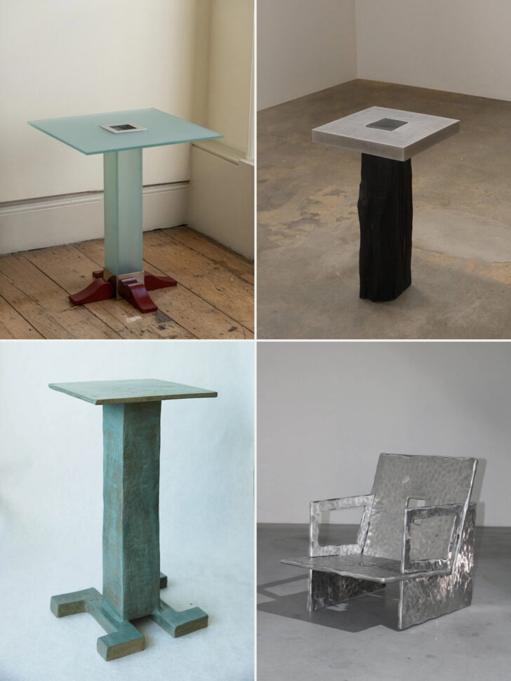
CLOCKWISE, FROM TOP LEFT:
–
Today’s Editor’s List is a kind of Exquisite Corpse of a few different themes I’ve long cherished or recently realized I’m drawn to — square side tables, voids, inset materials, tiny feet, and silvery metals among them. It started, unsurprisingly, with one of my favorite designers, EJR Barnes, who recently released not only this sweet glass table on balletic red feet but also a pearwood club chair perched on silver croissant paws.
–
The Klaebe table by Australian design studio Saturday Yard Work is made from green timber sourced from local arborists paired with cast aluminum. In some pieces the aluminum has a rougher, more jagged quality, but I prefer this table with the more organic base paired with a highly geometric top.
–
This chair with a hollow square in its back debuted at Collectible last month with Unveiled Collective, a group of nine interior design graduates from the LUCA School of Arts Ghent and Brussels. Designed by Louisa Moerman, it’s made from four cast-aluminum plates that slot into each other, no joinery or welds needed.
–
Lastly is this gorgeous aqua stoneware table on flared feet by Lápiz Objects, the artistic practice of Izaid Barr, a psychologist and artist originally from Mexico, who now lives and works in Los Angeles. The glazing on her Monolito ceramic table, which I originally spied on the site of Hammer & Spear, is chef’s kiss.
News
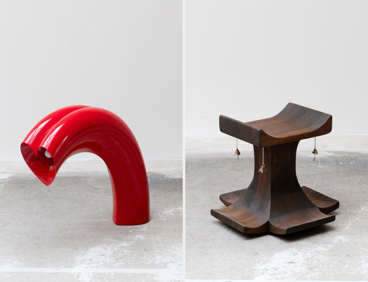
Works by Kimy Grignoire and Emily Thurman at St. Vincents in Antwerp. Photos: Eline Willaert
–
Through April 18 at St Vincents in Antwerp is Meet Me in the Middle, an exhibition of seven female designers focusing on the intersection of jewelry and furniture; it is “not a show about adornment, but about transference: how jewelry’s enduring value can mutate when untethered from the body and amplified into space.” This means things like Madeline Coven’s tables with pewter inlay; a wooden rocking chair by Emily Thurman, hung with dangling, earring-like bells; Hannah Kuhlmann’s flared metal lights; and Kimy Grignoire’s bent, heart-shaped lights, resembling nothing so much as half of a Best Friends necklace.
–
There’s a decent afternoon to be had if you’re in the area of New York’s Greenwich Village this month for that Magen H exhibition (above). Stop by Demisch Denant, too, where there’s an exhibition of postwar metal works on view until April 25. (I particularly love this leatherette chair on coiled springs.)
–
Everything about American airports has been terrible this year, but one bright spot is the Sean Gerstley installation at Philadelphia’s Terminal A. Curated by Helen Cahng and presented by Superhouse, Immediate Earth showcases Gerstley’s pinched, colorful work in ceramic — gashed vessels, tiled credenzas, and totemic lamps among them. On view through April 8.