03.29.13
Studio Visit
Nick Van Woert, Artist
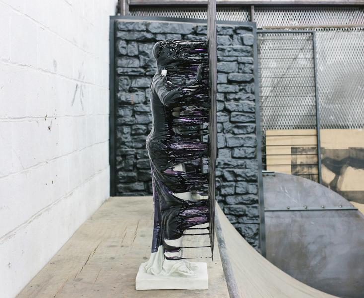
Visit Nick van Woert’s massive studio in Greenpoint, and in all likelihood you’ll find a cluster of white people standing in a corner, naked and clutching each others’ butts — these artificial neo-classical statues have been a recurring theme in the Nevada-born artist’s work since shortly after he began his career in earnest in 2006. Many of them get tipped over and enveloped in a cascade of colored resin that hardens in mid-drip; in one series, he hollowed out their midsections and let the wind give them garbage guts. “It was like a little trap, and the wind would blow weird shit in there that accumulated outside my studio,” van Woert says. “Anything from Doritos bags to Monster Energy drink cans. The DNA of the world outside.” It was his most literal manifestation of the mantra that drives most of his practice: You are what you eat.