11.02.09
Current Obsession
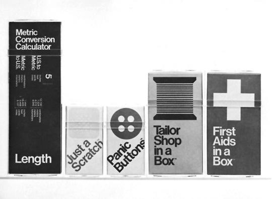
In a Box by Swatek Romanoff
There are more than 20,000 instances of great graphic design housed in the AIGA’s online archives , but for every Pushpin or Chiat\Day, there’s a Swatek Romanoff — a firm that churned out loads of wonderful work in its ’70s/’80s heyday but that isn’t the subject of much chatter among today’s design circles. When we were first putting together ideas for this site, it was Randall Swatek and David Romanoff’s whimsical 1979 “In a Box” series that inspired this column. In the total obviousness of the copy, it seemed a funny precursor to this year’s “help” line of products, and in its styling — the Helvetica, the plastic boxes we used as kids to store small school supplies — it seemed totally timeless. Late this summer, I tracked down Randall Swatek, who works now as a creative director in Wilton, Connecticut, and who seemed, judging by the peals of laughter that interrupted our conversation, totally tickled to receive the call.
Tell me a little bit about Swatek Romanoff.
David Romanoff is and was a brilliant package designer. His touch was very Swiss, very simple. But of course he’s not Swiss. He’s from Ohio. We actually met through the AIGA. David had gone to Pratt and was 10 years older than I was. I was literally just out of school, 26 or 27. We first worked out of a loft on 29th Street, and then later moved to lower 5th Avenue. We were a busy shop, but a small shop by choice.
Where did the idea for the box series come from?
I think we were just fascinated by that clear little Lucite box. The package was so perfect that we had to put something on it. The boxes came in a multitude of sizes, and they were styrene, which made them brilliantly clear, almost jewel-like. At the time, they came tinted as well but we liked the crystal one. We printed a little die-cut sleeve and dropped it into the box. We always left one panel open so the consumer could see what the product was inside. We did dozens of them.
What I loved about those boxes is that they were basically a typographic solution. Vector art and Helvetica. We used to laugh — we had IBM as a client for many years, and we’d get these type specimen books with hundreds of different faces. And we were like, “What do we need these for?” We used Helvetica and we used Times Roman and that was it.
What’s Panic Buttons?
Panic Buttons was a sewing kit. The one marked Length was a conversion kit. There was a huge push around that time for America to switch to the metric system, and we thought that’s something people would need! We had one in the series, called Jacks in a Box, which ended up winning a Clio. This was a project we had done for ourselves! We didn’t want to spend any money at all, so we bought stock styrene and customized it with a printed insert. I think it was only one-color printing — two-color when we got crazy. We were the client and the design team all in one. We were up against packaging giants who had spent millions.
Did the boxes represent any sort of zeitgeist in terms of what was happening in design at the time?
I think in terms of reference points, we both loved Paul Rand, who had the classical European influence of the grid system and a great respect for typography and was creating such a point of view for IBM at the time. And we loved Milton Glaser. We both took his class when we were working together to keep things fresh and fun. He’s just a wacky genius. We realized when you’re playful in your language and you’re simple in your design, it’s charming and appealing to people, for years to come.