11.12.14
Sighted
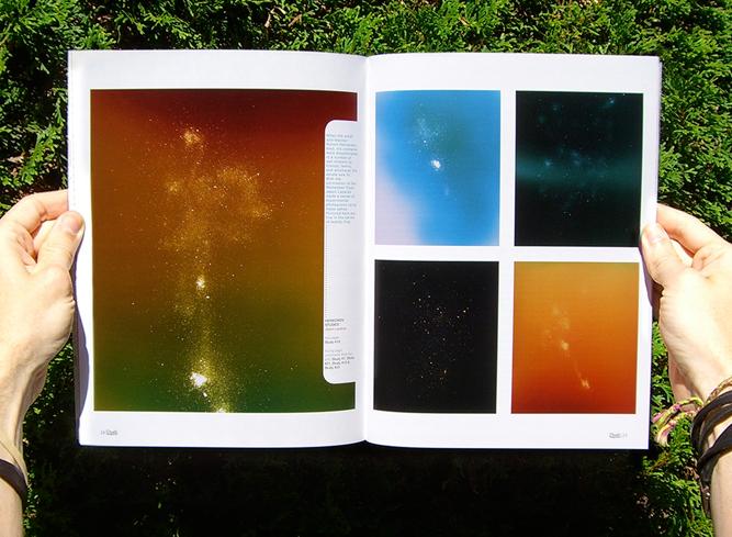
Marten Elder in 01 Magazine
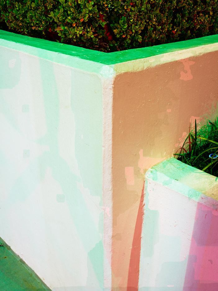
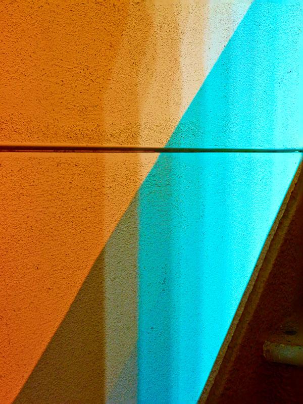
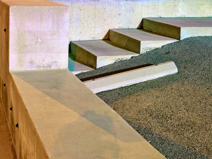
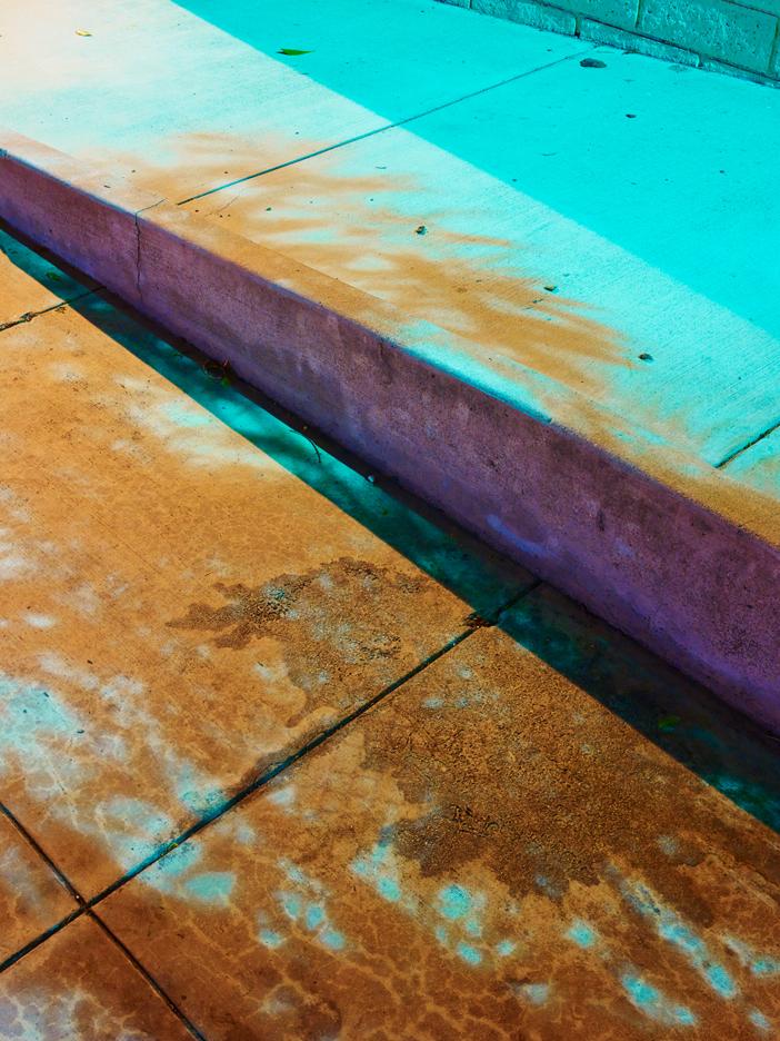
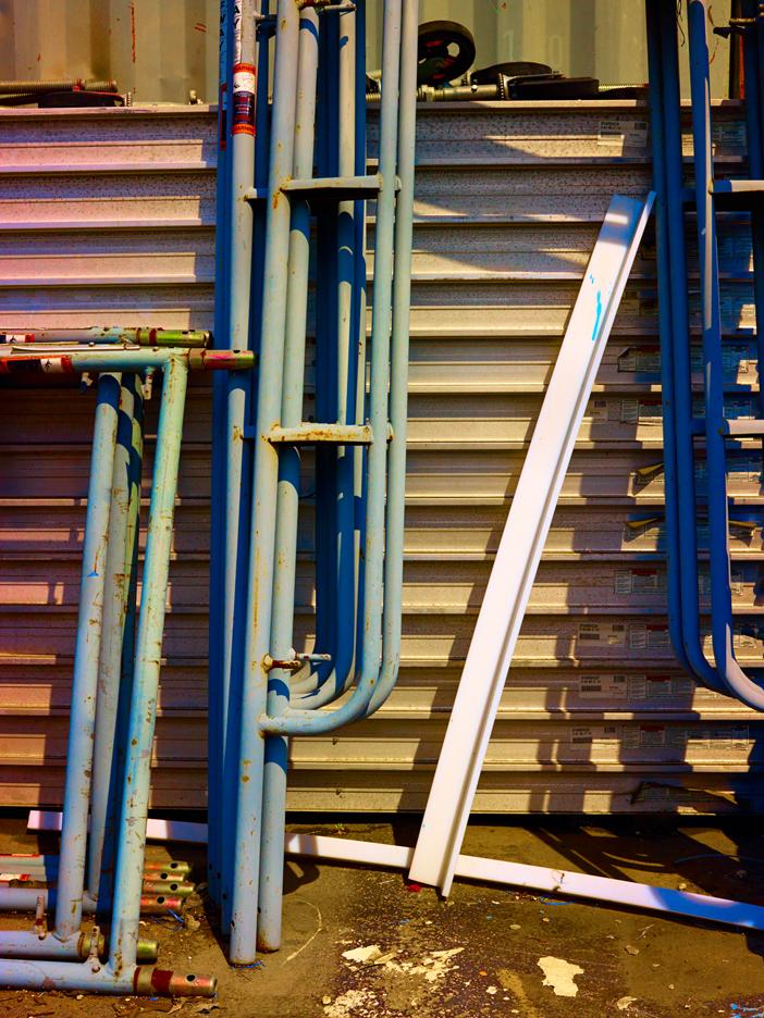
Sometimes you have to laugh at your own predictability. It was love at first sight when I first saw these images of Los Angeles photographer Marten Elder‘s work in the fantastic new issue of 01 Magazine (which also features SU faves like Oeuffice and Doug Johnston). But when I began to read the article, it became immediately clear to me why: Elder studied at Bard College, where his senior project advisor was Stephen Shore, another visual fascination of mine. But while Elder’s older work is more like Shore’s in its exquisitely faithful representation of a banal reality, his newer work represents a more color-saturated view of those equally ordinary vistas (a concrete street corner, a stack of scaffolding.) The accompanying interview is great, so we’re excerpted part of it, as well as our favorite images, here. Go to 01’s current issue for the full article, then visit Elder’s website for even more images.
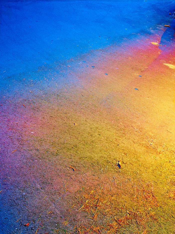
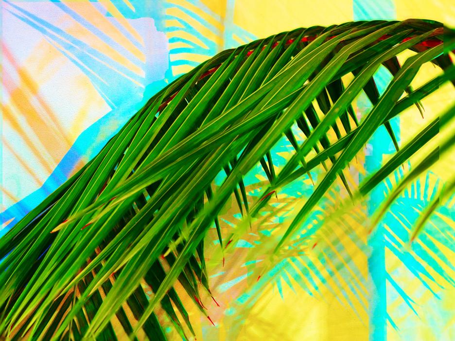
Los Angeles based artist Marten Elder creates photographs containing seductive, brilliant colours that, at first glance, mask the essentially documentary nature of his work. Elder’s images capture the city he lives in and the ordinary objects that surround him in striking hues, however they are primarily rigorous formal explorations of composition and depth of field, photographic problems he encounters in translating a three-dimensional world onto a two-dimensional image. Elder graduated with a BFA in 2008 from Bard College, Annandale-on-Hudson and received an MFA from University of California, Los Angeles in 2013. Solo exhibitions of his work are planned at Tif Sigfrids, Los Angeles, and Equinox Gallery, Vancouver, both upcoming in the spring of 2015. We caught up with Elder to ask him a few questions about his practice.
Interview by Emmy Lee Wall
Photographs courtesy of Marten Elder
Emmy Lee Wall: Your earlier photographs made while a student at Bard College appear more “traditional” focusing on composition and exploring depth of field. Your more recent work, shot in Los Angeles, appears quite different but in many ways is a continuation of your earlier concerns. Can you tell us a bit about your move from New York to Los Angeles and the way your work developed and changed over this time?
Marten Elder: Towards the end of my time at Bard I was working with Stephen Shore as my senior project advisor and he presented a set of visual problems that were related to the pictures I was making. The one that most interested me was related to photographic transformation of the world: how do you take the three-dimensional world and compress it onto a two-dimensional plane? For my undergraduate thesis project I would seek out the most complicated three-dimensional spaces possible and attempt to make sense of them through photographic transformation.
When I moved to New York after graduation I started working on new projects, but formally, I was still dealing with the same problem of spatial compression. Eventually I felt like I became really good at making pictures in this way, but it was no longer satisfying. I had arrived at what I thought of at the time as the solution to the problem, but I didn’t know what to do next.
I applied to UCLA, moved to Los Angeles, and switched from my 4×5 view camera and color film to a medium format digital camera. I then started to use some of the same techniques and logic I had developed before, but in reverse, to make something different. Instead of treating the photograph as a window into the world and attempting to extend pictorial illusion, I started making compositions that were intentionally flat. It was the same basic logic used to look at the world, but for reverse effect. Then I started to allow myself to break other rules, which led to the focus composites and the wide spectrum of colors rendered.
So, now you’re working to intentionally draw attention to the two-dimensionality of the picture plane, essentially acknowledging that the pictorial depth in a photograph is an illusion? Your response makes me think of what modernist painters in the early part of the 20th Century were doing, moving away from a representational mode of painting.
There are similarities to the way painters responded to this idea, but the big difference for me is that the pictures I am making contain only information the camera captures from the world. Although some of the compositions are more abstract than others, and there is (necessarily) interpretation of data, the final product is entirely made out of facts captured by the camera in the world.
Perhaps one of the most striking elements of your recent series is the tonal range it encompasses. The colours appear entirely manipulated and unnatural but as you say they are “facts captured by the camera in the world.” Can you describe your process in creating these works?
The color is all color as it exists in the real world, in the same relative relationship to one another, but mapped to the entire spectrum of what the digital camera captures and what the print can reproduce.
The default settings in the software that is used to process files from digital cameras are designed to make a digital photograph look like a photograph captured on film. But film couldn’t see details in shadows and in highlights at the same time the way the human eye can. It also couldn’t differentiate between subtly different colors very well (especially the color red). Film was the best we could do at the time and it was a convincing interpretation of the world, but it didn’t look like the world. There is so much more information that can be captured and I am maximising the use of the data that this new type of camera can produce, instead of forcing it to imitate an obsolete technology.
The most common example of this is a shadow on a sunny day with a clear sky. The sun is projecting an extremely bright, relatively neutral, white light onto say, a sidewalk. An object blocks the path of that direct sunlight, creating a shadow. Most people see that shadow as just a darker shade of the sidewalk, but it is also relatively bluer because a higher percentage of the light being reflected off of it is from the blue sky. This type of subtle coloring of the world happens everywhere, but we are not sensitized to it.
In some ways, would you say your photographs from this series are part of the documentary tradition? I was thinking that your images are not “staged” and they aren’t about a “decisive moment” and they are actually images of the real world so despite their surreal appearance, they are actually kind of documentary photographs!
Yes, I think they could be considered part of the documentary tradition. Maybe they don’t look like the real world or “accurate,” and they aren’t intended to be photojournalistic or reportage in any sense. I am not invested in the content at all (though the pictures can and do benefit from their content). But they are almost entirely products of an analytic process. I am going out into the world and capturing information. In fact, I am capturing and reproducing more information about light and color than the vast majority of photographs. Maybe I want to use Walker Evan’s term “documentary style”, but then they don’t really look like documentary photographs in the traditional sense. I am using real information from the world to make a picture.
It’s interesting that you say you’re not invested in the content. The images in your recent series are of sidewalks, stairwells, and concrete, as well as some vegetation like palm trees that, for me, really evoke urban Los Angeles, where you are based. Is this not intentional?
My primary interest in subject matter is based on what it lets me do photographically. It is raw material to be used in the making of a picture. The neutral grey color of concrete allows it to reflect every other color, which is what makes it a good subject for me to photograph. Plants are great, but it is the way their leaves overlap in space as well as move in time that makes them interesting to photograph. I am photographing Los Angeles, so it makes sense that the photographs will look like Los Angeles, and the pictures probably benefit from that fact. I am just making use of ubiquitous subject matter where I happen to be. I am not interested in photographic treasure hunting. I really believe that it is possible to make a picture of anything, so there is no reason to go out and find subject that is not convenient to access.
Can you tell us whose work you currently find exciting? Are you inspired by any other artists at the moment?
No one’s work is more exciting to me than my friends and classmates from when I was at UCLA: Catharine Ahearn, Lucas Blalock, Michael Cataldi, Heather Cleary, Owen Kydd, Sean Raspet, Calvin Marcus, Sean Raspet, and Katie Sinnott. Also Lee Friedlander’s work is still so good.
Go to 01’s website to read the article in full!