07.31.15
Up and Coming
L.A. Jewelry Designer Kathleen Whitaker
For the past few years, Kathleen Whitaker’s name has been practically synonymous with the ubiquitous gold dot and line earrings that are a staple in boutiques everywhere. But once you learn a thing or two about her biography — ceramics and Russian history studies at Tulane, job at the Met in New York, jobs in PR and financial services, night classes in jewelry making in LA — it becomes clear that evolution is her natural state. And so in addition to the minimalist metal studs that dominate her main line, she’s been quietly building up a parallel, more elevated collection that merges her signature geometric shapes with rough chunks of stones like opal and lapis. “Maybe I’m getting older and my tastes are more refined,” she muses. But she also attributes the shift in part to the economy: “I started my collection when the economy was down, making my jewelry smaller and smaller to make it more accessible. Now that we’re in a different place, there’s an opportunity to make things bigger again.”
The same could be said of her Los Angeles studio; she recently moved her office and workshop out of her Echo Park home and into 1,200 square feet of a 3,700 square-foot loft Downtown. “It feels so expansive,” she says. “It really changes your viewpoint and sparks imagination.” There, she’s not only developing the new collection but overhauling her branding and packaging — introducing lambskin envelopes and lucite boxes, a new website, and the first lookbooks she’s ever made. Amidst all this evolution, we figured it was a good time to check in with Whitaker and see what kinds of things were motivating her now. Read on for her answers.
PHOTOS BY STELLA BERKOFSKY
Kathleen Whitaker’s essential:
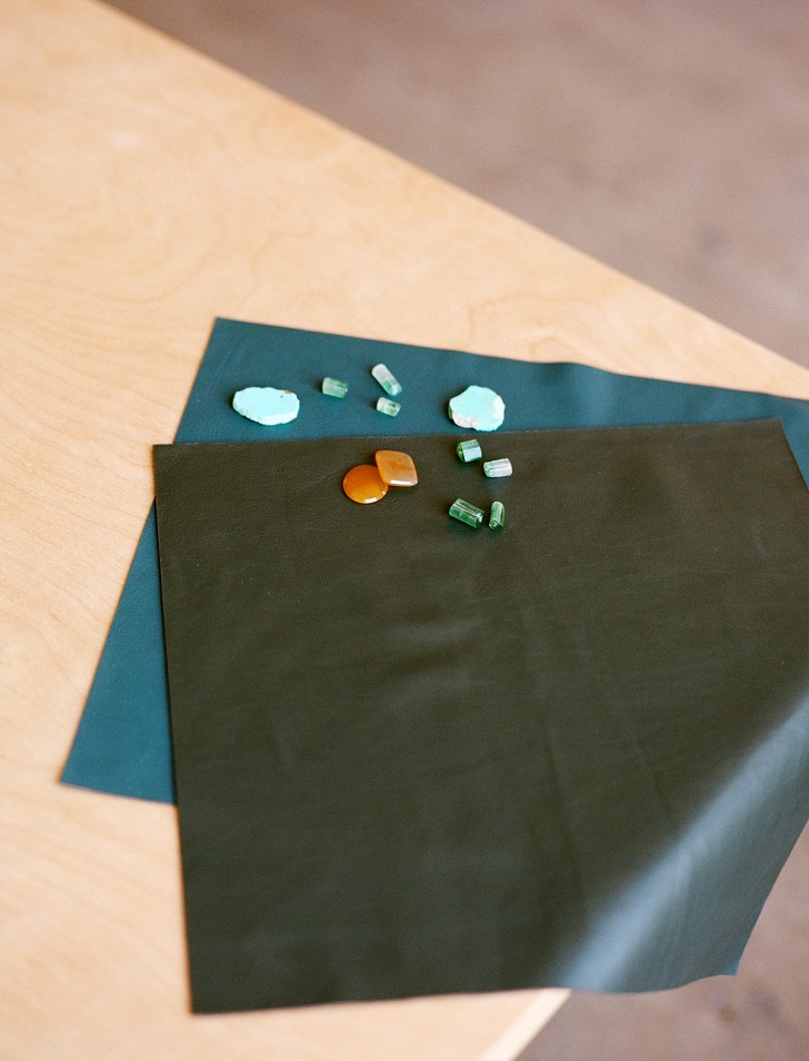
 Material
Semi-precious gemstones like Peruvian opal, Sleeping Beauty turquoise, chrysoprase, lapis, and carnelian. The newest collection of limited-edition and one-of-a-kind pieces uses this range of stones. The strong, opaque colors of these stones in rough, natural cuts set against simple, geometric gold forms makes a compelling contrast.
Studio soundtrack
Burning some Iggy Azalea lately. And for much less pop, I look to Garth Trinidad’s recommendations. From Kinshasa is Mbongwana Star’s debut album and is perfect summer (or anytime) listening.
Power snack
Ricola Herb Throat Drops. But if that doesn’t count as a snack, I’d say a Mast Brothers chocolate-dipped macaroon (not to be confused with the ubiquitous macaron) from Cookbook in Echo Park.
 Power accessory
Matthew Ready large bronze bangles — one a fat, rounded tube shape, the other with a center knife-edge. Future classics.
Museum
The Neue Galerie in New York, devoted to Germanic art, is just beautiful. Though I love its Cafe Sebarsky nearly as much as its exhibition halls. And Atelier Brancusi at the Pompidou is genius and requisite. But the place that feels most like home is The Metropolitan Museum of Art, where both my sister and I worked for many years, where I have such early memories and have spend hundreds of hours. It’s the tops. It’s interesting to see how these influences stay with you over years and are eventually translated and articulated.
 Color combination for 2015
Ochre yellow, a rich, deep green and a dark teal. With a tiny bit of oxblood. (Inspiration image from Kathleen’s Pinterest above.)
Website
Sight Unseen! I have been a fan for years for its discerning eye and singular aesthetic. I admire any entity or brand that works to differentiate itself, which Sight Unseen does so well! Several years ago, I remember seeing Sight Unseen’s piece on my pals Kristen and Shin of Iko Iko and thinking they’d made a high-water mark.
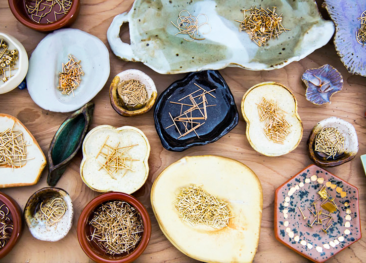
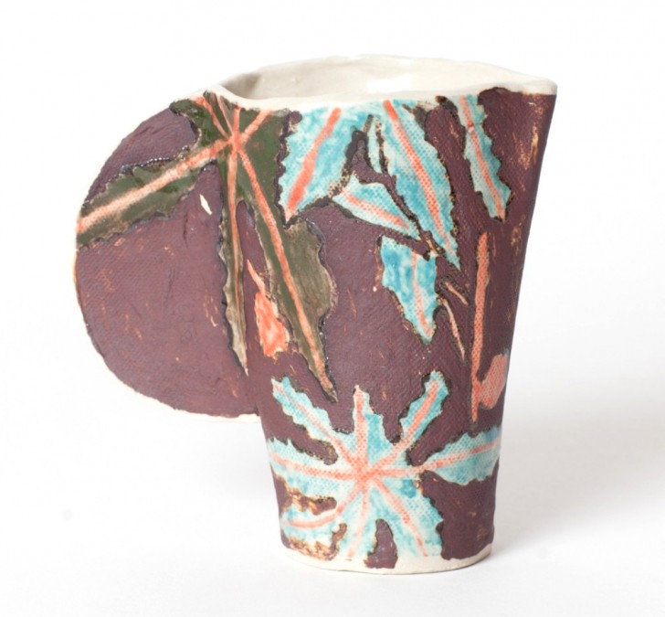 Ceramic technique
Hand built or pinched dishes. I hope to do a little collaboration with a friend and great artist, Rebekah Miles (her mug is pictured above), at some point this year in which I’ll build the forms and she’ll paint the surface decorations.
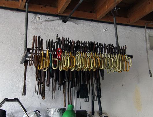
Studio tool
Brass sliding metric gauge for measuring, but I should switch to a digital read-out version for even more accuracy. Jewelry and ceramics alike require precise measuring and calculations.
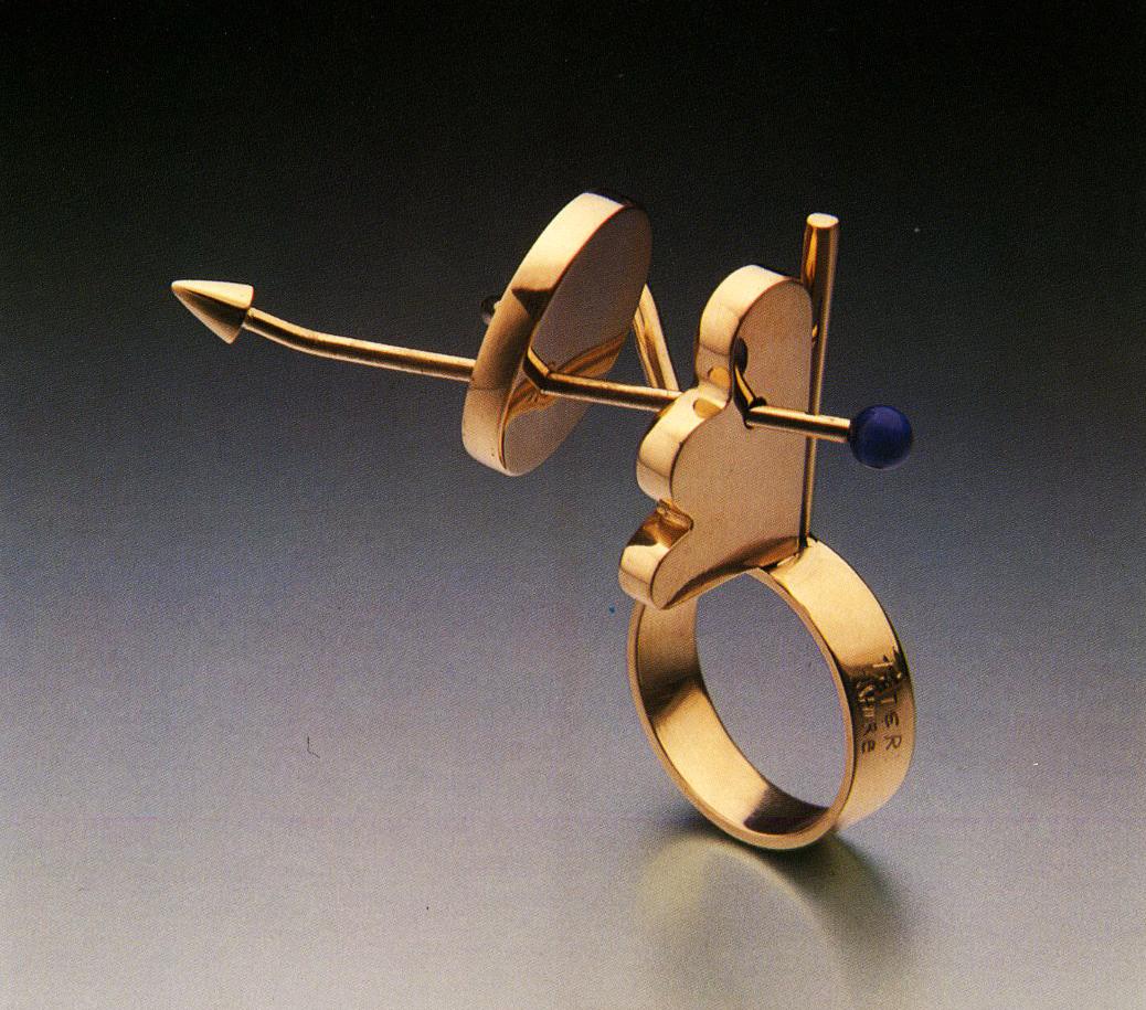
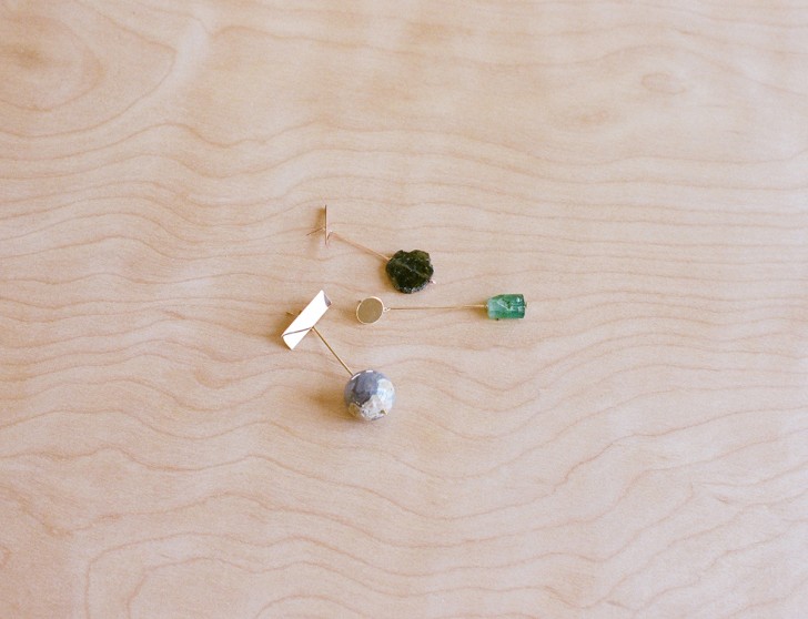
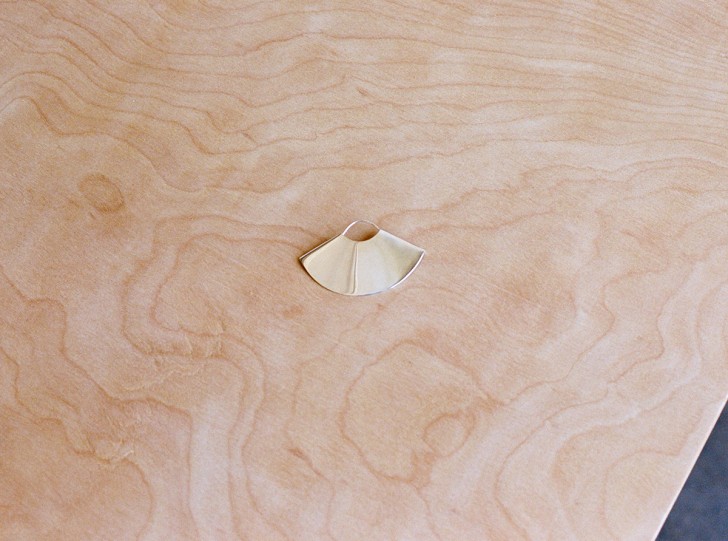 Shape
Shape
I had a conversation a few months ago with Azalea Lee of Place 8 about the Golden Mean, also called the Divine Proportion, which posits that the most satisfying, appealing, resolved shapes fall in the ratio of the Golden Mean. Fascinating to think that aesthetic success in design can be pinned to a number. In the course of the conversation, Azalea paid me the nicest compliment: that I needn’t pay close attention to the details of this principle, that it was already in my work (including the fan earring above) without my knowing or trying! So, I guess the shape of 2015 might be the rectangles that ascribe to this proportion.
L.A. boutique
Scout is stellar for easy, classic vintage pieces. Joey has great taste. He must have a direct line to the closets of the San Marino set.
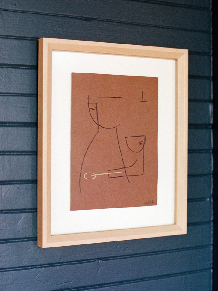 Artist or art movement
I saw Peter Plagens talk more than a decade ago about how Los Angeles was so freeing, expansive, and liberating for the working artist. And indeed, it makes for great art and artists: Calvin Marcus, Jay Stuckey, Lecia Dole-Recio, and Caitlin Lonegan are all doing it and doing it well. I also quite like the simple line drawings Ana Kras has been making (pictured, in Kathleen’s home).
Everyday object
A Postalco wallet. I chose it in red from South Willard and was later told red is good feng shui — you’ll keep your money!
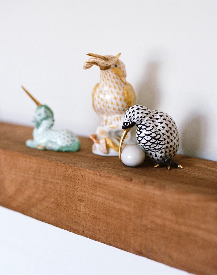 Collection
Handpainted ceramic figurines by Herend from Hungary. The signature fishnet pattern is so beautiful. And the subjects and forms are wonderful, from classic waterfowl to mythical and folk creatures. Those in our collection were gifts or inherited, so they have sentimental value in addition to being exquisite little house objects.
Supply store
Sav More leather and United Leather have huge selections. I’ve sourced from there for floor coverings, upholstery, and lambskin for our Kathleen Whitaker jewelry packaging.
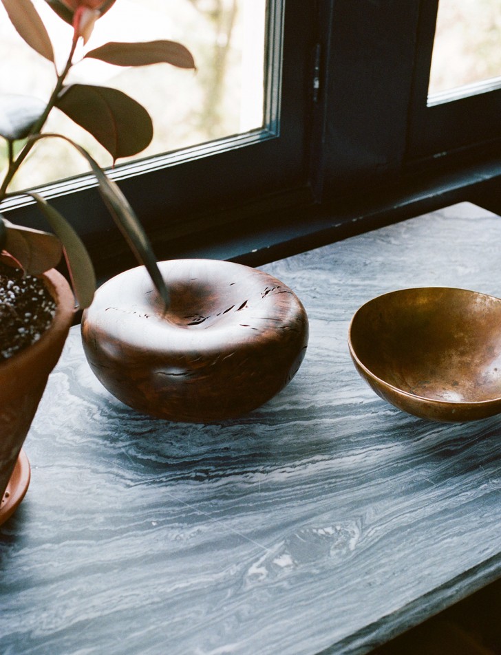 Desk object
Alma Allen bronze bowl.
Reference book
About a year ago when visiting the artist Justine Ashbee in the English countryside, she took me to Charleston House, one of the country homes of the Bloomsbury Group. It was so representative of its imaginative, raucous, complicated inhabitants — the use of color and pattern and repurposed, beautiful painted-over antiques. While the book (Charleston, A Bloomsbury House & Garden) does not do it justice, I often thumb through it to bring back happy memories and inspiration.
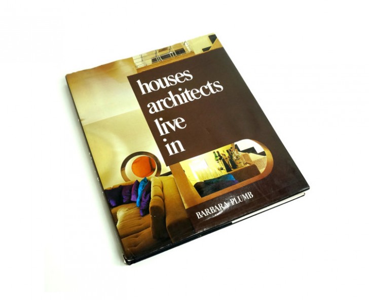 Instagram account
@ideabooksltd out of the UK has a great feed for those in search of rare zines and books on fashion, film, art, pop culture, and interiors. I believe they have a small outpost in London’s Dover Street Market. I particularly like their choices for interior design books: The Gentlemen’s Clubs of London, Houses Architects Live In, Tokyo Style.