10.26.15
Fair Report
At the 2015 Dutch Design Week
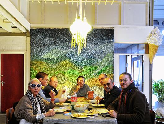
Every October, for 9 days, Dutch Design Week completely takes over Eindhoven, a city shaped by its industrial heritage. Buildings all over town are transformed: From derelict glass-blowing factories where Philips once manufactured lightbulbs, to gritty industrial estates on the outskirts, to shops and museums of all stripes, nearly everything becomes a backdrop for showcasing new design. At the center of it all is the revered Design Academy Eindhoven show, which is not only an important event for press, designers, and industry scouts, but also for locals, who seem to have an ingrained love of design. This year we visited that exhibition and dozens more in order to scout out our favorite projects from an event that consistently introduces top emerging talents into the European design scene. Here’s our guide to the names and projects to know from DDW 2015.
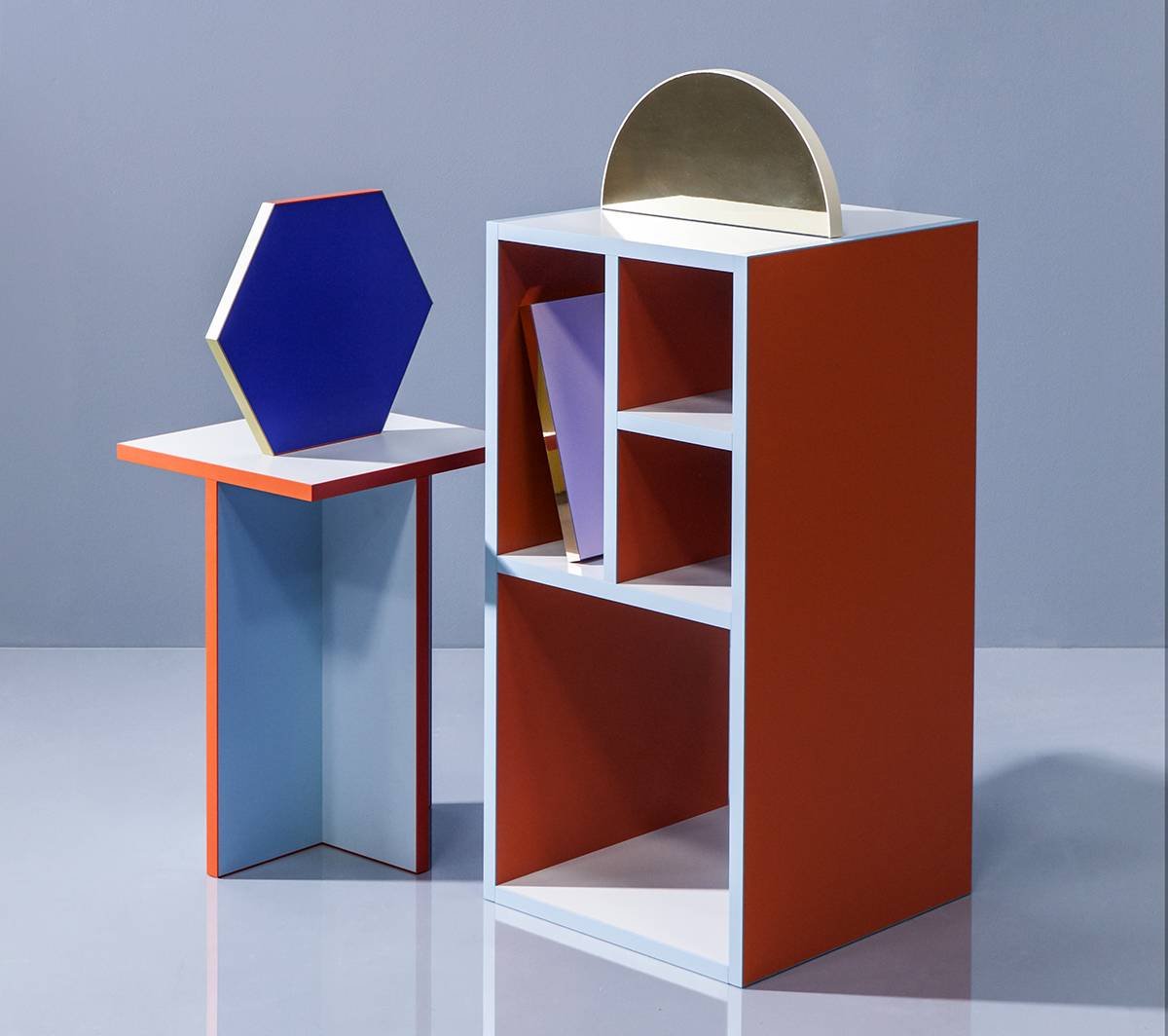
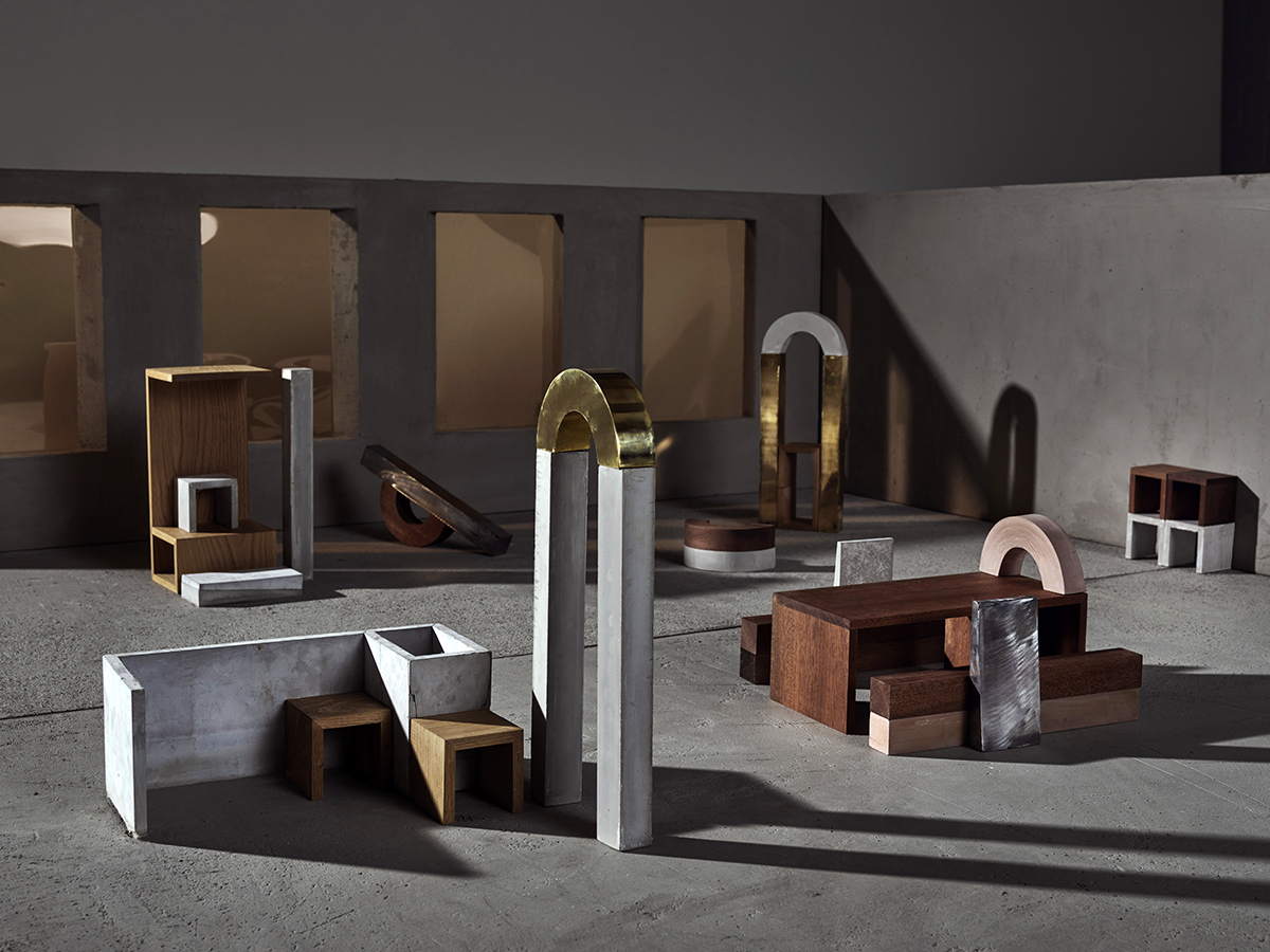
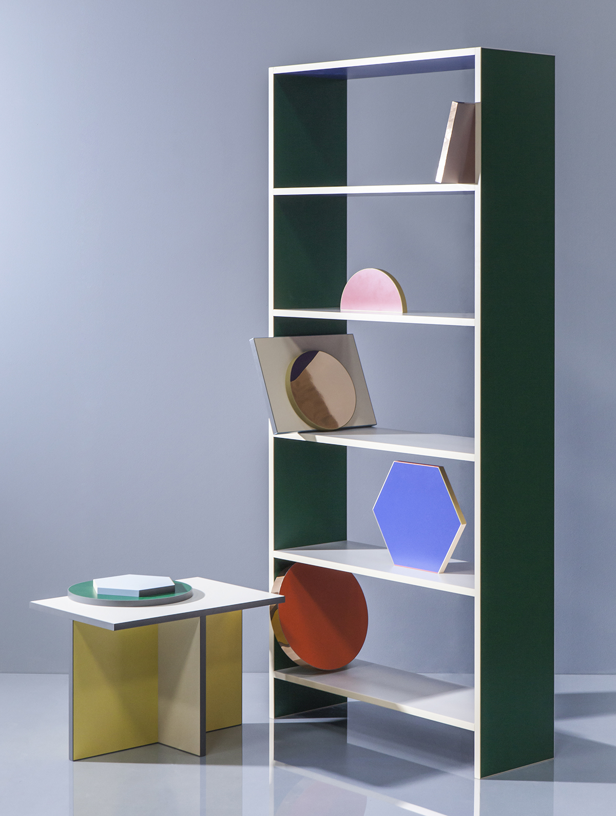 Baars Bloemhoff is a Dutch distributor for materials like color-core MDF, decorative laminates, and wood veneers. They asked 5 Dutch Designers to choose materials from their range to work with, and the resulting furniture proved to be a massive hit. Lex Pott chose to apply Abet Laminati (colored laminates) and Homapal (metallic laminates) to simple geometric forms. Each face and edge of the panel is clad with a different color, so that as you move around the piece you experience a different palette. (Photos, above and at top: Raw Color)
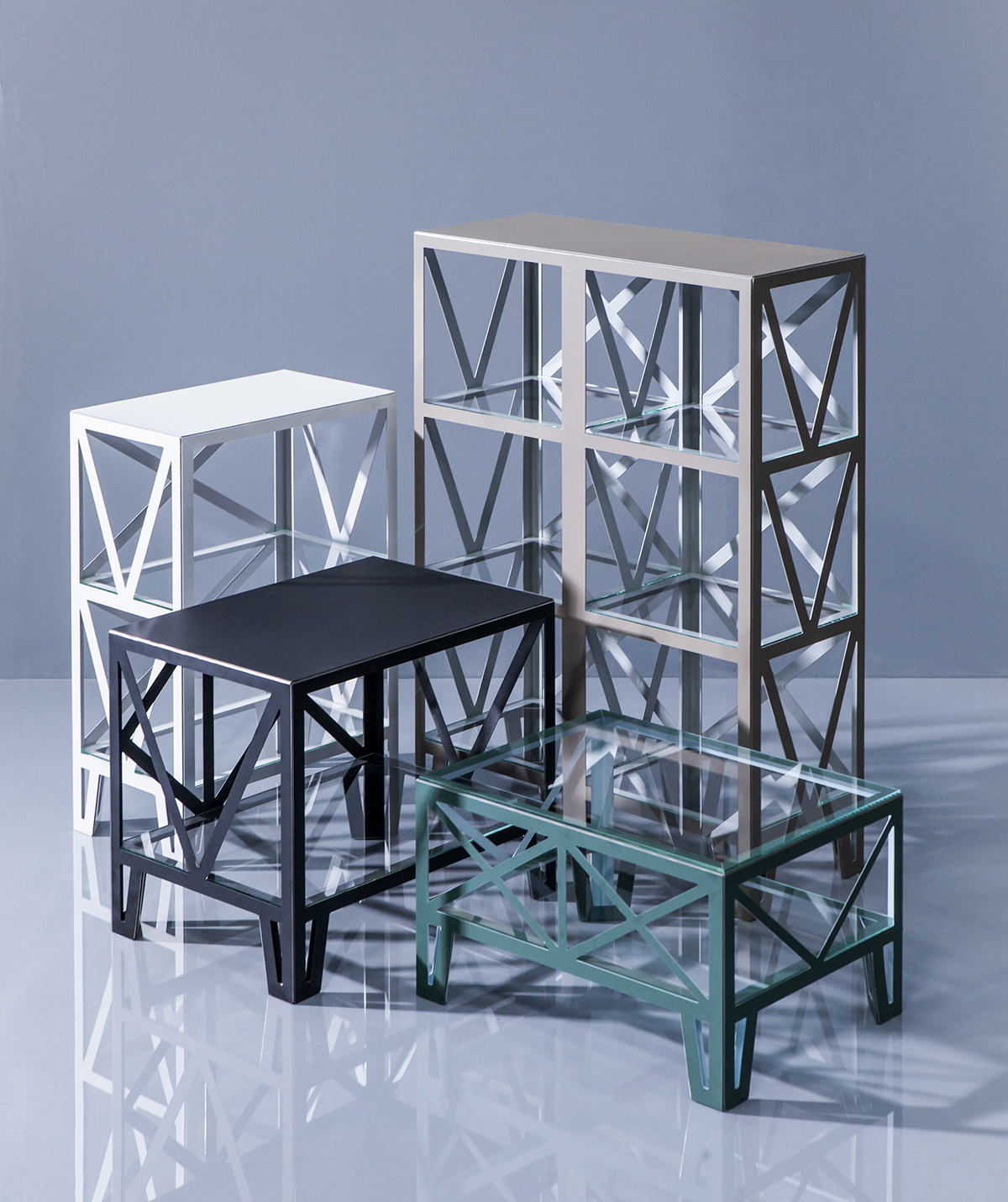 Michiel Martens used Homopal metal laminates, but instead of sticking them to a panel for sturdiness (which is how they are ordinarily used), he cut, scored, and folded the material, which is only 1mm thick, to produce a range of robust tables and cupboards. (Photo: Raw Color)
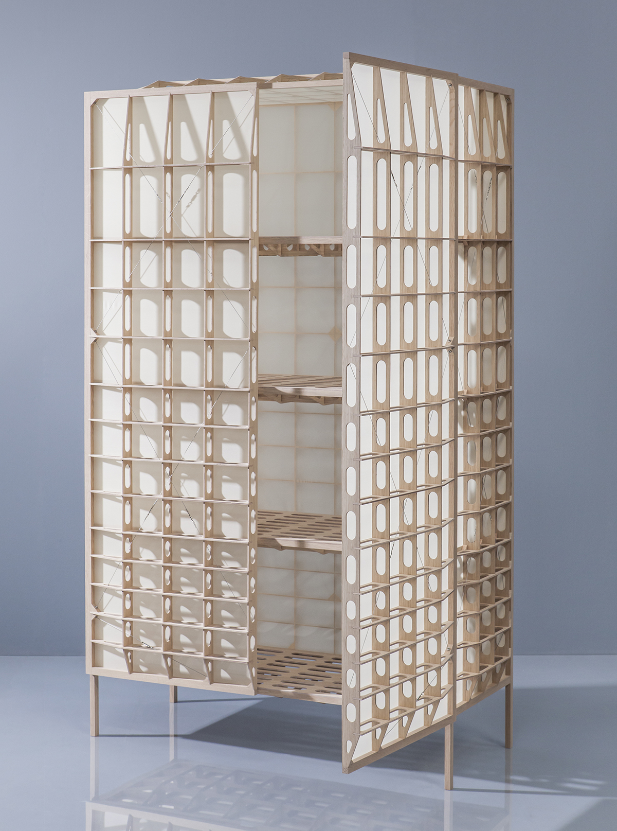 Also focusing on creating lightweight yet strong structures was Studio Mieke Meijer. Using oak veneer by Decospan, the firm created a wardrobe, supported by an exoskeleton inspired by the construction of airplane wings in the early 1900s. (Photo: Raw Color)
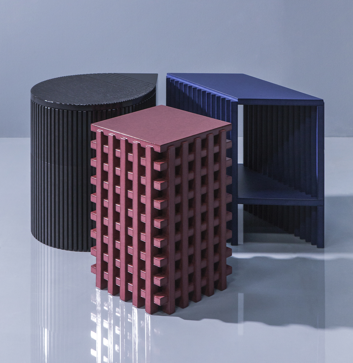 De Intuïtiefabriek took an everyday low-cost material and transformed it into a refined set of stools. Color-core MDF is routed, cut and shaped into these architectural forms, and the surface color is subtly intensified in graphic sections using glossy varnish. (Photo: Raw Color)
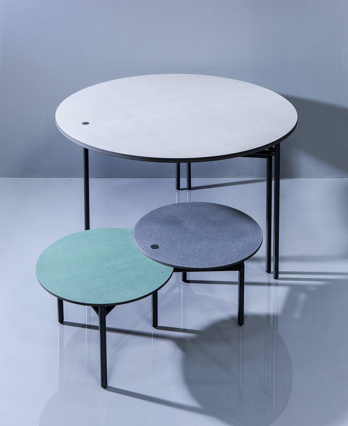 OS & OOS chose Alpi wood veneers to work with. Each table-top is reversible and can be rotated to adapt to different functions. These tables have been snapped up by Danish furniture brand Please Wait to be Seated.
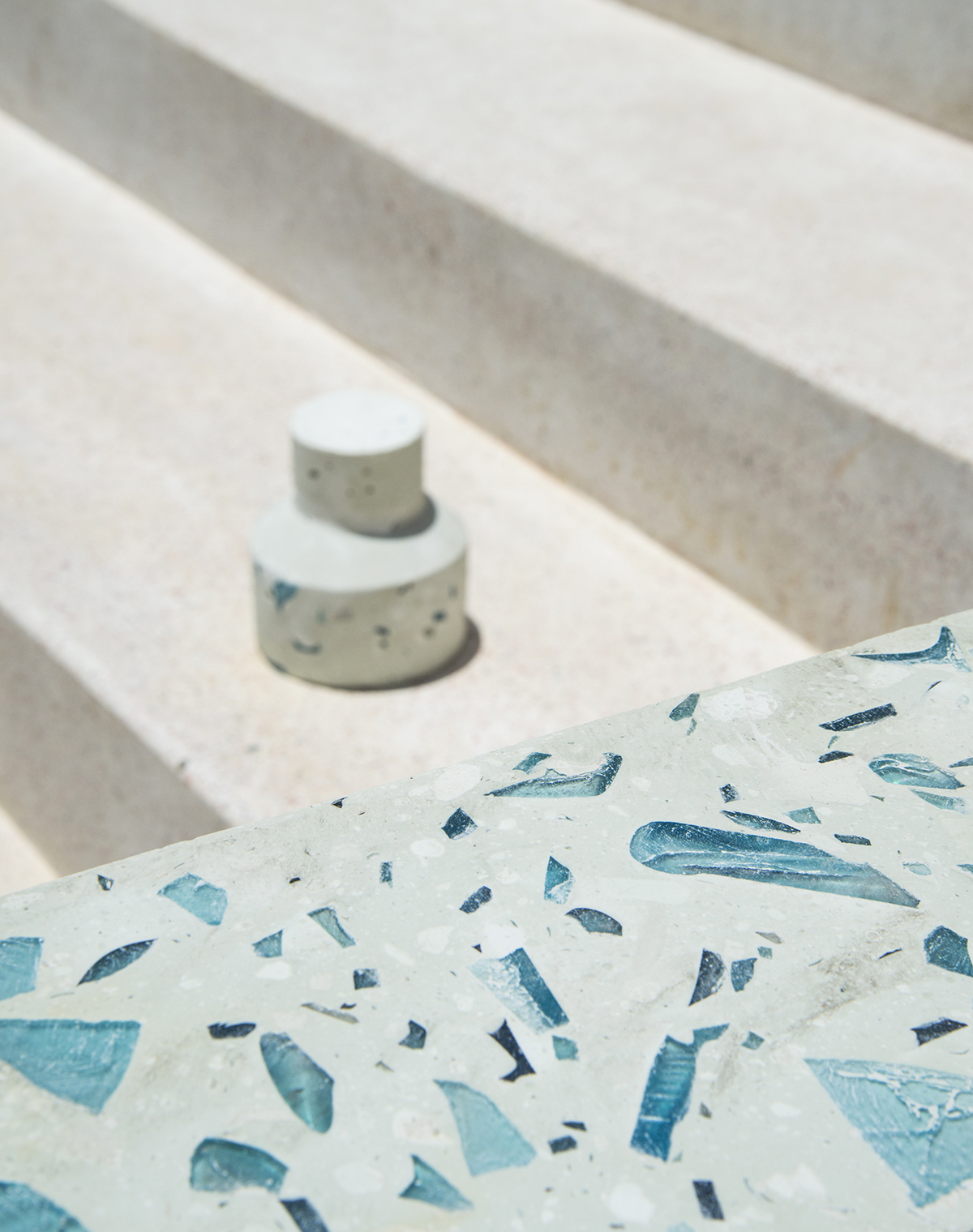 OS & OOS also worked on a separate project called Bottle-up, which attempts to find uses for old glass bottles on the island of Zanzibar. The bottles are brought to the island by tourists but the cost of shipping them away to be recycled is unaffordable. The team of designers worked with local people to develop products including an LED light diffuser, pots and this terrazzo-like surface material.
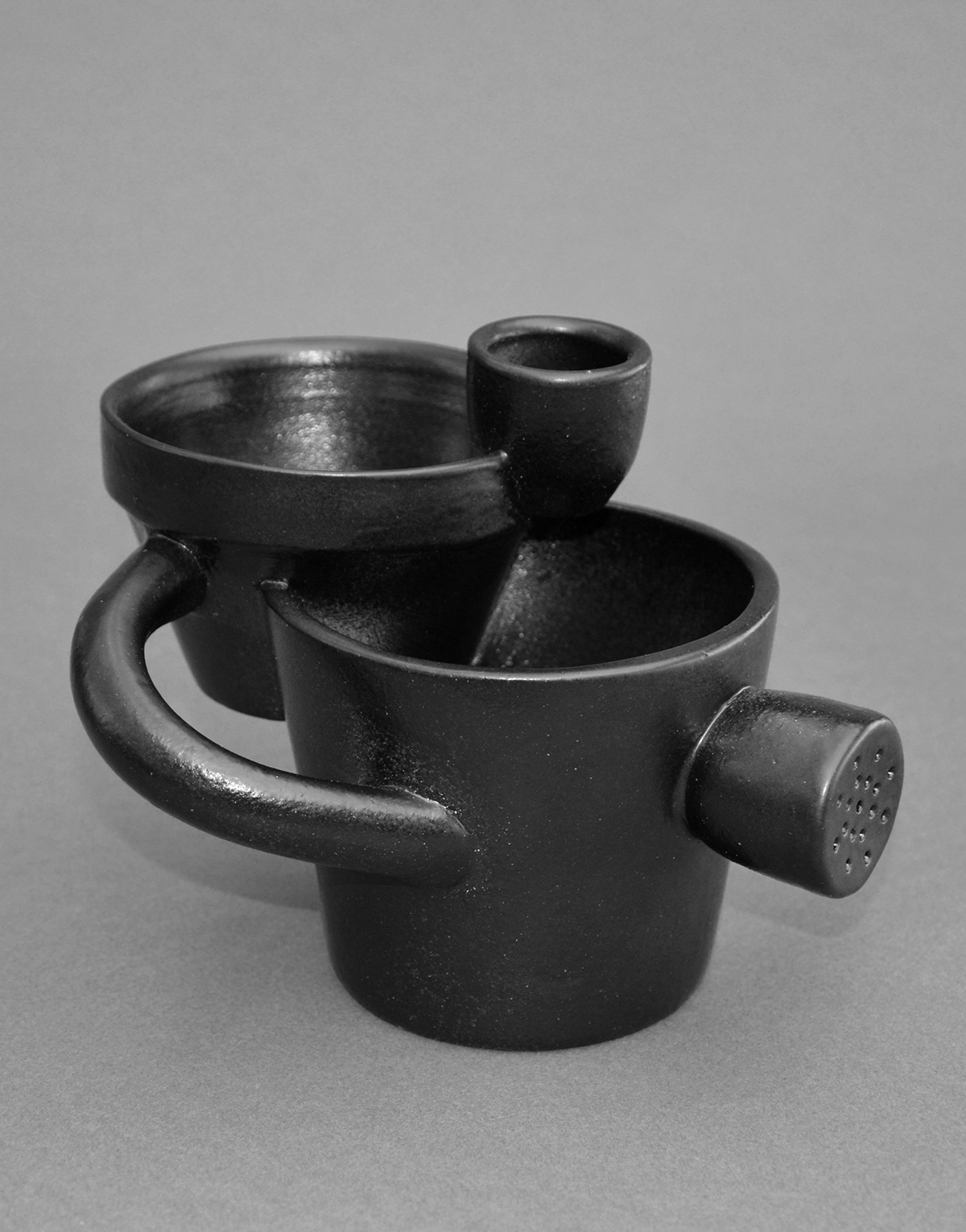
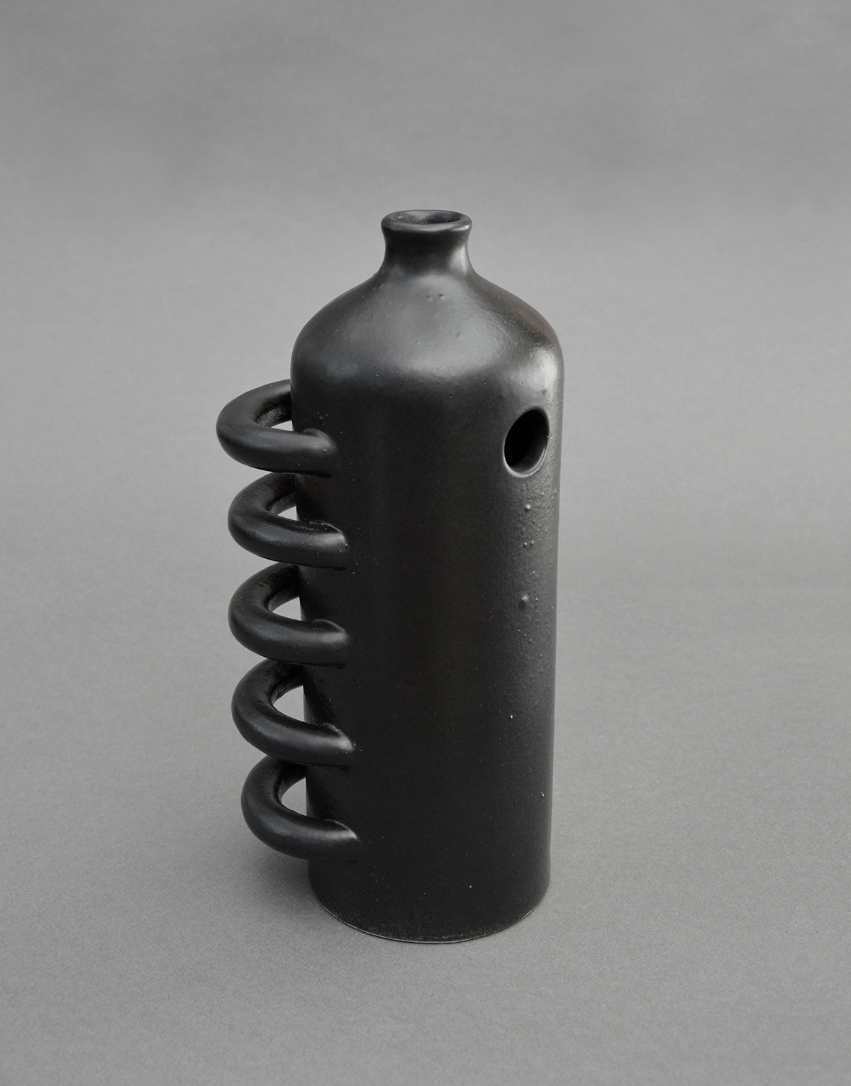
Coupé-Collé (French for cut and paste) is a collaboration between designers Cécile Charroy and Céline Ansel and French stoneware makers Manufacture de Digoin, who have been making ceramics since 1875. The pair were given free reign to raid the brand’s archive of plaster molds, creating these new hybrid objects by splicing different molds together.
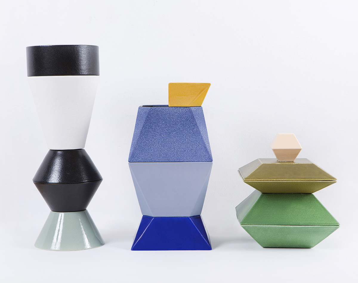
The brief to designers for the Dutch Invertuals show this year was No Static. In response, ceramicist Kirstie van Noort designed a series of objects that play with balance and stability. Each form has a curved base and a collection of weights on the top which can be moved to shift the balance of the piece. We hope to be able to share more photos from the show with you later this week. (Photo: Sioban Imms)
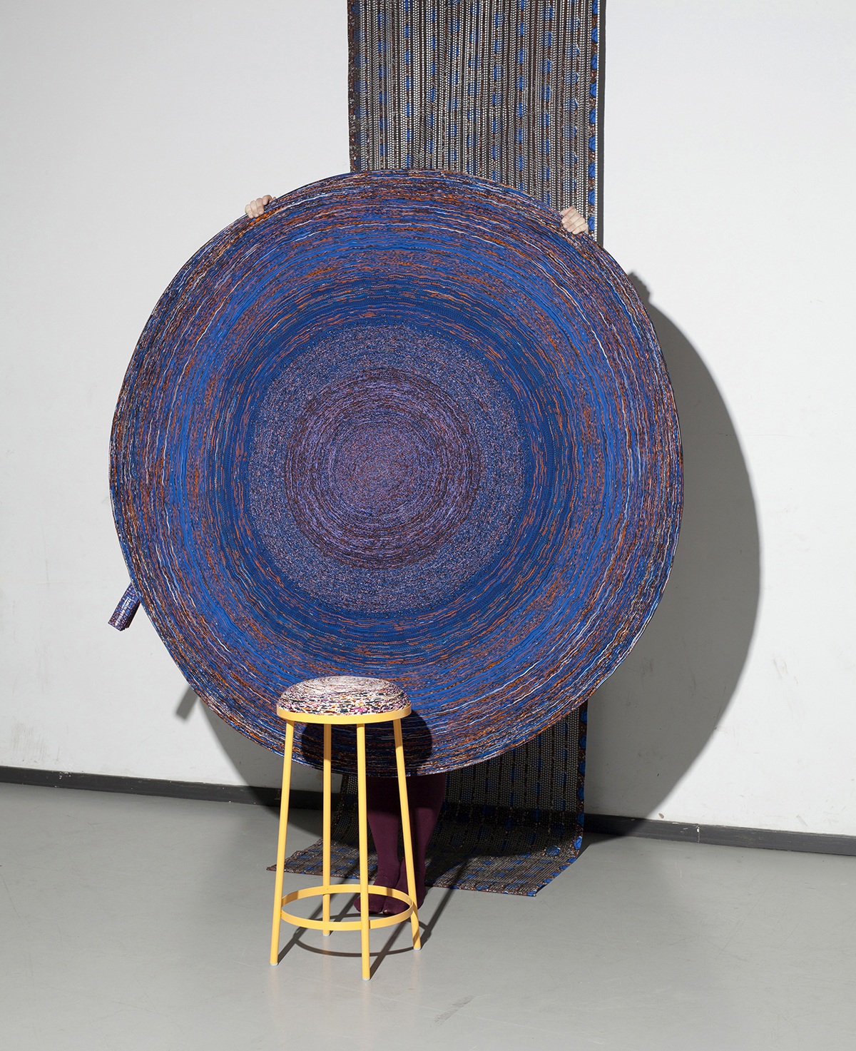
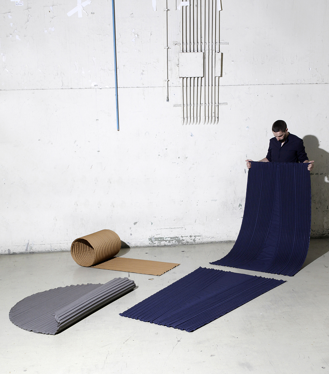 At the Design Academy Eindhoven show, which this year focused on material value and the increasingly blurred line between technology and our social needs, Anaick Lejart applied the French craft of boutis (or stuffed quilting) to industrial high-frequency welding to produce these substantial and tactile ridged rugs. (Photo: Lisa Klappe for Design Academy Eindhoven)
 Using a potter’s wheel, Eduard Auffray slowly rotates a cylindrical mold containing liquids such as plaster and clear resin, which cure into shallow bowl shapes. The speed of the wheel and position of the mold affect the resulting forms, which could be used as trays, bowls, or plates. (Photo: Lisa Klappe for Design Academy Eindhoven)
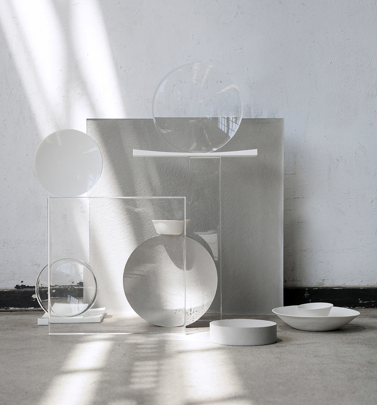
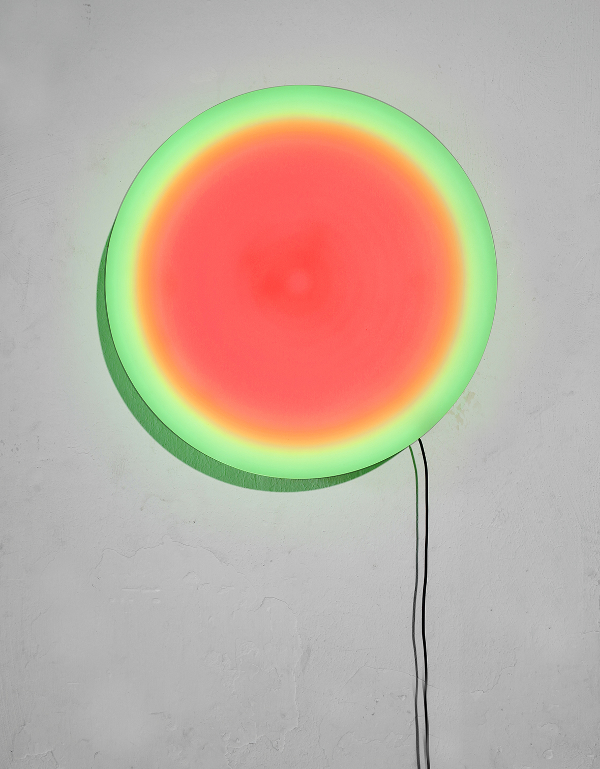
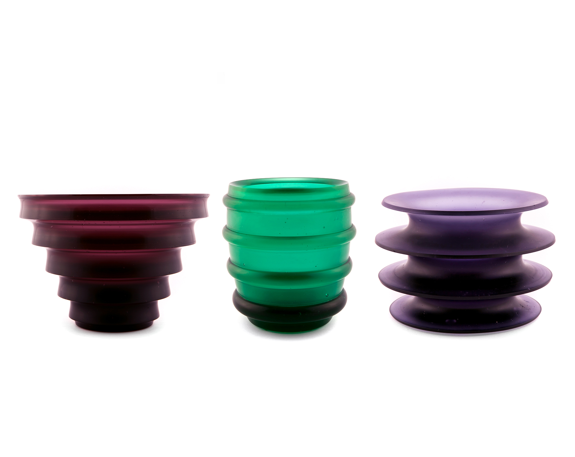
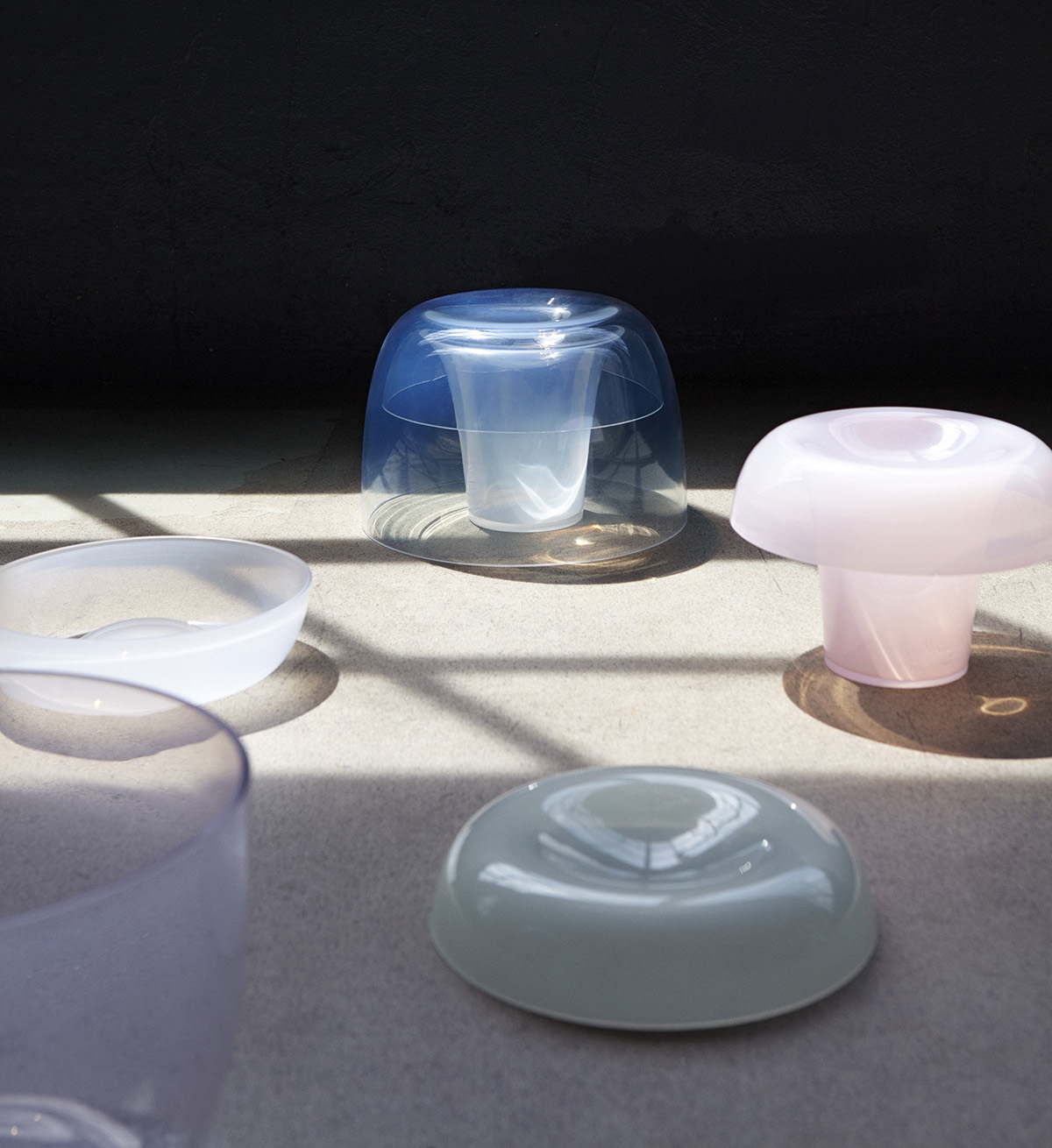 Playing with light and material, tonal gradients and translucency, Jeroen van de Gruijter has produced a poetic series of textiles and glass objects for the home, which constantly shift and change with the ambient light. (Photo: Femke Reijerman for Design Academy Eindhoven)
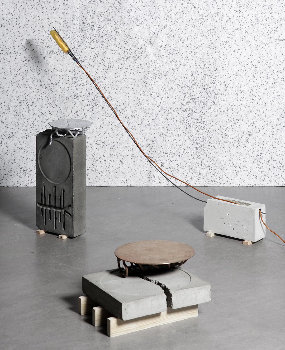 The molds that Martin Laforet uses to cast his products are also incorporated into the final piece. This interplay between the inverse mold and positive form lends a poetry to the industrial construction materials he uses, which include concrete, aluminum, wooden shuttering, and steel rebar. (Photo: Lisa Klappe for Design Academy Eindhoven)
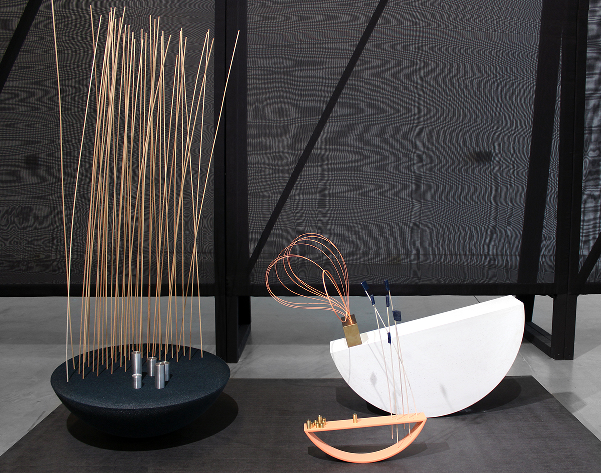
In response to the modern pressures to brush negative feelings under the carpet and project positivity and happiness, Nel Verbeke focusses on the importance of melancholy. Verbeke designed household objects to allow moments of pause, helping us to find a human-centred balance. These objects include a shallow alcove and a foggy domed mirror for moments of self-reflection. (Photos: Alexander Popelier)
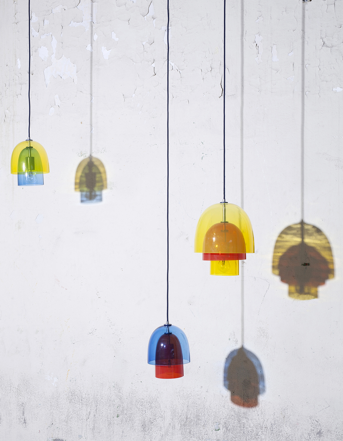
Using off-cuts from the Dutch wax printing company Vlisco, Simone Post laser-cuts and stitches strips into upholstery and rugs. Alongside this, Post was also showing lampshades made of layered glass domes in translucent primary colors; when light shines through areas of overlap, the secondary colors are revealed. (Photo: Lisa Klappe for Design Academy Eindhoven)
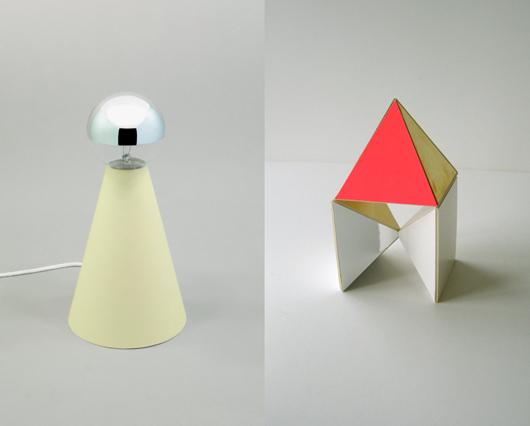
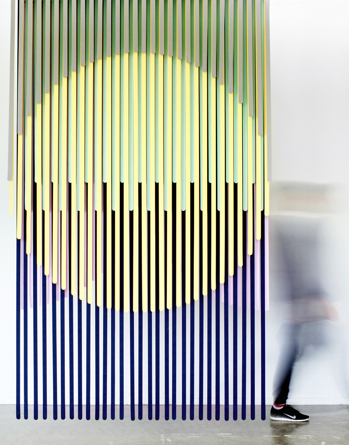 By lining up colorful plastic strips with simple overlaid cut-outs, Tijs Gilde devised a simple and charming room divider for open-plan spaces. (Photo: Femke Reijerman for Design Academy Eindhoven)
 The ancient Greeks used two words for time: chronos, meaning exact time, and kairos, meaning human time, which passes by gradually. Wout Wolf Stroucken observed that we only really perceive exact time nowadays, and has designed a timepiece that visualizes one whole hour at a time to help us value the present. (Photo: Lisa Klappe for Design Academy Eindhoven)
These 3-D–printed ceramic totems by Elise Luttik and Hester Stolk are designed for rituals centered around eating, sleeping, and beauty. The forms are purposefully abstract to allow the user to adapt each pot to their personal needs. (Photos: Floor Knaapen)
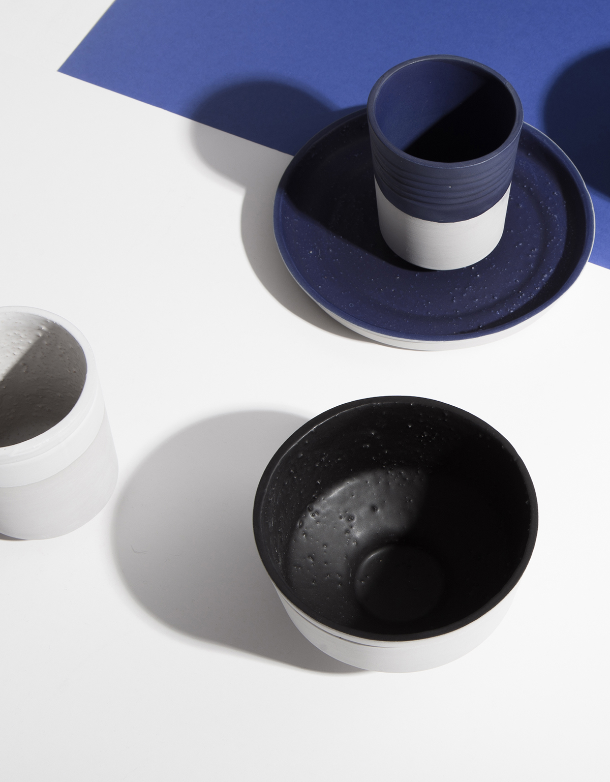 Alongside new cushions made from her refined double-sided wool furnishing fabrics, textile designer Mae Engelgeer showed a collection of ceramics produced by Cor Unum. These clean, minimal forms are detailed with sections of trapped texture beneath their thick matte glaze.
Studio Plott have developed a machine that digitally plots geometric patterns, extruding a molten plastic filament which they use to create lightweight screens and so-called “table graphics.” Their approach is akin to that of a weaver, in that they start with yarn windings to ensure the color and composition works before going into production.
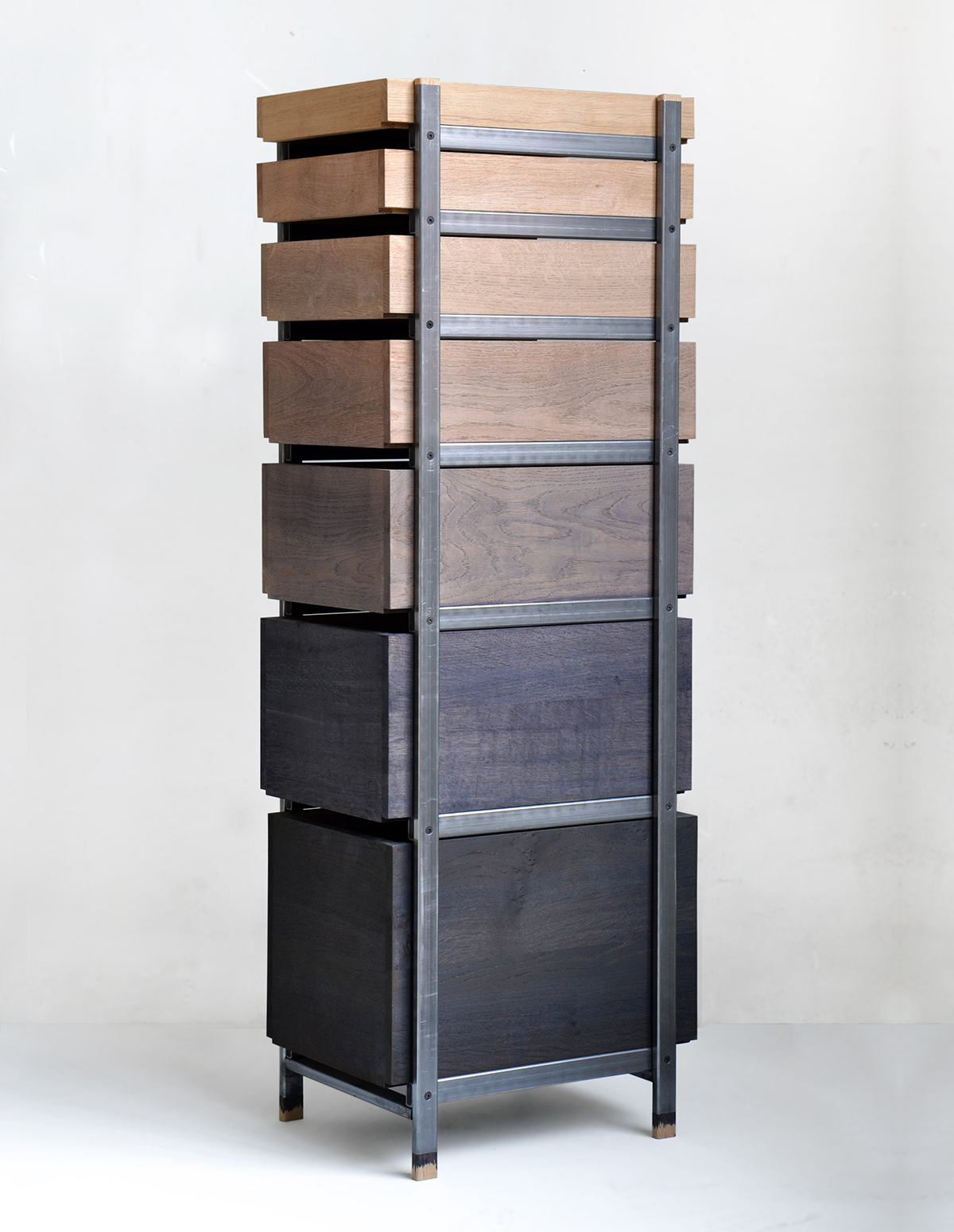 By soaking oak shavings in water, Steven Banken discovered that he could extract tannic acid and use it as a natural dye to color oak furniture. As layers of the solution are painted on, darker hues are produced.
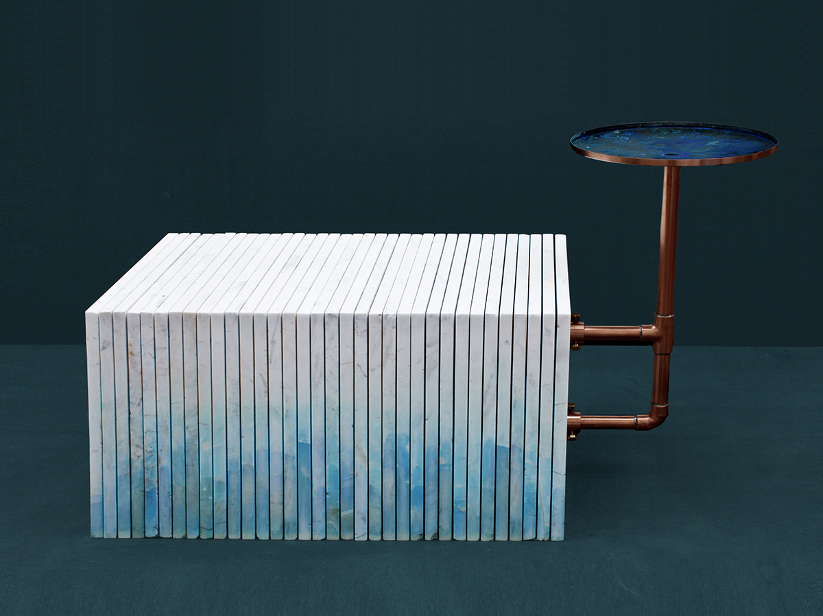 Back outside the Design Academy Eindhoven show, another exhibition which explored natural color was that of the studio Handmade Industrials, founded by Rutger de Regt and Marlies van Putten. They mixed copper and water with base materials including wool, white marble, ceramic, and alabaster; the neutral surfaces took on the green color of oxidized copper, which increases in intensity as the products age.
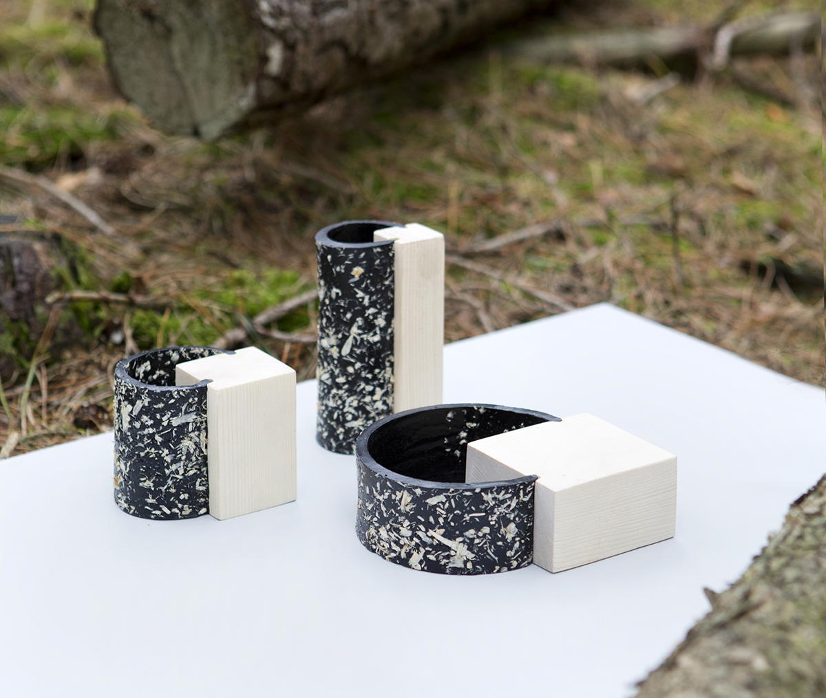
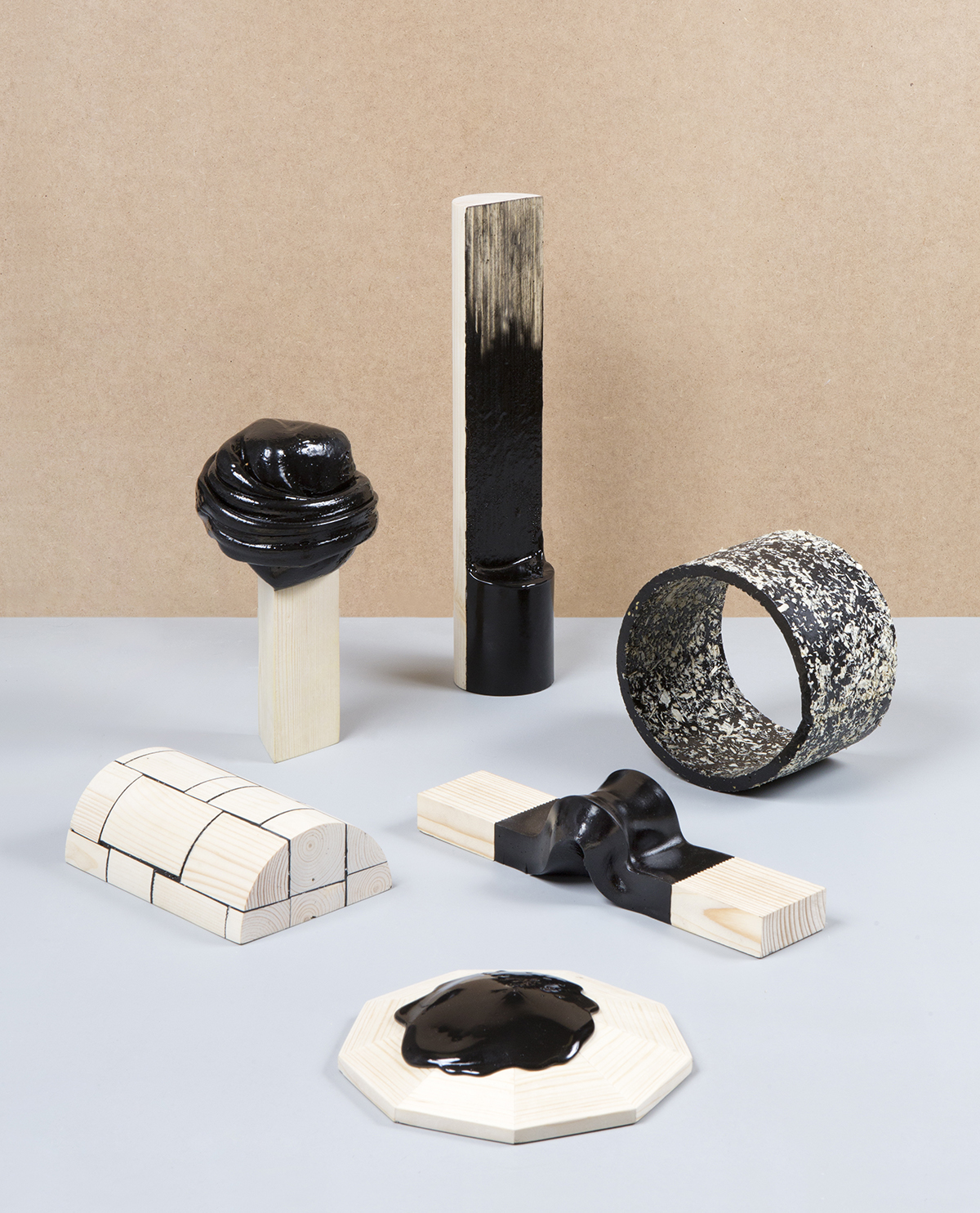
The Maritime Pine has historically been used for extracting resin to make pitch, the sticky tar once used to seal rooftops and join ship decks. Synthetic alternatives to this material have since superceded it, but Thomas Vailly wanted to re-examine this natural resource in a modern context. The suite of objects he created use the black matter to coat, join, and blend with light pinewood. (Photos: Floor Knaapen)
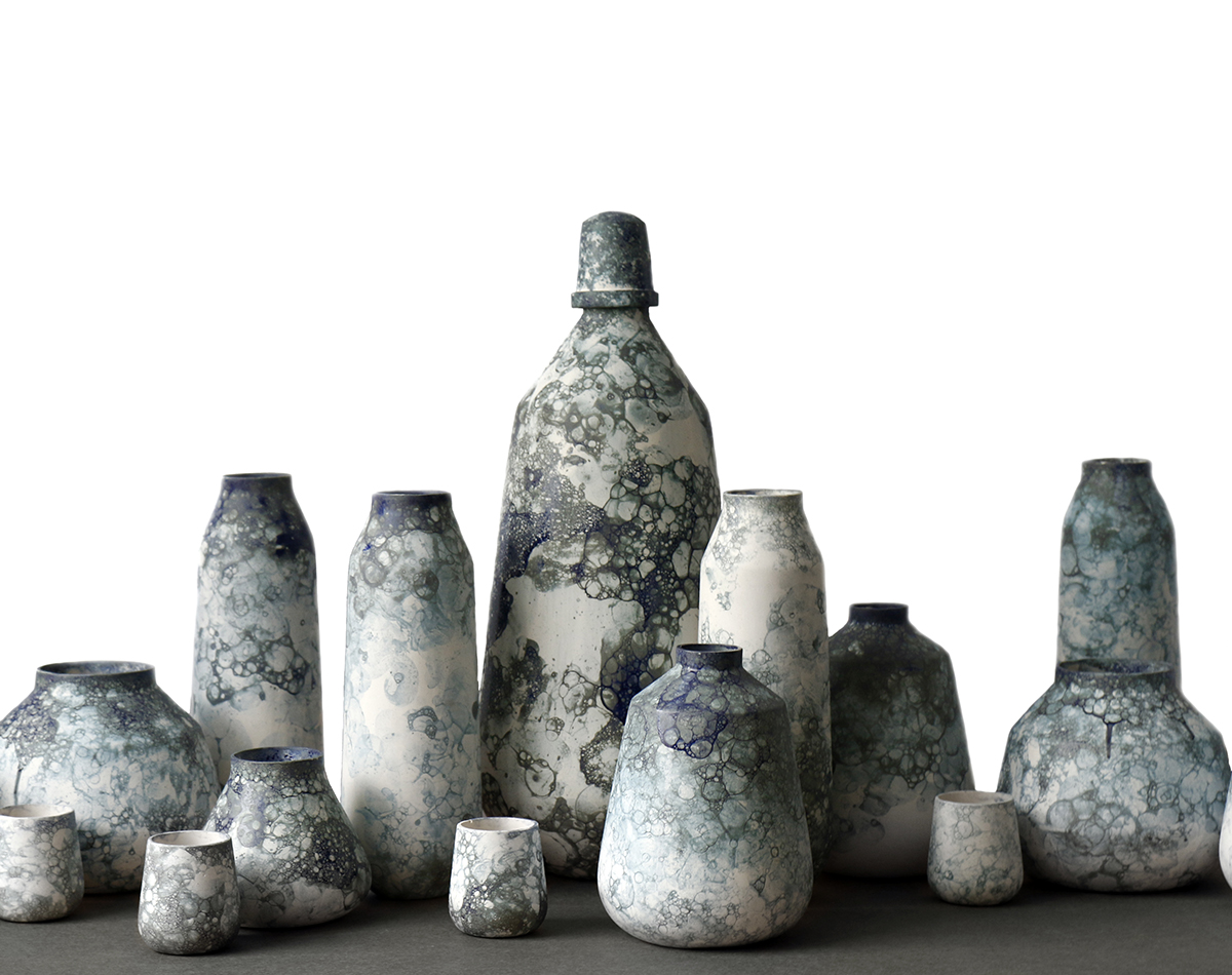
 Colored Drops is a project by Lotte de Raadt which captures the patterns of natural water formations in ceramic glazes — each piece has a unique and tactile surface.
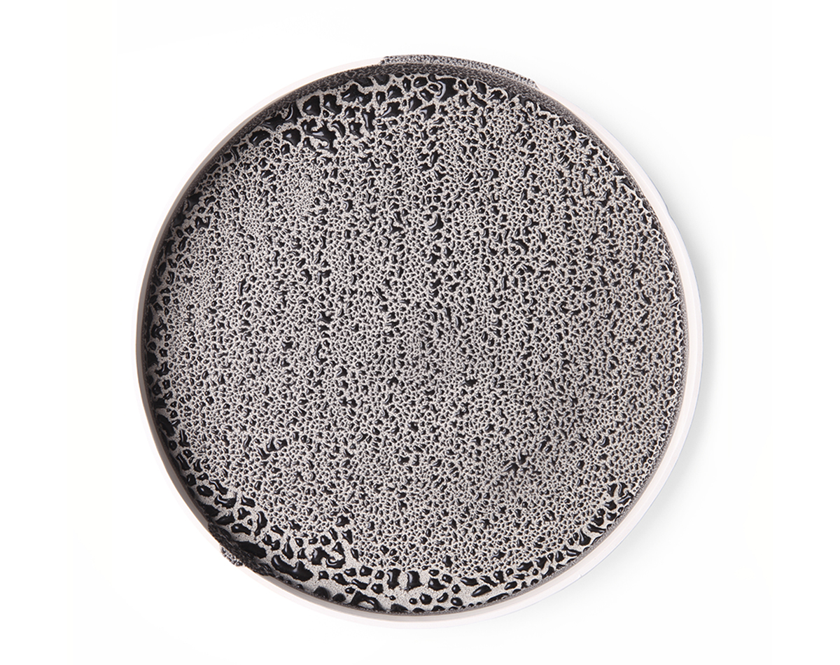
 By blowing air into the glaze, Studio Oddness create the impression of bubbles on these ceramic pots.
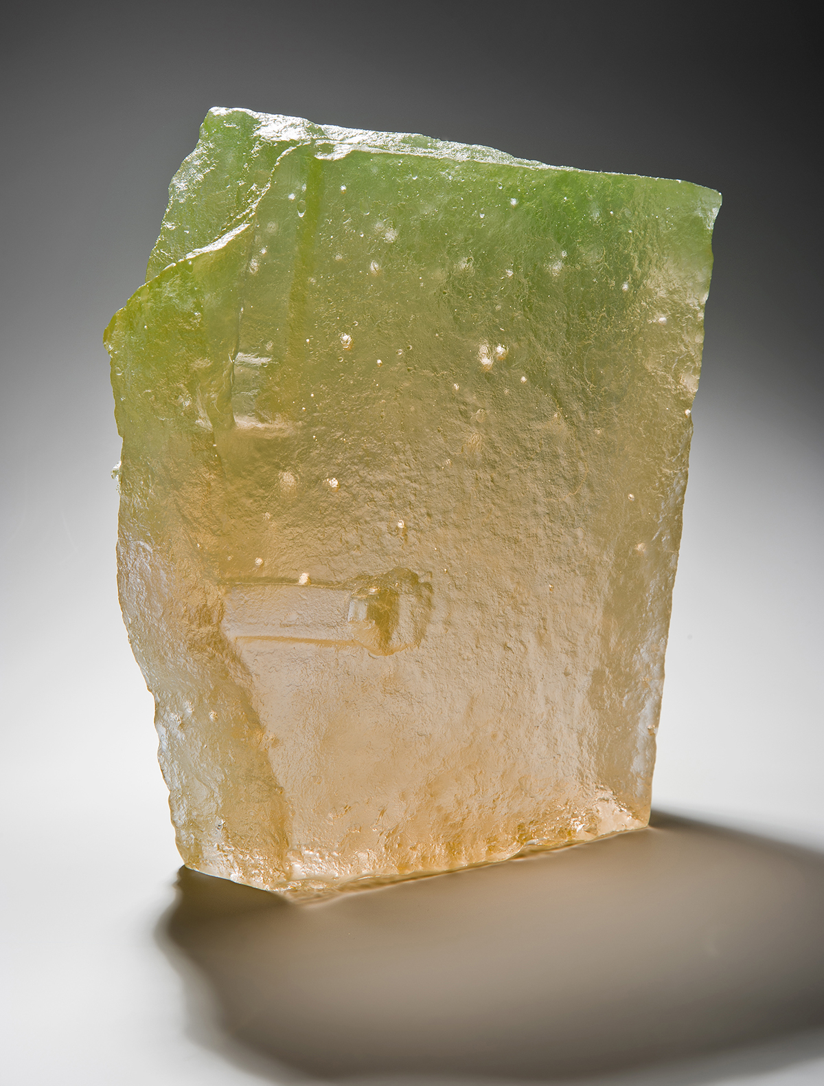
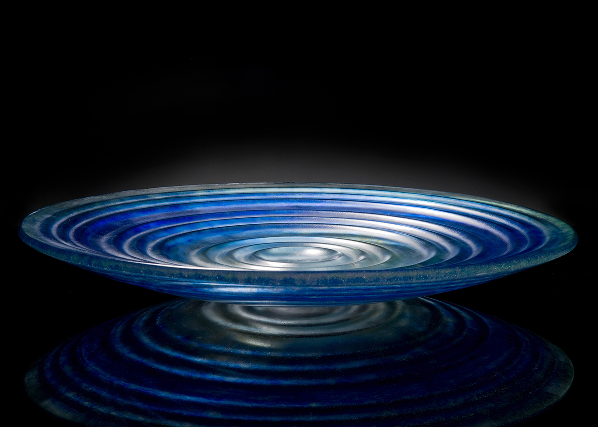
A collective of three designers specializing in kiln-fired glass showed three distinct approaches to the process at Inside Outside Glass. From top: Dawn Bendick incorporates metallic particles that infuse the glass with iridescent properties; Paul Stopler turns wax forms on the lathe that in-turn become the mould for the glass, and Max Jacquard heats crushed crystal to a viscous molten layer which takes on the form of his mold.
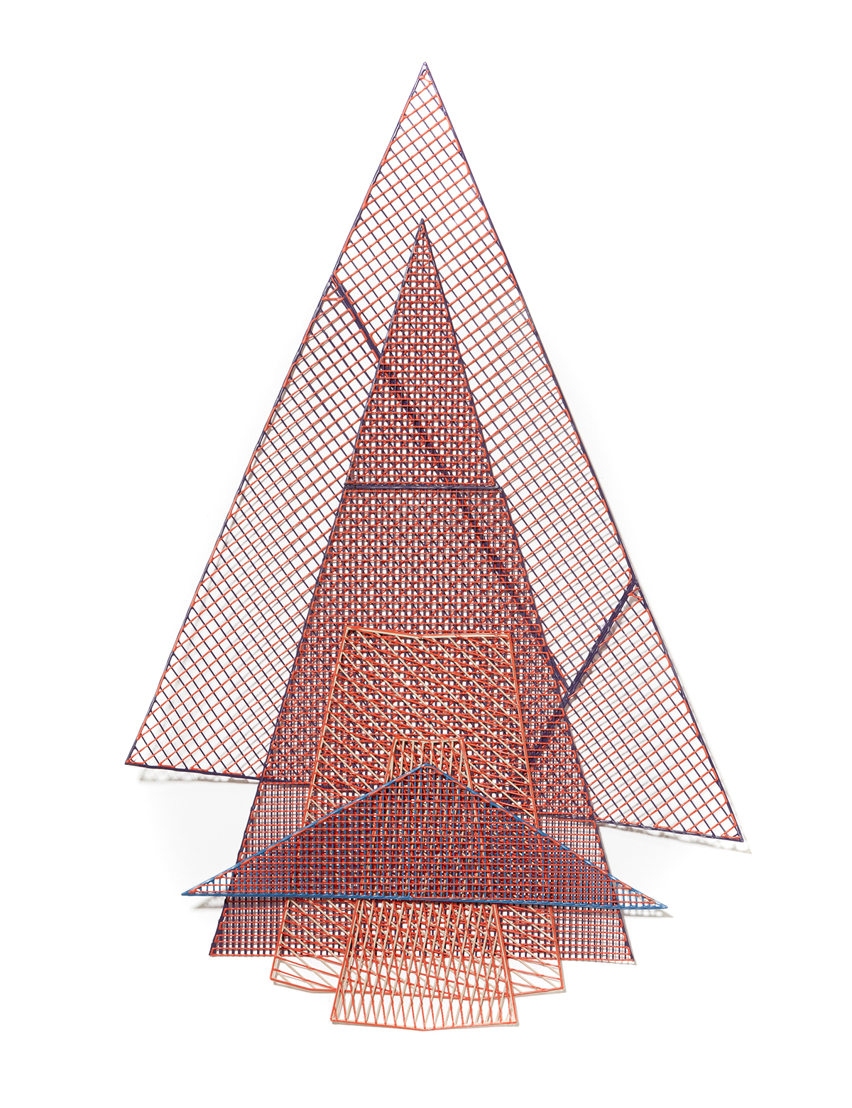
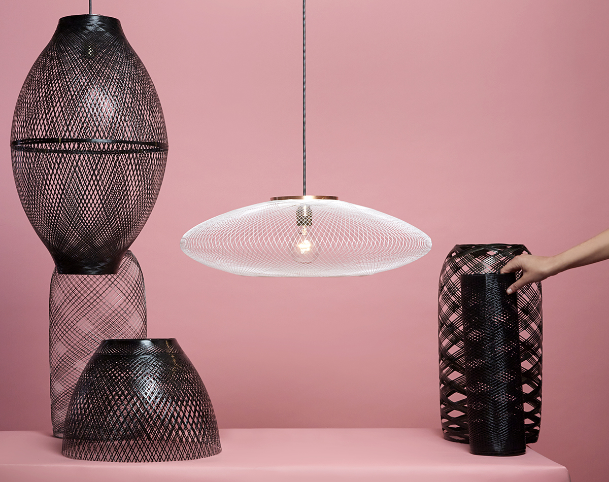 These delicate structures by Atelier Robotiq are digitally crafted using a robotic arm and industrial yarn. A spool of kevlar is slowly wound onto a form which repeats a series of programmed motions. The intricate layers of fiber cast patterns of light and shadow on the surroundings when lit. (Photo: Marta Musial)