11.25.15
Up and Coming
Chicago Illustrator Clay Hickson’s “Anti-Style”
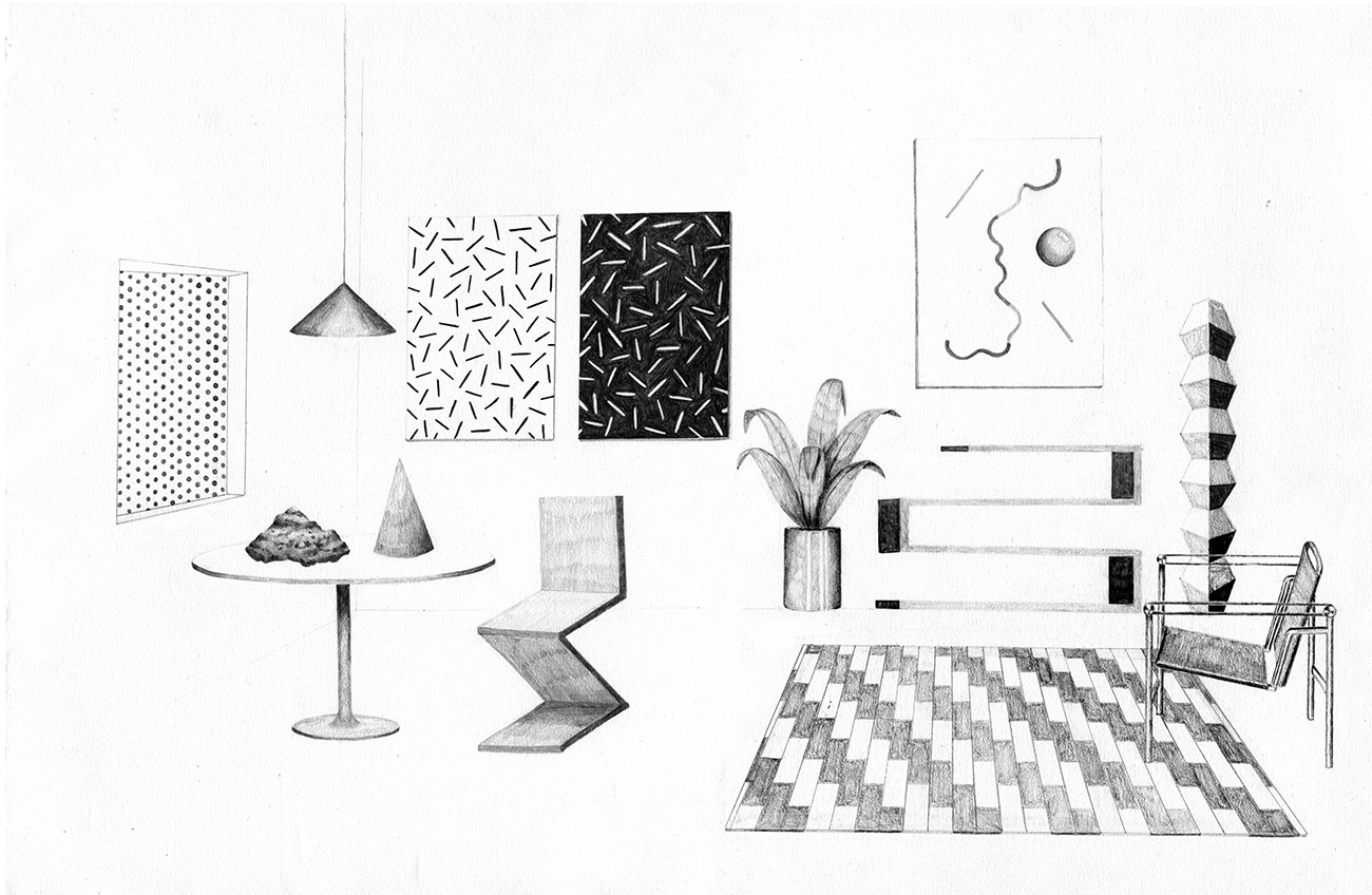
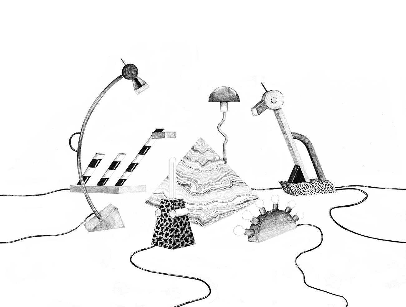
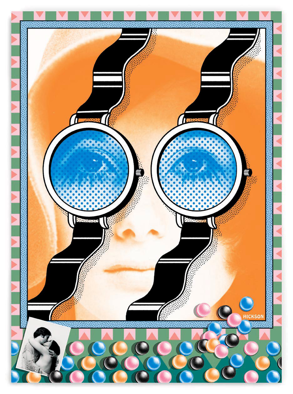
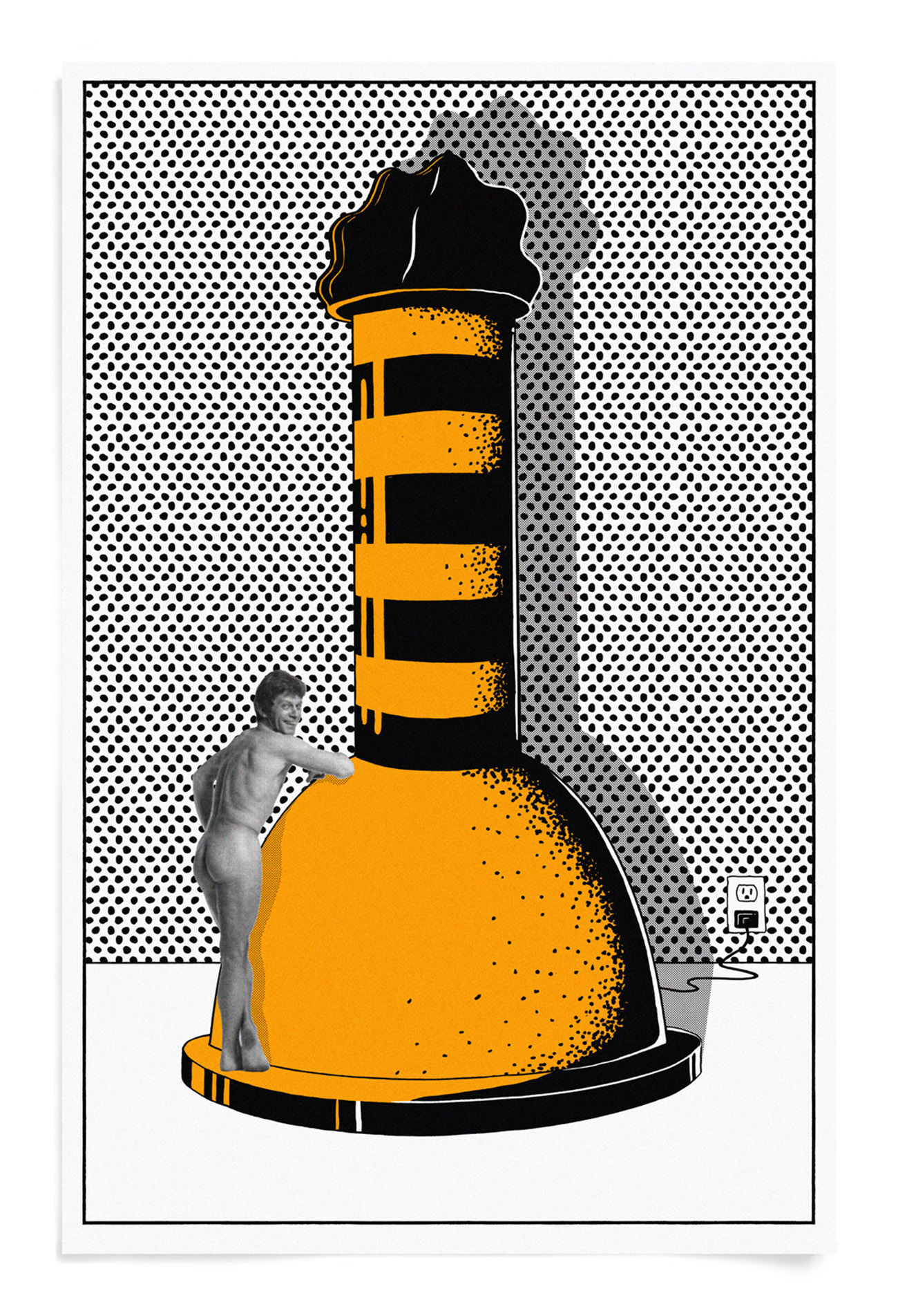
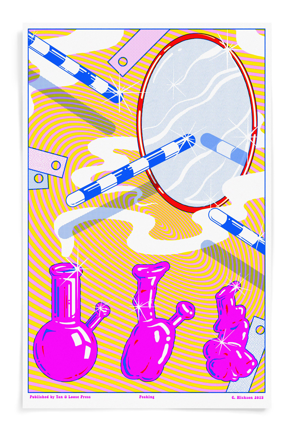
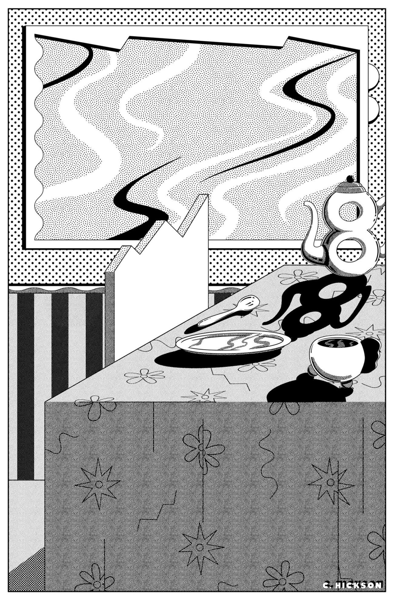
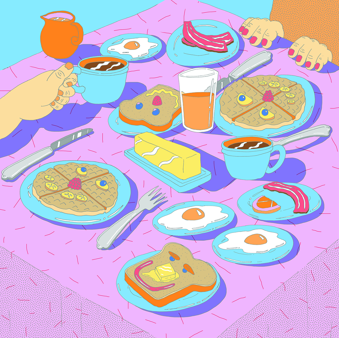
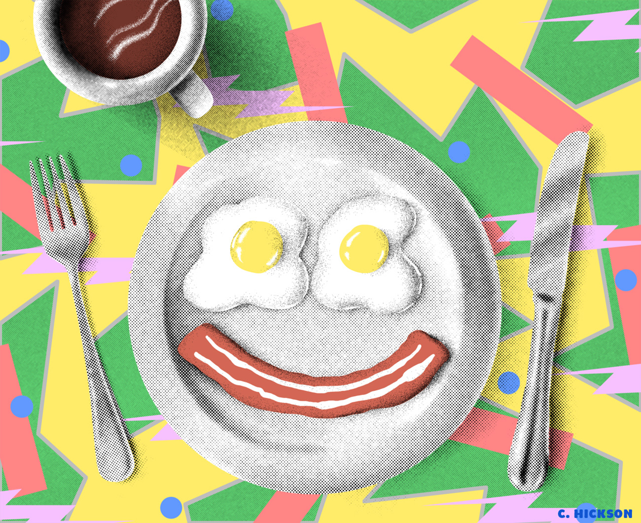
There’s a distinctive quality to Chicago illustrator Clay Hickson‘s work that I couldn’t quite put my finger on — that is, until he told me his dad had been an airbrush illustrator in the ’70s and ’80s, filling Clay’s childhood with the kind of sumptuous close-ups that turn product illustration into fetish. That cheekiness, bold composition, and surreal eroticism all resonate in Hickson’s work, but here they’re reinterpreted through digital media. And rather than harking back to just one era, Hickson weaves into his art a mind-blowing collection of visual references that span from Dadaist paintings to early ’90s internet to Memphis furniture.
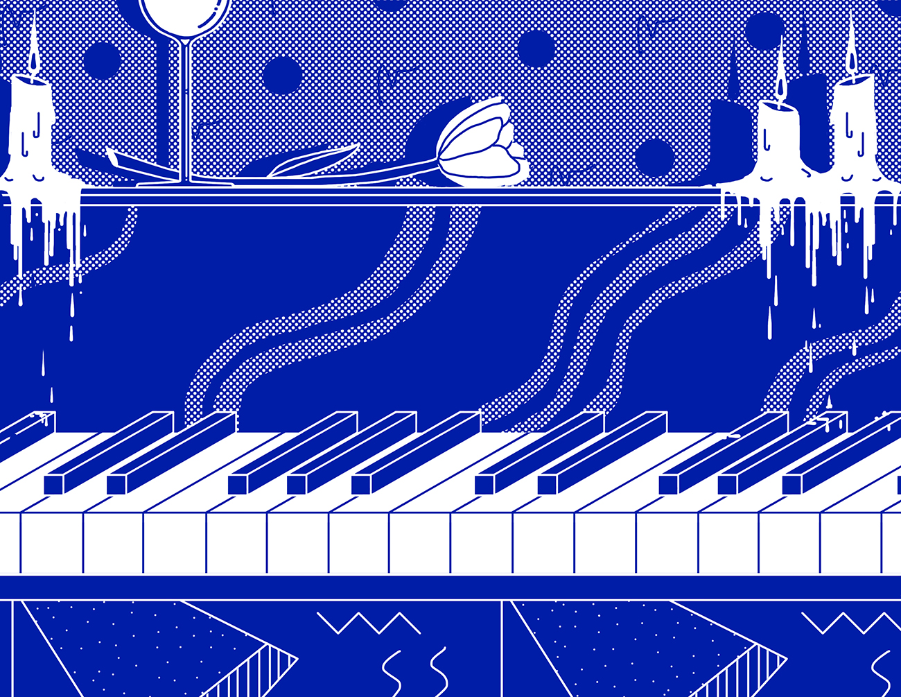
Hickson’s lack of allegiance to any specific inspiration source, technique, or distinctive style — he calls it his “anti-style” — is both striking and refreshing. These days, young illustrators are increasingly pressured to develop a recognizable visual identity from the very beginning of their careers. But the concept of a signature style is often synonymous with a more commercial, streamlined approach, where each work is just a version of another, tweaked and multiplied to serve a new purpose. Hickson’s work, on the other hand, is a result of continued experimentation. “I spent a lot of time in the beginning trying to find one signature style but that was really frustrating and didn’t feel right. Then I discovered the work of Push Pin Studios, the iconic 1950s collective of graphic designers. They wanted each artwork to have a completely different style. I was really inspired by these guys and how successful they became without ever committing to just one way of doing things.” See exactly how well that’s turned out for him, and read on for more of Hickson’s recent projects below.
Describe your most recent project and how it was made.
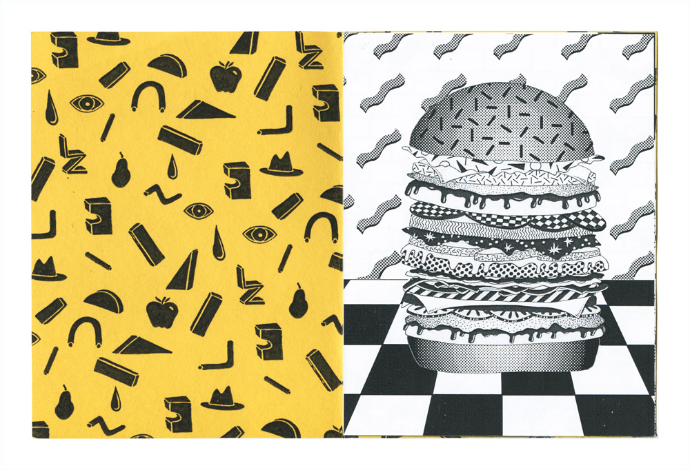
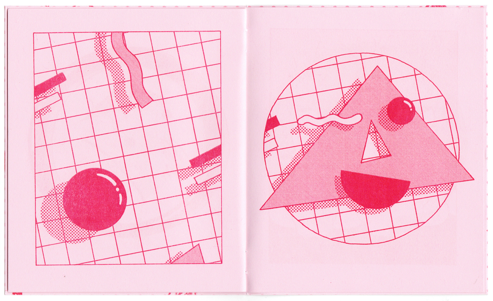
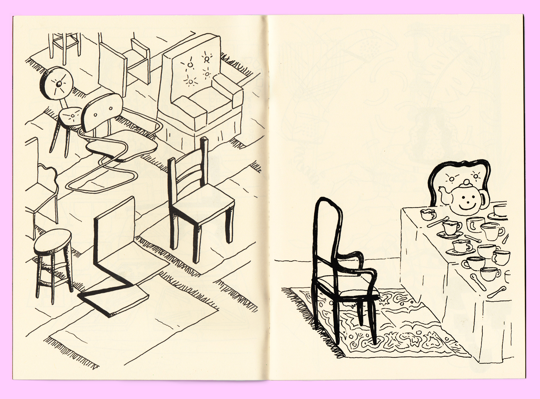
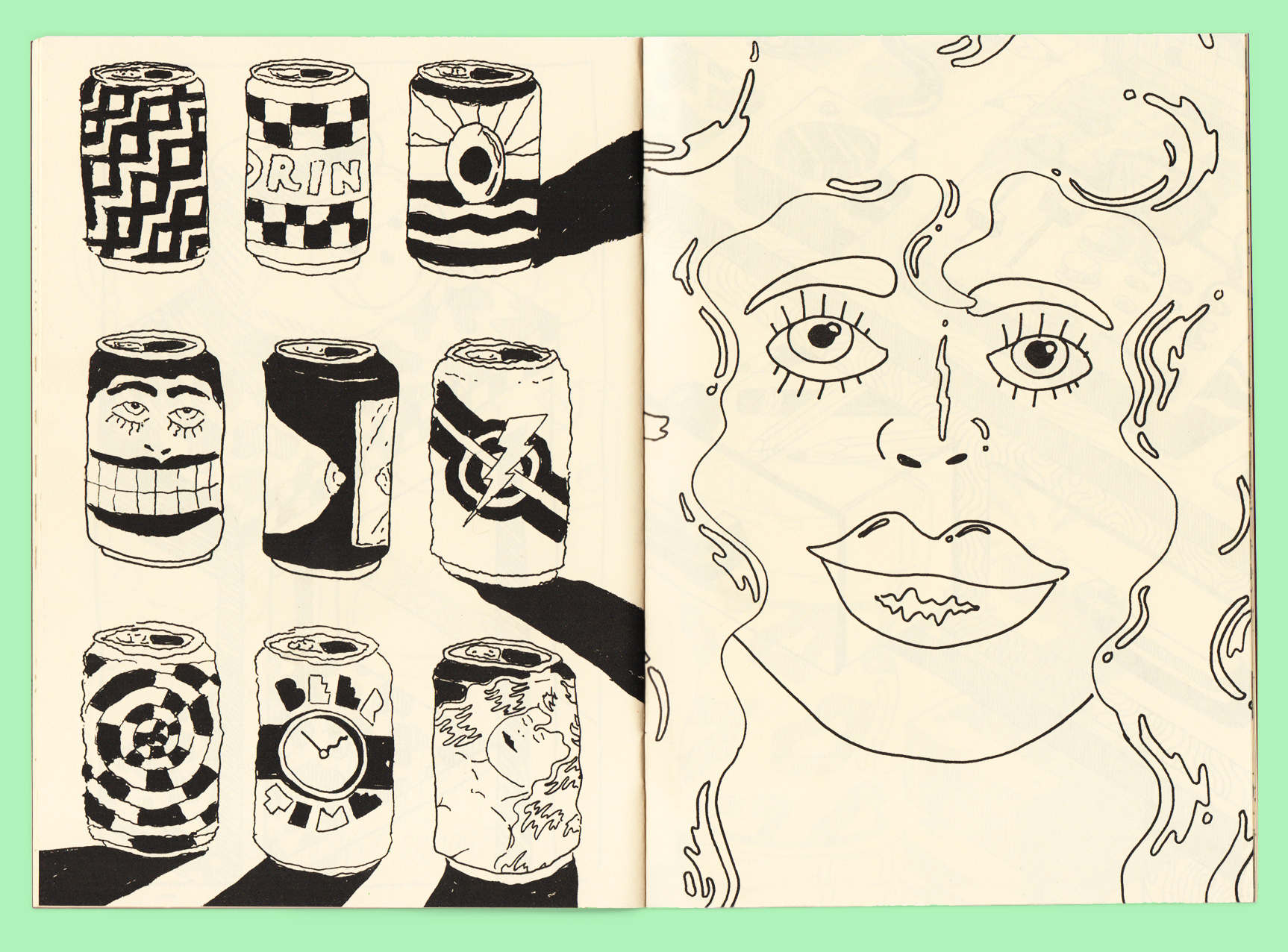
I’d been feeling a little frustrated by all the half-finished projects I had started and felt I needed to do something quickly and see it through to the end, so I decided to throw together a zine of drawings from my sketchbooks. It was such a nice break to be able to approach a project so casually and to have all the material already made. I went back through the last few years of sketchbooks and pulled out a variety of things: unfinished work, sketches that turned into larger projects, and things that I liked but never got around to expanding. I threw the whole thing together in a night and had it printed and bound within a few days. It was really exhilarating.
Describe your next project and how you’re currently making it.
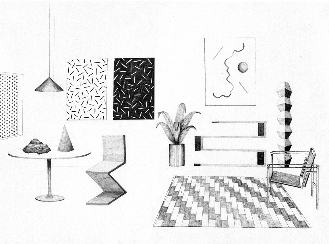
I’m in the middle of putting together another book. It’s sort of an homage to ’70s alternative parenting books — an instructional guide for raising children, written by hippies. My version isn’t exactly about parenting, though; it’s more about capturing the vibe of that era and the spirit of peace and positivity that people were trying to impart on their kids.
Some of my close friends are starting to have kids so I’ve been thinking a lot about what it must be like to be a parent. I don’t have kids of my own, so it’s all speculation, but the idea of curating the world that your children are exposed to is so exciting. Especially at a time like this when there is an abundance of cheap, plastic toys that seem like they are designed to distract kids instead of engage them.
At this point, I’m designing pages whenever I have time and doing lots of research which means looking at a lot of Bruno Munari’s work and books about design for children — really anyone who was approaching art and design as a tool for development. I’m trying to get super loose and work in mediums that I’m not very familiar with. I’m trying to give it the feel of a book from the ’70s, but I want the bulk of the content to be original. So I’ve been taking black-and-white film photos, hand-coloring them, and collaging with them. I’ve also been doing text pieces using old Letraset sheets. No matter how careful I am with it, the text is always a little crooked or off center, so it has more of a personality. I’ve never been able to get that lively feeling from digital text. I guess the whole point of this book for me is to take a step back from the computer and have more fun making the work.
Tell us one thing that’s been inspiring you lately and why.
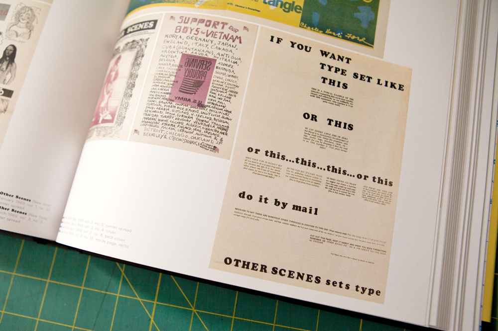
I’ve been looking through a ton of old underground newspapers and magazines from the ’60s and ’70s. Stuff like Oz, The Chicago Seed, Other Scenes, etc. I love the layout and design of those papers. I’m no expert, but it seems like the process of laying out a publication in those days was so tedious that anyone without a budget was forced to get creative. Clearly, a lot of the design decisions are meant to express a certain idea, but some seem like they were only about filling space and saving time. That urgency (coupled with the drug use) gave birth to an amazing new approach to communication. There is something really inspiring about that looseness.
It seems impossible for me at least to capture that spirit. Computers, obviously, have streamlined the process so much that it’s hard to surrender the control that is at my fingertips. I also lean towards tighter, cleaner design in my own work, so I’m basically trying to find a balance between that analog, cut and paste feel of the ’60s and the slick digital design of today. I should probably shut off my computer and hand make everything, but I think it’s a more interesting (and realistic) challenge to try to integrate the technology into the process.


Show us your studio and tell us what you like about it.
I’ve been working out of a small room in my apartment for the last few years. While I wouldn’t mind a little more studio space to make a mess in, I really love working from home. I understand why some people find it to distracting, but for me, the distractions — pets, the couch, cereal — are the best part. The small space is starting to become a problem, though. I’m finding that more and more my printing projects are spilling into the living room. I’ll probably start looking for more space once the mess reaches the kitchen.