Four years ago, Sight Unseen featured the first product by what was then a brand-new studio on the scene: The Syzygy series by Dutch duo Os ∆ Oos consisted of three lamps whose intensity depended on the subtle rotation of three light-filtering discs placed in front of the bulb; it was inspired by the astronomical phenomenon of three celestial bodies aligning in space. As a design product, it was both conceptually driven and artistically minded, but it was, at the end of the day, a lamp. “We’re definitely not artists; we’re designers,” clarifies Oskar Peet, who with Sophie Mensen makes up the Eindhoven-based studio. “We like to make functional projects.”
That mix of dreamy ingenuity, conceptual rigor, and deft practicality is what’s come to define Os ∆ Oos in the four years since and what’s brought them to the forefront of the Dutch scene. “We always try to make everything a bit too complex, but it’s an urge that we have. It can’t just be another light sitting there; it has to have another layer to it,’”says Mensen of the inherent way their objects tempt the viewer to take a closer look.
Looking around the duo’s studio — as we did this fall when we visited them during the annual Dutch Design Week — it’s clear that this conceptual thinking plays out as a synthesis of configuration and experimentation. Mensen and Peet share the same feeling for shape, form and materiality, an appreciation they honed while studying together at the Design Academy Eindhoven. They’re often drawn to the unpredictable behaviors of new materials, a fascination that sees them constantly forging relationships with unusual suppliers or manufacturers with whom they can push new material applications.
“We try not to make things that could have been made 50 or 100 years ago,” Peet says. “It’s nice if you look at the materials that are newly available to you at this moment and try do something with those.” (It’s why the two don’t naturally gravitate towards working with, say, wood.) For instance, the conjoining elements of their LED Mono-Lights are made from a specially developed extruded silicone foam, allowing them to flex accordingly. Other interesting materials that have crossed the designers’ paths include Hi-Macs, an acrylic stone surface that allows for malleable, yet durable, surfaces; Italian veneers; and, most recently, recycled glass.
And so what’s behind their name? “Os is from Oskar — that’s quite obvious,” laughs Mensen, who reveals that the name “Oos” is a family nickname from her childhood. “Oskar is of course my boyfriend, so when he came into my family they were always like, ‘Hey Os and Oos!’ So before we even had that name for our studio, we were named like that by my family.”
Sight Unseen was one of the very first blogs to pick up on the duo’s talents with the Syzygy series. “That got us in contact with Phillips du Pury in London and eventually the exhibition went to New York for a while, until that project stopped and the lights were then dropped off at Matter instead of being shipped all the way back to us.”
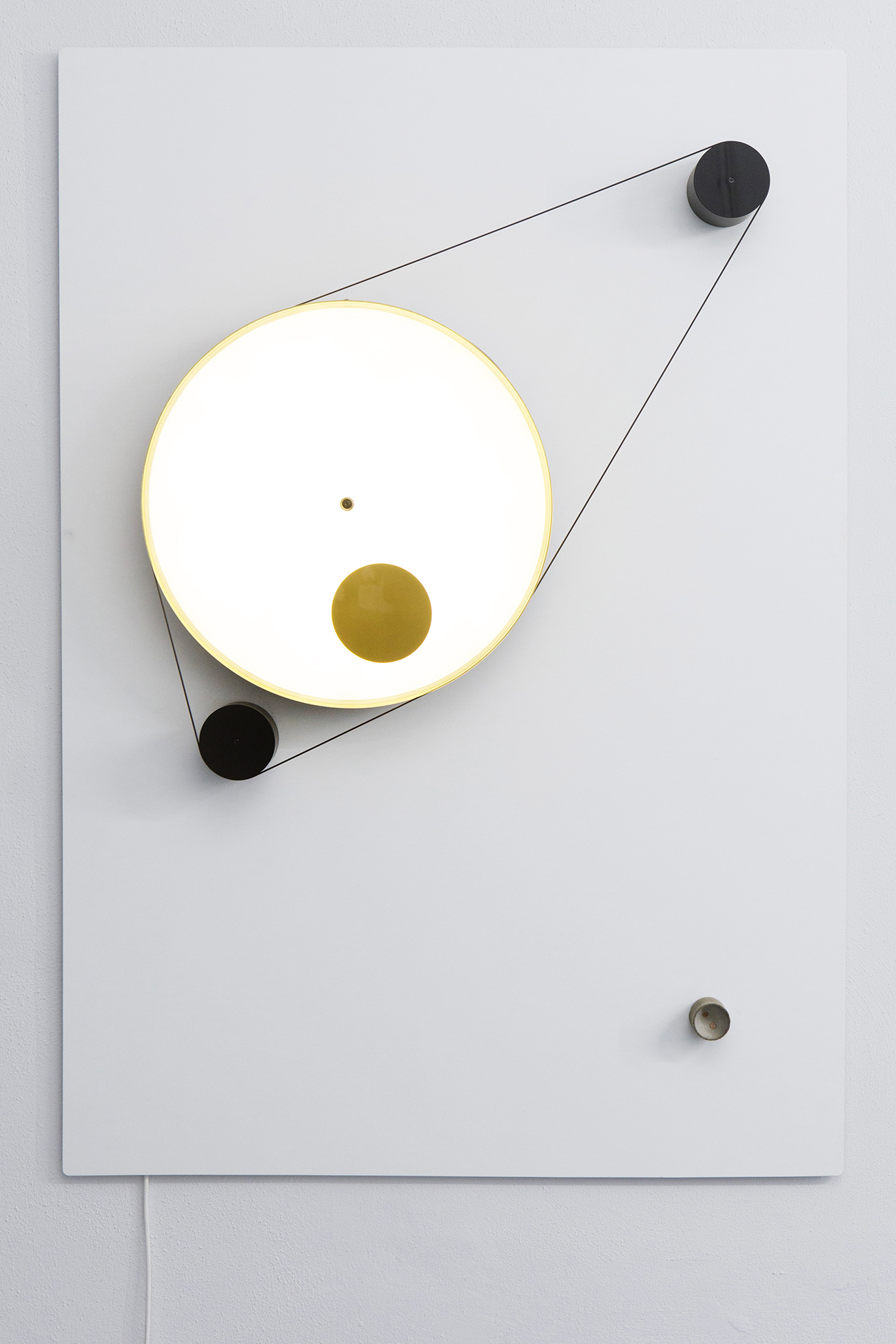
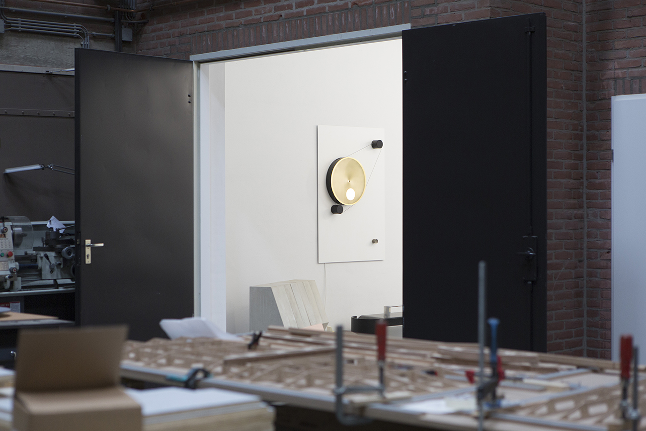
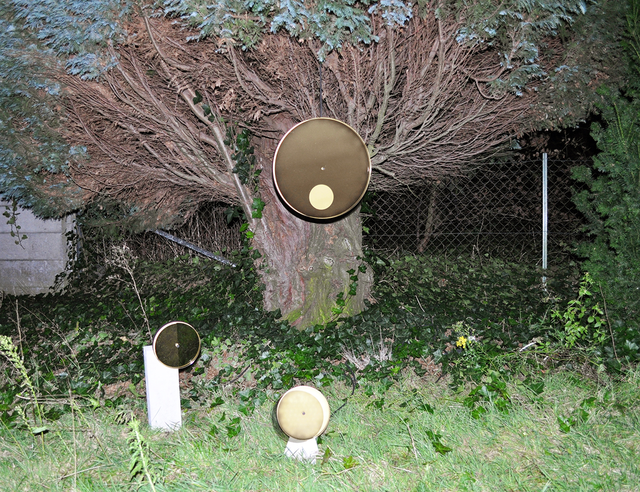
The Syzygy Phases clock is a continuation of the Syzygy lights. The clock reacts to real-time changes in light conditions, brightening and dimming in reaction, while its revolving inner circle indicates the time.
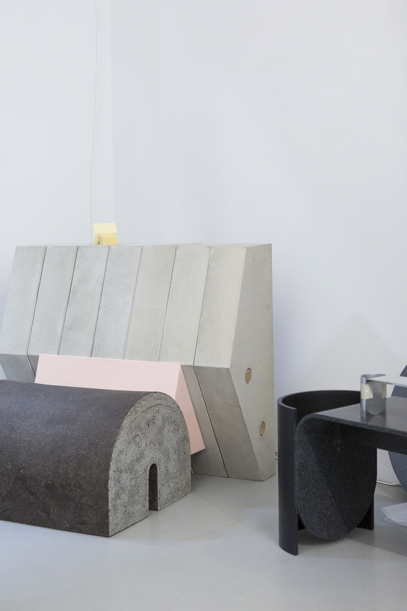
The original Keystone chair was an investigation into balance as well as an exploration of the duo’s fascination with shape and abstraction. Reassembled blocks of concrete, rubber and ceramic combined to form a chair with no connections; only sheer weight and gravity hold the piece together.
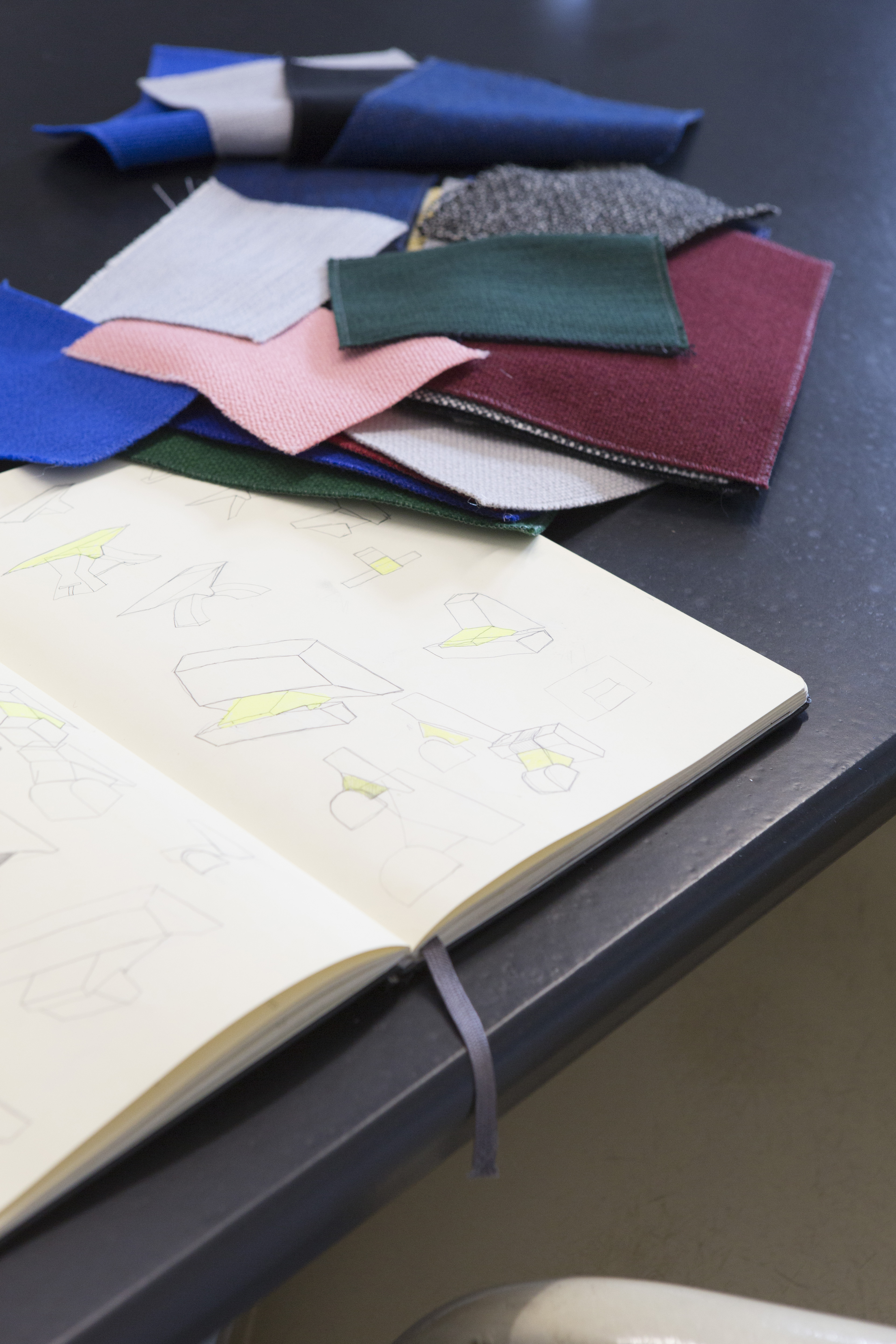
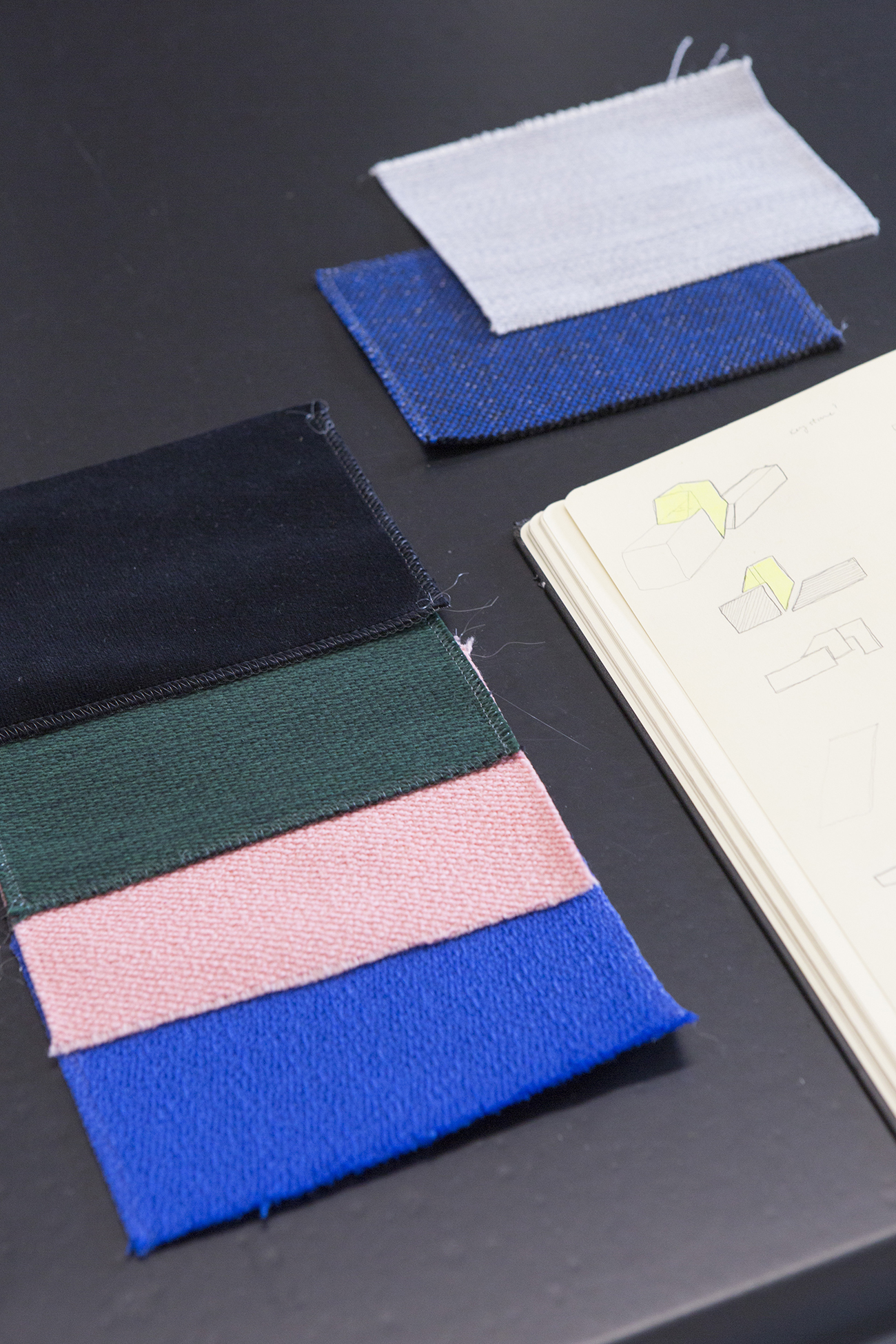
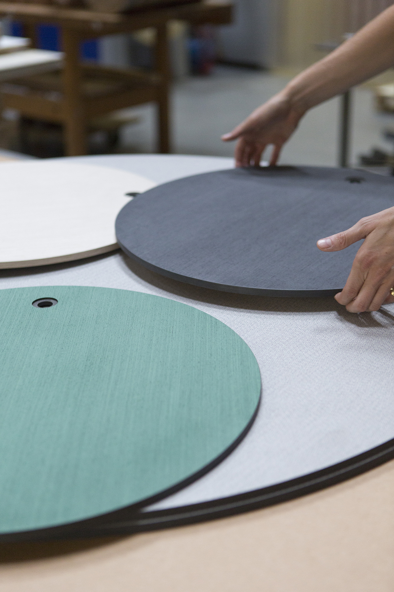
Sketches for the new edition of the Keystone chair, with upholstery swatches by Raf Simons for Kvadrat fabrics. “Kvadrat has thousands of colors. When you give the product to a client, they can never choose, so we try to make a selection,” notes Mensen, finding that three colors for each segment of the chair are enough in terms of options.
“We have some gray, gray and gray options,” says Peet. “Something that’s toned down for more commercial settings. But with the Raf Simons fabric, we went for the full impact.”
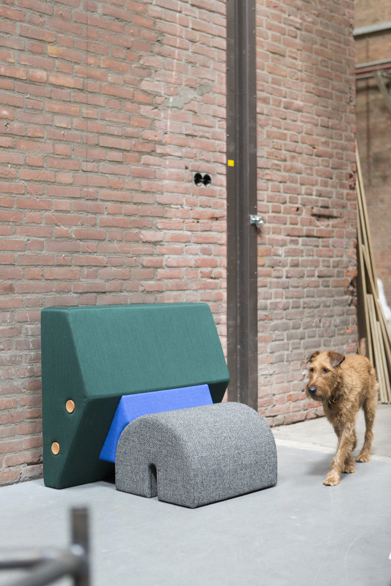
The newly upholstered Keystone chair and Bruce the Irish terrier, who’s been with the duo three years — just about as long as they’ve been a studio. “The idea to get a dog was to make sure we got out more and to not to spend all our time working — which seemed to be the case before him.”
The beginnings of the Otto Tables, a collaboration with Baars & Bloemhoff, a company that typically supplies decorative materials for interior designers. “They always present their material in sheet form, so they wanted to invite designers to do something different with it.”
Peet and Mensen are intuitively drawn to using similar colors over and over again. The detailed Italian veneers on the Otto tables were picked in shades of gray, blacks, and a dark green. “It has a sort of Japanese feel to it,” says Peet.
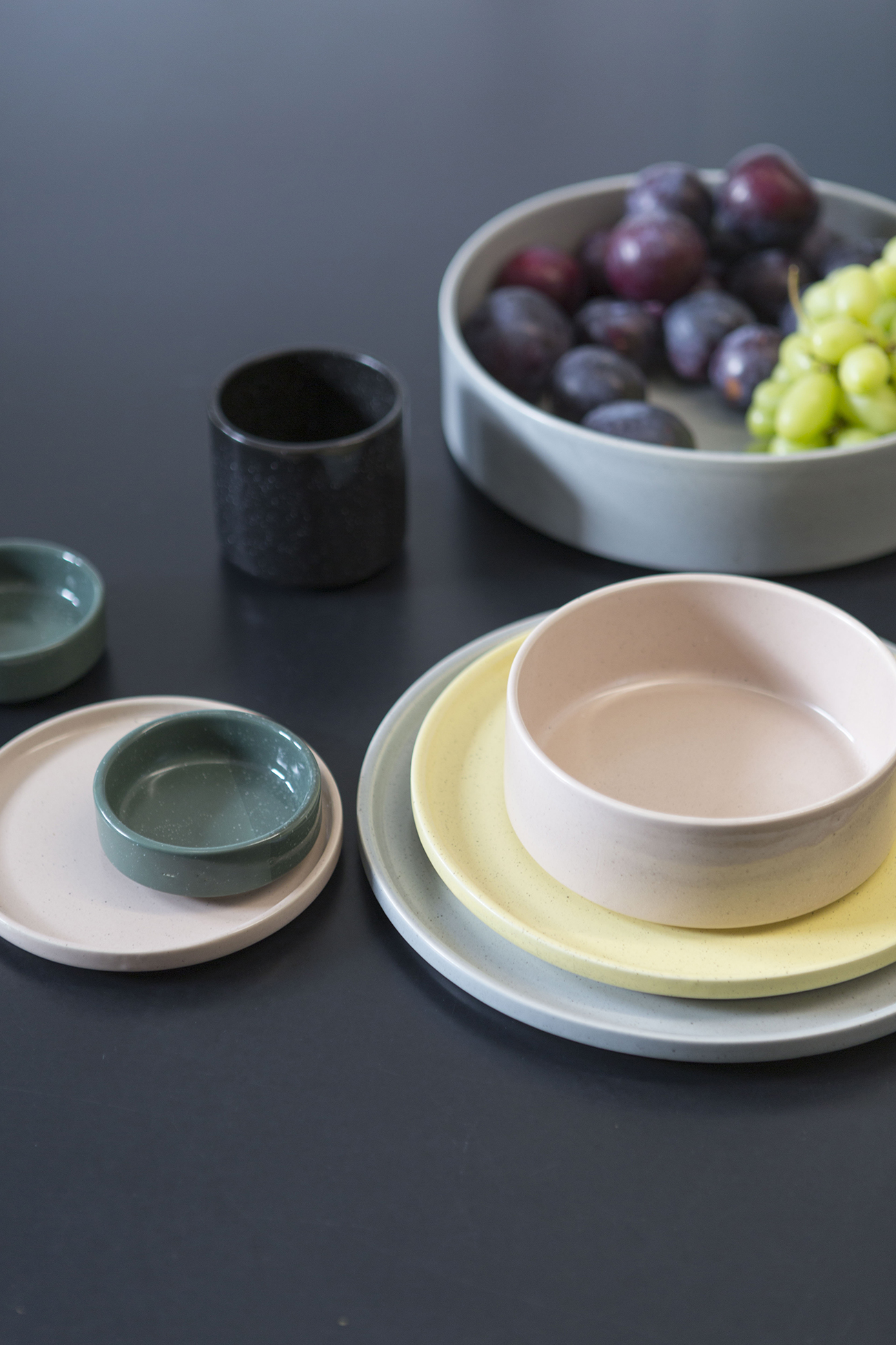
Those colors pop up again in the studio’s Sediment ceramics series, which they designed for Umbra Shift last year. “It’s nice to have a product that we can finally give as a Christmas gift,” laughs Peet about the affordable sets. “We were ready for that — continually giving our work away to friends was a little complex and expensive.”
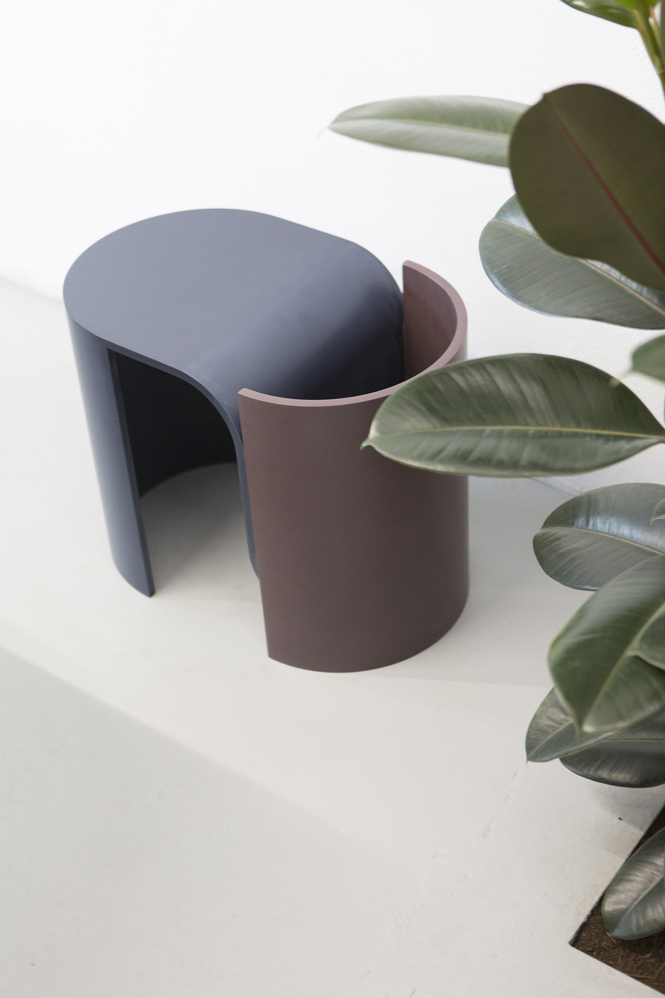
Molds for the duo’s Arc stool are quite costly to make, so the designers decided on only two elements, which are interchangeable. The stone-like quality of Hi-Macs allows the elements to be easily glued together without being able to see the joints.
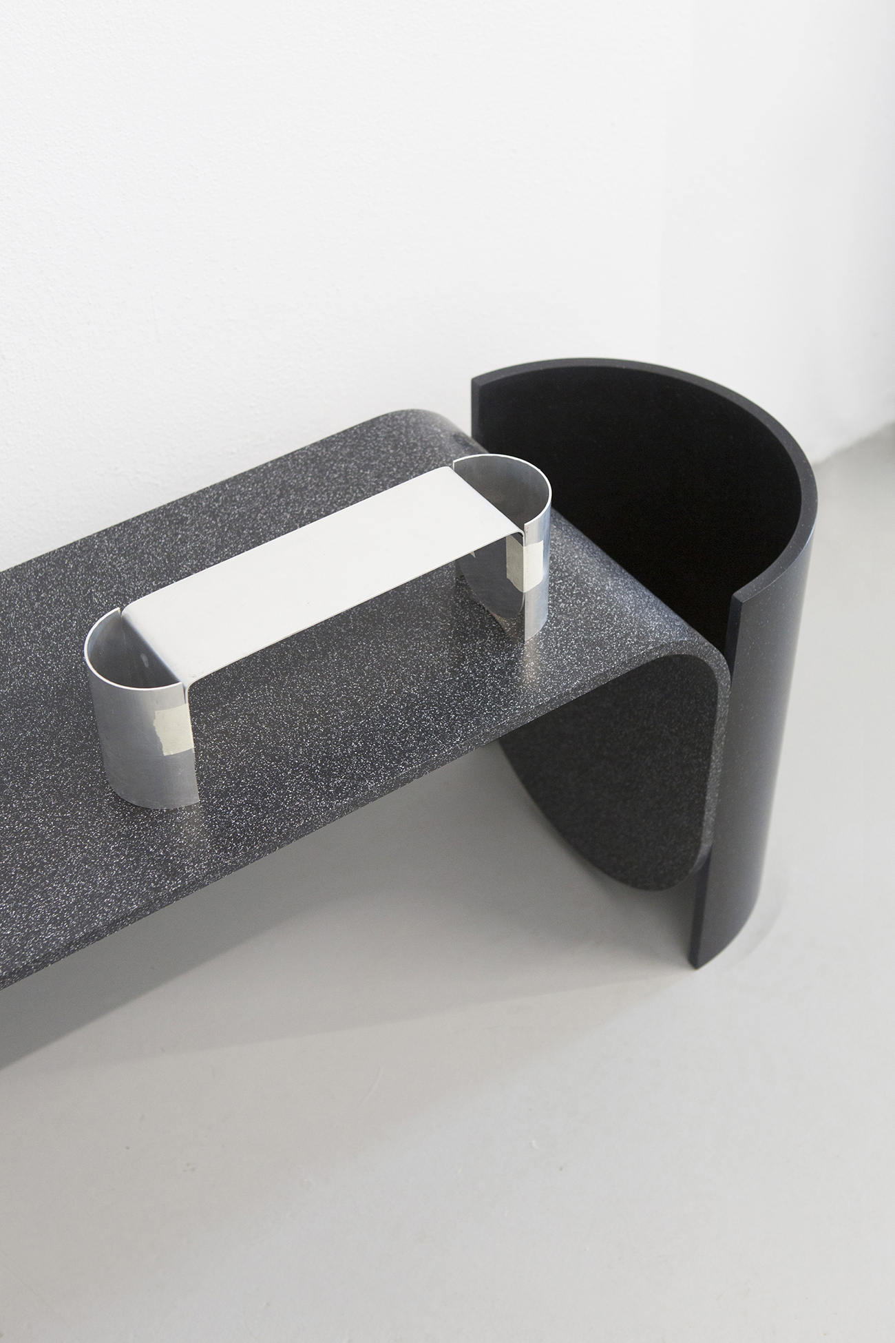
The Arc stool and a miniature maquette detailing where the elements are glued together. “The bench is actually made out of at least seven or eight pieces but it looks like it’s only made out of three.”
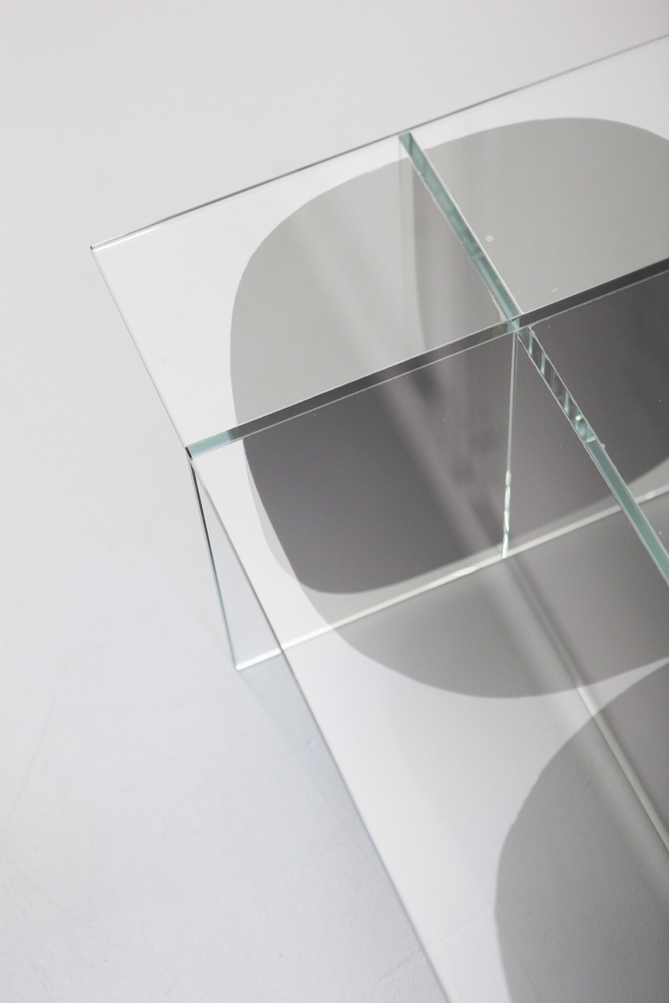
Surfaces of the Bipolar glass table, which the two launched last year during Milan Design Week, appear to shift with the varying configurations and transparencies of glass.
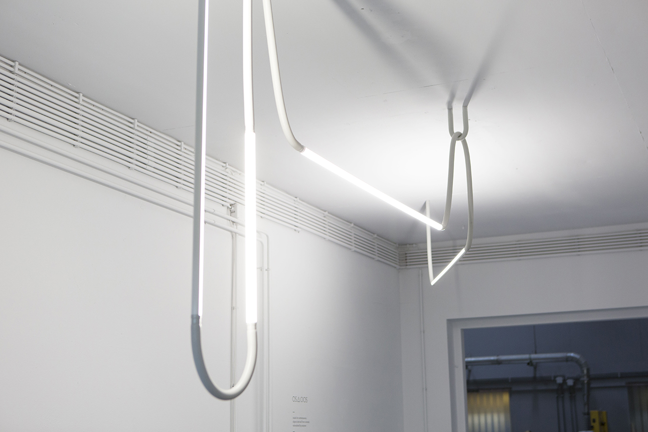
The Mono-Lights are made from a silicone foam, which has been extruded. The designers are frequently drawn to new materials that cross their paths and realizing their fullest potential in terms of form and function.
The duo was conscious of a name that could also function as a logo — “something that would be recognized a bit more than just a name,” says Mensen of the distinctive triangle, which can be made by pressing Alt-J on a keyboard. “Besides, you don’t have to send your logo to a company if they want it for an exhibition; they can just type it themselves,’ adds Peet.
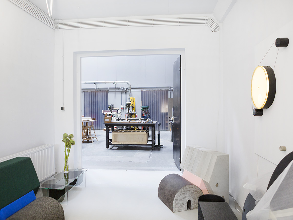
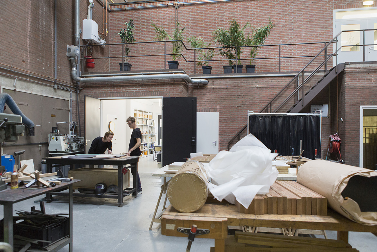
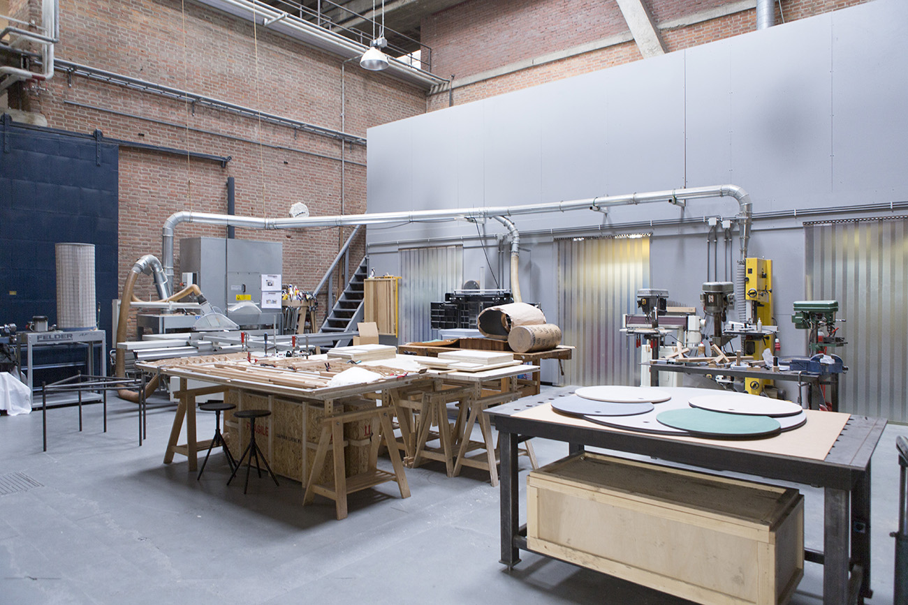
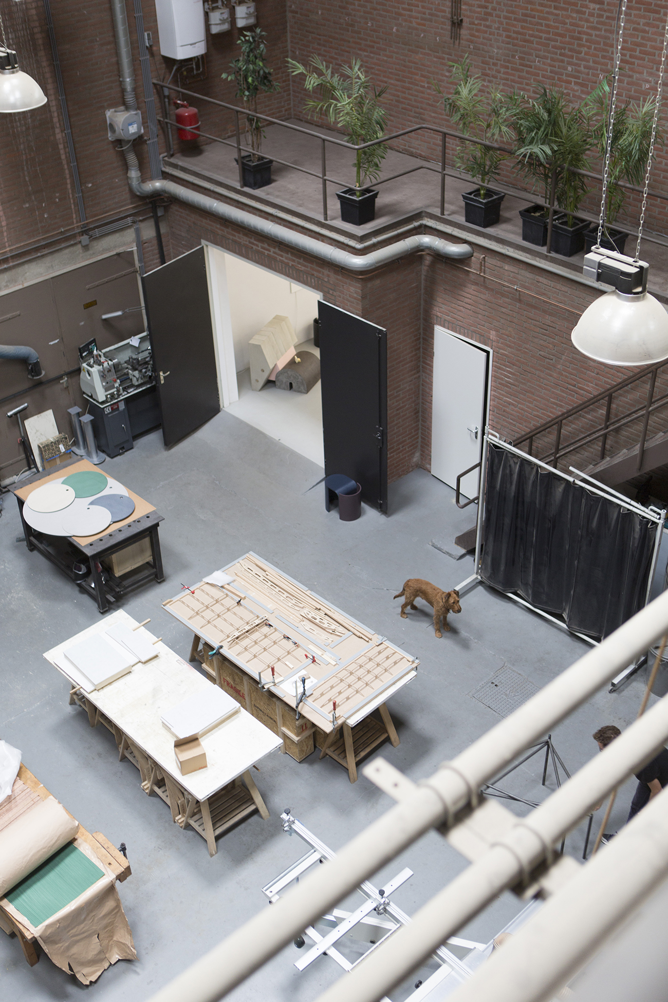
A shot of the workshop at the back of the studio office, with equipment for cutting, sanding, and joining materials.
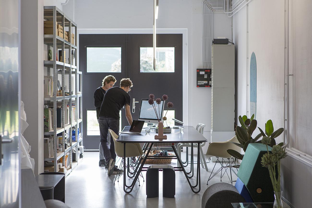
A shot from the workspace looking back to the studio office. Being positioned in Eindhoven affords the duo benefits of sharing expertise and space with fellow designers, as well as the virtues of cheap rent – the studio is relatively cheap in comparison to studio space in Amsterdam, Rotterdam and bigger cities.
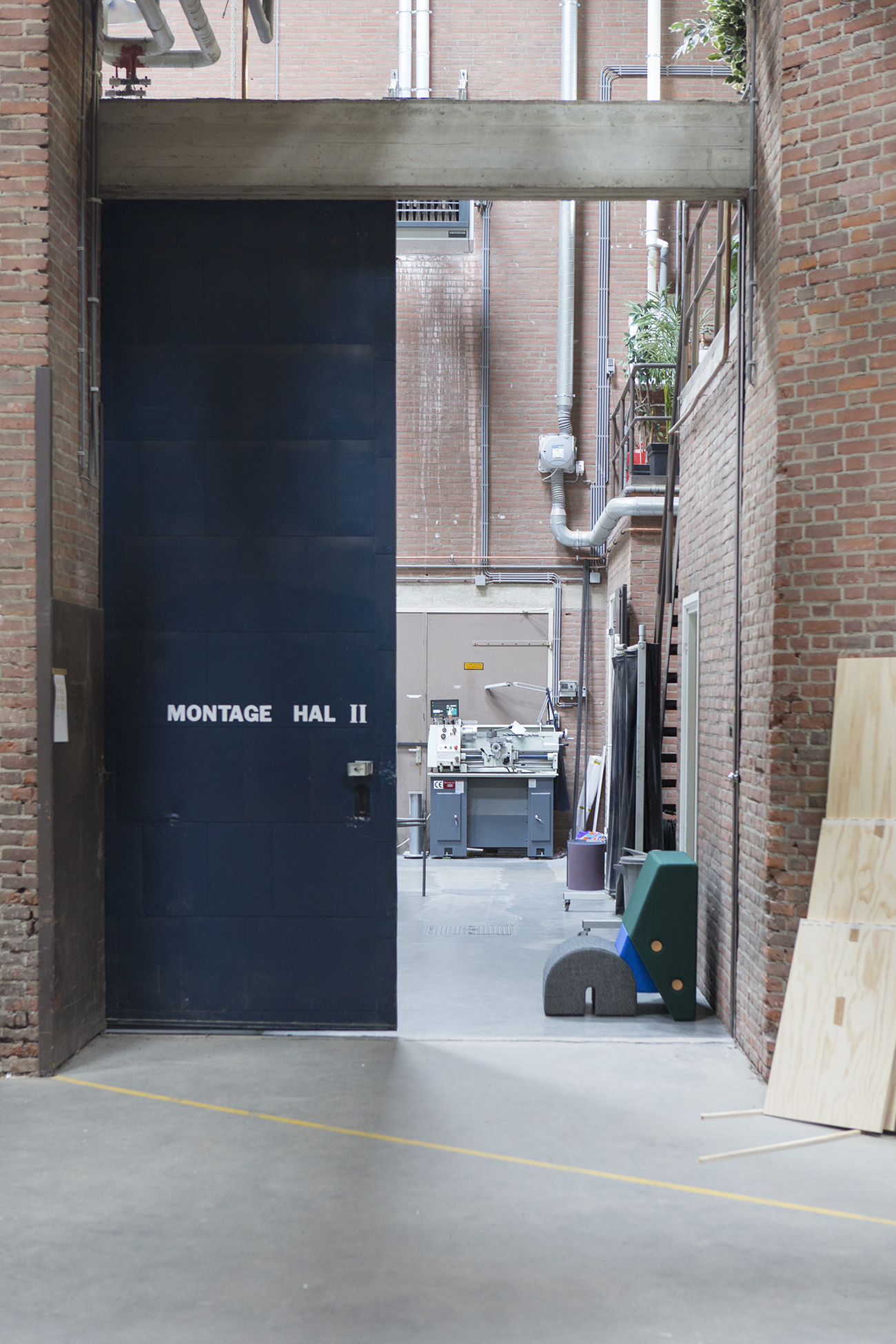
The workshop space is housed within an industrial building, which the duo shares in part with fellow Design Academy Eindhoven graduates Studio Mieke Meijer and Daphna Laurens.
“Eindhoven is quite a nice place to be. It feels a bit rough and it’s constantly developing. Every year you think, ‘Oh, let’s move to another place,’ and then the city actually gets better. So it’s a good work city; there’s not too much to do and it keeps you focused on work.”
Of their product development, Mensen says: “We like this moment where we don’t know what it’s going to be, or we’re just making tests or models or drawing, or investigating material. By digging further, it develops shape and you try to figure out what it could be. We never think at the beginning ‘this should be a chair, or a table’ or something like that.”
When asked who their inspirations are, Peet cites Gerhard Richter, among others. “I think he’s inspiring because he’s the master of changing styles,” says Peet. “To be able to be so multi-disciplinarian and still be so sharp in all fields — that’s something we also try and strive for. Being able to do ceramics, being able to do lighting, and trying to be a bit of everything.”
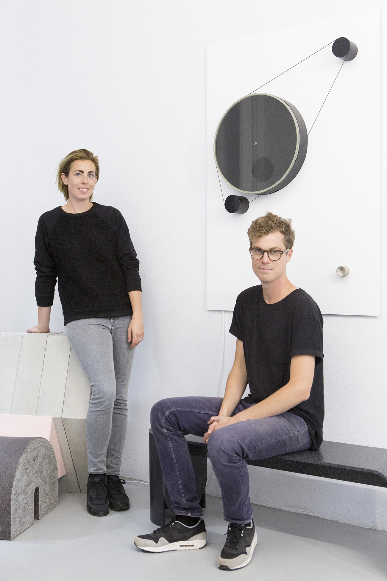
Credit where credit is due: The idea for Sight Unseen's newest column, Self Portrait, came from a chat we had recently with Pin-Up editor Felix Burrichter, over lunch in Soho. "Why don't you feature more products?" he asked us, to which we replied that our site is really about process — not products. Felix suggested we ask designers to pose with their latest works, something more personal than just reporting the news. The notion rattled around in our brains for a few months until it evolved into something even more exciting, at least we think so: A series inviting designers and artists to visually present their creations to us in a unique way, photographing them firsthand in a setting or setup that somehow illuminates the ideas behind the object. Our first submission comes from Oskar Peet, who with his partner Sophie Mensen founded the Eindhoven-based firm OS ∆ OOS this fall, launching with a trio of lamps so beautiful and intriguing that we actually feel grateful to Burrichter for inspiring the perfect platform with which to share them. Check out Peet and Mensen's submission above, then read below about how — and why — they got the shot.
There's a reason why one of the first questions we always ask Sight Unseen subjects is "What did your parents do?" In the nearly two years we've been producing this site, it's become apparent that the ideas and habits of ultra-creative people usually germinate in childhood, and that the environments in which they were raised tend to have played a part — whether their formative years resembled those of Kiki van Eijk, whose father competed on the 1976 Dutch Olympic field hockey team but also taught her to paint, or Lauren Kovin, whose parents filled the house with Ettore Sottsass furniture. The more designers and artists in a given family, the more interesting things tend to get, which is why we decided to start this new Related column. In it, we'll periodically ask creative talents who are related to interview one another about their respective practices and what it was like growing up in close proximity. First up are brothers Lukas Peet, 24, and Oskar Peet, 27, up-and-coming designers who were born and raised in the Canadian mountain resort town of Banff, attended the Design Academy Eindhoven together, and whose Dutch-born father Rudi Peet immigrated to Banff in 1974 and has since established himself as a successful jewelry designer there.
When Design Miami rolls around each winter, it’s hard to resist the siren’s song of sunshine in December, no matter how much you've decided you hate standing in line for parties or how high the hotel rates might balloon during that frenetic week. We’ve been known to pool resources with friends far and wide in order to hop on flights and hightail it out of New York on the promise of a stolen afternoon at the Standard’s pool, or even a press brunch at some Collins Avenue hotel du jour. But we’ve never made it to the event that started it all: Design Miami/Basel and its legendary accompanying art fair. Lucky for us, then, that we alighted this year on the perfect correspondent: Marco Tabasso, known in design circles as Rossana Orlandi’s right-hand man, who took advantage of a rare two-day break (the gallery sat this year out, after having debuted a massive Nacho Carbonell installation in 2011) to zip around the Swiss metropolis, capturing everything he saw for us on proverbial film.