08.09.16
Sighted
Five New Styling Pieces From a Favorite Brooklyn Housewares Brand
We once described the small-goods Brooklyn brand Areaware as straddling the line between Jeff Koons and Dieter Rams — which in practice meant that for every gold-foiled pig or pug-printed pillow, there was a hydroformed stainless steel flask, or a bottle opener with a built-in magnet. Their new fall collection falls along that same continuum, with carefully considered items that telegraph a sense of fun through either a color palette or an extremely clever concept. The new collection is meant to explore the idea of the table, but we think these items will look good pretty much anywhere — after all, look what they did for the collection’s off-site photography locale: the Center for Maximum Potential Building Systems in Austin, TX. We’ve chosen our five favorites from the new collection, launching later this month, here; click through for a sneak peek at the rest of the collection.
Radial Vessels by Pete Oyler
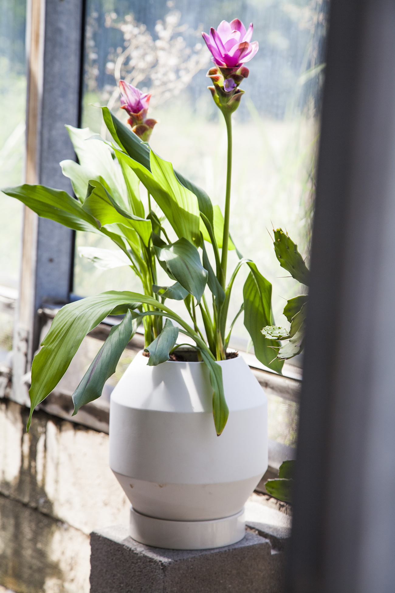

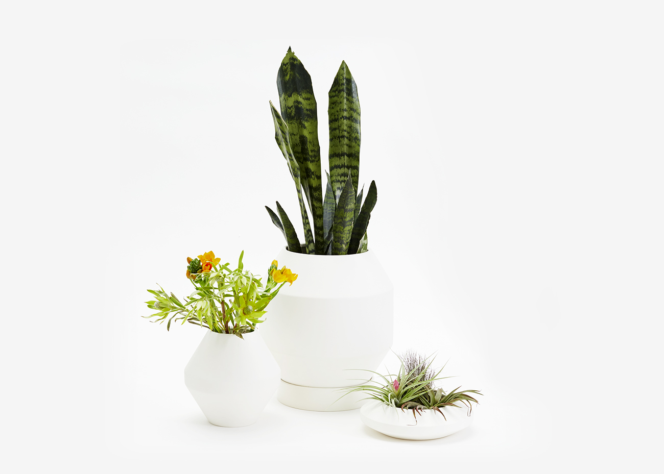
“The Radial Vessels are part of an ongoing investigation of the ways in which scale and proportion impact our understanding of form and function. The vessels in the Radial Collection share restricted geometries—the angles become more prominent as the height and diameter of the object increases or decreases resulting in various formal iterations. In designing this collection for Areaware, I was very interested in the idea of creating a series of objects that anticipated something else. I love plants, I love growing and sharing plants, and I am forever interested in the ways that plants transform our experience of interior spaces. Designed primarily on the computer, the paired down palette and restrained geometric forms are intended to highlight the organic wildness of the anticipated contents.” — Pete Oyler
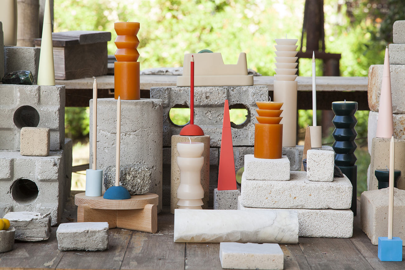
Totem Candles by Grain
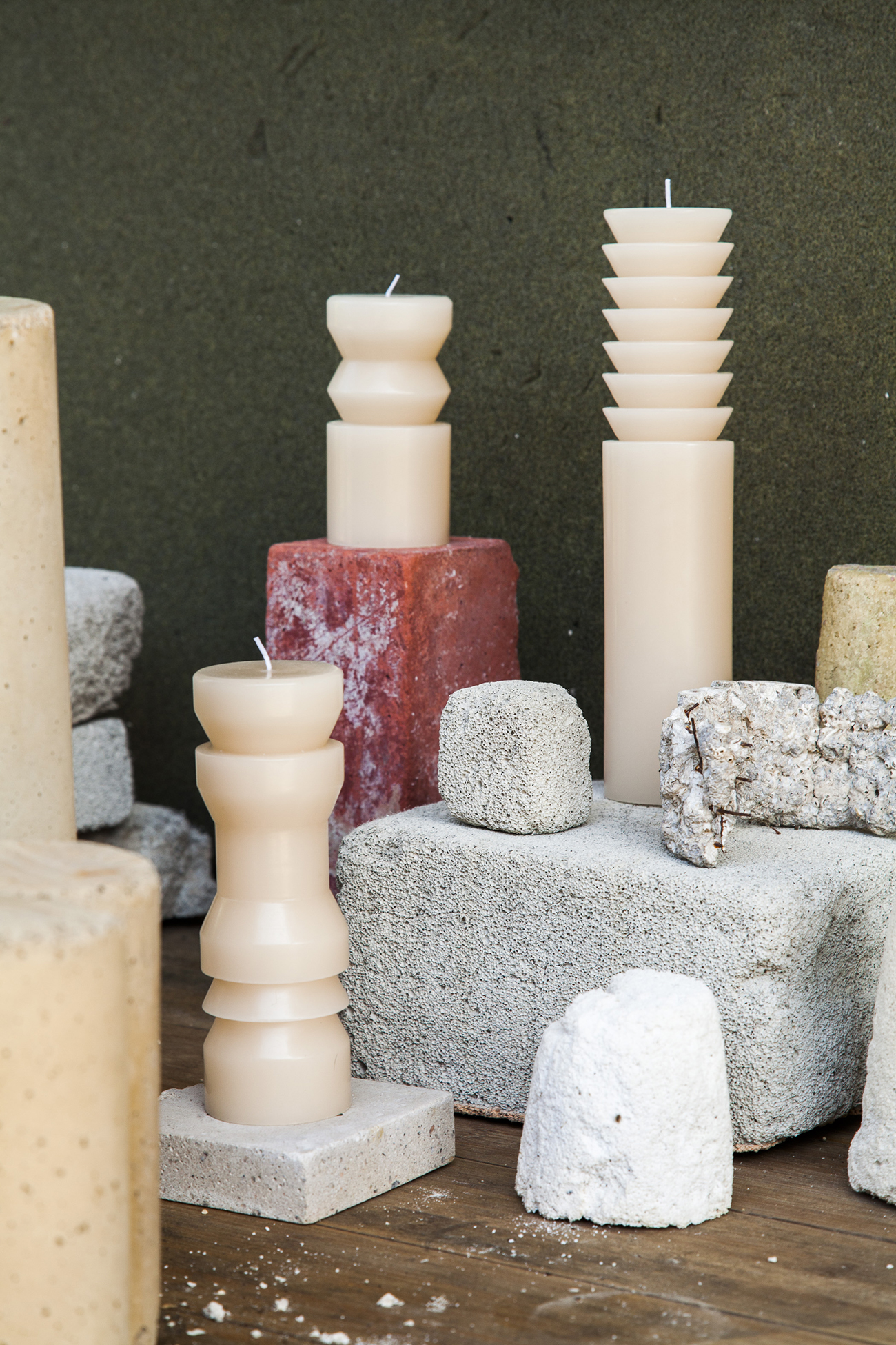
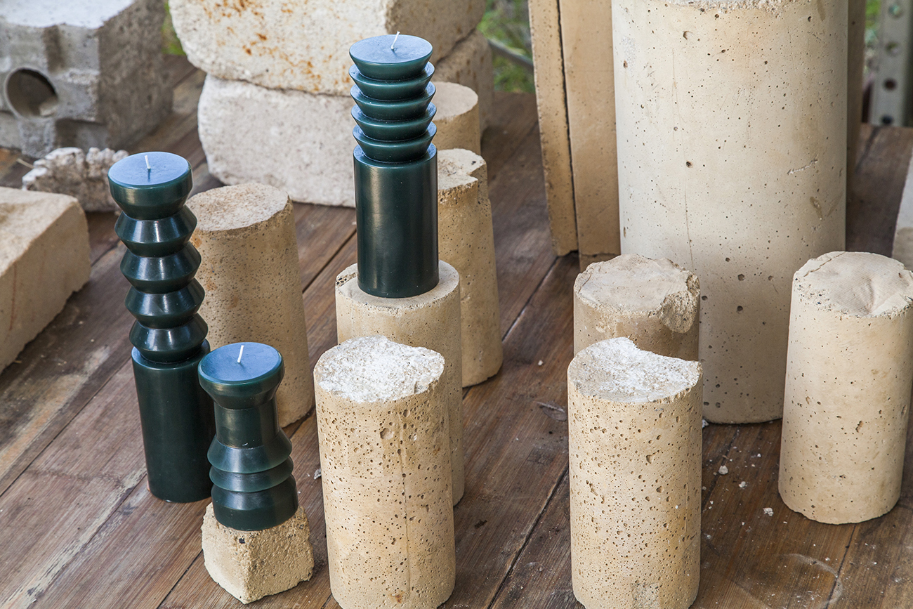
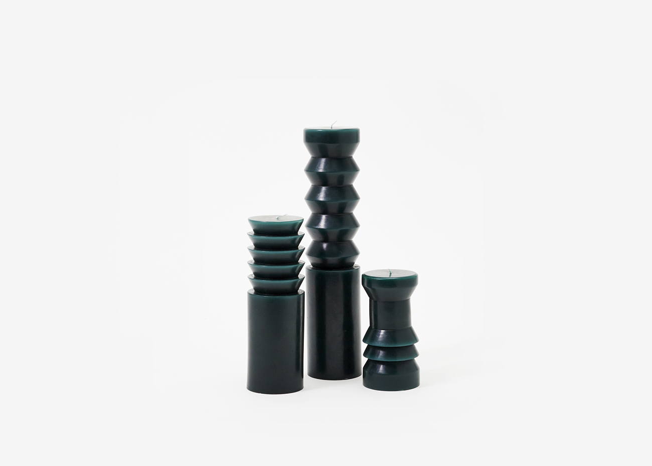
“One night James was working down in the shop on some order production, saw the box of candle samples, and was inspired to throw one on the lathe to see what would happen if he tried cutting into it. James had a lot of experience turning from RISD and from his woodworking and boat building background, but he wasn’t really sure how the wax would respond. They ended up cutting beautifully – what he would later describe as “like butter.” Though very controlled, the early process was also fast and satisfying for someone used to working with wood.” — Grain Design
Standing Pen by Clara Von Zweigbergk
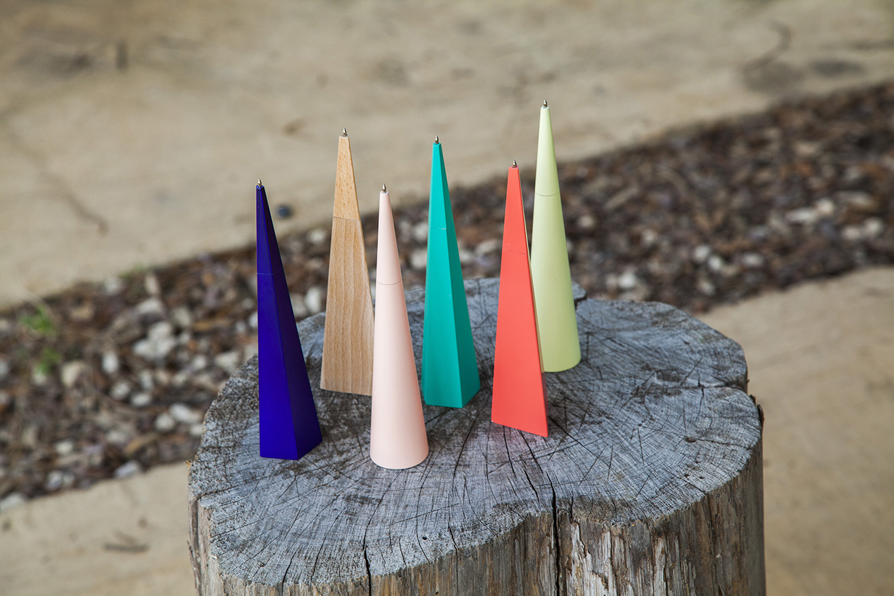
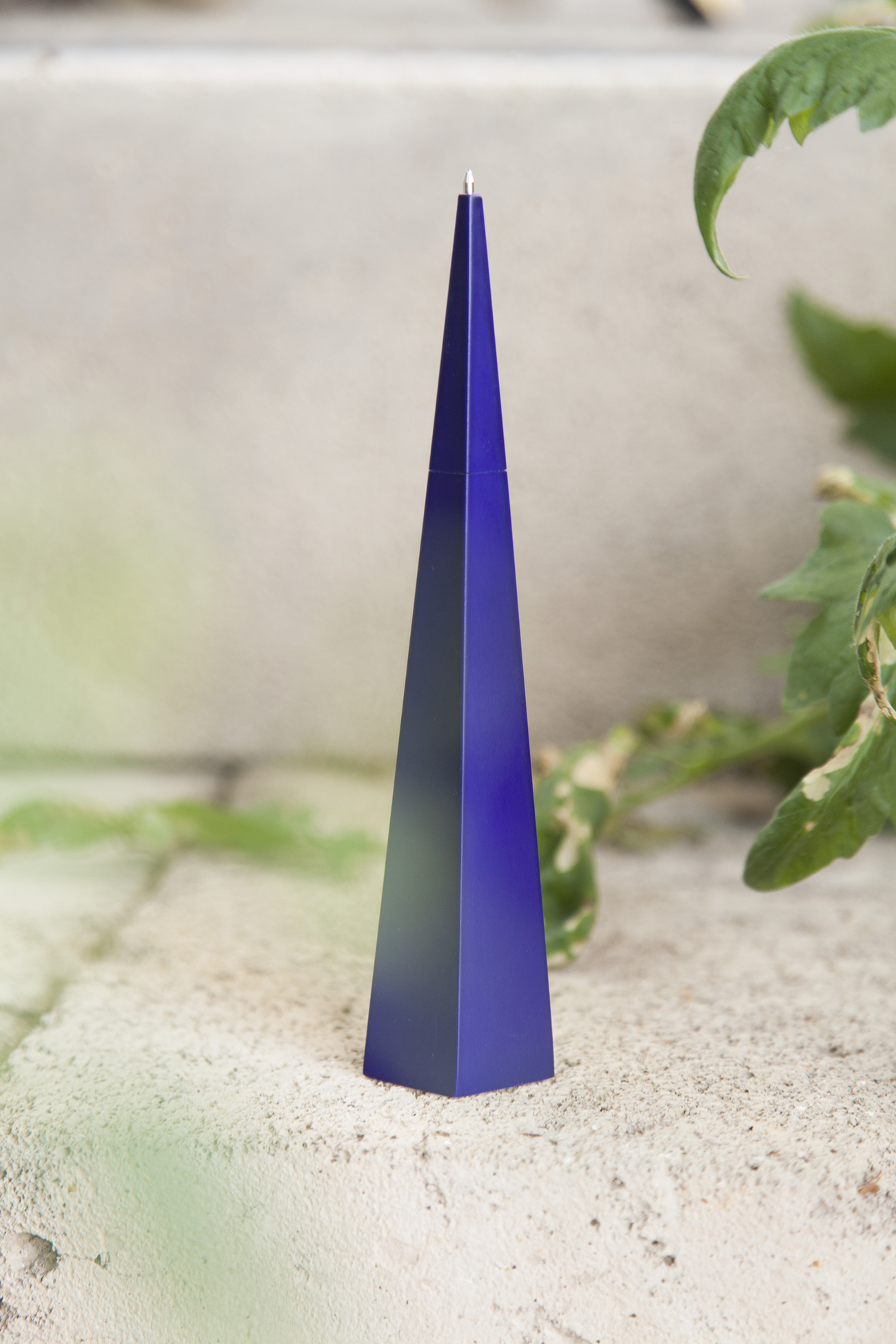
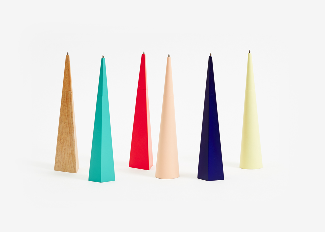
“As they often do, the idea for the Standing Pens came to me while I was working on another project. I was experimenting with paper folds for a three dimensional Christmas card. One of the left over pieces sort of folded up in my hand and into a pen shape. It felt nice to hold and reassuring it could stand on its own, easy to find and grab on a messy desk like mine. So I quickly made a few variants. I like the idea of a proudly standing pen, it gives it back importance.”
Stone Fruit Bowls by Chen Chen & Kai Williams
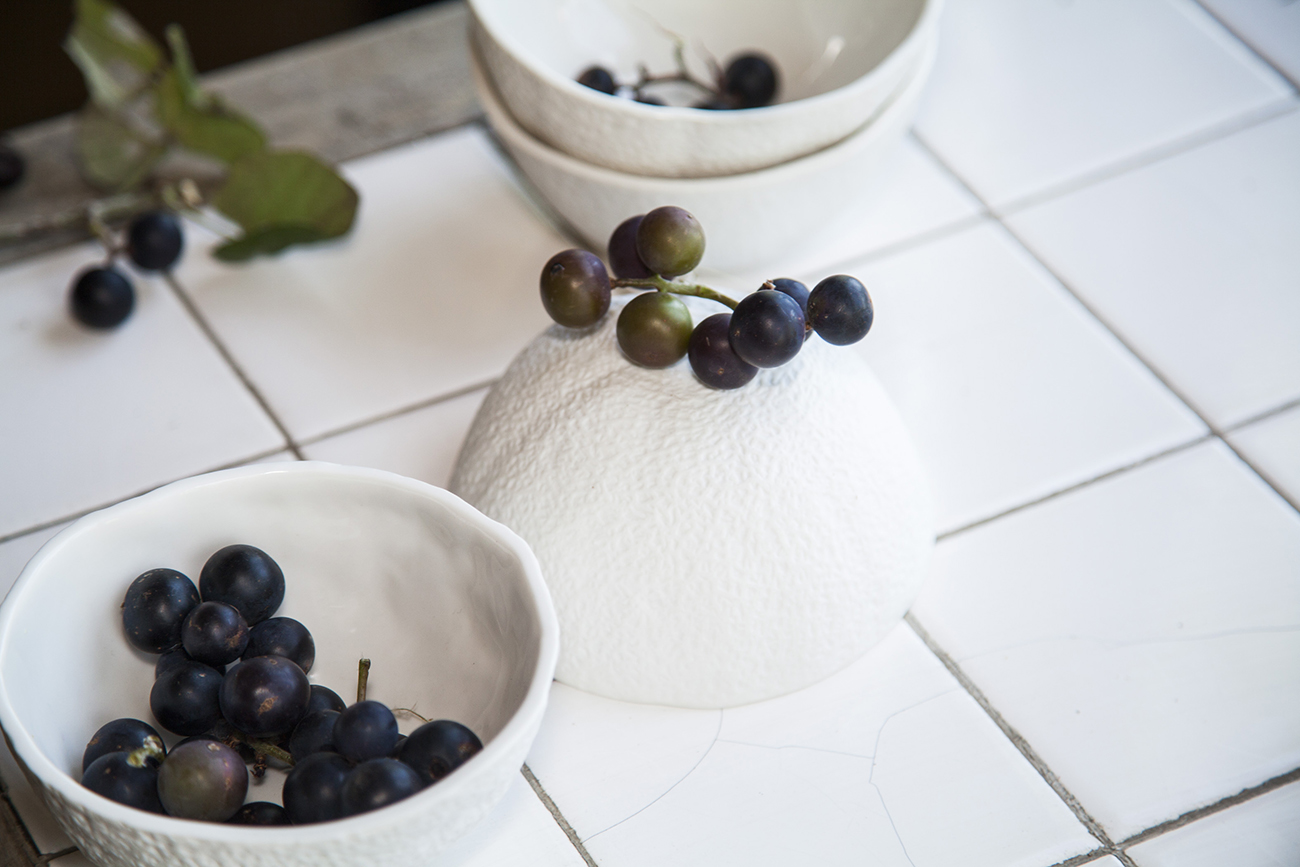
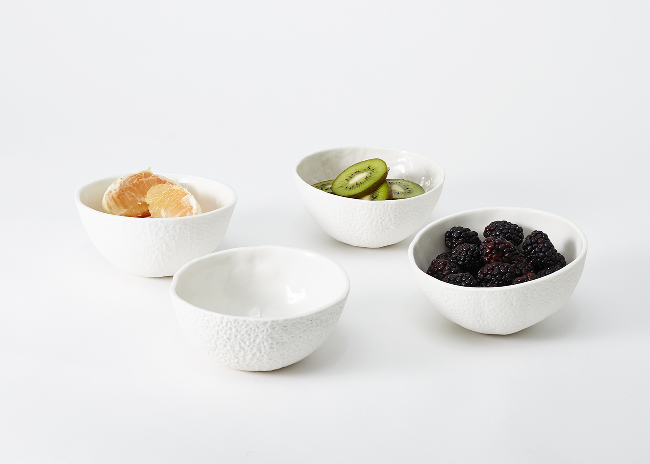 “The Stone Fruit bowls came about as an experiment with slip-casting porcelain as an offshoot of our Stone Fruit Planter series. Cast in soft, flexible silicone molds the bowls and planters emphasize surface texture. By making the forms a matte monochrome we heightened the way light interacts with the surface and the shadows that are created. We thought about making the porcelain bowls almost as an afterthought, almost sure that the rigid plaster mold wouldn’t release such a textured surface. Cantaloupe was the first fruit we played with because we liked the subtle differance in texture from one fruit to the next. It also had a simple hemisphere silhouette which was borderline abstract and made you look more at the texture. When trying to replicate an object with slip casting, it’s impossible to copy the same size because the clay shrinks as it dries. We originally produced two other shapes, an orange that shrank to the size of a clementine, and a grapefruit that shrank to the size of an orange. The shrinking creates a more intricate surface and helps turn these bowls into a hyper-real version of the original fruit.” — Chen Chen & Kai Williams
Eraser Stand by Earnest Studio & Phil Proctor
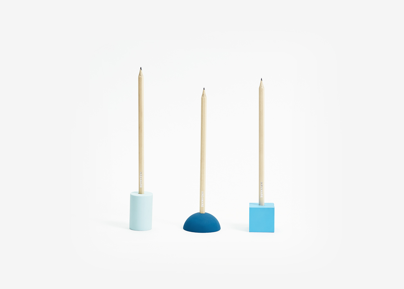
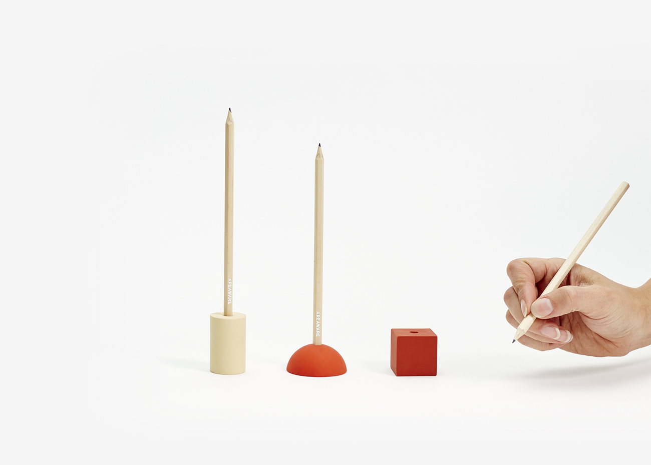
“One of the many benefits of working in a building with other designers (and friends) is that social visits can turn into projects. The Eraser Pencil Stand began with an off-cut that Rachel had lying on her desk. It was one half of a large wooden bead, and she had been using the hole as a pencil holder. Phil came downstairs one day to say hello, and suggested making the hemisphere from eraser rubber. Several weeks and wooden models later, our geometric eraser family was born.” — Earnest Studio and Phil Proctor
